8 YouTube Thumbnail Best Practices for More Clicks

Ryan Bennett • September 19, 2026
Apply YouTube thumbnail best practices for sharper visuals, stronger mobile readability, smarter testing, accessibility, and scalable AI production.
A thumbnail doesn't need to be pretty first. It needs to be understood instantly. That matters because viewers usually meet your video in a crowded feed, often on a phone, where a thumbnail has to communicate topic, emotion, and payoff before someone reads the title.
The evidence is blunt. A 2026 analysis of 11,223 YouTube thumbnails found that 71% featured a face, and the pattern was even stronger in categories like Vlog and Fitness and Finance, while Gaming lagged behind. The same analysis found that among thumbnails using text, the median was four words, and 23% used no words at all, which points to a simple rule: clarity beats density in a small-format feed (Tube Analytics thumbnail CTR patterns study).
That's the frame for these YouTube thumbnail best practices. Treat thumbnail design as a system, not a one-off creative task. Start with the technical canvas. Build a visual hierarchy that survives mobile compression. Use faces, contrast, and curiosity carefully. Protect brand recognition. Validate what works with segmented testing. Then make the whole process scalable with batch generation and editing.
The strongest thumbnail isn't just attractive. It's legible, truthful, accessible, and testable.
1. Bold Typography and High Contrast Text
Small text kills click-through. On YouTube, thumbnails are usually judged at phone size, under compression, and in a crowded feed. Typography has to survive that environment, not just look good at 1280 by 720.
If you use text, treat it like packaging copy. It should name the payoff, sharpen the tension, or clarify the angle in a split second. Short hooks such as “Worth It?” or “Don't Buy” work because they complete the image instead of restating the title.
A 2026 thumbnail analysis found a median of four words among thumbnails that used text, and more than a fifth used no words at all. It also found that many text-based thumbnails repeated too much of the title, which wastes limited space in the image (Tube Analytics thumbnail CTR patterns study).
Use the thumbnail to say what the title does not. If the title is “I Tested 5 Budget Cameras,” the image text can carry the decision, tension, or result: “Best Under Pressure,” “1 Clear Winner,” or “Not Worth It.”
Practical rule: Let the title explain the topic. Let the thumbnail text deliver the reason to care.
In production, this works best as a checklist, not a taste-based debate:
- Use heavy fonts: Bold or extra-bold sans serif fonts hold up better after resizing and compression.
- Keep the phrase short: Aim for two to four words. Cut anything that needs rereading.
- Build contrast on purpose: Use a stroke, shadow, dark overlay, or blur panel only when it improves legibility.
- Validate on mobile first: Review the thumbnail at small size before approval. If one word drops out, rewrite or resize it.
- Respect safe areas: Keep text away from corners, the bottom-right timestamp, and edges that get cropped on different surfaces.
- Check accessibility: High contrast helps everyone, including viewers with low vision or poor screen brightness.
There is a trade-off here. Bigger text improves readability, but it can crowd the focal point and make the design feel generic. The fix is not more styling. The fix is fewer words and stronger placement.
For teams publishing at volume, do not redesign each thumbnail from scratch. Build a small set of approved font, contrast, and placement templates, then batch-test multiple hooks on the same base image. A workflow for adding text to an image at scale makes that process faster and easier to compare. Then run A/B tests against real impressions, using mobile readability and CTR by traffic source as the decision criteria.
2. Emotional Facial Expressions and Eye Contact
Faces earn clicks faster than almost any other visual element, but only if the emotion is readable at phone size and supports the video's promise.
A 2026 CTR study analyzing 1,000 YouTube thumbnails reported that thumbnails with a human face averaged a 6.8% click-through rate versus 4.1% for thumbnails without a face, a relative lift of 66% (Awisee YouTube thumbnail best practices). The production takeaway is simple. Use a face when it clarifies the outcome, tension, or payoff in a fraction of a second.

Expression choice matters more than intensity. Surprise fits reveals. Concern fits risk, mistakes, or warnings. Relief fits before-and-after stories. If the title promises a sober finance breakdown, an exaggerated game-show reaction usually lowers trust instead of improving CTR.
Eye direction is a production decision, not decoration. Direct eye contact can stop the scroll because it creates immediate interpersonal attention. Off-frame gaze can work better when you need to pull the viewer toward a chart, object, result, or problem area inside the frame. Both approaches are useful. The right choice depends on what should win the first half-second.
Use this review process before export:
- Start with the title: Pick an emotion that matches the actual viewer payoff.
- Validate at small size: Zoom out to a mobile-scale preview. If the eyes and brows stop carrying the expression, recrop or replace the frame.
- Crop for recognition: Head-and-shoulders or tighter usually reads better than a full torso.
- Protect the face from UI overlap: Keep key features away from the bottom-right timestamp and edge crops.
- Test gaze direction: Compare direct gaze against off-frame gaze in A/B tests, then judge by CTR and watch behavior, not preference.
- Check accessibility: Strong facial separation, clean lighting, and visible eyes help the image hold up for low-brightness screens and lower-vision viewers.
This also scales well. Teams publishing often should build a small library of approved facial crops, gaze directions, and emotion types by content format, then batch out variants against the same title concept. That turns thumbnail work into a repeatable test system instead of a one-off creative guess.
Viewers click faster when the face explains what the video will feel like.
3. Strategic Use of Bright, Contrasting Colors
A good thumbnail has to compete with YouTube, not just with your own design preferences. White mode, dark mode, mixed creator styles, and mobile brightness settings all change what “looks good.”
That's why contrast matters more than palette sophistication. Many polished thumbnails fail because they use too many mid-tones. The result looks premium in Photoshop and invisible in a recommendation feed. Kurzgesagt stands out because the color blocks read instantly. Many top sports and entertainment channels do the same with strong separation between subject and background.
Design for feed conditions, not full-screen review
Recent 2026 coverage increasingly highlights mobile previews around 120 to 150 pixels, contrast checking, and testing in both light and dark mode. The same report claims thumbnails with a 7:1+ contrast ratio averaged 9.2% CTR versus 2.9% below 4.5:1, suggesting that simplified, high-contrast designs may outperform busier layouts as feeds compress further (Thumby thumbnail trends coverage).
Even if you don't use a formal accessibility tool on every image, the operating principle is useful. Strong subject-background separation usually survives real-world viewing conditions better than fine detail.
A scalable color workflow looks like this:
- Pick one dominant contrast strategy: Dark subject on light background, or the reverse.
- Use accent colors sparingly: A single red arrow, yellow number, or cyan outline can direct attention.
- Check in dark mode and light mode: A thumbnail can disappear against one interface and pop in another.
- Desaturate background clutter: Save the brightest values for the focal point.
- Batch-test colorways: Run multiple versions of the same layout instead of arguing over taste.
This is one area where accessibility and performance often align. Clearer contrast usually helps more people see the thumbnail, and it often improves click behavior too.
4. Clear Visual Hierarchy and Focal Point
Hierarchy decides the click before style does.
On YouTube, viewers do not study a thumbnail. They scan, usually on a phone, and make a choice fast. If the layout asks them to process a face, a product, three words, an arrow, and a background joke at the same time, the message collapses.
A stronger workflow is simple. Set one job for the thumbnail, then build the composition around that job. If the video is about a surprising result, show the result first. If the hook is a person's reaction, let the face carry the frame. If the promise is a comparison, make the contrast obvious and keep everything else quiet. Channels like Linus Tech Tips often handle this well because the lead object is obvious at a glance, even before the title adds context.
Here is the test I use in production: shrink the thumbnail to mobile-feed size and ask one question. What do I notice first?
If the answer is "a bit of everything," the composition is still unresolved.
Clutter usually comes from indecision, not lack of polish. Extra text, duplicate props, secondary faces, oversized badges, and busy background details all compete for the same first look. Removing one competing element usually improves performance more than refining five small effects.
A practical review pass looks like this:
- Name the primary subject: one face, one object, one result, or one contrast.
- Assign a second look: text, a small visual cue, or a supporting object.
- Demote everything else: reduce size, blur slightly, darken, or crop out.
- Check the mobile safe area: keep the key subject away from corners and lower-right UI overlap.
- Compare variants side by side: centered crop, tighter crop, and off-center composition often reveal the strongest focal path quickly.
This is also where bulk generation becomes useful. Build several hierarchy variants from the same source assets, validate them at small size, then A/B test the finalists. That turns composition into a repeatable decision process, with accessibility, mobile readability, and production speed built in from the start.
5. Consistency in Visual Branding and Style
Recognition starts before the title does.
Channels that grow over time usually stop treating thumbnails as isolated designs. They use a visual system viewers can identify in a crowded feed, especially on mobile where the channel name is easy to miss and every image competes at small size.
Consistency works best as a set of rules, not a frozen template. Keep a few elements stable across uploads, then change the parts that carry the episode-level hook. That balance protects recognition without making the feed feel repetitive.
A practical setup looks like this:
- Lock the brand signals: one or two fonts, a fixed text treatment, a narrow accent palette, and a repeatable cut-out or illustration style.
- Create series-level variants: tutorials, commentary, interviews, and product reviews often need different layouts under the same brand system.
- Define mobile-safe placements: reserve consistent zones for faces, text, badges, and logos so key elements survive small-size viewing and UI overlap.
- Set accessibility rules: maintain readable contrast, avoid color-only meaning, and keep recurring text treatments legible for viewers with low vision.
- Track template performance separately: test one template family against another so branding decisions can be measured, not defended by preference.
This also makes bulk production realistic. A team can generate a month of thumbnails from one component library, swap in episode-specific assets, and produce clean variants for A/B tests without rebuilding each file from scratch.
The trade-off is real. Too much sameness lowers curiosity. Too much variation weakens recall. The fix is simple. Standardize the frame, then let the promise change.
6. Strategic Use of Numbers, Arrows, and Visual Indicators
Numbers and markers can raise clicks fast, but they also create some of the easiest thumbnail mistakes to scale.
Used well, they shorten the viewer's decision. Used badly, they add noise, hide the subject, or make the thumbnail feel like low-trust clickbait. The test is practical. On a phone-sized preview, the indicator should explain the image in under a second.
The best use cases are specific: a ranked list, a price jump, a feature change, a hidden flaw, a before-and-after result, or a side-by-side choice that is not obvious at first glance. If the image already reads cleanly, skip the extra marker.
A simple review workflow helps:
- Shrink the thumbnail to mobile size.
- Check whether the core promise is clear without overlays.
- Add one indicator only if clarity improves.
- Export two variants and test them against each other.
That last step matters. Teams often assume arrows always improve CTR because they attract attention. In practice, they only help when they direct attention to something viewers would otherwise miss. A bold number badge can outperform an arrow on list videos. A circle may help on software or product thumbnails where the detail is small. For reaction, commentary, or story-led videos, extra indicators often weaken the frame.
Use each cue for a defined job:
- Numbers: lead with them when the quantity is the hook, such as rankings, budgets, counts, or percentage changes.
- Arrows: point to the exact payoff, not to the center of the canvas.
- Circles and highlights: reserve them for tiny details that would disappear at small size.
- Labels or badges: keep wording short so they survive mobile viewing.
- Comparison markers: use clear left-right or before-after signals when the viewer needs help reading the contrast.
Keep accessibility in the review, not as an afterthought. Do not rely on color alone to explain meaning. Pair color with shape, text, or position so the indicator still works for viewers with low vision or color-vision differences.
For channels producing thumbnails in batches, build indicators as reusable components. One arrow style, one badge system, one highlight treatment. That makes bulk generation faster and gives clean A/B test variants without redesigning the base thumbnail every time.
7. High-Quality, Optimized Image Assets and Compression
Sharp assets raise click confidence. Soft assets make the thumbnail look cheap, especially on mobile where every edge has to survive size reduction and YouTube's own processing.
Treat image quality as a production step, not a finishing touch. The goal is not the prettiest full-size file in Photoshop. The goal is a thumbnail that still reads clearly after export, upload, compression, and feed display at small size. That changes how teams should work.
A reliable workflow looks like this:
- Build from clean source material. Use high-resolution photos, screenshots, and cutouts so you can crop aggressively without breaking facial detail, product edges, or UI text.
- Keep a master file separate from the upload file. Make creative edits in the master, then export delivery versions with controlled compression settings.
- Validate at thumbnail size first. Zoom out to mobile-scale previews and check eyes, key text, and hard edges before approval.
- Apply sharpening selectively. Faces, headline text, and the main object usually benefit. Background textures often turn noisy if you sharpen the whole frame.
- Standardize exports across the team. A shared preset prevents one editor from sending crisp files and another from uploading muddy ones.
- Create a web-ready asset with a documented process for optimizing images for web delivery.
This is also where scalable channels separate design from throughput. If a team needs 20 thumbnails this week, asset prep, export settings, and QA rules should be templated the same way colors and type treatments are templated. That makes bulk generation faster and gives cleaner A/B test reads because image quality stays consistent across variants.
Compression always involves a trade-off. Larger files can preserve detail, but heavy files do not fix weak source images, and overcompressed exports smear small text and fine contrast. The practical target is simple. Keep the file crisp enough that the focal point holds up on a phone.
Teams that need fast drafts can use lightweight tools to make YouTube thumbnails, then move approved layouts into a repeatable asset pipeline with fixed export presets, mobile QA checks, and accessibility review.
8. Strategic Content Positioning and Safe Area Awareness
Placement decides whether a strong thumbnail survives the feed.
A clean design can still lose clicks if the payoff sits too low, too close to the edge, or in the corner YouTube crowds with interface elements. I treat safe-area planning as a production rule, not a polish pass after the layout is done.
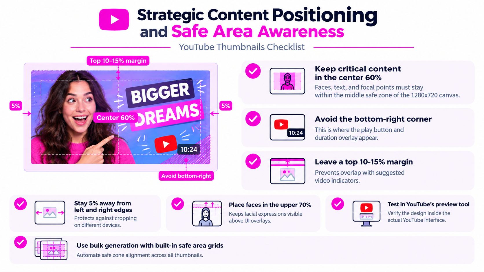
The working method is simple. Build the thumbnail at full size, then validate it at phone scale before approval. If the eyes, headline word, product result, or proof element gets crowded by the lower edge, the composition is wrong even if it looks balanced on a desktop canvas.
The safest layouts usually follow a few repeatable rules:
- Put the primary subject slightly above center so faces and focal objects hold up in small previews.
- Keep short text blocks away from the bottom edge and tight corners.
- Treat the lower-right area as risky space, especially for badges, prices, before-and-after labels, and small icons.
- Leave enough margin that minor crops, feed treatments, and recommendation layouts do not clip meaning.
- Use fixed canvas guides based on a documented aspect ratio reference for social media formats so designers are not guessing safe zones from memory.
This also affects accessibility. Small text placed near a busy edge becomes harder to read for everyone, and especially fragile for viewers scanning quickly on mobile or using lower-brightness screens. Safe-area discipline improves clarity without adding more text, more contrast, or more visual noise.
For teams producing thumbnails at volume, safe-area awareness should live inside the template file. Add guide layers, lock margin zones, and review every variant at mobile size before export. That gives cleaner A/B tests because each version changes the message or focal point, not the basic usability of the layout.
8-Point YouTube Thumbnail Best Practices Comparison
| Technique | Implementation complexity | Resource requirements | Expected outcomes | Ideal use cases | Key advantages |
|---|---|---|---|---|---|
| Bold Typography and High Contrast Text | Low–moderate, simple rules and contrast checks | Minimal, fonts, color palette, basic design tools or AI overlays | Better readability and CTR (≈20–30%); improved accessibility | Short-message thumbnails, mobile-first audiences, bulk social content | Readable at small sizes, scalable, accessible |
| Emotional Facial Expressions and Eye Contact | Moderate, requires direction, capture, and selection | Talent, good lighting/photography, face-detection or editing tools | Strong engagement uplift (≈30–50%); emotional connection | Vlogs, reactions, personality-driven and entertainment videos | High attention capture, universal appeal, higher retention |
| Strategic Use of Bright, Contrasting Colors | Low–moderate, palette selection and saturation tuning | Color guides, testing tools, design/editor or AI color optimizers | Increased visibility and CTR (≈25–40%); stronger brand recall | Competitive feeds, entertainment, high-volume channels | Stands out in feeds, reinforces branding, easy to automate |
| Clear Visual Hierarchy and Focal Point | Moderate–high, requires composition knowledge and testing | Design expertise or templates, composition overlays, AI assistance | Clearer message and CTR improvement (≈20–35%); professional polish | Product reviews, educational/informative content, tutorials | Guides viewer eye quickly, improves comprehension, versatile |
| Consistency in Visual Branding and Style | Moderate, needs guidelines and disciplined workflow | Brand assets, templates, team coordination, batch editors | Steady brand recognition and loyalty (+15–25% CTR lift) | Established channels, series content, brand-driven creators | Builds recognition, streamlines production, scalable at scale |
| Strategic Use of Numbers, Arrows, and Visual Indicators | Low, simple overlays and directional graphics | Graphic overlays, text styling, bulk A/B testing tools | Curiosity-driven CTR increase (≈20–40%); clearer value promise | Listicles, how-to, rankings, tips and countdown videos | Conveys specificity quickly, directs attention, easy to test |
| High-Quality, Optimized Image Assets and Compression | Moderate, requires format/compression knowledge | High-res source files, optimization tools, possible licensing | Professional appearance, consistent rendering, faster loads | Tech/product channels, high-production-value or large channels | Retains detail at small sizes, improves UX, reduces upload issues |
| Strategic Content Positioning and Safe Area Awareness | Low–moderate, technical guidelines and previews | Safe-area templates, preview/testing tools, batch overlays | Ensures critical content isn't obscured; consistent visibility | All thumbnails (essential for UI-sensitive compositions) | Prevents UI obstruction, improves legibility across devices, simple to enforce |
Turn Thumbnail Design Into a Repeatable System
The strongest thumbnail teams don't rely on instinct alone. They build a review process.
Start with the correct 16:9 canvas and a source image that stays sharp after cropping. Check the thumbnail at mobile size, not just on a large monitor. Verify that the focal point still reads, that the text is still legible, and that the key content sits safely away from likely interface overlays. Then confirm the most important non-design rule of all. The thumbnail promise has to match the video.
Performance judgment needs context too. Neutral guidance says there's no universal “good” CTR, because the same thumbnail can perform very differently across Home, Suggested, Search, and Subscriptions. Recent guidance also emphasizes reviewing performance in the first 24 to 48 hours and only swapping thumbnails when the video is clearly underperforming in context (Miraflow guidance on thumbnail CTR context). That's a better workflow than chasing one benchmark across every upload.
For production teams, one-variable testing matters more than endless redesign. Change the face crop, not the face crop and color and text at once. Test a textless version against a short-hook version. Compare a bright background against a dark one with the same composition. Document winners by traffic source, content format, and series type so your next design starts with real channel knowledge.
Scalable workflows start paying off. Batch editing lets you resize, sharpen, adjust contrast, and apply consistent branding across multiple thumbnail candidates quickly. Bulk generation goes one step further by helping you create several composition, color, and hook variations from the same concept without rebuilding every asset manually.
That's the practical way to apply YouTube thumbnail best practices now. Not as isolated design tips, but as a repeatable operating system for packaging videos. Build the canvas correctly. Keep the message short. Make the focal point obvious. Validate on mobile. Respect accessibility and safe areas. Test with context. Then keep a record of what wins for your audience.
If you need more concept volume at the ideation stage, tools for AI generated thumbnail ideas can help spark directions. Advantage comes when those ideas move into a structured production and testing workflow.
Bulk Image Generation is built for teams that need more than one good thumbnail. It helps you create and refine multiple thumbnail variations fast, keep branding consistent, and batch-edit assets for mobile readability, contrast, and safe-area compliance. If you want a faster way to operationalize these YouTube thumbnail best practices, visit Bulk Image Generation.