Aspect Ratio for Social Media: 2026 Guide for Perfect Posts

Aarav Mehta • June 13, 2026
Master the optimal aspect ratio for social media in 2026. Get pixel sizes, safe zones for Instagram, TikTok, Facebook, & more. Perfect your posts.
You spend an hour getting a post right. The headline is balanced, the product shot is sharp, the branding is clean. Then you publish it, open the app on your phone, and the text is jammed under interface buttons or cropped into a shape you never approved.
That's usually not a design problem. It's an aspect ratio problem.
Most advice about aspect ratio for social media stops at dimensions. Useful, but incomplete. What breaks posts in practice is the combination of placement, device behavior, and UI overlays. A graphic that looks fine in a desktop preview can fail in Stories. A square image can still “work,” but lose attention in a feed where taller posts hold more screen space. A vertical asset can still underperform if the call to action sits too close to the bottom.
If you're building content at scale, this gets expensive fast. Designers redo layouts. social media managers crop manually. teams waste time making one-off fixes instead of building a repeatable system. That's why a lot of teams move toward tools that can create and adapt assets in batches, including workflows built around an AI social media image generator.
The Hidden Reason Your Social Media Posts Fail
The failure usually shows up after publishing, not during design.
A feed post looks polished in Canva, Photoshop, or Figma. Then Instagram trims the edges. A Story places the app chrome over your title. A Reel thumbnail cuts off the product name you needed people to see before they tap. Nobody on the team made a “bad” asset. They made an asset for the wrong viewing context.
That's the part many guides miss. The issue isn't only whether the file is technically accepted by the platform. The issue is whether the post still communicates once the platform wraps it in interface elements, feed cards, profile grids, and mobile cropping behavior.
What this looks like in practice
A few patterns come up again and again:
- A square post gets buried in the feed because it doesn't command as much visual space as a taller post.
- A Story design gets its headline covered because text was placed near the top edge.
- A cross-posted video looks awkward because it was built for a feed but published into a full-screen placement.
- A clean brand layout becomes unreadable on mobile because the design assumed desktop viewing.
Your post can be the right size and still be the wrong format for the job.
That's why treating aspect ratio for social media as a simple spec sheet causes trouble. Specs matter. But what matters more is matching the creative to how people encounter it: scrolling quickly, holding a phone vertically, and seeing your content through layers of app interface.
Why teams keep repeating the same mistake
Designing often still begins from the asset outward. The question asked is, “What size should this graphic be?” The better question is, “Where will this appear first?”
Once you start there, a lot of common posting problems disappear before they happen.
Understanding Aspect Ratio in a Vertical World
A post that looked balanced in the design file can turn cramped the second it hits a phone screen. Headline too high. Product shot cropped too tight. CTA pushed under interface chrome. That usually starts with the wrong aspect ratio.
Aspect ratio is the relationship between width and height. In social work, that ratio decides how much screen space your post gets, how the platform crops it, and how natural it feels in the placement where people see it.

The shapes that actually matter
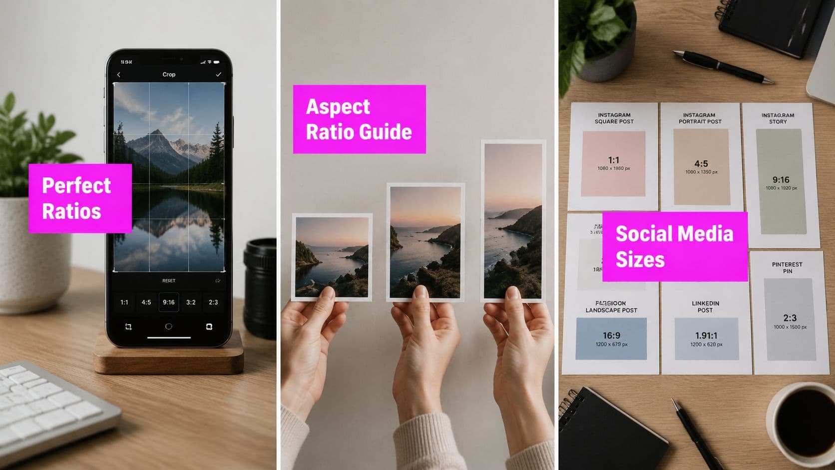
For day-to-day publishing, three ratios do most of the work:
- 1:1 square for general in-feed compatibility
- 4:5 vertical for feed posts that need more visual space on mobile
- 9:16 vertical for full-screen placements like Stories, Reels, Shorts, TikTok, and Snapchat
The pixel dimensions matter, but the placement matters more. A 4:5 post and a 9:16 post can both be technically correct while serving completely different jobs.
That is the part teams often miss.
A feed post competes for attention inside a scrolling stack, with captions, buttons, and surrounding posts fighting for space. A full-screen story or short video takes over the display, but it also gives the app more room to cover your design with UI elements. Choosing a ratio is really choosing the viewing context first.
Why vertical formats keep winning
People usually browse social on phones held upright. Taller creative gets more room in the feed and feels more native in mobile-first placements. That does not mean every asset should be vertical. It means square is no longer the default starting point for every campaign.
Use 4:5 when the post needs to perform in-feed. Use 9:16 when the content is meant to feel immersive and full-screen. Use a wider shape for banners, video thumbnails, or link previews only when the placement calls for a horizontal layout.
That trade-off matters in production. A 9:16 design can be adapted down into feed placements with planning, but a square post stretched into full-screen vertical usually looks like an afterthought. If your team is publishing more short-form video, that problem shows up fast, which is why Get Up Productions on short video is a useful reference when you are planning assets around the format instead of forcing edits at export time.
A faster way to choose the right ratio
Start with the first screen where the audience will see the post.
If it appears in a feed first, build for feed behavior. If it appears in Stories, Reels, or Shorts first, build for full-screen vertical. If it appears as a preview card, banner, or embedded player, use the wider format that placement expects.
That approach cuts down revisions because you stop asking for one universal size. You build one master that fits the primary context, then resize with intent. When you need to check dimensions before creating variants, use an aspect ratio calculator for social image sizing instead of doing the math by hand.
Your Platform by Platform Aspect Ratio Cheatsheet
Use the platform name to check specs. Use the placement to choose the file you design first.
That distinction saves time. It also prevents the common production mistake of building one asset for every channel, then spending the approval cycle patching crops, shrinking headlines, and re-exporting the same creative five times.
In-feed posts
For feed posts, 4:5 at 1080 × 1350 px is the strongest default in mobile-heavy environments. It takes up more vertical space than square, which gives the creative more presence before someone scrolls past it. Sprout Social's current sizing guidance also treats 4:5 as a core recommendation for Instagram feed publishing in practical social workflows, based on its Sprout Social image size guide.
I still use 1:1 when the team needs one simple fallback that travels cleanly across multiple feeds, especially for quote graphics, basic announcements, or posts that may be reused in email and web modules. But if the post is expected to compete in-feed on mobile, 4:5 usually gives you a better starting canvas.
Use feed ratios when:
- The first view is the feed
- Text needs to stay readable without tiny type
- The same campaign will be adapted across several social feeds
- You want one master that trims down cleanly instead of stretching up awkwardly
Full-screen vertical content
For Stories, Reels, Shorts, TikTok, and Snapchat, build in 9:16 at 1080 × 1920 px.
This is the ratio that matches how those placements are consumed. Full-screen vertical fills the phone, feels native, and gives you enough space for motion, captions, and product framing. In practice, it also simplifies production. One properly planned 9:16 master can often cover several short-form placements, with only minor edits for app-specific overlays or thumbnail crops.
The usual failure here is repurposing a wide-format creative into a tall frame. The result is predictable. Empty space, oversized background blur, or a tiny subject stranded in the middle of the screen. If the post is meant for immersive viewing, design for that context from the start.
Wide placements, link previews, and headers
Some placements still expect a wide frame. Link previews, certain X post images, cover-style assets, and some LinkedIn or Facebook promotional graphics work better in 1.91:1, often around 1200 × 630 px.
Use that shape when the placement itself presents content in a wide card. Do not force a portrait design into that box unless you want aggressive side cropping or wasted space at the edges.
For X specifically, a current resource on Twitter image dimensions is useful when you need to manage post images and header assets in the same workflow.
Social Media Aspect Ratio and Dimensions Quick Guide 2026
| Placement Type | Aspect Ratio | Recommended Pixels | Platforms |
|---|---|---|---|
| In-feed square fallback | 1:1 | 1080 × 1080 px | Major platform feeds |
| In-feed vertical | 4:5 | 1080 × 1350 px | Instagram feed, Facebook feed, LinkedIn feed, other mobile-heavy feeds |
| Full-screen vertical | 9:16 | 1080 × 1920 px | Instagram Stories, Reels, Facebook Stories, YouTube Shorts, TikTok, Snapchat |
| Wide feed or link-style placement | 1.91:1 | 1200 × 630 px | Facebook and LinkedIn wide or link-style placements |
What I'd actually choose by scenario
Here's the setup I use when a team wants fewer files without making obvious format mistakes:
- Feed campaign graphics: start with 4:5
- Stories and short-form video: start with 9:16
- Fast fallback for cross-posting: use 1:1
- Link cards, previews, and wide promos: use 1.91:1
The shortcut is not memorizing every platform spec. The shortcut is choosing the master ratio based on where the post will be seen first, then resizing from there with the UI in mind.
Designing for Safe Zones to Avoid Critical Errors
Most posts don't fail because the canvas size is wrong. They fail because critical information sits where the platform puts controls, captions, or profile elements.
That's why safe zones matter more than most aspect ratio lists.

Meta's guidance, as discussed by editing practitioners, emphasizes designing for placement-specific UI and safe areas because platform controls can cover titles or key visuals, especially in 4:5 and 9:16 formats. That point is summarized in this safe areas discussion focused on social formats.
What safe zones actually mean
A safe zone is the central area where your important content is least likely to be obscured.
That includes:
- Headlines
- Product names
- Logos
- Faces
- Call-to-action text
- Price or offer details
Anything essential should stay away from the outer edges unless the placement is very predictable.
The common failure points
I see the same layout mistakes over and over:
- Top-heavy Story designs where the title fights with the app header
- Bottom CTA bars that disappear behind captions or action buttons
- Corner logos that get clipped or covered
- Edge-to-edge text blocks that become fragile once the asset is reused elsewhere
The crop is only half the problem. The interface is the other half.
This gets worse when a team repurposes one asset across feed, Story, Reel, and thumbnail without adjusting text placement. The image may technically fit every placement, but the message won't survive every one of them.
A better design habit
Keep your key message in the middle area. Use the outer edges for background texture, secondary decoration, or nonessential visual weight.
If you want a practical house rule, use this one:
- Center the headline
- Keep logos off the extreme corners
- Avoid placing buttons or offer text near the bottom edge
- Treat every edge as unstable unless you've previewed the exact placement
Designers who follow this rule rarely have to scramble after publishing.
Common Aspect Ratio Mistakes You Must Avoid
Most aspect ratio mistakes are easy to spot once you know the symptoms. The trick is catching the cause before it goes live.
Mistake one: stretching instead of resizing
Symptom: people look wider, logos look warped, product shots feel off.
Cause: someone forced the asset into a new shape instead of rebuilding the layout for that ratio.
Solution: crop or redesign. Never stretch a square into a vertical or squeeze a horizontal image into a portrait. If the format changes, the composition has to change with it.
Mistake two: repurposing horizontal content for vertical placements
Symptom: black bars, tiny subject framing, wasted screen space.
Cause: a wide video or image got dropped into a Story or Reel frame with no redesign.
Solution: create a native vertical version. Don't treat vertical as a wrapper around horizontal. Treat it as a different composition with different focal points.
Mistake three: designing only for the canvas, not the interface
Symptom: headlines disappear, captions overlap text, product details sit under buttons.
Cause: the team designed to the edge of the file and forgot the app adds its own layers.
Solution: build with safe zones in mind from the start. Don't add “just a little more text” near the top or bottom because the mockup still looks clean.
Mistake four: uploading weak source files
Symptom: text looks soft, images feel compressed, graphics lose polish after upload.
Cause: the original file was too small or already compressed heavily before the platform touched it.
Solution: start with a larger, clean source file and export deliberately for the final placement. Social platforms will compress uploads, so weak files tend to get worse, not better.
If an image already looks borderline before upload, it will usually look worse after the platform processes it.
Mistake five: using one default ratio for everything
Symptom: the content “works,” but never feels native anywhere.
Cause: the workflow prioritizes convenience over placement fit.
Solution: keep a small format system. One feed master, one full-screen master, and one wide-format option when needed. That gives you consistency without forcing every placement into the same shape.
A Smarter Workflow for Perfect Social Media Images
Knowing the right aspect ratio for social media is one thing. Producing clean variations without eating your entire week is another.
The teams that handle this well don't redesign from scratch every time. They build a repeatable workflow around a few standard master formats and then adapt intentionally.
Start with a production baseline
A practical baseline for cross-platform production is 1080 px width, with 1080 × 1080 for square, 1080 × 1350 for vertical feed posts, and 1080 × 1920 for full-screen placements. Hootsuite notes that starting at this quality helps avoid blur from platform compression in its social media image sizes guide.
That baseline gives you a stable handoff point whether you're working in Canva, Photoshop, Figma, or an AI workflow.
Build one master, then create variants
This is the system I recommend:
-
Choose the primary placement first
If the campaign is feed-led, design the main asset for that feed shape. If it's short-form-led, start with full-screen vertical. -
Lock the safe zone before styling
Put headline, product, and CTA in stable visual territory before you worry about decorative details. -
Export the core versions as a set
Don't wait until scheduling day to realize you still need alternate crops. -
Preview in real placements
A platform preview catches issues a design canvas won't.
Here's the kind of tool-assisted workflow that makes this manageable at scale:

If you're handling a lot of campaign variations, seasonal promos, quote cards, or local-market versions, tools that support batch resizing save a lot of repetitive work. One option is bulk image resizing for social formats, which fits teams that need multiple output shapes from a single source set.
Where AI actually helps
AI is most useful here when it reduces format grunt work, not when it replaces judgment.
The smart use case is generating a strong base image set, then producing clean variations for square, feed vertical, and full-screen vertical without manually rebuilding every asset. That's where Bulk Image Generation fits. It can create image sets in bulk and support post-production tasks like resizing, which is practical for teams managing many social assets across placements.
Used well, AI doesn't remove the need to understand aspect ratios. It removes the slowest part of applying them repeatedly.
Your Aspect Ratio Questions Answered
A post can look right in the design file and still fail once it hits the app. The usual reason is simple. The ratio matched the export, but not the placement.
Can I still use 1:1 square posts for everything?
Yes, if your priority is broad compatibility and fast production. A square post is still the safest single format to keep on hand.
It is not the strongest default for mobile feeds anymore. Taller ratios usually earn more screen space, which gives the visual and headline more room to work before the user scrolls past. Use square when you need one asset that can survive across multiple placements. Use 4:5 or 9:16 when the placement is known and mobile attention matters.
What's the best aspect ratio for video ads?
Choose the ratio based on where the ad will appear. Feed placements need a feed shape. Stories, Shorts, and Reels need full-screen vertical.
This sounds obvious, but it gets missed all the time in campaign handoff. If media buyers are placing ads across mixed inventory and the creative team only built one shape, somebody is forced to crop late. Late crops are where logos get clipped, subtitles disappear, and product shots lose impact.
Does aspect ratio affect how platforms show my content?
Yes. Ratio changes how much visual space the post takes up and how the interface wraps around it.
That matters more than many teams expect. A feed post with a taller crop can command more attention. A story with the wrong framing can place your headline under platform UI. The platform may not reject the asset, but it can still display it in a way that weakens the result.
Should I make one asset and repurpose it everywhere?
Only if the design is built for that from the start. Keep text, logos, and offer details inside a conservative center area so the asset can survive different crops.
For simple creative, one master can work. For sales graphics, event promos, comparison charts, or anything with tight text layout, separate versions are usually faster than fixing broken crops after review. The time saved by using one file disappears if the team spends that time checking every placement manually.
What should I standardize on internally?
Use three working formats:
- 1:1 for compatibility
- 4:5 for feed-first publishing
- 9:16 for full-screen content
This addresses the majority of social publishing without creating a messy asset library. It also gives designers a clear rule set. Build the concept once, then adapt it for the contexts that matter instead of forcing every placement to accept the same crop.
If your team is tired of rebuilding the same post in multiple shapes, Bulk Image Generation is a practical way to speed up production. You can create image sets in bulk, generate variations for social campaigns, and adapt assets into the formats you need for feeds and full-screen placements without handling every resize manually.