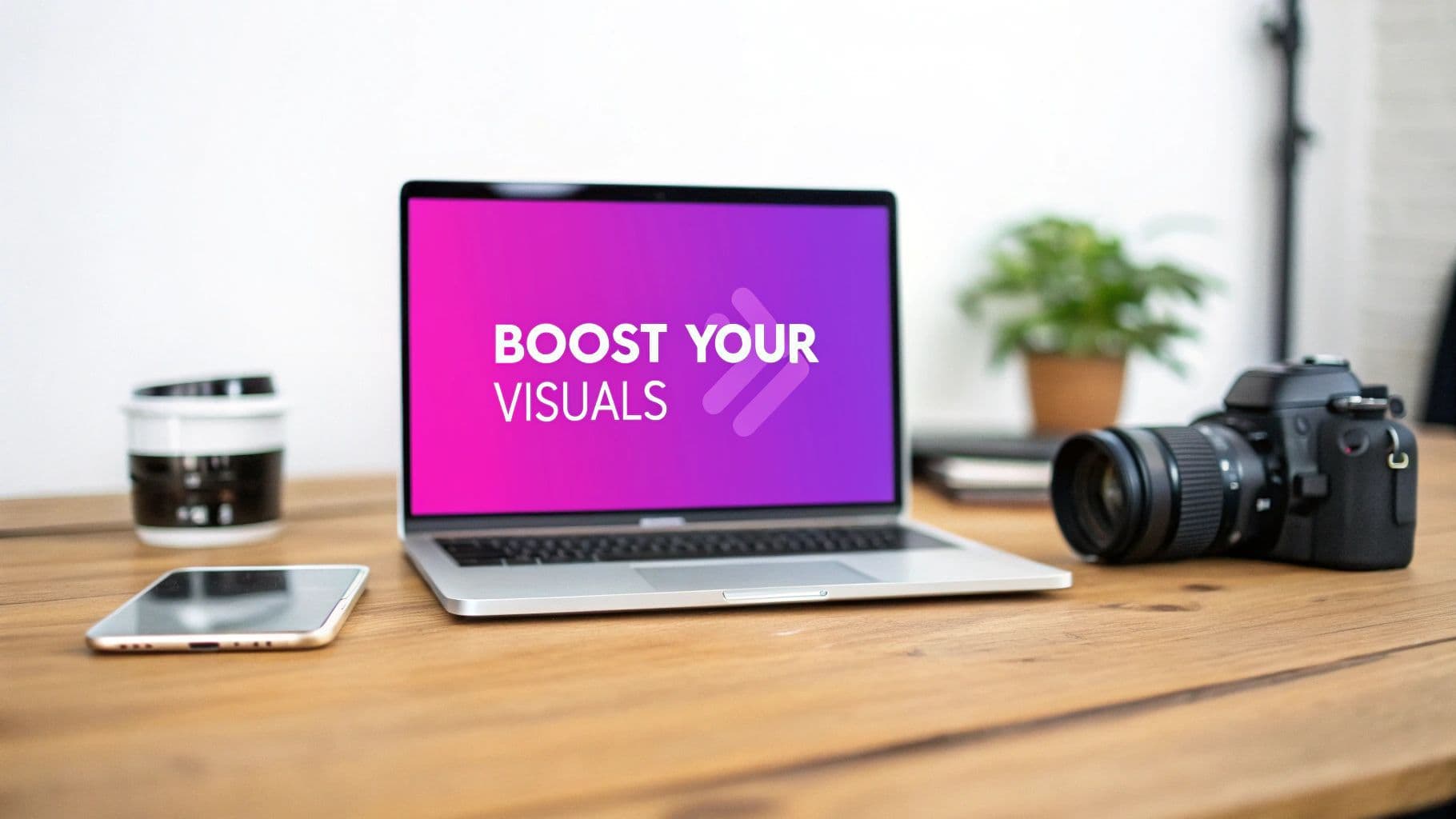
How to Add Text to an Image and Boost Your Visuals

Aarav Mehta • October 25, 2025
Learn how to add text to an image with our practical guide. Discover the best tools, design tips, and common mistakes to avoid for stunning visuals.
Putting text on an image can turn a simple photo into a message that really connects. It’s a lot easier than you might think, too.
With the right tools, you can quickly learn how to add text to an image and start making anything from shareable memes to professional-looking announcements for your social media. That little text overlay? It makes all the difference.
Why Adding Text to Images Is a Game Changer
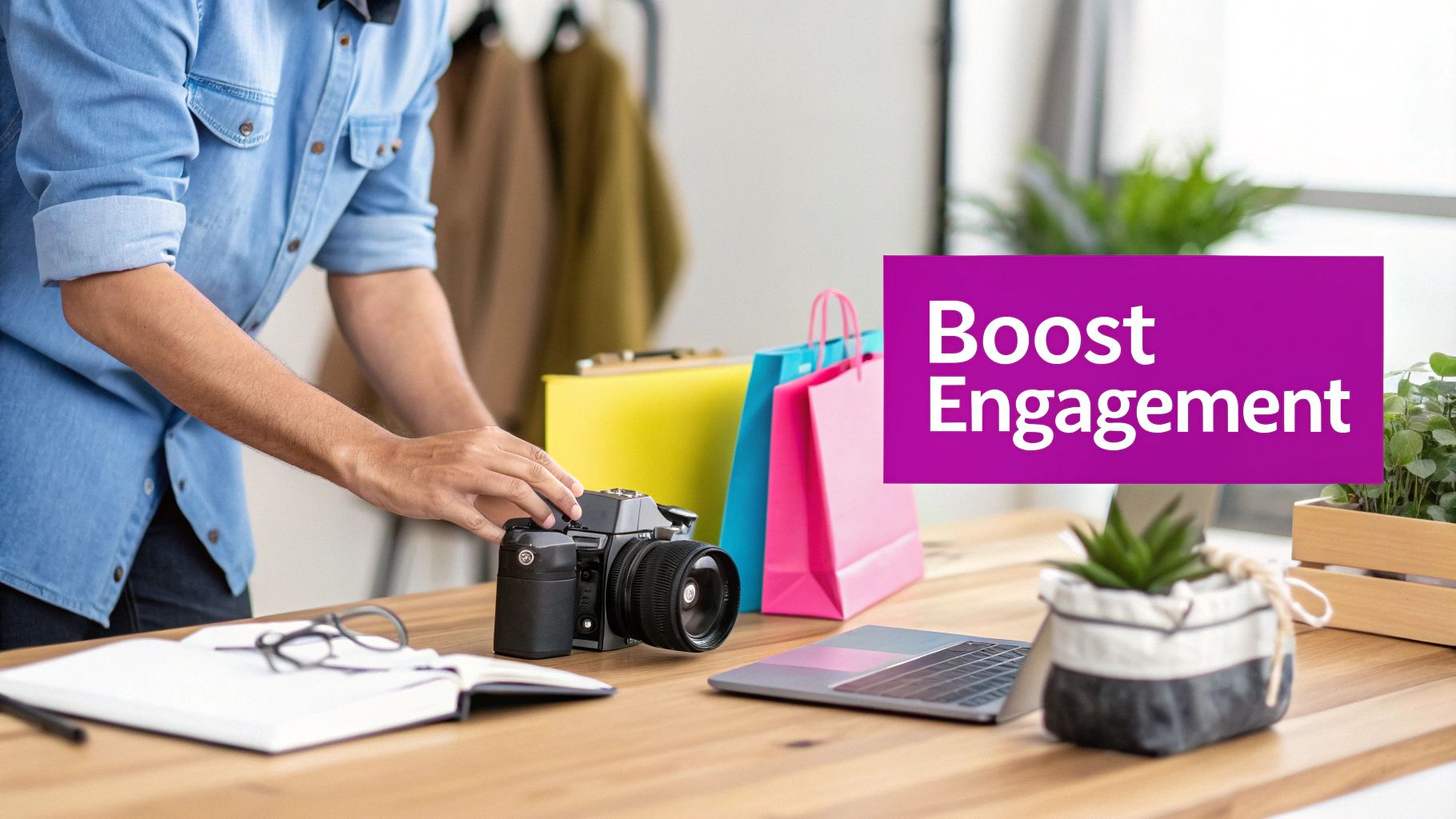
Before we get into the how, let’s talk about the why. A plain image can easily get scrolled past in today’s crowded feeds. When you add text, you’re giving it instant context, grabbing attention, and seriously boosting the chances people will actually engage with it.
And this isn’t just for professional designers anymore. It’s a must-have skill for anyone trying to make an impact online.
I see it every day in the real world:
- A small business owner uses a bold graphic to announce a flash sale, creating a sense of urgency.
- A blogger designs a killer featured image for their latest post, driving more clicks from their homepage.
- A social media manager drops a witty caption on a trending photo and watches it go viral as a meme.
In every one of these cases, the text transforms a static picture into a dynamic tool for communication. This combination is powerful—over 60% of marketers say that visuals with text get way more engagement than images or text alone. Thanks to a boom in user-friendly, cloud-based tools, anyone can now create professional-looking designs. You can see just how fast the market for AI-powered image tools is growing on market.us.
A simple text overlay does more than just decorate a picture—it clarifies the message, establishes a tone, and guides the viewer's eye exactly where you want it to go.
When it comes down to it, learning to add text to an image lets you tell a richer, more complete story. It makes your visual content work harder and smarter for you.
Choosing the Right Tool for Your Project
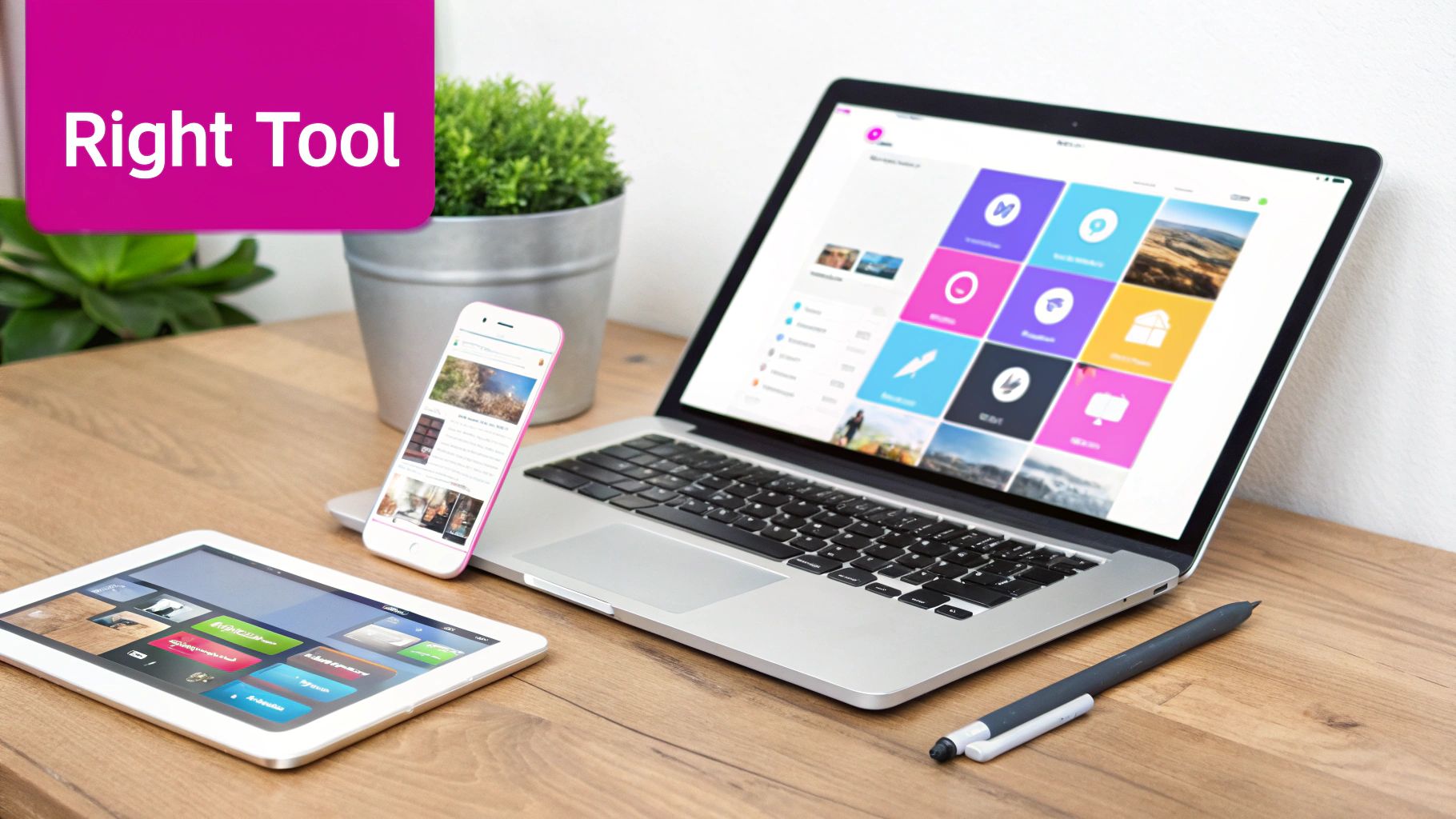
Not all image editors are created equal, and honestly, the best one is simply the one that fits your project. Picking the right tool can mean the difference between a quick, painless edit and a long, frustrating afternoon spent wrestling with features you don't need.
First, think about what you’re actually trying to do. Just need to throw a quick, stylish text overlay on an Instagram Story? A mobile app like Phonto or Adobe Express is perfect for that. They're built for speed and packed with social media-friendly features that get the job done on the go.
Matching the Tool to the Task
For bigger jobs that demand a bit more creative control—think blog headers or detailed social media graphics—you’ll want something more robust. This is where versatile online editors really shine. A tool like Canva has become a go-to for its massive template library and drag-and-drop simplicity, letting you create professional-looking visuals without a steep learning curve.
But if you’re a designer or marketer who needs pixel-perfect precision, nothing beats professional desktop software. Tools like Adobe Photoshop (or its excellent free alternative, GIMP) offer unmatched control over typography, layers, and effects. They’re the industry standard for a reason, but be prepared for a significant time investment to learn them.
The best tool isn't the one with the most features. It's the one whose features actually line up with your specific task and skill level. A simple tool used well always beats a complex one used poorly.
If you're already creating images from scratch, it makes sense to find a platform that keeps your entire workflow in one place. For instance, our own AI-powered image generator lets you create the visuals first and then immediately jump into editing, saving you from bouncing between different apps.
Before you download anything, ask yourself these questions:
- Speed vs. Control: Do you need this graphic in five minutes or five hours?
- Project Scale: Are you editing one photo or building out a campaign with dozens of images?
- Skill Level: Are you comfortable with layers and masks, or is "drag-and-drop" more your speed?
Answering these will help you cut through the noise and find a tool that actually works for you.
Comparison of Popular Image Text Editors
To make the decision a bit easier, I've put together a quick comparison of some of the most popular tools out there. This table breaks down what each one is best for, its key features, and what you can expect in terms of ease of use and cost.
| Tool | Best For | Key Features | Ease of Use | Price |
|---|---|---|---|---|
| Canva | Quick social media graphics, beginners, and non-designers. | Vast template library, drag-and-drop interface, team collaboration. | Very Easy | Free (Pro plan available) |
| Adobe Express | Mobile editing, social media content, and quick video edits. | AI-powered features, huge font library, integrated stock photos. | Easy | Free (Premium plan available) |
| Phonto | Simple, fast text overlays on mobile devices. | 200+ fonts, customizable text styles, user-friendly interface. | Very Easy | Free (with ads) |
| GIMP | Advanced editing for users on a budget who need powerful tools. | Layers, masks, advanced filters, extensive plugin support. | Moderate | Free |
| Adobe Photoshop | Professional designers needing ultimate control and precision. | Unmatched typography tools, layer effects, 3D text. | Difficult | Subscription-based |
| Bulk Image Generation | Batch processing and generating new images with text included. | AI-powered generation, batch editing, consistent styling. | Easy | Free & Paid Plans |
Choosing your editor really comes down to balancing power, speed, and your own comfort level. There's no single "best" option, only the best one for the job at hand.
Your Practical Guide to Adding Text to an Image
Alright, let's get our hands dirty. For this walkthrough, we'll be using Canva. It’s a fantastic tool—simple enough for beginners but with enough power to get the job done right. We're going to break down the process to show you just how quickly you can create something that looks sharp and professional.
First up, you need to get your image onto the canvas. Just upload a photo right from your computer or, if you're looking for inspiration, grab one from Canva’s massive stock library. Once your image is loaded and ready, it’s time for the words.
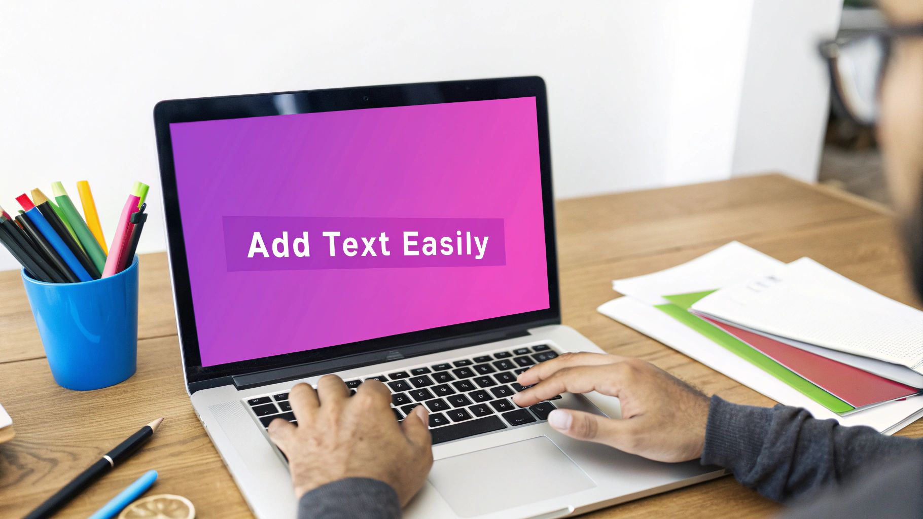
As you can see, the "Text" option is easy to spot in the main editor's left-side toolbar.
Finding and Adding Your Text
Look over to the left-hand side of the Canva editor. You'll spot a toolbar with all your design elements. Go ahead and click the "Text" icon (it's usually just a "T"). This pops open a menu where you can add a heading, subheading, or a bit of body text.
A real time-saver here is the pre-designed font combinations. Canva offers dozens of them, which is a great shortcut to getting a stylish look without agonizing over font pairings.
Once you pick a text option, a text box appears on your image. Now you can type your message directly into it. Don't stress about making it perfect just yet; you can easily tweak the font, size, and color in a moment. If you're working with product shots, getting tips on using mockups in your design workflow can add another layer of professionalism.
The key is to just get the words on the canvas first. All the fine-tuning and styling comes next, so lock in your message before you get lost in the design details.
Adding text to images isn't just a fun trick; it's a huge part of modern communication. It's so big, in fact, that the global visual content market is expected to jump from $5.2 billion in 2025 to a whopping $19.17 billion by 2032.
Positioning and Fine-Tuning
With your text on the image, the final touch is all about placement. Just click and drag the text box to move it anywhere you want. Canva is pretty helpful here, showing pink alignment guides that pop up to help you center your text or line it up with other elements on the page.
If you find that the image dimensions are fighting with your text layout, it might be worth resizing it first. Our bulk image resizer can help you get the canvas just right before you start designing.
This simple flow—upload, add text, and position—is really all it takes. Once you get the hang of these three basic actions, you can confidently add professional-looking text to any image you want.
Mastering Design for Maximum Impact
Alright, you’ve added the text. But making it actually look good? That’s what separates an amateur graphic from something people actually want to share. This is where the real magic happens—moving beyond just knowing how to add text to an image and into the world of smart visual communication.
It all starts with your font choice. I’ve found that a clean sans-serif font (think Arial or Helvetica) gives off a modern, easy-to-read vibe that’s perfect for snappy headlines or social media posts. On the flip side, a serif font like Times New Roman or Georgia can feel more traditional and elegant, which works great for things like inspirational quotes or formal announcements.
Choosing Your Color Palette
Color is your best friend for grabbing attention, but you have to use it wisely. The name of the game is high contrast and readability. Trust me, light text on a light background is a one-way ticket to an unreadable mess. Same goes for dark on dark. Always look for a sharp difference between your text color and whatever part of the image it’s sitting on.
What if the background image is just too busy? I run into this all the time. Here are a few tricks I always keep up my sleeve:
- A subtle drop shadow: This little touch can lift the text right off the image, giving it just enough depth to be readable.
- A semi-transparent overlay: Placing a slightly darkened or colored box behind your text creates a clean canvas without totally hiding the image underneath.
- A simple outline: A thin stroke around the letters can make them pop against even the most complex backgrounds.
Great design isn't about adding more stuff; it's about making every single element work together. Your font, color, and placement should all serve one purpose: making the message crystal clear and impactful.
Balance and Visual Hierarchy
Once your font and colors are locked in, it's time to think about balance. This is where visual hierarchy comes in—it’s just a fancy term for arranging things to show what’s most important. Your main message should be the biggest, boldest, or most eye-catching thing on the graphic. Any secondary info should be smaller and less in-your-face.
Proper alignment is another pro-move for a polished look. Whether you center your text or align it left or right, just be consistent. It creates a sense of order that makes your design feel deliberate and professional. If you really want to level up your skills, getting a handle on modern graphic design principles will make a huge difference.
And don't forget branding. Keeping a consistent look across all your visuals is non-negotiable, especially since over 89% of consumers now expect visual content from brands. For a deep dive on keeping things cohesive, check out our guide on creating brand kit-based image templates. It’s a game-changer for building a recognizable brand.
Let’s be honest, we’ve all seen those graphics where the text just feels… wrong. It’s the kind of thing that makes a design look instantly amateurish. The good news is that avoiding these common slip-ups is pretty straightforward once you know what to look for.
One of the biggest culprits? Bad contrast. Slapping light text on a light background (or dark on dark) is a surefire way to make your message impossible to read. It's a fundamental error, but one I see all the time.
Then there's the font choice itself. It can be tempting to go for a super decorative or fancy script font for a headline, but if people have to squint to figure out what it says, you've already lost them. For the important stuff, always lean towards clean, legible fonts.
Getting Placement Right (and Avoiding Clutter)
Where you put your text is just as critical as the words themselves. A classic mistake is placing text directly over the most important part of the image, like a person's face or the hero product you're trying to feature. This just creates a visual mess and pulls the viewer's attention in two different directions.
The pro move is to find a "quiet" spot in the image to work with. Look for areas of negative space—a clear blue sky, a simple wall, or a blurred background. These spots act as a natural canvas for your words.
Also, please, resist the urge to throw a font party. You don't need five different fonts to make a point. A solid guideline I always follow is to stick to two, maybe three, complementary fonts at most. Anything more and you’re heading into chaotic, unprofessional territory.
I’ve learned over the years that most bad design comes from trying to do too much. When you really get the hang of adding text to images, you realize that clarity and simplicity almost always beat complexity.
One last thing to watch for is text that’s crammed right up against the edges of your image. Always leave a little "breathing room" or margin around your words. This simple trick makes the entire design feel more intentional, balanced, and professional.
A Few Final Pointers
Even after you've got the basics down, a few questions always seem to pop up. I've been asked these countless times, so let's clear them up right now to help you fine-tune your work.
What Are the Best Fonts for Readability on Images?
When in doubt, always lean toward simplicity and clarity. For headlines and any text you really need people to see, you can't go wrong with bold, sans-serif fonts. Think Montserrat, Lato, and Poppins—they’re clean, modern, and stand out against almost any background.
For smaller bits of text, stick to workhorses designed for screen reading, like Open Sans or Roboto. The biggest mistake I see is people using thin, decorative script fonts. They might look fancy, but they become an unreadable smudge on a phone screen.
Here's a pro tip I always share: Test your design by shrinking it down to the size of a phone screen. If you can't read it easily, neither can your audience. It's a simple check that saves a lot of headaches.
How Can I Add Text to Multiple Images at Once?
This is where you absolutely need a batch processing tool. Trust me, manually adding a watermark or brand name to hundreds of photos is one of the most soul-crushing tasks you can do. Tools built for bulk editing are a total lifesaver here. You just set up a template once and apply it across your entire image set in one go.
Can I Add Text to Images on My Phone?
Absolutely. Mobile editing apps have gotten seriously powerful over the last few years. Apps like Adobe Express, Canva, and Phonto give you robust text editing features right in your pocket. They come packed with huge font libraries and ready-to-go templates, making it easy to whip up professional-looking social media content from anywhere.
Tired of editing your images one by one? Bulk Image Generation lets you apply text, watermarks, and other edits to hundreds of images in just a few seconds. Try our batch editor and scale your creative workflow today.