
How to Make Thumbnails for YouTube Videos

Ryan Bennett • October 10, 2026
Learn how to make thumbnails for YouTube videos that drive watch time. Master composition, text, and AI batch workflows to test and scale your channel visuals.
The most common advice about YouTube thumbnails is also the most incomplete: maximize click-through rate. That sounds logical until the image promises something the video doesn't deliver. You may attract a burst of low-intent clicks, then lose viewers quickly when they discover the mismatch. The stronger objective is qualified attention, a click from someone who understands the promise and stays because the video fulfills it.
A thumbnail is therefore not a decorative frame from your edit. It's the visual entry point to your content, and its job is to make the right viewer curious without misleading them. The workflow below shows how to make thumbnails for YouTube videos with a combination of clear composition, accurate promises, AI-assisted batch production, and watch-time-focused testing.
Rethinking Thumbnail Success Beyond Clicks
A high impressions click-through rate can look like a win while hiding a poor audience fit. YouTube defines an impression when a thumbnail is displayed for more than 1 second and at least 50% of it is visible, then reports impressions click-through rate based on how often viewers watch after seeing it. That metric matters, but it only describes the first decision. It doesn't tell you whether the viewer stayed, learned something, or felt misled.
YouTube's analytics connects impressions with views and viewing duration through the “Impressions and how they led to watch time” report. That relationship changes as distribution expands. A video can earn a strong click-through rate with a small, highly relevant audience and then show a lower percentage when YouTube presents it to a broader group. A decline alone doesn't prove that the thumbnail failed.
Practical rule: Design the thumbnail for the viewer who should watch the video, not for the largest possible pool of people who might click it.
That distinction affects every creative decision. An exaggerated facial expression, a fake result, or an unrelated object may create curiosity, but it also creates an expectation the opening seconds must satisfy. If the video can't satisfy it, the packaging has optimized the wrong outcome. For a useful framework on tying channel metrics to commercial objectives, see this guide to connecting site data to business goals.
YouTube's native testing system now evaluates thumbnail variations through watch-time performance rather than CTR alone, which reinforces this approach. YouTube says creators can test up to three thumbnail variations, and its feature had been used more than 15 million times by 2025. Those figures are documented in YouTube's thumbnail testing guidance, but the practical lesson is more important than the scale: your best thumbnail is the one that attracts viewers who continue watching.
Start by writing the video's core promise in one sentence. Then ask whether a viewer could infer that promise from the image and title together. The YouTube thumbnail best practices guide is useful for refining that packaging relationship, but your own retention data should decide which visual direction deserves more production time.
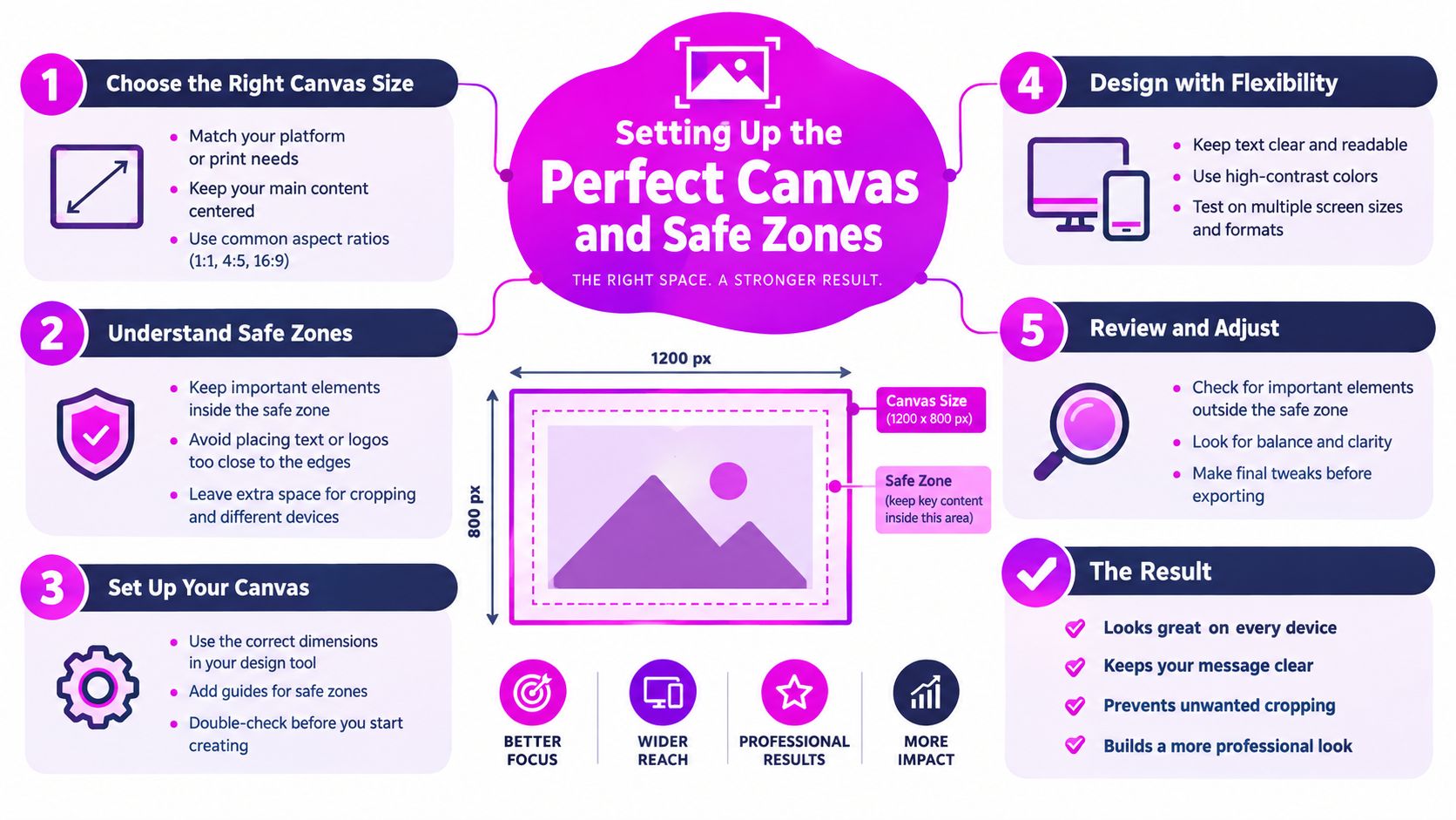
Setting Up the Perfect Canvas and Safe Zones
Thumbnail performance starts before styling. If the frame is wrong, no amount of contrast tuning or AI variation will save it once YouTube shrinks the image in feed.
For a standard YouTube video, build on a 16:9 canvas at 1,280 × 720 pixels. YouTube also sets a minimum width of 640 pixels, accepts JPG, GIF, or PNG, and limits standard video thumbnails to 2 MB, according to its official thumbnail upload requirements. It also documents higher recommended upload resolutions of 3,840 × 2,160 pixels for standard videos. I would still prioritise composition over sheer resolution. A sharper file does not fix a weak hierarchy.
Build the frame before the artwork
Treat the canvas as a production system with rules your team, or your image model, follows every time.
- Reserve the lower-right area. YouTube may place the video duration there. Keep critical text, key facial detail, and product proof away from that corner.
- Keep critical elements inward. Edges are fragile on mobile. A face cropped too tightly or text pushed to the border often reads well in the editor and fails in recommendations.
- Create a repeatable safe zone. Add guides for faces, headlines, and logos in your master template. That matters even more when you batch-generate thumbnail options with AI, because controlled experiments only work when layout variables stay stable.
- Preview at small size. Shrink the design until it looks like a phone recommendation tile. If the promise disappears, the thumbnail is attracting the wrong click or no click at all.
A clear 16:9 ratio guide helps standardise dimensions across design tools and automation workflows. Keep the working file in RGB or sRGB, then check final dimensions, format, and file size before upload.
Large monitors hide bad decisions. Thin type, edge-positioned faces, and low-contrast background details usually collapse first. Judge the thumbnail in its smallest real viewing context, because that is where qualified attention is won or lost.
Designing for Instant Visual Comprehension
A viewer should understand the thumbnail's subject and emotional direction almost immediately. That doesn't mean the image must explain the entire video. It means the composition needs one dominant idea that survives the crowded YouTube feed.
Start with one focal point. It might be a face, a product, a result, or a visually distinctive object. Multiple equal-sized subjects force the viewer to search, and searching costs attention. If the video is about repairing a camera, show the camera or the repair moment prominently. If it's an educational explanation, use the presenter's expression or the central diagram rather than a collage of every supporting idea.

Make hierarchy visible
Contrast should separate the subject from its surroundings and help the eye find the headline. A dark object against a lighter background usually reads more quickly than two similar tones competing for attention. You can create separation with color, brightness, blur, a shadow, a solid block, or a clean outline, but don't use every treatment at once.
Text should support the image rather than duplicate the title. Use a short phrase that adds context, tension, or a clear category. If the wording needs a full sentence to make sense, the visual concept probably needs simplification. Test the headline in its smallest preview, where thin fonts and low contrast tend to disappear.
Faces can supply an emotional signal, but the expression must fit the content. Surprise works for a discovery video, concentration suits a technical demonstration, and concern may suit a warning. A dramatic face attached to a calm tutorial creates the same expectation problem as misleading text.
For marketers and educators, thumbnail basics for B2B video offers a useful reminder that clarity often matters more than spectacle. Keep brand consistency through a recurring typeface, color treatment, or layout, while allowing the specific subject to change. Consistency helps recognition, but repetition without a fresh visual idea can make every upload look interchangeable.
Design test: Hide the title and ask someone to describe the thumbnail in a few words. If they can't identify the topic or dominant emotion, simplify the image before adding decoration.
Scaling Production with AI Batch Generation
A single thumbnail is a design task. A testing program is a production system. If you want to compare subject positions, background treatments, expressions, or text emphasis, creating every version manually can make experimentation too slow.
The useful role for AI is not to replace judgment. It's to produce controlled options quickly while you decide which promise is accurate and which composition remains readable. Bulk Image Generation, for example, can create batches of visuals from natural-language instructions and includes editing functions for background removal, face swaps, resizing, and enhancement. Those functions fit thumbnail production because they let you alter a defined visual variable without rebuilding the entire asset.

Use a variable matrix, not random generations
Begin with a locked brief:
- Subject: Define the person, product, or object that must remain present.
- Promise: State what the viewer should understand from the image.
- Composition: Choose a left, center, or right subject position.
- Treatment: Specify the background, contrast, color family, and depth.
- Text rule: Decide whether every variant uses the same short phrase or whether one batch tests text against no text.
Generate one baseline composition first. Then produce variants where only one major factor changes. For example, keep the subject, title, crop, and background style constant while changing the subject's position. In another batch, keep the layout fixed and compare a bright background with a dark one.
Name files by the variable, not by vague labels such as “final2” or “new version.” A system like camera-left-dark-bg or camera-left-bright-bg makes later analysis possible. After generation, inspect faces, hands, logos, text rendering, and object geometry. AI can produce visually attractive errors, and a thumbnail with a distorted product or unreadable lettering shouldn't enter a test.
Use the AI thumbnail maker workflow for inspiration, then apply your own safe-zone template and mobile preview. Batch generation saves time only when the review process remains disciplined.
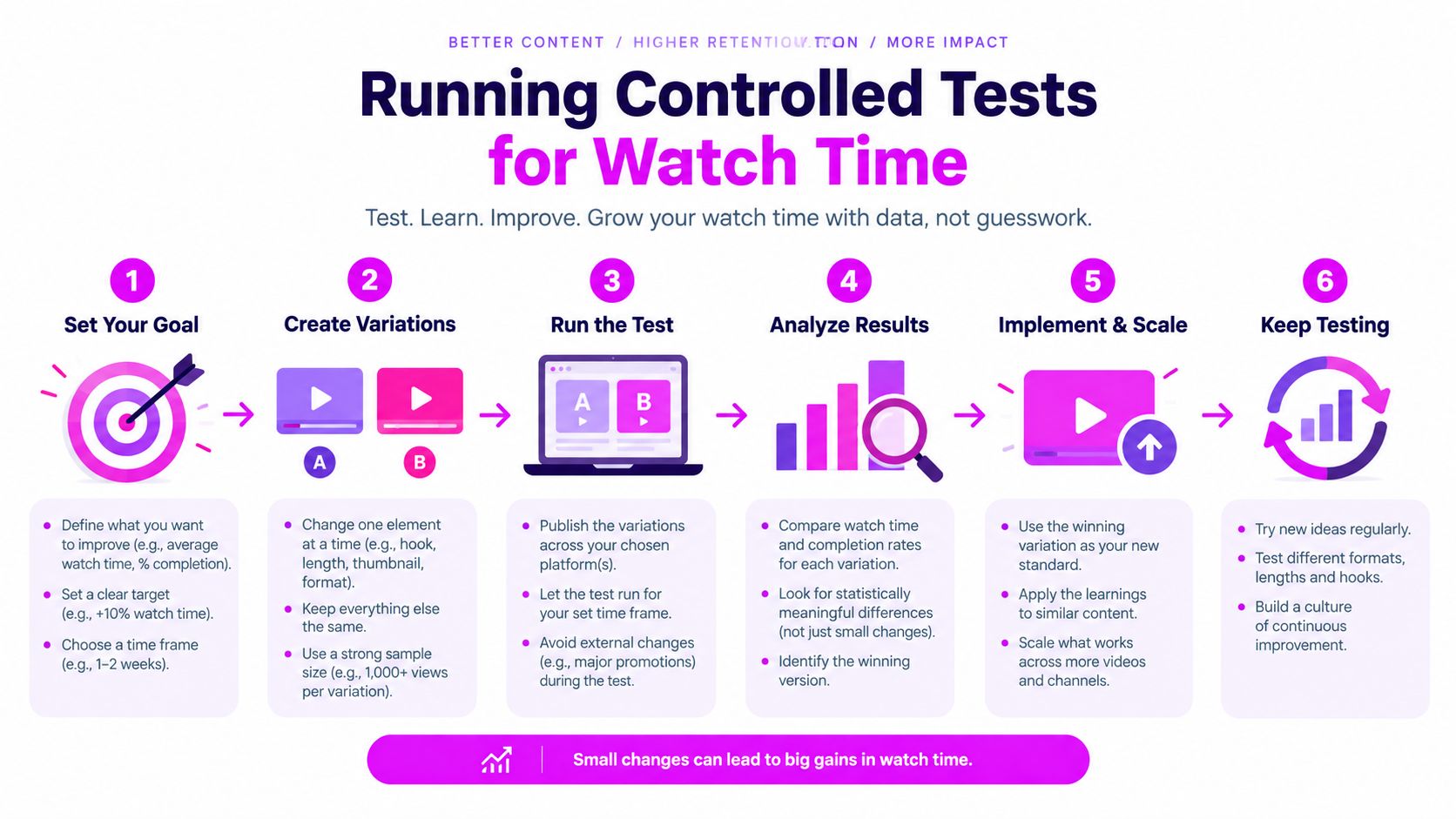
Running Controlled Tests for Watch Time
Subjective design debates usually continue until the loudest opinion wins. A controlled test replaces that argument with a defined comparison.
Keep the video, title, audience, and test window constant. Change one major thumbnail variable, such as a face crop, background contrast, headline treatment, or text versus no text. If you change the title and image together, you won't know which element influenced the result.
Read the result in layers
Record impressions, views, impressions click-through rate, average view duration, early retention, and watch-time share. CTR helps explain whether the packaging earned initial interest. Viewing behavior tells you whether the thumbnail attracted an audience that wanted the actual video.
A practical sequence looks like this:
- Choose the strongest hypothesis, not a random alternative.
- Prepare variants with one controlled change.
- Run them for comparable periods.
- Check whether traffic sources differ materially between the observations.
- Review the result against viewing duration and retention, not CTR alone.
- Keep the winning concept and document what changed.
YouTube's native test system favors watch-time performance, which is the right direction for channels that care about learning, leads, sales, or sustained audience value. A thumbnail that generates more clicks but causes viewers to leave quickly has not necessarily improved the video. It may have widened the gap between the promise and the experience.
Don't declare a winner from an unusually strong day or a small, uneven sample. Distribution can change while a test runs, and a new audience may respond differently from the viewers who first encountered the video. Treat each result as evidence about a specific topic, audience, title, and promise, not as a universal rule for every upload.
Measurement principle: The winning design is the one that earns attention and helps the right viewers continue, not automatically the one with the highest first-click rate.
Finalizing and Uploading Without Policy Risks
A thumbnail is ready only when it can win attention without creating the wrong expectation. Strong design is not enough. If the image overpromises, hides key details on mobile, or uses material YouTube can flag, the click gets less valuable and the packaging becomes harder to trust.
Before you upload, run a final review against the actual video. Check that the file uses a clean 16:9 layout, exports as JPG, GIF, or PNG, and stays within YouTube's standard size limits. Then look at the smallest mobile preview. Text needs to stay readable, faces need to remain clear, and the main subject needs to separate from the background after compression.
Accuracy matters just as much as polish. Compare the thumbnail to the opening and core payoff of the video, not the most dramatic frame you can invent. Remove visual claims the video does not support. Screen the image for nudity or sexually provocative material, hate speech, violence, and harmful or dangerous content. Also inspect the lower right overlay area and any text or logos placed near the edges.
The upload path is simple: YouTube Studio → Content → select the video → Upload thumbnail → Save. Keep the approved export, editable source file, and test notes in one place. That archive matters later when a concept works and you need to reproduce it with one controlled change instead of rebuilding from memory.
Build a repeatable approval habit
AI batch generation makes this review step more important, not less. A batch may produce several high-CTR looking options, but the safer choice is often the one that sets the clearest expectation. For example, one tutorial thumbnail might show an exaggerated outcome the video mentions only briefly. Another might use a real frame, a clear subject, and restrained text. The second version usually gives you cleaner watch-time feedback because viewers arrive with a more accurate promise in mind.
Treat thumbnail approval as part of the full packaging workflow. Supporting assets deserve the same screening. If you are evaluating licensed music options around the same release, the LesFM Hungary artist roster can help you review artists, while the thumbnail still needs its own accuracy and policy check.
Save the winning design, rejected variants, the single variable you changed, and the viewing signals that followed. Over time, that becomes a channel-specific packaging library. You can see whether your audience responds better to faces, products, diagrams, bright backgrounds, or text-light layouts without assuming one strong upload created a permanent rule.
Bulk Image Generation can help you produce controlled thumbnail variations, batch-edit subjects and backgrounds, and prepare assets for mobile readability without rebuilding every version manually. Visit Bulk Image Generation to turn your next thumbnail idea into a structured experiment focused on qualified attention and watch time.
