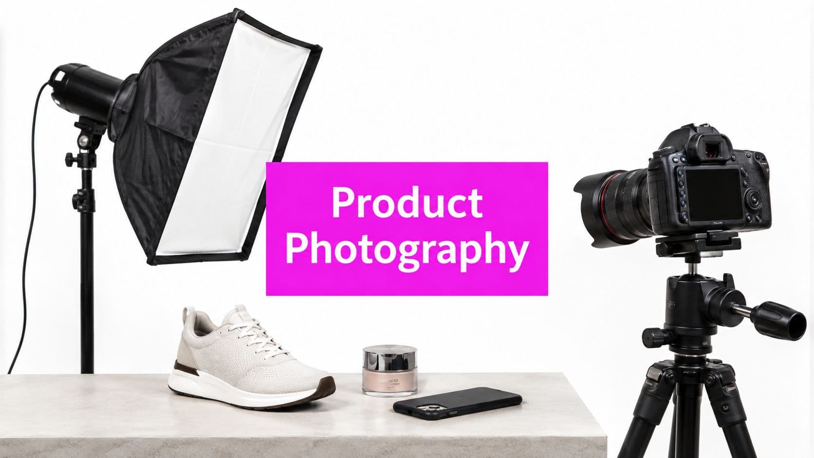
10 Product Photography Examples to Recreate with AI

Ryan Bennett • September 21, 2026
Explore 10 product photography examples for e-commerce, branding, and social ads, with strategic composition tips and bulk AI recreation methods.
Most shoppers look at the images before they read the copy. In one 2026 roundup, 56% of shoppers' first action on a product page was to inspect the images, 75% said they rely on product photos when deciding whether to buy, and 67% said image quality is very important to them, according to PixelPanda's e-commerce product photography statistics roundup. That's why the product image isn't decoration. It's part of the sales argument.
Strong product photography examples work because each image answers a different buying question. One shot proves shape and color. Another shows scale. Another reduces uncertainty about materials, fit, or use. When teams treat examples as reusable systems instead of one-off inspiration, they stop chasing random styles and start building image sets that support discovery, evaluation, and purchase.
That matters even more now because product photography is a growing commercial category. One industry estimate places the global e-commerce product photography market at US$163.91 million in 2025 and projects US$275.4 million by 2030, with an 11.6% CAGR, as summarized by Retouching Cloud's market overview. Brands aren't investing in visuals just to look polished. They're doing it because images now carry catalog, campaign, and marketplace work at scale.
If you want to boost mattress conversions with images, the same principle applies across almost every category. Match the image type to the decision it needs to support. The ten product photography examples below do exactly that, with composition logic, channel fit, production risks, and ways to create controlled AI variations without losing product accuracy.
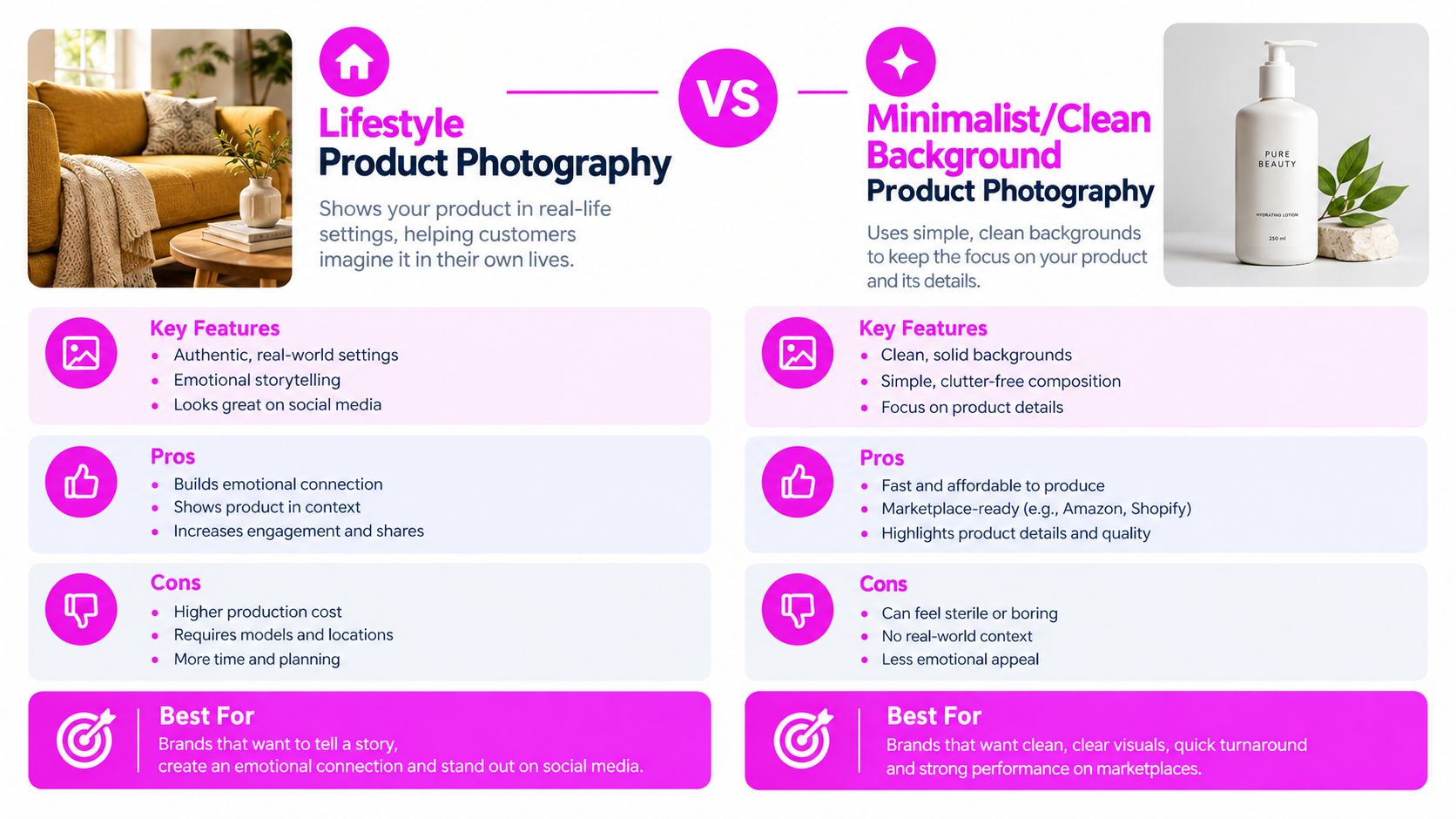
1. Lifestyle Product Photography
Lifestyle shots sell the result of ownership, not just the object. Nike does this well with shoes shown in motion, and Apple often places devices in real home or work settings so the product feels already integrated into daily life.
That works best when the environment answers a specific question. Is this product calming, portable, durable, social, premium, or routine? If the scene doesn't clarify one of those, it usually turns into clutter.
Build the scene around the buying moment
A good lifestyle image has one visual job. A reusable water bottle might belong in a gym bag, on an office desk, or in a car cup holder. Those are three different purchase triggers, so they deserve three distinct image systems.
Use this product photography primer as a grounding reference if your team keeps blending catalog and campaign needs.
- Keep the product readable: Don't let hands, props, or furniture hide the silhouette.
- Choose supporting objects carefully: A yoga mat, laptop, trail map, or child's lunchbox changes the audience signal fast.
- Lock one lighting mood per campaign: Warm window light and cool commercial light create different brand impressions.
Practical rule: If a lifestyle shot can't communicate the use case with the text removed, the scene isn't doing enough work.
For AI bulk generation, start with a fixed product description, then vary only context variables such as room type, season, model styling, and crop. That gives you usable campaign variation without changing the product's identity from image to image.
2. Minimalist Clean Background Product Photography
Minimalist product images do one job better than any other style. They remove every decision except the buying decision.
That makes them the workhorse format for marketplaces, category pages, packaging detail modules, and comparison tables. If a shopper needs to judge silhouette, color, material, or included components in two seconds, a clean background usually outperforms a styled scene.
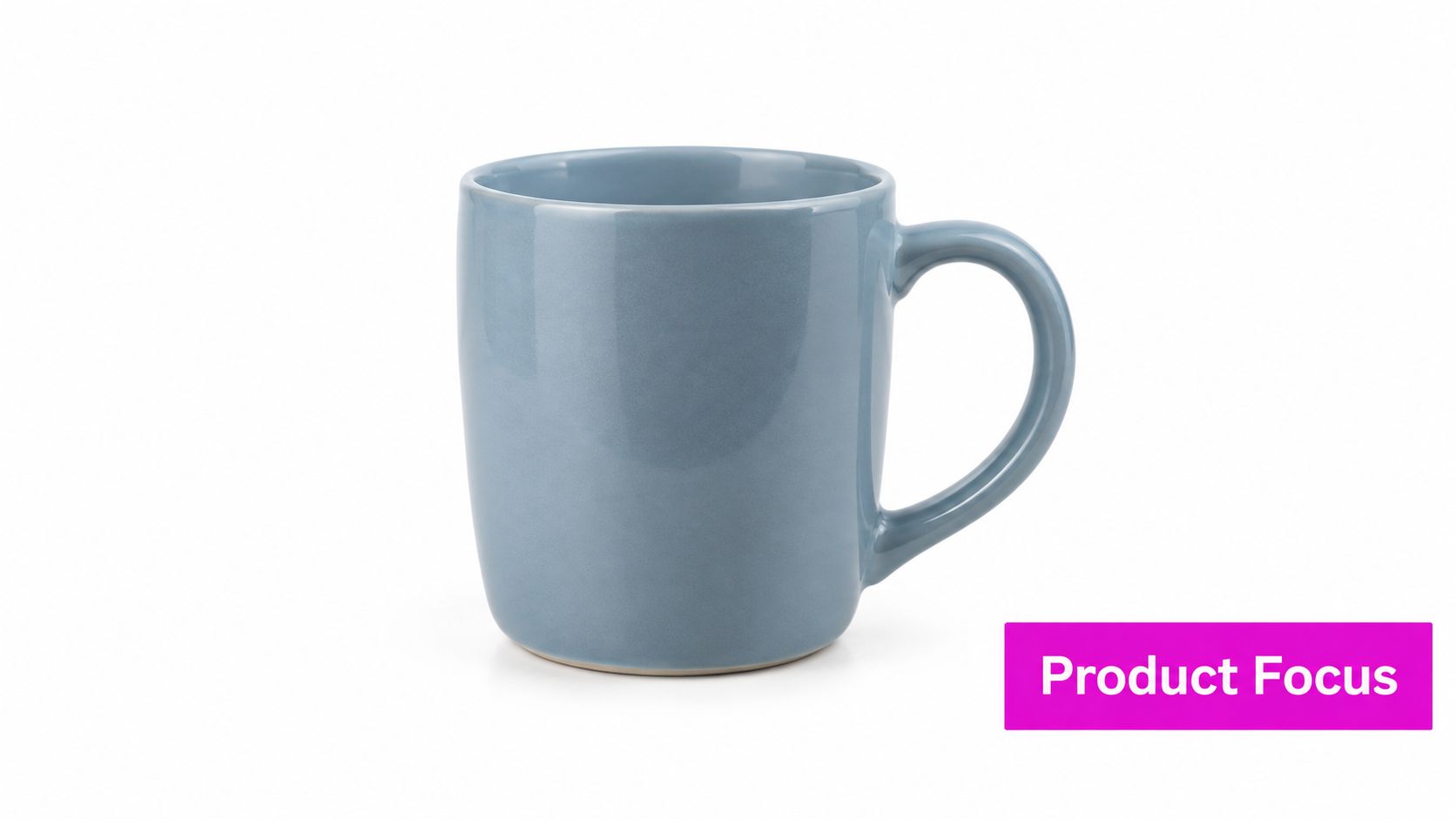
The mistake is treating this as a blank white image requirement instead of a production system. Good minimalist photography depends on repeatable choices. Camera height, focal length feel, crop ratio, shadow density, and edge separation all need to stay stable across the full SKU set. That consistency is what makes a catalog look trustworthy.
Build for comparison first
Use this style when the sales task is evaluation, not aspiration. A shopper comparing three coffee mugs, six serum bottles, or a full apparel size run needs clean evidence. Small inconsistencies break that fast. One item gets a soft side shadow, another floats with no grounding, a third is cropped tighter. The result looks less like a system and more like mixed inventory.
A controlled product photography studio setup matters because consistency is the actual deliverable.
Useful defaults:
- Choose one primary angle for the whole line: Front-facing for packaging, three-quarter for form, overhead for sets and kits.
- Keep the crop logic fixed: Equal top margin, equal visual weight, and matching scale from product to product.
- Decide how shadows behave once: Soft contact shadow for realism, or none for strict cutout use.
- Protect the product edge: White products on white backgrounds need rim definition or subtle tonal separation.
I usually treat the hero shot as the template and everything else as a variation set. Once that template is right, generating alternates becomes mechanical instead of creative.
For AI bulk generation, this style scales well because the variables are narrow and easy to control. Keep the same background value, camera angle, and lighting direction, then batch out colorways, bundle counts, label revisions, and aspect ratios for search results, PDPs, and paid social crops. The goal is not to make each image feel unique. The goal is to make the whole library feel dependable.
3. Flat Lay Overhead Product Photography
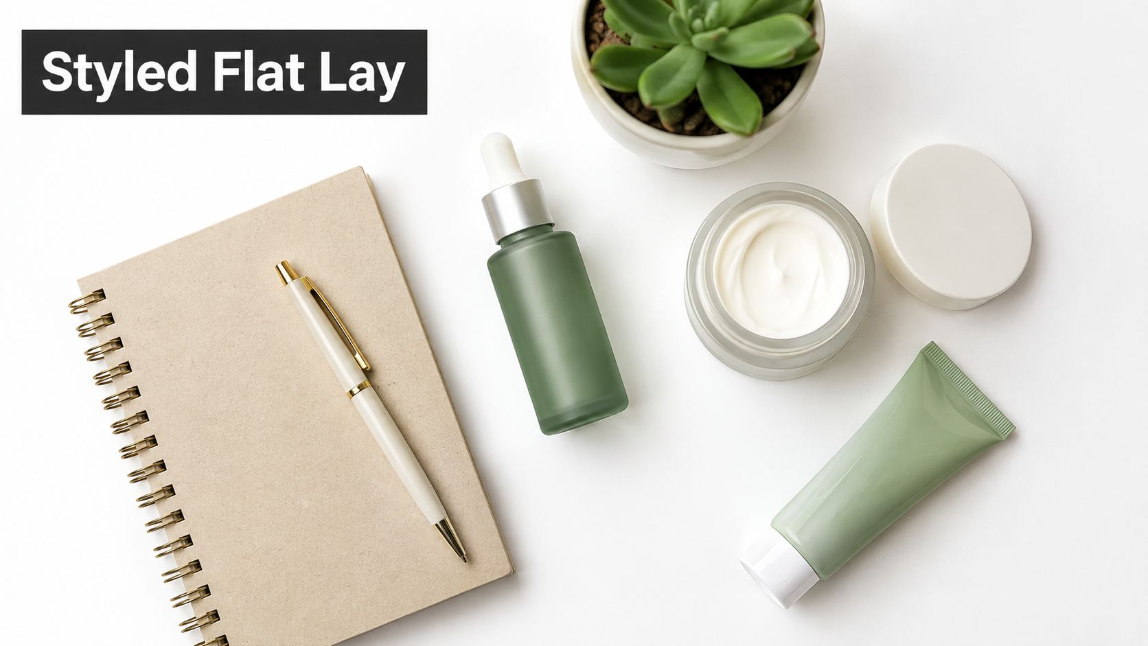
Flat lays work best when the sell happens through organization. Buyers can read the offer in one glance: what is included, how the items relate, and which product should get the attention first.
That makes overhead photography useful for bundles, kits, routines, gift sets, launch drops, and editorial social posts. The format removes perspective drama and replaces it with layout discipline. If the arrangement is weak, the image feels like scattered inventory. If the arrangement is controlled, the frame works like a merchandising system.
A good flat lay answers three questions fast:
- What is the hero product?
- What belongs with it?
- What space is being reserved for cropping, copy, or platform variants?
The overhead angle changes the job of composition. Height and depth matter less. Spacing, shape contrast, and visual weight matter more.
A skincare set shows the pattern clearly. Put the bottle, jar, and tube in a deliberate triangle or row. Keep one item slightly dominant through scale or placement. Then swap the support layer based on campaign use: towels and stone for spa cues, citrus for freshness, notebook and pen for a desk-friendly lifestyle edit, holiday textures for gifting. The base layout stays stable while the styling changes around it.
What usually improves results:
- Start with the sellable grouping: Show the exact kit, routine, or assortment before adding atmosphere.
- Build one visual anchor: Use the tallest package, boldest label, or most recognizable shape as the first read.
- Repeat spacing intentionally: Consistent gaps make the frame feel designed instead of casually placed.
- Use props by category, not impulse: Ingredients, tools, fabric, paper goods, and seasonal accents each send a different message.
- Protect negative space: Leave clean zones for headline overlays, story crops, and marketplace aspect ratios.
There is a trade-off. Flat lays show breadth better than form. They are excellent for assortments and rituals, but weaker for products whose side profile, thickness, or hardware detail drives the purchase decision.
For AI batch generation, treat the flat lay as a template with controlled variables. Lock true overhead view, define a placement map, and keep relative scale fixed. Then generate variations by changing only background material, prop family, palette, and crop ratio. That gives you a reusable system for catalog tiles, campaign headers, email banners, and social placements without rebuilding the scene from scratch each time.
4. 360-Degree Product Photography
Some products need inspection more than storytelling. Watches, sneakers, furniture, luggage, and technical gear benefit from 360-degree photography because buyers want to check seams, closures, side panels, and proportions before they commit.
Trend coverage now includes more interactive imagery, but the question isn't whether 360 views look modern. It's whether the product has enough visual decision points to justify the extra image volume. Serenity Digital's trend review is useful on that distinction. More creative isn't always better. Role-specific image systems usually outperform random variety.
Use it where inspection reduces hesitation
ASOS-style rotational apparel views help buyers understand drape. Luxury watch retailers use turntable-style inspection because finish and hardware details matter. Sneaker brands use multi-angle imagery because shape from the side can matter as much as the top.
A 360 system fails when each angle looks like a different lighting setup.
For AI workflows, build the product once, define a fixed camera height and lens look, and rotate around the subject in controlled increments. Then review edge details closely. Soles, straps, zippers, and reflections often drift first. This format rewards discipline more than imagination.
5. Contextual Environmental Product Photography
Context sells placement.
A product can look polished in isolation and still fail on the page if the buyer cannot place it in a real setting. Environmental photography solves that problem by showing where the product belongs, what it sits beside, and how much visual space it should occupy. That makes it especially useful for home goods, outdoor gear, kitchen tools, office accessories, and any product where fit depends on surroundings.
The environment is the proof. A desk lamp inside a styled office communicates scale, color temperature, and design compatibility in one frame. A backpack on a trail signals use conditions and customer identity before the viewer reads a line of copy.
Lifestyle shots often center action or a person. Environmental shots center spatial fit.
Three composition decisions control whether this style works:
- Choose a setting that matches the buying question. Furniture buyers ask, “Will this work in my room?” Camping buyers ask, “Does this belong outdoors or just look outdoors?”
- Keep prop hierarchy strict. Supporting objects should explain context, not compete for attention.
- Anchor scale visibly. Floor lines, countertops, chairs, shelving, and door frames help the eye judge size fast.
A camping stove on a marble countertop sends the wrong signal. A linen throw in a sterile studio hides the reason someone would want it. The setting has to carry the same commercial message as the product.
I use this style as a production system, not a one-off mood image. Start with one approved product render or hero cutout. Then generate controlled environment variants around it: small apartment, bright modern kitchen, darker rustic kitchen, trail camp at dawn, trail camp in overcast light. That gives marketing teams a matched set of assets for product pages, seasonal campaigns, and social crops without rebuilding the product each time.
Control matters more than variety here. If one version uses a low camera angle and another shifts to a high editorial angle, the set stops feeling intentional. Keep camera height, lens feel, and product scale consistent across scenes, then swap room style, surface material, weather, or time of day with purpose.
Common failure points are easy to spot once you know where to look: oversized products, floating shadows, props that imply the wrong customer, and backgrounds that are prettier than they are believable. Environmental images work best when the scene feels lived-in enough to be credible and edited enough to keep the product first.
6. Detail Macro Product Photography
Price claims get tested in the details. Macro product photography works because it answers the buyer's quiet question: what does this feel like up close?
That makes this style less about magnification and more about evidence. The useful frame is the one that proves a finish, material, mechanism, or build choice the customer would care about before buying.
A leather bag needs grain and edge paint. A watch needs the bezel, crown, or bracelet links. A skin care bottle needs the dropper, texture, or residue on glass. Generic closeness has no sales job.
Build macro shots around one buying question
Start by naming the proof point. What would a skeptical customer inspect first in person? That answer should drive the crop.
I usually separate macro targets into three groups:
- Material proof: weave, grain, polish, glaze, brushed metal, liquid texture
- Construction proof: seam quality, stitching, hinge, clasp, zipper, molded edge
- Finish proof: engraving, coating, transparency, texture consistency, surface precision
That structure helps when you need repeatable outputs across a catalog. Instead of asking for “some close-ups,” define a macro set per SKU: one material crop, one construction crop, one finish crop. The result is easier to standardize, easier to review, and easier to reuse across PDP modules, paid ads, and social cut-ins.
The crop has to stay product-specific
A strong macro image should still be identifiable as your product. If the detail could belong to five competing items, it is too abstract.
The fix is usually compositional, not technical. Include one recognizable cue near the proof point: a logo edge, a distinctive seam path, a cap shape, a stone setting, a stitch pattern. That small anchor keeps the image tactile and branded at the same time.
Lighting decides whether texture reads as premium or messy. Side light reveals surface character. Front light flattens it. Specular highlights can help glass, metal, and gloss, but they can also wipe out the exact detail you were trying to show. If your close-ups keep losing texture or picking up bad reflections, use this product photography lighting guide.
A repeatable macro system for AI generation
Macro images perform best when they are planned as a fixed asset class, not requested at the end of a shoot. Pair each hero product image with a controlled detail sequence: full product, medium crop for orientation, then two or three tight proof-point views. Keep lens feel, sharpness behavior, and highlight treatment consistent so the set looks intentional.
For bulk AI generation, lock the proof points before you generate variations. Then change only what serves placement needs: crop ratio, background tone, highlight intensity, or depth-of-field style. That gives ecommerce teams clean catalog detail shots, campaign teams more dramatic crops, and social teams tighter texture-first assets without changing the product story.
7. Model Person Holding Using Product Photography
Products held or worn by a person answer two sales questions fast: How big is it, and how does it enter real use? That makes this style useful for apparel, jewelry, drinkware, beauty, tech accessories, and any item that feels abstract on a blank background.
It also shifts the asset from pure documentation to guided intent. A bottle near the mouth suggests hydration on the go. A watch adjusted at the cuff suggests fit and finish. A serum bottle held beside the cheek suggests routine and skin proximity. The pose does the marketing job.
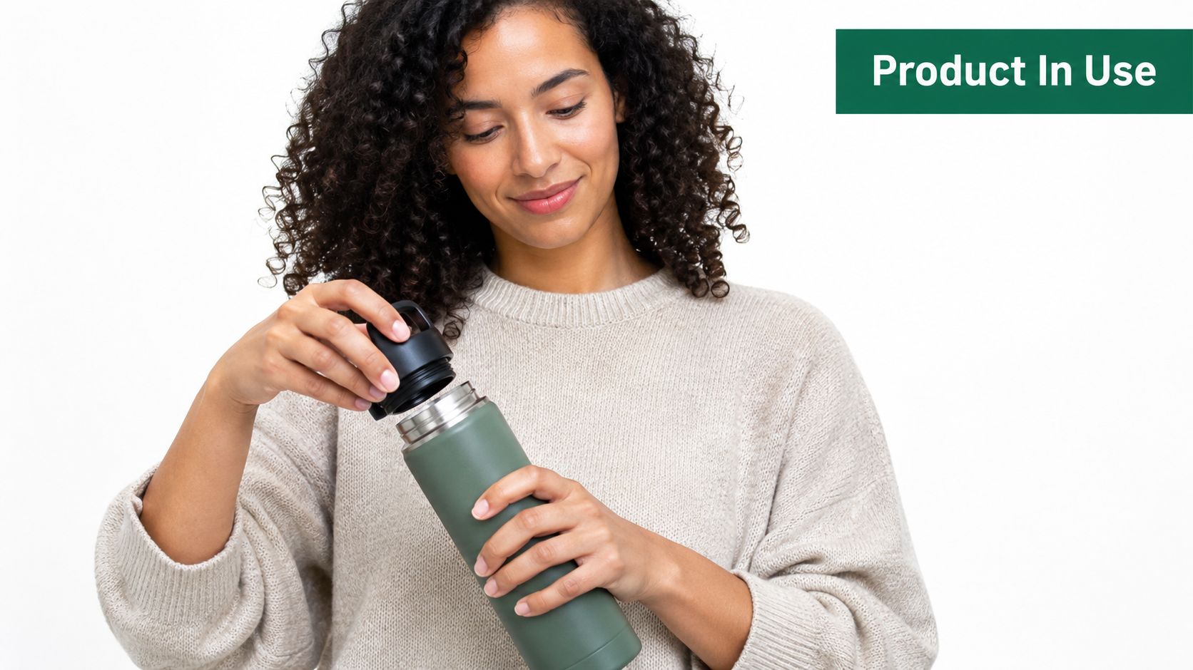
Use this format as a production system with three asset tiers, not as a one-off lifestyle shot.
Tier 1: proof of scale. Show the product in hand, on wrist, on face, or against the torso.
Tier 2: proof of use. Add one clear action such as opening, applying, carrying, pressing, or sipping.
Tier 3: proof for placement. Create a calmer variant with reduced expression and cleaner framing for PDPs, marketplaces, and paid ads that need product clarity more than personality.
The trade-off is simple. More human presence raises emotion, but it also creates more ways to lose the product. Hair covers earrings. Fingers block labels. Sleeves hide bracelet size. Strong expression pulls the eye away from the item. Good model-holding images control all four.
For AI generation, lock the pose family before making variations. Decide the hand angle, product distance from camera, face crop, and logo visibility rules first. Then generate controlled changes for channel needs: portrait crop for social, wider negative space for ads, tighter hand crop for ecommerce modules, and alternate skin tones or wardrobe colors for campaign matching. That gives the brand a reusable set instead of one hero image plus random leftovers.
Review contact points carefully. Hands, wrists, and grip pressure are where AI mistakes show up first. If the product is small, require at least one frame where branding, silhouette, and how the item is held are all readable at once. That single constraint keeps the image commercially useful.
8. Comparison Before-After Product Photography
Before-and-after images sell proof fast. They work when the buyer needs evidence, not atmosphere. That makes them useful for skincare, stain removal, restoration, fitness tools, hair care, software interfaces, and any offer built around visible change.
The format only works if the comparison can survive scrutiny. A stronger result image is not enough. Buyers check whether the angle shifted, the lighting improved, the crop hid a flaw, or the subject looked better for reasons unrelated to the product.
Build the pair as a controlled proof system
Set the frame once and treat it like a template. Camera height, focal length, crop, exposure, white balance, surface texture, and subject position should stay fixed. The only meaningful change should be the result you want to show.
That choice protects trust and makes production easier at scale.
If the image implies a performance claim, the claim needs to be visually supportable and approved by the team handling compliance or legal review.
For AI workflows, start from one locked base scene and generate matched pairs from that source. Then create controlled variants for each use case: a tight side-by-side for PDP modules, a vertical split for paid social, a labeled carousel for marketplaces, and a cleaner crop for email. Bulk generation helps here because the goal is not one dramatic image. The goal is a repeatable set with stable framing across products, claims, and channels.
Inspect continuity hard. Skin tone shifts, different countertop grain, altered shadows, moved labels, or changed hand position will break credibility. In comparison photography, small inconsistencies do more damage than a less dramatic result.
9. Composite Styled Product Photography
Composite styled photography sells a collection, not just a SKU. Use it when the buying decision depends on mood, gifting, routine, or product family logic. Beauty sets, holiday bundles, home fragrance lines, and food assortments all benefit because the image can show how the products belong together.
The production mistake is usually the same. Styling starts to compete with the merchandise.
Treat this format as a system with three controlled layers: product hierarchy, prop vocabulary, and background mood. Once those are defined, the image becomes easier to scale across launches instead of being rebuilt from scratch for every campaign. A hero product should hold the strongest position, the clearest label view, and the cleanest light. Supporting products and props should explain the story without stealing that job.
A simple way to build the system is to lock decisions at the brand level:
- Product hierarchy: Decide which item leads and how many secondary items can appear before the frame feels crowded
- Prop vocabulary: Choose a narrow set of materials such as stone, paper, metal, fabric, botanicals, or food ingredients
- Color control: Keep props inside the brand palette so packaging remains the strongest visual signal
- Crop logic: Plan safe zones for square, vertical, and wide placements before generating variants
That structure matters in review. Analysts at Rewarx's e-commerce product image quality benchmark evaluated listings against product accuracy, product fidelity, visual consistency, ecommerce readiness, workflow efficiency, and scalability. Those criteria fit composite work well because a visually strong campaign image can still fail if labels disappear, shadows muddy the pack, or the set design changes too much from one launch to the next.
For AI workflows, start with one approved composition recipe and vary only a few controlled inputs: seasonal props, surface color, camera distance, and crop ratio. Bulk generation is useful here because the goal is not one hero image. The goal is a matched set for catalog headers, paid social, gift guides, email banners, and collection pages that all feel related. That gives the creative team range without sacrificing recognition.
10. Transparent See-Through Product Photography
Transparent product photography is persuasive because it reveals what packaging hides. Clear serum bottles, beverage containers, supplement capsules, and mechanical products all benefit when buyers can inspect color, fill, texture, or internal structure.
This style works especially well when the inside is part of the value. A tinted skin care formula, layered capsule, or visible mechanism gives the image an explanatory role that a standard pack shot can't match.
Reflection control is the whole game
Clear materials are unforgiving. Reflections, warped edges, and muddied contents can make a premium product look cheap fast. The shot succeeds when the viewer can separate container, contents, and background instantly.
The economics matter too. Independent market coverage describes a shift from flat per-shot pricing toward subscription and AI-based production, with typical high-volume catalog costs reportedly moving from about US$25 to under US$8 per image, and the same coverage notes that listings with 7+ images can convert 2.4x better than single-image listings, according to Data Insights Reports' market coverage. That makes transparent and explanatory views easier to justify as part of a broader image set, not just a premium extra.
For AI generation, define bottle shape, liquid level, transparency behavior, and highlight direction up front. Then create a sequence: isolated bottle, angled bottle, close detail of contents, and in-hand transparency shot. The consistency is what makes the set useful.
10 Product Photography Styles Compared
| Style | Implementation complexity | Resource requirements | Expected outcomes | Ideal use cases | Key advantages |
|---|---|---|---|---|---|
| Lifestyle Product Photography | High, multi-element planning and direction | Locations, models, props, crew, longer shoot time | High engagement, emotional connection, higher conversions | Social campaigns, brand storytelling, aspirational products | Relatability, authentic context, brand differentiation |
| Minimalist / Clean Background | Low, controlled studio setups | Studio, seamless backgrounds, basic lighting, minimal crew | Clear product focus, fast turnaround, platform-compliant images | E-commerce catalogs, marketplace listings, spec pages | Cost-effective, scalable, consistent presentation |
| Flat Lay / Overhead | Medium, careful styling and composition | Props, tabletop, overhead rig, stylist | Shareable visual content, shows multiple items and themes | Instagram/Pinterest content, product bundles, lifestyle posts | Visual storytelling, product grouping, easily reusable |
| 360-Degree Product Photography | High, many angles and strict consistency | Turntable/rig, consistent lighting, hosting/interactive viewer | Increased buyer confidence, reduced returns, higher conversions | Footwear, furniture, high-consideration products, retail pages | Comprehensive view, interactive inspection, trust-building |
| Contextual / Environmental | High, integrates product with setting | Location sourcing, props, production crew, permits | Clear usage context, reinforced brand values, memorable imagery | Outdoor gear, home décor, experiential branding | Communicates purpose, strengthens brand narrative |
| Detail / Macro | High, technical focus on optics and lighting | Macro lenses, precise lighting, high-res sensors, expert retouch | Demonstrates craftsmanship and material quality, supports premium pricing | Jewelry, watches, textiles, premium cosmetics | Highlights fine detail, justifies premium positioning |
| Model / Person Holding/Using | High, casting, direction, styling complexity | Models, stylist, makeup, wardrobe, studio/location time | Relatable images, clear usage demonstration, better conversion | Apparel, accessories, cosmetics, wearables | Human scale reference, emotional connection, trust |
| Comparison / Before‑After | Medium, requires matched conditions and editing | Controlled setups, paired shooting, careful post-processing | Persuasive proof of results, strong conversion impact (when substantiated) | Skincare, cleaning products, renovation, fitness transforms | Clearly shows benefits, persuasive for transformation claims |
| Composite / Styled | High, design-led, layered compositions | Multiple products, props, stylists, set design, extended post | Rich, curated visuals that drive cross-sell and aesthetic appeal | Seasonal campaigns, luxury branding, curated collections | Shows ecosystems, tells a story, enhances perceived value |
| Transparent / See‑Through | Medium–High, specialized lighting and techniques | Clear materials, cutaways, specialty lighting and retouching | Builds trust by revealing contents/mechanisms, supports clean-label claims | Cosmetics, supplements, beverages, mechanical products | Demonstrates contents/quality, educational, differentiates product |
Turn These References Into a Repeatable Image System
The useful way to read product photography examples is not “which one looks best?” It's “which image type answers which buying question?” Clean-background shots handle catalog clarity. Lifestyle and environmental images create aspiration and context. Model-led images explain fit, scale, and use. Flat lays and composites support social, editorial, and launch storytelling. Macro images prove quality. Comparison and transparent views explain performance, contents, and construction.
That framework matters because buyers don't inspect every image for the same reason. Some images reduce friction. Some create desire. Some build trust by showing details plainly. If your catalog, ads, and social placements all reuse one visual style for every job, you'll end up with attractive assets that leave obvious questions unanswered.
A practical build process starts small. Choose one product and write a fixed subject description that won't change across outputs. Define the core camera angle, the direction and softness of light, the background logic, and the aspect-ratio set you need for product pages, marketplaces, paid social, and organic posts. Once those rules are set, generate variations in batches rather than improvising one image at a time.
Then review the outputs with a hard production lens. Check product accuracy first. Look for shape drift, incorrect labels, wrong finishes, broken proportions, and impossible interactions with hands or surfaces. Next, check continuity. Do the shadows, cropping, edge definition, and color treatment still feel like one brand system? Finally, check claim compliance. If an image implies a use case, ingredient presence, fit, or result, make sure your team can support that claim.
Bulk AI generation becomes useful. It accelerates controlled variation creation, but it doesn't replace brand judgment. Product identity, packaging truth, and consistency still need human review. That's especially important when one base visual is being adapted into catalog pages, campaign assets, and mobile-first placements.
Bulk Image Generation is one workflow option for this kind of production. It can generate up to 100 visuals in under 20 seconds, and its batch editor supports tasks like background removal, resizing, enhancement, and other post-production adjustments. That setup fits this category well because product photography usually isn't about producing one perfect hero shot. It's about building a coordinated image system that can scale across channels without losing visual control.
If you treat these ten styles as systems instead of inspiration boards, you'll make better decisions faster. You'll know which shots deserve strict consistency, which ones can carry more creativity, and where AI variation helps instead of hurting. That's the difference between having product photography examples and having a product image strategy.
If you want to turn one approved product setup into a larger image set, Bulk Image Generation is built for that workflow. You can generate controlled variations for catalogs, campaigns, and social placements in batches, then use the batch editor to clean backgrounds, resize formats, and refine outputs before publishing.