How to Optimize Images for Web: Quick Tips for Faster Pages

Ryan Bennett • November 23, 2025
Learn how to optimize images for web to speed up pages with practical tips on compression, formats, and responsive sizing.
Optimizing images for the web isn't just one thing. It's a whole process that starts with picking the right file format (like WebP), resizing your images before you even think about uploading them, and then hitting them with the right compression to shrink the file size. Throw in some smart loading tricks like lazy loading, and you've got a recipe for a fast website that keeps users happy and search engines even happier.
Why Image Optimization Is Crucial for Your Website
Before we get into the "how," let's talk about the "why." I can't tell you how many times I've seen a beautiful website brought to its knees by massive, unoptimized images. They're often the number one reason for slow load times, which is a direct cause of high bounce rates and frustrated visitors.
When someone lands on your site, you have seconds to make an impression. Large, heavy images are the silent killers of that first impression. This isn't just about shaving a few milliseconds off your load time; it has a real, measurable impact on your success.
The Impact on Performance and SEO
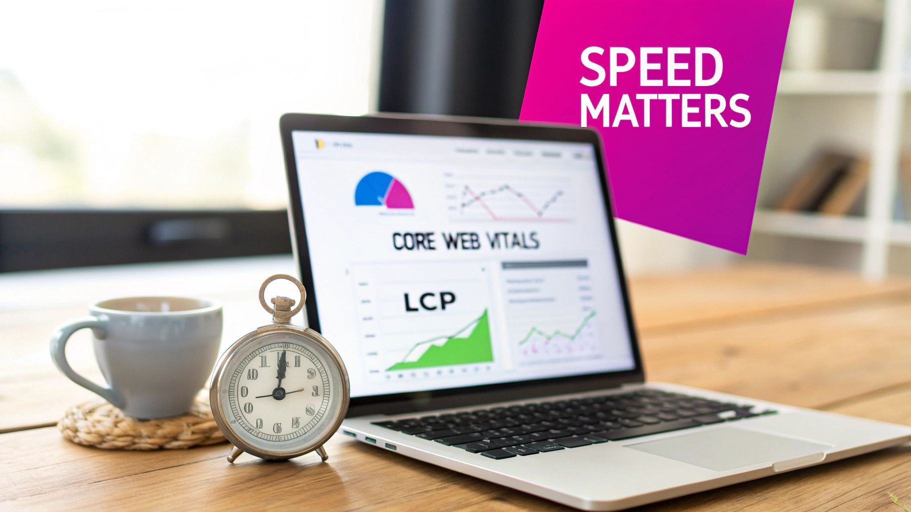
Google's Core Web Vitals aren't just technical jargon; they're a set of metrics that reflect a real user's experience on your site, and they directly influence your search rankings. One of the big ones is Largest Contentful Paint (LCP), which basically measures how long it takes for the main event—the biggest image or block of text—to show up on the screen.
Heavy images obliterate your LCP score. This sends a clear signal to Google that your site offers a sluggish experience. On the flip side, well-optimized images do wonders:
- Better User Engagement: When pages pop up instantly, people stick around. They click more, read more, and engage with your content.
- Higher Conversion Rates: If you're running an e-commerce store, slow product images are a deal-breaker. A snappy, seamless experience is what turns browsers into buyers.
- Improved SEO Rankings: It’s simple. Search engines want to send users to great websites, and page speed is a non-negotiable part of a great experience.
Think of image optimization not as a technical chore, but as a core business strategy. By cutting down those file sizes, you're directly improving user satisfaction, boosting your search visibility, and ultimately, helping your bottom line.
The True Cost of Heavy Images
Optimizing images has become a fundamental part of web performance for a reason. Studies consistently show that properly optimized visuals can slash page load times. We're not talking small gains here—data shows that websites with effective optimization can see up to a 25% improvement in loading speed.
That's a massive deal, especially when you consider that images can make up anywhere from 50% to 90% of a webpage's total weight. They are, without a doubt, the single biggest performance bottleneck on most sites.
For a deeper dive into the specifics of formats, dimensions, and compression techniques, you can check out this comprehensive guide on how to optimize images for web. Mastering this stuff is what takes a website from being a slow-loading liability to a high-speed asset.
Choosing the Right Image Format and Dimensions

The road to a lightning-fast website begins long before you even touch a compression tool. It starts with a fundamental choice: picking the right image format. Serving the wrong format is like showing up to a gunfight with a spoon—it's simply not the right tool for the job, and your site's performance will pay the price.
Not all image formats are built the same. Each has its own personality, its own strengths and weaknesses. Nailing this decision from the get-go can slash your file sizes without anyone noticing a drop in quality.
Decoding Modern Image Formats
The web has grown up. We're past the simple days of just JPEG and PNG. While those two still have their place, modern contenders like WebP and AVIF offer vastly superior compression and features. Knowing the players is key to winning the game.
To help you get started, here's a quick reference guide on which format to choose for your project.
Image Format Comparison Guide
This table breaks down the best use cases for the most common image formats, helping you make a quick, informed decision.
| Format | Best For | Key Feature | File Size |
|---|---|---|---|
| JPEG | Photographs, complex images with many colors | Great for realistic images, universal support | Small |
| PNG | Graphics needing transparency (logos, icons) | Lossless quality, supports alpha transparency | Large |
| WebP | A modern replacement for both JPEG and PNG | Excellent compression, supports transparency | Very Small |
| AVIF | When absolute smallest file size is critical | The best compression available today | Smallest |
| SVG | Logos, icons, and simple vector graphics | Infinitely scalable, tiny file size, animatable | Tiny |
Ultimately, understanding each format's strengths allows you to build a more efficient and visually appealing website.
So, when should you use each one?
- JPEG (or JPG): Still the undisputed king for photographs. It's built to handle images with millions of colors and smooth gradients, like a stunning landscape or a detailed product shot.
- PNG: This is your go-to for anything that needs a transparent background. Think logos, icons, or any graphic where the background needs to show through. Just be mindful of its lossless nature, which can lead to hefty file sizes.
- WebP: The modern workhorse. WebP is a fantastic all-rounder, offering excellent compression that shrinks file sizes by up to 30% compared to JPEGs and PNGs. It even supports transparency. It's the best of both worlds.
- AVIF: The new kid on the block, delivering even more aggressive compression than WebP. It's the champion for achieving the absolute smallest file sizes, but browser support is still catching up, so you’ll need to provide fallbacks.
The global trend is clear: next-gen formats are taking over. For most sites I build today, WebP has become the default choice because of its incredible balance between quality and file size. You can dive deeper into these image format trends on momenticmarketing.com.
Why You Must Resize Images Before Uploading
One of the most common—and damaging—mistakes I see is people uploading a massive, high-resolution photo and just scaling it down with CSS. When you set width: 500px; on a 4000px wide image, the browser is still forced to download the entire multi-megabyte file. It’s a colossal waste of bandwidth and a direct ticket to a slow-loading page.
The rule is simple: Resize your images to the largest size they will ever be displayed on your site, and do it before you upload them. Never rely on the browser to do the heavy lifting of resizing.
Figuring out the right dimensions takes a little bit of detective work. Pop open your browser's developer tools and inspect the containers where your images live.
- If your main blog content column is 800px wide, your images shouldn't be any wider than that.
- For a full-width hero banner that needs to look great on a big desktop screen, you'll probably need something around 1920px wide.
- A product thumbnail in a grid? 300px is likely more than enough.
Getting the dimensions perfect can sometimes feel like a guessing game, especially with responsive layouts. A good aspect ratio calculator can be a lifesaver here, saving you a ton of time and preventing distorted, stretched-out images.
By getting the format and dimensions right from the very start, you’re setting yourself up for success. This first step is often more impactful than any compression technique you apply later. It’s the low-hanging fruit of image optimization that delivers huge performance wins.
Squeezing Every Last Kilobyte: Mastering Image Compression
Alright, you've picked the perfect format and nailed the dimensions. Now for the magic trick: compression. This is where we dramatically shrink an image's file size, often by 50-80%, without anyone noticing a difference in quality. It's the final, crucial step that turns a clunky file into a lightning-fast, web-ready asset.
Think of compression as a simple trade-off between file size and image quality. Every image is just a collection of data. Compression algorithms are clever little programs that find and remove some of that data to make the file smaller. The goal is to hit that sweet spot where the file is tiny, but the image still looks sharp to the human eye.
The Two Flavors of Compression: Lossy vs. Lossless
Not all compression is created equal. The right method depends entirely on what kind of image you’re working with and how much detail you can stand to lose. You'll run into two main approaches: lossy and lossless.
Getting the difference between these two is fundamental to making smart optimization choices.
-
Lossless Compression: This is a perfect, reversible process. It shrinks file size by finding and eliminating redundant data without throwing away any original information. When you open the image, it's perfectly reconstructed, pixel for pixel. This is your go-to for images where every detail counts—think technical diagrams, logos with crisp lines, or graphics containing text.
-
Lossy Compression: This one is way more aggressive. It achieves much smaller file sizes by permanently deleting data it decides is "non-essential." While that information is gone forever, modern algorithms are so good that these changes are often completely invisible. For photos and other complex images, this is almost always the right choice.
Anytime you save a JPEG, you're using lossy compression. That "quality" setting—usually a slider from 0 to 100—tells the algorithm exactly how aggressive to be. More compression means a smaller file, but at some point, you'll see the quality start to dip.
Finding That Perfect Balance
So, how do you decide? For nearly every photograph you put on the web, lossy compression is the hands-down winner. The file size savings are just too good to pass up. The real question is, how much is too much?
From my own experience, I’ve found a quality setting between 70-85% for JPEGs is the sweet spot. It usually delivers a massive reduction in file size while the image remains visually identical to the original. Once you dip below 60%, you often start seeing noticeable artifacts—that ugly blockiness or blurring that can make a site look cheap.
For your logos and graphics saved as PNGs or WebPs, you’ll want to stick with lossless compression. This keeps those sharp edges and transparent backgrounds perfectly intact, just as they were designed.
My Go-To Tools for Image Compression
You don't need to be a Photoshop wizard to get this done. There are a ton of powerful, easy-to-use tools out there, and many of them are completely free. Having a reliable tool in your workflow is non-negotiable if you're serious about performance.
Here are a few I use and recommend all the time:
- TinyPNG: Don't let the name fool you. This free web tool is a beast for both PNG and JPEG files. It uses smart lossy algorithms to slash file sizes with a simple drag-and-drop.
- ImageOptim: A fantastic, free open-source app for Mac users. It runs your images through a gauntlet of different compression algorithms to squeeze out every last kilobyte, often finding savings other tools miss.
- Squoosh: Built by Google, Squoosh is a slick in-browser tool that gives you a live, side-by-side comparison of your original and compressed image. It lets you play with different formats and settings in real-time, which makes it an amazing way to learn what's actually happening under the hood.
Using these tools couldn't be simpler. You upload your resized image, let the tool work its magic, and download the optimized version. Making this a routine part of your workflow is one of the single most impactful things you can do to speed up your website.
Making Your Images Work on Every Device
Here’s one of the biggest performance killers I see all the time: forcing a tiny mobile screen to download a massive image meant for a 27-inch desktop monitor. It’s a huge waste of data, a drain on battery life, and a guaranteed way to slow down your site for most of your visitors.
The fix? Stop serving one-size-fits-all images. Instead, you need to let the browser pick the perfect version for any given device. This is where modern HTML comes to the rescue with responsive images. You're basically giving the browser a menu of options, empowering it to make the smartest choice based on the user’s screen size, resolution, and even network speed. It’s all about delivering a tailored experience that feels fast and seamless, no matter how someone finds your site.
This diagram breaks down the core workflow for getting your images ready for the web, from choosing your settings to finding that sweet spot between file size and quality.
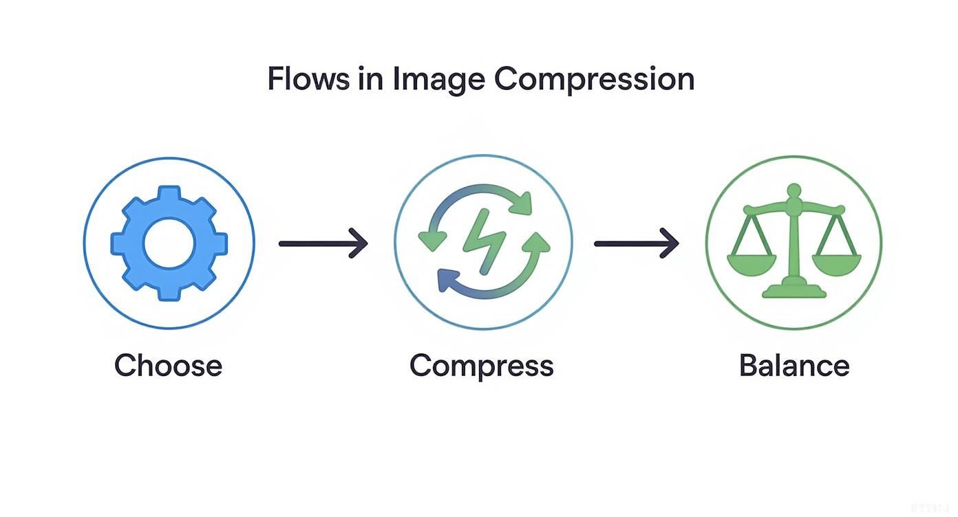
Ultimately, it all comes down to that balancing act—shrinking the file size without making the image look terrible. It’s a decision that directly impacts how fast your page loads and how good it looks.
Use srcset for Different Resolutions
The real workhorse of responsive images is the srcset attribute. Instead of just one src, you give it a comma-separated list of image files along with their actual widths. This tells the browser, "Hey, here are all the sizes I have for this image. Pick the one that makes the most sense for this screen."
Let's say you have a typical blog post image. You'll want a small version for phones, a medium one for tablets, and a large one for big screens. Your code would look something like this:

See the w descriptor? That tells the browser the pixel width of each image file. The browser then looks at the device's screen and downloads the most appropriate file. That plain old src attribute is still there as a fallback, just in case you get a visit from an ancient browser that doesn't understand srcset.
Add More Context with the sizes Attribute
While srcset gives the browser the options, the sizes attribute gives it crucial context. It tells the browser how much space the image will actually take up on the page, relative to the viewport.
Let's build on our last example. Imagine your blog image spans the full width on mobile but only takes up 50% of the screen on desktops. The sizes attribute helps the browser make a much smarter choice.
Here's what that's saying: "If the screen is 600px wide or less, this image will fill 100% of the viewport width (100vw). On any screen wider than that, it will fill 50% of the viewport width (50vw)."
Armed with this info, the browser can calculate the perfect image size it needs and download the best match from the srcset before it even starts laying out the page. Of course, creating all those different image versions by hand is a pain. That's why a good bulk image resizer is a lifesaver; it can automate this entire step.
Take Control with Art Direction
Sometimes, just scaling an image down isn't enough. A wide, panoramic hero image might look amazing on a desktop, but on a tall, skinny mobile screen, it shrinks into an unrecognizable sliver. This is where "art direction" comes into play, and the <picture> element is the tool for the job.
The <picture> element gives you the power to serve completely different images—or even different crops of the same image—based on specific breakpoints.
A classic use case for the
<picture>element is swapping a wide landscape hero image on desktop for a tightly cropped portrait version on mobile. This ensures your main subject stays front and center, no matter the screen size.
For example, you could show a wide landscape image for bigger screens and a cropped, portrait version for smaller ones:

The browser works its way down the list of <source> elements and checks their media query. It uses the first one that matches. That <img> tag at the end is mandatory; it's your fallback to make sure something always shows up. This technique gives you total creative control over how your images look on every single device.
Boosting SEO and Accessibility with Your Images
Image optimization isn’t just a tech chore for faster load times. It’s one of the most effective ways to sharpen your site’s SEO and open it up to a wider audience. When you stop treating images as just decoration and start seeing them as content assets, they become powerful tools that can pull in some serious organic traffic.
Think about it from a search engine’s perspective. Google can’t see a photo of a beach sunset. It relies entirely on the text-based clues you leave behind to figure out what the image is about and why it belongs in the search results.
Writing Alt Text That Actually Works
The alt text (or alternative text) is your most important clue. It’s a simple HTML attribute that does double duty: it describes the image for visually impaired users who use screen readers, and it gives search engines the context they need.
So many people get this wrong. They either stuff it with keywords or write lazy, one-word descriptions. Neither helps. To make your alt text effective, it needs to be:
- Descriptive and Specific: Don't just write
alt="dog". That's useless. Instead, tryalt="Golden retriever puppy chasing a red ball on a grassy lawn". You want to paint a clear picture. - Concise: Be descriptive, but get to the point. Screen readers don't need fluff. Drop unnecessary phrases like "An image of..." or "A picture of..."—it’s already known that it’s an image.
- Contextually Relevant: The description should fit naturally with the text around it. If your article is about dog training, the alt text should reflect that context.
Create SEO-Friendly File Names
Your SEO work starts before you even hit the "upload" button. An image named IMG_7892.jpg tells search engines absolutely nothing. It's a missed opportunity.
Contrast that with a filename like blue-nike-running-shoe-side-view.jpg. It's incredibly informative. Using hyphens to separate words is a standard best practice that makes it easy for crawlers to read. This simple habit can dramatically boost your chances of showing up in image searches.
And this isn't just theory. The impact is real. Websites that use descriptive alt tags and properly compressed images can see a 23% boost in organic traffic. Considering that image searches make up a massive 22.6% of all Google queries, it’s a channel you can't afford to ignore. Check out more of these technical SEO statistics on Page Optimizer Pro.
Advanced Tactics for Better Visibility
Once you've nailed the basics of file names and alt text, you can layer on a few more advanced strategies.
Structured data, using Schema.org vocabulary, is a big one. By adding ImageObject schema markup to your page, you can feed search engines extra details like the creator, copyright info, and licensing. This is what helps your images earn those little "badges" in Google Images, which can seriously increase click-through rates.
If you run an image-heavy site, like a portfolio or an e-commerce store, creating a dedicated image sitemap is a no-brainer. It ensures Google can find and index every single one of your visual assets.
Finally, don't forget about the data hidden within the image file itself. Gaining a better handle on understanding image metadata can give you a more complete picture of how every element works together, turning your images from passive decorations into hardworking assets for your website.
Automating Your Workflow and Measuring Success
Optimizing images one by one is a noble effort, but let’s be real—it’s not sustainable, especially if you’re trying to grow a website. The real secret to consistently fast load times is building an efficient, automated system that does the heavy lifting for you. This frees you up to focus on what really matters: creating great content.
If you’re still manually resizing, compressing, and converting every single image, you’re on the fast track to burnout. Thankfully, there are powerful tools that can handle this entire process for you.
Putting Optimization on Autopilot
For anyone using a content management system like WordPress, plugins are an absolute game-changer. A good image optimization plugin will automatically resize and compress your images the moment you upload them to the media library. It’s a "set it and forget it" approach that ensures no bloated, unoptimized image ever makes it onto a live page.
Beyond CMS plugins, dedicated batch processing tools give you even more control. These apps can process hundreds of images at once, applying the exact same resizing, compression, and conversion rules across your entire library. This is a lifesaver for initial site builds or when you’re overhauling an existing image collection.
Even better, you can start right from the source. An AI website images generator can create visuals in bulk, and its built-in editor can then handle post-production tasks like background removal and resizing for the whole batch simultaneously.
The goal is to make image optimization an invisible, routine part of your publishing workflow. The best system is one you don't even have to think about.
Measuring the Impact of Your Efforts
So, you've got your automated system humming along. How do you know if it’s actually working? You have to measure it. This is where web performance analysis tools come in, giving you cold, hard data to prove the value of your work.
Tools like Google PageSpeed Insights and WebPageTest are essential here. They don’t just give you a simple score; they provide a detailed breakdown of your site's performance, pinpointing exactly how your images are affecting load times.
Here’s a look at a typical report from Google PageSpeed Insights, showing clear opportunities for improvement.
This report highlights specific images that could be compressed further or served in next-gen formats, giving you a clear, actionable to-do list for any remaining bottlenecks.
What to Look for in Performance Reports
When you run a test, you’re not just chasing a high score. You’re digging for specific, image-related diagnostics you can act on. Keep an eye out for these key recommendations:
- Properly size images: This flag pops up when you're serving images that are way larger than their display size on the screen—a classic performance killer.
- Serve images in next-gen formats: You'll see this when your JPEGs or PNGs could be converted to WebP or AVIF for some serious file size savings.
- Efficiently encode images: This is a direct signal that your compression levels could be more aggressive without a noticeable drop in visual quality.
By running these tests regularly, you can quantify your improvements, catch any new issues that pop up, and continuously dial in your workflow. This cycle of automating and measuring is how you maintain a fast, high-performing website for the long haul.
Common Questions About Image Optimization
When you're deep in the weeds of optimizing images, a few key questions always seem to pop up. I hear them all the time. Let's clear up some of the most common points of confusion so you can get back to building a faster website.
Should I Still Use JPEGs And PNGs?
Absolutely. You definitely should. While the new kids on the block like WebP and AVIF are fantastic for compression, they still don't work on every single browser out there. It's close, but not 100%.
The smartest play right now is a fallback strategy. Use the <picture> element to serve a WebP or AVIF file first, but always have a high-quality JPEG or PNG ready to go for older browsers. This way, everyone gets an image, and most people get the fastest version possible. Your source file for a photo should still be a crisp JPEG, and a logo with transparency should start its life as a PNG.
Does Image Optimization Affect Quality?
Yes, but the whole point is to make that quality loss completely imperceptible to your visitors. It’s a balancing act.
There are two flavors of compression:
- Lossless: This method reduces file size without touching a single pixel of quality. It's great, but the file size savings are usually modest.
- Lossy: This is where the magic happens. It intelligently removes data that the human eye isn't likely to notice.
Your goal is to find that perfect sweet spot. For most JPEGs, I find a quality setting between 70-85% gives you massive file size reductions with no visible downside. You want to compress it right to the edge, just before you can see any weirdness, and then pull back just a tiny bit.
The best optimization is the one your visitors never notice. They just experience a blazing-fast website. The only thing they should see is a beautiful, sharp image that loads instantly.
How Important Is Lazy Loading?
It’s not just important; it's a non-negotiable part of modern web performance. Especially for pages with a lot of images that aren't immediately visible when the page first loads.
Think about it: instead of forcing a user's browser to download all 20 images on a long blog post at once, lazy loading tells it to only grab the first two or three. As the user scrolls down, the next images are fetched just in time. This dramatically improves your initial load time, saves a ton of bandwidth (especially on mobile), and makes your site feel infinitely faster.
Plus, modern browsers make it incredibly easy with a simple attribute: loading="lazy". It’s one of the highest-impact changes you can make with the least amount of effort.
Can I Optimize Images That Are Already Uploaded?
You can, and you absolutely should. If your site has been around for a while, you're likely sitting on a goldmine of performance gains locked away in an unoptimized media library.
Most content management systems, like WordPress, have plugins that can go back in time and fix everything for you. These tools can crawl your entire library and perform bulk actions without you having to lift a finger.
They can handle things like:
- Resizing images that were uploaded way too big.
- Running every file through a compression algorithm.
- Converting your entire library to next-gen formats like WebP.
Seriously, running a bulk optimization on an existing site is one of the fastest ways to see a massive jump in your performance scores.
Ready to stop optimizing one image at a time? Bulk Image Generation lets you create hundreds of professional, web-ready images with AI and then resize, compress, and enhance them all at once with our powerful batch editor. Start creating faster at https://bulkimagegeneration.com.