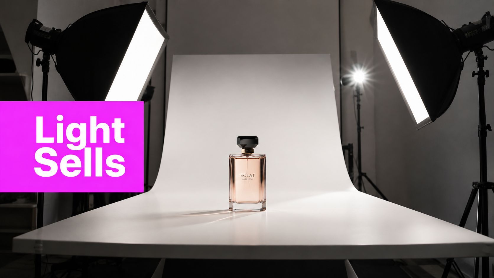
Product Photography Lighting That Actually Sells in 2026

Ryan Bennett • August 1, 2026
Master product photography lighting in 2026 with practical setups, camera settings, and AI workflows for small items, apparel, and reflective products.
You're probably staring at a table of sample shots right now, wondering why one product looks crisp and premium while the next one looks dull, gray, or oddly cheap. The camera didn't change much. The lighting did. In product work, that's usually the difference between a page that earns trust and one that gets skipped.
Product photography lighting is not a decoration layer. It's the production standard that keeps catalogs consistent, protects color accuracy, and helps shoppers understand what they're buying fast. The best setups are rarely the flashiest ones, they're the ones that can be repeated on SKU fifty with the same result as SKU one.
Why Lighting Drives Product Sales Before Anything Else
A shopper doesn't carefully study every pixel on a product page. They skim, decide whether the image feels believable, and move on. That's why lighting has to do more than make a shot look pretty. It has to make the product readable, trustworthy, and easy to compare.
Industry coverage cited in lighting guides links professionally lit product images with stronger commerce outcomes, including 15–40% higher conversion versus ambient or suboptimal light, and UK e-commerce guidance says optimized product images can improve sales by up to 28%–30%. The same body of coverage notes Baymard Institute research showing users judge a page's usefulness in as little as 0.67 seconds, while Salsify research found 93% of shoppers prioritize visual appearance and 85% say visual authenticity affects trust. Those numbers are a reminder that lighting sits inside the buyer's first impression, not after it.
Practical rule: if a product page feels slow to understand, don't start by blaming the copy. Start with the photo.
What lighting really controls
Lighting affects where the eye lands first, how much texture survives compression, and whether the product looks authentic or staged. A shirt shot under flat window light can lose shape. A glossy bottle shot under uncontrolled overhead light can become a reflection problem instead of a selling image.
The setup also affects operational consistency. Commercial teams need the first image to match the twentieth image, because mismatched color, shadow density, or background tone creates a catalog that feels assembled instead of managed. That's why modern product photography lighting is better treated as infrastructure than art direction.
The working mindset
Think in terms of repeatability, not inspiration. Before you press the shutter, decide what the frame needs to do, preserve color, show texture, and keep the product honest across the catalog. Once that's clear, the lighting plan becomes a business decision instead of a style preference.
The Two-Light and Three-Light Setups Explained
Most product work starts with a simple truth. You don't need a complicated grid of lights to get a usable image. You need a setup that gives you control over shape, shadow, and reflection, then you need to repeat it without drift.

The most reliable baseline in modern commercial workflows is still the two-light arrangement, with a key softbox at 45° and a white reflector opposite it, paired with ISO 100–200 for detail and color consistency, according to the 2026 guidance on studio lighting. That setup persists because it solves the core problem: it gives you enough direction to create shape, but not so much drama that the image becomes hard to reproduce across a batch.
What each light is doing
The key light sets the direction of the image. Place it off to the front side of the product, usually at that 45-degree angle, and let it define the main highlight and shadow edge. The reflector doesn't “light” in the dramatic sense, it fills the dead side so the product doesn't look cut in half.
A three-light setup adds a backlight or rim light behind the product. That third source separates the object from the background and gives edge definition, which matters most on reflective or glossy products. In practice, the rim light is often used more carefully than beginners expect, because too much power turns the shot into flare, not separation.
How to think about power balance
On shiny surfaces, the fill light usually stays lower than the key, often around 50–70%, so specular highlights don't wipe out surface detail. That ratio gives you shape without blowing out the finish. If the product is metallic or lacquered, test frames matter more than theory, because a tiny move in light height or distance can change the highlight pattern completely.
Keep the setup boring until the catalog is finished. Drama belongs in campaign images, not in the system that has to be repeated fifty times.
For a deeper look at studio coordination across wider production teams, the logic behind catalog setups is similar to what you'd see in broader commercial video production companies, the goal is controlled output, not improvisation.
Matching Modifiers to Surface Type
The wrong modifier doesn't just create a bad photo. It creates a bad workflow, because you end up fixing the same reflection, hotspot, or flatness problem over and over. Surface type should drive modifier choice, not the other way around.
Matte ceramics and soft apparel tolerate more direct shaping, so a softbox or large diffused source usually works well. Glossy glass and polished metal need more restraint. A diffusion tent, strip light, or a heavily softened source gives you control over the reflection line instead of a bright square screaming back at the camera.
Surface by surface decisions
For matte products, aim for broad, even light that preserves texture without building harsh contrast. A bounce card can help lift a shadow side when the product has depth, and a grid can keep spill off the background if the setup is small.
For glossy or reflective products, treat the modifier as a shape maker. A strip light often works better than a square softbox for tall bottles because it creates a cleaner vertical reflection line. A light tent is useful for jewelry and small reflective pieces, but it can also flatten a perfume bottle if you overuse it.
For transparent liquids and glass, use diffusion carefully. Beginners often point bare light directly at the object and then wonder why the bottle looks harsh and clinical. The safer move is to light the diffused surface, not the product itself, so the glass reads as glass instead of a mirror.
A simple decision rule
If the product reflects too much, diffuse more. If the product disappears into the background, tighten the light with a strip or grid. If it looks lifeless, reduce the amount of diffusion so you can recover some edge and dimension.
A lot of teams overcomplicate this with gear obsession. The advantage comes from matching surface behavior to the modifier before the shoot starts. For category-specific lighting strategy, the cleaner thinking in AI Texture Generator workflows also helps, because texture and surface treatment have to stay believable across a family of images.
Camera Settings That Match the Lighting Plan
Lighting and camera settings either reinforce each other or fight each other. If you build a controlled setup and then let the camera wander, the batch starts drifting fast. Product work rewards boring settings, because consistency beats experimentation once the lights are dialed in.
For catalog work, ISO 100–200 is the safest range because it preserves detail and keeps color noise low. Aperture around f/5.6 to f/9 usually gives you enough sharpness across the product while keeping the background controlled. Shutter speeds from 1/60 to 1/200 work depending on whether you're using continuous light or strobes, but the tripod matters either way because it keeps framing and focus stable.
Camera Settings by Product Scenario
| Scenario | ISO | Aperture | Shutter | White Balance |
|---|---|---|---|---|
| Small items on white seamless | 100–200 | f/8 to f/9 | 1/60 to 1/200 | Gray card |
| Apparel on mannequin | 100–200 | f/5.6 to f/8 | 1/60 to 1/125 | Gray card |
| Reflective products on acrylic | 100 | f/8 to f/9 | 1/125 to 1/200 | Gray card |
Why the gray card matters
White balance is where a lot of batches fail. The light may look fine on screen, but when you compare the whole set later, one frame is warmer and another is cooler. A gray card gives you a reference point that keeps the color story consistent before you commit to the full run.
If the first test frame isn't right, don't “fix it in post” and move on. Fix the light first.
For reflective products, test the angle before you shoot the full set. On apparel, the exposure can stay a little more forgiving, but the shoulder seams, fabric weave, and label color still need to hold together under the same settings. A tripod and repeatable focus point matter more here than in portrait work, because product pages can't afford frame-to-frame drift.
Keeping Lighting Consistent Across a Whole Catalog
The difference between a one-off beautiful photo and a useful catalog system shows up on frame twelve. That's when fatigue starts, a stand gets nudged, or someone decides to “improve” the setup by eye. The shoot gets slower, and the consistency falls apart.
A better production day starts with the first test shot as a template. Document light height, distance, power level, aperture, and white balance, then lock those values in. The guidance on modern product photography lighting recommends exactly that kind of documentation so every image in a batch matches the initial test frame, and that's the right instinct for any catalog workflow.
What changes from SKU one to SKU fifty
On a steady shoot, the product changes more than the lighting should. The base setup stays put, the camera stays on the tripod, and the same exposure decisions carry through the line. When the team tries to reinvent the frame for every item, re-shoots go up and the catalog starts to look like it came from different vendors.
The best lighting for catalog work is often the least dramatic one. It won't win a moodboard, but it will save time because it minimizes surprises. That's the commercial value, predictable output that makes the post-production queue easier to clear.
A lighting diagram only helps if somebody else can rebuild it after lunch.
How to make the setup portable
Draw the setup, label the modifier, mark the angle, and note the product distance from the background. If another shooter picks up the job next week, they should be able to recreate the frame without guessing. For teams working with large image volumes, a bulk image resizer is useful only if the source frames already share the same lighting logic, because resizing bad inputs just makes the inconsistency smaller.
That's also where catalog lighting diverges from hero lighting. Catalog frames should be stable and repeatable. Hero frames can be more stylized, but mixing the two in the same workflow usually creates a mess.
Where AI Image Generation Fits Into the Workflow
AI doesn't replace a controlled studio when color has to be exact, but it does fill a real operational gap. For quick mockups, social variations, concept testing, and bulk format changes, it can save a lot of manual repetition. The smartest teams treat AI as the volume layer and the camera as the precision layer.

The practical boundary is simple. If the image needs verified texture, exact color, or a physically real reflection pattern, the camera still wins. If the job is about generating consistent variations or testing how a product reads on different backgrounds and formats, AI can move faster than a traditional reshoot cycle.
Where the split makes sense
AI is useful for catalog mockups, lifestyle variations, social crops, and quick concept exploration. Traditional shoots still matter for final hero images, products with strict color fidelity, and surfaces where the texture has to hold up under scrutiny. That split keeps the workflow honest instead of pretending one tool handles everything.
The batch tools matter too. A system that can create up to 100 images in 20 seconds using Flux 1.1 Pro, support 9:16, 16:9, and 1:1 formats, and handle background removal, face swapping, resizing, and enhancement that cuts editing time roughly in half changes how teams allocate labor. Those capabilities don't fix bad lighting, but they do reduce the hours spent repurposing already-usable assets.
For prompt writing, the useful language is specific, not decorative. “Soft diffused studio light, 45-degree key, white background” works better than vague style words because it anchors the output to the lighting logic already used in the studio. The same idea applies to AI product photography tutorials, where the workflow gets stronger when the prompt mirrors real studio decisions.
Use AI to multiply a good lighting system, not to hide a weak one.
Troubleshooting and Your Repeatable Lighting Checklist
Most lighting problems are predictable. Mixed color temperatures, a sloppy key angle, and over-diffused frames are the ones that waste the most time because they don't always look broken at first glance. They show up later, when the batch is already half-shot and the images don't match.

The failures worth catching early
Color temperature mismatch happens when continuous and strobe sources don't agree, or when white balance is left on auto. Harsh shadows usually mean the modifier is too small, too close, or aimed too directly. Overexposure is often a distance problem, not just a power problem.
Reflective products add two more headaches. Inconsistent reflections appear when the camera angle changes even slightly, and background glare shows up when the light isn't flagged well enough. If you need a practical reference for how a softer lamp position affects shadow behavior, the framing in professional half moon lamp tips is a useful reminder that angle and diffusion shape the whole look.
Tape this checklist to the wall
- Verify the key angle: keep the main light at the chosen 45-degree position before the batch begins.
- Check the fill ratio: make sure the opposite side doesn't go flat or wash out detail.
- Shoot a gray card: lock white balance before the full run.
- Document every setting: height, distance, power, aperture, and white balance need to stay consistent.
- Run a test frame: inspect reflections, shadow density, and background edge before committing to the batch.
The last mistake is over-diffusion. When everything gets softened too much, the product starts to look fake, flat, or vaguely AI-generated. That usually means the frame needs a little more direction, not another layer of diffusion.
If you want to scale catalog image production without losing control of lighting logic, Bulk Image Generation gives you a way to turn a good product photo workflow into a faster one. It's useful when you need consistent image variants, faster post-production, and cleaner batch handling around the studio system you've already built.
