Best Social Media Image Sizes for Every Platform in 2026

Ryan Bennett • September 22, 2026
Find the best social media image sizes for every platform in 2026. Quick-reference dimensions, aspect ratios, and bulk-export tips for marketers and creators.
You've exported the campaign, queued every caption, and approved the creative. Then the Instagram preview shows a cropped headline, the Facebook card looks too wide, and the Story version has a logo hidden behind the interface. The problem usually isn't the design itself. It's that one image has been forced into placements built for different shapes.
The practical answer to the best social media image sizes isn't a giant per-platform lookup table. It's a small family of production ratios, each with a clear job. Build the right masters first, then batch-export the platform variants your campaign needs.
Why Image Sizes Decide Whether Your Post Gets Seen
A social image can fail before anyone reads the caption. A wide hero placed into a vertical feed may arrive with awkward empty space. A square graphic stretched into a full-screen Story can lose its hierarchy, while a detailed design shrunk by aggressive platform compression becomes difficult to read.
The production mistake is treating resizing as a final technical task. Cropping changes composition, not just dimensions. It can remove a product, split a face, cut through a logo, or leave text too close to interface controls. That's why a post that looked polished in Photoshop can feel careless in a live feed.
Mobile viewing makes the trade-off more visible. Taller feed images occupy more of the screen, which is why current guidance identifies 1080 × 1350 pixels at 4:5 as the preferred feed format across Instagram and Facebook, while 1080 × 1080 at 1:1 remains a dependable fallback and 1080 × 1920 at 9:16 serves full-screen placements (Hootsuite's social media image size guide).
Production rule: Don't resize one finished file repeatedly. Export each ratio from a controlled master so the composition is rebuilt where necessary.
Start with three working masters
Use these formats as the foundation of a weekly content system:
- 1:1 square: A flexible fallback for feed posts, profiles, and simple graphics.
- 4:5 portrait: The primary feed canvas when mobile visibility matters.
- 9:16 vertical: The full-screen canvas for Stories, Reels, TikTok, and Shorts.
The rest of this guide treats platform dimensions as derivatives of those families. That approach reduces guesswork and makes bulk generation easier to QA.
The Three Ratio Families That Drive Every Platform
Aspect ratio tells you the shape of an image, while pixels tell you its output resolution. For production, the ratio comes first. If the shape is wrong, adding more pixels won't prevent a bad crop.
The 1:1 square at 1080 × 1080 is still the safest universal fallback. It works well for cross-posting and gives text-heavy layouts a predictable frame. Its weakness is visual real estate. On a phone held vertically, a square card doesn't occupy as much feed height as a portrait card.
The 4:5 portrait at 1080 × 1350 is the strongest general-purpose feed format. Current industry guidance describes portrait posts as taking up roughly one-third more screen space than square posts, which helps explain its adoption for mobile-first publishing (Hootsuite). It gives product photography, educational slides, and promotional copy more room without the cropping risk of a wide image.
The 9:16 vertical at 1080 × 1920 is designed for full-screen surfaces. Stories, Reels, TikTok posts, and Shorts use the screen as the card, so horizontal thinking creates unnecessary letterboxing or forces a crop.
| Ratio | Dimensions | Mobile Viewport Share | Primary Platforms |
|---|---|---|---|
| 1:1 | 1080 × 1080 px | Moderate | Instagram, Facebook, LinkedIn, X, Threads |
| 4:5 | 1080 × 1350 px | Higher than square | Instagram, Facebook, LinkedIn, Threads, X |
| 9:16 | 1080 × 1920 px | Full-screen | Stories, Reels, TikTok, Shorts |
For a deeper explanation of how these shapes map to publishing workflows, see this guide to aspect ratio for social media. Keep the three masters in your template library, then add horizontal, pin, banner, and share-card versions only when a placement requires them.
Instagram Image Sizes for Posts, Stories, and Reels
Instagram needs three distinct creative decisions. A feed post is not a Story, and a Reel cover isn't automatically safe just because the source file is vertical.
For a new feed post, use 1080 × 1350 pixels at 4:5 when the composition benefits from height. Square posts at 1080 × 1080 pixels remain useful for logos, quote cards, and designs that must travel cleanly across several networks. Horizontal posts at 1080 × 566 pixels, approximately 1.91:1, suit panoramic photography but usually make text and subjects feel smaller in a mobile feed.
Stories and Reels should be exported at 1080 × 1920 pixels, 9:16. Build the main subject inside a central area, because usernames, captions, stickers, and action controls can cover the upper and lower edges. A Reel cover may also appear in smaller feed and profile crops, so its headline needs to survive outside the full-screen view.
| Placement | Dimensions | Aspect Ratio | Use When |
|---|---|---|---|
| Feed portrait | 1080 × 1350 px | 4:5 | Default feed creative |
| Feed square | 1080 × 1080 px | 1:1 | Cross-platform or grid-led designs |
| Feed landscape | 1080 × 566 px | 1.91:1 | Panoramic or cinematic images |
| Stories and Reels | 1080 × 1920 px | 9:16 | Full-screen vertical content |
For production details specific to short-form video covers and canvases, the 2026 Instagram Reels size guide is a useful companion reference. For carousels, match every slide to the first slide. A portrait opener followed by square cards creates a distracting shift and can force inconsistent crops during swiping.
Keep an Instagram export preset for each ratio, and document the crop behavior in the template itself. The Instagram image dimensions workflow guide can help teams standardize those presets.
Facebook Image Sizes for Feeds, Covers, and Previews
Facebook combines feed publishing, community surfaces, profiles, covers, and link cards, so one campaign can need several shapes. The most useful feed masters are 1080 × 1350 pixels for portrait, 1080 × 1080 for square, and 1200 × 630 for horizontal or shared-link creative, based on current platform sizing guidance (Tilda's social media image size guide).
Use 1080 × 1920 pixels at 9:16 for Stories and Reels. A Facebook cover needs its own shallow composition at 851 × 315 pixels, while group and event covers use different canvases. Don't place a headline near the lower-left corner of a profile or Page cover, where profile imagery can overlap the design.
| Placement | Dimensions (px) | Aspect Ratio | Notes |
|---|---|---|---|
| Profile image | 320 × 320 | 1:1 | Design for a circular crop |
| Page or profile cover | 851 × 315 | 2.7:1 | Keep key content away from overlap areas |
| Group cover | 1640 × 856 | 1.92:1 | Create a dedicated community banner |
| Event cover | 1920 × 1005 | 1.91:1 | Use for event-page presentation |
| Feed portrait | 1080 × 1350 | 4:5 | Mobile-first feed creative |
| Feed square | 1080 × 1080 | 1:1 | Flexible general update |
| Link preview | 1200 × 630 | 1.91:1 | Separate share-card master |
| Stories and Reels | 1080 × 1920 | 9:16 | Full-screen vertical placement |
Facebook differs from Instagram most clearly in link sharing. A wide preview can be appropriate for a URL post even when a portrait image is the better choice for an organic feed post. For a Facebook-only campaign, export at least one 4:5 feed version, one 1:1 fallback, one 9:16 vertical, and one 1.91:1 share card.
LinkedIn, X, Threads, TikTok, Pinterest, and YouTube Sizes
Cross-platform teams lose time when every network gets its own unrelated design process. A ratio-family workflow is more practical. Start with the 4:5, square, and vertical masters, then create the platform-specific banners, pins, thumbnails, and cards that can't be derived safely by simple cropping.
| Platform / Placement | Dimensions (px) | Aspect Ratio | Production Note |
|---|---|---|---|
| LinkedIn personal or company feed | 1200 × 627 | 1.91:1 | Use for wide thought-leadership or link-led creative |
| LinkedIn personal banner | 1584 × 396 | 4:1 | Keep important content centered |
| LinkedIn article cover | 1200 × 644 | Approx. 1.86:1 | Build separately from feed posts |
| X single landscape image | 1600 × 900 | 16:9 | Suitable for wide visual storytelling |
| X portrait image | 1080 × 1350 | 4:5 | Keep essential copy central |
| X header | 1500 × 500 | 3:1 | Protect the profile-image overlap area |
| Threads portrait post | 1080 × 1350 | 4:5 | Strong mobile feed option |
| Threads square post | 1080 × 1080 | 1:1 | Reliable fallback |
| TikTok static post | 1080 × 1920 | 9:16 | Use a full-screen vertical canvas |
| Pinterest standard Pin | 1000 × 1500 | 2:3 | Treat as a dedicated pin master |
| Pinterest video Pin | 1080 × 1920 | 9:16 | Keep text clear in a vertical frame |
| Pinterest profile cover | 800 × 450 | 16:9 | Use a wide brand image |
| YouTube thumbnail | 1280 × 720 | 16:9 | Design for thumbnail-scale reading |
| YouTube channel banner | 2560 × 1440 | 16:9 | Keep text inside the central safe zone |
| YouTube Shorts cover | 1080 × 1920 | 9:16 | Design for full-screen and profile crops |
| YouTube end screen | 1280 × 720 | 16:9 | Match the video canvas |
TikTok's static posts still belong in the vertical family. For a technical explanation of the proper TikTok video aspect ratio, keep the key subject away from interface-heavy edges and avoid importing a wide video frame with artificial bars.
Pinterest is the main exception among discovery feeds. Its standard Pin uses 1000 × 1500 pixels at 2:3, so don't treat it as a stretched 4:5 post. YouTube thumbnails and channel artwork also need dedicated 16:9 compositions because their viewing context is different from a scrolling social feed.
Link Preview and Share Card Image Sizes
Link previews deserve their own master. They're generated from a URL, rendered inside a compact card, and often displayed beside a headline or description. A feed-post crop rarely keeps the same hierarchy.
The dependable share-card standard is about 1200 × 630 pixels at 1.91:1, with 1200 × 628 also commonly accepted (RFE/RL Academy's aspect-ratio guideline). Facebook link-share images commonly use 1200 × 630, while LinkedIn and other card systems may accept closely related dimensions. The small difference matters less than maintaining a dedicated composition.
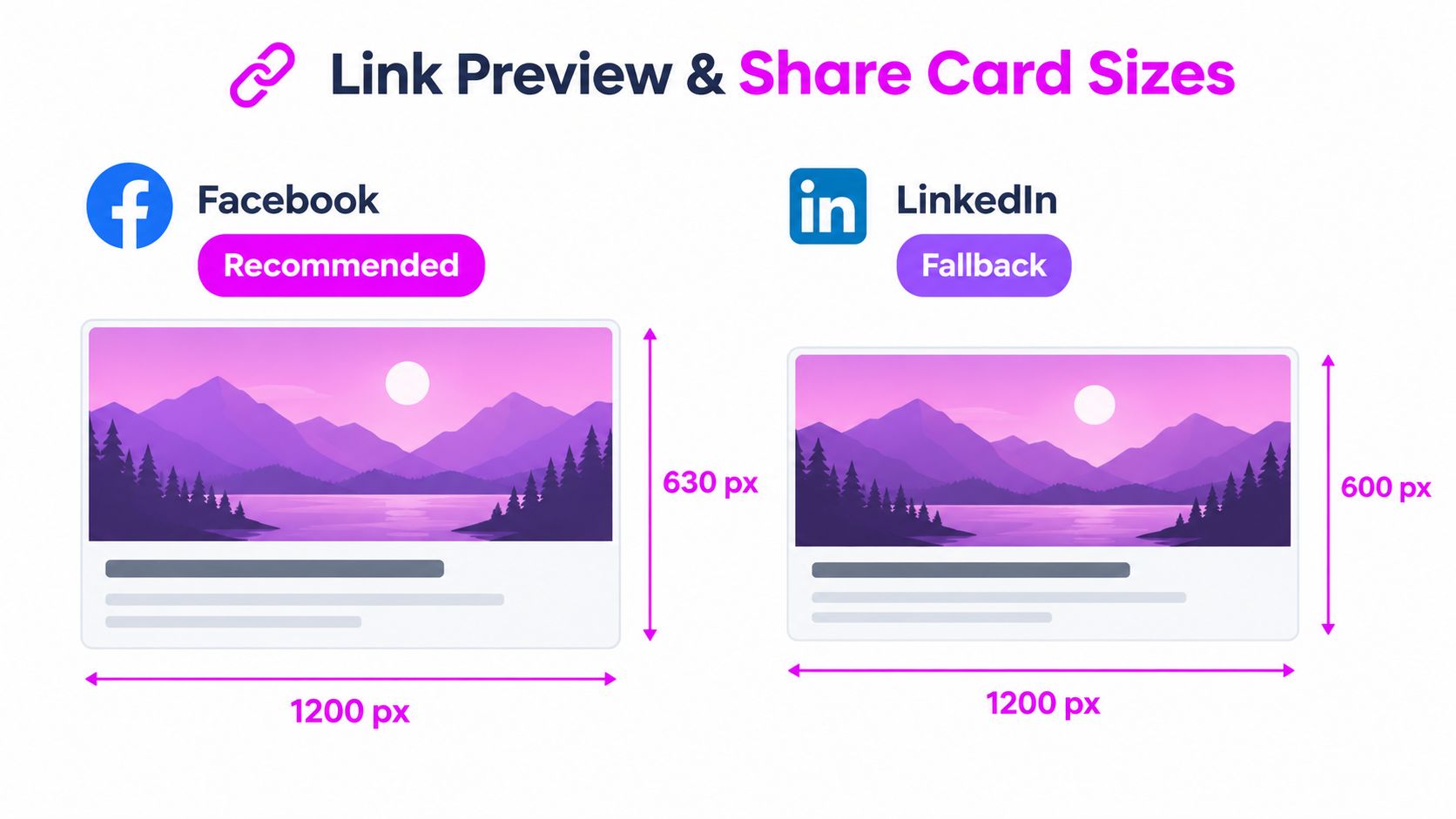
Build the card independently
A portrait feed asset often places its headline high or low to take advantage of vertical space. In a share card, that same headline may become tiny, sit too close to the edge, or compete with the title rendered outside the image.
Create a horizontal variant with a short visual message, strong contrast, and generous margins. Keep essential words away from the outer edges because cards can be downscaled or cropped differently across desktop and mobile timelines. Generate the 1.91:1 card alongside the 1:1 and 4:5 feed versions, rather than treating it as an afterthought.
Use the same campaign subject, color system, and brand mark across all three ratios. The files should feel related, but they shouldn't be identical crops. That distinction preserves readability when the same URL moves from a website share into Facebook, LinkedIn, X, or a messaging channel.
The Rise of Taller Vertical Feeds Beyond 4:5
The old square-versus-portrait debate is no longer broad enough for current production. Industry guidance increasingly identifies 3:4 as an emerging expanded vertical feed format, alongside established 4:5 and full-screen 9:16 assets (Marketing Agent's 2026 social media image size guide).
A 3:4 canvas gives a creative team more height than 4:5 while remaining a feed-oriented image rather than a full-screen Story. That extra space can help with editorial photography, product context, or a multi-line headline. The trade-off is workflow complexity. More height can increase crop sensitivity, create new grid-preview problems, and require a separate composition rather than a simple export.
Use a second tall variant when the original image has meaningful vertical context. A person standing, a product on a shelf, or a step-by-step visual may benefit from the additional room. Don't create 3:4 automatically for every post if your source artwork is already clean and effective at 4:5.
The ratio family should therefore include optional members:
- 4:5: The default portrait feed master.
- 3:4: An expanded vertical feed variant for compositions that need more height.
- 9:16: A full-screen version with interface-safe spacing.
The most efficient teams don't ask for one universal size. They decide which ratio family a campaign needs, then generate only the variants that preserve the message. That keeps batch exports useful instead of turning every post into unnecessary manual adaptation.
Safe Zones and UI Overlays for Vertical Formats
Correct dimensions won't save a design whose headline sits beneath a button. Vertical placements carry interface elements over the creative, and the exact overlay can vary by surface, device, and content type.
For a 9:16 canvas, place the primary subject in the central region. Keep faces, logos, product names, and calls to action away from the top area used for account and follow controls, and away from the bottom area where captions, buttons, and navigation can appear. A 4:5 feed post has less vertical space, so its headline should be even more deliberately centered.
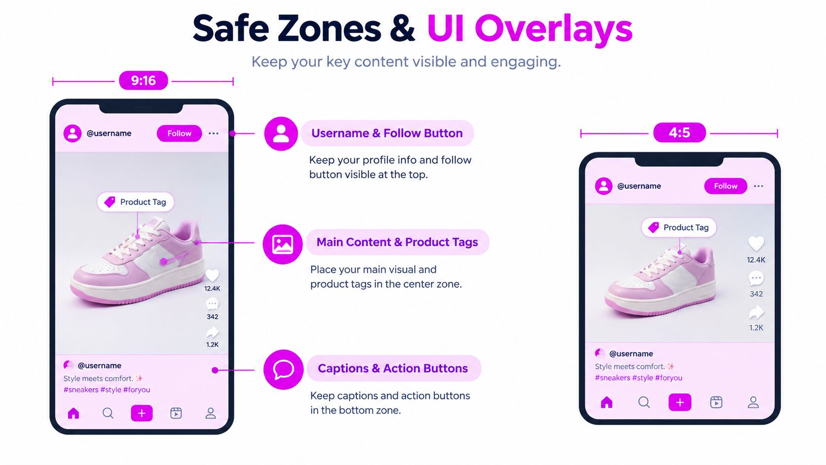
Use a layered safe-zone review
Build guides into the template rather than relying on memory. A useful review has three passes:
- Top check: Confirm that the username area and follow controls don't cover the subject or first line of text.
- Center check: Keep the main message, face, product, and tags inside the strongest visual area.
- Bottom check: Move critical copy away from captions, action buttons, music labels, and navigation.
For routine production, design around the central 80 percent of the canvas, then place critical text inside the core 60 percent band. Those are workflow guardrails, not guarantees for every interface. Preview the actual export in the destination app before approving a campaign, especially for Reels and Stories.
Export Settings for Sharp, Fast-Loading Social Images
A clean master can still look poor after export. Social platforms recompress uploads, and small text, gradients, skin tones, and sharp logos expose that processing quickly.
Use sRGB for the color profile so colors remain predictable across browsers, design tools, and mobile apps. JPEG is the default for photographs and blended artwork. PNG-24 is better for transparency and hard-edged graphics, while WebP can be useful where the destination and scheduling workflow accept it reliably.
A practical export preset
Set up named presets instead of adjusting every file by hand:
- Photos and mixed artwork: JPEG, high quality, sRGB.
- Transparent logos or interface graphics: PNG-24, sRGB.
- Web delivery workflows: WebP when the publishing system supports it.
- Resolution metadata: Keep the design tool's standard web export behavior consistent. DPI metadata matters less to screen display than pixel dimensions.
Avoid exporting a tiny file and expecting the platform to restore detail. Start with the native target canvas, inspect fine type at actual viewing size, and check for banding in large color fields. Then compress the file only as far as your scheduler and destination require.
A useful workflow is to compare the original and uploaded preview side by side. Look at thin strokes, small labels, skin texture, and high-contrast edges. For broader file-reduction techniques, use this guide to reduce image size, then keep the visual QA step in place.
Batch Generating Every Required Size in One Pass
The master file should hold the campaign logic, not just the artwork. Build the headline, subject, logo, background, and watermark as editable layers or smart objects so the same source can feed multiple ratio-specific exports.
A practical Photoshop workflow starts with a 1080 × 1350 portrait source. An action or Image Processor Pro setup can create square, vertical, wide, pin, and cover variants, then apply the color profile, watermark, and export format in sequence. The crop still needs human review, but the repetitive file handling disappears.
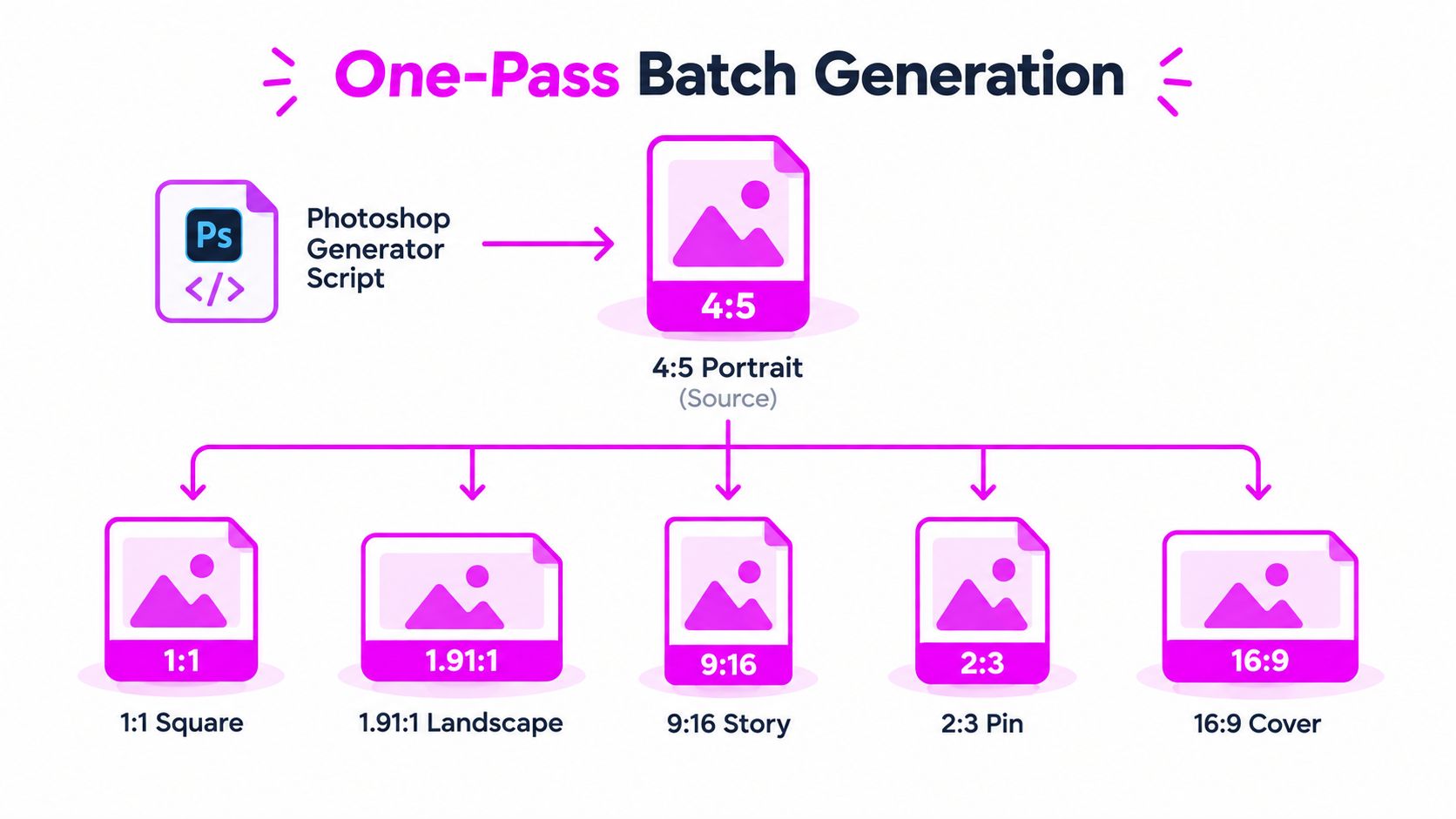
Keep the ratio math visible
A small ratio reference prevents wrong-canvas exports:
- 4:5 = 0.8
- 1:1 = 1.0
- 9:16 = 0.5625
- 3:4 = 0.75
- 1.91:1 = 1.91
Use those values to check whether a crop should remove width or height. If the focal subject can't survive the crop, create a new composition instead of forcing the source into the target.
Make the folder do the handoff
Use a strict naming convention such as Platform_Placement_Ratio_Date.ext. Examples include IG_Post_4x5_2026-03.jpg and LI_Feed_1.91x1_2026-03.jpg. A folder-watch process can ingest new creative from a shared Dropbox folder, run the export action, and place the finished set in a scheduler-ready folder.
For teams producing many variants, Bulk Image Generation can generate and resize campaign visuals in batches, while a human still checks composition, safe zones, and brand accuracy. The important operational idea is consistency: one source, predictable outputs, clear filenames, and a short approval pass before scheduling.
Quick Reference Cheat Sheet for 2026
Keep four source files available for most campaigns: 1080 × 1350 portrait, 1080 × 1080 square, 1080 × 1920 vertical, and the separate 1200 × 630 share card. Add the platform-specific formats only when the placement needs a different shape.
| Platform | Placement | Dimensions (px) | Ratio |
|---|---|---|---|
| Feed portrait | 1080 × 1350 | 4:5 | |
| Feed square | 1080 × 1080 | 1:1 | |
| Stories and Reels | 1080 × 1920 | 9:16 | |
| Feed portrait | 1080 × 1350 | 4:5 | |
| Link preview | 1200 × 630 | 1.91:1 | |
| Link preview | 1200 × 627 | 1.91:1 | |
| X | Landscape post | 1600 × 900 | 16:9 |
| Threads | Portrait post | 1080 × 1350 | 4:5 |
| TikTok | Static post | 1080 × 1920 | 9:16 |
| Standard Pin | 1000 × 1500 | 2:3 | |
| YouTube | Thumbnail | 1280 × 720 | 16:9 |
| YouTube | Shorts cover | 1080 × 1920 | 9:16 |
Before scheduling, check the mistake most likely to affect each platform:
- Instagram: Don't let Reel-cover text depend on the full-screen crop.
- Facebook: Don't reuse a portrait feed file as a link preview.
- LinkedIn: Don't place banner copy near the edges.
- X: Don't ignore the responsive crop on the header image.
- Threads: Don't assume every post needs the same ratio.
- TikTok: Don't import horizontal artwork with empty side bars.
- Pinterest: Don't replace the dedicated 2:3 Pin canvas with a casual feed crop.
- YouTube: Don't design thumbnail text too small for a 16:9 preview.
Finish with the export defaults: native pixel dimensions, sRGB, JPEG for photos, PNG-24 for transparency, and a visual QA pass on the actual destination surfaces.
Use Bulk Image Generation to create campaign visuals in batches and prepare consistent ratio variants for Instagram, Facebook, LinkedIn, and other social placements. Start with your 4:5 master, generate the required family of exports, and replace repetitive manual resizing with a repeatable production workflow.