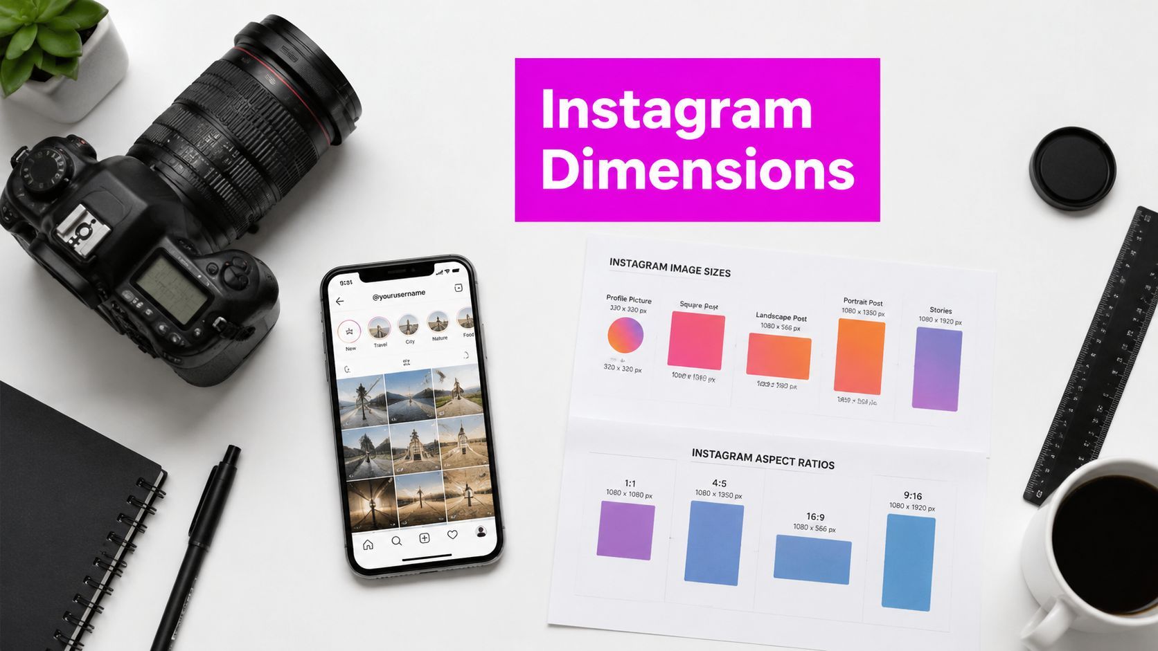
Instagram Image Dimensions: 2026 Pixel & Ratio Guide

Ryan Bennett • July 10, 2026
Ultimate 2026 guide to Instagram image dimensions. Get correct pixel sizes & aspect ratios for posts, Stories, Reels, and ads. Avoid cropping & compression.
You export a clean design, upload it to Instagram, and the result looks nothing like what you approved. The crop is off. The text sits too close to the edge. A product shot that looked sharp in Photoshop turns soft in the feed. If you manage content at any kind of volume, this gets expensive fast. Not in ad spend first, but in wasted production time.
Most Instagram image dimension guides make this worse because they freeze the platform in an older state. They repeat old portrait specs, skip actual compression rules, and act like getting close is good enough. It isn't. Instagram is picky about width, ratio, and vertical framing. If your workflow doesn't respect that, Instagram will make the decision for you.
Stop Letting Instagram Ruin Your Images
The most common failure isn't bad design. It's a mismatch between the asset you made and the frame Instagram displays.
A typical example looks like this. A team designs a vertical product graphic, exports it at the right width, uploads it, and assumes the job is done. Then Instagram crops the bottom edge, or the type appears cramped on the profile grid, or a near-correct ratio gets compressed just enough to make the whole thing feel cheap. The visual wasn't weak. The prep was.
That's why Instagram image dimensions matter more than often realized. They're not a formatting detail you can fix at the end. They shape how much of your post people see, how clean it looks after upload, and whether your composition survives feed view, grid view, Stories, and Reels.
Practical rule: If a post has text, logos, product labels, or faces, design for Instagram's actual display behavior first and your editing canvas second.
The key, often overlooked, change is simple. Portrait feed content no longer conforms to the idea that 4:5 is the only serious vertical option. Instagram's newer display behavior and grid preferences now make 3:4 the smarter default in many workflows.
That shift matters a lot if you publish at scale, especially with AI-generated visuals, product images, educational graphics, or coloring pages. One wrong default can subtly ruin an entire batch.
Instagram Dimensions 2026 Quick Reference Chart
If you need the working specs immediately, use this list and save it. These are the dimensions that keep most Instagram workflows clean and predictable.

For teams producing content in batches, a preset system matters more than memorization. Build templates around platform-native shapes, then resize your source assets before upload. If you need to standardize a whole content library, a bulk social media image generator is the cleanest way to avoid one-off manual resizing.
| Format | Recommended size | Aspect ratio | Best use |
|---|---|---|---|
| Square feed post | 1080 x 1080 px | 1:1 | General feed graphics, quotes, product tiles |
| Portrait feed post | 1080 x 1440 px | 3:4 | Taller feed visuals, grid-friendly compositions |
| Landscape feed post | 1080 x 566 px | 1.91:1 | Wide photos, banners, scenic visuals |
| Stories | 1080 x 1920 px | 9:16 | Full-screen vertical content |
| Reels | 1080 x 1920 px | 9:16 | Vertical video and cover design |
| Profile photo | 320 x 320 px | 1:1 | Logos, headshots, brand marks |
Two operating rules sit behind this chart:
- Match the ratio exactly. Near-correct files often trigger unnecessary adjustment.
- Design for the display context. A feed post, Story, and profile image don't crop the same way.
The New Vertical Standard Understanding 4:5 vs 3:4
Most Instagram guides are stuck on 1080 x 1350 px. That's the classic 4:5 portrait post, and for years it was the default recommendation. It still works. It still looks good. But it's no longer the full story.
Instagram has officially introduced support for 3:4 feed posts at 1080 x 1440 pixels, and that newer format is described as grid-friendly in current recommendations from Sked Social's Instagram sizing coverage, which also notes that it gives you 90 more pixels of height than 1080 x 1350 and that many third-party guides are still behind on the update by 12+ months (Sked Social's Instagram size recommendations).

Why 3:4 matters now
That extra height changes composition decisions. If you create educational graphics, product explainers, poster-style visuals, or character art, 3:4 gives you more usable vertical room without pushing into awkward overlong framing.
It also matches the way Instagram's newer grid presentation favors taller, cleaner crops. That means fewer surprises between what you upload and what shows up on your profile.
Here's the practical difference:
- 4:5 still works well when you already have a proven design system built around it.
- 3:4 is the better default when you're building a fresh workflow for current Instagram behavior.
- Mixed teams get into trouble when designers build in 4:5 but social managers expect 3:4 grid behavior.
When to still use 4:5
You don't need to throw out every 4:5 template. A lot of existing brand libraries, ad creatives, and carousel designs were built around 1080 x 1350 px. If those assets are performing well and the framing is stable, keep using them.
What you shouldn't do is assume 4:5 is still the only “correct” portrait answer. It isn't.
The real mistake isn't using 4:5. It's using 4:5 by default because an outdated blog post told you to.
If you're unsure whether a design concept should live in 4:5 or 3:4, use an aspect ratio calculator for Instagram layouts before your team generates a full batch. That saves a lot of avoidable rework later.
Detailed Feed Post Dimensions Square Landscape and Portrait
Instagram feed posts still run on one foundational rule. Width matters first.
Instagram standardized feed images around a 1080-pixel width in 2015, replacing the older 640-pixel standard, and that width has remained the core feed rule for square, horizontal, and portrait posts through current guidance. Buffer's size guide lists the standard dimensions as 1080 x 1080 for square, 1080 x 566 for horizontal, and 1080 x 1350 for portrait, while noting that the 4:5 portrait format can occupy up to 78% more vertical space than horizontal in the feed (Buffer's Instagram image size guide).
Square posts
1080 x 1080 px is still the safest feed format when you need consistency.
Square works best for:
- Centered product imagery
- Quote graphics
- Logo-led announcements
- Carousel covers that need symmetry
Square is forgiving. It's also less aggressive in the feed than taller portraits, so it won't command as much vertical attention. Use it when clean structure matters more than maximizing screen space.
Landscape posts
1080 x 566 px is the standard wide format. It's useful, but it's the weakest option if your goal is feed dominance.
Wider images are still well-suited for:
- Wide environmental photography
- Screenshots or dashboards
- Horizontal product scenes
- Before-and-after comparisons with wide framing
The trade-off is visibility. Wide posts feel smaller in the feed, and that makes text-based designs harder to pull off well.
Portrait posts
Portrait is where the majority of effort should be invested. If a post needs presence, portrait usually wins.
The practical options are:
| Portrait type | Size | Use case |
|---|---|---|
| Traditional portrait | 1080 x 1350 px | Legacy templates, classic feed graphics |
| Newer portrait default | 1080 x 1440 px | Taller editorial visuals, current grid-friendly posts |
Carousel reality
Carousels are less flexible than people think. The first asset often dictates how the rest of the post behaves visually. If your opening slide is square, Instagram may force the rest of the set into that visual logic. If the first frame is portrait, the set feels stronger in-feed, but the other slides need to be built carefully.
Working habit: Decide the carousel ratio before anyone designs slide two.
That single decision prevents awkward crops, uneven padding, and mixed-format sequences that look stitched together.
Stories and Reels Dimensions A Vertical-First World
Stories and Reels live in a completely different viewing environment from feed posts. They fill the screen, move quickly, and compete with interface elements at every edge. That changes how you should design them.
The standard working format is 1080 x 1920 px at a 9:16 ratio. That gives you a full-screen vertical canvas. But if you use all of that space for important content, Instagram's interface can still cover part of your message.

The safe zone matters more than the canvas size
Current sizing guidance notes that for Stories and Reels, the top and bottom 250 pixels are often obscured by interface elements. That means logos, subtitles, calls to action, and faces shouldn't sit flush against those areas.
Treat the visible center as your true design canvas.
A strong vertical asset usually follows this layout:
- Top area: Light branding only, never critical copy
- Middle zone: Main subject, headline, product, or instructional visual
- Bottom area: Leave breathing room so buttons and captions don't crash into your design
What usually goes wrong
The biggest Story and Reel mistakes are mechanical, not creative.
- Text too low: Captions and UI controls compete with your message.
- Faces too high: Username and top overlays crowd the composition.
- Feed-first design reused vertically: A square or horizontal asset stretched into a Story almost always looks improvised.
- Cover image ignored: Reels may look fine full-screen but weak on-grid if the framing wasn't planned.
If you want another practical perspective on portrait-first framing and why taller formats need deliberate composition, MerchLoom's Instagram sizing guide is worth reading.
Keep important content away from the edges. Instagram uses those edges for itself.
That single habit fixes a surprising amount of bad-looking vertical content.
Other Key Dimensions Profile Photos and Ad Specs
Feed posts get the attention, but profile images and ad placements subtly shape how professional the account feels.
Profile photos
Instagram profile images should be prepared at 320 x 320 px. Even though that starts as a square, Instagram displays it as a circle, so the corners are disposable space.
That changes how logos should be built for profile use.
A good profile image setup looks like this:
- Center the mark. Don't let icons or lettering drift toward the edge.
- Use padding. Tight logos often feel cropped once Instagram masks them into a circle.
- Test at small size. Fine detail that looks good in a design file can disappear on mobile.
For brand accounts, simplify aggressively. If your full lockup includes a wordmark and icon, the icon often survives profile display better.
Ads
Instagram ad specs vary by placement, and paid placements don't always behave exactly like organic posts. The safest operating principle is simple: design ad creative specifically for where it will appear instead of repurposing one asset everywhere.
In practice:
| Placement | Best creative shape | Practical note |
|---|---|---|
| Feed ads | Square or portrait | Keep the focal point central and mobile-friendly |
| Story ads | Vertical full-screen | Build for motion, overlays, and fast reading |
| Reel ads | Vertical full-screen | Treat the opening frame like a hook |
| Explore placements | Feed-friendly visuals | Strong thumbnail framing matters |
If you boost an existing post, you inherit that post's dimensions and its weaknesses. If the original asset was badly cropped or cramped, paid distribution won't fix it. It just spreads the problem wider.
For ads, build cleaner masters than you think you need. Paid placements expose every sloppy edge.
Technical Best Practices Beyond Pixel Size
A file can have the correct width and still fail on Instagram. That's the part many teams miss.
A common issue is aspect ratio precision. Buffer's help documentation states that Instagram accepts image ratios strictly between 0.8 (4:5) and 1.91 (1.91:1), and that images outside that range trigger automatic cropping or scaling, which can blur or distort the result (Buffer's accepted aspect ratio guidance).
Close enough isn't good enough
A lot of people assume a file that's “basically portrait” will pass cleanly. That's risky. Slight ratio drift can force Instagram to reinterpret the image, and that's when quality drops.
Examples of avoidable problems:
- Off-ratio exports: A file that lands slightly outside a standard format may get adjusted.
- AI batches with inconsistent height: One prompt style can generate a whole set of almost-matching images that all need correction.
- Manual cropping in-app: This often gives Instagram more control than you want it to have.
Non-negotiable habit: Export to the exact target ratio before upload. Don't rely on Instagram to finish the job.
File handling choices
Not every asset should be exported the same way. In everyday social workflows, the practical split is straightforward:
- Use JPG for photos, lifestyle imagery, and most feed visuals where gradients and realistic detail matter.
- Use PNG when sharp edges, flat graphics, interface mockups, or transparent-source artwork need to hold together better before final upload.
- Keep color consistent by working in sRGB if your design tool gives you profile control.
- Avoid repeated exports of the same file through multiple tools. Every unnecessary processing step risks softness.
If your team is building paid creative too, it helps to review ad-specific production workflows alongside image prep. For that side of the process, Social Loop AI has a useful walkthrough on how to create Instagram ads easily.
The bulk workflow problem
This gets worse when you produce content at scale. One incorrect preset can push dozens of images into soft compression, bad crops, or inconsistent framing. That's why AI image workflows need more discipline, not less. Speed only helps if the output dimensions are locked down.
The right workflow isn't complicated. Standardize the ratio first, generate second, then export once.
How to Bulk Resize Images for Instagram in Seconds
Manual resizing is fine when you're fixing one post. It breaks the moment you need to prep a campaign, a month of educational graphics, a product catalog, or a stack of AI-generated visuals for multiple placements.
That's where organizations frequently lose time. Not in design, but in repetitive cleanup.

What a fast resizing workflow should do
A practical Instagram resizing workflow needs to handle four things well:
- Apply exact aspect-ratio presets so square, portrait, and vertical assets stay platform-safe.
- Batch process image sets instead of forcing one-by-one editing.
- Preserve composition so faces, product labels, and text don't drift into crop zones.
- Keep outputs organized by destination so feed posts, Stories, and Reels don't get mixed.
Most traditional design tools can do this, but not without a lot of manual intervention. That's the problem. Social media teams don't need another editing canvas. They need a production system.
Where automation actually helps
AI image workflows create a new challenge. You can produce lots of assets quickly, but if those outputs aren't resized and framed correctly for Instagram, you just created more cleanup work.
The better approach is to resize in bulk with fixed output targets. If you need to process multiple images at once, an AI bulk image resizer is the kind of utility that removes the slowest part of the workflow.
Use cases where that matters most:
- Campaign variants across square feed, portrait feed, and Stories
- Product photography that needs the same framing logic across a whole catalog
- Educational carousels with cover slides and matching supporting panels
- Coloring pages and printable art previews that need vertical consistency
- Brand kits where logos, titles, and safe margins need to stay uniform
The teams that stay efficient aren't the ones designing faster by hand. They're the ones that stop doing preventable production work at all.
Frequently Asked Questions
Should I still use 4:5 for Instagram posts?
Yes, if your existing templates are built around it and the framing still works. But don't assume it's the best default for new portrait content. Current Instagram guidance has shifted toward 3:4 for many feed workflows.
Why does my image still look blurry even when the size is correct?
Usually one of three things happened:
- The aspect ratio wasn't exact
- The file was exported and re-exported too many times
- Important details were placed where Instagram's display behavior made them feel cramped or soft
What size should Reels and Stories be?
Use 1080 x 1920 px in a 9:16 format, and keep critical content away from the top and bottom interface areas.
How should I future-proof my asset library?
Build master templates by format, not by campaign. Keep separate masters for square, portrait feed, and full-screen vertical. That makes adaptation much easier when Instagram changes display preferences again.
What's the safest rule for Instagram image dimensions?
Use Instagram-native widths and exact ratios. Don't upload “close enough” files and hope the platform leaves them alone.
If your team is spending too much time fixing crops, rebuilding templates, or resizing assets by hand, Bulk Image Generation is the practical next step. It's built for high-volume image production, which makes it useful for marketers, agencies, ecommerce teams, and creators who need clean Instagram-ready visuals without the usual editing bottleneck.
