
album cover maker for music: create eye-catching art fast

Aarav Mehta • November 10, 2025
Learn how an album cover maker for music can help you craft stunning, click-worthy artwork fast with practical tips for musicians.
An album cover maker for music can feel like a secret weapon, turning the complex process of creating art into something any artist can tackle. With AI tools, you can generate professional-looking visuals in minutes, making sure your work pops on streaming platforms without needing a huge budget or years of design experience.
Why Your Album Cover Is Your Most Important Ad
Think about it: in a sea of new music, your album cover is the first handshake with a potential fan. It's so much more than a pretty picture; it's a critical marketing tool that has just a few seconds to grab someone's attention and tell them what your music is all about.
Before anyone even hits play, your artwork sets the entire mood. It hints at the genre, the vibe, and your artistic vision. A dark, moody cover promises a completely different journey than one bursting with bright, vibrant colors. This visual first impression helps listeners decide if your sound is for them, acting as a powerful filter when they're faced with endless options.
The Streaming Battleground
On platforms like Spotify, your cover is usually just a tiny thumbnail, fighting for eyeballs against dozens of others on the same screen. That small square of visual real estate is your most valuable asset.
Just look at this real-world example from a Spotify playlist.
See how the bold, simple designs with high contrast jump out? The cluttered or low-res images just fade into the background.
This is where AI-driven design tools are changing the game, giving independent artists access to the kind of professional artwork that used to be out of reach. In a world where millions of tracks are uploaded every day, a strong visual hook is absolutely essential. It’s been shown time and again that people are heavily influenced by an album's look when choosing what to listen to next.
Your album art isn't just packaging; it's the visual handshake you offer to every potential listener. Make it count.
To really nail the visual impact of your next release, it's crucial to invest in quality cover art that truly reflects who you are as an artist. It’s a small investment that can pay off big time in discoverability and building your brand.
Translating Your Sound Into a Visual Concept
Before you even think about firing up an album cover maker for music, the real work begins. It happens away from the keyboard, with just your tracks and your thoughts. You need a solid concept—it’s the bridge between what your music sounds like and what the artwork feels like.
This isn’t about being a design pro. It's about getting to the core of your own creative DNA.
Put your headphones on and listen to your tracks, but with a mission: pinpoint the core emotions. Is the vibe melancholic and atmospheric, or is it pure, aggressive energy? Start jotting down keywords that hit the mark.
A lo-fi hip-hop track might bring up words like "nostalgic," "rainy," and "cozy." A metal song? Probably more like "chaotic," "powerful," and "dark." These words are your creative blueprint.
Building Your Visual Mood Board
Okay, now let's turn those abstract feelings into something you can actually see. It's time to build a mood board. No need for fancy software—a folder on your desktop or a Pinterest board is perfect.
Start gathering inspiration that aligns with your keywords. Don't second-guess it. Just collect images, colors, and textures that feel right.
- For a chillwave EP: You might grab shots of hazy sunsets, vintage film photos, and soft pastel color palettes.
- For a high-energy punk record: Think gritty urban textures, messy hand-drawn fonts, and stark black-and-white photos.
This isn't just a creative exercise. You're building a clear visual guide that you can feed directly into an AI tool, making sure the results are intentional, not random.
This whole process taps into a bigger trend in cover art. The move to digital streaming has polarized design in a fascinating way. On one hand, you see super simple designs made to pop as tiny thumbnails. On the other, the range of styles has exploded.
There’s more room than ever to carve out a unique visual niche for your sound. You can explore how to translate these ideas into stunning visuals with a modern AI art generator.
Making the AI Work for Your Music
This is where the magic happens—where your ideas finally meet the machine. Using an AI album cover generator isn't about being a Photoshop whiz; it's about being a great communicator. Think of yourself as an art director guiding a very literal, incredibly fast artist. The quality of what you get out is a direct reflection of what you put in.
Vague directions like "a cool album cover" will spit back something generic and forgettable. You have to be precise. Instead, try something like, "A lonely astronaut floating in a nebula of purple and gold, vintage sci-fi comic book style, grainy texture." The difference is night and day.
How to Write a Killer Prompt
Getting good at writing prompts is the most critical skill in this whole process. It’s what separates the amateur stuff from the truly stunning artwork.
Start by describing your main subject, then layer in details about the artistic style, the overall mood, the lighting, and even the camera angle. Don't be afraid to get a little poetic.
Here’s a simple formula I follow:
- Subject: What's the star of the show? Is it "a solitary wolf howling at a fractured moon" or "a futuristic cityscape dissolving into rain"? Be specific.
- Style: What's the artistic vibe? Are you going for an "impressionist oil painting," "1980s airbrush art," or a clean "flat vector illustration"? Name the style.
- Mood & Lighting: How should the cover feel? Describe it with phrases like "melancholy, soft morning light" or "chaotic and aggressive, lit by a harsh neon glow."
- Composition: How is the scene framed? Is it a "dramatic close-up portrait" or a "sweeping wide-angle landscape"?
If you're hitting a creative wall and can't find the right words, specialized tools can be a lifesaver. You can get some great ideas and build much stronger prompts using a free AI image prompt generator built for this exact task.
To really nail the artwork, you need to match your prompt's language to the genre's aesthetic. A folk album needs a different visual language than a synthwave track. Here’s a quick cheat sheet to get you started.
| AI Prompt Strategies for Different Music Genres |
| :--- | :--- | :--- |
| Music Genre | Core Elements & Keywords | Example AI Prompt |
| Indie Folk / Singer-Songwriter | Natural, earthy, vintage, film grain, muted colors, solitary figures, landscapes. | A lone figure with a guitar walking on a dusty road at sunset, 35mm film photo, warm golden hour light, muted colors, nostalgic and melancholic. |
| Synthwave / Electronic | Neon grids, retro-futurism, 80s aesthetic, chrome, reflections, cityscapes at night. | A chrome sports car driving down a neon-lit highway at night, city in the background, 1980s retro synthwave style, vibrant pink and blue glow. |
| Heavy Metal / Hard Rock | Dark, mythical, aggressive, high-contrast, fire, skulls, epic fantasy, detailed illustration. | A hyper-detailed digital painting of a skeletal warrior in ornate black armor, wielding a flaming sword, dark and chaotic battlefield background, dramatic lighting. |
| Lo-Fi / Chillhop | Cozy, rainy, anime-inspired, soft pastels, window views, simple illustrations, nostalgic. | A cozy room with a cat sleeping on a windowsill, rain streaming down the glass, lo-fi anime aesthetic, soft pastel color palette, warm and peaceful mood. |
| Hip-Hop / Rap | Urban, gritty, bold typography, high-fashion, gold chains, confident poses, street art. | A low-angle shot of a man in streetwear standing in front of a graffiti-covered wall, high-contrast black and white photography, confident and powerful stance. |
This table just scratches the surface, but it shows how a few specific keywords can completely transform the AI's output to fit the music's vibe.
Refining and Finalizing Your Cover
Your first attempt is almost never the final one. Iteration is key. If an image is 90% there but has a weird detail—like an extra finger or a random object in the background—it's time to use negative prompts.
By adding simple commands like --no text or --no people, you’re telling the AI exactly what not to include. It’s a powerful way to clean up your generations.
A great AI-generated cover is rarely a single-click creation. It's built through layers of prompting, refining, and combining the best elements from multiple attempts.
Once you’ve got a background or a core image you love, it’s time to add your text. Don't just slap your name and title on top. Open the image in a simple editor (Canva works great for this) and really integrate the text. Play with different fonts, placements, and subtle effects like a soft glow or a drop shadow to make it feel like a cohesive part of the artwork, not an afterthought.
Getting Your Technical Specs Right for Streaming
You’ve poured your heart into the music and agonized over the perfect artwork. The absolute last thing you want is a rejection email from your distributor because of a simple technical error. Nailing the specs isn't just a friendly suggestion; it’s a hard requirement for getting your music live on Spotify, Apple Music, and everywhere else.
Think of these specs as the universal language that every single streaming service understands. Get them wrong, and your message gets lost.
The undisputed gold standard for digital distribution is a perfectly square image. This guarantees your art looks right everywhere, from a tiny icon on a phone to a full-screen display on a desktop app. If you get this wrong, you risk ugly stretching or awkward cropping that kills your visual impact. You can always double-check your dimensions with a simple aspect ratio calculator to make sure it’s a perfect 1:1.
This visual guide shows the streamlined process from idea to final artwork using an AI album cover maker for music.
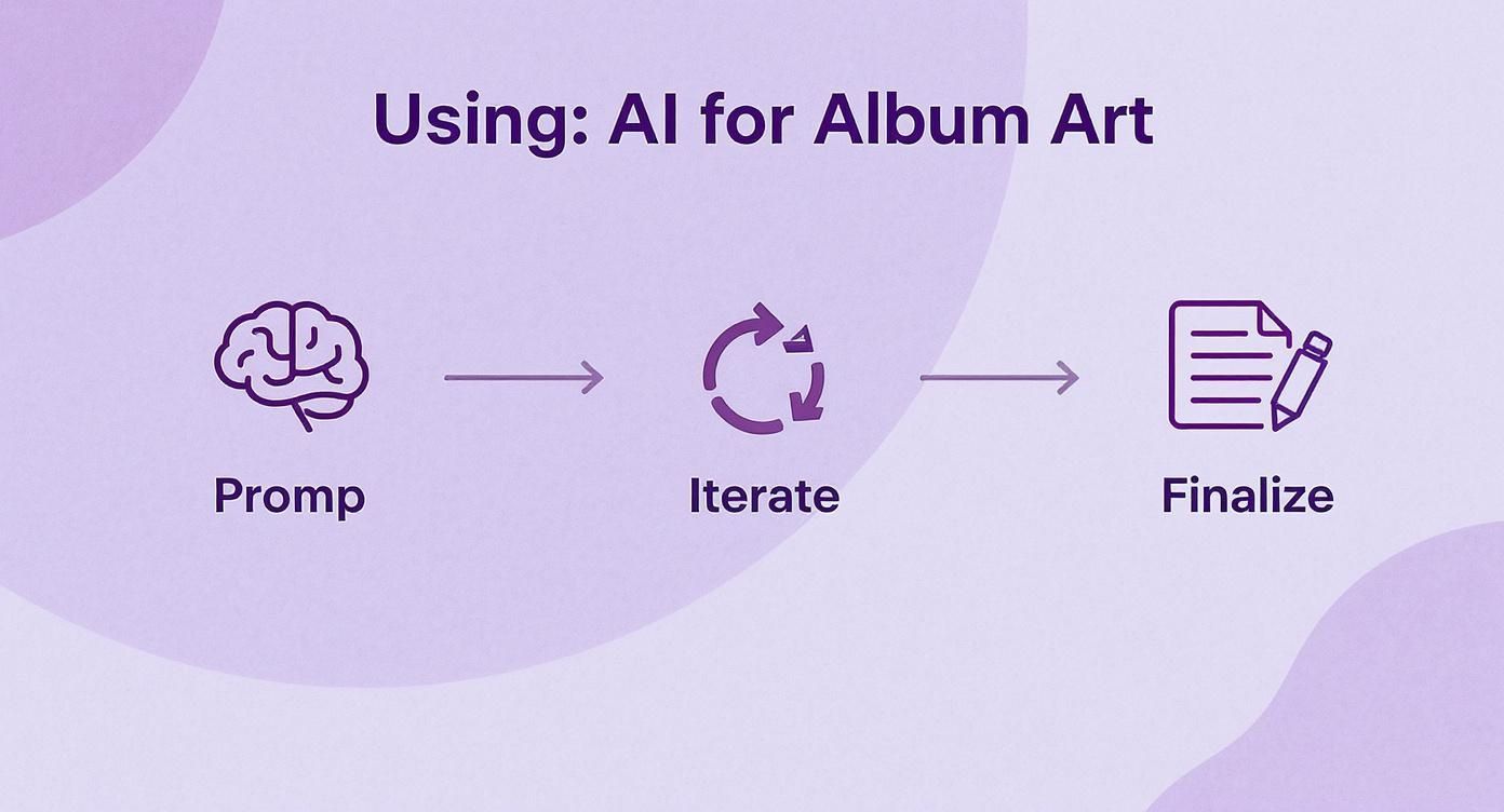
The flow from a solid prompt to iterating and finalizing the design shows just how each step builds on the last to create a polished, professional cover.
Essential File Requirements
Beyond the square shape, the file's nitty-gritty details are just as critical. These are the non-negotiables that will save you from upload errors and make sure your art looks crisp, not like a blurry, pixelated mess.
Here are the specs that really matter:
- Resolution: Go for a minimum of 3000 × 3000 pixels at 300 dpi. This keeps it sharp on every screen and even leaves the door open for physical prints down the line.
- Color Mode: Always, always use RGB. It’s made for screens. CMYK is for printing and can cause bizarre color shifts when you upload it.
- File Format: Stick to the basics. JPEG or PNG will give you the best mix of compatibility and quality.
Remember: A distributor's uploader is a machine looking for specific data. It doesn't care about your artistic vision, only whether the file checks all the right boxes.
Finally, just as your cover needs to look right, your audio needs to sound right. Understanding concepts like Pro Audio Mastering Levels is crucial for a release that sounds as professional as it looks.
And a final word of warning: keep your artwork clean. No URLs, no social media handles, and definitely no brand logos. That's a fast track to an immediate rejection from any distributor.
Pro Tips to Make Your Album Cover Memorable
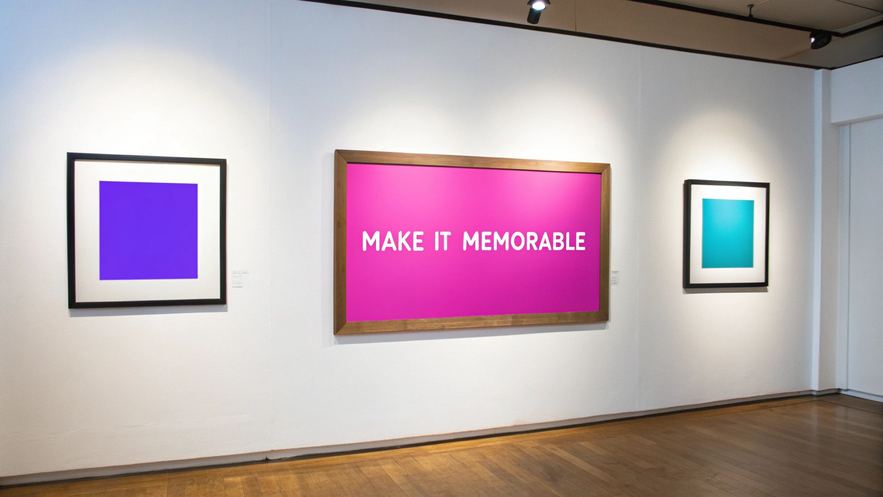
Alright, you've got a solid design. Now what? Let’s talk about the little things that give your artwork a real competitive edge. These are the strategies that help independent artists get noticed in a sea of new releases, turning a good cover into one people actually remember. It’s about thinking bigger than just one single.
Think about your favorite artists for a second. Chances are, you can spot their work just from the color scheme or the font they use. That’s brand recognition, and it comes from building a consistent visual identity. Use your album cover maker for music to lock in a style that feels like you across all your singles and EPs.
This doesn't mean every cover needs to be a carbon copy. It just means they should all feel like they're part of the same artistic family, creating a visual thread your fans can instantly recognize and connect with.
Bring Your Artwork to Life
In the streaming era, your cover art doesn't have to just sit there. A little bit of animation can make your release pop on platforms that support it, like Spotify Canvas. It’s surprisingly effective.
- Keep It Subtle: You don't need a full-blown music video. A gentle drift in the background, a soft glow appearing on the text, or a simple looping texture is often more powerful and less distracting.
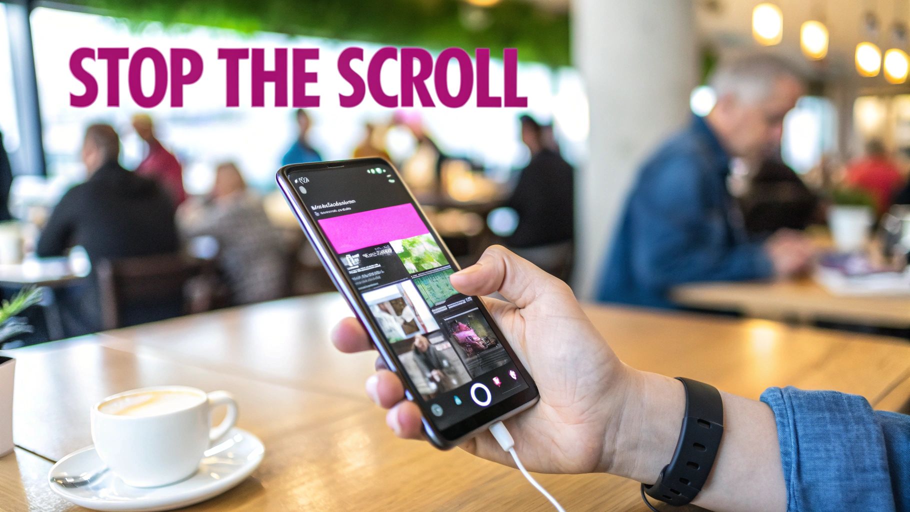
- Perfect for Social: Animated covers are pure gold for social media promotion. They’re way more likely to stop someone's endless scrolling than a static image.
This one simple step elevates your art from a placeholder image to an engaging piece of content. It’s an easy win that makes your entire project feel more polished and professional.
Before you finalize anything, do the thumbnail test. I can't stress this enough. Shrink your cover down to the size of a postage stamp on your screen. Does it still work? Is the main idea still clear?
Remember, most people will first see your art as a tiny square in a playlist or on their phone. If it turns into a muddy, unreadable blur when it's small, it's failed the most critical test. Your design absolutely has to be bold and clear enough to grab attention at any size.
Common Questions About Album Cover Makers
When you're first dipping your toes into using an album cover maker for music, a few questions always seem to surface. Getting good answers upfront can save you a ton of grief and let you get back to the creative part with confidence.
Let's break down the big ones I see artists wrestle with all the time.
Can I Legally Use AI-Generated Images?
This is the big one, and for good reason. The short answer is: it completely depends on the tool you're using. Many AI platforms give you full commercial rights to whatever you create, which means you’re clear to use it for your album release without any legal headaches.
But—and this is a big but—you absolutely must check their terms of service before you publish anything. The legal world is still catching up to AI art. To keep yourself and your music safe, stick with generators that explicitly say their images are commercially licensed for exactly this kind of project.
What Are the Biggest Design Mistakes to Avoid?
Most of the classic screw-ups are technical. I constantly see artists use a low-resolution image that looks great on their phone, only to find it's a pixelated mess on a bigger screen. Another common mistake is cramming way too much detail into the design. It might look cool full-size, but it turns into an unreadable smudge when it's shrunk down to a thumbnail.
And don't forget about the specs! Failing to check the technical requirements from your distributor—whether it's Spotify, Apple Music, or someone else—is a huge rookie error. This is how you get your release rejected and stuck in a frustrating cycle of delays.
The goal is clarity at a glance. If a potential fan has to squint to figure out what they're looking at, you've already lost them.
A more subtle mistake? Choosing a font that has absolutely nothing to do with the vibe of your music. Your typography should feel like a part of the sound, not just some random text slapped on top.
Do I Really Need Text on My Cover?
Look, a few global superstars can drop a cover with zero text and everyone instantly knows whose it is. For the other 99.9% of us, it's a really risky move. Your artist name and the title of the album or single are your calling cards. They're essential for discovery and for people to start recognizing your brand.
For any artist on the rise, clear, readable text is non-negotiable. It’s what makes your music identifiable at a glance. The trick is to make the text feel like it belongs there—fully integrated into the art, not just sitting on top of it.
How Do I Make My Cover Look Good on Spotify?
The litmus test is simple: shrink it down. Way down. Before you even think about finalizing a design, shrink it on your screen until it’s about the size of a postage stamp.
Then, ask yourself a few honest questions:
- Can I still tell what the main image is?
- Is the text still legible, or has it blurred into a blob?
- Does it still pack an emotional punch, even when it’s tiny?
This tiny version is how most listeners will see your art for the first time. It has to work. To avoid any nasty compression issues, always start with and upload a high-quality, perfectly square image—aim for at least 3000x3000 pixels.
Ready to create stunning, professional-quality album art in minutes? Bulk Image Generation lets you generate hundreds of unique concepts with simple text prompts, so you can find the perfect visual for your sound without any design experience. Start creating for free today at https://bulkimagegeneration.com.