1280x960 Aspect Ratio: Cropping and Export Guide

Ryan Bennett • October 16, 2026
Learn how the 1280x960 aspect ratio affects your images, with practical cropping and export tips for crisp, well-framed results.
1280x960 is an exact 4:3 image canvas containing 1,228,800 pixels, so any non-4:3 target requires cropping, padding, or distortion. The right choice depends on whether the whole composition must remain visible, whether the destination needs a different shape, and whether you're preserving sharp pixel geometry.
You may have met this problem while preparing a slide deck, worksheet, game asset, or product graphic. The original image looks balanced in its native frame, then appears stretched, clipped, or surrounded by empty space after you place it in a modern widescreen layout. The file may be fine. The transformation is usually the issue.
A reliable workflow starts with the 1280x960 aspect ratio, not with a resizing button. Identify the geometry, decide what must remain visible, and only then choose between proportional resizing, cropping, padding, or a larger 4:3 master.
Why 1280x960 Keeps Showing Up in Your Workflow
A designer drops a 1280x960 image onto a widescreen presentation slide. The subject looks too wide after the software fills the frame, so the designer tries a different export and gets clipped text instead. This familiar chain of fixes treats a canvas decision as if it were a file-quality problem.
The source is a precise grid measuring 1280 pixels across and 960 pixels high, with 1,228,800 total pixels. The format is commonly associated with Quad VGA and the 4:3 family of computer-display formats, rather than with modern widescreen canvases. Its proportions still appear in legacy training hardware, classroom materials, projector-oriented slide decks, older digital cameras, embedded equipment, and retro applications.
The people who still request it
A teacher preparing an instructional worksheet may need the entire diagram, labels, and margins visible. A game developer working with a legacy asset may need the original geometry preserved rather than converted to a wider frame. A marketer may receive a brief that says “4:3” without giving pixel dimensions, then discover that the production team expects an exact 1280x960 export.
That's why the number keeps resurfacing. It represents a usable working canvas for compositions that need more vertical room than a widescreen frame with the same width. Product-plus-text layouts, educational graphics, portraits, and document-heavy designs can feel less cramped inside 4:3.
Practical rule: Treat 1280x960 as a geometry requirement first and a pixel-size requirement second.
The distinction also helps when a brief uses loose language such as “SXGA family” or “SVGA-style display.” Don't assume that a shared width means a shared shape. Ask for both dimensions, then verify the ratio before generating a batch. That small check prevents a large set of assets from inheriting the wrong crop or scale.
The 4 - 3 Math Behind 1280x960
Aspect ratio is the fixed relationship between width and height, and for 1280x960 that relationship is exact. A quick check shows why it lands in the 4:3 family.
For 1280x960, divide the width by the height:
1280 ÷ 960 = 1.3333
That value is equivalent to 4 ÷ 3, so the canvas is an exact 4:3 aspect ratio. Multiplying the two dimensions gives 1,228,800 pixels, as documented in the 4:3 aspect ratio reference.
A useful test is simple. Change the height to 1024 while keeping the width at 1280, and the ratio becomes 5:4 instead of 4:3. That is the mistake that causes a circle to turn into an oval, or a label to feel squeezed.
Why 1280x1024 is not interchangeable
A common specification mistake pairs 1280x960 with 1280x1024 as if they were two versions of the same format. They aren't. 1280x1024 uses a 5:4 ratio, while 1280x960 uses 4:3. The shared width can hide the difference until a circle becomes an oval or text appears unnaturally compressed.
Use an aspect ratio calculator for image production when a vendor gives you dimensions without naming the ratio. Check the canvas before you generate, downscale, pad, or crop a batch, because the ratio determines whether the output will fit the frame cleanly.
This matters beyond screens. If you are exploring visual ideas where proportion affects the design, AI-generated ratio tattoo concepts can also show how a shape changes when its frame changes. The same principle applies to logos, faces, diagrams, and product silhouettes.
How 1280x960 Behaves on Modern 16 - 9 Displays
A 4:3 image placed inside a 16:9 display has three honest outcomes: preserve the shape with empty space, fill the frame by cropping, or fill the frame by stretching. The software may make one option look automatic, but it hasn't removed the trade-off.
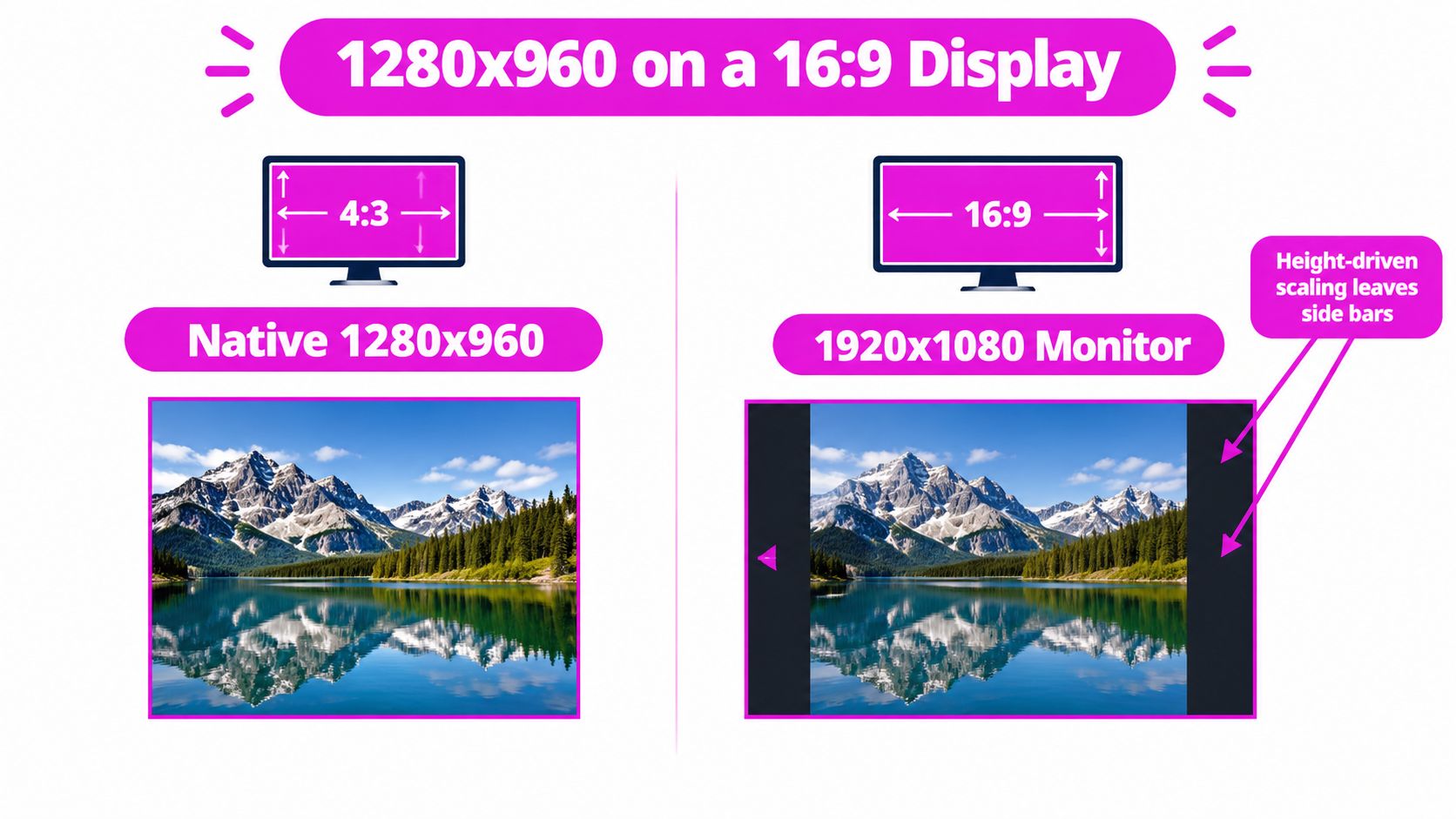
On a 1920x1080 16:9 canvas, height-driven scaling enlarges the 1280x960 image to 1440x1080. That leaves approximately 240 pixels of side bars on each side, because the image reaches the full display height while keeping its original geometry, as explained in the aspect-ratio scaling documentation.
Three display behaviors
On a native 4:3 monitor, the image fits its intended frame. On a 16:9 monitor using letterboxing or pillarboxing, the image remains proportional and the unused regions become visible around it. On a widescreen monitor using stretched scaling, the image fills more of the viewport but circles, faces, logos, and letterforms change shape.
Width-driven scaling creates the opposite problem. Expanding the image until it reaches the full 1920-pixel width produces a height greater than the available viewport, so the display must crop the top and bottom. That can work when the subject sits safely inside the center, but it can remove headings, borders, or important details.
For pixel-art and retro-game assets, integer scaling is often preferable because each source pixel receives an even treatment. A 1280x960 image can scale cleanly by 2× to 2560x1920, but it can't become 1920x1080 without resampling and a ratio conversion. For broader background on widescreen geometry, see this guide to the 16:9 aspect ratio.
Resizing Without Distortion
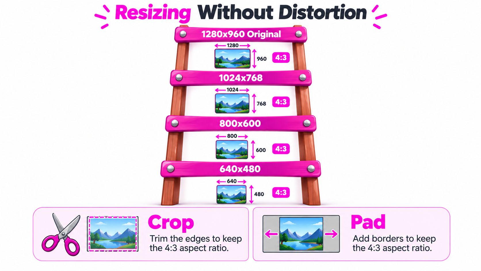
A proportional resize changes both dimensions by the same factor, so the image keeps its original shape. If you start with 1280x960, a smaller proportional version such as 1024x768 still preserves the same 4:3 geometry.
The safe 4:3 ladder includes:
- 1024x768: A smaller 4:3 canvas that preserves the original geometry.
- 800x600: A compact 4:3 output for compatible displays and lightweight assets.
- 640x480: A further reduction that still keeps the same relationship between width and height.
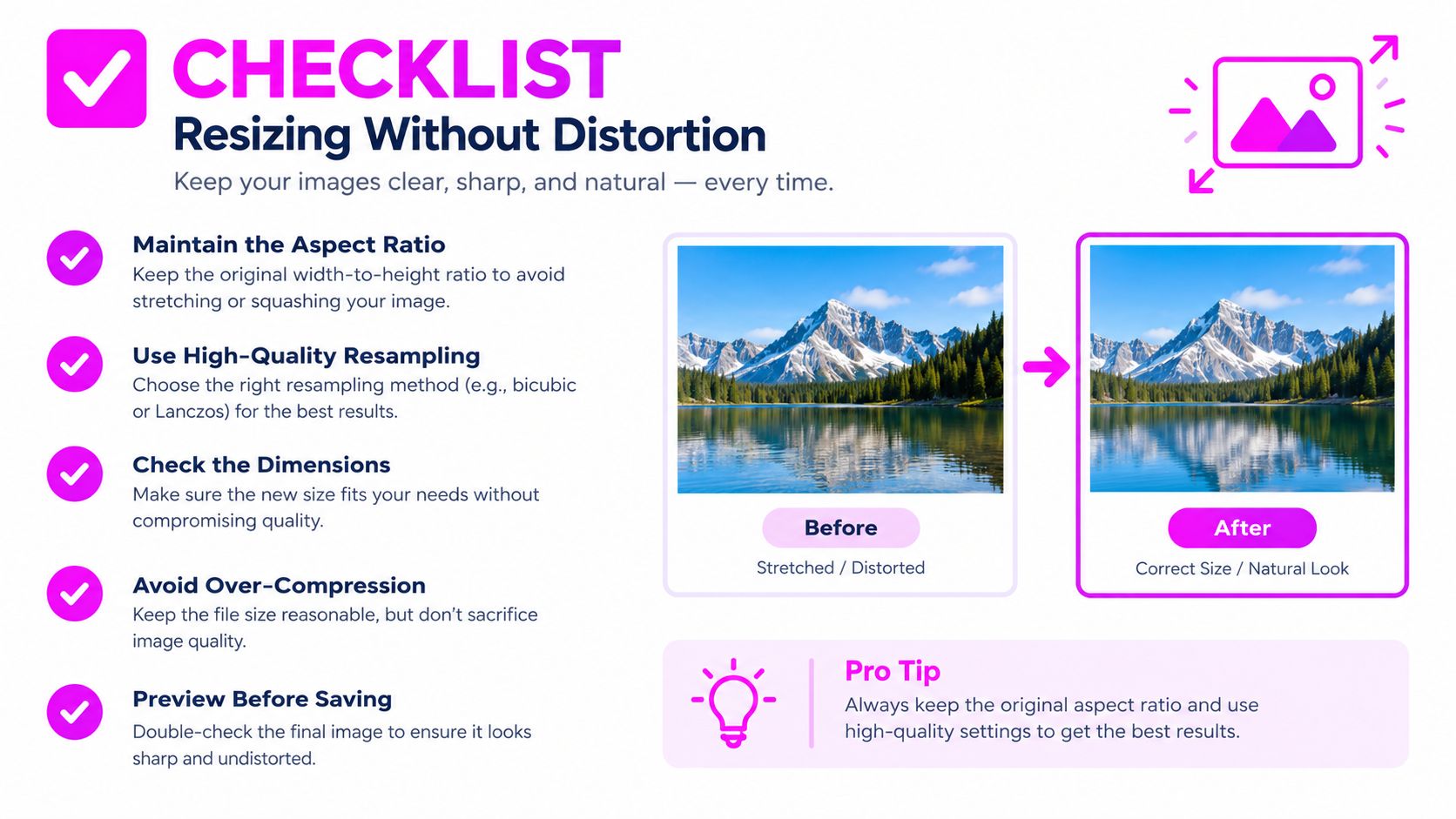
These sizes stay proportional because width and height are reduced together. The image resizing guidance for 1280x960 recommends keeping the aspect ratio intact whenever the original proportions need to survive the resize.
Choose padding when everything must stay visible
Padding adds space around the artwork instead of altering the artwork itself. Use it for worksheets, diagrams, logos, instruction cards, and product layouts where cutting away an edge would weaken the message.
A padded image may leave unused space, but that is better than missing text or a warped shape. Match the added area to the destination background, choose a neutral fill, or extend a texture when the design supports it.
Choose cropping when the destination controls the frame
Cropping removes part of the source to fit a new ratio. It works best when the destination has a fixed shape and the composition can handle losing peripheral content. A centered product graphic may tolerate a crop, while a worksheet with instructions near the edge may not.
Keep important subjects away from the crop boundary during generation. If the image will feed several destinations, leave safe margins around faces, titles, logos, and product details. Leave at least 10% of canvas width as safe margin on every side if the asset will feed multiple destinations.
Choosing Between Crop, Pad, and Integer Scale
The right transformation depends on what the image is allowed to lose. A tight promotional composition may sacrifice background space, while a technical diagram may not be allowed to lose anything.
| Method | Best For | Success Cue |
|---|---|---|
| Crop | Social compositions and centered subjects | The key subject and text remain inside the new frame |
| Pad | Worksheets, diagrams, logos, and product cards | The complete artwork stays visible without deformation |
| Stretch | Limited legacy compatibility where distortion is acceptable | The destination explicitly permits altered proportions |
| Integer scale | Pixel art and retro assets | Edges remain crisp and source pixels receive even scaling |
Use crop with a prepared composition
Cropping works best when you plan for it before generation. Keep the focal subject central, avoid placing essential text near the edges, and create a version with enough surrounding space to support alternate frames. For physical production layouts, related gang sheet layout tips can help you think about spacing and placement as part of the original composition.
Use pad when fidelity matters more than fill
Padding preserves the whole image and makes the geometry honest. It's usually the safest choice for educational materials, brand marks, diagrams, and product instruction cards.
Stretching belongs at the bottom of the list. It fills a frame quickly, but it changes the artwork itself. If the output must support several destinations, review this guide to changing an image aspect ratio before choosing a destructive transformation.
Real-World Bulk Image Generation Workflows
A real batch often starts with one awkward request: the educator wants a full worksheet image, the marketing team needs social crops, and sales wants slide-ready visuals from the same artwork. That is why 1280x960 works less like a definition and more like a routing choice. You are deciding which file becomes the master, which version gets exported small, and which outputs need padding or cropping later.
A good rule is simple. If the batch may branch into several destinations, create one larger 4:3 master first. It works like cutting patterns from a larger sheet of material. You keep room for safer text placement, cleaner downscaling, and alternate crops without rebuilding the image. If the destination is already fixed and the smaller canvas is the whole point, generate directly at 1280x960. Otherwise, generate a larger 4:3 source and downscale.

A repeatable batch sequence
- Generate the 4:3 master: Place the subject, heading area, and important details inside a safe middle zone so later crops do not clip them.
- Export the exact worksheet version: If a worksheet or product card needs the precise canvas, save a 1280x960 version. PNG is useful for clean text, line art, and transparency.
- Build social variants separately: Crop on purpose for square or vertical placements. Do not stretch the original just to fill a frame.
- Prepare presentation outputs: Match the slide template by padding or cropping, then review the result at the size people will see.
- Archive the master: Keep the larger 4:3 file as the source of truth so future exports do not start from a compressed derivative.
One sample check can save a full rerun.
For motion campaigns, the LunaBloom AI video generator can extend a still concept into video, but the same decision rule stays in place. Preserve the frame when the whole composition matters. Crop when the motion layout has a fixed window. Pad when nothing important can be lost.
Bulk Image Generation fits this kind of pipeline by producing images from natural-language prompts, then supporting resizing and enhancement for downstream versions. The steady habit is to set the ratio before the batch begins and review one sample from each export path before scaling up.
When 1280x960 Is Still the Right Canvas
A good way to judge 1280x960 is to treat it like a working tray, not a final promise. In a batch workflow, this canvas still makes sense when the job itself is fixed to 4:3 and the layout needs to stay predictable from file to file. That is common with worksheets, document-led graphics, retro-style assets, embedded-screen visuals, projector slides, and coloring-page batches where the full subject needs to remain intact.
Its other strength is control. 1280x960 is compact enough to review quickly, export consistently, and hand off without creating oversized files for simple digital uses. The tradeoff shows up at print time. The canvas contains approximately 1.23 megapixels, and at 200 pixels per inch it works out to about a 6-by-4-inch print. If a piece may be printed larger or needs extra detail later, start from a bigger 4:3 master and export 1280x960 as one version, not the source of truth.
That turns the format into a decision point.
Use 1280x960 directly when the destination already expects that exact size or when a lighter file helps your production run. Use a larger 4:3 source when you want room for cleaner type, safer margins, or future variants. Then apply the rule you already set earlier for shape changes. Crop for fixed alternate frames, pad when nothing can be lost, and avoid stretching unless a legacy system accepts altered geometry.
Bulk Image Generation supports this workflow by creating 4:3 batches, resizing derivatives, and keeping the master-to-export process consistent across repeated runs.