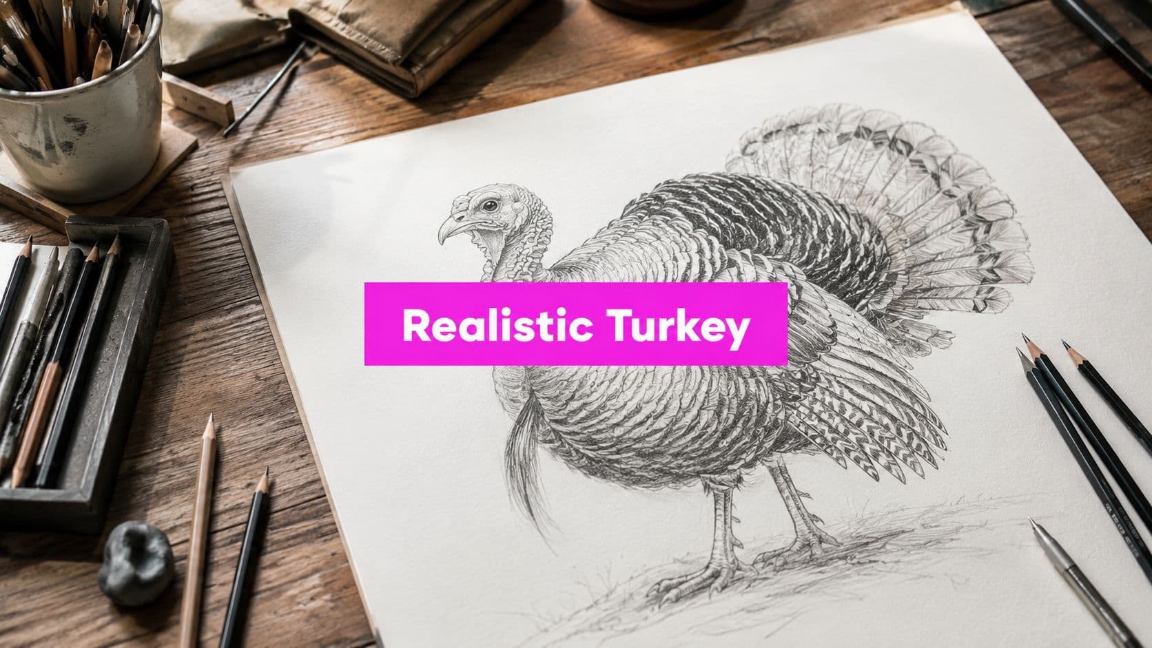
Turkey Drawing Realistic: A Step-by-Step Guide for Artists

Aarav Mehta • July 24, 2026
Learn turkey drawing realistic with this step-by-step guide. Master proportions, feather shading, and anatomy for a lifelike turkey illustration in any style.
You've got a turkey on the page, but it still looks like a sticker, not a bird. The body feels too round, the head floats, and the tail fans out like decoration instead of plumage with weight. That frustration usually isn't about talent, it's about structure, because a turkey drawing realistic enough to feel alive starts with anatomy, not with extra feathers.
The good news is that realistic turkey drawing is repeatable. Once you learn the body-to-head relationship, how the neck connects, and where feather detail belongs, the whole sketch starts behaving like a living animal instead of a cute Thanksgiving icon. A simple construction system, paired with reference photos, gives you a clear way to check whether your drawing is convincing before you waste time polishing the wrong shapes.
Why Most Turkey Drawings Look Cute Instead of Realistic
The most common mistake in turkey drawing is starting with the head instead of the torso. A small head and a quick beak feel easy to place, so many beginners build the bird from the top down and hope the rest will fall into place. That usually produces a turkey that reads as a mascot, because the body never gets enough visual weight to hold the pose.
You can see the problem right away in the silhouette. If the torso is too neat, the neck too stiff, or the tail treated like decoration, the bird stops feeling grounded. A realistic turkey needs a body that carries mass, legs that support that mass, and a head that sits in relation to the torso rather than floating above it.
Realism starts before the feathers
Feathers are the last layer, not the first decision. A turkey looks like a turkey because of its rounded torso, long neck, layered tail, and the way its body weight settles into the legs. One art guide points artists toward a simple proportional framework, with a large oval body, a smaller oval head, wings at roughly 50% of the body length, and a tail around 25% of the body length. That same guide also recommends using reference photos so body shape, feather patterns, and light behavior stay faithful to the bird (art reference basics for animal drawing).
Practical rule: if your turkey still feels cute after you hide the beak, the proportion is usually doing the wrong job.
This is why adding detail too early can make the drawing worse. Extra feather lines do not fix a weak structure, they only make the mismatch easier to see. Start with the body first, then let the feathering follow the anatomy, like shingles laid over a roof that already has the right slope.
A realistic turkey drawing is less about decoration and more about restraint. The bird should already read correctly in its broad shapes before you refine the edge of a wing or the fan of the tail. If you want a smaller, stylized comparison while you practice structure, you can study simplified character design in this chibi art generator, then notice how far a realistic turkey needs to move away from that kind of exaggeration.
The Proportional Framework That Anchors a Realistic Turkey
Start with a tiny measurement key in the corner of your page. It doesn't need to be fancy, just enough to remind you what belongs where before you get lost in details. A realistic turkey drawing becomes much easier when you treat the body like a measured form, not a symbol.
A reliable starting point is a large oval for the body and a smaller oval for the head. Connect them with a neck that feels long and flexible, because turkey anatomy relies on that upward curve and not on a stiff little tube. Several drawing guides also push the same idea, a substantial body shape, a smaller head, and a connected neck before any refinements begin (DrawingForAll turkey guide).
Use proportions as checks, not as cages
The useful part of proportions is that they keep you honest. If the head begins to equal the body, the bird starts drifting toward caricature. If the tail is too small, the silhouette loses one of the turkey's strongest identifying features. The reference-photo approach matters here too, because one guide specifically recommends matching body shape, feather pattern, and light-and-shadow behavior against real birds rather than guessing from memory (cybe.eu turkey drawing guide).
Here's a clean way to keep your proportions under control:
| Body Part | Proportion of Body Length | Visual Cue |
|---|---|---|
| Wings | about half the body length | Hug the torso, don't stick out like side paddles |
| Tail | about a quarter of the body length | Occupies a major part of the silhouette |
| Head | smaller than the body oval | Sits above the torso on a connected neck |
The point isn't mathematical precision for its own sake. It's visual stability. A turkey with balanced masses feels like it has weight on the page, and that sense of groundedness is what makes the drawing believable.
Building the Construction Sketch From the Inside Out

Lay in the body first with a light egg shape or soft oval, then place the smaller head oval above it so the neck can arc naturally between the two. A beginner-friendly tutorial shows that even a recognizable turkey can be blocked in quickly with simple geometry, including circles, oval tail shapes, leg lines, and a beak, before realism gets added through refinement and texture (Storydeskly turkey tutorial). That same stepwise logic still works when you want the bird to look more serious.
The spine line helps more than people expect. It gives you a center of gravity, which keeps the bird from feeling like it's sliding sideways. From there, place the tail as a fan behind the body, using three tall oval guides if that helps you think in layers rather than in a single flat wedge.
Build the form before you chase details
The wings should sit close to the torso, more like flattened forms hugging the body than decorative flaps. The legs can be mirrored lines with simple foot geometry, because symmetry matters when you want the turkey to look stable instead of wobbly. A basic triangular beak belongs slightly above the vertical center of the head, not dropped too low where it makes the face feel off-balance.
Keep the first lines so light that you can almost ignore them later.
That advice matters because construction lines are temporary. If they're too dark, the refinement stage becomes a fight against your own scaffolding. A clean sketch gives you room to adjust the head angle, widen the torso, or shift the tail before you commit to the final contour.
A good habit is to step back after each mass goes in. Ask whether the head still feels small enough, whether the body looks broad enough for a real bird, and whether the tail is helping the silhouette instead of flattening it. That pause saves more drawings than any trick pencil ever will.
Feather Anatomy and Where Detail Actually Belongs
A turkey's plumage is a map of distinct zones, the broad fan of the tail, the dense overlapping contour feathers of the breast and body, the lifted shoulder feathers, and the bare wrinkled skin of the head and neck. Each area behaves differently, so the drawing needs to show that difference instead of treating the bird like it wears one continuous coat. When beginners repeat the same stroke everywhere, the turkey loses its weight and starts to read like a patterned shape.
The sharpest detail belongs where the viewer naturally looks first. The eye, the beak, and a few outer tail feathers need the crispest edges and the strongest contrast. The rest can stay softer, especially across the body, where the feathers overlap like shingles and support the larger silhouette. That contrast gives the bird a face and a form at the same time.
Think in layers, not in individual feathers
A simple way to handle feather realism is to group the plumage before you render it. The tail fan reads well when a few long outer feathers set the arc, then the inner feathers fill the space with less emphasis. The shoulder area and body work best as overlapping contours with directional strokes, not as dozens of fully drawn quills. If you want a broader workflow reference, use this guide for creating digital art alongside a guide to structuring texture and edge control for digital art, because both points support the same habit, place texture only where the form needs it.
Strong feather realism comes from deciding what to leave soft.
That choice keeps the turkey from looking overworked. If every feather gets the same treatment, the eye has nowhere to rest. If the eye, beak, and a few tail feathers stay crisp while the rest settles into mid-tones, the drawing gains depth almost on its own.
Light direction matters here too. A highlight on one edge of a feather tells the viewer which way the form turns. Shadow under the layers shows how the feathers sit on top of one another. That kind of edge hierarchy does more for realism than a dense field of identical lines.
Shading and Coloring Techniques for Traditional and Digital Media
Traditional pencil work gives you immediate control over texture. Hatching and cross-hatching let you describe feather direction without flooding the drawing with graphite, and they're especially good when you want the turkey to feel handmade rather than polished in a glossy digital way. The trick is to keep the marks following the bird's form, not the shape of your wrist.
Digital tools, on the other hand, make correction easier. In Procreate, Photoshop, or Krita, you can vary brush hardness, stack layers, and adjust value without erasing the whole drawing. That makes digital especially useful if you're testing several lighting ideas or building a series of seasonal illustrations.
Pick the medium that matches the job
If you're making one finished hero piece, traditional pencil plus colored pencil can give the turkey a rich, tactile surface. If you're producing several versions for a campaign or classroom set, digital brushes save time because they let you standardize your feather texture and revise the contrast quickly. The challenge in both cases is the same, build the values intentionally before you chase color.
Start with the darkest darks first. Then place the mid-tones around them so the turkey doesn't end up chalky or flat. Earthy browns work well for the body, while warmer red accents can support the facial skin areas and small highlights of life around the head. A darker tail with controlled bronze or greenish notes can suggest iridescence without turning the bird into a shiny object.
For artists who want a structured workflow for image creation and texture control, the AI Texture Generator is a useful reference point for thinking about repeatable surface treatment, even if you're drawing by hand.
Value comes first, color comes second, texture sits between them.
That order prevents a common mistake. Beginners often color too early, then try to fix the form with shading afterward. When the form is already clear in grayscale, the color becomes an enhancement instead of a rescue mission.
Using Reference Photos to Lock In Anatomy and Light
Reference photos keep your drawing honest. A turkey from memory often drifts into generic bird territory. A photo shows the neck's true length, the body's fullness, and the tail's structured fan.
Start with small thumbnails. Don't try to copy every line at full size. Note the silhouette, the angle of the head, where the light hits the body, and what kind of shadow sits under the wing. That way, you are translating a three-dimensional bird into a drawing instead of tracing a photograph with your imagination switched off.
Use more than one reference
A single image can mislead you if the pose is awkward or the lighting is extreme. Multiple references help you separate anatomy from photography quirks. One source may show the body shape clearly, while another shows the tail fan or facial skin better. A few different angles will teach you more than one perfect image ever could.
If you are organizing a workflow around repeated image production, it helps to keep references and output prompts structured. A practical tool for that kind of setup is the free AI image prompt generator, especially when you are planning variations from the same core turkey pose.
For teams that also handle branded seasonal artwork, how FLYP automates swag shows how a repeatable setup can keep variations organized without losing the base idea.
Draw the bird, not the photo.
That line is the habit. Absorb the parts that matter, then redraw them in a way that still works under your own light source. When the lighting and anatomy feel believable together, the turkey stops looking copied and starts looking observed.
Putting the Realistic Turkey to Work in Real Projects
A finished realistic turkey drawing shouldn't live in one file and disappear. A teacher can turn the same master sketch into a coloring page by removing shading and keeping the outlines clean. A marketer can reuse the same pose across email headers, social posts, and seasonal graphics without redrawing the anatomy each time.
The smartest reuse happens after the structure is done. Once the turkey's proportions and silhouette are solid, the illustration can be adapted into different formats without losing credibility. The body still reads as a real bird whether the final piece is meant for a classroom handout, a Thanksgiving campaign, or a fall-themed content set.
| Use Case | Best Output Format | Key Finishing Step |
|---|---|---|
| Coloring page | Clean line art | Remove shading, keep contours clear |
| Social media post | Square or vertical export | Tighten contrast around the face |
| Classroom worksheet | High-contrast printable file | Simplify feather detail for clarity |
That's also where AI-assisted bulk workflows can be practical, because they let one strong base image branch into a family of variations without erasing the authenticity you already built. If you've drawn a turkey with believable anatomy, the next step is often adaptation, not redrawing from scratch.

A single well-constructed turkey can become a worksheet, a seasonal asset, and a reusable template for future projects. That's the payoff of putting anatomy first. If you want to scale one finished illustration into multiple practical formats, use Bulk Image Generation to turn your realistic turkey into a cleaner, faster content set without rebuilding the drawing from zero.