Text to Banner: How AI Creates High-CTR Ads Fast

Ryan Bennett • October 11, 2026
Learn to turn text to banner designs in minutes using AI. Master prompts, aspect ratios, and post-editing for better ad performance.
You can generate up to 100 unique, high-quality banners in under 20 seconds with modern AI tools, provided you treat prompt engineering as a structured layout task rather than a single artistic request. The best text-to-banner workflows use AI for speed and composition, then rely on deterministic text rendering, accessibility checks, and human review before publication.
The familiar bottleneck starts with a simple request: produce a few campaign concepts for several audiences, placements, and messages before the afternoon review. One image generator takes time to return a single variation. Photoshop opens slowly, layers multiply, and every size change creates another manual task. By the time the first banner looks polished, the campaign needs a new headline.
The answer isn't to remove designers from the process. It's to stop spending their judgment on repetitive production work. A good workflow lets AI create structured visual options at scale while people control the message, brand assets, factual claims, and final approval.
The Problem With Traditional Design Workflows
A marketer can have a clear offer, a defined audience, and a strong landing page, yet still lose hours preparing the supporting creative. The delay usually appears between campaign planning and execution. One person exports a social banner, another adapts it for display, and a third notices that the headline is clipped on a narrower placement.
That process becomes painful when a campaign needs variations for different audiences at the same time. A B2B audience may need a restrained layout and proof-led headline, while a consumer audience may respond better to a stronger product image or incentive. Each variation requires resizing, repositioning, copy checks, and another approval round.
Volume exposes the real bottleneck
The constraint isn't usually a lack of ideas. It's the cost of turning one idea into a complete asset set without introducing errors. Traditional software remains valuable for precise editing, but it isn't always the most efficient place to begin when the team needs many credible starting points.
Bulk generation changes the first pass. Instead of waiting for one composition, a marketer can define the campaign rules, produce a broad set of options, and reserve manual design time for the strongest candidates. That approach works particularly well for social campaigns, seasonal promotions, and audience-specific testing where the team needs variation before it can learn what resonates.
A structured workflow automation guide for image production can help teams identify which repetitive steps belong in a batch process and which still require creative judgment. For teams also producing short-form promotional content, a platform such as ShortGenius AI UGC ad platform offers a related way to accelerate ad production beyond static banners.
Practical rule: Automate the repeatable layout work, not the decision about what the audience should believe.
Text-to-banner generation becomes useful when it reduces production friction without pretending that every output is ready to publish. The first version should be treated as a structured draft. Its value lies in giving the team more relevant options to evaluate, not in replacing quality control.
Setting Up Your Generation Parameters
Start with the constraints, not the prompt. An AI system can create an attractive image that fails the campaign because the message is aimed at the wrong audience, the subject sits beneath a platform overlay, or the composition leaves no usable space for copy.
Define the production brief in a compact parameter sheet:
- Audience and intent. State who should notice the banner and what action matters. “Operations leaders evaluating workflow software” creates a different visual direction from “small business owners looking for a simple design tool.”
- Placement. Name the destination, such as an Instagram Story, LinkedIn feed placement, website hero, or display unit. Placement determines how quickly the viewer sees the message and where interface elements may cover the artwork.
- Canvas and safe area. Specify the required dimensions or aspect ratio, then reserve a clear region where the headline and CTA can remain readable. Keep important content away from edges, faces, product details, and likely platform controls.
- Brand system. Provide approved colors, typeface preferences, logo treatment, photography style, and forbidden visual patterns. “Modern” isn't a brand system. “Warm off-white background, dark navy type, restrained product photography, no decorative gradients” is much more actionable.
- Message hierarchy. Identify one headline, one supporting line if necessary, and one primary call to action. Multiple competing CTAs make the banner harder to scan and harder to test.
The parameter generation and control guide is useful when a team needs to turn creative preferences into repeatable inputs. The more consistently those inputs are defined, the easier it becomes to compare outputs instead of judging unrelated designs.
Treat every placement as its own layout problem
A strong desktop composition may fail in a mobile placement because the subject becomes too small or the text loses its breathing room. Don't ask the model to “adapt everywhere” without defining what must remain fixed. Tell it which elements must stay put and which can move.
A practical prompt brief might say: “Create a professional display banner for procurement managers. Reserve the left side for a short headline and CTA. Keep the product image on the right. Use the approved navy and cream palette. Maintain generous negative space. Avoid small supporting text.” This gives the system a visual job with boundaries rather than an abstract request for something attractive.
Crafting Prompts for Legible Typography
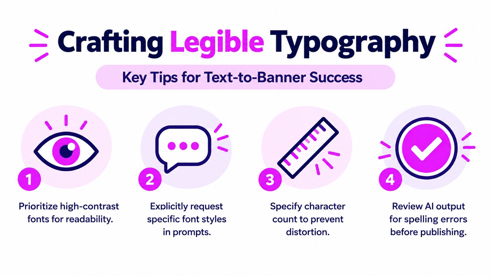
The most common text-to-banner mistake is asking for an image and hoping the system will place exact copy inside it. Image-generation models can produce malformed characters, inconsistent spacing, altered logos, and near-correct words that look acceptable at a glance but fail in a live ad.
Separate visual generation from exact text rendering whenever copy accuracy matters. Ask the model to create the background, subject, lighting, and reserved text area. Then place the approved headline and CTA with a deterministic layout engine or design editor. This preserves control over spelling, kerning, line breaks, and brand typography.
Prompt for structure, not decoration
A useful prompt describes hierarchy and space before style. Include instructions such as:
- Reserve text space: Keep the upper-left area calm and uncluttered for the headline.
- Create a clear hierarchy: Make the product or subject secondary to the message when the campaign objective is traffic.
- Protect the CTA: Leave enough contrast and breathing room around the action button.
- Control visual density: Avoid busy patterns, competing focal points, and small decorative text.
- Specify the format: State the aspect ratio and how the composition should survive cropping.
You can mention a type direction, such as “bold geometric sans serif,” but don't rely on the model to reproduce an exact proprietary font. Render the final typography yourself when the brand requires fidelity. A practical generative typography guide can help teams assess where generated lettering is acceptable and where controlled overlay is safer.
Typography is part of the conversion path. If the viewer can't read the promise and the action quickly, visual polish won't rescue the banner.
Keep the copy short enough to remain readable at the smallest target size. The exact character limit depends on the placement, font, and hierarchy, so define it during planning rather than forcing the generator to solve it after the artwork is complete. Review every output for spelling, duplicate words, awkward line breaks, and accidental claims.
A reliable production pattern is to generate multiple backgrounds with the same layout rules, then apply one approved text system across them. That creates creative variety without allowing typography to drift from one asset to the next.
Post-Editing for Clarity and Compliance
AI generation is a first draft, not a compliance decision. Post-editing gives the team control over the parts that affect comprehension, accessibility, and brand safety.
Start by checking the final rendered asset at every target size. A banner can look correct on a large monitor and fail when reduced for a smaller placement. Look for cropped faces, hidden products, clipped text, weak contrast, and a background that competes with the CTA.

Use a deterministic finishing pass
A batch editor can handle repetitive changes such as resizing, background removal, enhancement, and format export. Those tasks belong after the creative direction is approved, because automating the wrong composition only produces more unusable files.
Run a final checklist for each asset:
- Copy accuracy: Confirm that the rendered headline, CTA, product name, and legal wording match the approved source exactly.
- Layout integrity: Check for overflow, truncation, unsafe edge placement, and inconsistent alignment.
- Brand fidelity: Verify that logos, colors, product proportions, and approved type treatments remain intact.
- Contrast: Test text over photographs, gradients, and textured backgrounds rather than judging it by eye.
- Destination fit: Confirm that the banner points to the intended landing page and uses the correct campaign version.
WCAG 2.2 requires a 4.5:1 contrast ratio for normal text and 3:1 for large text, including text placed over photographs, gradients, or banners. These aren't merely design preferences. They provide a concrete acceptance standard for a creative team working across many generated variants.
For broader production governance, document licensing and asset provenance before launch. A practical resource on commercial license requirements for generated images can support that review, especially when campaigns use generated people, recognizable products, or third-party visual elements.
Testing and Optimizing Your Banners
The attractive banner isn't automatically the effective banner. Creative testing should replace personal preference with controlled comparison.
Build a small test matrix and change only one or two high-impact dimensions at a time. Keep the audience, placement, bid strategy, landing page, and frequency constant while comparing headline, image treatment, CTA wording, color emphasis, animation, or layout. Pre-register the primary metric before launch. Use click-through rate for a traffic objective, and use post-click conversion rate when the campaign's value depends on what happens after the visit.
Consider two prompts for the same campaign:
Prompt A: “Create a restrained B2B banner for procurement leaders. Use a calm product image on the right, reserve the left side for a direct efficiency headline, and use a single action-oriented CTA.”
Prompt B: “Create a bold consumer banner for shoppers. Use a close product crop, high visual energy, a prominent offer area, and a short CTA with strong color emphasis.”
Neither prompt is universally better. The audience and objective determine whether restraint or urgency makes sense. Research using 8,725 real advertisements found that content and design elements, including incentives, emotional appeals, interactivity, color, and animation, affect performance differently in B2B and B2C contexts, so the empirical banner study supports testing by market rather than adopting one universal template.
Format can matter as well. One comparative study reported that the 160 × 600 wide-skyscraper format achieved more than twice the click-through rate of the other tested formats on both examined sites. That finding is directional, not a universal benchmark. Publisher context and audience can change the result.
Historical numbers also need careful handling. The early HotWired AT&T banner is often associated with an approximately 44% click-through rate, but surviving primary campaign data doesn't fully support the repeated figure. Oral-history reporting described a rate in the high 70% to low 80% range during the first two or three weeks, then around 40% for roughly two to two and a half months before declining. A 0.09% average display click-through rate cited by DoubleClick for 2010 campaigns shows why early novelty isn't a modern target. The Internet History Podcast account provides the necessary historical context.
Balancing Automation With Human Oversight
AI is excellent at expanding the option set. It isn't a reliable final authority for factual text, pricing, testimonials, regulated claims, or subtle brand meaning. A scalable workflow therefore needs a human gate, even when the system generates hundreds of variations quickly.
Assign responsibility clearly:
- The marketer owns the claim. Every benefit, offer, comparison, and CTA must match the approved campaign brief.
- The designer owns the visual system. People should validate logos, typography, composition, imagery, and accessibility.
- The reviewer owns the release decision. Someone must inspect the rendered files at their actual delivery sizes, not just approve a prompt or thumbnail.
- The analyst owns the learning loop. Results should inform the next controlled variation, rather than encouraging random aesthetic changes.

Decide how to disclose AI involvement
Disclosure creates a genuine trust trade-off. A 2025 experiment with 304 participants found that disclosing AI-generated advertising reduced average trust in the advertisement from 5.01 without disclosure to 4.51 with disclosure, while organizational trust fell from 4.69 to 4.17. The findings come from the published advertising disclosure experiment.
That doesn't mean every campaign should hide AI involvement. It means disclosure should be treated as a trust-design decision, not a decorative label. “AI-assisted design, reviewed by our team” communicates a different level of oversight from “AI-generated,” particularly for high-involvement purchases or claims that require close scrutiny.
Keep human review mandatory for factual copy, pricing, testimonials, accessibility, and regulated advertising language. Let automation handle volume and structured composition, then use people to protect accuracy and credibility.
Bulk Image Generation helps marketers produce up to 100 unique visuals in under 20 seconds, then refine them through batch editing for resizing, background removal, enhancement, and other production tasks. Visit Bulk Image Generation to turn your text-to-banner workflow into a faster, more controlled system for testing campaign creative at scale.
