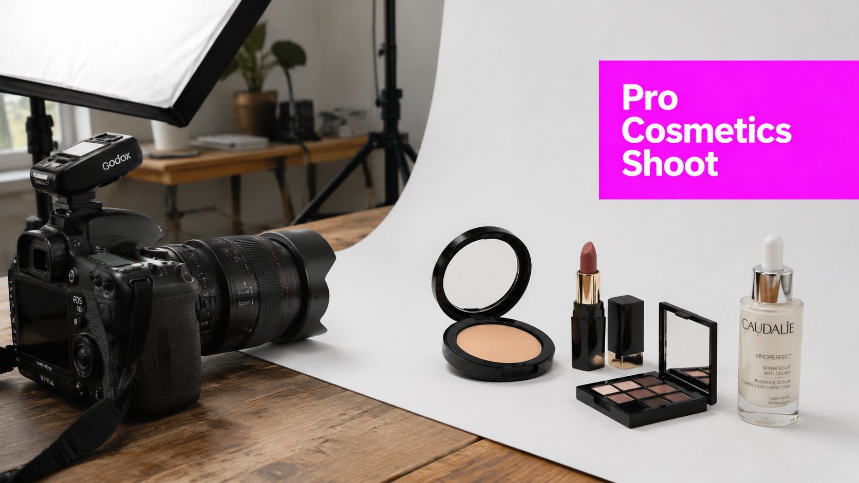
Pro Product Photography Cosmetics Guide 2026

Ryan Bennett • September 30, 2026
Learn pro product photography cosmetics. Our 2026 guide covers lighting, styling, AI editing with Bulk Image Generation, and social media optimization.
You've probably had this happen already. The serum bottle looks elegant on your desk, the compact has a beautiful finish in real life, and the lip color is exactly right in person. Then you photograph it, open the files, and everything feels cheaper than it is. The glass throws ugly reflections, the gold cap goes muddy, the cream texture looks flat, and the final image says “small seller with a phone” instead of “brand worth trusting.”
That gap matters more in beauty than in almost any other category. Cosmetics are bought with the eye first. Customers can't test texture, compare undertones, or feel packaging weight through a product page, so your photos have to carry all of that information without lying, overselling, or falling apart on a mobile screen.
Why Great Cosmetic Photos Matter More Than Ever
Beauty brands live or die on visual trust. If your moisturizer looks waxy instead of dewy, or your lipstick shade shifts too warm because of bad white balance, shoppers notice immediately. They may not know why the image feels off, but they know they don't want to risk the purchase.

That's not just creative opinion. According to Product Photography Statistics 2025, 67% of online shoppers explicitly cite image quality as the top factor influencing their buying decisions for cosmetic products. In practical terms, the product photo often does the work a beauty counter associate used to do.
What bad cosmetic photography actually costs
Poor images rarely fail in one obvious way. They fail in layers.
- They weaken perceived value. A premium jar can look drugstore if reflections are unmanaged.
- They create hesitation. If a foundation tone seems inconsistent across shots, shoppers assume the color isn't reliable.
- They hurt repeatability. If every SKU looks like it was shot on a different day by a different person, the catalog feels unstable.
- They slow marketing. Teams end up re-editing, re-cropping, and patching old assets instead of launching campaigns.
Practical rule: In cosmetic ecommerce, the goal isn't to make the product look dramatic first. The goal is to make it look desirable and believable at the same time.
A lot of founders try to solve this by buying a better camera before fixing their process. That usually doesn't work. Better product photography cosmetics comes from controlled prep, accurate light, disciplined styling, and clean post-production. Gear helps, but decisions matter more.
If your current images feel close but not polished, studying how to make photos professional can help sharpen the basics before you upgrade anything expensive. In beauty work, those basics show up fast. Dust, glare, crooked labels, and weak composition don't hide.
What good cosmetic photos need to do
A strong cosmetic image has to do several jobs at once:
- Show true color
- Reveal texture
- Respect packaging materials
- Fit the platform where it will appear
- Stay consistent across a full line
That last point is where many brands stumble. One good hero image isn't enough. You need a repeatable visual system.
Pre-Shoot Prep Your Essential Gear and Shot List
Most cosmetic shoots are won before the camera comes out. If the shot list is vague, the product arrives dusty, and no one has decided whether the images are for Amazon-style catalog pages, paid social, or a launch carousel, the session turns into improvisation. Improvisation is where consistency goes to die.
A useful prep process starts with the commercial use of the image, not the object itself. Ask what each asset has to accomplish. A clean packshot needs different framing than a texture swipe for Instagram. A reflective fragrance bottle needs a different set plan than a squeeze tube or eyeshadow palette.

Build the shot list before you touch the lights
A strong beauty shot list usually includes:
- Hero images for homepage banners, launch pages, and ads
- Catalog angles that show front, side, back, open product, applicator, and scale cues where needed
- Macro details for texture, pigment, shimmer, embossing, brush tips, or droppers
- Styled scenes for brand storytelling
- Format variations for square, vertical, and horizontal crops
This prep work directly affects revenue quality. A detailed analysis of cosmetic product photography found that 75% of online shoppers rely heavily on product photos when deciding on a potential beauty purchase, while 22% of returns in the cosmetic category happen because the product looks different in the image than it does in reality. If your shot list doesn't include accuracy shots, not just pretty ones, you're creating avoidable problems later.
Choose gear by control, not by ego
You don't need the same setup as a full commercial studio, but you do need enough control to repeat a look.
| Setup Tier | Best For | Core Tools |
|---|---|---|
| Pro camera setup | Large catalogs, paid campaigns, retouching flexibility | DSLR or mirrorless body, macro or short telephoto lens, tripod, strobes or strong LEDs, diffuser, reflectors |
| Budget setup | Small brand shoots, web stores, controlled tabletop work | Entry camera or older mirrorless body, kit lens or affordable prime, tripod, window light plus foam boards or compact LEDs |
| Mobile setup | Fast content batches, social-first shoots, behind-the-scenes assets | Recent smartphone, phone tripod, clip-on diffuser or soft window light, small reflectors, careful composition |
Prep details people skip
These are the things that save more time than any plug-in:
- Clean every surface twice. Cosmetics collect lint, fingerprints, and dried product fast.
- Keep a styling tray nearby. Cotton gloves, microfiber cloth, tweezers, tape, and alcohol wipes belong within reach.
- Mark positions. Use small floor or table markers so products return to the same angle after cleaning or swapping shades.
- Create a reference frame. Shoot one frame with your intended composition and keep it visible during the session.
If your photoshoot feels rushed, the problem usually started in the prep. On set is the worst time to decide what the image is for.
Mood boards help too, but only when they're specific. “Clean luxury” is not specific. “Soft side light, pale stone surface, muted shadows, warm neutral grade, no visible ingredient props” is specific.
Lighting and Composing for Different Cosmetic Types
Cosmetics punish generic lighting. A setup that works for a matte cardboard box can completely fail on a serum bottle or shimmer palette. The trick isn't using more lights. It's using the right shape of light for the product surface.

Glass bottles and translucent packaging
Serums, oils, fragrances, and ampoules are all about controlled reflection. Front-lighting them too heavily makes the bottle look dead. Uncontrolled side light creates chaotic hot spots.
For clean white-background catalog work, use a simple geometry that protects the edges of the bottle. Position the product at least 15 to 20 cm from the white background and set the background light to +0.1 to +0.3 F-stop brighter than the key light. That spacing helps the background read as pure white without throwing flare back onto translucent surfaces.
A practical starting point:
- Large diffuser as the main light slightly to one side
- Separate light on the background
- White cards to shape edge reflections
- Black cards if the bottle needs definition on the sides
- Tripod for consistency
If the bottle still looks washed out, the issue usually isn't exposure. It's spill. Move the product farther from the background, narrow the light, or flag the sides.
Powders, palettes, and shimmer products
Eyeshadow pans, pressed powders, and baked formulas need directional light. Flat front light kills texture. Harsh light creates glare and false hotspots that don't match the actual finish.
Use a soft source from above and slightly off-axis. Then rotate the product until the embossed logo, powder grain, or shimmer catches cleanly. Small changes matter here. Even a slight tilt can turn dead pigment into a rich, dimensional surface.
Angle the light to reveal texture, not to blast the product evenly. Beauty buyers want to see finish. Matte should look matte. Satin should look satin.
Tubes, squeezables, and soft packaging
Tubes are deceptively difficult because they crease, bulge, and reflect in uneven bands. The goal is shape without making the material look dented or cheap.
Try this:
| Product Type | Primary Challenge | Recommended Lighting Setup |
|---|---|---|
| Glass bottles and serums | Reflections and flare | Diffused key light, separate background light, white and black cards for edge control |
| Powders and palettes | Glare and weak texture | Soft directional top-side light with slight product tilt |
| Tubes and squeeze products | Wrinkles and uneven highlights | Broad side light with front fill card and careful rotation of the tube |
| Swatches and smears | Flat texture and color distortion | Side or back-diffused light with controlled shadow to show thickness |
For tubes, broad side light usually works better than direct frontal light. Add a front fill card to keep branding readable. If the cap is glossy and the body is matte, treat them separately. Let the matte body hold shape and allow a narrower highlight on the cap.
Swatches and texture shots
At this stage, many product photography cosmetics guides are no longer useful. They tell you to “show texture,” but they don't show how to keep a swatch from looking like toothpaste smeared on glass.
The most convincing swatches usually have three things:
- A believable edge
- A visible thickness gradient
- A light direction that creates depth without making the product look greasy
For cream and gel textures, drag the product in one confident movement with a palette knife, spatula, or clean acrylic tool. Then light from the side or from a slightly higher angle so the ridges cast micro-shadows. Don't over-smooth the surface. Small imperfections are what make the texture feel real.
For compositions, keep the frame disciplined. Negative space is useful in beauty. It gives expensive packaging room to breathe. The rule of thirds still helps, especially when pairing the full product with a secondary texture element like a swipe or droplet, but rigid symmetry often works better for catalog hero shots.
Composition choices that improve sell-through
A few framing rules hold up across most beauty categories:
- Front-facing symmetry works well for ecommerce thumbnails and premium skincare
- A slight three-quarter angle adds depth to bottles and boxed sets
- Top-down layouts suit routines, duos, and ingredient stories
- Macro crops work best when they isolate one sensory detail, such as shimmer, balm sheen, or brush fibers
The test is simple. If the image looks stylish but doesn't tell the customer what the product is, it's not doing its job.
Styling Your Shot with Props and Textures
Props should support the product's story, not audition for their own campaign. A clean niacinamide serum doesn't need scattered pearls, tropical flowers, and a marble bust around it. It needs a visual environment that matches the brand promise. Clinical products usually benefit from restraint. Botanical ranges can handle more organic texture. Color cosmetics often benefit from stronger graphic shapes.
The easiest way to choose props is to ask what the product wants to be associated with. Calm. Precision. Nature. Play. Luxury. Utility. Once you know that, the prop choices narrow fast.
Props that help and props that distract
Useful props tend to fall into a few categories:
- Material cues like stone, acrylic, glass, brushed metal, or ceramic
- Ingredient references such as leaves, petals, seeds, or citrus slices
- Functional beauty objects like spatulas, cotton pads, brushes, or droppers
- Graphic support including blocks, paper sweeps, translucent panels, and textured fabrics
What doesn't work is random abundance. If the prop has more contrast, saturation, or texture than the actual product, it steals attention.
A matte clay mask in an earthy tube can look excellent on travertine, raw linen, or warm paper. A futuristic silver compact may look better on acrylic risers with cooler reflections. The style choice should feel like the product belongs there naturally.
Making texture swatches look expensive
This area presents a significant obstacle for many indie brands. A major gap in current guidance is consistent swatch capture, and 68% of indie cosmetic brands struggle with flat-looking texture swatches. The common failure is building the smear correctly but lighting it like a label shot.
Use fewer elements than you think. One clean swatch beside the product often beats a whole spread of smears. The swatch should show body, drag, and finish. A cream blush should look spreadable. A gloss should catch a highlight without turning into a blown-out streak.
For planning those scenes, a visual prompt tool like the free AI image prompt generator can help you articulate styling direction before the shoot. It's useful when you know the mood you want but need clearer language for surfaces, palette, reflections, and shot framing.
Good swatches look intentional, not accidental. One deliberate pull with visible depth beats five messy experiments in the same frame.
Two practical styling scenarios
A “clean clinical” setup might use a white or pale grey sweep, a translucent acrylic block, and a single gel smear with a crisp edge. Shadows stay soft. Labels stay readable. Nothing competes with the product.
A “natural treatment” setup might pair a jar with a soft stone tile, muted linen, and one ingredient cue, like a leaf or petal placed off-axis. The texture shot can sit nearby as a controlled scoop or smear, not a random spill.
If you're styling for social, leave room in the composition for crop flexibility. A prop arrangement that only works in horizontal format will become frustrating later.
Post-Production with an AI Powered Workflow
Most cosmetic retouching isn't glamorous. It's repetitive. You remove dust from caps, fix tiny label rotations, match whites across SKUs, tame a reflected hotspot on a bottle shoulder, and make sure the blush shade in frame three still matches the product in frame one. The work is detail-heavy, and that's exactly why disciplined workflow matters.

The manual workflow that still matters
Even with modern AI tools, the foundation stays the same.
Start by organizing files by product line, shoot date, or campaign. Then cull aggressively. Cosmetic shoots generate a lot of near-duplicates, and the slowest editing pipeline is the one where nobody picked the finals properly.
A reliable sequence looks like this:
- Cull and label the sharpest, most on-brand images
- Apply global corrections for white balance, exposure, contrast, and color consistency
- Clean defects such as dust, scratches, fingerprints, and loose fibers
- Refine edges and backgrounds for marketplace or catalog requirements
- Export platform variations for ecommerce, ads, and social crops
That order matters. If you retouch tiny flaws before fixing overall color and exposure, you'll waste time reworking files later.
Where AI actually helps
The strongest AI use in product photography cosmetics is not replacing taste. It's removing friction. Background cleanup, batch resizing, repetitive cutouts, and rough variant generation are perfect candidates for automation. Precision still needs a human eye, especially with color-critical products like lipstick, foundation, and blush.
That's why I treat AI as a production assistant, not an art director. It speeds the boring parts so more attention stays on the parts buyers notice.
Expert post-production workflows that use color labels, batch reviewing, and AI tools for background removal can reduce editing time by 50% for large SKU sets and lead to 95% cleaner catalog images. Those gains come from consistency, not magic. If the source files are badly lit, AI won't turn them into luxury photography. But if the files are solid, AI can remove a lot of repetitive labor.
What to automate and what to keep manual
Good candidates for automation
- Background removal on large product sets
- Basic crop and size variants
- Batch alignment for consistent framing
- Initial cleanup passes on simple dust and edge issues
- Creative mock variations for campaign planning
Better handled manually
- Final color matching for cosmetic shades
- Reflection sculpting on glass and metallic caps
- Skin-adjacent texture accuracy in swatches
- Fine retouching on embossed logos or mirrored packaging
AI is fastest when the visual rules are already clear. If your catalog style isn't defined, automation scales inconsistency.
If you want to understand the broader mechanics of AI-assisted product imaging, the AI product photography tutorial gives a useful overview of how teams blend generation, cleanup, and batch processing. The useful mindset is simple. Let software handle repetition. Keep judgment with the photographer or brand team.
A practical color warning
Beauty retouching fails most often at color. A serum can go too blue. A lipstick can drift warmer than it should. A white tube can pick up a background tint and suddenly the whole brand system feels inconsistent. Use a neutral reference during capture when possible, and compare edited files side by side, not one by one.
Consistency beats isolated perfection. One brilliant image that doesn't match the rest of the line creates more work than value.
Optimize and Publish for Ecommerce and Social Media
A finished photo still has one job left. It has to work where customers see it. That means your best ecommerce image is not always your best Instagram image, and your best TikTok crop is rarely the one you'd choose for a retailer grid.
Catalog pages need clarity first. Keep backgrounds clean when the platform expects uniformity. Show the front-facing pack clearly, then add supporting frames for angle, applicator, ingredient detail, and texture. File naming matters too. Use descriptive names tied to product, shade, and view, because those assets become much easier to manage once the catalog grows.
Match the image type to the platform
Social platforms reward a different mix. They're faster, more crowded, and more dependent on visual hooks in the first instant. That's where detail shots often outperform standard packshots.
New 2025 analytics from Instagram Business reveal that macro shots of lipstick textures generate 3.2x more saves than full-product shots, while only 12% of cosmetic brands use this angle ratio in their content calendars. That should change how you plan your exports and your posting mix. If lipstick is a key category, macro texture crops deserve a regular place in the content schedule, not occasional use.
For creative benchmarking, it helps to explore beauty and skincare advertising examples and study how successful campaigns separate clean conversion assets from mood-driven storytelling visuals. The lesson is usually the same. Don't ask one image to do every job.
Export cleanly and keep versions organized
A simple publishing checklist keeps this manageable:
- Use JPG for most standard web images where transparency isn't needed
- Use PNG when transparency matters for layered design use
- Create channel-specific crops instead of relying on automatic platform cropping
- Keep a master archive with final edited high-resolution files
- Generate resized derivatives for each platform so pages stay fast and layouts stay sharp
For bulk delivery across channels, a dedicated bulk image resizer saves a lot of repetitive export work, especially when you need square ecommerce images, vertical story crops, and web-friendly versions from the same master set.
A good publishing workflow also protects the investment you made in the shoot. The same bottle can serve as a retail packshot, a homepage hero, a vertical story card, and a cropped texture-led social asset, but only if you planned and exported it with those uses in mind.
The strongest beauty catalogs don't just look polished. They feel coherent from product page to ad creative to social feed.
If you need to turn one solid visual system into a larger library without spending days on repetitive production work, Bulk Image Generation is worth a serious look. It helps teams create, resize, and streamline product visuals at scale, which is especially useful when you're juggling ecommerce listings, ad variants, and social formats across a growing cosmetic line.
