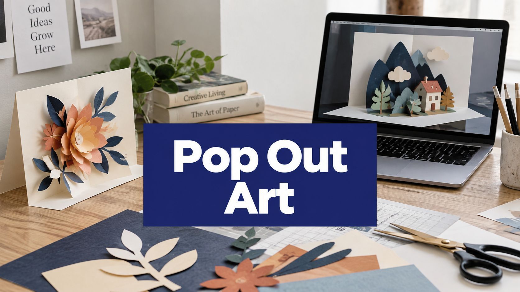
Pop Out Art: A Practical Guide for Creators and Brands

Ryan Bennett • August 31, 2026
Learn what pop out art is, how perspectival and stereoscopic tricks work, and how to generate it with AI for social media, coloring pages, and branding.
You've got a flat image that should feel alive, a social post that needs a little theater, or a classroom sheet that's meant to make kids lean in. That's the sweet spot of pop out art, a visual trick that makes a surface behave like a window, so part of the subject seems to break the frame and enter your space. The appeal isn't new, either, because pop art itself emerged in Britain and the United States in the mid-to-late 1950s as a reaction to postwar high-art conventions, using advertising, comics, packaging, celebrities, and ordinary goods to blur the line between fine art and mass culture, a shift described by The Art Story's overview of Pop Art.

That same pull shows up online now, where a cookie, a pumpkin, or a product bottle can feel more clickable when it appears to cross the edge of a feed card. Designers already know that visual cues influence how people judge and choose, and a useful discussion of that idea appears in Silver Spoon Agency's piece on influence buying decisions through design. For marketers working at scale, the practical question is no longer whether depth gets attention, but which layout keeps working when you need a whole series of assets. A useful adjacent read on that workflow mindset is the guide to AI marketing software, because the same production logic now sits behind many fast image systems.
Why Pop Out Art Still Stops People Mid-Scroll
A person scrolling in a coffee shop doesn't stop because the subject is complex. They stop because the image seems to break its own borders. A cookie that appears to rise off a laptop screen, or a pumpkin that looks like it's hovering over a flat layout, triggers a quick depth read before the brain has time to label it as “just a graphic.”

Pop art has long relied on that same visual interruption. Its history sits inside a bigger culture of paper engineering and dimensional imagery, from movable books to mural illusions, but the mechanism is always the same, a flat surface is made to behave like a stage with a foreground, a middle plane, and a background. That's why pop out art still works in thumbnails, banners, and print, even when the viewer only gives it a second.
Practical rule: if the subject reads instantly at small size, the illusion is doing its job. If the viewer has to hunt for the depth cue, the image is already losing the scroll.
The modern twist is production speed. A creator can now generate many variations of the same visual idea, but the core appeal still comes from the old problem of perspective, not from the software. That's what makes pop out art useful for brand work, because the trick can be repeated without changing the message.
The Hidden Geometry Behind a Convincing Pop
A convincing pop starts with geometry, not decoration. Stand at one end of a long corridor painted on a gym floor, and the lines seem to meet in the distance. Step sideways, and the illusion breaks because the image was built for one specific viewpoint, not for every angle at once.
How the brain decides something has depth
The eye looks for a small set of cues. Converging lines point the mind toward a vanishing point, overlap tells it that one object sits in front of another, cast shadows anchor objects to a surface, and scale shifts help the brain guess what's near and what's far away. Pop out art pushes those cues hard, so a coffee cup can look like it's leaning out of a phone screen instead of sitting inside it.
That mechanism is called perspectival anamorphosis when the image is deliberately distorted in 2D so it resolves correctly from one chosen viewpoint. It's why a forced-perspective mural can look dramatic from the intended camera position and wrong from a few feet away. The geometry is exact, and that's the point.
A pop-out image succeeds when the depth cues agree with each other. When the line direction, shadow direction, and scale all pull in the same way, the surface stops feeling flat.
For creators, that means the illusion is fragile in the best possible way. Crop the image too aggressively, change the camera angle, or distort the aspect ratio, and the constructed depth can collapse. Build the geometry carefully, though, and the result can read as a real object leaving the frame.
Two Roads to Pop Out Depth and When to Use Each
There are two common ways to make pop out art feel dimensional, and they don't behave the same way. One depends on perspective, the other on binocular disparity. If you choose the wrong path for the wrong format, the illusion either weakens or disappears.
| Aspect | Perspectival Pop | Stereoscopic Pop |
|---|---|---|
| Core mechanism | One-point or forced perspective creates depth from a fixed viewpoint | Two slightly offset views give each eye a different image |
| Best format | Still images, prints, social tiles, posters | Interactive viewing with filters, glasses, or special display setups |
| View dependence | Works from one chosen angle | Depends on left-eye and right-eye separation |
| Scalability | Translates well to thumbnails and bulk image workflows | Hard to preserve in a single flat still |
| Main risk | A bad crop can break the geometry | Too much disparity can become uncomfortable or fail to read |
The perspective route is the one most need. It uses a single viewpoint, so a subject can appear to rise out of a background and still look convincing in a static image. That's why it scales cleanly to product graphics, social posts, and coloring pages.
The stereoscopic route is more specialized. It relies on the small left-right difference your eyes normally resolve, which means the image works best in formats that preserve separate views. For a flat feed, that strength becomes a weakness, because a single still can't deliver the same effect.
If you're choosing for a brand asset, pick perspectival pop. If you're building an interactive experience, stereoscopic depth can be worth the extra setup. For most creators, the first route is the one that survives real-world publishing.
From Paper Engineering to Prompt Engineering
Traditional pop-up and pop-out work is built by hand, but the logic transfers cleanly to AI generation. The paper version starts with structure, then light, then finish. The prompt version should do the same, because the model needs the same visual constraints even if the material is different.
A simple build translated into prompt language
A physical layout might start with 200 gsm cardstock for the base, 160 gsm for a floating middle layer, and a thin top silhouette cutout, with foam spacers placed to separate the planes. A strong raking light from the upper left makes those layers read as distinct. In prompt terms, those choices become cues like “three stacked layers”, “die-cut paper sculpture”, and “45-degree side lighting.”
The layering order matters because depth is never just a subject choice. A foreground object, a middle object, and a background field create a readable scene even before the viewer notices the details. If the model is asked for a single flat subject, the result often feels like a sticker. If it's asked for separate planes, the image starts behaving like a miniature stage.
For help shaping those prompt fragments, a tool such as the free AI image prompt generator can be useful when you want to test wording variations without rebuilding the whole idea from scratch.
Reusable template: “die-cut paper sculpture, three stacked layers, 45-degree side lighting, shallow depth of field, neutral background.”
That line works because it encodes the same things a paper engineer controls by hand, base, lift, silhouette, and light. The model doesn't need a lecture, it needs constraints. Once you supply those, the output starts to look built rather than merely described.

Four Use Cases You Can Generate This Week
Pop out art works best when the format matches the job. A social tile wants immediate impact. A coloring page wants clear outlines. A product shot needs believable depth without visual clutter. A logo treatment needs restraint, because the brand still has to read first.
1. Social media tiles
Use a square layout and let one subject break the frame. A simple prompt like “ultra-shallow depth of field, subject breaking the frame, soft studio rim light” keeps the attention on the pop cue instead of on background noise. The trick is to make the foreground element feel a little too close to the viewer, so the image reads in a fraction of a second.
2. Coloring pages
For educators and hobbyists, the best version is usually clean and obvious. Try “coloring page, clean line art, thick outlines, no fill, no shading, single subject breaking frame” and keep the structure simple enough for kids to trace and fill. This route is more about shape clarity than realism, so a strong silhouette matters more than texture.
3. Product photography
A cosmetic bottle, snack box, or gadget can feel more premium when a related ingredient or component floats toward the camera. A prompt like “product hero shot, pedestal, ingredient floating mid-air, controlled reflections” gives the scene a commercial polish while still preserving the pop-out effect. For this kind of content, the object has to stay readable as a product first and an illusion second.
4. Branding
A logo can step out of a flat badge without becoming noisy. Use “flat circular badge, isometric icon stepping out of the badge, brand-safe palette” when you want the mark to feel dimensional but still on-brand. That balance is especially useful for campaign headers, launch graphics, and seasonal identity systems.
People who also want to see how motion and framing work in short-form content can compare this with ShipTeaser's standout AI videos, because the same visual logic often carries across still and moving assets.

Building a Cohesive Pop Out Art Series in Bulk
The hardest part of bulk generation isn't making one image look good. It's keeping twenty images in the same visual family. Most series fail because the camera drifts, the lighting shifts, or the background tone changes just enough to make each piece feel unrelated.
The cleanest way to prevent that is to lock the camera language first. Reuse the same focal length, angle, and framing tokens in every prompt, then lock the lighting recipe, then lock the palette. After that, vary only the subject and the specific pop cue, so the series feels designed instead of random.
A batch workflow makes that easier because the style block can stay fixed while the content changes. In practice, that means the same prefix can carry a whole run of variations, whether you're making campaign tiles, classroom visuals, or brand graphics. Bulk generation systems such as Bulk Image Generation are built for that kind of repeated output, where the challenge is consistency rather than invention.
Batch rule: one style block, one camera setup, one palette, many subjects.
Four things break the illusion in a series.
- Shifting vanishing point: the depth direction changes from image to image.
- Inconsistent edge softness: some frames look crisp, others look airbrushed.
- Mixed aspect ratios: the geometry no longer lines up from tile to tile.
- Background tone drift: the series stops feeling like one campaign.
A final thumbnail pass helps more than expected. If the set still reads at very small size, the structure is holding. If the depth cue disappears when the images shrink, the series needs another round of simplification.
Why Your Pop Out Looks Flat and How to Fix It
When a pop-out image falls flat, the problem is usually one of three things. The composition is confusing, the scale is wrong, or the edge treatment is too even. Those issues make the scene feel pasted together instead of built in space.
Check the shadows first
If cast shadows point in different directions, the brain stops believing the scene belongs together. Use one clear light description, such as single key light from upper left, matching cast shadows, and keep every object obeying it. A shadow that contradicts the light source makes the whole image feel like a collage.
Then check the size relationship
Foreground and background objects need different apparent scale, or the viewer reads the scene as stacked stickers. Make the pop-out element larger and more immediate, then let distant pieces shrink enough to feel receded. The goal isn't realism in the abstract, it's believable separation.
Then look at the edges
If every layer has the same blur and contrast, the image starts to feel like flat paper. A sharper foreground with a little atmospheric softness behind it usually gives the illusion enough hierarchy to breathe.
Quick test: crop the image to a small square and ask whether the subject still leads the eye forward. If not, simplify the shadows and strengthen the size contrast.
A small checklist solves most of the problem fast.
- One light source with matching shadows.
- One clear foreground object that is visibly larger.
- One edge strategy with crisp front, softer back.
- One test crop before final export.
That routine is useful because it turns an aesthetic issue into a repeatable diagnosis. Once the image passes those checks, it usually reads as dimensional in both feed views and full-size layouts.
Where Pop Out Art Goes From Here
Pop out art is moving toward more interactive and more repeatable formats. AR layers will let a static composition step onto a real desk or wall, while brand teams will keep turning reliable prompt recipes into on-demand assets. The core visual grammar won't change much, because the appeal still comes from how the eye reads space.
Educational uses may grow as well, especially where a child can learn depth, shape, and composition at the same time. Participatory campaigns already point in that direction, since audiences don't just look at these images, they photograph, share, and remix them. The stronger the scene design, the more reusable it becomes.
That's why pop out art isn't just a novelty effect. It's a durable way to control attention, and the creators who understand the geometry will keep getting better results than the people who only chase the style.
If you want to generate pop-out concepts in batches without rebuilding every prompt by hand, Bulk Image Generation can help you turn one visual idea into a consistent set of campaign-ready images. It supports bulk image generation, batch editing, and prompt-based workflows, which makes it a practical fit for pop out art series, coloring pages, product visuals, and brand assets.
