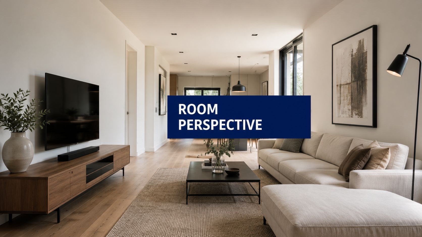
Mastering Perspective of Room in AI Art

Ryan Bennett • June 21, 2026
Learn the fundamentals of perspective of room, from one-point to three-point. Create stunning AI images & avoid common mistakes.
You generated a room image that should have looked polished. The furniture style is right. The lighting is close. The color palette fits the brief. But the scene still feels wrong. The sofa seems to lean for no reason, the floor reads as a tilted plane, and the back wall has that pasted-on look that instantly tells a viewer this room wasn't composed with real spatial logic.
That problem usually isn't the prompt. It's perspective.
For artists, interior designers, educators, and social media teams creating room visuals at scale, perspective is the difference between a room that feels inhabitable and one that feels synthetic. The frustrating part is that AI can produce a beautiful single image by accident, then lose geometric discipline across a larger batch. If you're generating many room images for campaigns, product mockups, coloring pages, or brand scenes, perspective stops being an art-school topic and becomes a production issue.
Why Your Room Images Look 'Off' and How Perspective Fixes It
A believable room image needs one thing before texture, decor, or style. It needs a stable spatial viewpoint.
Rooms fail in recognizable ways. Lines don't agree on where depth is going. Furniture doesn't sit on the same floor plane. Windows imply one camera angle while the ceiling implies another. The result is subtle, but viewers catch it fast. They may not say “the orthogonals are inconsistent,” but they'll say the image feels flat, warped, or fake.
Perspective is not decoration
Perspective gives a room its internal logic. It tells the eye where the viewer is standing, how high the camera sits, and how quickly objects recede into space. Once that logic breaks, every styling choice on top of it loses credibility.
That's why the history matters. The modern mathematical basis of perspective is usually traced to the Italian Renaissance, with Filippo Brunelleschi's experiments around 1415–1420 and Leon Battista Alberti's written codification in 1435, as summarized by Essential Vermeer's history of perspective. Alberti's key idea was simple and profound: a picture only resembles nature when it is viewed from a definite distance and location, with objects diminishing in size as distance increases.
That principle still governs every convincing interior image, whether it's sketched in charcoal or generated by a model.
Practical rule: If the image doesn't imply one clear viewer position, the room won't feel real.
What AI gets wrong in practice
In manual drawing, you usually commit to a viewpoint before adding objects. In AI workflows, many creators do the opposite. They prompt for decor, mood, materials, and brand style first, then hope the model resolves the camera geometry on its own.
Sometimes it does. Often it doesn't.
The modern workflow presents a challenge. Bulk generation is efficient, but speed tends to expose perspective weaknesses. A model may keep the mood consistent while drifting on room depth, wall angles, or furniture alignment across a set. That's the paradox. The more images you need, the more important perspective fidelity becomes.
A better way to think about room generation
Don't prompt for “a room.” Prompt for a room seen from a specific place.
That one mental shift improves almost everything:
- Camera position matters: doorway view, centered wall view, corner view, low-angle floor view.
- Eye level matters: seated, standing, child-height, overhead.
- Depth structure matters: one-point, two-point, or three-point organization.
When you start treating the perspective of room imagery as scene construction instead of style description, your outputs become more stable, more directable, and much easier to fix.
The Building Blocks of Realistic Rooms
Before you can troubleshoot a room image, you need two anchors: the horizon line and the vanishing point. Everything else grows from those.

Horizon line and vanishing point
The horizon line represents the viewer's eye level. Raise it, and you're looking down into the room. Lower it, and the room starts to tower over you. In interiors, that one line controls whether the image feels observational, dramatic, childlike, architectural, or intimate.
The vanishing point is where parallel lines appear to meet as they recede. In a room, that usually means floorboards, ceiling seams, wall edges, shelves, tables, and cabinets. If these lines don't agree with each other, the room loses coherence.
A useful shortcut is to inspect any image by tracing implied lines with your eye. Extend the edges of the rug, sofa, window trim, and ceiling. If they seem to converge consistently, the room has a fighting chance. If they scatter, the image is structurally weak.
One-point perspective
One-point perspective is the cleanest place to start. It's the classic straight-on room view, like standing in the center of a hotel corridor or facing a wall head-on.
According to Craftsy's one-point room drawing guide, the horizon line and a single vanishing point control all receding orthogonals. That's why the back wall is drawn as a true rectangle, then depth is built by projecting lines from the vanishing point through its corners.
For AI-generated interiors, one-point perspective works well when you want:
- Centered compositions: bedrooms facing the headboard wall, home offices facing a desk wall.
- Retail-style symmetry: product staging, backdrop scenes, window displays.
- Educational clarity: coloring pages and simple spatial teaching materials.
If you're also preparing multiple crops for different channels, use an aspect ratio calculator for image layouts before generating. A perspective that feels balanced in one frame can feel cramped once it's cropped vertically.
A room in one-point perspective looks disciplined because the image makes one strong promise to the eye and keeps it.
Two-point perspective
Two-point perspective appears when you see a corner instead of a flat wall. Most real interior photography lives here because people rarely stand perfectly square to a single wall.
This setup makes the room feel more natural and less diagrammatic. It's also better for showing furniture arrangements, flow through a space, and relationships between adjacent walls.
Use it when the brief depends on context:
| Room goal | Better choice | Why |
|---|---|---|
| Showcase wall decor | One-point | The wall reads cleanly and directly |
| Show layout and depth | Two-point | Corners create stronger spatial cues |
| Create a branded lifestyle scene | Two-point | Feels closer to photography |
Two-point perspective is where many AI room images start to drift. The model may render one wall convincingly, then assign a slightly different set of angles to the opposite wall or furniture. The room still looks stylish, but it no longer feels built.
Three-point perspective
Three-point perspective adds a vertical vanishing point. You see it when the camera looks sharply up or down. In rooms, this can create a powerful effect, but it's easy to overdo.
A low-angle view can make a small room feel monumental. A high-angle view can turn a space into a plan-like overview, almost halfway between interior rendering and map. For editorial work or stylized campaigns, that can be useful. For ordinary room scenes, it often introduces distortion that competes with the subject.
If you want realism, treat three-point perspective like a spice rather than a base ingredient.
How Perspective Shapes a Room's Mood and Story
Perspective doesn't just organize space. It tells the viewer how to feel about that space.

The same living room can feel calm, grand, clinical, or uneasy depending on where the virtual camera sits. That's why strong room images often read more like directed scenes than neutral records. The perspective of room composition is a storytelling choice first and a geometry choice second.
Eye level changes emotional distance
An eye-level view usually feels trustworthy. It puts the viewer in the room as an occupant, not as an observer hovering above it or crouching below it. That's useful for product backdrops, residential lifestyle imagery, and almost any interior where comfort matters.
Drop the camera lower, and the room gains authority. Chairs feel heavier. Fireplaces feel larger. Ceiling height becomes part of the drama. This can help with luxury branding or mood-heavy scenes where you want architecture to dominate.
Raise the camera, and the room becomes more informational. You start seeing layout before atmosphere. This is often a smart move for educational visuals, design planning images, and children's activities where spatial comprehension matters more than cinematic realism.
If the room's purpose is comfort, keep the viewer at human height. If the room's purpose is analysis, raise the viewpoint.
The room gets bigger or smaller without changing size
That's one of the most useful compositional truths in interior image-making. Perspective can make a compact room feel open or a generous room feel compressed.
A doorway view with receding floor lines creates invitation. The viewer senses there's space to enter. A tight, square-on crop of the back wall can flatten the same room and make it feel constrained, even if the furnishings are identical.
Here's a quick comparison:
- Low horizon line: makes vertical forms feel taller, stronger, more dramatic.
- High horizon line: reveals surfaces and layout, often making scenes feel more designed than lived in.
- Centered vanishing point: creates order, symmetry, and calm.
- Off-center composition: introduces movement and a more editorial feel.
Function should drive viewpoint
A common mistake is choosing a perspective because it looks flashy in prompts. That's backward. Start with the room's job.
A reading nook benefits from an intimate, seated-height view. A classroom coloring page may benefit from a clearer, slightly higher viewpoint that separates floor, wall, and furniture forms. A social post about decor details may need a tighter angle that still preserves consistent receding lines.
When creators match viewpoint to function, the image reads as intentional. When they don't, the perspective fights the concept.
Common Perspective Mistakes and How to Fix Them
Most bad room images don't fail because of style. They fail because the geometry sends mixed signals.

Creators often assume AI mistakes are random. They usually aren't. They're patterned. Once you know the symptoms, you can diagnose the cause fast and either reject the image, revise the prompt, or repair the composition in post.
Symptom-based diagnosis
| Symptom | Likely cause | Practical fix |
|---|---|---|
| Furniture looks like it's floating | Object bases don't share the room's floor plane | Add a visible floor reference and check all object bottoms against the same receding logic |
| The back wall feels pasted on | Weak or missing one-point structure | Prompt for a straight-on room view with one clear central vanishing point |
| Opposite walls disagree with each other | Conflicting vanishing points | Simplify the camera angle and reduce scene complexity |
| Cabinets, shelves, or windows look bent | Lens-style distortion or unstable geometry | Avoid extreme wide-angle language unless distortion is intentional |
| The room feels flat | Depth cues are too weak | Include stronger floor, ceiling, or wall-edge lines in the composition |
What to look at first
Don't inspect decorative details first. Inspect the architecture.
Start with these checks:
- Trace the ceiling edges. They reveal drift quickly.
- Check the floor plane. Rugs, tile lines, and baseboards expose false depth.
- Compare furniture angles to wall angles. A table can't obey one system if the room obeys another.
- Look at repeated objects. Chairs, frames, and shelves show scaling problems fast.
A room can survive a slightly odd lamp. It won't survive a broken floor.
Manual and AI fixes are different
If you're editing manually, a grid overlay is your best friend. Pull guide lines from the dominant room edges and see where they intersect. That gives you the image's actual structure, even if the artist or model didn't intend one clean system. Then correct the biggest offenders first, usually floor-contact objects and wall boundaries.
If you're generating with AI, the fix starts earlier:
- Be explicit about viewpoint: “centered eye-level view from doorway,” “corner view with two-point perspective,” “low-angle interior.”
- Reduce contradictory instructions: don't ask for symmetrical staging and extreme diagonal camera energy in the same prompt.
- Anchor the scene with architecture: doors, windows, floorboards, beams, or tiled floors help the model commit to depth.
Field note: The more objects you add before the room geometry is stable, the more likely the model is to fake depth with decoration instead of structure.
What usually doesn't work
Throwing more adjectives at a broken scene rarely fixes perspective. “Ultra realistic,” “architectural,” or “cinematic” can improve rendering quality while leaving the underlying geometry unstable.
Another weak fix is overcropping. Tight crops can hide one bad corner, but they often create a new problem by removing the lines that explain the space. If the room only works when half the architecture is cut off, the base composition probably wasn't sound.
Generating Perfect Room Perspectives with AI
AI room generation gets much easier when you stop treating perspective as a hidden property and start treating it as a promptable variable.
The most useful prompt ingredients for interiors are often the least glamorous: camera position, eye level, lens restraint, and spatial intent. Style terms matter, but they can't rescue a room whose geometry was underspecified.
Prompt for viewpoint, not just decor
A stronger room prompt usually includes five ingredients:
- Room type: living room, classroom, nursery, office, hotel suite.
- View position: from doorway, from corner, centered facing back wall.
- Eye level: seated height, standing eye level, high overhead.
- Perspective type: one-point, two-point, low-angle three-point if needed.
- Architectural anchors: floorboards, ceiling beams, wall trim, tall windows, shelving.
Examples work better than abstract advice.
For a clean branded backdrop
Minimal home office, centered eye-level view facing the back wall, one-point perspective, rectangular back wall clearly visible, oak floorboards leading into depth, balanced natural light, restrained decor, realistic furniture scale
For a lifestyle social asset
Cozy living room seen from the front corner, standing eye level, two-point perspective, sofa and fireplace aligned to room architecture, soft afternoon light, editorial interior photography feel
For an educational coloring page
Simple children's bedroom line art, slightly elevated viewpoint, clear room depth, bold outlines, readable furniture spacing, uncluttered floor plane, perspective designed for easy coloring
If you want more vocabulary for phrasing visual instructions cleanly, this guide to AI picture prompts is a useful companion because it helps translate visual intent into prompt language without slipping into keyword soup.
The bulk generation problem nobody talks about enough
Single-image generation can hide perspective errors because you only keep the best one. Batch workflows expose them.
When you generate many room visuals for a campaign, a product series, or a set of learning assets, consistency becomes the hard part. One image lands with clean one-point structure. The next shifts the camera slightly. Another bends the room into a pseudo-wide-angle view. A fourth keeps the style but loses the floor logic. The batch is no longer cohesive.
That's the bulk generation vs. perspective fidelity paradox. Fast output is easy. Stable geometry across a whole set is not.
This matters most in workflows like these:
- Digital marketing teams need multiple room scenes that feel like they came from one shoot.
- Branding agencies need product backdrops with repeatable camera logic.
- Educators and hobbyists need room images that remain readable, especially when turning them into coloring sheets or printable activities.
- Small businesses need social content that looks deliberate instead of randomly generated.
A practical bulk workflow
Here's the process that holds up best in production.
Start with a perspective template
Choose one base camera logic for the set. Don't improvise from prompt to prompt. Decide upfront whether the series is centered one-point, corner-based two-point, or deliberately mixed.
Generate for structure first
Your first pass shouldn't optimize for decor richness. It should test geometry. Use simpler prompts, lower scene density, and obvious architectural edges. You're checking whether the model can hold the room together.
Lock your format
If the final assets will be square, vertical, or horizontal, commit before generation. Late cropping can break compositions that originally worked. A tool like this free AI image prompt generator can help standardize prompt phrasing, especially when multiple team members need to keep viewpoint language consistent.
Add complexity in layers
Once the base perspective is stable, introduce styling, seasonal changes, brand objects, or alternate furniture sets. This is much safer than asking for everything at once.
Run a post-batch perspective check
Review the batch side by side and look only at geometry. Ignore color and styling for a moment. Ask:
- Are the horizon heights consistent?
- Do similar rooms use the same camera logic?
- Do tables, shelves, and windows obey the architecture?
- Does any image feel flatter or more distorted than the rest?
That review step is where many teams save the batch from visual drift.
Good bulk room generation isn't about making every image identical. It's about making every image obey the same spatial rules.
Where creators usually lose control
They ask the model to solve style, branding, furniture layout, lighting mood, room function, lens behavior, and perspective all in one shot. That's convenient, but it encourages the model to prioritize surface appeal over structural discipline.
The better approach is art-directing in layers. First establish where the viewer is. Then decide what the viewer sees. Then decide how it should feel.
That sequence produces better perspective of room imagery because it matches how real scenes work. Space comes first. Objects come second. Styling comes last.
Your Perspective Toolkit for 2026 and Beyond
The most useful shift is simple. Stop judging room images only by taste, and start judging them by structure.
When a room image feels wrong, the problem often sits below the visible style layer. Horizon line, camera height, vanishing behavior, and object alignment decide whether the viewer trusts the space. Once those are solid, your prompts get more predictable, your batches become more coherent, and your edits get faster.
Keep these tools close
- A quick grid overlay tool: use it to test whether major lines converge cleanly before you approve a room image.
- A reference folder of interior photos: collect doorway views, corner views, low-angle shots, and high-angle shots so you can prompt from real camera logic.
- A texture workflow: when geometry is stable, material quality matters more. For surface experimentation, this guide to an AI Texture Generator workflow is a practical next step.
- A rejection habit: if the floor plane is wrong, discard the image early. Don't waste time polishing a broken structure.
Perspective isn't a rulebook that limits creativity. It's the control layer that lets you direct AI instead of negotiating with it. Once you understand the perspective of room composition, you can generate spaces that feel intentional, readable, and usable across real production workflows.
If you need to create room images at scale without wrestling with every prompt manually, Bulk Image Generation gives you a faster way to produce large batches of visuals while keeping creative control over composition, style, and post-production. It's especially useful when you're building repeatable interior scenes for campaigns, product backdrops, educational assets, or branded content.
