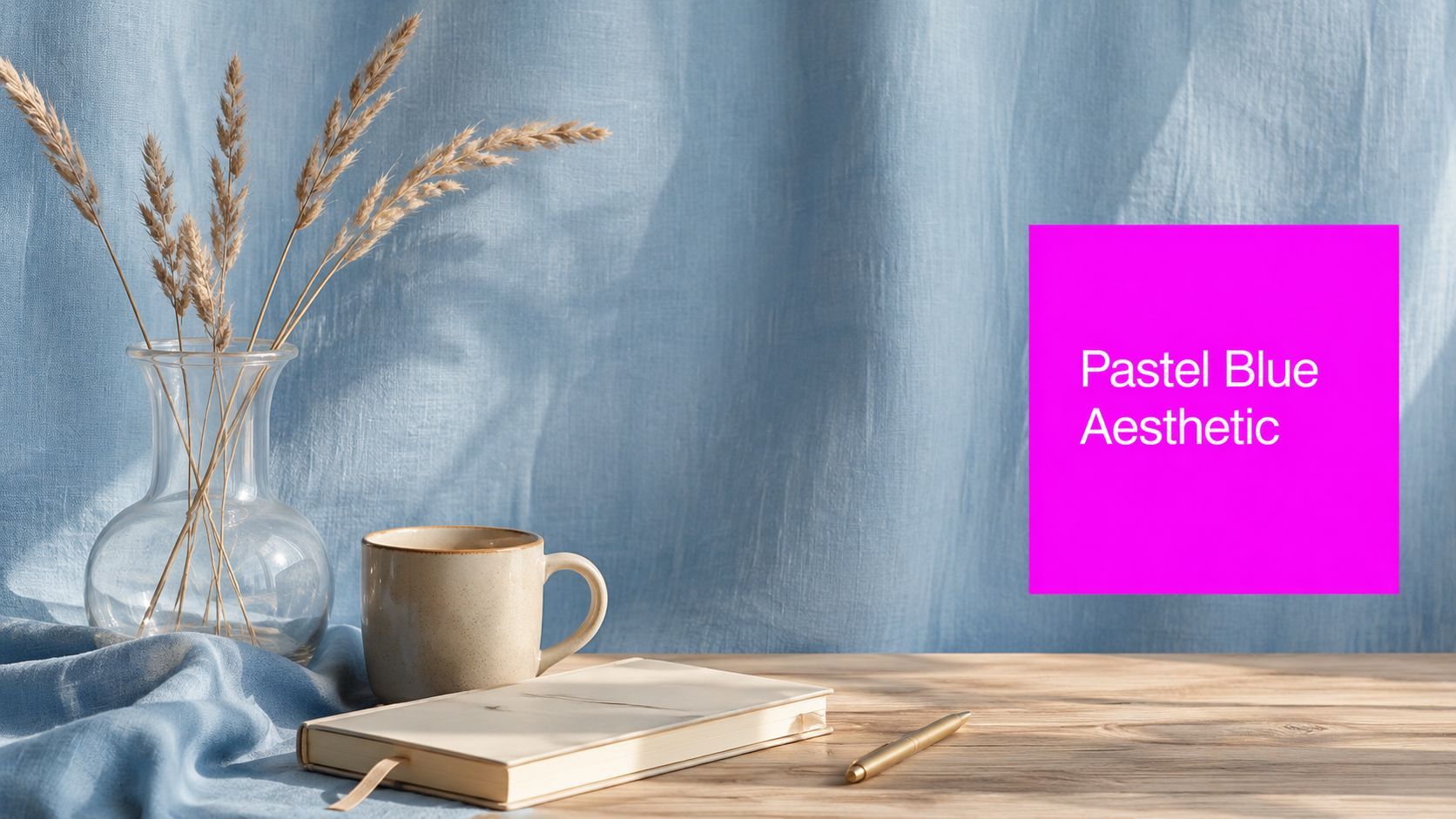
Pastel Blue Aesthetic: A Practical Guide for 2026

Ryan Bennett • August 29, 2026
Master the pastel blue aesthetic in 2026 with palettes, styling rules, and AI prompts for social media, branding, interiors, and fashion.
You've opened your feed and found ten beautiful references, but they don't look like they belong together. One image is icy blue, another is almost gray, and a third feels more like a nursery postcard than a polished brand asset. The problem probably isn't your composition. It's color control.
A successful pastel blue aesthetic depends on treating pastel blue as a flexible, managed family rather than one universal paint chip. You need a lightness range, a few dependable hex anchors, warm counterpoints, and repeatable prompt instructions. Once those decisions are fixed, moodboards become easier to build, and AI-generated batches can feel connected without looking identical.
What the Pastel Blue Aesthetic Actually Is
Pastel blue is generally a pale blue with high lightness and low-to-medium saturation. In plain language, it contains plenty of visual brightness and relatively little color intensity, so it feels powdery, airy, and quiet instead of electric or dramatic. Color references commonly describe it as soothing and gentle, while palette guides place related shades across blue-cyan hues with restrained saturation and very high lightness. QuillBot's pastel blue color guide provides a useful reference for how designers tune the family.
A practical starting point is to work with a lightness range around 78% to 90% and saturation around 10% to 35% when you're defining a digital palette. These are working targets, not a universal technical definition. The important idea is that lightness should remain consistently high, while saturation stays controlled.
Start with a family, not a single swatch
Use several related anchors:
- Soft sky blue:
#B6D0E2 - Pale powder blue:
#C5D9E8 - Muted dusty blue:
#A8C0D1 - Airy blue-gray:
#D6E4EC
These shades don't communicate exactly the same thing. #B6D0E2 feels grounded and editorial, while #D6E4EC creates more open space. The darker, grayer #A8C0D1 works well for supporting surfaces, borders, or props because it gives the eye somewhere to settle.
That distinction helps separate pastel blue from nearby categories. Baby blue often feels more childish and straightforward. Periwinkle shifts toward violet. Dusty blue usually carries more gray and a more weathered mood. Powder blue can overlap with pastel blue, but it often suggests an especially pale, chalky finish.

Working rule: Keep your backgrounds, objects, and styling references inside the same lightness neighborhood. A single saturated blue can make the entire set feel inconsistent.
Where Pastel Blue Came From
A pastel-blue moodboard can borrow from a Rococo room, a postwar kitchen, and a carefully edited social feed without looking historically confused. The key is to treat pastel blue as a color family whose meaning changes with its setting.
Soft blue tones appeared in the Rococo era, when pale colors supported graceful, light-filled interiors and fashion. The broader history of pastel color reaches back centuries. The term “pastel” entered consumer-facing color education in 1662, and pastel shades became especially popular during the 18th-century Rococo era. Pastel blue's low saturation softened the ornate surroundings, much like a quiet voice can make a busy conversation easier to follow.
From Rococo softness to postwar comfort
Pastel blue became especially recognizable in mass culture during the 1940s and 1950s. Postwar design placed soft palettes across architecture, furniture, fashion, appliances, and automobiles. Baby blue cars, mint appliances, and gentle bathroom interiors connected these colors with consumer recovery, cleanliness, optimism, and domestic comfort. A history of popular colors by decade places pastel blue within the shift from prewar palettes to the softer visual language of postwar design.
The shade's role changed again in the 1980s. Interior design and pop culture used pastel colors in playful, graphic combinations, where pale blue supported contrast, geometric forms, and unusual pairings. In that context, it could feel energetic rather than delicate.
Around 2014, muted tones returned through digital-era styling and highly curated social feeds. Pastel blue suited screens because a light, restrained field could create spaciousness while preserving enough structure for type, products, or imagery.
This history gives modern pastel-blue work a useful source library: Rococo softness, postwar interiors, retro appliances, fashion, digital minimalism, and wellness branding. For a moodboard or a batch of AI-generated assets, choose only a few of those references and repeat them consistently. That selection keeps dozens of images related without forcing every asset into the same period.
Building a Pastel Blue Color Palette That Holds Together
A dependable palette begins with a primary blue family, then adds neutrals and one controlled accent. The familiar 60-30-10 ratio can serve as a flexible design exercise: let the main pastel blue occupy roughly 60% of the visual field, neutrals support about 30%, and an accent provide the remaining emphasis. You don't need to measure every pixel. Use the ratio to prevent every surface from competing for attention.
Start with these blue anchors:
#B6D0E2, a balanced soft blue#C5D9E8, a lighter powder tone#A8C0D1, a muted blue-gray#D6E4EC, an almost mist-like background
Then introduce neutrals that are warmer than pure white:
- Warm white:
#F7F4EF - Ivory:
#EFE7DA - Soft greige:
#D9D2C7
Warm neutrals keep pastel blue from becoming sterile. They also make product photography, interiors, and fashion styling feel more tactile. If you're comparing wall colors or building a room reference board, a paint color visualizer app can help you assess how the blue behaves beside furniture, flooring, and changing room contexts.
Choose the accent by mood
Muted coral and dusty peach create a romantic, human counterpoint. Pale butter yellow gives the palette a sunny, nostalgic quality. Sage makes the result feel botanical and coastal without relying on obvious beach imagery.
| Pastel Blue Pairing Reference | Pastel Blue | Pair With | Hex Combo | Mood |
|---|---|---|---|---|
| Soft romantic | #B6D0E2 | Muted coral | #B6D0E2 + #E8B4A0 | Gentle and expressive |
| Minimal editorial | #D6E4EC | Warm white | #D6E4EC + #F7F4EF | Clean and spacious |
| Coastal natural | #C5D9E8 | Sage | #C5D9E8 + #B7C9B3 | Fresh and grounded |
| Soft vintage | #A8C0D1 | Pale butter yellow | #A8C0D1 + #F2E6C2 | Cheerful and nostalgic |
Test the palette on a phone before locking it. View a thumbnail, a text-heavy card, and a product image at reduced size. If the light blue and warm white merge, darken the supporting blue or introduce a desaturated navy for text. Low-chroma colors can lose separation on bright screens, so evaluate the relationship between surfaces, not just the individual swatches.
Visual Styling Rules for a Pastel Blue Look
A pastel blue aesthetic becomes more professional when every visual decision supports the same quiet hierarchy. Use these five rules across a photo shoot, mockup, interior concept, or AI prompt.
Anchor one dominant plane
Give the eye one clear pastel-blue field. It might be a wall, linen backdrop, sky, tiled surface, or oversized garment. Let surrounding space breathe through cream, warm beige, or a related pale neutral. Without a dominant plane, the color scatters across small objects and the image loses its visual center.
Soften the light
Soft daylight or a diffused LED preserves the delicate quality of the palette. Harsh overhead light can make pale surfaces look chalky, while strong cyan light can push the blue away from its intended family. Ask for diffused window light, gentle shadows, and restrained highlights in an AI prompt. For post-production, a practical AI color grading guide can help you think about temperature, contrast, and consistency without treating color correction as a last-minute rescue.

Add one warm material
Pastel blue needs a tactile counterpoint. Choose one warm material per frame, such as brushed brass, terracotta, dried wheat, raw oak, or warm stone. The purpose isn't to make the image colorful. It's to stop the cool palette from feeling flat or institutional.
Build texture quietly
Matte ceramics, washed linen, sheer cotton, bouclé, and unfinished wood reinforce softness. Glossy surfaces can work, but too many reflective objects turn the image into a showroom or beauty-ad campaign. Texture should be visible through light and shadow, not through visual noise. For generated surfaces and material studies, a dedicated AI texture generator tutorial can help you describe grain, weave, and finish more precisely.
Keep typography gentle but readable
Pair a humanist serif or soft geometric typeface with generous tracking and comfortable line height. Fraunces, Recoleta, and Aeonik can support the mood, but the exact font matters less than the spacing and contrast. Replace pure black with a desaturated navy such as #4A5A6B, then check small text on an actual device.
Practical rule: Pastel blue should usually support the message, not overpower it. Use it for the environment, surface, or accent, then let contrast and hierarchy carry the information.
Adapting the Aesthetic Across Social Media, Branding, Interiors, and Fashion
The same pastel blue can look youthful, premium, coastal, or clinical depending on its surroundings. The color family stays recognizable when lightness remains high and saturation stays restrained, but each medium needs a different execution.
| Pastel Blue Aesthetic Across Four Contexts | Context | Key Adjustment | What Stays Constant |
|---|---|---|
| Social media | Use one blue hero image in a carousel and let cream space support the remaining frames | Clear focal point and calm lightness |
| Branding | Build a kit around #BFD7EA, #EFE7DC, dusty terracotta #C9A48A, and desaturated navy type | Controlled family and one warm anchor |
| Interiors | Use one focal wall with oak, bouclé, or brushed brass | Blue needs material contrast |
| Fashion | Style one blue coat, trouser, bag, or knit against bone, oat, or warm gray | Avoid visual overload and preserve softness |
Social content needs stronger separation
A phone compresses detail, so a pale blue background can disappear beside white interface space. Use a clear hero object, a slightly darker supporting blue, and warm neutrals that preserve edges. A 3:4 composition can give the color enough room to register, but the subject still needs a defined silhouette.
Branding needs repeatable decisions
A brand kit should specify where each color belongs. Assign the soft sky blue to backgrounds or large surfaces, warm beige to supporting fields, dusty terracotta to selective emphasis, and navy to typography. Reserve pure white for moments that need clear contrast, such as a call-to-action area.
For teams creating a reusable identity system, a brand kit tutorial can help translate the palette into repeatable templates rather than isolated inspiration boards.
Interiors and fashion need physical grounding
In an interior, a single blue wall can feel architectural when paired with natural oak and textured upholstery. Matching blue furniture across the room can flatten depth, especially when the surfaces have similar lightness. In fashion, one statement piece works better than a head-to-toe blue outfit. Bone, oat, and warm gray give the garment a clean frame while keeping the look modern.
The constant across all four contexts is simple: preserve the airy value structure, then add one warmer element to keep the result human.
AI Image Prompts and a Batch Workflow for Pastel Blue Assets
AI image generation responds better to a controlled vocabulary than to a mood word alone. “Pastel blue” can produce anything from baby blue plastic to icy cyan unless you specify light, materials, composition, and supporting colors.

Try these production-ready prompts:
-
Skincare flatlay:
overhead flatlay of skincare bottles, ceramic tray, dried eucalyptus, on pastel blue linen background, soft north-facing daylight, Aaton Grand 65 film look, muted palette, 35mm -
Interior scene:
minimal living room, one pastel blue feature wall, natural oak floor, bouclé sofa, brushed brass lamp, diffused window light, editorial interior photography -
Fashion editorial:
female model wearing pastel blue oversized coat over oat cashmere, standing in cream studio, soft directional light, medium format look, calm palette -
Branding mockup:
pastel blue business card mockup on warm beige stone slab, letterpress type, negative space, brand kit still life
You can use a free AI image prompt generator when you need variations, but keep your core style instructions fixed. The generator should expand your concept, not replace the palette system you already chose.
Use a batch workflow with fixed controls
- Lock a five-image reference board. Include the exact blue family, warm neutral, accent, texture direction, and lighting style you want repeated.
- Create a shared prefix. Add the same palette and lighting language to every prompt, such as “high-lightness pastel blue family, warm cream neutral, one muted terracotta accent, diffused daylight.”
- Control variation deliberately. Fix the seed for hero shots when your tool supports it, then vary the seed for supporting images so the set feels related without becoming repetitive.
- Run visual QA. Reject outputs that drift into saturated cyan, icy blue, pure white, or cold metallic styling.
- Export consistently. Keep one color-management approach across the batch, then inspect representative images on both a large screen and a phone.
The strongest batch isn't the one with identical backgrounds. It's the one where different subjects still share the same lightness, material language, and warm anchor.
Implementation Checklist and Common Misreads to Avoid
A focused afternoon is enough to build a useful first set if you work in sequence. Start with references, make decisions before generating, and leave time for quality control instead of treating QA as optional cleanup.

Follow the production order
- Moodboard: Gather references that share soft blue light, quiet materials, and a warm counterpoint.
- Palette lock: Choose your primary blue anchors, neutral background, accent, and text color.
- Prompt drafting: Write one reusable prefix, then add subject-specific details for flatlays, interiors, fashion, or branding.
- Batch generation: Produce related variations while preserving the same lighting and palette language.
- QA check: Inspect saturation, edge separation, typography, texture clashes, and mobile readability.
- Export: Apply consistent sizing, color handling, and file naming before publishing.
The most common misreads are easy to identify:
- Baby blue confusion: If the result feels childish, add gray or lower saturation and use more structured styling.
- Excessive saturation: If the blue feels electric, move toward a paler, less chromatic reference.
- Pure-white dependence: If the image looks sterile, replace some white with warm white, ivory, or greige.
- No warm anchor: If the palette feels cold, add oak, terracotta, brass, dried wheat, or a similar material.
- Texture overload: If matte linen, glossy plastic, metal, and heavy pattern compete, remove the least important surface.
- Skipped contrast checks: If text or small objects disappear, darken the supporting blue or use desaturated navy.
Start with one moodboard and one prompt. A controlled test reveals more than a large batch built on an undefined color family.
The best pastel blue aesthetic work balances softness with discipline. Lock the family, give each context a clear role, and judge every output as a functional design asset rather than a pretty isolated image.
Bulk Image Generation can help you turn a locked pastel-blue direction into a coordinated batch of social, product, branding, or editorial visuals without rebuilding every prompt from scratch. Visit Bulk Image Generation to explore bulk creation tools and start with a small pastel-blue test set you can review, refine, and scale.
