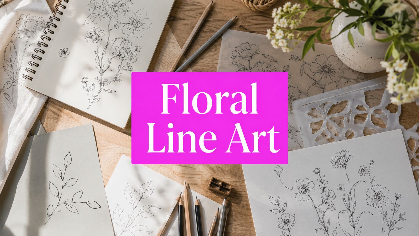
7 Line Drawing Flowers Styles to Master in 2026

Ryan Bennett • June 30, 2026
Explore 7 distinct line drawing flowers styles, from minimalist to botanical. Get AI prompts & tips to generate beautiful floral art for any project in 2026.
I've had projects where one flower sketch turned into a logo lockup, a social post, a thank-you card insert, and a printable coloring page set by the end of the day. The bottleneck wasn't ideas. It was producing enough clean variations fast enough to keep the workflow moving.
Beyond the blank page, floral line art becomes much more useful when you treat it as a scalable asset system instead of a one-off drawing. If you also work across print and décor, it helps to understand adjacent visual categories like choosing botanical art prints so your flower illustrations fit the final product, not just the sketchbook.
1. Botanical Line Drawing with Detailed Veining

A florist client once approved a rose sketch in seconds, then immediately asked for matching versions for soap wraps, seed packet inserts, and a workshop handout. Detailed veining made that easy. The same core illustration could carry product information, decorative value, and a more botanical feel without being redrawn from scratch.
This style works best when the flower needs to look observed, not stylized. On skincare packaging, herbal labels, museum handouts, and educational printables, internal petal lines, leaf veins, and stem structure signal care and accuracy. Decorative line art can look pretty. Botanical line work has to hold up under closer viewing.
That difference matters in bulk generation. If the goal is to build an asset library, start by choosing specimens with recognizable structure such as roses, peonies, camellias, poppies, and magnolias. Then generate in sets. I usually separate the run into hero stems, cropped bloom studies, leaf clusters, buds, and corner elements so the outputs are ready for packaging, stationery, and editorial layouts.
How to prompt it well
Good prompts name the plant parts. Weak prompts ask for a pretty flower and leave the model guessing.
- Use anatomical language: “Detailed botanical line drawing of a wild rose, visible leaf veins, sepal detail, stem thorns, black ink on white background, no shading.”
- Set the layout: Use phrases like “isolated specimen,” “full stem with two leaves,” “top-down bloom study,” or “scientific plate composition” based on the final format.
- Build in production variety: Request “three pose variations,” “consistent line weight,” or “collection of matching botanical elements” so one generation pass produces a usable set instead of a single image.
- Protect the style: Add “line art only,” “no watercolor,” “no gray shading,” and “no engraved crosshatching” if the model tends to drift.
I use this style when the image has to explain, label, or support a premium product story. Veining gives you detail without visual noise.
There is a trade-off. More internal detail improves credibility, but it also makes scaling trickier at very small sizes. Fine veins that look excellent on an art print can clog up on a small jar label or wax seal sticker. For that reason, I generate one detailed version for larger uses and a simplified companion version with fewer interior lines for micro-applications.
A reliable production prompt looks like this: “Botanical line drawing of a wild rose on stem, detailed petal folds, realistic leaf veining, clean black ink outlines, isolated on white, vintage scientific illustration feel, no shading, no color, high detail.” From there, batch editing performs the core work. Thicken outer contours, remove stray artifacts, and export grouped assets so one prompt run becomes invitation corners, product badges, insert art, and monochrome print pieces.
2. Minimalist Single-Line Continuous Drawing

I learned to respect this style the first time I had to build fifty matching floral assets for a brand system in one afternoon. The brief sounded simple. Minimal flower line art. The first batch looked elegant at thumbnail size, then fell apart in production because the line wandered, doubled back, and turned each flower into a different visual language.
Single-line floral work only looks effortless. The path has to be controlled from the start.
That is also why AI often misses it. The model can mimic the look of continuous drawing, but it will default to decorative loops unless the prompt tells it where to focus. For bulk generation, the goal is not just one pretty result. The goal is a repeatable set with consistent stroke behavior, clean silhouettes, and enough variation to cover multiple formats.
Use continuous-line flowers where clarity matters more than detail
This style performs best when the flower acts like a graphic symbol rather than an illustration study. It works well for florist logos, candle labels, jewelry insert cards, social post templates, phone wallpapers, and simple packaging seals. The line stays readable at small sizes, and recoloring is fast.
The trade-off is accuracy. A tulip or poppy usually survives simplification. A peony or ranunculus can collapse into visual noise if the line tries to describe every petal turn in one pass.
I handle that by prompting for species with strong outer silhouettes first, then building a library in batches. Tulip, lily, daisy, orchid, and anemone usually give better single-line results than densely layered blooms. I also keep each run narrow. One species, one composition rule, one stroke style. That makes it much easier to sort, resize, and reuse the outputs across square posts, vertical stories, product stickers, and logo drafts.
A prompt that holds up in production looks like this: “Minimalist single-line flower drawing of a tulip, one continuous stroke, clean black line, balanced negative space, centered composition, white background, modern logo style, no shading, no color, no extra sketch lines.”
Then add volume instructions that help with scaling:
- For asset libraries: “six variations, consistent stroke weight, each flower isolated, matching style set”
- For logo exploration: “simple silhouette, minimal overlaps, vector-friendly contour, icon-like clarity”
- For social graphics: “centered composition, generous white space, vertical and square crop safe”
- For cleaner outputs: “single continuous line only, no scribbles, no pencil texture, no crosshatching”
One line can carry a lot of commercial work, but only if it knows where to go. If the stroke crosses itself too often, the drawing stops feeling refined and starts feeling hesitant.
A useful reference point comes from traditional contour drawing practice. The Museum of Modern Art describes line as one of the most direct ways artists define form and movement, which helps explain why continuous drawings read so well in branding and editorial applications in MoMA's line glossary. The same principle applies in AI generation. Clear line direction creates a flower that reads fast, even when the image is reduced to a label, favicon, or stamp-sized graphic.
3. Detailed Floral Arrangement with Multiple Blooms

Single stems are easy to place. Full arrangements do more commercial work. They fill a book cover, carry a textile repeat, anchor wall décor, and give packaging a fuller visual language.
The challenge is clutter. A multi-bloom drawing fails when every flower competes for attention with the same line weight and detail density. You need hierarchy. One or two blooms should lead, while leaves and secondary flowers support.
Build arrangements with foreground and background logic
A useful traditional benchmark comes from botanical line drawing practice. Using smaller nibs such as 0.1mm for background elements and larger nibs such as 0.5mm for foreground elements creates a 35% increase in perceived depth and contrast, according to a botanical art guide focused on flowers and linework in this flower line drawing class reference. In AI prompting terms, that translates to “fine background linework, heavier contour on front-facing blooms.”
Use prompts like these:
- For wall art: “Detailed floral arrangement line drawing, three focal blooms, layered foliage, foreground flowers with heavier outlines, white background.”
- For pattern development: “Balanced bouquet line art, repeating botanical spacing, clean negative space between stems.”
- For coloring pages: “Complex floral bouquet with clear closed shapes, no gray shading, printable black outlines.”
What works is generating arrangement families, not one masterpiece. Run a set for symmetrical bouquets, another for loose garden clusters, and another for corner sprays. That gives you a library you can reuse across banners, inserts, and covers without redrawing from scratch.
A good arrangement also respects scale. If every bloom is the same size, the piece feels pasted together. Slight overlap, smaller background flowers, and line-weight contrast fix that quickly.
4. Monochrome Gradient Line Illustration
Pure outline line drawing flowers are clean, but sometimes they're too flat for premium print. That's where monochrome gradient line illustration earns its place. You still stay in black and white, but you add depth through denser strokes, directional hatching, and controlled shadow blocks.
This style is useful when a client wants sophistication without going full vintage engraving. Wine labels, formal invitations, editorial openers, and heritage-leaning packaging all benefit from it.
How to make depth look intentional
The biggest mistake here is random texture. If hatching doesn't follow form, petals look dirty rather than dimensional. Good monochrome line illustration uses line direction to describe curvature.
Professional line art workflow guidance recommends a solid round brush with a hard edge for clean outlines, and notes that reducing sketch layer opacity to 30 to 40% before final inking can accelerate refinement by 50%. The same guidance says increasing brush size by 10 to 15% on outer petal edges helps create perceived volume, while directional lines and subtle black blocks add shadow depth in this professional line art guide.
That advice transfers well to AI cleanup and post-production:
- Prompt for structure: “Monochrome floral line illustration, varied line density, subtle cross-hatching, engraved depth, no color fill.”
- Use post-production for clarity: Strengthen outer contours first, then darken only the deepest recesses.
- Keep printable areas open: Dense hatching can clog at small sizes, so save the most detailed versions for larger formats.
Studio note: If the asset will be printed small, simplify the inner hatching before you simplify the contour. The silhouette carries the flower first.
This style works best when you need a bridge between graphic and classical. It doesn't have the austerity of minimal line art, and it doesn't require the historical styling cues of a true engraving.
5. Whimsical Decorative Floral Line Art
A client once needed 60 floral graphics for a spring stationery launch by the end of the day. Botanical accuracy was irrelevant. What mattered was warmth, repeatability, and enough variation to fill cards, tags, stickers, and social posts without the set feeling copied.
That is where whimsical decorative floral line art earns its keep. This style favors personality over realism. Petals can spiral, stems can loop, and small accents like dots, stars, and tiny flourishes can carry a lot of visual charm without adding much production time.
It scales well because the brief is easier to control in batches. You are building a family of assets with shared mood, stroke logic, and ornament choices. For bulk generation, that matters more than naming a precise flower species.
Best uses for high-volume asset libraries
This style works especially well for wedding invitation suites, greeting card packs, classroom printables, party signage, seasonal social graphics, stickers, and craft templates. It also gives you more tolerance for prompt variation than stricter botanical styles. A slightly exaggerated petal or playful leaf shape usually reads as intentional.
The trade-off is consistency. If every output gets a different kind of flourish, the set looks scattered fast. I keep one decorative rule per batch, such as curled stem ends, dotted centers, or hand-lettered leaf shapes, then vary composition around that rule.
When generating at volume, write prompts that lock the decorative system first, then the use case. A good starting point is the free AI image prompt generator for floral asset batches, especially if you need multiple prompt variants built around one art direction.
- For invitations: “Whimsical flower line drawing, delicate curled petals, ornamental stems, balanced negative space, clean black outline, printable invitation graphic.”
- For kids' activities: “Playful floral doodle line art, bold simple outlines, cheerful decorative petals, large open spaces, coloring page friendly.”
- For seasonal campaigns: “Decorative spring flower line art, light flourishes, airy composition, charming card illustration style, monochrome outline.”
- For sticker packs: “Cute decorative floral line art, compact compositions, varied bloom shapes, crisp contour lines, white background, sticker-ready.”
This style is a strong fit for printable products because it stays readable even after simplification. That gives you room to repurpose one prompt set into cards, coloring sheets, tags, and mini icons with only light cleanup. As noted earlier in the article, floral line art has steady demand across stock libraries and printable design categories.
For printable activity products, build themed sets instead of isolated pages. A birthday set, spring set, garden set, and alphabet-flower set will outsell a random folder of unrelated flowers because buyers want cohesion. If coloring pages are part of your workflow, the Bulk Image Generation coloring page tools make it much easier to turn decorative flower concepts into clean printable batches.
6. Abstract Geometric Floral Line Art
A client once asked for floral packaging that felt precise, not romantic. Standard botanical prompts kept producing soft petals and natural curves. Geometric floral line art solved that problem fast. It keeps the flower recognizable while giving the composition enough structure to sit inside a modern brand system.
This style fits tech products, minimalist skincare, editorial poster series, interface icon sets, and home goods that need a cleaner visual language. A key advantage is repeatability. Once you define the geometry rules, such as hexagonal centers, equal-angle petals, or fixed stroke weight, you can generate dozens of assets that still look like they belong to the same collection.
Readability decides whether this style works. If every petal becomes a hard-edged symbol, the drawing stops reading as a flower and starts reading as an abstract badge. Keep one botanical cue intact. A curved stem, radial bloom center, or believable petal spacing usually does the job.
That trade-off matters in production too. Tighter geometry scales well for icons, stamps, and small labels, but it can feel cold in larger hero graphics. Looser geometry feels more human, though it often needs more cleanup to keep a set consistent.
Use prompt structures like these:
- For icons: “Abstract geometric flower line art, minimal black outline, symmetrical petal construction, consistent stroke weight, scalable icon style, white background.”
- For poster sets: “Modern geometric floral line drawing, Bauhaus-inspired shape language, structured petal symmetry, refined negative space, monochrome line art.”
- For interface assets: “Contemporary geometric flower symbol, clean vector-like linework, high legibility at small sizes, simple floral abstraction, white background.”
- For brand libraries: “Geometric floral line art collection, unified petal logic, varied bloom silhouettes, consistent outline weight, modern packaging-ready asset set.”
I generate this style in families, not one-offs. Start with one strong prompt, then vary the flower head shape, petal count, and center construction while keeping the same visual rules. That gives you a usable library for packaging, UI accents, social templates, and print collateral instead of a folder full of unrelated experiments.
If you need help building those prompt variations quickly, the free AI image prompt generator for floral asset sets speeds up the first draft stage. For bulk output, the Bulk Image Generation AI art generator is useful for producing cohesive series that can be reviewed side by side.
7. Vintage Botanical Engraving Style Line Drawing
Vintage botanical engraving style sits at the opposite end of the spectrum from minimalist one-line work. It's formal, referential, and detail-heavy. You use it when a project needs age, authority, or a museum-adjacent tone.
This style is especially effective for tea packaging, apothecary-inspired branding, educational handouts, gallery merchandise, historical fiction covers, and natural wellness products. The linework suggests heritage before the customer reads a single word.
Perspective matters more than most guides admit
A lot of engraving-inspired flower art still looks flat because the underlying drawing is flat. That's not just a skill issue. It's a tutorial issue. One analysis of beginner content says most line drawing flower tutorials focus on frontal or top-down views, while side-view and overlapping 3D perspective is often neglected. The same source notes that 85% of available “single line flower” illustrations are flat or top-down, while only 15% show multi-angle perspective with depth cues like overlap and variable line width in this perspective-focused tutorial reference.
That matters even in vintage styles. If the flower head tilts, overlaps, or turns in space, the engraving suddenly looks much more convincing.
- Use a period-specific prompt: “Vintage botanical engraving line drawing of chamomile, historical naturalist illustration, stippling and fine hatch detail.”
- Ask for composition control: “Centered specimen plate,” “museum catalog style,” or “labeled botanical study” can steer the result.
- Add age later, not in the first prompt: Generate the clean drawing first. Apply paper texture or warm toning in post.
I also prefer to generate a library by plant family. Herbs, meadow flowers, roses, and medicinal botanicals each create a more coherent set when grouped. If you need help refining those prompt structures, the free AI image prompt generator is a useful starting point for style-specific variations.
7-Style Comparison of Line Drawing Flowers
| Style | Implementation complexity | Resource requirements | Expected outcomes | Ideal use cases | Key advantages |
|---|---|---|---|---|---|
| Botanical Line Drawing with Detailed Veining | High, precise anatomy and fine line control | Moderate, skilled artist or detailed AI prompts; high-res files | Accurate, scalable monochrome botanical art with visual depth | Educational diagrams, premium packaging, coloring pages, branding | Versatile, professional, retains detail at multiple sizes |
| Minimalist Single-Line Continuous Drawing | Low, simple, fast execution | Low, minimal compute and small files; easy AI bulk generation | Clean, elegant single-stroke floral forms optimized for screens | Social media graphics, logos, wallpapers, tattoos | Fast to produce, highly shareable, minimal file size |
| Detailed Floral Arrangement with Multiple Blooms | High, complex composition and balance required | High, more compute and careful prompt engineering | Impactful, layered compositions suitable for large formats | Textile/wallpaper, large wall art, comprehensive branding, coloring books | Strong visual statement; ideal for patterns and campaigns |
| Monochrome Gradient Line Illustration | High, requires precise line-weight and hatching control | Moderate–High, high resolution for cross-hatching; skilled execution | Tonal depth and engraved, print-ready black-and-white illustrations | Luxury packaging, editorial spreads, formal stationery | Sophisticated, premium look without color; excellent for print |
| Whimsical Decorative Floral Line Art | Medium, stylized ornamentation and balance | Low–Moderate, creative prompts and variation testing | Playful, decorative visuals with ornamental flourishes | Invitations, greeting cards, children's books, seasonal content | Engaging and versatile; builds friendly brand personality |
| Abstract Geometric Floral Line Art | Medium, design-forward intent for geometry and balance | Low–Moderate, easy to scale and produce icon sets | Modern, stylized floral motifs with geometric structure | Tech branding, logos, icons, contemporary decor | Contemporary and scalable; strong digital visual impact |
| Vintage Botanical Engraving Style Line Drawing | High, historical techniques and authentic detailing | High, multiple iterations, aged textures, high-res output | Authentic, museum-quality vintage botanical illustrations | Heritage branding, educational texts, museum and archival materials | Credible, premium, well-suited for tradition-focused projects |
From Inspiration to Production Scale Your Floral Designs
Line drawing flowers have lasted because they solve real design problems. They stay readable at small sizes, adapt well across print and digital formats, and can swing from scientific to decorative without changing the core medium. The historical range is part of the appeal. Floral line art traces back through ancient art traditions and keeps showing up in modern branding, educational publishing, stock libraries, and digital product design.
The practical takeaway is simpler than the history. Don't generate random flowers and hope you'll find a use for them later. Generate by system. Build one set for botanical education, one for minimal branding, one for arrangements, one for decorative printables, and one for vintage packaging. That's how you turn AI output into an asset library instead of a messy downloads folder.
For digital marketers, that means faster campaign production. A single theme can become post graphics, story backgrounds, lead magnet covers, printable bonuses, and ad creative variations. For educators and hobbyists, it means cleaner worksheet sets, themed coloring pages, and more consistent classroom materials. For small business owners and agencies, it means you can test multiple visual directions before committing to one.
There's also a workflow advantage. Bulk Image Generation lets you move from prompt idea to production-ready batches without getting buried in manual prompt tinkering. According to the platform description, users can create up to 100 unique visuals in under 20 seconds, and its batch editor supports tasks like resizing, background removal, and enhancement while reducing editing time by half. That combination is what makes style libraries realistic to maintain, not just attractive in theory.
Use the seven styles in this guide as production categories. Start with the commercial use case, write prompts that describe structure instead of mood alone, and generate families of assets rather than isolated one-offs. If you're also exploring adjacent print opportunities, studying markets like best POD niches for 2026 can help you match floral styles to products that sell well.
Bulk Image Generation helps you turn line drawing flower ideas into usable asset libraries fast. If you need logo-ready florals, printable coloring pages, social graphics, packaging art, or full themed collections, Bulk Image Generation gives you a practical way to create, refine, and scale them without the usual production bottleneck.
