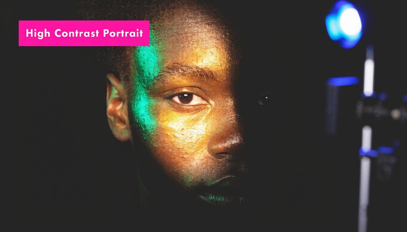
Master the Art of the High Contrast Portrait in 2026

Ryan Bennett • May 14, 2026
Learn to create a stunning high contrast portrait. This 2026 guide covers lighting, camera settings, pro editing techniques, and AI prompts for bulk generation.
The last time a campaign portrait set fell flat, the problem wasn't the subject or the styling. It was the light. Every frame had detail, but none of them had tension, and that's what a high contrast portrait fixes fast.
The Power of a High Contrast Portrait
A high contrast portrait isn't just a photo with darker shadows and brighter highlights. It's a portrait that makes a clear editorial choice about what matters and what can disappear. That usually means sculpted light, controlled shadow, simplified color, and a frame that tells the viewer where to look first.

Flat portraits ask the viewer to do too much work. The face blends into the background, skin tone sits in the same tonal zone as the wardrobe, and expression loses force. High contrast strips that clutter away. It gives you shape before detail, mood before polish, and identity before decoration.
Why the look works so well
Marketers like this style because it stops the scroll. Art directors like it because it reproduces well across formats. Photographers like it because it gives a face structure, even when the set is simple and the budget isn't.
There's also solid aesthetic evidence behind it. A 2020 PMC study on image statistics and aesthetic ratings found that high contrast in portraits, measured by steeper negative Fourier spectral slopes, was a dominant predictor of appeal. In that portrait-specific model, it explained up to 18.6% of the variance in viewer ratings and low-contrast peers were outperformed by up to 75% in predicted appeal.
That tracks with what works in the field. If the portrait has to carry emotion in a thumbnail, on a landing page, or inside a carousel ad, contrast is often doing more of the job than styling.
Practical rule: If a portrait still feels strong when you shrink it down and squint, the contrast structure is probably doing its job.
What high contrast adds to brand work
This style gives brands a useful kind of consistency. A founder portrait, a creator headshot, and a campaign character image can look related even when locations, wardrobes, or production conditions change. The tonal treatment becomes the glue.
That matters more now because visual systems are sprawling. Brands need portrait assets for email headers, social cuts, event banners, profile photos, paid ads, and AI-assisted mockups. The teams that move fastest usually aren't chasing novelty. They're standardizing a look that's hard to forget. For a broader view of where this is heading, the shift is visible across AI image generation trends in 2025.
Here's the trade-off. High contrast is powerful, but it's not forgiving. If your light placement is lazy, skin texture goes ugly instead of cinematic. If your edit is heavy-handed, “moody” turns into muddy. If your AI prompt is vague, the result looks like generic noir wallpaper.
The reward is worth it. Done well, a high contrast portrait feels deliberate, premium, and emotionally direct.
Crafting Contrast with Light and Camera
If you want the strongest result, build the contrast in-camera first. Post can refine it, but it shouldn't have to invent it.

The cleanest studio recipe I know is simple. Use a dark background, one hard key, one controlled separation light, and flags that actively remove spill instead of trying to “fix” it later.
The lighting setup that works
A Broncolor high-contrast portrait setup lays out a very practical approach. The key light is a single strobe with a P70 reflector and barn doors, placed 1m above the subject and 45-90° to the side. Add black flags to deepen shadows by 2-3 stops, and the setup produces a contrast ratio greater than 8:1. The recommended camera settings are ISO 100 and f/8 to preserve detail.
That setup works because every piece is doing one clear job:
- Background first: A dark plain or dark wall keeps the portrait graphic. If the background is too bright, the mood leaks out of the frame.
- Key light with intent: The side angle carves cheekbones, jawline, nose bridge, and eye socket. Barn doors keep the beam from splashing everywhere.
- Rear separation light: Used lightly, it prevents black hair, dark clothing, or a turned shoulder from collapsing into the background.
- Flags close to the subject: Amateurs often fail here. They add more fill when the shot looks weak. Pros often subtract light instead.
Camera choices that protect the file
Shoot RAW. That isn't optional for this style. Hard light creates fast tonal transitions, and JPEG gives you less room to recover mistakes gracefully.
I also keep the exposure disciplined:
- Meter for the highlights. Skin can look dramatic with deep shadows, but blown highlights look cheap.
- Keep ISO low. The referenced setup uses ISO 100 for good reason. Noise in underlit shadow transitions kills the clean look.
- Stay around f/8 in studio. You want enough depth for eyes, lashes, brow, and the front plane of the face to hold together.
- Watch catchlights. One crisp catchlight can make a severe portrait feel alive. No catchlight, and the same frame can feel dead.
Hard light is honest. It reveals every lighting mistake, but it also rewards precision faster than soft light does.
What usually goes wrong on set
A lot of photographers think “high contrast” means “underexposed.” It doesn't. The face still needs a deliberate tonal anchor. If the key side is too dim, the whole image just drifts into gray-black soup.
The second common mistake is using oversized modifiers because they're easier. They are easier. They're also the fastest way to flatten the portrait. If you want drama, use a tighter source, control spill, and let some parts of the face fall away.
A few field-tested checks help before you move on:
| On-set check | What you want to see |
|---|---|
| Shadow side | Deep, but not empty |
| Highlight side | Texture on skin, no chalky clipping |
| Background separation | Visible edge where needed, invisible where not |
| Histogram | Spread across tonal range, not bunched in the middle |
If the frame already looks authoritative on the back of the camera, post-production becomes shaping, not rescue.
Mastering Contrast in Post-Processing
A great high contrast portrait edit doesn't come from dragging one contrast slider until the image snaps. It comes from building tonal separation in layers, then deciding where to preserve subtlety.

For commercial work, I prefer edits that stay flexible. Campaigns change. Crops change. A portrait that looked right for a poster may need a softer skin response for a mobile ad or a cleaner monochrome feel for a profile card.
A Photoshop stack worth repeating
A documented Photoshop workflow for desaturated high-contrast portraits uses a base layer, a desaturated layer at 40% opacity, and a Curves layer at 50% opacity set to Soft Light. The same source states that this approach can lift engagement by 35% on social media, and that similar desaturated black-and-white portraits showed 2.1x higher CTR than color images in major market tests.
That stack works because it separates mood from damage. Desaturation reduces the noise of competing color information. Soft Light curves expand the drama without making every transition look brittle. The base layer keeps you tethered to the original file.
Here's the version I'd use in a working folder:
- Start with cleanup: remove temporary blemishes, flyaway distractions, and background junk before adding drama.
- Duplicate for tonal design: keep a clean base, then add the desaturated layer at the stated opacity.
- Use Curves in Soft Light: shape contrast, but watch skin transitions around the forehead, cheek, and under-eye area.
- Dodge and burn locally: forehead ridge, nose bridge, cheekbone crest, lip line, jaw edge.
- Add grain last: if the image needs grit, do it after tonal decisions, not before.
Where editors push too far
Most bad “gritty” portraits die in the blacks. People crush them because the thumbnail looks punchier, then they realize they've erased fabric texture, hair detail, and the subtle shape of the shadow side.
I'd rather preserve a little tonal information and darken selectively. The same logic applies to highlights. A bright cheek or forehead can feel sculptural. A fully nuked highlight feels like a retouching mistake.
Editing note: If the portrait looks dramatic only at full screen, the edit is probably relying on texture tricks instead of tonal design.
There's also a useful crossover here for people working across categories. If you're balancing realism, surface detail, and controlled tonality in other commercial visuals, this guide to crafting lifelike AI product photos is worth reading because many of the same judgment calls apply.
A better rhythm for commercial portraits
I usually think in three passes instead of one giant edit. First, fix. Second, shape. Third, unify. That keeps the portrait from becoming overworked.
For black-and-white or desaturated campaigns, the best result often comes when the skin still feels dimensional, not polished flat. The point of a high contrast portrait isn't to remove humanity. It's to make the emotional read faster and stronger.
Generating High Contrast Portraits with AI
AI is no longer just a concept board tool for portrait direction. It's a production tool. If you need volume, style consistency, and fast variation, it's often the most efficient route to a usable high contrast portrait set.

The gap in most tutorials is obvious. They teach photographers how to place a light, but they don't help a social team that needs a hundred character portraits before lunch. That's exactly where AI has become practical.
Why AI fits this style so well
One verified workflow note says marketers and businesses can use AI to generate 100+ unique high-contrast portraits in under 20 seconds, powered by Flux 1.1, and that internal platform data showed hobbyists producing 5x more assets weekly by bypassing studio costs, as discussed in this AI-driven workflow reference.
That speed matters because high contrast is a style with strong repeatable rules. AI handles repeatable rules well when the prompt is specific. If you describe light direction, shadow behavior, background depth, skin finish, and lens feel, the outputs become much more art-directable.
If you want a broader grounding in model behavior and image generation language before building portrait prompts, this explainer on understanding generative AI visuals is useful context.
Prompt anatomy that gets better results
Weak prompts ask for mood. Strong prompts ask for lighting geometry and tonal priorities.
Use terms like these:
- Lighting language: hard side light, single-source strobe, barn doors, deep falloff, rim separation
- Tonal language: crushed blacks, bright cheek highlight, deep eye socket shadows, monochrome, desaturated skin tones
- Camera language: tight headshot, 85mm portrait lens feel, eye-level, studio backdrop, shallow to moderate depth of field
- Stylistic guardrails: clean skin texture, realistic pores, no glam retouching, cinematic, editorial, premium
For teams that don't want to build prompts from scratch, a free AI image prompt generator can help translate a rough visual idea into something more structured.
Flux 1.1 Prompt Recipes for High Contrast Portraits
| Portrait Style | Flux 1.1 Prompt Example |
|---|---|
| Gritty black and white | high contrast portrait, monochrome, hard side light from camera left, deep shadow on far cheek, dark seamless background, crisp catchlight, realistic skin texture, editorial fashion mood |
| Cinematic founder headshot | professional high contrast portrait of a startup founder, desaturated color palette, single hard key light, subtle rim light, black wardrobe, clean dark background, premium magazine style |
| Street cast look | raw high contrast portrait, harsh directional light, shadow cutting across face, textured jacket, urban mood, moody grayscale, natural expression, non-glamorous realism |
| Luxury beauty drama | close-up high contrast beauty portrait, bright sculpted highlight on cheekbone, strong shadow under jaw, clean skin detail, black background, polished commercial finish |
| Experimental metallic concept | surreal high contrast portrait, reflective metallic paint, dramatic light falloff, deep blacks, glowing highlights, editorial art direction, premium campaign aesthetic |
AI is best when you treat it like a fast first shoot, not a magic final answer. Generate wide, shortlist aggressively, then refine with edits or reference the best outputs for a live set.
Scaling Production with Batch Editing
One dramatic portrait is easy. A campaign library is where the discipline shows.
When teams miss consistency, it usually isn't because they lack taste. It's because every image gets edited by feel. Batch editing fixes that by turning your taste into a repeatable system.
Use contrast as a quality-control metric
A useful anchor here is RMS contrast, which measures the standard deviation of pixel values. In the technical explanation from 35mmc on histograms and contrast, a post-enhancement portrait might sit at σ=65 compared to a baseline at σ=40. That same source supports the prompt language “high RMS contrast portrait, σ>60” for more consistent dramatic outputs.
You don't need to obsess over the number on every file, but it gives you a practical benchmark. If one portrait in a campaign feels flat next to the others, the histogram usually tells you why before your eye fully articulates it.
My batch workflow for campaign sets
I build batch editing around templates, not one-off hero edits. That means deciding in advance what should stay fixed across the set and what can vary.
A reliable sequence looks like this:
-
Create one approved hero look
Finalize the tonal treatment on a single portrait first. Lock in blacks, highlight behavior, desaturation level, grain choice, and any vignette or background cleanup. -
Save the look as a reusable preset or action
If you're working in Photoshop, Lightroom, or a batch editor, keep the stack modular. Global tone, local dodge and burn, sharpening, and grain shouldn't live in one destructive move. -
Run the set in groups, not all at once
Group by lighting condition, skin tone range, wardrobe density, or source type. A studio shot and an AI-generated frame may want the same mood but not the same exact black point. -
Check histograms after batch application
High contrast should create tonal spread. If the histogram collapses into one side, you've gone too far or started from mismatched source files.
Batch editing should preserve decisions, not automate mistakes.
What to batch and what to leave alone
Good candidates for batching:
- Global contrast curve: the overall tonal signature of the campaign
- Desaturation treatment: especially for a consistent editorial monochrome or near-monochrome look
- Background cleanup: if all assets share a similar backdrop strategy
- Resize and export profiles: social, web, email, paid, and profile variants
Leave these for selective adjustment:
- Facial dodge and burn
- Catchlight cleanup
- Hairline and edge separation
- Shadow detail on darker wardrobes or hair
If you're standardizing deliverables after the creative pass, a bulk image resizer is a practical final-stage utility because campaign portraits almost always need multiple crops and dimensions.
The biggest win from batch editing isn't speed alone. It's confidence. You know the fifteenth image in the sequence still belongs with the first.
Common Mistakes and How to Avoid Them
The most common mistake with a high contrast portrait is assuming “more contrast” always means “better portrait.” It doesn't. There's a point where the image stops feeling intentional and starts looking broken.
The tonal mistakes
The first failure is crushed blacks. If shadow side skin, hair texture, and clothing all collapse into one dead block, the portrait loses sophistication. Keep the shadows deep, but leave a trace of shape where the form needs to read.
The second failure is blown highlights. Forehead, cheekbone, nose bridge, and shoulder highlights need structure. Once those areas clip too hard, the frame looks brittle.
A quick field checklist helps:
- If the jaw disappears completely, lift selective shadow detail instead of raising the whole exposure.
- If the cheek highlight looks chalky, reduce the highlight intensity before adding more global contrast.
- If the eyes feel lifeless, fix the catchlight or local contrast around the eyes, not the whole frame.
The angle problem people ignore
A lot of portrait advice treats the high angle as universally flattering. That's lazy advice. It can work, but it can also distort facial proportions fast.
The verified angle reference from this analysis of high-angle portraiture notes that high-angle portraits can create “dynamic innocence,” but can also reduce perceived attractiveness by 20-30%. It also notes that inclusive AI prompting such as “flattering high-angle portrait, no distortions” has produced 95% flaw-free variants.
That matters for diverse subjects because the same angle doesn't shape every face the same way.
Better fixes in camera and in AI
For camera work, the easiest correction is moderation. Instead of lifting far above the subject, stay closer to eye level and use light direction to create drama. You'll keep the expression strong without exaggerating chin, forehead, or nose relationships.
For AI, be explicit. Don't prompt “high-angle dramatic portrait” and hope for the best. Add constraints that protect the subject:
- flattering high-angle portrait
- no distortions
- natural facial proportions
- diverse skin tones
- realistic eyes and jawline
A dramatic portrait should feel bold, not punishing.
The best high contrast portraits are severe in tone, not careless in execution. Keep the light intentional, the edit restrained, and the angle honest to the subject.
If you need high-contrast portrait variations at campaign scale, Bulk Image Generation is built for that workflow. You can generate up to 100 unique visuals in under 20 seconds, shape prompts in natural language, and use batch editing for background removal, resizing, face swaps, and fast enhancements without building a studio pipeline from scratch.
