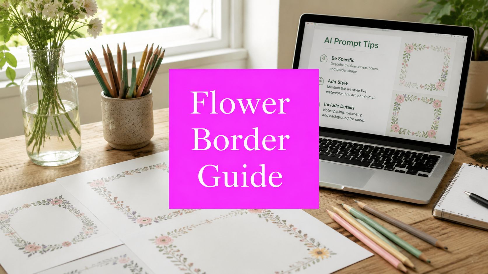
Flower Border Image: AI Prompts & Design Tips for 2026

Ryan Bennett • August 21, 2026
Create stunning flower border image assets with AI. Learn prompt templates, batch workflows, color tips, and export strategies for social and print.
Most advice about a flower border image starts with beauty. Add more blooms, more detail, richer color, and intricate corners, then export the result. That approach works for a standalone illustration, but it breaks down as soon as the border has to frame a certificate, leave room for worksheet instructions, or sit behind text in a social post.
A usable floral asset needs negative space, predictable edges, readable contrast, safe margins, and the right file structure. Decorative borders have served practical page layouts for centuries, from medieval manuscripts to the renewed Arts and Crafts interest associated with William Morris and Morris & Co. (The Conversation) The strongest modern workflow keeps that design discipline while using AI for speed.
Why Most Flower Border Images Fail in Real Projects
The prettiest generated border is often the wrong border. Dense blossoms may look impressive in an image viewer, yet they compete with names on certificates, crowd the writing area of worksheets, and become muddy when reduced for a mobile frame. A floral edge has one job beyond decoration, it must support the content inside it.

Judge the border inside its container
Previewing the artwork by itself hides the problems that matter. Place it around a realistic text block, reduce it to the intended display size, and test it against the background color. A certificate may need an open center field for a recipient's name and award text, while a worksheet needs quieter edges so pupils can follow instructions without visual distraction.
Look for four failure points:
- Insufficient negative space: Flowers or leaves intrude into the text field, forcing smaller type or awkward line breaks.
- Unsafe margins: Fine petals reach the trim or content boundary, so the design feels clipped after printing or resizing.
- Broken corners: Each corner follows a different visual logic, making the frame look assembled rather than intentional.
- Brand conflict: Saturated petals overpower a restrained identity system or clash with the colors already used in the layout.
Practical rule: Approve a border only after testing it with real copy, real margins, and the smallest size your audience will see.
A border also needs structural consistency. Symmetrical frames are forgiving because the viewer expects balanced repetition. Corner-weighted designs can feel more natural, but they require clear directionality and enough breathing room between clusters. If the border will repeat as a tile, inspect the left-to-right and top-to-bottom joins before generating a collection. A beautiful edge that fails at the seam creates extra repair work in every application.
The research history of floral borders supports this usability-first view. A 2021 peer-reviewed study treated flower borders as small-scale vegetation environments and found that visual attributes affect aesthetic preference and emotional perception. (International Journal of Environmental Research and Public Health) In practice, that means composition isn't a finishing detail. It changes how people experience the entire page.
Use-Case-Driven Prompt Templates for Floral Borders
Generic prompts usually produce decorative clutter because they describe flowers without defining the container. Start with the use case, then specify density, center clearance, corner behavior, edge continuity, background treatment, and output orientation.
Three prompt structures that hold up
For an elegant certificate, use a calm botanical vocabulary and a firm structural constraint:
“Elegant certificate flower border image, watercolor peonies and eucalyptus, muted ivory, sage, and dusty rose palette, symmetrical corner flourishes, thin botanical branches along the edges, open center field for award text, restrained detail, consistent inner margin, clean white background, horizontal landscape composition, print-ready ornamental frame.”
“Open center field” protects the text area. “Symmetrical corner flourishes” reduces irregular corner construction, while “restrained detail” prevents the model from filling every gap with petals.
For an educational worksheet, clarity matters more than realism:
“Playful worksheet flower border image, flat illustration, simple daisies, leaves, and friendly garden motifs, bold clean outlines, limited color palette, low-density arrangement, wide open center for instructions, rounded corner elements, evenly spaced edge decorations, white background, portrait page composition, no text, no overlapping center content.”
The phrase “flat illustration” generally gives a more repeatable silhouette than a highly textured painterly style. “No text” also prevents accidental lettering from appearing in the frame.
For a social story overlay, design for a narrow vertical canvas:
“Minimalist social media story flower border image, delicate line-art wildflowers placed around the outer perimeter, transparent background, generous central safe area for headline and portrait photo, light asymmetry, small corner accents, high contrast against dark and light backgrounds, vertical composition, no text, no watermark.”
The prompt should describe the empty area as carefully as the flowers. That is the part many creators leave undefined.
| Use Case | Core Prompt Structure | Key Modifiers | Output Traits |
|---|---|---|---|
| Certificate | Formal botanical frame with centered text field | Watercolor, muted palette, symmetrical corners, restrained detail | Elegant, balanced, quiet center |
| Worksheet | Friendly illustrated perimeter around instructions | Flat illustration, clean outlines, low density, no text | Clear, approachable, easy to print |
| Social frame | Outer-edge overlay around image or headline | Line art, transparency, vertical layout, high contrast | Light, flexible, mobile-friendly |
Before generating a full set, test a few prompt variants with a free AI image prompt generator. It can help separate style language from layout instructions, which makes later revisions easier. For broader visual planning, ai for garden design offers useful context for thinking about plant groupings, color relationships, and natural spacing, even when the final asset is an illustrated border rather than a garden plan.
Color and Composition Principles That Actually Work
Color decisions affect both emotion and function. A certificate usually benefits from muted botanical tones that let the recipient's name dominate. A social frame can tolerate stronger contrast, especially when the border must remain visible over changing photographs. A coloring-page border needs clear line separation rather than subtle tonal variation.
Research on flower-border imagery found that cooler tones, green-dominant palettes, higher brightness, and richer color configuration supported stronger aesthetic preference and emotional valence, while warmer color proportions reduced valence in the tested images. The same controlled study standardized images to 3936 × 2214 px, extracted four visual-characteristic dimensions, and found that three factors explained 79.42% of total variance, with factor loadings ranging from 0.63 to 0.97. (iStock flower-border illustrations) Treat those findings as generation guidance, not a substitute for testing your actual audience and layout.

Build a palette with hierarchy
AI models often scatter unrelated hues across petals, centers, stems, and leaves. Prevent that confetti effect by assigning roles:
- Dominant color: Use green, cream, or another quiet base for foliage and structural elements.
- Supporting color: Add a restrained secondary family, such as blue-violet or soft pink, to create rhythm.
- Accent color: Reserve a brighter bloom or center tone for visual punctuation, not every flower.
The classic 60-30-10 rule can help as a starting framework, but don't force it when the border needs a different balance. The practical test is whether the center field remains visually quieter than the perimeter.
Composition controls where attention travels. Radial symmetry feels formal and works well for diplomas. Corner-weighted arrangements feel lighter and leave long edges open, making them useful for invitations and social overlays. Curving stems can guide the eye around the page, but stems that point inward too aggressively turn into arrows aimed at the copy.
Use the aspect ratio calculator before prompting so the model works toward the intended container rather than asking you to crop away important corners later.
Batch Generation Workflow for Consistent Results
Generating one convincing floral frame is straightforward. Maintaining a recognizable collection requires a system that separates what must stay fixed from what can change.
Establish the visual contract
Write a master prompt containing the structural elements that every asset shares:
“Botanical flower border image, consistent outer frame, open center field, even inner margin, controlled floral density, coherent corner treatment, clean edge continuity, no text, no watermark.”
Lock the model, resolution, orientation, background choice, and any available seed controls. Then add variable layers for flower type, palette, illustration method, or seasonal mood. Don't change the structure and the style at the same time. If the output improves or degrades, you need to know which instruction caused it.
A practical batch setup looks like this:
- Create a small test group: Generate variations around one fixed structure before expanding the flower vocabulary.
- Change one variable: Rotate between peonies, daisies, wildflowers, or foliage while preserving the same spacing language.
- Keep output dimensions fixed: Switching dimensions mid-run makes visual comparison unreliable and can alter how much of the frame the model fills.
- Review at checkpoints: Inspect every tenth image for density drift, inconsistent corners, color creep, and accidental text.
- Record prompt-to-output mapping: Save the exact prompt, model, seed, aspect ratio, and post-production notes beside each approved file.

Catch drift before it multiplies
Prompt bleed is common in bulk work. A style modifier intended for one subgroup can influence later outputs if you reuse an evolving prompt document without a clean baseline. Keep a master version, duplicate it for each collection, and mark every alteration.
Generate enough alternatives to compare composition, not just flower species. A border with attractive blooms may still have a weak center clearance or a malformed lower edge. Selection should happen inside a mock certificate, worksheet, or story frame, because isolated approval rewards surface detail over practical performance.
For high-volume social assets, a bulk social media image generator can support repeated production, but the same review discipline still applies. Automation accelerates output. It doesn't decide whether a corner is too heavy or whether a headline remains readable.
Background Removal and Batch Editing Techniques
Raw AI artwork rarely arrives ready for delivery. Delicate petals, thin stems, and pale leaves can confuse automatic background removal, leaving halos or small rectangular remnants around the border.
Start with a duplicate of the original and use a batch-capable remover for the first pass. Inspect every edge at high magnification, especially white flowers against white backgrounds and fine foliage crossing the frame. Repair missed gaps with a layer mask rather than erasing the original pixels, so you can recover detail when the border is placed on a darker design.
Standardize the whole collection
Apply the same correction sequence to every approved asset:
- Clean the perimeter: Remove background fragments, stray marks, and model-generated specks.
- Normalize the canvas: Align the border to a consistent inner margin and pad the file so corner placement stays predictable.
- Balance color: Use one correction preset for exposure, white balance, and saturation, then make only deliberate exceptions.
- Inspect transparency: Place a temporary dark and light layer beneath the artwork to reveal halos.
- Export working files: Retain layered masters or editable vectors before creating delivery copies.
A reusable preset might include background cleanup, canvas expansion, color correction, sharpening, and export naming. Save it in Photoshop, Affinity Photo, or another editor that supports batch actions. The point isn't to remove human judgment. It's to stop repeating the mechanical steps that cause inconsistent results.
File naming should describe the asset without forcing you to open it. A structure such as certificate_peony_sage_corner_v01 identifies the use case, subject, palette, layout, and revision. Add searchable tags for transparency, orientation, line style, and intended channel. That small investment prevents duplicate work when a client requests a matching frame later.
For reusable assets, keep transparent PNGs for overlays and preserve vector-like or editable versions whenever the generation and cleanup process supports them. A single flattened file may look finished, but it limits future changes to color, scale, and placement.
Export Formats and Usage Across Channels
A flower border image should be exported for its destination, not for the convenience of the creator. The same artwork may need transparency for a social overlay, sharp edges for stationery, or scalable linework for a coloring page. Choosing the format late can force avoidable rebuilding.
| Channel / Use Case | Format | Color Profile | Resolution / Notes |
|---|---|---|---|
| Social story overlay | Transparent PNG | RGB | Match the target vertical canvas and check the file on both light and dark backgrounds |
| Web post or lightweight frame | WebP or AVIF where supported | RGB | Use compression testing to balance loading speed with petal detail |
| Certificate or invitation | PDF, TIFF, or print-ready PNG | Use the printer's requested profile | Preserve safe margins and inspect text placement before delivery |
| Worksheet | PDF for distribution, PNG for digital placement | Match the production workflow | Favor clear outlines and a quiet center field |
| Coloring-page border | SVG or PDF when clean linework is available | Grayscale or monochrome workflow | Confirm that strokes remain distinct after scaling |
Transparency is valuable for overlays because it lets the background show through, but it also exposes edge artifacts. Flattened images are easier to place in fixed layouts, yet they remove flexibility. Web formats can reduce delivery weight, while aggressive compression can soften fine stems and create halos around pale petals.
For print, ask the production partner about the required color profile and output settings instead of assuming a single universal preset. RGB artwork converted without review can lose the subtle greens and violets that made the border work on screen. For coloring pages, prioritize decisive black lines and clean white space over painterly texture.
A broader view of floral asset workflows is available when you browse the LunaBloom blog, particularly if you're comparing decorative generation with reusable design systems.
Before delivery, open the exported file in its actual environment. Print a certificate draft, place the worksheet in a classroom-style page, and test the social overlay over several photographs. A technically correct file can still fail if its border dominates the content or disappears against the intended background.
Bulk Image Generation helps you turn a proven flower-border prompt into a consistent asset set, then prepare variations for certificates, worksheets, social frames, and other channels with bulk editing tools. If you need to scale a floral library without rebuilding every image by hand, visit Bulk Image Generation and test your workflow with a real use case.
