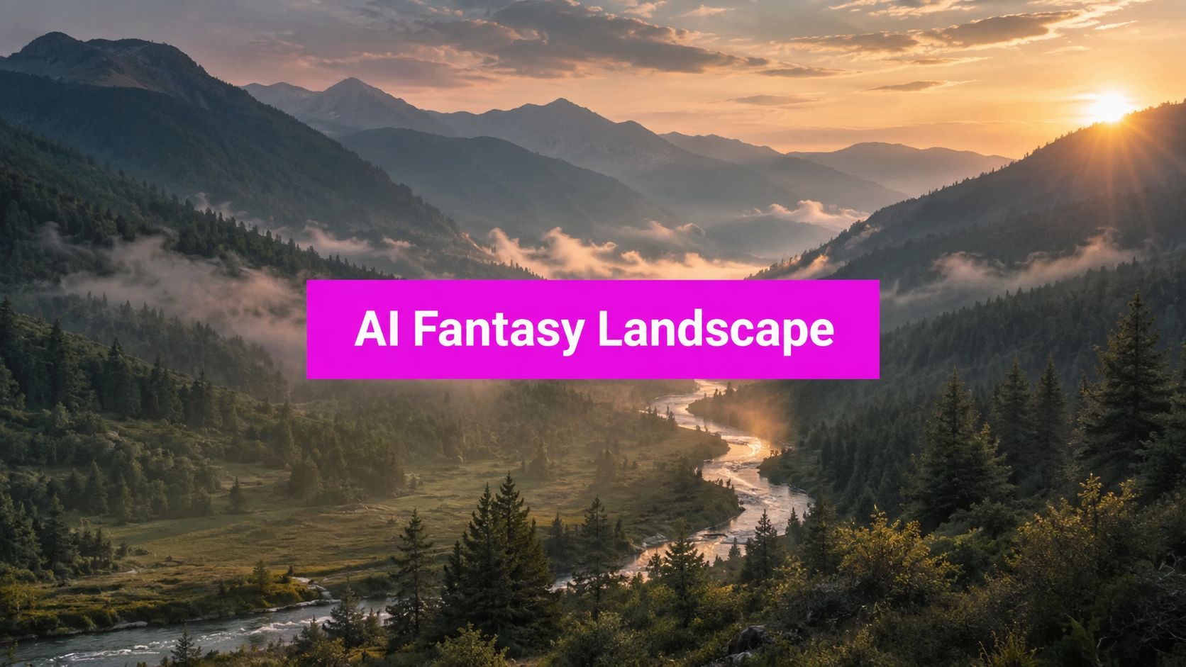
How to Create a Fantasy Art Landscape with AI

Ryan Bennett • August 4, 2026
Learn to craft a stunning fantasy art landscape using AI tools. This practical guide covers techniques, prompts, and tips for beginners in 2026.
You've got the brief open, the prompt is decent, and the generator keeps handing you the same glowing mountains, moonlit cliffs, and impossible ruins. That's usually not a prompt problem. It's a planning problem, a composition problem, and a consistency problem that shows up the moment you need ten scenes that belong to one world instead of ten near-duplicates.
Fantasy art scenes have always borrowed from a long visual history. Landscape painting became a distinct genre in Europe in the early 15th century, then emerged as a subject in its own right in the 16th century, and by the 17th century the classical landscape was fully formed, with compositional norms that kept evolving over time Getty background on landscape painting. That matters now because AI doesn't invent taste from nowhere. It remixs a tradition that already knows how to place scale, depth, and focal emphasis.
Why Most Fantasy Landscapes Look the Same
A marketer needs three landing page banners, a creator needs a book cover, and a hobbyist wants a wallpaper set. They type in different adjectives, maybe add “epic,” “cinematic,” or “highly detailed,” and still get the same formula, a huge central mountain, a dramatic sky, a river of light, and a castle that looks pasted in from the same mental stock library.
That sameness happens because the prompt is asking for mood without giving the model enough structure. The model reaches for the safest visual shorthand, and fantasy shorthand is crowded with cliffs, spires, fog, moons, and floating islands. Even the history of fantasy art helps explain why, since modern fantasy imagery was amplified by illustrated fiction and pulp publishing, including Weird Tales in 1923, and later by Tolkien's map-heavy worldbuilding in The Hobbit and The Lord of the Rings history of fantasy art and illustration.
The real failure mode
The issue isn't that the art is bad. It's that it doesn't have a decision tree behind it. If you haven't chosen a composition, a palette, a time of day, and a visual anchor, the AI fills in the blanks with generic fantasy defaults.
Practical rule: if the prompt could describe five different scenes with the same sentence, it's too vague for production work.
The fix is a pipeline, not more adjectives. Plan the world first, sketch the layout cheaply, prompt with style intent instead of clutter, then batch the approved direction. That's how one fantasy art scene becomes a reusable system instead of a one-off image.
Planning and Inspiration Before You Generate
Begin with references before you touch the prompt box. The strongest fantasy scenes usually come from a narrow set of visual decisions, not from a giant mood board stuffed with unrelated "inspiration." Pick two or three anchors, for example a classic painterly fantasy look, a modern book-cover finish, and one environmental reference that gives the scene a believable geology or weather pattern.
Then write one sentence that states what the image is doing. Not the vibe, the action of the scene. “A foggy ruin rises above a marsh at dawn, with a single lit path cutting toward the entrance” gives the model more to work with than “epic dark fantasy swamp, cinematic, masterpiece.” The first sentence names the relationship between land, light, and focal point.
The thumbnail habit matters more than people think. Art instruction that works in practice recommends starting with at least 6 thumbnail sketches, then recropping and selecting one final thumbnail, and it also recommends 3 or more reference photos to support depth, scale, and atmospheric perspective thumbnail and reference workflow. That process keeps you from locking into the first acceptable layout.

Build the reference stack
Before generating, gather these inputs:
- Scene intent: one sentence that says what's happening in the scenery.
- Composition idea: horizon placement, focal location, and whether the scene reads wide, tall, or layered.
- Mood references: two or three visual anchors that share a believable tone.
- Environmental reference: weather, geology, vegetation, or architecture that makes the fantasy feel grounded.
- Output use: cover, banner, social post, ad, or print variant.
If you want a practical starter that stays close to a specific fantasy aesthetic, the visual language in this Ghibli-style AI art tutorial shows how style direction changes the result without overloading the prompt. The point isn't to copy a studio. It's to define a consistent visual grammar before generation begins.
Composition and Color Theory You Can Actually Prompt
Most composition advice only survives in prompts if it's short and concrete. The AI doesn't need a lecture on art history, it needs a few structural instructions that control where the eye lands and how the space opens up. The strongest fantasy art vistas still rely on three things, foreground, midground, and background separation, a clear focal point, and enough value contrast that the scene doesn't collapse into one flat image.
A useful prompt fragment looks like this, “foreground roots and broken stones, midground river and ruined bridge, distant citadel softened by haze.” That single line does more than ten style adjectives. It creates depth, tells the model what must stay close, and keeps the background from stealing attention.
Composition rules that translate well
- Foreground, midground, background: Use terms like “layered depth,” “foreground rocks,” and “distant mountains softened by haze” so the image reads in planes instead of a single wall of detail.
- Focal point away from center: Say “off-center tower,” “path leading from lower left to a shrine,” or “main subject near the upper third” to avoid the dead-center poster look.
- Atmospheric perspective: Add “distant forms lighter, less detailed, and cooler in tone” when you want believable distance.
- Avoid equal splits: Don't ask for “half sky, half land” unless you really want symmetry. Uneven divisions feel more natural and give the scene more energy.
Multiple digital painting tutorials make the same technical point in different words, keep lighting consistent, simplify color rendering, and don't split the canvas into equal halves value-first background painting guidance. That advice isn't decorative. It stops the model from producing muddy compositions with nowhere for the eye to rest.
Color temperature does more than mood
Warm light against cool land, or cool light against warm stone, gives a fantasy scene instant hierarchy. A golden sky over blue-gray cliffs feels different from a violet dusk over amber marshland, even if the layout is the same. If you need a broader list of production-minded visual tools, the roundup of tools for creating designs that sell is useful context for choosing where composition support fits into a larger workflow.

The shortest useful rule is this, prompt structure first, then palette, then style. If those three are clear, the fantasy art scene usually comes back with usable bones instead of decorative noise.
Three Prompt Recipes for Different Fantasy Moods
A good prompt doesn't need to be huge. It needs clear line-by-line control over composition, palette, and mood. The examples below are written so you can swap in your own terrain, architecture, or story detail without losing the underlying structure.
Dark fantasy swamp
Prompt:
“A cursed swamp at twilight, twisted cypress trees in the foreground, a half-sunken stone causeway leading diagonally to a ruined shrine, low fog hugging the water, distant dead trees fading into haze, muted green-black palette, cold moonlight, ominous, painterly, high detail, off-center focal point”
Here, “foreground,” “leading diagonally,” and “off-center focal point” control the composition. “Muted green-black palette” and “cold moonlight” control color. “Ominous” tells the model the emotional register, while “painterly, high detail” nudges rendering style without locking the image into hard realism.
Ethereal high-fantasy citadel at golden hour
Prompt:
“A towering citadel built into a cliff above a vast valley, foreground terraces with banners and luminous steps, midground bridges connecting spires, far mountains softened by atmospheric perspective, warm golden-hour light, pale blue shadows, elegant, monumental, serene, cinematic fantasy illustration”
This one works because the scene climbs upward in layers. The word “terraces” tells the model to show scale, “far mountains softened by atmospheric perspective” keeps depth believable, and the warm-and-cool pairing gives the setting a clear time of day. If you need a prompt generator that can help you iterate that skeleton quickly, the free AI image prompt generator is a practical starting point.
Painterly storybook forest
Prompt:
“A winding forest path under oversized mossy trees, mushrooms and roots in the foreground, a small cottage glowing in the midground, soft glades and layered trunks in the background, gentle morning mist, pastel green and amber palette, whimsical, storybook, hand-painted texture, balanced asymmetry”
“Balanced asymmetry” is doing real work here. It keeps the forest from feeling like a centered postcard, and “soft glades and layered trunks” helps the model build a scene that breathes. If you want a style anchor, swap the rendering language, not the layout. “Painterly fantasy illustration” gives one result, while “classic heavy-metal fantasy cover” or a more contemporary book-cover look gives another.
Short negative prompt note: avoid words that pull the image toward sameness, such as “symmetrical,” “centered castle,” “floating island,” or “overly detailed background everywhere.” If every element is equally loud, nothing reads clearly.
A reusable skeleton looks like this, [setting] + [foreground] + [midground] + [background] + [light] + [palette] + [mood] + [rendering style]. Fill those slots with intent, and the model has a much better chance of producing something specific.
Batch Generation Workflow for a Whole Fantasy World
Once one direction works, don't keep reinventing the prompt from scratch. Lock the approved structure, keep the style anchor consistent, and vary the scene details around it. That's how you build a world that looks curated instead of randomly generated.
A batch workflow makes the most sense when you need multiple assets for one campaign, one classroom set, or one product line. In that context, a tool like Bulk Image Generation is useful because it can generate up to 100 unique visuals in under 20 seconds with Flux 1.1 and OpenAI's GPT-Image-1, while also handling batch editing tasks like background removal, resizing, and enhancement from the same environment. That kind of throughput changes the job from “make one perfect image” to “approve one design language, then scale it across formats.”

A practical batch routine
- Lock the seed direction. Keep the core prompt stable, then change only the scene variables, such as swamp, canyon, citadel, forest, or volcano.
- Store the template in notes. Save the base prompt, the style anchor, and the palette language so you're not rebuilding it every time.
- Vary aspect ratios on purpose. Design one version for wide headers, one for vertical social crops, and one for print-friendly framing.
- Review in groups, not one by one. Batch review makes it easier to spot when the world feels coherent or when one output drifts into a different visual identity.
The key trade-off is consistency versus novelty. If you change too many prompt variables at once, the series fragments. If you change too little, every image looks like a copy. Keep the style anchors stable, then swap the geography, weather, and narrative props.
The history of fantasy illustration helps here too. Tolkien's maps made imagined geography feel almost obligatory in modern high fantasy, and a survey of 200 fantasy books found 67 titles, 34%, included at least one map, with 73.1% of those mapped books using one map fantasy art and worldbuilding survey. That's a reminder that fantasy visuals work best when they feel like part of a system, not isolated paintings.
Post-Processing Tips to Keep a Series Consistent
The fastest way to clean up a fantasy series is to unify value and color before you chase detail. If one image reads dark and dense while the next floats in a bright haze, the set feels mismatched even if the subject matter is similar. That's why value-first finishing still matters in AI work, because the model can give you a good image and still miss the family resemblance across the batch.
A solid finishing pass usually starts with global tone, then focal cleanup, then selective atmosphere. Lift the distant planes a little, cool the shadows if the series needs cohesion, and sharpen the focal point where the eye should land. If a scene needs more depth, add haze in post instead of asking the generator to solve every atmospheric problem at prompt time.
Keep the series on the same visual rail
- Match the blacks and midtones: A set looks unified when the darkest values and the middle range feel related across images.
- Hold color temperature steady: Decide whether the world leans warm, cool, or split-toned, then keep that decision consistent.
- Protect the focal point: Don't sharpen everything. Save contrast for the key subject or landmark.
- Use texture sparingly: Over-texturing every surface makes the whole set feel noisy.
The useful part of a batch editor is that it handles the boring cleanup fast. In platform terms, background removal, resizing, and enhancement are most valuable when they happen after the prompt direction is already approved, not before. If you need deeper texture-specific ideas for overlays or environment finish, the AI Texture Generator tutorial is a good companion read.
A quick before-and-after check helps:
- Does the horizon feel consistent across the set?
- Do the shadows point in the same visual direction?
- Does every image share the same palette family?
- Does the focal point remain readable at small size?
If one answer is no, fix that before exporting. A fantasy art series only feels professional when the edits support the world instead of fighting the generator.
Making Your Fantasy Landscapes Feel Original
Generic fantasy usually comes from predictable swaps, another mountain, another moon, another floating rock. The fix is to replace the expected centerpiece, give the scene a specific geological or cultural reference, and add one small narrative detail that a stock prompt wouldn't naturally invent.
A practical originality test is simple. If you remove the named subject from the prompt and the scene still sounds like standard fantasy wallpaper, it needs more identity. If the setting has a distinct material language, a memorable silhouette, and a restriction on palette, it usually feels more ownable. For visual merchandising and prints, that specificity matters, and Printano's landscape wall art tips are a useful reminder that strong wall art starts with a clear focal read, not a cluttered scene.
Use this originality checklist
- Swap the expected focal element: Replace the obvious mountain or castle with a bridge, monolith, salt flat, cliff garden, or sunken temple.
- Anchor the world in one real texture: Basalt, mangrove roots, limestone terraces, tundra ice, or volcanic ash will make the scene feel grounded.
- Add one narrative object: A lantern, footprint trail, broken banner, or abandoned cart gives the scene a story.
- Limit the palette: Fewer competing colors make the scene feel designed instead of assembled.
That discipline matters even more when you batch. A hundred images only help if they look like they belong to the same campaign or world. Originality in fantasy art work isn't about inventing unfamiliar fantasy language every time, it's about combining familiar elements in a way that feels specific enough to remember.
If you want to turn one strong fantasy scenery prompt into a whole brand-safe image set, Bulk Image Generation gives you the speed and batch control to do it without rebuilding every asset by hand. Visit Bulk Image Generation and use it to move from one hero scene to a full, consistent world of fantasy visuals.
