
10 Inspiring Fall Color Palette Ideas for 2025

Aarav Mehta • November 18, 2025
Discover 10 designer-curated fall color palette ideas for 2025. Get hex codes, design tips, and AI prompts to bring your autumn projects to life.
Welcome to your definitive guide to the modern fall color palette. This season, we're moving beyond the expected oranges and browns to explore 10 curated palettes that capture the essence of autumn with sophistication and style. Whether you're a marketer planning a seasonal campaign, a designer seeking fresh inspiration, or a small business owner looking to infuse your projects with autumnal warmth, you'll find everything you need right here. This comprehensive resource is designed to be immediately actionable, helping you create a cohesive and memorable aesthetic.
To truly reinvent an aesthetic, it's beneficial to understand how color choices connect to your overall message and audience perception. A well-chosen palette does more than just look good; it communicates a feeling and reinforces your identity, which is a core part of the principles of branding. This guide bridges that gap between inspiration and implementation.
Inside this curated collection, each fall color palette comes equipped with:
- Precise Hex Codes: For perfect color matching across all your digital platforms.
- Practical Usage Tips: Learn how to apply these colors effectively in social media, web design, and print materials.
- Accessibility Notes: Key considerations to ensure your designs are inclusive and legible for all users.
- AI Prompt Snippets: Unique prompts for tools like Bulk Image Generation, enabling you to create stunning, on-brand visuals at scale and save hours of manual design work.
Let's dive into the colors that will define your visual strategy this season.
1. Warm Rustic Palette
The Warm Rustic Palette is the quintessential fall color palette, a timeless combination that immediately evokes the feeling of a crisp autumn day. It draws inspiration directly from nature's seasonal transformation, featuring deep, earthy tones that mirror changing leaves and the harvest. This palette typically combines a rich burnt sienna with warm oranges, deep chocolate browns, and a soft, balancing cream. It’s a classic for a reason; its inherent warmth and familiarity create an instant sense of comfort and nostalgia.
This color scheme is a favorite among major brands known for their seasonal marketing. Think of Pottery Barn's cozy autumn catalogs, Starbucks' iconic fall promotions, or even the sophisticated, warm-toned backdrops in Apple's autumn product launches. These companies leverage the palette’s deep-rooted connection to the season to create an immediate emotional link with their audience.
When and Why to Use This Palette
The Warm Rustic Palette is exceptionally versatile but shines brightest when the goal is to create a feeling of comfort, tradition, and natural elegance. It's an excellent choice for brands in the home decor, food and beverage, and fashion industries looking to align with conventional autumn aesthetics. Use it to promote seasonal sales, design welcoming event invitations, or create a cozy atmosphere for your social media feed. Its enduring appeal, popularized by tastemakers like Martha Stewart Living, ensures it resonates widely.
Key Insight: This palette’s strength lies in its ability to evoke a powerful sense of nostalgia and comfort, making it ideal for campaigns targeting family-oriented and traditional consumer segments.
Actionable Tips for Implementation
To get the most out of this classic fall color palette, consider these specific strategies:
- Create Visual Balance: The deep oranges and browns can be intense. Use the cream or an off-white shade as your primary background color to give the richer tones space to breathe and prevent the design from feeling too heavy.
- Incorporate Texture: This palette pairs beautifully with natural textures. In your designs, overlay images of wood grain, burlap, or knitted fabrics to add depth and tactile appeal.
- Add a Touch of Luxury: For a more elevated and sophisticated feel, introduce metallic gold or bronze accents. This can be used for typography, borders, or small graphic elements to catch the eye.
- Accessibility Note: The contrast between the deep brown (#4A2E20) and burnt sienna (#B54A23) can be low. Ensure that when these colors are layered, they are not used for critical text or UI elements without sufficient size or bolding. The cream color provides a high-contrast base for all the darker shades.
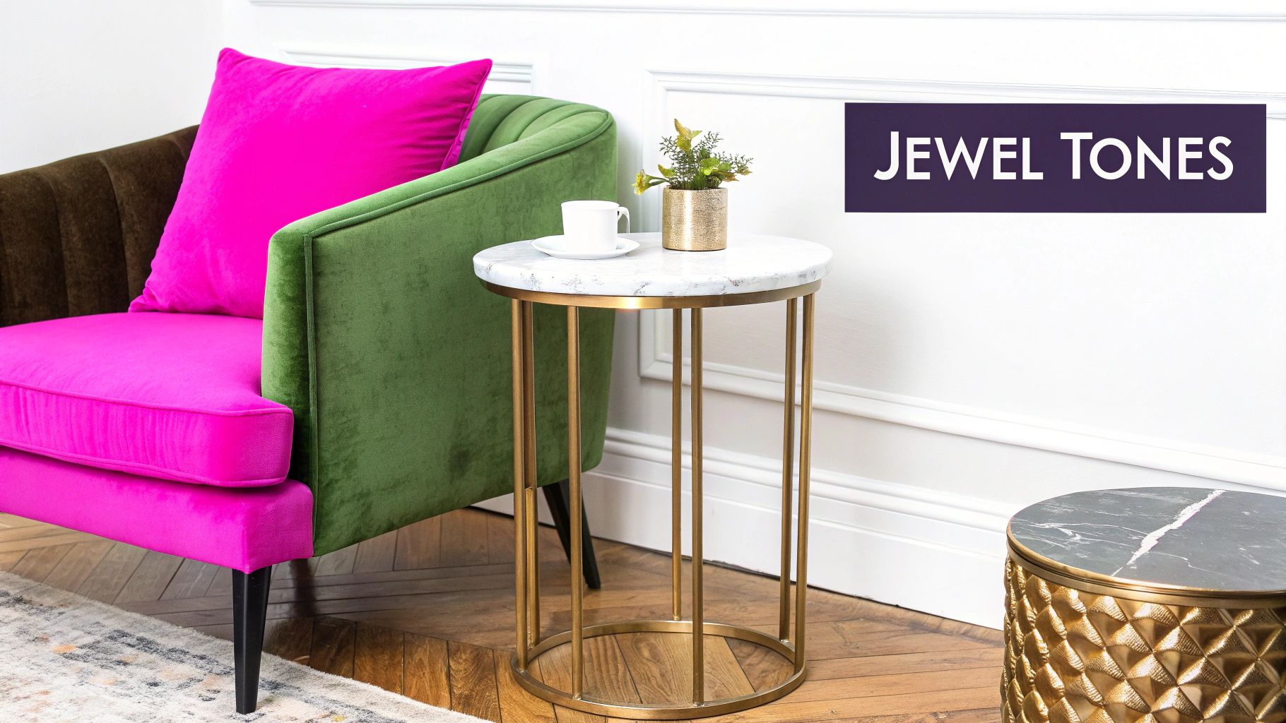
2. Deep Jewel Tone Palette
The Deep Jewel Tone Palette offers a luxurious and modern interpretation of the classic fall color palette. It shifts away from earthy, rustic shades and embraces a more opulent, sophisticated aesthetic. This palette draws inspiration from precious gems, featuring a rich emerald green, a deep sapphire blue, an elegant plum, and a bold burgundy, often accented with a shimmering gold. It’s a contemporary choice that feels both indulgent and seasonally appropriate, perfect for brands that want to project an image of quality and refinement.
This high-fashion color scheme is frequently seen in luxury markets. Consider the sumptuous seasonal collections from Hermès, the theatrical and rich store designs of Anthropologie, or the sophisticated packaging used by premium wine and spirits brands. These companies use jewel tones to create an atmosphere of exclusivity and elegance, aligning their products with a sense of elevated taste that stands out from more traditional autumn visuals.
When and Why to Use This Palette
The Deep Jewel Tone Palette is ideal for campaigns aiming to convey sophistication, luxury, and modern style. It’s a powerful choice for high-end fashion, beauty, interior design, and hospitality brands that want to differentiate themselves from the typical fall aesthetic. Use this palette for exclusive product launches, upscale event promotions, or a bold social media presence. Its growing popularity, championed by the Pantone Color Institute and high-fashion designers like Gucci, ensures it connects with a trend-conscious audience.
Key Insight: This palette’s strength is its ability to create a sense of modern luxury and drama, making it perfect for premium brands targeting aspirational consumers who value quality and style.
Actionable Tips for Implementation
To effectively implement this stunning fall color palette, focus on balance and thoughtful application:
- Use White Space: The deep, saturated nature of jewel tones can feel overwhelming. Pair them with plenty of white, cream, or light gray in your design to create breathing room and ensure the rich colors pop without overpowering the layout.
- Embrace Metallic Accents: Gold is the perfect companion to this palette. Use it for typography, icons, borders, or subtle graphic elements to add a touch of warmth and reinforce the luxurious feel. Copper or bronze can also work well.
- Focus on Statement Pieces: Rather than using all colors equally, choose one or two jewel tones as your dominant colors and use the others as accents. This is especially effective for physical spaces, like an accent wall or statement furniture.
- Accessibility Note: The contrast between deep jewel tones like sapphire (#0F52BA) and plum (#5D3A5D) can be very low. Avoid layering them for essential text or interface elements. Always check contrast against a neutral background like white or a very light gray to ensure readability.
3. Warm Sunset Palette
The Warm Sunset Palette captures the fleeting, dramatic beauty of an autumn evening sky. This fall color palette moves away from earthy browns and instead leans into the vibrant, energetic side of the season. It is dominated by a gradient of warm hues, including fiery reds, bright oranges, soft peaches, and glowing golden yellows. This combination creates a sense of warmth, energy, and optimism, reminiscent of the last moments of a brilliant fall day.
This high-energy palette is frequently used by brands aiming for a dynamic and youthful appeal. Think of the bold packaging for Reese's Peanut Butter Cups during their fall campaigns or the cheerful, eye-catching designs on Trader Joe's seasonal products. Sportswear brands also adopt these colors for their autumn collections to convey action and vitality. The palette's inherent vibrancy makes it a favorite for social media influencers and event promoters looking to grab attention in a crowded feed.
When and Why to Use This Palette
The Warm Sunset Palette is an excellent choice when your goal is to evoke excitement, positivity, and a modern feel. It’s perfect for brands in the food and beverage, retail, and tech industries that want to present a fresh, contemporary take on autumn. Use this energetic fall color palette for social media campaigns, digital advertisements, and product packaging that needs to pop. Its optimistic feel makes it ideal for event promotions, especially those aimed at a younger, more active audience.
Key Insight: This palette’s strength is its ability to stand out with vibrant energy. It's best suited for brands that want to break from traditional autumn aesthetics and project a sense of modern dynamism.
Actionable Tips for Implementation
To harness the energy of this fall color palette without overwhelming your audience, follow these tips:
- Balance with Neutrals: The intensity of the reds and oranges can be overpowering. Use a soft cream or a light gray as a background to ground the design and allow the brighter colors to shine as accents.
- Create a Focal Point: Use the most vibrant shade, like a bright orange (#F57C00) or red (#D32F2F), for key elements like call-to-action buttons, headlines, or logos to draw the viewer’s eye.
- Incorporate Natural Textures: Pair these warm colors with light-colored natural wood textures or soft linen patterns. This adds an organic, tactile element that balances the palette's digital-friendly vibrancy.
- Accessibility Note: The contrast between the golden yellow (#FFC107) and the peach shade (#FFDAB9) is very low. Avoid layering these two for important text or UI elements. Ensure that any text placed on these bright colors is a dark, high-contrast shade for readability.
4. Moody Neutral Palette
The Moody Neutral Palette offers a sophisticated, modern take on autumn, moving away from bright oranges and reds in favor of an understated and elegant look. This fall color palette is defined by its use of charcoal, taupe, muted sage green, and warm grays, creating a calm and contemplative atmosphere. It captures the quieter side of the season: misty mornings, overcast skies, and the subtle, earthy tones of withering flora. Its strength lies in its minimalism, evoking a sense of warmth through nuance and texture rather than vibrant color.
This aesthetic is frequently embraced by brands that prioritize a clean, high-end feel. Think of the minimalist branding of luxury brands like Aesop or Diptyque, the serene interiors featured in Scandinavian design magazines, or the sleek branding of contemporary tech companies. These brands use moody neutrals to communicate sophistication, quality, and a modern sensibility that feels both professional and inviting.
When and Why to Use This Palette
The Moody Neutral Palette is ideal for brands aiming for a minimalist, refined, and contemporary aesthetic. It excels in professional contexts, such as corporate branding, web design, and high-end retail, where an atmosphere of calm authority is desired. Use this fall color palette to create a sophisticated social media grid, design elegant marketing materials, or style product photography that feels timeless. Its popularity with interior design influencers and Scandinavian designers showcases its ability to make spaces and products feel both modern and cozy.
Key Insight: This palette’s power is in its subtlety. It creates a feeling of sophisticated calm, making it perfect for luxury, wellness, or tech brands that want to convey elegance and focus without seasonal clichés.
Actionable Tips for Implementation
To effectively use this understated fall color palette, focus on depth and subtle details:
- Layer with Textures: Since the colors are muted, add visual interest by incorporating textures. In your designs, think of linen, concrete, soft wool, or natural wood grain to prevent the visuals from feeling flat.
- Use a Singular, Soft Accent: If you need a touch of color, introduce a single, desaturated accent like a dusty rose, soft terracotta, or a deep navy. Use it sparingly for call-to-action buttons or small graphic elements to maintain the minimalist feel.
- Focus on Typography: Strong, clean typography becomes a key design element in a neutral palette. Use a well-chosen font hierarchy to guide the eye and add personality where color does not.
- Accessibility Note: The contrast between charcoal (#36454F) and taupe (#8B8589) can be low. Ensure text is readable by placing darker text on lighter gray or taupe backgrounds and vice versa, always checking contrast ratios for critical information. The muted sage green also requires a light background for legibility.
5. Spiced Autumn Palette
The Spiced Autumn Palette is a sensory feast for the eyes, directly inspired by the aromatic spices that define the season’s comfort foods and drinks. It’s a warm, inviting combination that evokes the feeling of a cozy kitchen filled with the scent of baking. This palette blends a rich cinnamon red with warm ginger orange, deep clove brown, and a soft, golden ochre, creating a scheme that feels both nostalgic and indulgent.
This fall color palette is the hallmark of seasonal food and beverage marketing. Starbucks' Pumpkin Spice Latte campaigns are a prime example, using these exact tones to communicate warmth and flavor. You can also see it in the packaging for luxury autumn-scented candles from brands like Jo Malone and Diptyque, as well as in the promotional materials for artisanal bakeries and fall food festivals.
When and Why to Use This Palette
The Spiced Autumn Palette is most effective when the goal is to trigger sensory experiences, particularly taste and smell. It’s a perfect choice for brands in the food, beverage, home fragrance, and hospitality industries. Use this palette to market seasonal menu items, design packaging for autumn-themed products, or create a warm, welcoming atmosphere for a cafe's social media. Its strong association with comfort and indulgence makes it highly effective.
Key Insight: This palette’s power comes from its direct link to the senses of taste and smell. It creates an immediate craving for the comforting, flavorful experiences of fall.
Actionable Tips for Implementation
To make the most of this deliciously warm fall color palette, apply these specific strategies:
- Balance with Neutrals: The rich, warm tones can be overwhelming together. Use a creamy off-white or a light beige as a background to allow the spiced colors to stand out without competing with each other.
- Emphasize with Modern Typography: Since this palette has traditional, rustic roots, pair it with a clean, modern sans-serif or an elegant serif font. This contrast will give your design a contemporary and sophisticated feel.
- Incorporate Organic Textures: Enhance the sensory appeal by pairing these colors with visuals of natural materials like cinnamon sticks, kraft paper, or unbleached linen. For AI-generated visuals, you can experiment with prompts using a free AI image prompt generator to blend these elements.
- Accessibility Note: The contrast between the deep clove brown (#5D3A2A) and the cinnamon red (#A13C25) is low. Avoid placing important text in these colors on top of each other. The golden ochre provides a brighter option for accents on the darker backgrounds.
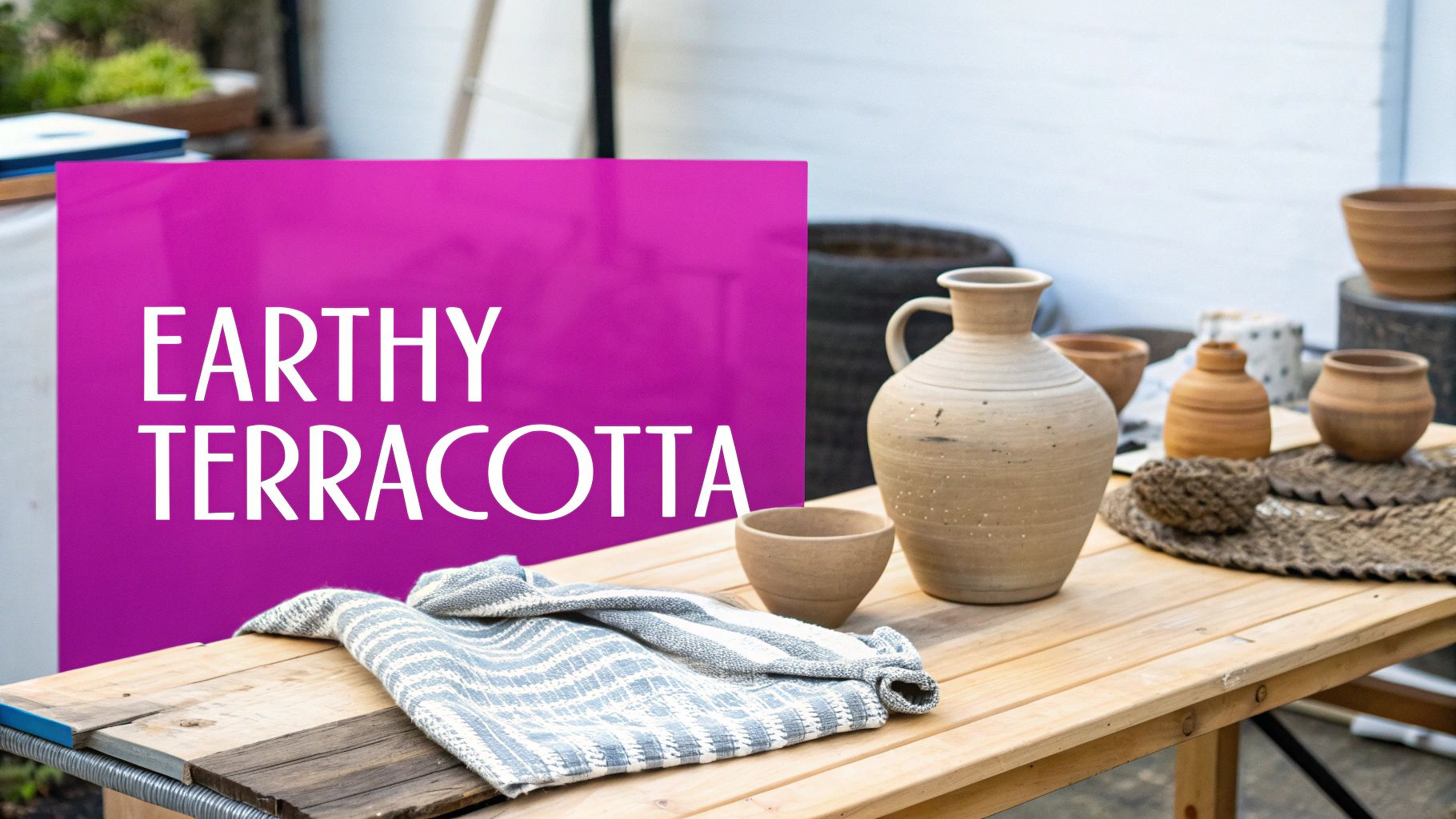
6. Earthy Terracotta Palette
The Earthy Terracotta Palette is a grounded, organic fall color palette that draws its inspiration from raw, natural materials like clay, soil, and stone. It centers on the rich, baked warmth of terracotta and rust, complemented by a golden ochre, muted sage green, and a deep charcoal. This combination creates a sophisticated yet unpretentious aesthetic that feels both ancient and modern, evoking artisanal traditions and a deep connection to the earth.
This color scheme is beloved by brands that prioritize sustainability, craftsmanship, and natural ingredients. You can see it in the branding of sustainable fashion labels, the packaging for organic beauty products, and the visual identity of artisan communities like those found on Etsy. These brands use the palette to communicate authenticity, quality, and an eco-conscious ethos, connecting with consumers who value handmade and natural goods.
When and Why to Use This Palette
The Earthy Terracotta Palette is ideal for brands aiming to project a sense of authenticity, craftsmanship, and grounded sophistication. It's a perfect fit for businesses in the pottery, sustainable fashion, wellness, and artisanal food sectors. Use this palette to build a brand identity that feels both contemporary and timeless, or to design packaging that highlights natural ingredients. Its rise in popularity, championed by interior designers and eco-conscious brands, makes it a compelling choice for connecting with a mindful, modern audience.
Key Insight: This palette’s strength is its ability to convey a sense of craftsmanship and connection to nature, making it perfect for brands that want to highlight their artisanal quality or sustainable practices.
Actionable Tips for Implementation
To bring this earthy fall color palette to life effectively, apply these focused strategies:
- Emphasize Natural Textures: This palette is inherently tactile. Pair it with high-quality images of natural materials like linen, unglazed pottery, wood, and stone to enhance its organic, grounded feel in your designs.
- Use Generous White Space: The rich, mid-tone nature of terracotta and ochre can make a design feel dense. Use a clean off-white or light cream background to create contrast, ensuring the layout feels open, airy, and modern.
- Incorporate Artisanal Elements: Strengthen the handmade theme by using hand-drawn illustrations, brush-stroke fonts, or subtle, imperfect graphic elements. This reinforces the authentic, non-corporate feel of the palette.
- Accessibility Note: The contrast between terracotta (#A15136) and charcoal (#3E3E3B) is generally good, but ensure that the muted sage green (#7E846B) is not used for small text on top of the other mid-tones. Always use the charcoal or a dark font on a light background for primary body copy to ensure readability.
7. Bold Harvest Palette
The Bold Harvest Palette moves away from muted, earthy tones and embraces the most vibrant and dramatic aspects of the season. It's a high-contrast fall color palette that celebrates autumn foliage at its absolute peak, combining a deep, wine-like burgundy with a bright, energetic orange, a radiant golden yellow, and a grounding forest green. This combination is unapologetically loud and cheerful, designed to capture attention and convey a sense of energy and celebration.
This dynamic color scheme is a favorite for event marketing, especially for fall festivals, Thanksgiving celebrations, and Halloween parties. You’ll see it used by retail brands looking to create eye-catching seasonal campaigns that stand out from the more traditional rustic aesthetics. Party planning companies and even sports teams with autumn merchandise often leverage this palette to create a festive and spirited atmosphere that feels both seasonal and full of life.
When and Why to Use This Palette
The Bold Harvest Palette is your go-to choice when the goal is to be noticed. It is perfect for brands that want to project energy, excitement, and festivity. Use it for promotional materials for a fall festival, social media graphics announcing a seasonal sale, or vibrant invitations for a Halloween party. Its high-energy feel makes it ideal for campaigns aimed at a younger demographic or for any brand looking to break through the noise of more subdued seasonal marketing.
Key Insight: This palette’s strength is its high-contrast, attention-grabbing nature. It's ideal for designs that need to make an immediate impact and communicate a sense of fun and excitement, rather than quiet nostalgia.
Actionable Tips for Implementation
To harness the energy of this bold fall color palette without overwhelming your audience, follow these tips:
- Balance with Neutrals: With so many strong colors, a neutral is essential. Use a crisp white or a deep black as your background or primary text color to provide a stable foundation and make the bold hues pop.
- Use the 60-30-10 Rule: Avoid using all colors in equal measure. Assign a dominant color (60%), a secondary color (30%), and an accent color (10%) to create a clear visual hierarchy and prevent the design from looking chaotic.
- Highlight Key Information: Reserve the brightest colors, like the golden yellow or vibrant orange, for crucial elements you want to stand out, such as headlines, buttons, and calls-to-action.
- Accessibility Note: The contrast between the forest green (#2A401E) and burgundy (#6E1423) can be very low. Avoid layering these colors for text or important interface elements. Always check your color combinations against a white or black background to ensure readability.
8. Vintage Fall Palette
The Vintage Fall Palette captures the delicate, time-worn beauty of autumns past. It moves away from bright, saturated hues and instead embraces a sophisticated, muted elegance. This palette features a nostalgic blend of faded plum, dusty rose, muted mustard, and an aged, antique gold. It’s a fall color palette that evokes the feeling of thumbing through an old photo album or discovering a treasured antique, combining historical charm with a soft, modern sensibility.
This aesthetic is a favorite among indie brands and creators who want to cultivate a unique, story-driven identity. You can see its influence in the branding for antique shops, the carefully curated feeds of lifestyle bloggers on Instagram, and the distinct visual tone of independent films set in historical periods. These creators use the palette’s subdued tones to build an atmosphere of authenticity, romance, and thoughtful craftsmanship.
When and Why to Use This Palette
The Vintage Fall Palette is perfect for brands aiming to project a sense of history, artistry, and gentle nostalgia. It excels in industries like vintage fashion, handmade goods, artisan foods, and boutique home décor. Use this palette to design a website for an Etsy shop, create packaging for a small-batch product, or build a social media aesthetic that feels both personal and timeless. Its quiet sophistication, often championed by film and television production designers, appeals to audiences who appreciate subtlety and heritage.
Key Insight: This palette’s power comes from its ability to tell a story and create a specific mood. It’s ideal for brands that want to connect with consumers on an emotional level by evoking memories and a sense of enduring quality.
Actionable Tips for Implementation
To bring this beautifully aged fall color palette to life, consider these specific techniques:
- Embrace Imperfection: Enhance the vintage feel by incorporating textures like film grain, light leaks, or faded paper overlays in your designs. This adds a layer of authenticity that complements the muted colors.
- Choose Appropriate Typography: Pair this palette with period-appropriate fonts. Serif typefaces with classic forms or elegant script fonts will reinforce the nostalgic and historical feel much more effectively than modern sans-serifs.
- Opt for Matte Finishes: When used in print or product design, a matte or uncoated finish will enhance the palette’s soft, understated quality. A high-gloss finish can clash with the vintage aesthetic.
- Accessibility Note: The dusty rose (#C9A9A6) and muted mustard (#D4A056) have a relatively low contrast. Avoid using them together for important text or UI elements. Ensure text is placed on the lighter rose or a neutral background for readability.
9. Warm Woodland Palette
The Warm Woodland Palette moves away from the vibrant oranges and reds of changing leaves and takes you deep into the heart of an autumn forest. This nature-inspired fall color palette is grounded and serene, drawing its tones from the forest floor and evergreen canopy. It features a deep forest green, rich chocolate brown, a pop of warm amber, and a soft cream for balance, creating a grounded, natural atmosphere that feels both calming and sophisticated.
This color scheme is a staple for brands centered around the outdoors, sustainability, and natural products. Outdoor recreation giants like Patagonia and REI often use these earthy tones to connect their products to the environments they're designed for. Similarly, environmental organizations and national parks leverage this palette to evoke a sense of conservation and reverence for nature in their marketing and merchandise.
When and Why to Use This Palette
The Warm Woodland Palette is ideal for brands that want to convey a sense of stability, growth, and connection to the natural world. It’s an excellent choice for eco-friendly product packaging, outdoor apparel brands, wellness services, and any organization with a focus on sustainability. Use this palette to build a brand identity that feels authentic, reliable, and deeply rooted in nature. Its organic feel, popularized by the hiking and nature photography communities, resonates with audiences who value authenticity and the environment.
Key Insight: This palette’s strength is in its ability to create a calm, grounded, and trustworthy brand image, making it perfect for markets focused on wellness, sustainability, and outdoor recreation.
Actionable Tips for Implementation
To effectively implement this earthy fall color palette, consider these specific strategies:
- Balance with Lightness: The deep green and brown can make a design feel dark. Use the cream shade generously as a background color to create contrast and ensure the layout feels open and approachable, not heavy.
- Leverage Natural Imagery: This palette is a natural fit for high-quality photography. Pair it with images of dense forests, misty hiking trails, and close-ups of natural textures like bark, moss, and stone to enhance its organic feel.
- Emphasize Amber Accents: Use the warm amber color sparingly as an accent for calls to action, key highlights, or small icons. This will create a focal point and add a touch of warmth that prevents the palette from feeling too cool.
- Accessibility Note: Ensure sufficient contrast between the deep green (#2E3B30) and the chocolate brown (#3D2C24), as they can blend together. Avoid placing text in one of these colors directly on top of the other without a significant size or weight difference. The cream provides a high-contrast base for all darker tones.
10. Modern Minimalist Fall Palette
The Modern Minimalist Fall Palette breaks from tradition, offering a restrained and sophisticated take on seasonal color. This contemporary approach embraces simplicity and negative space, often using just three to four key colors: a warm taupe, a soft, muted black, and a single, deliberate accent like rust or muted sage. It acknowledges the season subtly, focusing on atmosphere and elegance rather than an overt display of autumn hues.
This fall color palette is a favorite among luxury minimalist brands, tech companies, and contemporary art institutions. Think of the clean, atmospheric marketing from brands like Everlane or the sophisticated seasonal announcements from a modern art gallery. These entities use the palette's clean lines and uncluttered feel to convey professionalism and modern luxury while still nodding to the time of year.
When and Why to Use This Palette
The Modern Minimalist Fall Palette is ideal when your goal is to project sophistication, calm, and a modern aesthetic. It’s perfect for high-end professional services, tech startups, and fashion brands that want to avoid the rustic clichés of autumn. Use this palette for sleek digital campaigns, minimalist product packaging, or a refined social media grid. Its understated elegance, popularized by Scandinavian design influencers and contemporary design agencies, appeals to a design-conscious audience.
Key Insight: This palette’s power comes from its restraint. By using fewer colors, it places greater emphasis on typography, layout, and high-quality imagery, signaling a brand's confidence and attention to detail.
Actionable Tips for Implementation
To effectively execute this minimalist fall color palette, focus on precision and balance:
- Prioritize Typography: With a limited color scheme, your font choice becomes a primary design element. Pair this palette with clean, modern sans-serif typefaces like Helvetica Now or a refined serif like Garamond to create a strong visual hierarchy.
- Embrace Negative Space: Don't crowd your design. Use ample white (or taupe) space to let the elements breathe. This reinforces the minimalist aesthetic and draws the viewer's eye to key information.
- Introduce Texture Subtly: Add seasonal depth through high-quality photography rather than overt graphics. Think images of raw linen, brushed metal, or the soft texture of a cashmere sweater. These details add warmth without clutter. You can even experiment with an AI wallpaper generator to create custom textured backgrounds.
- Accessibility Note: The contrast between soft black (#2B2A2A) and taupe (#BFA995) is generally good, but ensure your rust accent (#A75439) is used on a light enough background for text to be legible. Use online contrast checkers for critical UI elements.
Comparison of 10 Fall Color Palettes
| Palette | Implementation complexity | Resource requirements | Expected outcomes | Ideal use cases | Key advantages |
|---|---|---|---|---|---|
| Warm Rustic Palette | Low — straightforward color mixing and layouts | Low — common pigments/materials, easy sourcing | Familiar, cozy autumnal look | Retail seasonal collections, home interiors, mainstream branding | Highly recognizable fall aesthetic; versatile and soothing |
| Deep Jewel Tone Palette | Moderate — careful balance to avoid heaviness | Moderate — premium materials, metallic accents recommended | Luxurious, sophisticated, elevated perception | High-end fashion, luxury branding, boutique hotels | Timeless elegance; distinctive alternative to classic fall tones |
| Warm Sunset Palette | Moderate — energetic palette requires restraint | Low–Moderate — vibrant inks or digital color calibration | Bold, warm, attention-grabbing energy | Food & beverage, social campaigns, youth-oriented brands | Eye-catching; generates positive, warm emotions |
| Moody Neutral Palette | Moderate — subtlety and texture critical | Low — neutral materials and quality finishes | Calm, minimalist, contemporary atmosphere | Professional services, minimalist interiors, galleries | Timeless and versatile; season-agnostic sophistication |
| Spiced Autumn Palette | Low — intuitive pairing of spice-inspired tones | Low — standard printing/material options | Comforting, nostalgic, sensory-driven warmth | F&B seasonal campaigns, candles, baking brands | Strong sensory associations; inviting and cozy |
| Earthy Terracotta Palette | Low — natural palette with simple harmonies | Low–Moderate — natural materials, artisan production | Grounded, authentic, craft-forward aesthetic | Pottery, sustainable fashion, artisanal brands | Eco-conscious, authentic, well-suited to handmade goods |
| Bold Harvest Palette | High — high-contrast composition needs control | Moderate — vivid printing and color management | Highly visible, festive, high-impact visuals | Event marketing, festivals, seasonal promotions | Maximum visibility; celebratory and energetic |
| Vintage Fall Palette | Moderate — requires texture, filters, and typography | Low–Moderate — matte finishes, vintage effects | Nostalgic, curated, trendy visual identity | Lifestyle brands, vintage retailers, social media content | Instagram-friendly nostalgic charm; curated feel |
| Warm Woodland Palette | Moderate — balance dark greens and warm accents | Moderate — natural photography and materials | Calming, nature-inspired, grounded presence | Outdoor brands, environmental orgs, national parks | Nature-forward, gender-neutral, versatile outdoors aesthetic |
| Modern Minimalist Fall Palette | High — relies on precise layout and restraint | Low — few colors but high design quality needed | Clean, professional, timeless presentation | Tech companies, luxury services, contemporary design | Focused, timeless, content-forward; highly professional |
Bringing Your Fall Vision to Life
You now have a comprehensive toolkit of ten distinct fall color palettes, each designed to bring the rich, evocative spirit of autumn into your creative projects. From the cozy warmth of the Spiced Autumn Palette to the sophisticated depth of the Moody Neutral Palette, we've moved beyond simple color swatches. The true power of these palettes lies not just in their aesthetic appeal, but in their strategic application.
By now, you understand that selecting the perfect fall color palette is an intentional decision. It’s about aligning color psychology with your brand’s voice, your audience’s sensibilities, and the specific emotional response you aim to trigger. Whether you’re designing a social media campaign, developing product packaging, or creating educational materials, the colors you choose are the foundation of your visual narrative. They set the tone before a single word is read.
Key Takeaways for Impactful Application
Let's distill the core principles we've explored into actionable takeaways:
- Intentionality Over Imitation: Don't just pick a palette because it's trending. Ask yourself why it works for your project. Does the Earthy Terracotta Palette reflect your brand's organic, grounded nature? Does the Bold Harvest Palette capture the energetic, celebratory feeling you want for a seasonal promotion? Purposeful selection is paramount.
- Accessibility is Non-Negotiable: A beautiful design that a portion of your audience cannot properly see or interact with is a failed design. Always use contrast checkers for text and critical interface elements. Remember, an inclusive fall color palette is not only ethical but also expands your reach and improves user experience for everyone.
- Context Dictates Dominance: The 60-30-10 rule is your guide, not a rigid constraint. The success of a palette depends on how you balance its colors. A background, a primary call-to-action, and an accent color all serve different functions. Experiment with which color from your chosen palette takes the lead to dramatically alter the final mood.
- Tools as Accelerators: Your creativity is the engine, but modern tools are the fuel. The provided AI prompt snippets are designed to be starting points. Use them with Bulk Image Generation to translate your color concepts into a vast library of unique, on-brand visual assets in a fraction of the time it would take manually.
From Palette to Production: Your Next Steps
The journey from a list of hex codes to a finished product can feel daunting, but it doesn’t have to be. Your immediate next step is to choose one or two palettes from this list that resonate most strongly with your current goals. Don't overthink it; pick the one that sparks an immediate idea.
Next, start experimenting in a low-stakes environment. Create a few sample social media posts or a mock-up for a website banner. See how the colors interact and feel in a real-world application. To take your visual strategy a step further, you need to think about how these colors will come to life in photography and videography. To fully embody your chosen fall aesthetic, explore resources for creative photoshoot ideas that brands love, providing practical inspiration to translate your digital palette into stunning, tangible imagery.
Ultimately, mastering the use of a fall color palette is about more than just making things look good. It's about becoming a more effective communicator. It’s about creating visuals that not only capture attention but also build connection, evoke emotion, and drive action. Embrace the transformative power of color and let this autumn be your most visually compelling season yet.
Ready to turn these stunning fall color palettes into hundreds of unique, on-brand images? With Bulk Image Generation, you can use our AI prompts to create entire visual campaigns in minutes. Stop designing one image at a time and start creating at scale with Bulk Image Generation today.