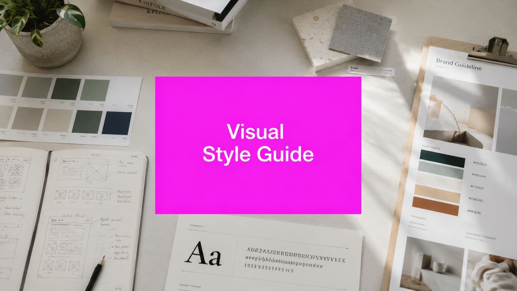
Visual Style Guide: How to Create One for Your Brand

Aarav Mehta • July 28, 2026
Learn how to create a visual style guide from scratch. Our step-by-step guide covers core elements, templates, and using AI for brand consistency at scale.
Your brand can look polished in one place and unrecognizable in the next. The website uses one set of colors, the social feed drifts into another, product screenshots feel off-brand, and every new asset seems to come from a different company. A visual style guide gives you one standard to protect, so the people making content can move fast without improvising the brand every time.
Why Your Brand Needs a Visual Style Guide Now More Than Ever
When a brand grows without a shared visual system, the cracks show up everywhere. Marketing publishes a clean campaign, sales forwards a deck with different typography, and social posts borrow whatever template is closest at hand. The result is not just visual clutter, it is slower work, more revisions, and a brand that feels harder to trust.
A visual style guide fixes that by making the brand's visual decisions repeatable. Carnegie Mellon's data visualization guidance recommends limiting a visualization to one main theme with two or three supporting concepts, while the Urban Institute says bar charts should usually start at zero and use balanced bar widths, about twice the gaps between bars, so audiences can read data quickly and accurately (Carnegie Mellon data visualization guidelines). Those rules are not decoration, they reduce misinterpretation and cognitive load.
That matters even more now because content production is no longer one designer making one asset at a time. Teams are producing more formats, more variants, and more platform-specific versions, often with AI involved. Without a guide, every batch becomes a new judgment call.
Practical rule: if two people can interpret a brand decision two different ways, the guide is too vague.
A formal guide also gives your team a single place to align look, layout, and readability. Nightingale defines data visualization style guides as standards for charts, graphs, tables, and diagrams, and technical writing guidance reinforces the need for numbered captions, labeled axes, legends, and source attribution for every visual (Nightingale on data visualization style guides). That shift matters because the guide is no longer just a branding file, it is a governance tool.
For a practical example of how brands can connect system rules to production workflows, see this brand kit tutorial. It shows why a style system has to live where people create assets, not only in a static PDF.
The Core Elements of a Winning Visual Style Guide
A strong visual style guide is specific enough to remove guesswork and flexible enough to scale. That means documenting the parts creators touch most often, then showing exactly how each part behaves in real use. The goal is not to memorialize every design choice. It is to make the most common choices consistent.

Start with the elements people reuse every day
Logo rules need more than a placement note. A useful guide specifies clear space, minimum sizes, and acceptable variations so the mark doesn't get squeezed into headers, cropped in social templates, or placed on busy backgrounds. That kind of specificity turns a logo from a file into a system.
Color works the same way. Instead of saying “use the brand blue,” define exact color codes, primary and secondary roles, and when accents are allowed. If you don't define usage, teams will invent their own hierarchy every time they need a highlight, button, or chart accent.
Typography should read like a working hierarchy, not a font preference. The guide should identify the headline family, body family, weights, line spacing, and where each size belongs. A type system is what keeps an email, a landing page, and a presentation feeling like they were made by one brand.
Clear rules save more time than clever ones. If creators can't apply the rule fast, they won't use it.
Don't stop at the visual surface
Imagery and iconography need their own standards because they do a lot of brand signaling. Define subject matter, crop style, realism level, line weight, and composition rules so people don't mix editorial photography with flat icons that feel like they came from different toolkits. Layout and grid systems matter for the same reason, because spacing is part of brand identity, not just housekeeping.
If your team uses templates or AI-assisted tools, the guide should also cover what those tools are allowed to produce. That includes common compositions, acceptable variation, and how closely assets should follow the reference system. A practical companion example is this AI logo generator resource, which shows why generated assets still need human-defined rules before they can be used consistently.
For teams building a first draft, Figma's guidance is useful as a guardrail. Keep the guide to about 25–35 pages and use inline links for deeper references so the document stays usable instead of bloated (technical guidance on visual style guides). That's the right balance, enough detail to work from, not so much that people stop opening it.
Building Your Guide From the Ground Up
Start with a documented audit of what already exists. Pull together your website pages, ad creative, social templates, slide decks, product screenshots, and any common image or UI patterns your team keeps repeating. Yale recommends beginning with an audit and then focusing first on the elements teams use most often, which is the fastest way to reduce inconsistency without trying to solve everything at once (Yale style guide guidance).
Standardize the high-frequency decisions first
The first version should usually cover the rules that cause the most friction. That often means colors, typography, buttons, spacing, and imagery, because those are the elements people reuse constantly. If the guide solves the daily decisions, adoption becomes much easier.
A good audit looks for patterns, not just mistakes. Which headline style appears most often. Which button treatment keeps getting redesigned. Which image crops feel off-brand. Once you see the repeats, you can set a rule and stop reviewing the same problem in every asset cycle.
Use a format the team will open. A clean PDF can work at launch, but a shared document or living documentation platform is better if people need to search, comment, or link out to deeper references. If the guide is hard to find, it will be ignored no matter how good it looks.
Write rules creators can use without interpretation
The strongest style guides translate taste into instructions. “Use thin strokes” is vague. “Use 2 px strokes for outline icons and avoid decorative joins” is usable. “Make it feel modern” is vague. “Use sans serif display type, restrained color contrast, and generous white space” gives people a direction they can apply.
Pair each rule with examples. Show the approved version, then show a rejected version, so the difference is obvious. That prevents endless review cycles because creators can self-correct before asking for approval.
A guide should make good work easier to produce, not make every decision feel like a compliance review.
If you're documenting from scratch, it helps to look at a practical walkthrough such as creating brand guidelines with AI. Even when AI helps assemble the draft, the structure still has to come from the brand team, because the tool can organize content but it can't define your standards for you.
Common Mistakes and Expert Dos and Don'ts
The most common failure is overcomplication. Teams try to document every possible edge case, and the guide becomes too long to use. Keep the document focused on the decisions people make all the time, then link out to deeper references when needed.

Use rules that creators can apply fast
Do give people concrete examples. Don't leave them with only text descriptions. A screenshot or side-by-side comparison removes ambiguity faster than a page of prose ever will.
Do keep the guide accessible. Don't bury it in a folder no one can find. Put it where designers, marketers, and outside collaborators already work, so the guide becomes part of the workflow instead of an extra task.
Do involve stakeholders. Don't write the guide in isolation and expect adoption to follow automatically. The people who use the rules every day need a say in whether the rules are practical.
Avoid rules that trap the team
Do allow flexibility where it matters. Don't make the system so rigid that it breaks the moment someone needs a new format, channel, or asset size. A guide is strongest when it sets boundaries, not when it kills adaptation.
Do treat accessibility as part of the brand system. Don't assume color alone will carry meaning. The Nielsen Norman Group says teams should not rely on color alone, should maintain at least 4.5:1 contrast for small text, should use descriptive alt text, and should add cues like patterns or strokes to visuals, with Digital.gov also recommending 45–75 characters per line and 48px touch targets (visual accessibility guidance).
If your team works with fonts across campaigns, product, or templates, it's smart to review Font Checker Pro's license violation tips. Font rules fail in real projects when people use the right typeface in the wrong way, and licensing needs to be part of the guide just like spacing or color.
Supercharging Your Style Guide with AI Image Generation
AI changes the job of a style guide. Describing the brand in broad language like “clean,” “approachable,” or “premium” is no longer sufficient. Those words have to become prompt rules that a tool can repeat across batches without drifting away from the brand.

Translate brand language into prompt structure
The most useful prompt structure starts with subject, style, lighting, composition, and output constraints. If your guide says the brand imagery should feel warm and inviting, that has to become visible instructions such as natural light, soft shadows, indoor lifestyle scenes, and a consistent color palette. If your iconography should feel minimal, the prompt should call for simple forms, clear line weights, and no decorative clutter.
That matters because AI tools give users many ways to drift. One image may come back moody, another too glossy, and another with a composition that feels too editorial. Recent image-style tooling shows how modular this space has become, with 11 style categories and 130+ presets spanning camera angles, lighting, color grades, moods, art styles, and historical eras, which is a clear signal that prompt control has to be built into the guide itself (AI image styles guide).
A strong prompt usually includes brand-safe constraints, not just creative directions. That can mean specifying background tone, negative space, realism level, and what should stay consistent from one batch to the next. If you do not define those limits, the tool will explore on its own, and exploration works against consistency at scale.
The prompt is the production rule. If the prompt is loose, the batch will wander.
Keep variation inside the brand fence
The goal is not identical images. It is controlled variation. A product campaign can use different scenes, but the lighting, palette, and composition should still signal one brand. That is why your style guide needs to function as a prompt library, because the rules determine what can vary and what must stay fixed.
For teams building this workflow, Bulk Image Generation's AI image generation trends tutorial is a useful reference point for how modern generation workflows think about style at scale. The platform itself can generate many visuals in bulk, so the guide has to tell it what “on brand” means before production starts.
A practical prompt example might read like this, in structure rather than as a copy-paste formula, product shown on a neutral background, soft daylight, muted brand colors, minimal composition, no extra props, and a clean editorial finish. Another might call for a social image with a centered subject, generous margin, and consistent contrast so text overlays remain readable. The point is not clever prompting, it is repeatable prompting.
If you are using a bulk workflow, document prompt rules the same way you document logo rules. Define what the brand prefers, what it avoids, and what counts as an acceptable variant. That turns AI from a novelty into an operational channel.
Making Your Visual Style Guide a Living Document
A style guide loses value the moment people stop updating it. Brands change, tools change, and teams find new ways to use the same assets. If the guide stays frozen, people stop trusting it and go back to improvising.
Accessibility also has to stay in the loop. The Nielsen Norman Group and Digital.gov guidance makes it clear that teams should not rely on color alone, should keep contrast strong, and should use descriptive alt text and additional cues like patterns or strokes so visuals remain usable across disabilities (visual treatments and accessibility).
Build a review habit, not a one-time launch
Assign ownership for updates. Someone needs to decide when a new template, icon style, or image treatment becomes official. Without ownership, the guide ages into a stale archive.
Make review part of the release rhythm. When a new campaign format works well, fold it into the guide. When a pattern keeps causing confusion, tighten the rule or add a better example. That keeps the system useful instead of decorative.
Train the people who touch the brand most often. Designers need the visual rules, marketers need the template logic, and external collaborators need the do's and don'ts before they start creating. The fewer surprises at handoff, the more consistent the output.
If a rule keeps getting explained in meetings, it belongs in the guide.
A living guide is also easier to maintain when it is built for search and quick reference. People should be able to find a rule in seconds, not read the whole document every time they need an answer. That is the difference between a brand asset library and a binder that no one opens.
Bulk Image Generation helps teams turn a visual style guide into a repeatable production workflow, so brand rules can travel into bulk image creation without being reinvented every time. If you're trying to keep large volumes of visuals consistent across campaigns, templates, and AI-assisted output, visit Bulk Image Generation and see how its tools fit into that process.