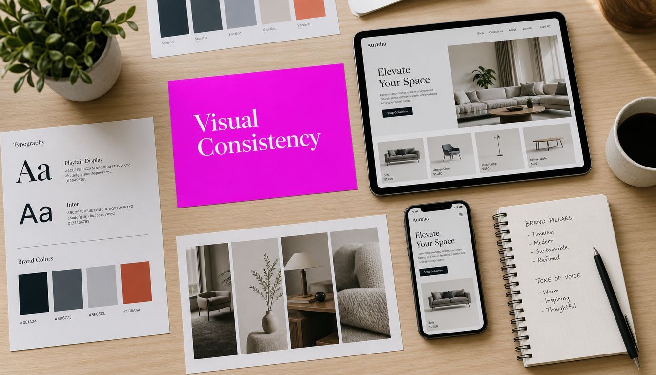
Master Visual Consistency: A Guide to AI & Branding

Ryan Bennett • July 15, 2026
Achieve flawless visual consistency across all your marketing with our guide. Learn to use AI tools like Bulk Image Generation to scale your brand identity.
You're probably dealing with this right now. The campaign is approved, the copy is locked, and the image set looks wrong the moment you see everything together in one folder. The product shots don't share the same light. The AI-generated lifestyle scenes drift between warm and cool tones. The illustrated mascot has one face in the ad set, another in the carousel, and a third in the landing page hero.
None of those images look bad on their own. Together, they look like they belong to different brands.
That's the visual consistency problem. It rarely fails at the single-image level. It fails in the batch, in the grid, and across channels where customers compare assets side by side without thinking about it. When that happens, the brand starts to feel improvised, even if the individual creative pieces are polished.
The Hidden Cost of Inconsistent Visuals
A launch team usually notices visual inconsistency late. Not when the first mockup arrives, but when the assets stack up. A paid social set, a few email banners, product graphics, story formats, and a homepage hero can all look acceptable in isolation. Then someone opens the full campaign board and sees the drift.
The logo treatment shifts slightly. Shadows fall in different directions. Skin tones change from image to image. Backgrounds move from matte studio minimalism to glossy lifestyle realism. The brand voice may still be intact, but the visual system is no longer acting like a system.
That inconsistency creates operational drag before it creates brand damage. Designers start patching color by hand. Marketers swap assets at the last minute. Teams ask for another round of revisions because the visuals don't “feel like us,” even when nobody can explain exactly why.
Why this problem got bigger fast
This used to be manageable when brands produced a small set of campaign images. AI changed the scale. Since the launch of AI text-to-image models in 2022, over 15 billion images have been generated globally, and the industry now runs at 34 million images per day. At that volume, even a 5% inconsistency rate would produce nearly 750 million incoherent images, which is why automated consistency frameworks have become a practical necessity rather than a design preference, according to Everypixel's AI image statistics.
That number matters because it describes the same issue brands face internally. Once your team starts generating creative in batches, manual review stops being enough.
Practical rule: If your consistency process depends on one person “having a good eye,” it will break as soon as output volume rises.
What it looks like in real teams
The symptoms are easy to recognize:
- Campaign drift: One ad set looks premium and controlled, another looks playful and oversaturated.
- Character instability: A recurring person, mascot, or founder likeness changes across executions.
- Catalog mismatch: Product images share the same SKU but not the same visual language.
- Channel fragmentation: Email, social, and landing pages each develop their own unofficial style.
The hidden cost isn't only aesthetic. It's slower approvals, heavier post-production, more internal debate, and weaker recognition when customers encounter your brand more than once.
What Visual Consistency Really Means for Your Brand
Visual consistency is your brand's digital uniform. It tells people, before they read a word, that they're still in the same branded environment. The best systems achieve this subtly. The audience doesn't stop to admire the discipline. They just recognize the brand faster and trust the experience more.

The parts that actually need to stay stable
A lot of teams reduce visual consistency to logo usage. That's too narrow. In practice, a consistent brand usually holds steady across a handful of visible variables:
- Color behavior: Not just the palette itself, but how saturated, muted, warm, or cool the brand appears in real assets.
- Typography rhythm: Headline style, spacing, hierarchy, and how text blocks interact with imagery.
- Image treatment: Whether visuals feel editorial, commercial, stylized, flat, cinematic, or documentary.
- Composition rules: Subject placement, crop logic, whitespace, and framing patterns.
- Logo discipline: Placement, size, clear space, and whether the logo appears as a signature or a dominant element.
- Mood and tone: The emotional temperature of the brand. Calm, energetic, minimal, playful, luxe, clinical, rugged.
Teams that already work with product, web, and campaign design will recognize how closely this overlaps with foundational UX design principles. Consistency isn't only decorative. It helps users process what they're seeing without friction.
Coherence matters more than perfection
Many AI workflows falter. Teams chase exact replication when they really need coherence. Those are not the same thing.
Visual consistency is measurable. In benchmark testing, Adobe Firefly reached a Visual Consistency Index of 0.83 for brand logo generation, while achieving around 95% character consistency often requires custom model training rather than prompt-only workflows, as noted in this comparative study on AI visual consistency.
That distinction is useful. If you need the same branded spokesperson or illustrated character across a large campaign, prompt engineering won't reliably get you there. If you need a family of assets that share the same mood, lighting, palette, and composition logic, you can often get most of the value without perfect identity matching.
Consistency is not identical output. It's controlled variation inside a recognizable system.
The brand test that matters
A simple brand test works better than endless debate. Ask this: if a customer saw five assets from this campaign in five different places, would they assume they came from the same company?
If the answer is yes, you have visual consistency. If the answer is “mostly, except for a few,” you have a production problem waiting to spread.
The Measurable ROI of Visual Cohesion
Creative teams sometimes treat visual consistency like polish. Leadership teams often treat it like taste. Both miss the business value.
A cohesive visual system lowers friction in the moments that matter most. Customers don't need to relearn your brand every time they encounter it. They move through the page, ad, or product grid with less hesitation because the environment feels familiar. Familiarity doesn't guarantee conversion, but inconsistency often interrupts it.
Where the return shows up
The return from visual cohesion usually appears in operational and commercial signals at the same time.
On the operational side, teams spend less time reworking assets that looked fine individually but failed as a set. Reviews become faster because the criteria are clearer. Production scales more cleanly because there's a shared visual target.
On the commercial side, the gains show up as stronger recall, cleaner campaign presence, and a higher perceived level of professionalism. In crowded feeds and category pages, buyers often make quick judgments based on which brand appears more resolved and deliberate.
Why the brain likes consistency
Customers don't audit your palette or inspect your shadow treatment. They react to pattern continuity. When color, composition, and image style stay aligned, the work feels intentional. When those elements drift, the brand feels less stable.
That matters even more in e-commerce and performance marketing, where a buyer might move from ad to landing page to product detail page in minutes. If each touchpoint looks like it came from a different creative brief, trust gets chipped away.
A cohesive brand reduces the number of small doubts a customer feels before taking action.
The practical investment logic
Teams often underestimate how expensive inconsistency is because the cost gets distributed. A few extra edit rounds here. A delayed approval there. A set of assets that “needs cleanup” before launch. None of it looks dramatic on its own.
Put together, though, inconsistent visuals create an ongoing tax on speed and clarity. The alternative is not expensive perfection. It's a repeatable system that keeps your creative within controlled boundaries.
That's why visual consistency belongs in brand operations, not just brand guidelines.
Building Your Foundational Visual Style Guide
You can't automate a visual system that hasn't been defined. Before any AI workflow works well, the brand needs a source of truth that translates taste into rules.
That source of truth is the visual style guide. It doesn't need to be oversized or ceremonial. It does need to be specific enough that another person, another team, or another model can produce work that still looks like your brand.

What the guide must include
Start with the elements that most often drift under production pressure.
- Color definitions: Primary, secondary, and accent colors. Include exact values and also describe how they should feel in use. Bright and punchy creates a different outcome than soft and restrained, even with similar hues.
- Typography rules: Define headline, subhead, body, and utility styles. If the font changes by channel, specify the fallback system and when to use it.
- Logo usage: Document preferred lockups, unacceptable treatments, minimum sizes, and background conditions.
- Photography direction: State the lighting style, depth of field, framing preference, and subject behavior. “Natural light” is too vague. “Soft directional light with clean shadows and uncluttered backgrounds” is usable.
- Illustration guidance: If you use AI-generated illustrations, specify line quality, texture, color density, level of realism, and facial treatment.
- Icon and UI treatment: This matters more than most brand teams think. Icons and interface graphics can quickly introduce a second visual language.
Write rules that production can actually use
Most style guides fail because they're descriptive instead of operational. They show examples but don't help teams make decisions under deadline.
A stronger guide answers questions like these:
| Element | Weak guidance | Usable guidance |
|---|---|---|
| Photography | “Modern and clean” | “Neutral backgrounds, soft studio-style light, product centered or slightly off-center” |
| Illustration | “Friendly” | “Rounded forms, low texture, limited shading, no harsh outlines” |
| Color | “Use brand pink” | “Pink appears as accent, not full-frame wash, and should not dominate product imagery” |
One of the more practical ways to translate a brand guide into image generation rules is to build from a reusable kit, reference set, and prompt structure. This walkthrough on brand kit based image generation is useful because it treats the brand guide as a production input rather than a PDF nobody opens.
The style guide is not documentation for its own sake. It's a constraint system.
What older methods get wrong
Traditional brand governance assumed lower output volume. A designer made the asset, another reviewer checked it, and the process held. That model breaks once one team needs dozens of variations across formats, audiences, and channels.
At that point, the guide still matters, but it stops being the finish line. It becomes the reference layer that everything else needs to enforce.
Scaling Consistency with AI Bulk Generation
The old workflow for visual consistency was straightforward and exhausting. Generate or source images one by one, review them manually, fix the obvious mismatches, send them to design, then patch whatever still feels off after seeing the full set. That process can work for a small campaign. It falls apart when the volume rises.
The main reason is simple. Humans are decent at evaluating a few images. They're much worse at maintaining exact standards across a large batch produced under time pressure.
Why prompts alone stop working
Prompt engineering helps with direction, but it doesn't solve persistence. A model doesn't remember your character's face, your preferred highlight rolloff, or how your product should sit in frame from one generation to the next.
For identity-sensitive work, that limitation matters. Achieving around 95% character accuracy in bulk generation is best handled by training a custom model with Flux LoRA, because that constrains the model to reproduce specific visual features rather than improvising each time. For broader style consistency, a unified AI editor that applies consistent color grading and sharpening can cut post-production time by about 50%, according to this analysis of style consistency across AI-trained models.
That matches what teams run into in practice. Prompts are useful for direction. They're weak as a long-term enforcement layer.
What a scalable workflow looks like
A more reliable system has three layers:
-
Definition layer
The style guide, reference images, approved compositions, and any identity assets such as logos or character references. -
Generation layer
Batch creation based on one visual objective, not a series of disconnected prompts. -
Standardization layer
Batch editing for color grading, background normalization, sharpening, sizing, and cleanup.
That last layer is where many teams recover consistency. Raw generations often contain small lighting mismatches, texture noise, and tonal drift. Standardizing those details after generation produces a more cohesive set than trying to force perfection upfront.

Where a bulk workflow helps
In practical terms, a tool like Bulk Image Generation for social media batches offers a solution. It lets teams generate large image sets from a single goal and then use batch editing controls to normalize output across the set. That's materially different from writing isolated prompts and hoping the results line up later.
The advantage isn't magic consistency. It's fewer opportunities for drift.
What works and what doesn't
Here's the candid version.
What works
- Reference-led generation: Feed the system examples of the visual language you want.
- Single-batch objectives: Generate campaign families together instead of asset by asset.
- Post-generation normalization: Correct color and background behavior in one pass.
- Custom training for recurring identities: Use LoRA-style constraints when the same person or character must remain stable.
What doesn't
- Prompt-only identity control: Fine for exploration, weak for repeatability.
- Mixed source references: Combining conflicting examples usually creates muddy output.
- Late-stage visual review: If you only inspect after export, most of the cost has already been created.
- Channel-specific improvisation: Letting each team “adapt the style a bit” usually produces brand fragmentation.
The shift is less about replacing designers and more about moving designers upstream. They define the system, the references, and the acceptance rules. The machine handles repetition and variation inside those boundaries.
Implementing a Visual Consistency Scorecard
Image batches are still commonly reviewed with some version of thumbnail squinting. They lay out the set, scan for anything that feels off, and start commenting. That method works when the batch is small and the reviewer is experienced. It's a weak quality-control system for scale.
A better approach is a visual consistency scorecard. Instead of asking whether the batch “looks right,” the team scores the same dimensions every time. That turns a vague creative review into an enforceable production process.
A practical scorecard for bulk workflows should evaluate lighting temperature, shadow intensity, background uniformity, color saturation, and composition alignment, as recommended in this discussion of AI image consistency for e-commerce workflows.
The scorecard framework
Use a simple 1 to 5 scale. The point isn't mathematical precision. The point is consistent judgment across reviewers and batches.
| Metric | Evaluation Criteria (1-5 Scale) | Notes |
|---|---|---|
| Lighting temperature | 1 = visibly mixed warmth/coolness across images. 3 = mostly aligned with occasional drift. 5 = batch shares the same temperature profile throughout. | Watch skin tones, white surfaces, and metallic reflections. |
| Shadow intensity | 1 = shadow depth varies heavily and distracts. 3 = minor variation that still feels related. 5 = shadows behave consistently in depth, softness, and color. | Look for direction changes and muddy blacks. |
| Background uniformity | 1 = backgrounds feel unrelated in tone, texture, or realism. 3 = generally aligned with a few outliers. 5 = every image supports the same visual environment. | This is often the fastest pass/fail signal. |
| Color saturation | 1 = some images are muted while others are overly vivid. 3 = palette holds but intensity varies. 5 = saturation is controlled and brand-appropriate across the set. | Compare against brand palette intent, not personal taste. |
| Composition alignment | 1 = subject framing and crop logic feel inconsistent. 3 = mostly similar with a few awkward placements. 5 = subject position, spacing, and visual balance follow a clear pattern. | Review in grid view, not one by one. |
How teams should use it
The scorecard works best when it's attached to production gates.
- Before approval: Score a sample batch before generating the full set.
- After generation: Run the full batch through the same five dimensions.
- After editing: Rescore only the dimensions affected by batch corrections.
- Before launch: Approve based on threshold, not intuition alone.
Some teams set internal pass rules. Others use the scorecard to identify where drift happens most often. Both approaches are useful. What matters is that the same dimensions get reviewed every time.
Don't ask whether the images are good. Ask whether they are consistent enough to act as one campaign.
Why this beats manual thumbnail review
Manual review tends to overfocus on the loudest mistake. One strange hand, one odd face, one awkward object. Those defects matter, but they aren't the whole consistency problem.
The scorecard keeps the team focused on system-level variables. If lighting, shadows, background treatment, color behavior, and composition all score well, the batch will usually feel branded even when individual images vary in subject matter.
That's the true upgrade. You stop managing taste and start managing standards.
Your Path to Effortless Brand Alignment
The practical path is shorter than often assumed. Define the visual system clearly. Generate within that system. Standardize the output. Score the batch before it goes live.
That's how visual consistency becomes manageable at scale. Not through endless revisions or stricter opinions, but through a workflow that treats consistency as something measurable and enforceable.
This matters even more if your brand shows up across multiple channels. If you're aligning web, paid, email, social, and retail touchpoints, this overview of Rebus on omnichannel strategy is a useful reminder that the customer experiences all of it as one brand, even when your internal teams don't.
For small teams, the win is speed. For larger teams, it's control. For both, the upside is the same. Fewer mismatched assets, fewer approval loops, and a brand that looks like itself everywhere it appears.
If you're building a lean marketing function, this guide to AI images for small businesses is a practical next step for turning those ideas into a repeatable workflow.
Frequently Asked Questions
Do I need perfect image matching to have visual consistency
No. Most brands need visual coherence, not identical outputs. If the lighting, palette, composition, and mood stay aligned, the batch can still feel unified.
When should I train a custom model
Train a custom model when the same person, mascot, or branded character must stay stable across many images. That's where prompt-only workflows usually break down.
What should I review first in a large batch
Start with backgrounds and lighting. Those two variables often reveal drift faster than finer details.
Is a style guide enough on its own
No. A style guide defines the system, but it doesn't enforce it. You still need generation constraints, batch editing, and a scorecard.
How often should I update the scorecard
Update it when your brand style changes, when a new campaign format appears, or when the team keeps finding the same kind of inconsistency in reviews.
If you're tired of fixing the same visual drift over and over, Bulk Image Generation is worth exploring as part of a more structured workflow. It gives teams a way to generate image batches from a single creative goal, then standardize them with batch editing tools so the final set stays closer to the brand system you want to maintain.
