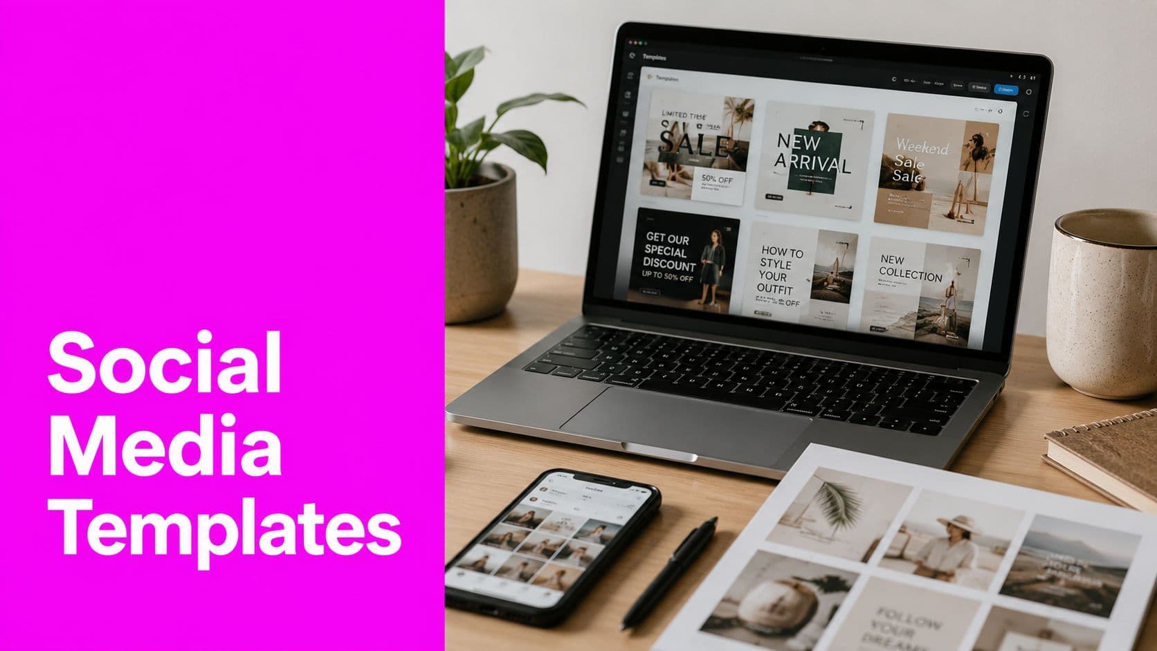
How to Pick and Customize Social Media Graphics Templates

Aarav Mehta • July 30, 2026
Learn how to pick, customize, and scale social media graphics templates for every platform. Covers sizes, branding, accessibility, and AI batch workflows.
You're staring at a content calendar that won't slow down, the deadline is close, and the same three layouts have already been recycled enough times that even your team can spot the pattern. That's the reason social media graphics templates matter. They're not just a shortcut for busy days, they're the only sane way to keep shipping at the pace social platforms demand without turning every post into a one-off design project.
The smartest teams stop treating templates like disposable slides and start treating them like a brand system. A good template gives you speed, but a better one gives you repeatability, editability, and a recognizable visual fingerprint that compounds over time. That difference is why template libraries have moved into the mainstream, not the niche. Shutterstock alone lists 11,863 royalty-free “social media statistics infographic” assets, while Canva and Visme both keep dedicated libraries for statistics-driven social visuals, which shows how much demand there is for reusable, data-first layouts across marketers, educators, and small businesses Shutterstock's social media statistics infographic library.
The Production Reality Behind Template-Based Posting
A marketer with 30 posts due by Friday doesn't need inspiration. They need a system that can survive the calendar. The temptation is to pull up a random template, swap the headline, change the colors, and call it done, but that's how feeds start to look repetitive and why teams end up spending extra time trying to hide the fact that they're using templates at all.
The better move is to treat each design as part of a repeatable production line. That means templates are not final outputs, they're controlled starting points. When the layout is built to support quick variation, the same core structure can handle campaign announcements, quote graphics, stat cards, and repurposed blog promos without forcing a redesign every time.
Template work is batch work
Social platforms reward consistency in output, not perfection in one beautiful post. That's why a reusable template system matters more than a polished one-off graphic. The workflow becomes simpler when the team knows what stays fixed and what changes, because the design burden shifts from invention to controlled variation.
Practical rule: if a post can't be updated without rebuilding it, it isn't really a template yet.
This is also where teams get tripped up by tool thinking. A template saved in a design app is not automatically a template asset. It becomes one only when the structure is predictable, the layers are editable, and the brand rules are clear enough that a teammate can make a fast change without breaking the composition. That's the difference between a file and a system.
Four Quality Benchmarks Every Template Must Meet

A template can look attractive and still fail in production. The four checks that matter most are consistency, white space, hierarchy, and accessibility. Those aren't abstract design virtues, they're the controls that keep a post readable in a feed, recognizable across a series, and usable by people who are scrolling fast.
Consistency keeps the brand recognizable
A template family should look like it belongs to the same brand even when the headline, image, or statistic changes. If one post uses a different type scale, another shifts the logo placement, and a third changes the spacing rules, the feed starts feeling disconnected. Consistency is what makes a set of posts feel intentional instead of assembled at random.
White space gives the content room to breathe
Crowded layouts are easy to spot because they force the eye to work too hard. When every edge is filled, the headline competes with the chart, the icon competes with the body copy, and nothing gets read cleanly. White space is not wasted space, it's what lets the main message land without visual noise.
Hierarchy tells people what matters first
A social graphic needs one clear focal point. If the statistic, title, logo, and supporting text all carry the same weight, the viewer doesn't know where to look. Good hierarchy uses size, placement, and contrast to create a reading path, which is especially important when the design is meant to be understood in seconds.
Accessibility has to be designed in
High contrast, legible type sizing, and simple relationships between text and background are not optional if you want a template to work for more than one audience. A pretty gradient with thin light text might look polished in the editor and fail badly on a phone screen. A template that ignores accessibility becomes a liability, because the team will either avoid using it or keep patching it after publish.
| Check | What it should do | What usually goes wrong |
|---|---|---|
| Consistency | Keep a series visually related | Random spacing, type, or logo placement |
| White space | Improve scanning and readability | Crowded edges and cramped copy |
| Hierarchy | Lead the eye to the key message | Too many elements fighting for attention |
| Accessibility | Stay legible across devices | Low contrast, tiny type, weak separation |
A good template fails quietly. A bad one creates cleanup work after every publish.
Platform-Specific Sizes and What They Force You to Design
The wrong size can ruin a good layout before anyone sees it. Platform dimensions aren't trivia, they shape the composition from the start. A square post supports centered balance, a story forces vertical movement, and a portrait post asks for more detail without turning into a text wall.
If you're building template families across channels, use an aspect ratio calculator before you commit to the canvas. A fast reference helps prevent the classic mistake of designing once and discovering the crop problem later, especially when the same content needs to work in feed, story, and portrait formats. The practical tool reference sits here for workflow planning, the aspect ratio calculator workflow.
Build the layout around the format
A 1080×1080 square post rewards strong center alignment and compact message design. A 1080×1920 story needs vertical hierarchy, because the reader's eye moves top to bottom and anything too wide gets crowded fast. A 1080×1350 portrait post gives more room for copy and supporting graphics, which makes it useful when the message needs a little more detail.
The older feed formats still matter too. A 1200×630 Facebook feed graphic needs a composition that survives a wider crop, while LinkedIn and Pinterest often force you to think in terms of scanability and depth rather than simple symmetry. The same content can work across formats, but only if the template system is designed to absorb those differences instead of fighting them.
| Platform | Format | Dimensions (px) | Design Priority |
|---|---|---|---|
| Instagram feed | Square | 1080×1080 | Centered composition |
| Instagram stories | Vertical | 1080×1920 | Vertical hierarchy |
| Portrait feed post | Portrait | 1080×1350 | Balance detail and feed presence |
| Facebook feed | Wide | 1200×630 | Safe cropping and clear headline |
The point is not to memorize every number. The point is to design each master artboard with its final destination in mind, so the post doesn't get cropped into something awkward the moment it's published.
Why Most Templates Look Generic and How to Break the Pattern
A template starts to look generic when the same visual shortcuts show up again and again. The familiar placeholder image, the soft gradient header, and the default font stack all signal that the design came straight from the editor, not from the brand. The post may still be clean, but it stops feeling specific.
That trade-off matters in real production. A template can save time and still flatten a brand's presence if every post leans on the same starter choices. Speed only helps when the audience can tell the content apart from the last few posts they scrolled past, so customization has to reach past color changes.
The cues that scream stock template
Repeated image framing is a common giveaway. Leaving the default placeholder photo in place while only changing the headline creates the same effect. Starter fonts and template backgrounds do it too, because those elements carry the designer's habit more clearly than the brand system.
The fix is to break the signals that repeat. Re-crop the image so the focal point lands somewhere less expected. Move the grid so text and image do not sit in the default positions. Replace stock illustrations with branded shapes, icons, or custom visual motifs that keep the family recognizable without letting every post look stamped out of the same file.
For a useful comparison, the guide to film presets at Department of Vibe explains a similar tension in another medium, matching a look versus building one that still feels personal.
Worth remembering: a brand can stay consistent without looking repetitive.
Shift the template toward intentional asymmetry
Intentional asymmetry changes the read fast. Leave one element slightly oversized, shift the text block off center when the layout gives you room, or let one side carry a little more visual weight than the other. Those small decisions tell the viewer a designer made choices, not just edits. That is what separates a branded template from a generic shell.
If the team is building around a brand kit, a brand kit based workflow helps keep those choices repeatable without forcing every post into the same shape. The goal is not novelty for its own sake. The goal is to give the template enough variation that it still feels designed after the tenth reuse.
Building a Master Template Family You Can Reuse
A real template system starts with brand variables, not with a pile of finished images. Lock the colors, type scale, logo placement, and spacing rules first, then keep the content layers editable so the team can swap headlines, figures, or images without disturbing the structure. That's what makes the family reusable.

The operational benefit is simple. When the brand system is locked, the designer doesn't need to rediscover the same decisions for every post. The file itself enforces the rules, which is much more reliable than hoping each teammate remembers them on a busy day.
Keep the edit points clean
Editable layers are where the handoff succeeds or breaks. Exporting to SVG preserves flexibility, especially when clients or teammates need to swap text, colors, or components later. Ungrouped elements and removed clipping masks matter because they keep the file open for downstream edits instead of trapping the design in a flattened image.
Export one artboard at a time
One artboard at a time is the safest workflow when you need multiple sizes. It keeps the output clean and reduces the chance that a flattened file locks in the wrong crop or spacing. The mistake I see most often is treating a batch of sizes like one combined image, which makes reuse harder and handoff clunkier than it needs to be.
A useful starting point for this setup is the brand kit based tutorial, because it aligns the template structure with repeatable brand inputs rather than ad hoc edits.
Build for variants, not for one-off perfection
A master template family should produce several related layouts from the same core grid. One version might prioritize the headline, another might emphasize a stat, and a third might swap the supporting graphic while keeping the same brand frame. That approach keeps the feed coherent while still giving the team enough variation to avoid visual fatigue.
The pay-off is operational, not theoretical. The more the template system handles automatically, the less time the team spends redrawing the same structure just to make a small change.
Scaling Output with AI Batch Generation and Post-Production

AI earns its place in template work when it takes over the repetitive tasks that do not need judgment. Background variations, crop variants, batch resizing, background removal, and enhancement all fit that category. The message still needs a person behind it, and the visual strategy still needs editorial judgment, but AI can turn one approved template into a full set of assets without forcing manual rework on every file.
The cleanest bulk workflows separate design decisions from production steps. One part of the system sets the structure, while another handles high-volume output from structured inputs and cleans up the files afterward. For teams comparing what different generators are built to do, XBurst's top AI post picks is a useful reference point.
A relevant tool for this workflow is Bulk Image Generation, which supports bulk creation from a single template base and can generate up to 100 unique images in under 20 seconds with models like Flux 1.1 Pro. It also includes batch editing for background removal, face swaps, resizing, and enhancement, which cuts editing time in half.
Use AI where repetition is the bottleneck
AI pays off most when the task is mechanical. If you need the same post in several aspect ratios, or you need multiple visual variations from one approved composition, batch generation removes a lot of manual clicking. If the work depends on taste, such as deciding which crop best supports the message, a designer still needs to stay in control.
That trade-off matters more than the tool choice. Fast output is useful only when the variations still hold up in feed, in story, and on the client review screen. A sloppy batch run saves time on production and costs more time in revision.
Keep the designer in the loop
A fast batch workflow can still produce weak assets if nobody checks the result. Composition, copy hierarchy, and brand polish still need a designer's eye, especially when a template is being adapted to multiple channels. AI should reduce the production burden, not replace the judgment that makes the final graphic feel deliberate.
The strongest teams use AI after the template system is already stable. Once the master artboard, brand variables, and export settings are set, batch generation becomes a controlled extension of the workflow instead of a shortcut that drifts away from the brand. That keeps speed and originality in balance, which is a test of scaling templated social content.
Your Repeatable Template Workflow Checklist

A template workflow works best when the order never changes. Start with the use case, because a quote card, a stat graphic, and a campaign teaser don't need the same structure. Then lock the brand variables so the team isn't redeciding colors or type every time a new post goes out.
- Define the use case. Choose the content type first, because the message should shape the layout.
- Set the platform size. Build the canvas for the actual destination, not a generic square that might fit later.
- Lock the brand variables. Hold the logo, type, palette, and spacing rules steady so the system stays recognizable.
- Build editable master artboards. Keep text, images, and icons easy to swap without breaking the structure.
- Customize past the defaults. Change the obvious template cues so the post doesn't look copy-pasted.
- Generate variants in batch. Use bulk production where repetition is the problem, not where judgment is needed.
- Export in an editable format. Preserve future changes by keeping the handoff flexible instead of flattened.
This checklist works because it treats templates like a production habit, not a design philosophy. The team can move faster when every step has a place, and that speed only holds when the template stays editable after the first publish.
If you're trying to scale social posts without making every graphic look cloned, Bulk Image Generation gives you a bulk workflow for creating and editing many images from one template base. It's built for the exact tension this topic raises, speed without losing control over the final asset.