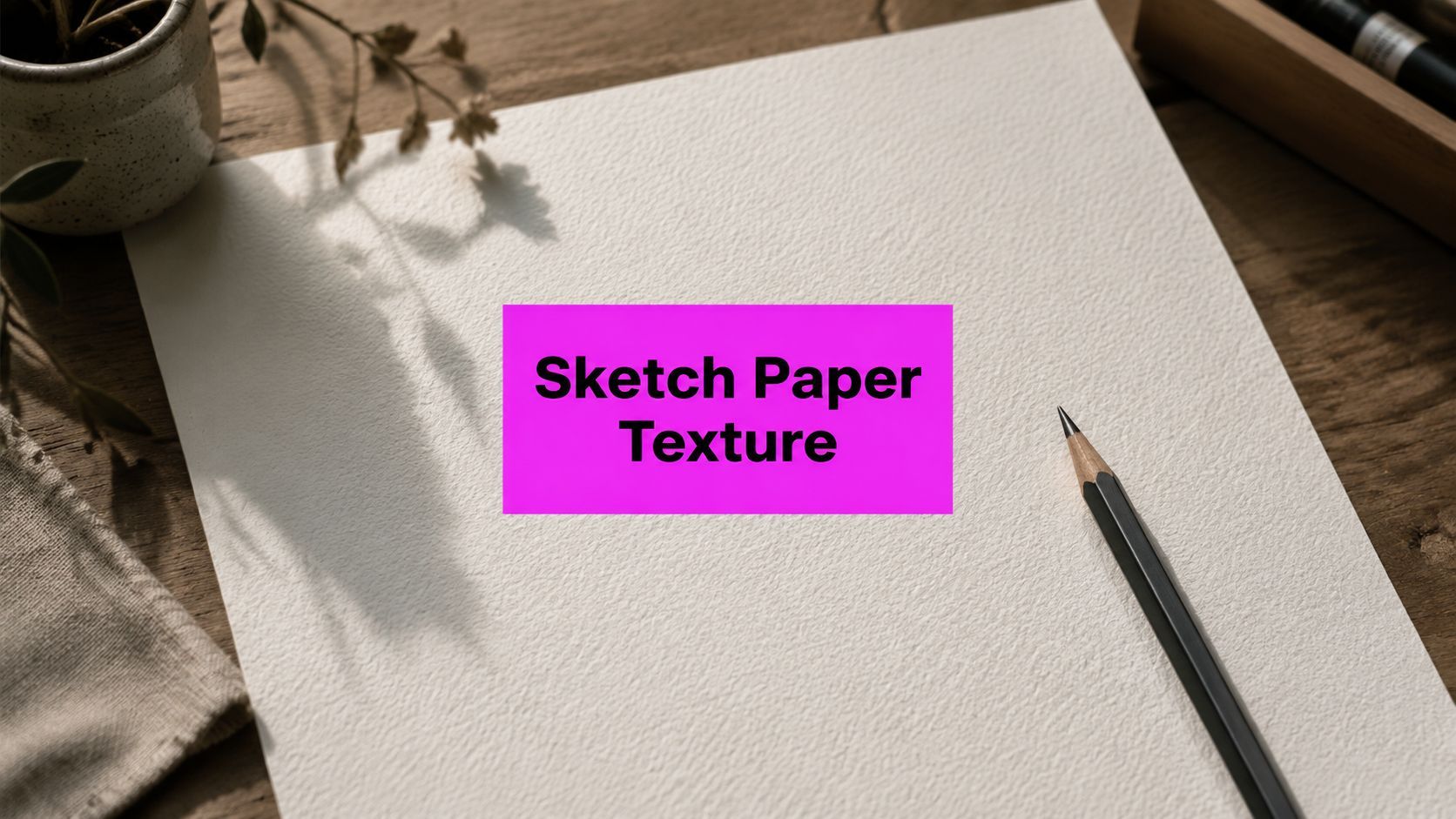
Sketch Paper Texture: A Practical Guide for Designers

Ryan Bennett • September 1, 2026
Learn how sketch paper texture shapes design and AI bulk image workflows. Compare types, weights, and capture methods in this practical 2026 guide.
You've finished a sketch, scanned it, and placed it over a digital layout. Yet the result still looks strangely flat. The lines are accurate, the colors are right, and the composition works, but the screen has erased the small irregularities that made the original feel human. That missing quality often comes from sketch paper texture, especially the relationship between tooth, grain, absorbency, and paper weight.
The right texture can make graphite feel grounded, give an AI-generated image a handmade edge, or help a batch of marketing visuals share a coherent visual language. The wrong one can muddy fine details, create obvious repeats, or make a clean illustration look artificially distressed. This guide treats physical paper and digital texture as one connected design problem, from choosing a sheet to building a continuous asset for repeatable image production.
Why Sketch Paper Texture Still Matters in a Digital World
A designer can spend an afternoon refining an illustration and still feel that something's missing. On a blank digital canvas, every edge may be perfectly clean, but the work can lack the slight resistance that paper gives to a pencil or brush. That resistance affects how marks settle, how shadows break up, and how viewers interpret the image.

Texture acts as a bridge between tactile and digital design. A subtle grain can soften a sterile background, separate layers in a dense composition, and suggest that an image was made through a physical process. That doesn't mean every project needs a distressed or visibly rough surface. Often, the strongest result is a texture viewers notice emotionally before they identify it technically.
Why designers use it
A paper surface can support several visual goals:
- Authenticity: Small variations in grain make an illustration feel less mechanically uniform.
- Hierarchy: A textured background can sit behind sharper typography or product photography without competing with it.
- Brand character: Fine grain may feel refined, while rough tooth can suggest craft, printmaking, or editorial illustration.
- Workflow consistency: One carefully prepared master texture can support a family of assets instead of requiring a new treatment for every image.
Physical paper also has a useful history. Until 1757, handmade paper commonly showed ribbed surfaces with visible laid and chain lines created by the mold wire frame. James Whatman the Elder's introduction of wove paper removed that distinct structure, producing a smoother and more uniform surface. That transition is widely treated as a milestone in modern artist paper and is associated with the golden age of British watercolor. Gagosian's discussion of paper surface history places texture in that longer context, from an unavoidable result of papermaking to a deliberate design choice.
For digital teams, the practical lesson is simple. Texture shouldn't be added as decoration at the very end. Choose it alongside the intended medium, viewing size, and output style, then preserve enough detail for the smallest format in the batch. The next decisions become much easier once you can describe what the surface is doing.
The Anatomy of Paper Tooth and Grain
Start with tooth. Tooth is the network of microscopic peaks and valleys on a sheet, and those irregularities create friction between paper and dry media. A soft carpet gives your hand more resistance than fine velvet. Paper tooth works in a similar way. A rougher surface catches more graphite, charcoal, or pastel, while a smoother surface lets the tool travel with less drag.
Grain is related but different. It describes the directional pattern created by fibers and manufacturing. Under angled or raking light, grain can appear as a directional flow across the sheet. It may influence how shading feels from one direction to another, but it isn't the same as tooth. Tooth describes surface relief. Grain describes visible or directional fiber structure.

Weight changes what the sheet can tolerate
Paper weight is commonly expressed in GSM, or grams per square meter. Modern guides place sketch-oriented papers in ranges such as 90 to 150 GSM for light sketching, 190 to 250 GSM for medium-weight drawing and mixed media, and 300 to 500 GSM for heavier papers that can support wet media and repeated layering. These ranges come from artist paper guidance on GSM, absorbency, and texture.
Lighter sheets suit quick ideation and simple graphite studies, but they can show marks through the reverse side and may react poorly to aggressive erasing. A heavier sheet generally gives you a more stable surface for layering, scanning, and presentation. Weight alone doesn't determine quality, though. A smooth, heavy sheet and a rough, lighter sheet can produce very different results.
For pencil work, industry guidance places daily practice paper around 70 to 90 GSM, while 90 to 120 GSM is often recommended as a minimum for more serious sketching because it better tolerates erasing and repeated layers. The Graphite Guide explains this relationship between weight, tooth, and pencil handling.
How physical traits become digital information
A scan records more than color. It records the contrast between raised areas, recessed areas, fibers, shadows, and pigment deposits. A high-tooth original can therefore produce richer overlay detail, especially when reduced into a small background or blended into an AI-generated image.
Before scanning, ask what you need to preserve. If the project depends on clean linework, prioritize subtle surface variation. If it depends on charcoal drag or expressive graphite buildup, retain stronger peaks and valleys. The digital file should represent the paper's behavior, not merely imitate a beige background.
Hot Pressed, Cold Pressed, and Rough Compared
Hot-pressed, cold-pressed, and rough papers are best understood as positions on a surface spectrum. They aren't three unrelated labels, and the “best” finish depends on whether you value line precision, pigment retention, or visible character.
Hot-pressed paper is smoothed by rollers and has minimal tooth. It supports controlled ink, precise graphite, detailed marker work, and clean scans. Designers often choose it when an illustration needs crisp edges, technical forms, or masks that must follow a sharply defined contour.
Cold-pressed paper occupies the practical middle. Its subtle dimples provide enough grip for graphite and light watercolor while still allowing detail to survive. That balance makes it a strong general-purpose option for sketchbooks, marketing mockups, and digital textures that need warmth without overwhelming the subject.
Rough paper has deeper, more visible tooth. Charcoal, pastel, and soft graphite can settle into its surface with dramatic variation, but thin lines may break up and smooth gradients can become harder to control. The Virtual Instructor's overview of drawing surfaces supports this medium-to-output matching approach.
| Finish | Surface Feel | Best Media | Digital Capture Notes |
|---|---|---|---|
| Hot-pressed | Very smooth, low tooth | Ink, technical graphite, detailed markers | Preserve fine tonal changes and avoid sharpening |
| Cold-pressed | Moderate tooth with subtle dimples | Graphite, colored pencil, light watercolor | Capture balanced grain for flexible overlays |
| Rough | Deep, irregular tooth | Charcoal, pastel, expressive dry media | Check that the grain doesn't overpower resized details |
Match the finish to the final image
Choose hot-pressed when the texture should sit behind a precise subject. Choose cold-pressed when you want a recognizable paper feel that remains adaptable across layouts. Use rough stock when visible surface disruption is part of the creative direction, not merely an attempt to make a flat image look “artistic.”
A medium-tooth surface often gives the most forgiving result for general sketching because it accepts multiple graphite layers while preserving finer details. Heavily textured paper can make soft shading less predictable because the pencil touches the raised points first. The surface may look rich at full size but become noisy after reduction.
The same rule applies digitally. A rough texture should be reduced carefully and tested at the smallest output. If the grain becomes a field of dark speckles around a face, logo, or product edge, the texture is working against the design.
Capturing Real Paper Texture by Scanning and Photography
A scanner is usually the cleanest starting point for physical paper. It gives you even illumination, repeatable framing, and a flat source that can become a reliable master texture.
Place a single sheet on a dust-free platen. If air pockets appear between the sheet and glass, use a soft brayer or a plain paper weight to press the surface gently and evenly. For a detailed master, scan at a minimum of 600 dpi in 16-bit grayscale or RGB, and disable sharpening, descreening, and dust-reduction filters. These settings and capture practices are outlined in Jackson's Art Supplies' paper texture guidance.

A practical scanning sequence
- Prepare the sheet. Remove loose fibers and dust with a clean, soft brush. Avoid wiping aggressively, since rubbing can alter delicate surfaces.
- Flatten air gaps. Press the paper gently without creasing it. Air gaps can create uneven density and false shadows.
- Scan without “helpful” corrections. Software filters may make a scan look cleaner while removing the tooth you need.
- Inspect before editing. Zoom into highlights, shadows, and corners. Look for compressed fibers, clipped tones, and color shifts.
Large sheets create a different problem. Scan overlapping sections and stitch them in Photoshop, Affinity Photo, or GIMP. The overlap should be consistent enough to give the stitching software shared landmarks, but the final composite still needs a careful inspection for changes in grain direction.
When photography is the better choice
Photography makes sense for sheets that exceed the scanner bed or contain deep embossing. A tethered DSLR with a macro lens can capture relief without pressing it against glass. Use two matched 5000 K lights positioned at 45 degrees, a color checker card for white balance, an aperture between f/8 and f/11, ISO 100, and RAW capture, as specified in the supplied capture plan.
Watch for three common failures:
- Glare hotspots: Move the lights farther off-axis or adjust their height until reflections leave the frame.
- Moiré: Remove nearby screens and patterned surfaces, then change the camera distance or angle.
- Fiber compression: Photograph instead of scanning when the scanner lid flattens a raised surface.
If your work also includes product scenes, the same attention to controlled lighting and surface detail applies to this AI product photography tutorial. The aim isn't a dramatic photograph. It's a neutral, repeatable source that can survive color correction and batch processing.
Resolution, File Format, and Seamless Tiles for Digital Use
A texture file should be built for its smallest important use, not just its largest source scan. A social background, a printed package, and a large editorial image place different demands on detail, tonal depth, and repeat behavior.
The following production targets are useful working specifications for organizing assets. They're workflow recommendations, not universal technical rules.
| Output Use | Min Resolution | File Format | Bit Depth | Seamless Tile? |
|---|---|---|---|---|
| Social posts | 1500 × 1500 pixels | PNG or JPEG for delivery | 8-bit | Recommended |
| Print packaging | 6000 pixels on the long edge | TIFF or PNG master | 16-bit when heavily shaded | Strongly recommended |
| Editorial layouts | Sized to final placement | TIFF or PNG | 8-bit or 16-bit by tonal complexity | Useful for flexible crops |
| AI batch backgrounds | Square master sized for resizing | PNG or TIFF | 16-bit master when color shifts are likely | Essential for repeatable output |
The master should usually be TIFF or PNG because both preserve image data without the losses associated with repeated JPEG editing. JPEG is better reserved for final web delivery, where file size matters more than preserving every subtle fiber transition. For a practical explanation of balancing visual quality and delivery weight, consult this guide on compression and formats.
Building a tile that doesn't announce itself
In Photoshop or GIMP, use an offset filter to move the image's edges into the center. Set each offset value to half the image dimension. The former borders now meet in the middle, where you can remove visible transitions with healing tools, cloning, or carefully sampled texture.
Crop only after the seams are resolved. A hard-edged square helps you test whether the tile repeats cleanly, while a feathered edge can conceal problems instead of fixing them.
Before adding the file to a batch workflow, check:
- Square dimensions: The asset should repeat predictably in both directions.
- No visible seams: Inspect the center after applying the offset preview.
- Neutral color cast: Paper should not turn unexpectedly pink, green, or gray under different overlays.
- Consistent shadow direction: Directional photography can create a repeated lighting pattern.
- Useful scale: Grain should remain believable after resizing, not become either invisible or noisy.
For large collections, a consistent resize process matters as much as the source. A tool such as the Bulk Image Resizer can help standardize dimensions before texture compositing.
Integrating Paper Texture into AI Bulk Image Workflows
Treat paper texture as a reusable asset, not a one-off effect. Once you separate the texture from the artwork, you can control its intensity, placement, and scale across a complete image set.
A reliable workflow has three paths. The first keeps texture outside the generation process. The second asks the model to interpret the texture as part of the visual condition. The third limits texture to selected regions so the subject stays clean.

Path one uses a reusable compositing layer
In Photoshop, create a texture layer above the generated image and test Multiply, Overlay, and Soft Light. Multiply tends to darken through the texture, Overlay increases contrast, and Soft Light creates a gentler interaction. Keep the texture layer independent so you can change opacity, mask it, or replace it without rebuilding the image.
Photoshop batch actions can apply the same sequence to a folder of outputs. A typical action might open the image, place the texture, convert it to the required dimensions, apply a blend mode, save a flattened delivery copy, and preserve the layered master separately.
This approach is predictable because the AI model doesn't need to reproduce the paper surface. It's especially useful when the same brand treatment must appear across product cards, social posts, and educational graphics.
Path two conditions the generation
In Stable Diffusion workflows, ControlNet or IP-Adapter can help guide the generation toward a consistent surface language. The exact result depends on the model, conditioning image, denoising choices, and prompt construction, so test the texture with a small representative set before committing to a large run.
Prompt language should describe the surface rather than relying on the vague word “paper.” Examples include:
fine grain sketchbook paper, soft graphite texture, matte surfacecold-pressed 200 GSM paper, subtle tooth, restrained fiber variationrough drawing paper, visible dry-media grain, handmade editorial finishsubtle deckle edge, natural paper fibers, non-glossy surface
Negative prompts can suppress unwanted finishes:
glossy plasticsynthetic shinepolished 3D rendersmooth digital gradientlaminated surface
The prompt should also state what must remain clear. For example, “paper texture confined to the background, clean facial features, readable typography, crisp subject edges” gives the system a more useful priority order than a texture keyword alone.
Path three protects the subject with masks
Inpainting masks let you apply texture to a background, border, or empty color field while leaving a product, face, or logo untouched. This is often the safest choice for marketing visuals because excessive tooth can interfere with skin, small text, or precise product contours.
A simple folder structure keeps the process traceable:
textures/masters/textures/tiles/inputs/outputs/review/outputs/final/manifests/
Use a CSV or JSON manifest to map each source file to its intended output size, texture variant, prompt, and export location. A ComfyUI graph or API script can then loop through the manifest, resize the image, apply or condition the texture, and export the result.
Workflow orchestration becomes useful when generation, resizing, masking, review, and delivery involve separate systems. Sprello's explanation of workflow orchestration provides helpful context for thinking about those dependencies as one managed process rather than a chain of manual handoffs.
For a prompt-driven route, Bulk Image Generation's AI Texture Generator can create a texture from a written description and provide a downloadable result. Use the output as a candidate asset, then test it like any scanned texture.
Production rule: Run a small Z-test batch before scaling. Check the smallest output, the largest output, a light subject, a dark subject, and any layout with typography.
Automated review can flag obvious repeating seams, missing files, incorrect dimensions, and inconsistent naming. A useful naming convention might preserve the source and treatment, such as coldpress_mediumtooth_masterA_softlight_bg_v02. The exact format can vary, but every final render should point back to its physical sheet or generated master.
Choosing the Right Texture for Your Project
Texture selection becomes clearer when you stop asking, “Which paper looks most realistic?” and ask, “What should the audience notice first?” A texture that looks beautiful in a close-up may distract from a small advertisement. A subtle surface that disappears on screen may be exactly right for a printed worksheet.
Use a three-part decision filter
First, define the context. Identify the medium being simulated, the final print or screen size, the expected viewing distance, and the brand mood. A refined stationery identity may need fine grain and restrained contrast. An editorial illustration may benefit from visible tooth and irregular pigment hold.
Second, match the surface to the delivery channel. Smooth or lightly cold-pressed tiles usually support social carousels because they preserve small text and facial detail. Medium tooth works well in editorial layouts where the paper feel should remain visible without dominating. Rough grain suits packaging mockups when visible fibers and handmade character are part of the product story.
Third, perform a fast layering test in Photoshop or Figma. Check legibility, overlay opacity, and repeat behavior at thumbnail size. If the texture only works when enlarged, it isn't ready for a multi-format campaign.
| Scenario | User | Grain Type | Weight Feel | Resolution | File Format |
|---|---|---|---|---|---|
| Warm café social campaign | Marketer | Warm rough grain | Light-to-medium | 300 DPI | PNG master |
| Printable learning sheets | Educator | Subtle cold-pressed tooth | Medium | 200 DPI | PDF-ready TIFF |
| Artisan candle packaging | Small business owner | Visible fibers and heavier surface | Heavy stock simulation | 400 DPI | TIFF master |
Three practical choices
A coffee shop marketer might choose warm rough grain for an illustrated seasonal campaign. The next step is to prepare a 300 DPI texture treatment, build a continuous square tile, save a PNG master, and test prompt terms such as warm rough sketch paper, matte coffeehouse poster, natural fiber variation.
An educator preparing printable worksheets should favor subtle cold-pressed tooth. The next step is to create a 200 DPI TIFF with restrained contrast, test it behind black text and line illustrations, and prompt with subtle cold-pressed drawing paper, clean printable worksheet, low-contrast grain.
A small candle brand may want a heavier stock simulation with visible fibers. The next step is to create a 400 DPI TIFF master, build a repeating tile that remains believable across package panels, and use prompt terms such as heavy artist paper, visible fibers, tactile handmade packaging, matte surface.
Don't choose by zoomed-in beauty alone. Reduce every candidate to its smallest planned output, place real content over it, and inspect the result without enlarging. The right sketch paper texture should support the message, preserve important details, and remain stable when your workflow generates many variations.
Bulk Image Generation lets you create prompt-based textures and apply them within larger image production workflows, making it practical to test paper surfaces across repeated outputs. Visit Bulk Image Generation to explore texture generation, batch creation, and resizing tools for your next sketch-inspired campaign.
