
Create Stunning Retro Video Game Posters with AI

Aarav Mehta • December 6, 2025
Learn how to generate incredible retro video game posters at scale. This guide covers AI prompting, design, and print-ready production for artists and creators.
Creating high-quality retro video game posters is a lot more doable than it used to be, especially with AI in your corner. Now, you can churn out unique, professional-level designs at a scale that was once impossible. This guide walks you through the entire workflow—from nailing down the concept to getting your files print-ready—all by tapping into the booming nostalgia market with bulk generation tools.
Why Retro Gaming Art Is Making a Huge Comeback
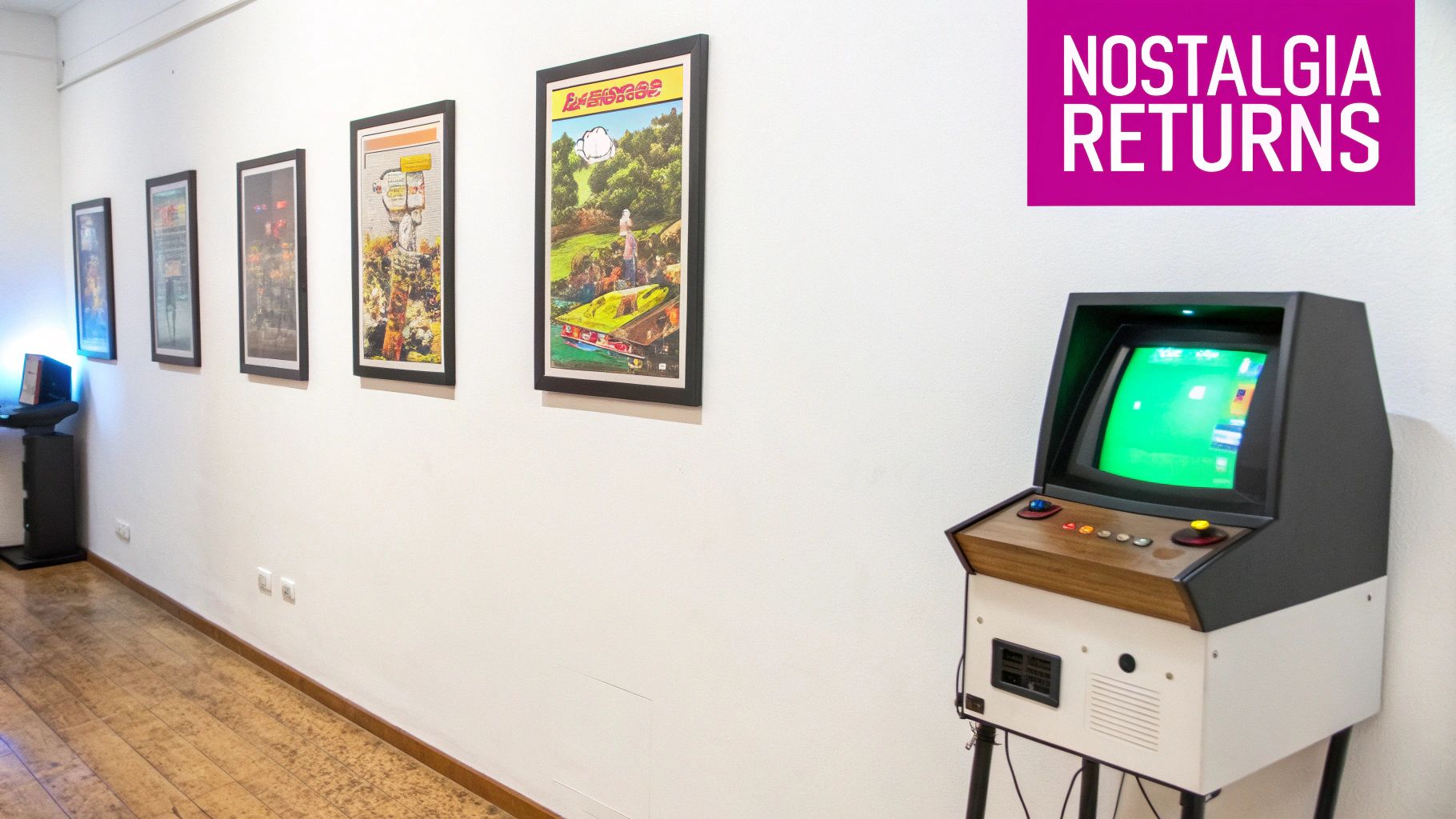
Those pixelated heroes and 8-bit worlds we grew up with are far more than just fond memories; they’ve become a genuine cultural force. What was once a niche hobby has exploded into the mainstream, creating a massive demand for merch that perfectly captures the spirit of gaming’s golden age.
This comeback isn’t just about firing up old consoles. It’s about celebrating the art, the chiptune music, and the pure, simple joy these games brought to millions. This wave of nostalgia has opened up a real opportunity for artists, designers, and entrepreneurs. The magic of retro video game posters is their power to trigger an instant emotional connection, speaking directly to a generation that shares these iconic adventures. It’s a visual language we all understand.
The Market for Nostalgia
This demand isn't just a feeling—it’s backed by some serious numbers. The global market for gaming posters, where classic titles are a huge driver, was valued at USD 245.21 million in 2023. It’s projected to skyrocket to USD 455.26 million by 2029, growing at a compound annual rate of nearly 11%. The data is clear: people want tangible pieces of their gaming history.
If you want to get a better sense of how vintage art transforms a space, take a look at A Guide to Retro Posters UK. The core ideas of connecting with a vintage vibe apply just as well to gaming as they do to any other part of pop culture.
Bridging Passion with Modern Tools
In the past, building a diverse collection of high-quality posters was a grind. Each design meant hours of painstaking work, making it incredibly tough to build a catalog with enough variety to appeal to different tastes. That’s where AI-powered tools like Bulk Image Generation completely change the game.
Here's what I'll show you how to do:
- Lock in a strong creative vision for your poster series.
- Whip up hundreds of unique images efficiently with AI prompt templates.
- Nail the fundamentals of design and typography.
- Get your final files ready for professional printing at scale.
By blending the timeless appeal of retro gaming with today's tech, you can build a unique product line that hits home with a passionate and growing audience. This workflow lets you go from a simple idea to a full portfolio in a fraction of the time it would have taken just a few years ago.
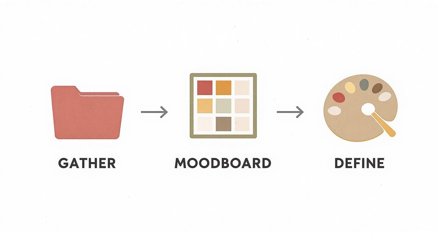
Before you even think about generating an image, you need a solid game plan. This early planning stage is what separates a random jumble of pictures from a truly cohesive series of retro video game posters. It's the groundwork that makes every single piece feel like it belongs.
The whole point is to nail down your target aesthetic with crystal clarity. Are you aiming for the neon glow of an 80s arcade, or the grand fantasy vibe of a 16-bit RPG? Every era has its own distinct visual language, and your first task is to get fluent in the one you've chosen. The best way to do that? A well-curated moodboard.
Gather Your Visual Inspiration
Start pulling together images that just feel right. Don't box yourself in with only game screenshots or box art, either. When I'm starting a project like this, I cast a much wider net to build a richer visual vocabulary.
Get creative with your sources. I often look at:
- Vintage tech ads from the 70s and 80s for their killer color palettes and typography.
- Classic sci-fi and fantasy movie posters to get ideas for dramatic compositions.
- Arcade cabinet artwork and old promotional flyers for their punchy, action-packed graphics.
- Album covers from the period to really understand the graphic design trends of the time.
Mixing all these influences helps you cook up a style that feels nostalgic but still has a fresh twist. As you collect these assets, you'll start spotting patterns—recurring colors, shapes, and themes—that you can then weave into your own designs.
A strong moodboard isn’t just a pretty collage. It’s a strategic document that will guide every single creative decision you make from here on out. It becomes your North Star, keeping everything consistent, even if you’re generating hundreds of images.
Defining Your Artistic Direction
Once you've got your inspiration board filled up, it's time to set some ground rules for the project. This is where you turn those abstract feelings into concrete design choices. Lock in a core color palette, pick out a few key typographic styles, and identify specific motifs that will tie your poster series together.
This kind of strategic thinking is especially critical if you're targeting a specific audience. For instance, North America is a huge market for gaming posters, thanks to its deep-rooted gaming culture and serious consumer spending on retro merch. Fans there have a powerful connection to classics like Super Mario, Zelda, and Sonic, so knowing the visual cues they expect is a massive advantage. You can find more insights on these global gaming poster market trends on wiseguyreports.com.
Having this clear direction also makes the AI work for you, not against you. You can translate your visual rules directly into your prompts, which means the AI is far more likely to spit out results that actually match your vision. It's a similar process to defining parameters for creating game textures. For a look at how that works, check out our guide on using an AI Texture Generator. Trust me, a clear plan from the get-go saves a ton of time and leads to a much more professional final product.
Crafting Powerful AI Prompts for Bulk Generation
Once you’ve nailed down your creative direction, it’s time to translate that vision into a language the AI can understand. This is where the magic really begins—moving from abstract ideas to stacks of high-quality, tangible art. Using a bulk generation platform powered by a model like Flux 1.1 lets you crank out a massive volume of unique retro video game posters from a single, well-structured template.
The whole process hinges on the prompt template. Think of it like a recipe where you can swap out key ingredients to create entirely different dishes. Instead of painstakingly writing a new prompt for every single poster, you build one master prompt with variables. This approach gives you an incredible amount of control and makes the entire workflow ridiculously efficient.
This simple workflow—gathering ideas, building a moodboard, and defining your core elements—is the foundation you build your prompts on. It’s what keeps your results consistent and on-target.
Starting with this structure means your AI prompts are born from a solid creative strategy, not just random guesses.
Structuring Your Master Prompt
Your master prompt is a mix of fixed elements and variables. The fixed parts lock in the consistent style for your whole series—the art medium, the era, and the overall mood you're after. The variables are just placeholders for the things you want to change from one poster to the next, like the main character, the setting, or a specific action.
For instance, a fixed element might be something like: 16-bit pixel art style, vibrant synthwave color palette, cinematic composition. This ensures every single poster shares that same core aesthetic.
The variables, usually marked with brackets like {character} or {setting} in a bulk tool, are where the variation comes in. You can then feed the tool a list or spreadsheet with all the different characters and settings you want to generate.
Building Prompts for Different Retro Styles
Different gaming eras demand completely different language. You can't just use the same descriptors for an Atari 2600-style poster and expect it to work for a PlayStation 1-era design. You have to speak the right visual language.
-
For 8-Bit Pixel Art: Think simple. Use terms like
8-bit sprite,chiptune aesthetic,limited color palette,blocky graphics, andminimalist pixel art. The goal is to capture that iconic, stripped-down look. -
For 16-Bit Fantasy RPGs: Now you can get more descriptive. Try phrases like
detailed 16-bit fantasy art,lush landscapes,epic battle scene,SNES-style graphics, anddynamic character sprites. -
For 90s Vector & 3D: Shift your vocabulary again. Use terms that evoke that specific period, like
early 3D render,low-poly models,vector graphics,bold outlines, and90s arcade racing game poster.
If you're ever stuck trying to find the right words, a specialized tool can give you a major leg up. You can explore all sorts of artistic keywords with a free AI image prompt generator to find the perfect phrasing for your vision.
The key is to be specific but flexible. Your prompt should guide the AI strongly toward your desired style while leaving enough room for it to generate unique and surprising compositions within those boundaries.
To get the best results for different retro looks, it helps to break down how each part of your prompt contributes.
Flux 1.1 Prompt Template Components for Retro Styles
| Prompt Component | Purpose & Example | Best For (Style) |
|---|---|---|
| Core Subject | Defines the main focus. Example: A heroic knight, a futuristic spaceship. | All Styles |
| Style/Medium | Sets the artistic foundation. Example: 8-bit pixel art, low-poly 3D render. | 8-Bit, 16-Bit, 90s 3D |
| Color Palette | Controls the mood and era. Example: limited 4-color palette, synthwave neon. | 8-Bit, 16-Bit, 90s Vector |
| Composition | Guides the layout and framing. Example: cinematic wide shot, dynamic action pose. | 16-Bit, 90s 3D/Vector |
| Era Descriptors | Adds authentic details. Example: SNES-style graphics, early 90s arcade. | 16-Bit, 90s Styles |
| Lighting/Effects | Enhances the atmosphere. Example: CRT scan lines, dramatic backlighting. | All Styles |
Using these components together gives you precise control over the final look, ensuring each poster feels authentic to its era.
Fine-Tuning Batch Settings for Quality
Finally, don't forget that your batch settings are just as crucial as the prompts themselves. When you're creating retro video game posters, you want to push for quality. I always recommend setting the generation steps or quality parameter to a higher value. This ensures you get crisp details and rich, vibrant colors instead of a muddy mess.
Pay close attention to the aspect ratio, too. Most posters have a vertical orientation, so a 2:3 or 3:4 ratio is usually your best bet. Generating images in the correct final aspect ratio from the very beginning will save you a world of hurt in post-production. No more awkward cropping or stretching images later.
These small tweaks to your batch settings can make a massive difference in whether your final product looks amateur or truly professional.
Mastering Poster Composition and Typography
Getting a killer AI-generated illustration is a great first step, but it's the design choices you make next that turn raw art into a professional poster. This is where the real magic happens. The right composition and typography will make your retro video game posters not just something people see, but something they feel.
Sure, you’ve heard of the rule of thirds, but for the high-octane world of video games, you need to think more about motion and focus. A character sprinting from left to right feels way more natural if they have space in front of them, not behind. It’s a simple tweak, but it guides the viewer's eye and creates an immediate sense of forward momentum.
Leading the Viewer's Eye
In game art, composition is all about directing attention. Think of every element in your image as an arrow pointing to what matters most. A laser blast, a trail of smoke, even the angle of a sword—these can all act as leading lines, pulling the viewer's gaze toward a character's face or the heart of the action.
As you sift through your generated images, keep an eye out for ones that already have these strong directional cues baked in. A poster for a space shooter, for instance, hits harder if the ships are arranged to suggest movement and conflict, not just parked in space.
Your goal is to create a visual hierarchy. The composition should instantly tell the viewer what the most important part of the story is, whether it's the hero, the villain, or the epic world they inhabit. This makes the poster immediately readable and engaging.
This strategic approach is vital for grabbing the attention of a seriously passionate audience. The market for retro games isn't just a niche hobby anymore; it's booming. One report estimates its value will hit around USD 5.8 billion in 2025 and skyrocket to USD 11.3 billion by 2032. Tapping into that means creating products that feel authentic and thoughtfully crafted. For a deeper dive, you can read the full retro games market analysis at worldwidemarketreports.com.
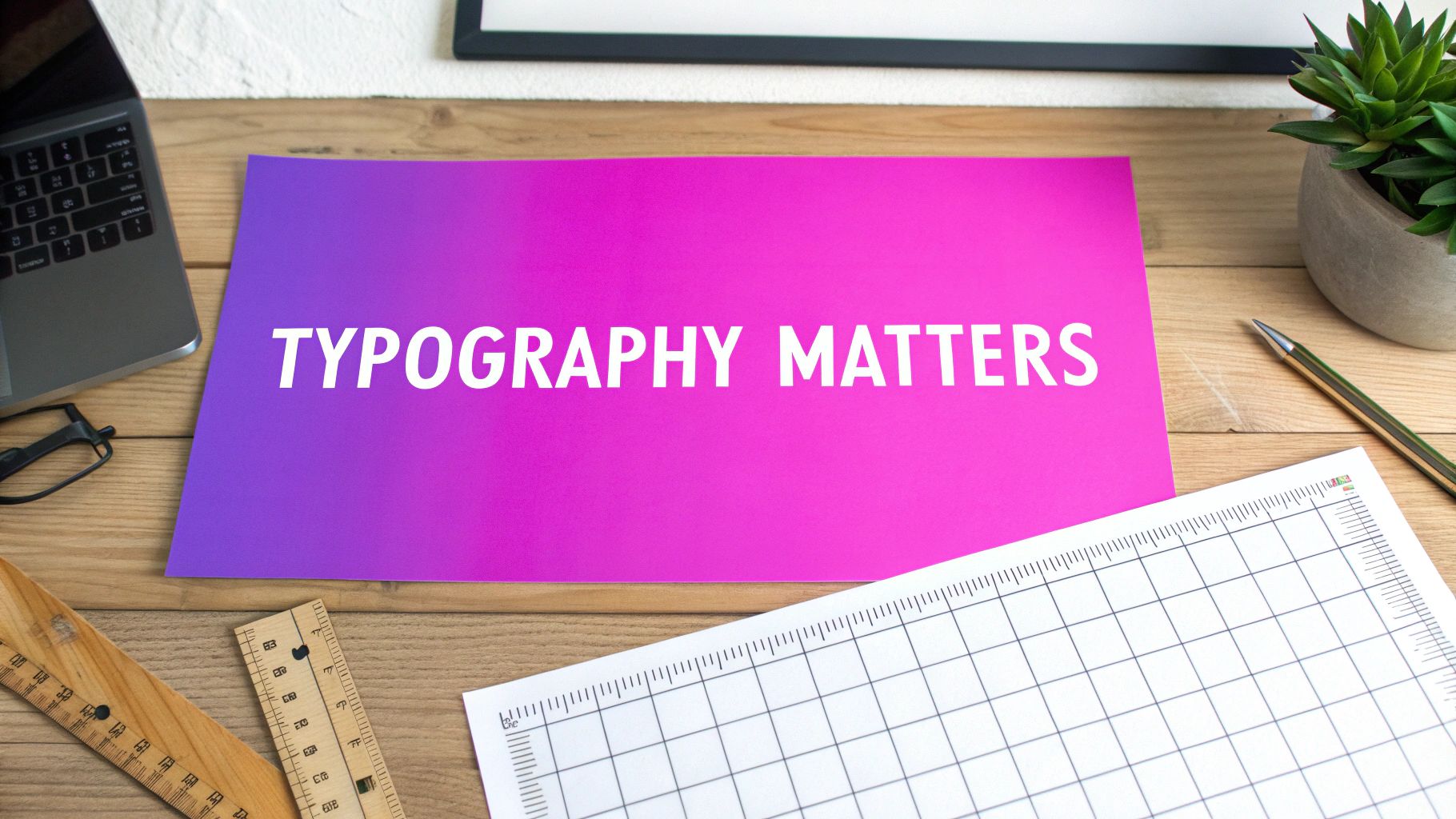
Choosing Fonts that Define an Era
Typography is your time machine. The right font can instantly transport someone back to an 80s arcade or the middle of a 90s console war. It’s one of the most powerful tools you have for locking in that authentic retro feel.
Here are a few styles I always come back to:
- Pixel Fonts: Nothing screams authenticity for the 8-bit and 16-bit eras like chunky, blocky text. It's a direct nod to early game graphics and a must-have for that classic vibe.
- Sci-Fi Scripts: Think of the sleek, futuristic fonts from late-80s movie posters and games. These are perfect for nailing a Blade Runner or Metroid-inspired aesthetic.
- Bold Serif Fonts: For fantasy RPGs, a strong, classic serif font can evoke a sense of epic adventure, just like the title screens of the JRPGs we all grew up with.
The final piece of the puzzle is integrating the text. Place your title and any taglines where there's less visual noise—an open patch of sky or a dark corner of the composition. A pro tip is to color-pick your text directly from the artwork itself. This small step ensures your typography complements the art instead of competing with it, giving you a balanced, powerful final design.
Finishing and Preparing Your Files for Print
Once your digital creations are ready, the final—and arguably most critical—step is getting them prepped for the physical world. This is where you transform those vibrant pixels on your screen into professional retro video game posters that look just as good on paper.
Think of this as the final polish that turns a great image into a sellable product.
The only sane way to do this at scale is with batch processing. If you’ve just generated 100 unique posters, the last thing you want to do is edit them one by one. I use Photoshop Actions for this, but most good editing software has a similar feature. You can record a sequence of adjustments—like color correction, sharpening, or resizing—and apply it to your entire batch with a single click.
This doesn't just save a ton of time; it guarantees consistency. Every poster gets the same treatment, creating a cohesive, professional look across your entire product line.
Dialing in the Technical Details
Before you even think about sending a file to the printer, you have to get the technical specs right. This is non-negotiable. The two big ones are color profiles and resolution.
-
Color Profile (CMYK vs. RGB): Your screen displays colors using RGB (Red, Green, Blue). It’s an additive process based on light. But printers work with ink, using a subtractive CMYK (Cyan, Magenta, Yellow, Key/Black) profile. You must convert your files to CMYK, or the colors in your final prints will be off. It’s a classic rookie mistake.
-
Resolution (DPI): For a sharp, professional-looking print, you need a resolution of at least 300 DPI (dots per inch). Anything less, and you risk your posters looking blurry or pixelated, especially at larger sizes. Always double-check this before you export.
Getting your dimensions right from the start is also a massive time-saver. If you know your target print size, use our handy aspect ratio calculator to figure out the exact pixel dimensions you need at 300 DPI. This prevents any nasty surprises or last-minute cropping issues.
Post-production is your final quality check. It's the essential step that bridges the gap between your digital vision and a tangible product someone will hang on their wall. Skipping this part undermines all the creative work you've already put in.
Advanced Post-Production Tricks
Once you've nailed the basics, a few advanced tricks can really elevate your posters. One common headache with AI generation is character consistency. Sometimes, your hero's face might look slightly different across a dozen images. This is where AI face-swapping tools come in handy during post-production. You can apply a single, consistent "master" face across the entire series.
Batch background removal is another incredibly powerful technique. It lets you cleanly isolate your main subjects and drop them onto custom backgrounds, giving you far more creative control over the final composition. These might seem like small edits, but they make a huge difference in the perceived quality and uniqueness of your work.
Making sure your digital art translates perfectly to print is everything. For anyone serious about professional-grade output, a guide to flawless A1 poster printing offers some fantastic tips on resolution, color profiles, and paper types for large-format pieces.
Finally, when you're ready to save, use a high-quality, lossless format like TIFF or a high-resolution PDF. This preserves every last detail for the printer.
Got Questions About AI Poster Creation? Let's Clear Things Up.
Jumping into AI for creating retro video game posters is exciting, but it definitely brings up a few questions. It's one thing to generate a single cool image, but it's a whole different ball game when you're trying to build a professional, sellable collection.
Let's tackle some of the most common hurdles I see people run into.
"How Do I Keep My Art Style Consistent?"
This is probably the biggest concern I hear. When you're generating hundreds of images, how do you stop them from looking like a random, disconnected mess?
The secret is all in your prompt template. You have to lock in your core stylistic descriptors—think of them as your non-negotiables. For example, if you decide on an 80s airbrushed art style or 16-bit pixel art, muted color palette, those phrases become the stylistic anchor for every single image.
The variables for the character, setting, or action provide the variety, but that core aesthetic never changes. This is how you ensure that whether your poster features a space marine or a mythical knight, it feels like it belongs to the same cohesive series. It’s about being really strict with your foundational style rules while giving the AI enough creative freedom to play within those boundaries.
"What About Copyright and Selling My Posters?"
Okay, this one's a biggie. Intellectual property. It’s tempting to create fan art of your favorite game characters—and for personal projects, that’s usually fine. But trying to sell it? That's a legal gray area you really don't want to wander into.
While some IP holders are pretty chill with fan creations, commercial use is a completely different story. To stay on the safe side, especially when you're trying to build a real brand, my advice is always the same: create original characters and worlds that are inspired by retro aesthetics, not direct copies.
- Make Your Own Heroes: Design a new mascot in the classic 8-bit style.
- Build a Fictional Universe: Dream up a new sci-fi world that has that distinct 90s console game vibe.
- Lean on Archetypes: Generate posters based on timeless concepts like the "elf archer," the "cyberpunk street racer," or the "lone space marine."
This strategy lets you tap into that nostalgic feeling everyone loves without stepping on any legal toes, giving you total commercial freedom.
The most successful artists I've seen evoke the spirit of an era, not just its icons. This gives your work a unique voice and, more importantly, keeps you clear of any potential legal headaches.
"Which Print-on-Demand Service Should I Use?"
You've got a folder full of amazing designs. Now what? The final step—printing—is where a lot of people stumble. Not all print-on-demand (POD) services are created equal, particularly for art prints.
Quality can vary wildly. You'll see differences in everything from paper thickness and texture to color accuracy and the final finish. After trying a bunch of them, I’ve learned to look for services that offer archival-quality paper and Giclée printing options. These printers use much higher-quality, pigment-based inks that produce more vibrant, accurate colors and are incredibly resistant to fading over time.
Before you even think about listing a product, always order samples. Seriously. There is no substitute for seeing and feeling the final print yourself. It's the only way to be 100% sure it meets your quality standards before your customers see it.
Ready to go from an idea to a full inventory? Bulk Image Generation gives you the toolkit to create hundreds of unique, high-quality retro video game posters in minutes, not months. You can streamline your entire workflow at https://bulkimagegeneration.com.