
A Guide to Resolution and Image Size

Aarav Mehta • December 2, 2025
Master resolution and image size with our guide. Learn to optimize images for web, print, and social media to achieve perfect clarity and performance.
It’s a classic mix-up in the digital world: resolution and image size. People often throw these terms around as if they mean the same thing, but they describe two totally different—though related—concepts.
Getting this right isn't just about sounding smart. It's fundamental. Understanding the difference is the first step to making sure your images look fantastic everywhere, from a tiny phone screen to a massive printed banner.
Decoding Your Digital Blueprint
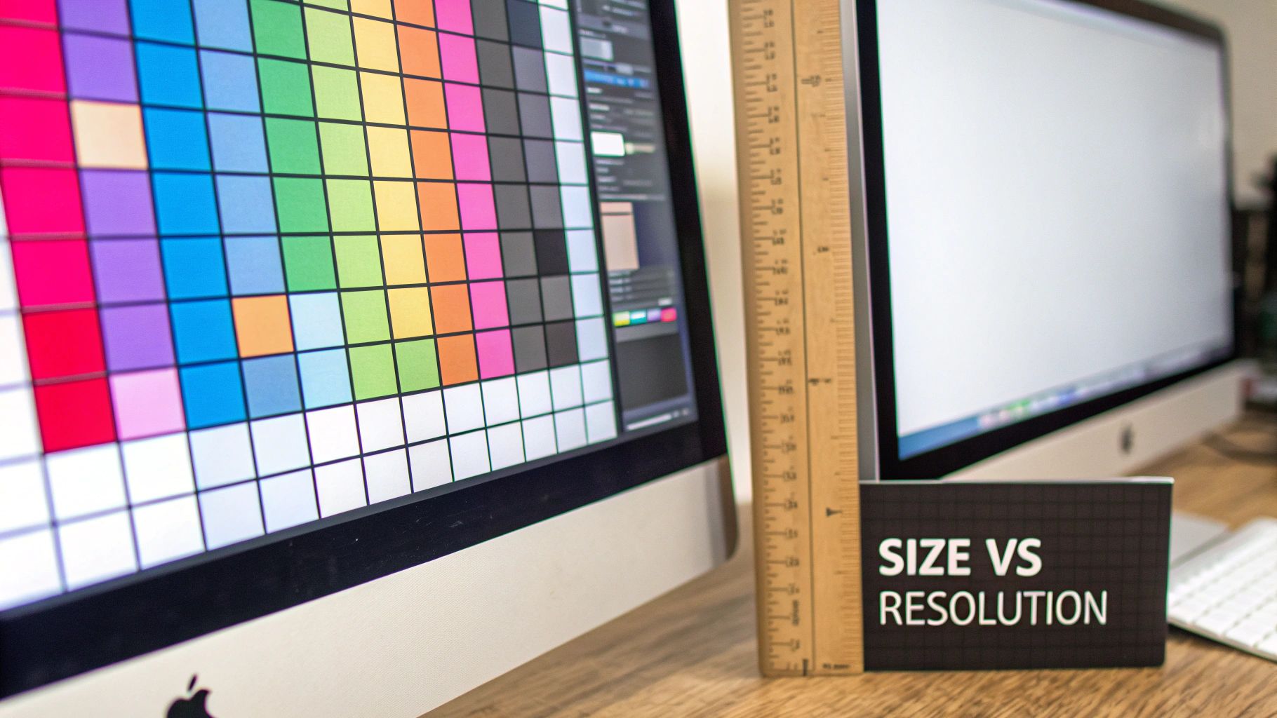
Let's break it down with a simple analogy. Imagine you're creating a giant mosaic.
Image size is the total number of tiles you have to work with. A big image, say 4000 x 3000 pixels, gives you a whopping 12 million tiles. With that many tiles, you can create something packed with incredible detail. A smaller image, like 800 x 600 pixels, gives you only 480,000 tiles. You can still make a picture, but the level of detail is naturally limited.
Resolution, on the other hand, is all about how you place those tiles. It’s the density of your mosaic. If you cram all your tiles into a small one-inch square, you have a high resolution—a sharp, detailed image. But if you spread those same tiles out over a ten-foot wall, the resolution becomes low. The image looks blurry, blocky, or "pixelated" because the tiles are too far apart.
Why This Distinction Matters
This isn’t just technical jargon; it has real-world consequences. It affects everything from how fast your website loads to how crisp your printed poster looks. Nail this, and your visuals will always appear sharp and professional.
For a quick reference, here’s a simple table to keep the concepts straight.
Resolution vs Image Size At a Glance
| Concept | What It Measures | Unit of Measurement | Primary Impact |
|---|---|---|---|
| Image Size | The total amount of visual data in an image. | Pixels (e.g., 1920 x 1080px) | Digital detail and file size. |
| Resolution | The density of pixels within a physical space. | Pixels Per Inch (PPI) | Print quality and on-screen sharpness. |
This table neatly sums it up, but let's explore a bit further.
-
Image Size (Dimensions): This is the width and height of an image measured in pixels. It defines the total amount of digital information you have. For example, a common 16:9 aspect ratio image might have dimensions of 1920 x 1080 pixels. If you need to figure out different dimensions while keeping the same shape, a good aspect ratio calculator can do the math for you.
-
Resolution (Density): This is measured in Pixels Per Inch (PPI). It tells you exactly how many of those pixels are packed into one linear inch of a physical screen or a printed page. The higher the PPI, the sharper and more detailed the image will look in that physical space.
It’s a common myth that a "high-resolution" image is always a large file. While that's often the case, you could have an image with massive pixel dimensions but a very low PPI. Print that out, and it will look terrible. The magic is in the relationship between the total number of pixels and the final output size.
Grasping this core relationship is your first big step toward mastering image optimization. Whether you're prepping images for a lightning-fast blog or a high-end print brochure, it all starts here.
How Screens and File Formats Shaped Our Digital World
To really get why we use the image sizes and resolutions we do today, you have to look back at the tech that set the rules. Every single image we create is seen through a lens—the screen—and its limitations have been shaping our digital design choices for decades.
Think about early computer monitors. They were bulky, low-resolution beasts. For what felt like an eternity, the king of screen sizes was 1024x768 pixels. This wasn't a random number; it was the absolute peak for common CRT and early LCD monitors for years. Our entire digital world was built to fit neatly inside this little box.
The Great Resolution Race
Then, things started changing. Fast. The story of screen resolution over the last two decades is one of constantly moving goalposts. By March 2012, 1366x768 had pushed its predecessor off the throne, mostly because it was the standard for all those new, affordable laptops flooding the market.
The hunger for sharper, better visuals never stopped. Full HD (1920x1080) became the new global standard by late 2020, a shift pushed hard by the TV industry's move to a 16:9 aspect ratio. You can actually see a fascinating breakdown of these screen resolution trends over on teoalida.com.
This hardware evolution brought a new headache. How could we possibly share these beautiful, detailed images without making people wait minutes—or even hours—for them to download? The answer came from some clever engineering in the form of file formats, each one a solution for its time.
File Formats as Problem-Solvers
These formats weren't just containers; they were brilliant solutions that literally made the visual web we know and love possible. Each one strikes a different balance between quality, file size, and features.
-
GIF (Graphics Interchange Format): In the slow, painful era of dial-up internet, GIFs were a godsend. They used compression and a limited 256-color palette to shrink images down to a manageable size. Of course, its support for simple animations made it an icon of early web culture that’s still going strong.
-
JPEG (Joint Photographic Experts Group): Once digital cameras went mainstream, we needed a way to handle millions of colors without creating ridiculously huge files. JPEG’s "lossy" compression was the perfect answer. It smartly throws away data the human eye is less likely to notice, finding that sweet spot between quality and file size.
-
PNG (Portable Network Graphics): Born as a better alternative to GIF, PNG offered superior "lossless" compression, handled millions of colors, and introduced a game-changer: alpha transparency. This is what allows for images with complex, see-through backgrounds, a feature that’s absolutely essential for modern web design.
Every single image we touch today carries this history. The dimensions we pick are shaped by decades of screen evolution, and the file format we choose is a direct descendant of these early, problem-solving innovations. This isn't just trivia—it's the backstory for every optimization choice we make.
Understanding PPI vs DPI for Screens and Print
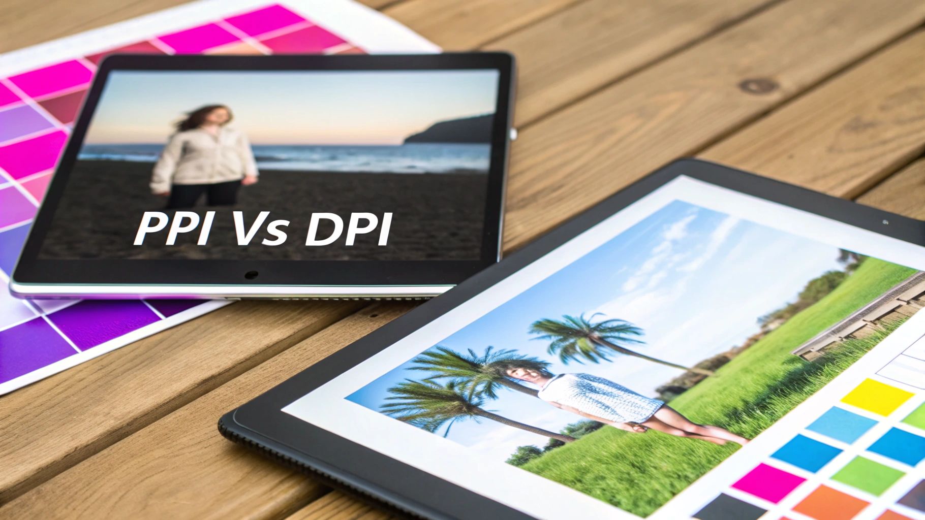
Of all the jargon thrown around about image quality, the confusion between PPI and DPI is easily the most common. People use them interchangeably, but they operate in completely different worlds: one is purely digital, the other is physical.
Getting this right is the key to making your images look sharp and professional, whether they’re on a screen or on a piece of paper.
Think of it like this: PPI (Pixels Per Inch) is the digital blueprint. It’s all about the density of pixels packed into the image file itself. More pixels squeezed into an inch means more detail and a crisper, clearer picture on your monitor.
On the flip side, DPI (Dots Per Inch) is the physical execution of that blueprint. It refers to the literal number of tiny ink dots a printer lays down on paper. Printers mix dots of cyan, magenta, yellow, and black ink to recreate the image you see on screen.
Why The Confusion Matters for Screens
Here’s the single most important thing to remember if you’re working with images for websites, social media, or any digital use: web browsers completely ignore the PPI value saved in your image file. A browser only cares about the absolute pixel dimensions—the total width and height in pixels.
This means an image that is 800 x 600 pixels saved at 72 PPI will look exactly the same on a screen as another 800 x 600 pixel image saved at 300 PPI. The old myth that web images must be 72 PPI is just a holdover from ancient monitor technology. When you're working digitally, just focus on getting the pixel dimensions right.
A simple rule of thumb: If your image will only ever be seen on a screen, PPI is the relevant concept, but only the total pixel dimensions matter. If it’s destined for a printer, DPI becomes the critical factor for quality.
From Analog Film to Digital Pixels
Interestingly, this whole idea of measuring detail density has been around forever. Long before digital sensors, the resolution of photographic film was a huge deal. Historical analysis shows that the native resolution of film—measured in terms equivalent to PPI—roughly doubled every 58 years. It was a much slower "Moore's Law" for analog photography.
For instance, large format negatives from the early 1900s could capture detail equivalent to 800 to 1200 PPI, a level of clarity that early digital cameras couldn't even touch. You can dive deeper into these historic image resolution findings to see just how far back this stuff goes.
When you shift from screen to paper, the printer's DPI capability takes over. A higher DPI means more ink dots per inch, which gives you a smoother, more detailed print that doesn't look "dotty" or pixelated. This is why the industry standard for high-quality printing is 300 DPI—at that density, the ink dots are so small and close together that the human eye can't distinguish them.
How to Resize Images Without Losing Quality
Alright, let's move from theory to the real world and tackle one of the most common tasks you'll ever do with an image: changing its size. The secret here is knowing the huge difference between "resizing" and "resampling." Getting this wrong can permanently wreck your image quality.
Think of your image as a piece of fabric. Resizing is just changing the size of the frame you put around it. You aren't adding or removing any threads (pixels); you're just changing the physical space those threads are displayed in. A 1000-pixel image squeezed into a 2-inch frame has a high PPI, while that same image stretched across a 10-inch canvas has a low PPI. The number of pixels never changes.
Resampling, on the other hand, is like getting out a needle and thread to actively add new threads or taking scissors to cut some out. It's a "destructive" process because it permanently alters the number of pixels in your file.
When to Resample Your Images
When you make an image smaller (downsampling), the software has to throw away pixels. This is usually pretty safe. Most programs are smart enough to discard pixel data in a way that keeps the image looking clear and sharp.
The real trouble starts when you try to make an image bigger (upsampling).
When you upscale, you're asking the software to invent new pixels out of thin air to fill the gaps. It looks at the neighboring pixels and takes a guess at what the new ones should be. This is why upscaling almost always leaves you with a blurry, soft, or pixelated mess. You simply can't create detail that wasn't there in the first place.
The classic mistake is trying to take a small, low-resolution graphic you found online and turn it into a high-quality print. Upscaling can't magically invent the pixel data you need, and the result is always a fuzzy, disappointing letdown.
To handle these jobs, editing software uses different mathematical methods called algorithms.
- Bilinear: A fast but less precise method. It’s okay for quick edits where absolute top quality isn't the goal.
- Bicubic: This is the industry workhorse. It's a more complex algorithm that gives you much smoother, sharper results, making it the standard for high-quality work.
- Bicubic Smoother/Sharper: These are just specialized versions of Bicubic. "Smoother" is designed for enlarging images, while "Sharper" is tuned for reducing them.
Getting this distinction right is everything when it comes to keeping your images looking professional. If you need to apply these kinds of changes to hundreds of files at once, a bulk image resizer can automate the entire workflow, letting you pick the right resampling method to guarantee both speed and quality.
By choosing the right tool for the job—resizing for print density or resampling for digital dimensions—you get total control over how your images look in the end.
Optimal Settings for Web, Social Media, and Print
Trying to figure out the right image settings for your website, social media, and print projects can feel like you're juggling three different rulebooks at once. What makes a photo look amazing on a website might look blurry in a printed brochure or get mangled by Instagram's compression.
Let's cut through the confusion. Each medium has its own specific needs when it comes to image size and resolution, and getting them right is the key to making your visuals pop everywhere they appear.
Think of it like this: resizing and resampling are two totally different tools in your kit. One is like changing the frame around a picture, while the other is like repainting the picture itself.
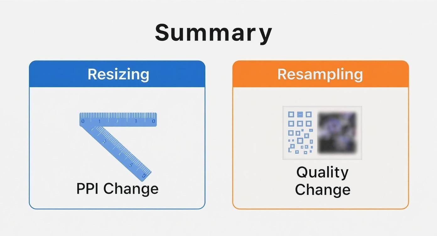
As you can see, resizing just changes the print density (PPI) without touching the actual pixels. Resampling, on the other hand, fundamentally changes the number of pixels, which directly impacts the image quality.
Optimizing Images for Websites
When it comes to your website, two things matter above all else: lightning-fast load times and sharp, clear visuals. Huge, heavy images are the number one cause of slow websites, and that's a killer for user experience. In fact, a user is 53% more likely to bounce if a mobile site takes longer than three seconds to load.
Here are the settings you need to keep your site speedy and looking professional:
- Featured Images & Blog Banners: Aim for 1200 x 630 pixels. This 1.91:1 ratio is what social platforms like Facebook and LinkedIn love to see when you share a link.
- Full-Width "Hero" Images: For those big, impressive banners at the top of a page, 1920 x 1080 pixels is the standard.
- In-Content Images: For images inside your blog posts or pages, a width between 1000 and 1200 pixels usually works perfectly.
- File Format: Stick with JPEG for photos and complex images. For graphics that need a transparent background (like logos) or have sharp lines, PNG is your best bet. If you can, use modern formats like WebP, which offer fantastic compression and quality.
- File Size: This is a big one. Try to keep every image under 200 KB.
Best Practices for Social Media Platforms
Social media platforms are notorious for squashing oversized images, often leaving them looking pixelated and sad. The trick is to upload your images at their preferred dimensions to sidestep their heavy-handed compression algorithms.
A good rule of thumb is to export your images at the highest quality the platform will reasonably allow. Exporting a JPEG at an 80-90% quality setting is often the sweet spot before you start getting massive files with no real visual improvement.
Here are the key dimensions for the big players:
- Instagram (Square): 1080 x 1080 pixels
- Instagram (Portrait): 1080 x 1350 pixels
- Facebook & LinkedIn: 1200 x 628 pixels
- X (formerly Twitter): 1200 x 675 pixels
If you're managing a bunch of different accounts, a bulk social media image generator can be a lifesaver, cranking out perfectly sized images for every platform automatically.
Preparing Images for Print
Print is a whole different ballgame. Forget everything you know about web optimization—here, pixel density is king. While PPI is mostly irrelevant for screens, it's the single most important factor for printed materials.
- Resolution: The gold standard for print is 300 DPI (Dots Per Inch). This high density ensures the tiny ink dots are packed closely enough to create a smooth, sharp image without any visible pixelation.
- File Format: TIFF is the go-to for professional printers because it's "lossless," meaning it keeps every single bit of image data intact. High-quality JPEGs can also work well for many projects.
- Dimensions: This will depend entirely on what you're printing, whether it's a business card or a giant poster. If you're new to print, checking a comprehensive guide to poster printing sizes can save you a lot of headaches. Always calculate the required pixel dimensions for your target print size at 300 DPI.
Here’s a quick reference table to pull all these recommendations together.
Recommended Image Settings by Platform
| Platform / Use Case | Recommended Dimensions (Pixels) | Resolution | Recommended Format(s) |
|---|---|---|---|
| Website (Blog Banner) | 1200 x 630 px | 72 PPI | JPEG, WebP |
| Website (Full-Width) | 1920 x 1080 px | 72 PPI | JPEG, WebP |
| Instagram (Square) | 1080 x 1080 px | 72 PPI | JPEG, PNG |
| Instagram (Portrait) | 1080 x 1350 px | 72 PPI | JPEG, PNG |
| Facebook / LinkedIn | 1200 x 628 px | 72 PPI | JPEG, PNG |
| Standard Print (A4) | 2480 x 3508 px | 300 DPI | TIFF, JPEG (High Quality) |
| Professional Print | Varies by size | 300 DPI | TIFF |
Bookmark this table or keep it handy. Knowing these core settings will ensure your images look sharp, load fast, and print beautifully every single time.
Common Questions About Resolution, Answered
Even when you've got the basics down, the relationship between resolution and image size can still get a little tricky in practice. Let's walk through some of the most common questions and sticky situations you'll run into, with clear answers to help it all click.
Can I Make a Low-Resolution Image High-Resolution?
Ah, the holy grail of image editing. The short answer? No, not in the way most of us hope. While software can definitely increase an image's pixel dimensions—a process called upscaling or resampling—it can't magically invent detail that was never there.
Think of it this way: the software is essentially guessing what the new pixels should look like based on the ones around them. It's an educated guess, but it's still a guess. This usually leaves you with a blurry, soft, or fuzzy-looking image. Modern AI tools are getting scarily good at this, but at the end of the day, they're still making sophisticated predictions, not recovering lost information.
For any work that needs to look sharp, especially for print, you absolutely must start with an image that has a high native resolution. Trying to blow up a tiny 500-pixel web graphic into a wall poster is a recipe for a pixelated mess.
Why Does My Image Look Blurry on My Website?
It's a frustrating moment: you upload a beautiful, crisp photo, but on the live site, it looks soft and blurry. What gives? The problem usually isn't the original image, but how your website is handling it.
Here are the most common culprits:
- CSS Scaling: This is a big one. Your website's code might be stretching a small image to fit a much larger container. If you upload a 400-pixel wide image but your blog layout forces it into an 800-pixel space, the browser has no choice but to stretch it, causing that blur.
- Over-Compression: To keep websites fast, many content management systems (like WordPress) and optimization plugins automatically compress images. If these settings are too aggressive, they can seriously degrade the quality, leaving your photos looking muddy.
- High-Density "Retina" Displays: The screens on modern laptops and smartphones pack way more pixels into the same physical space. An image that looks perfectly fine on a standard screen can appear noticeably soft on a "Retina" display unless you serve up a version with twice the resolution (often called a 2x image).
To fix this, always upload images with pixel dimensions large enough for the biggest space they'll fill, and double-check your website's compression settings to find a good balance.
What Is the Difference Between File Size and Image Size?
This is a critical distinction that trips a lot of people up. They're related, but they measure two completely different things. Nailing this concept is key to balancing visual quality with site performance.
Image size is about dimensions—the width and height in pixels, like 1920x1080. It tells you how much visual information is in the image. More pixels mean more potential detail.
File size is about weight—how much storage space the image takes up, measured in kilobytes (KB) or megabytes (MB).
The final file size is influenced by a few things. Pixel dimensions are the biggest factor; more pixels mean a bigger starting point. But the file format (like JPEG vs. PNG) and the level of compression have a huge impact, too. You can have two images that are both 1920x1080, but a heavily compressed JPEG might be just 150 KB while a lossless PNG could be over 2 MB.
Does PPI Matter for Web Images?
Let's clear this one up for good: unequivocally, no.
The PPI (Pixels Per Inch) value tucked away in an image's metadata has absolutely zero effect on how it displays on a screen. Web browsers completely ignore it.
A browser only cares about one thing: the image's dimensions in pixels. A 500x500 pixel image saved at 72 PPI will look identical on a screen to the exact same 500x500 pixel image saved at 300 PPI. The whole "save for web at 72 PPI" rule is a ghost from the past, a relic from old CRT monitors whose physical pixel density was close to that number. Today, it’s irrelevant.
For anything digital, just focus on getting the pixel dimensions right for the container it's going into.
Ready to stop resizing images one by one and take control of your creative workflow? With Bulk Image Generation, you can generate hundreds of perfectly sized, high-quality images in seconds. Let our AI handle the prompts, styles, and resizing so you can focus on your big ideas. Start creating faster today at https://bulkimagegeneration.com.