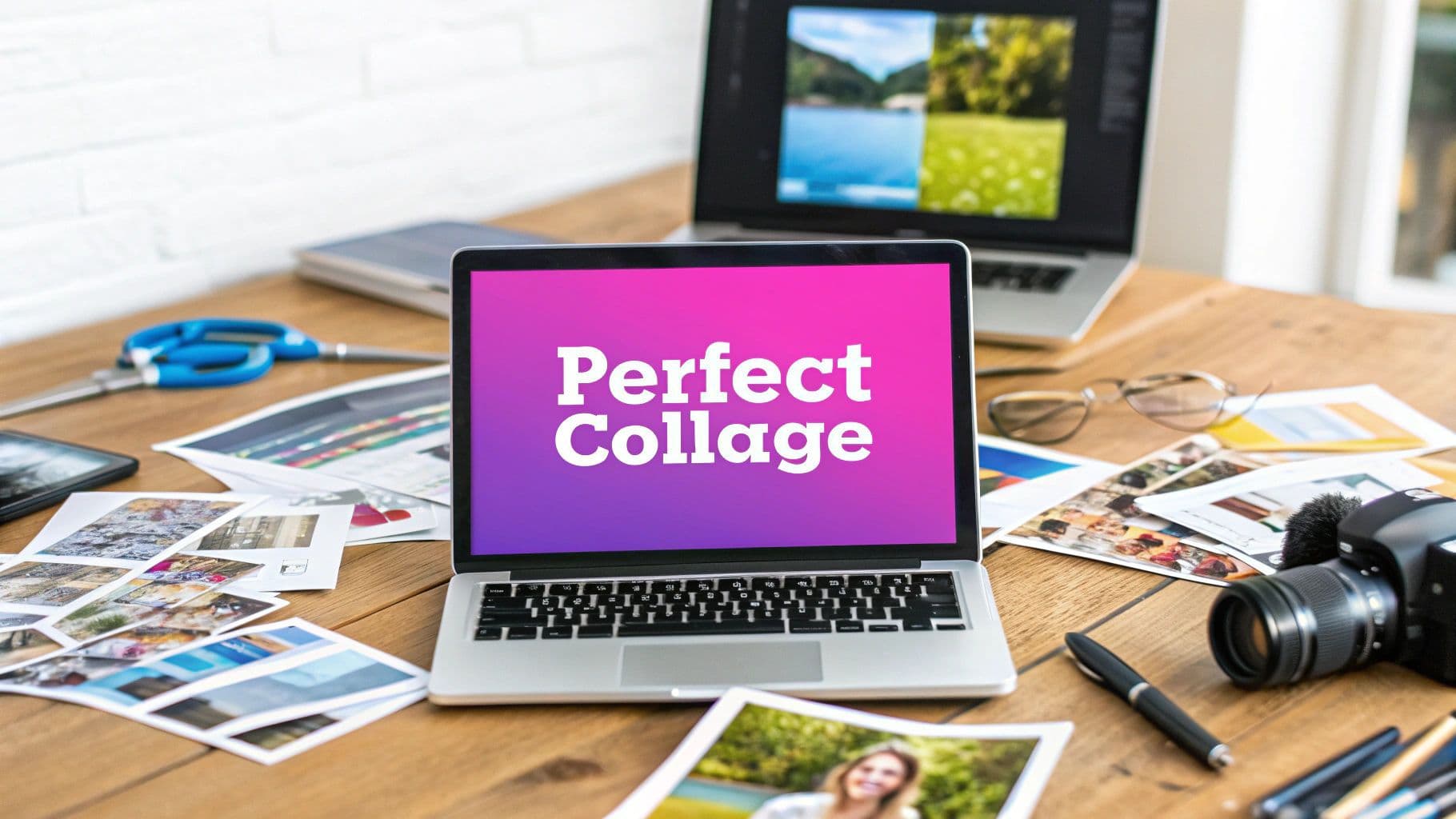
How to Make a Picture Collage for Facebook Cover That Looks Perfect

Aarav Mehta • January 10, 2026
Learn how to make a picture collage for Facebook cover that looks amazing on any device. Get pro tips on dimensions, tools, and design for a flawless look.
Making a great picture collage for your Facebook cover really comes down to three things: choosing photos that feel connected, getting the dimensions right for both desktop and mobile, and using a design tool that doesn't make you want to pull your hair out. It’s more than just slapping a few pictures together; you're telling a story that needs to look sharp no matter where people see it.
Your Facebook Cover Collage Is Your Digital First Impression
Think of your Facebook cover photo as your digital billboard. Whether it’s for your personal profile or a business page, it’s the very first thing people see, and it sets the tone instantly. A single photo can be limiting, but a well-designed collage can show off a brand's personality, highlight a new product line, or celebrate a personal milestone all at once.
This is your prime real estate to make an immediate connection. A messy or poorly formatted collage can feel unprofessional, but a thoughtful one draws people in and builds credibility. The goal here is to create something that’s not just pretty, but strategic.
Turning Clicks into Connections
The real magic of a great cover collage is how it tells a story at a glance. It can turn someone just scrolling by into an engaged follower by showing multiple sides of who you are or what your business offers. If you want to dive deeper into making your visuals really connect, check out these strategies for visual storytelling on social media to see just how powerful a good narrative can be.
A cover collage is more than a decoration; it's a strategic communication tool that works for you 24/7. It sets the tone for every interaction a visitor has with your page.
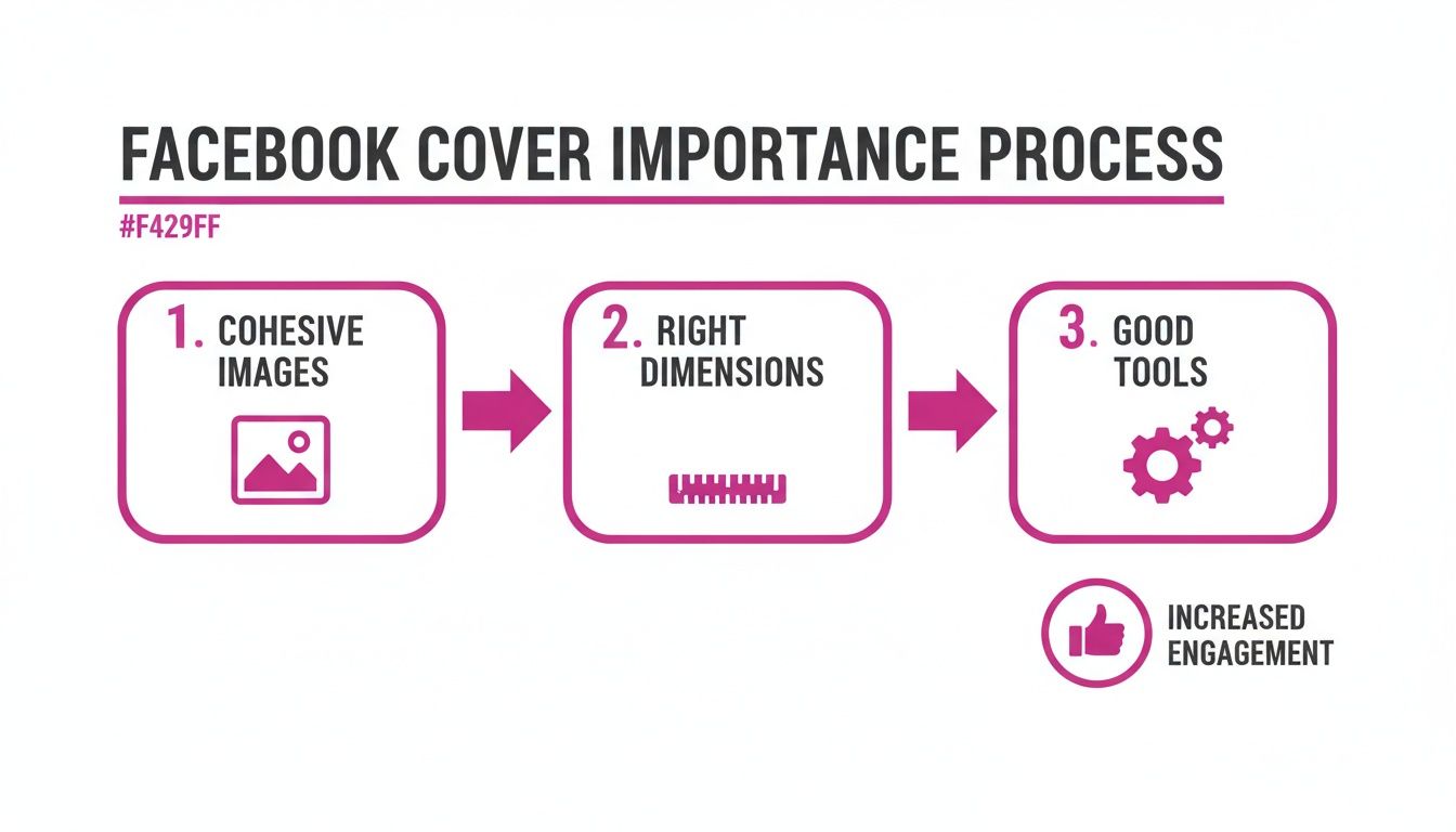
Before you jump into the design, it helps to nail down a few core principles first. I've learned these are non-negotiable for a great result:
- Cohesive Imagery: Stick to photos with a consistent theme, color palette, or style. It just looks more polished.
- Smart Dimensions: Always design with the mobile "safe zones" in mind. This prevents your most important elements from getting awkwardly cropped on phones.
- The Right Tools: Use software that makes the process simple without sacrificing quality.
By focusing on these areas from the start, you’ll sidestep common frustrations like blurry uploads and ensure your collage makes the professional, high-impact first impression it’s supposed to.
Mastering Facebook's Dimensions and Safe Zones
Getting the dimensions wrong is the most common pitfall when you make a picture collage for a Facebook cover. We’ve all seen it: a beautiful design on a desktop that gets awkwardly cropped on a phone, cutting off someone’s head or hiding the company logo.
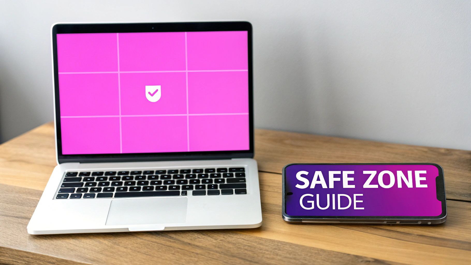
The secret to avoiding this mess is designing for the "safe zones."
Think of the safe zone as the core real estate of your cover photo. It's the central area that stays perfectly visible no matter what device someone is using, from a huge monitor to a tiny smartphone screen. Any critical content—like faces, your logo, or important text—absolutely must live within this space. Adopting this mobile-first mindset from the start is what separates amateur designs from professional ones.
This visual guide breaks down the whole process, starting with the most important part: getting the dimensions right before you even think about the creative stuff.
As you can see, mastering the technical specs is the foundation. It ensures all your creative work actually gets seen.
Understanding the Numbers
Officially, the recommended Facebook cover photo size is 820 pixels wide by 360 pixels tall. This fits the standard 16:9 aspect ratio you see on most desktops.
But here’s the catch: the profile picture overlaps on mobile, and different screens chop off the sides. This means your true safe area for the important stuff is a much smaller central zone of roughly 640 x 312 pixels.
To make this easier, I've put together a quick cheat sheet for the most common Facebook cover types.
Facebook Cover Photo Dimensions Cheat Sheet
This table is your go-to reference for getting the specs right every time, ensuring your collage looks great wherever it's viewed.
| Cover Type | Recommended Dimensions (Pixels) | Aspect Ratio | Key Consideration |
|---|---|---|---|
| Personal Profile | 851 x 315 | ~2.7:1 | Very wide format; mobile safe zone is crucial. |
| Business Page | 820 x 360 | ~2.28:1 | The 640 x 312 px central safe zone is key for logos and text. |
| Group Cover | 1640 x 856 | ~1.91:1 | Taller than other types; offers more vertical space. |
| Event Cover | 1920 x 1005 | ~1.91:1 | Optimized for event pages; keep text centered. |
Keeping these numbers handy will save you a ton of headaches down the road.
Pro Tip: Before you hit publish, always preview the design on your own phone. Most design tools have a mobile preview, but nothing beats sending the draft to yourself to see exactly how it crops in the real world.
This simple check takes ten seconds and can save you from a complete redesign. If you’re ever struggling to visualize different ratios for your images, our free aspect ratio calculator can help you get it right. By keeping that safe zone in mind from the very beginning, you guarantee a flawless, professional look on any device.
Choosing the Right Photos for a Cohesive Collage
Here’s a hard truth: a great collage is made before you even open a design tool. It feels intentional, not like a digital scrapbook where you've just dumped a bunch of random pictures into a template. The single most important step is picking your photos with a clear theme in mind. This central idea is the creative glue that holds everything together.
Your theme can be anything that serves your goal. For a business, you might showcase a new product line with shots of its features, behind-the-scenes production, and happy customers. For a personal profile, maybe it’s a seasonal vibe—all your best autumn hikes or that one unforgettable summer vacation. This decision will guide every photo you select from here on out.
The whole point is to create a unified visual statement. If you just grab random photos, you’ll end up with clashing colors, jarringly different lighting, and mismatched styles that look chaotic. Instead, you want to curate a set of images that feel like they actually belong together.
The Foundation of a Great Collage
Getting that polished, professional look really comes down to a few core principles during your photo selection. Nailing these elements will make a massive difference in how your final Facebook cover turns out.
- Consistent Color Palette: Look for photos that share similar colors or tones. If your brand leans into blues and grays, then every image you choose should feature those colors prominently.
- Uniform Lighting and Style: Try to avoid mixing a bright, sunny outdoor shot with a dark, moody indoor photo unless that contrast is a deliberate artistic choice. For most collages, consistency is your best friend.
- High-Resolution Images: This one is non-negotiable. Always, always use the highest quality photos you have. A blurry or pixelated image will drag the whole design down and make it look unprofessional, no matter how great the layout is.
By selecting images with a unified style and theme, you can create a narrative that guides the viewer's eye across the cover, telling a mini-story at a glance.
What if you have a great set of photos but are missing that one perfect shot to tie it all together? This is where modern tools can save the day. You can use an AI stock image generator to create a custom visual that perfectly matches your color palette and style. It’s a great way to ensure every single piece of your collage contributes to a cohesive, compelling final product.
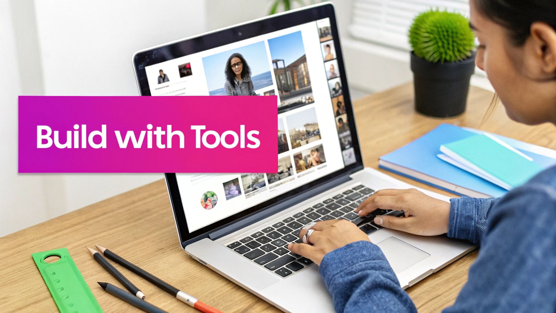
Bringing Your Collage to Life With Modern Design Tools
Alright, you've picked out your photos. Now for the fun part: putting it all together.
You absolutely do not need to be a professional designer to create a Facebook cover collage that looks polished and grabs attention. Thanks to modern design tools, the process is easier than ever, whether you like to get hands-on or prefer to let AI do some of the heavy lifting.
The manual approach is usually the best place to start. Super intuitive platforms like Canva and Adobe Express have pre-sized Facebook cover templates ready to go, which takes all the guesswork out of the dimensions. You just drag and drop your photos into a layout, shuffle them around, and tweak the spacing until it feels right.
The Hands-On Design Workflow
Taking the manual route gives you total creative freedom. You can either begin with a blank canvas sized to 820 x 360 pixels or save time by picking from hundreds of existing collage layouts.
- Start with a Grid: Using a pre-made collage template is a great shortcut. It keeps everything perfectly aligned and spaced, giving your design a clean, professional look right from the start.
- Add Your Message: Most of these tools have huge font libraries. You can easily overlay your business name, a tagline, or even a call-to-action directly onto your images.
- Infuse Your Brand: It’s simple to change background colors or drop in graphic elements like icons and shapes to make sure the final collage fits your brand’s vibe.
If you want to see what's out there, check out these effective graphic design software options that are perfect for getting started without a steep learning curve. This method is ideal for anyone who really enjoys the creative process and wants to control every last detail.
Leaning on AI for a Quicker Workflow
Pressed for time or want to try something a little more dynamic? This is where an AI-assisted workflow can be a real game-changer. Imagine you want to layer your photos with overlapping subjects instead of just slotting them into a rigid grid.
AI-powered features like background removal can instantly pull a person or object out of its original photo. This lets you build a dynamic, layered collage that looks professionally edited—in a fraction of the time it would take to do it manually.
For example, you could take five team headshots, use an AI tool to remove the background from each one in a single click, and then arrange the cutouts of your team members over a new branded background.
Some platforms even have "smart resize" tools that automatically adjust your finished collage to fit Facebook’s specs perfectly, making sure nothing important gets awkwardly cropped. This approach is the best of both worlds: your creative vision combined with the speed and precision of AI.
How to Export and Upload for a Flawless Finish
You’ve spent all this time arranging the perfect collage; don’t let a simple mistake at the finish line ruin all your hard work. This last part—exporting and uploading—is where so many great designs lose their sharpness to Facebook's aggressive image compression.
Getting this right is what separates a professional-looking cover from a blurry mess.
First up, you have to pick the right file type. For a collage that’s mostly photographs, a JPG (or JPEG) is almost always your best bet. Its compression is built for images with tons of colors and complexity. But, if you've included any sharp text, bold graphics, or your company logo, switch over to PNG. It’ll keep those edges clean and prevent any frustrating fuzziness.
The Final Quality Check
Before you even think about hitting that upload button, give your file one last look. It's so easy to miss little things after you've been staring at a design for a while.
Run through this quick checklist:
- File Size: Your goal is to keep the final file under 100KB. Anything larger is a red flag for Facebook's compression algorithm, which will crunch it down and often leave you with a pixelated image.
- Dimension Double-Check: Is it still 820 x 360 pixels for a business page? Make sure the dimensions haven’t changed. If you need to resize it without losing quality, a specialized tool is your friend. You can learn more about resizing images with our free bulk image resizer.
- Mobile Preview: Seriously, look at the design on your phone. Did your profile picture just cover up the most important part of a photo? Is your main message still visible inside that mobile-safe area?
A flawless finish comes down to respecting the platform’s technical limits. A smaller, optimized file often looks better than a large, high-resolution one after Facebook’s compression is done with it.
It's also worth remembering that not all Facebook covers are the same. While a standard business page uses that familiar 16:9 aspect ratio, event covers are a different beast. The new standard for Facebook event covers is 1920 x 1005 pixels, a big jump from the old minimums, designed to ensure they look great everywhere. For more details on this, you can check out the latest Facebook cover dimensions on outfy.com.
Got Questions About Your Facebook Cover Collage? We've Got Answers
Even with the best plan, you might hit a few snags. It happens to everyone. Let's walk through some of the most common issues that pop up when you're trying to get that perfect picture collage onto your Facebook cover.
Why Does My Collage Look Blurry After I Upload It?
This is a classic—and frustrating—problem. More often than not, it boils down to two culprits: you either started with low-quality photos, or Facebook's compression algorithm got a little too aggressive.
First things first, always start with the highest-resolution images you have. Then, when you're ready to export, stick to the 820x360 pixels dimension. If you have any sharp text or logos in your design, save it as a PNG file. PNGs are much better at handling crisp lines and solid colors than JPGs, which helps prevent that fuzzy, compressed look.
A blurry collage isn't a design flaw; it's a technical one. High-resolution source images and a properly exported PNG file are your best defense against Facebook’s heavy-handed compression.
As a final check, try to keep your file size under 100KB. This gives Facebook less of a reason to shrink it down and ruin the quality.
Can I Use a Video Collage for My Cover?
Absolutely! And honestly, you should consider it. A video cover can be incredibly eye-catching and is a fantastic way to grab someone's attention the moment they land on your page. This feature is available for Facebook Business Pages.
Just keep a few key specs in mind:
- Your video needs to be between 20 and 90 seconds long.
- The ideal dimension is 820 x 462 pixels.
You don't need to be a video wizard, either. Simple editing tools can help you stitch together short clips, add animated text, and create something far more dynamic than a static image ever could be.
How Often Should I Update My Cover Collage?
There’s no hard-and-fast rule here, but thinking strategically about updates keeps your page feeling current.
If you’re running a business page, a good rhythm is to refresh your cover collage quarterly or for major events. Think new product launches, seasonal promotions, or big company news. For a personal profile, it's more about sharing your life. Updating it with the seasons, for a birthday, or to show off photos from a recent trip is a great way to keep your page fresh for friends and family.
Ready to create stunning visuals without the hassle? With Bulk Image Generation, you can generate hundreds of unique, high-quality images in seconds and use our batch editor to perfect your creations. Start building your next project with AI today!