logo design for youtube: YouTube logo that grabs attention

Ryan Bennett • November 9, 2025
Master logo design for youtube with a step-by-step guide to creating a standout channel logo that strengthens your brand and attracts subscribers.
A great YouTube logo is your digital handshake. It’s the first thing a potential subscriber sees, instantly telling them if your content is professional, fun, educational, or something else entirely.
This tiny icon shows up everywhere—next to your comments, in subscription feeds, and right on your channel page. A strong logo builds recognition over time, turning casual viewers into a loyal community. Honestly, strategic logo design is one of the most underrated factors in subscriber growth. It makes you memorable in a sea of endless content.
Your Logo Is More Than Just a Picture
Let's be real: while your content is king, your YouTube logo is the visual ambassador for your entire brand. It’s the first impression that often determines whether someone even bothers to click on a video, let alone subscribe.
Before anyone watches a single second of your content, that little icon has already communicated your channel's identity.
A well-crafted logo is doing a lot of heavy lifting behind the scenes. It:
- Builds Instant Recognition: When users are scrolling, a distinct logo makes your content pop out immediately.
- Establishes Professionalism: A polished, high-quality logo sends a clear signal: you take your channel seriously. That builds trust.
- Communicates Your Niche: The right colors, fonts, and imagery can instantly tell viewers if you're a gaming, lifestyle, educational, or comedy channel.
Before you start designing, it's worth understanding the core components that make a logo effective. I've put together a quick table to break down what really matters.
Key Elements of an Effective YouTube Logo
This table breaks down the essential components of a successful logo, providing a quick reference for creators to evaluate their design ideas.
| Element | Why It Matters | Best Practice Example |
|---|---|---|
| Simplicity | Complex logos become unreadable when shrunk to a tiny circle on mobile. Simple designs are memorable and instantly recognizable. | A bold initial, a simple icon, or clean typography. |
| Scalability | Your logo must look great on a 4K monitor and as a tiny 80x80 pixel icon next to a comment. It has to work everywhere. | Vector-based designs that don't lose quality when resized. |
| Relevance | The design should give a clue about your channel's content. A wrench for a DIY channel, a controller for a gaming channel. | A minimalist mountain peak for an outdoor adventure channel. |
| Memorability | Unique and distinctive logos stick in people's minds. Avoid generic templates that blend in with everyone else. | A unique color combination or a custom-drawn mascot. |
Thinking through these elements will help you create a logo that not only looks good but also works hard for your channel's growth.
The Strategic Value of a Strong Logo
Think about the most successful channels you follow. Their logos are often dead simple, incredibly scalable, and totally unforgettable. That's not a coincidence. They get that a logo has to be legible not just on a big screen but also as a tiny, pixelated circle on a phone.
This adaptability is everything for brand consistency.
Even the big players follow this rule. Just look at YouTube itself. The platform's logo has evolved over the years, shifting toward digital minimalism to stay consistent across smartphones, smart TVs, and everything in between. You can even explore the history of YouTube's logo changes to see how a massive brand adapts. It’s a masterclass in strategic design.
Your logo isn't just a creative side project; it's a core business asset. It works for you 24/7, reinforcing your brand with every comment you leave and every video that appears in a sub feed. A strong logo is a direct investment in your channel's long-term growth.
Finding Your Channel's Visual Identity
Before you even think about firing up an AI to create a logo, we need to talk about your channel's identity. This is the bedrock of everything. It’s about translating the feeling of your channel into a visual language that clicks with your audience instantly.
Think of it this way: a good logo doesn't just look cool; it represents something. It’s the difference between a random graphic and a symbol for your entire brand.
So, start by asking yourself some real questions. What's the vibe? If you're a high-octane gaming channel, you're probably leaning into bold, aggressive colors and sharp fonts. But if you run a chill lifestyle vlog, you'll want clean lines and maybe some muted, earthy tones to match that calm energy. The goal here is to pin down the emotional tone first.
Choosing Your Core Colors
Your color palette is a powerful psychological shortcut. It's not just about picking colors you like; it’s about choosing colors that make your viewers feel something.
A tech review channel, for example, might stick to blues and grays to look trustworthy and professional. On the flip side, a kids' channel is going to splash around in bright yellows, pinks, and greens to scream fun and energy. A truly great YouTube logo nails this emotional connection.
Key Takeaway: Choose colors that reflect the feeling you want your viewers to associate with your content. Keeping that palette consistent across your logo, banner, and thumbnails is how you build a powerful, recognizable brand.
Selecting the Right Typography
Just like colors, the fonts you choose have their own personalities. Your typography can say a ton about your channel's style without you having to utter a single word.
- Serif Fonts: These are the classic fonts with the little "feet" on the letters. They often feel traditional, authoritative, and reliable. A perfect fit for channels focused on education or history.
- Sans-Serif Fonts: Clean, modern, and super easy to read. This makes them a go-to for just about anyone, but especially for tech, lifestyle, and minimalist brands.
- Script Fonts: These look like handwriting and can feel personal, elegant, or even a bit playful. They’re a fantastic choice for DIY, art, or other creative channels.
When you blend the right colors with the right fonts, you're building a solid visual foundation that will guide every other design choice you make. If you want to dive deeper into creating a consistent look, check out our guide on how to build a brand kit for consistent AI image generation. This is how you make sure every single visual—logo included—feels perfectly on-brand.
How To Use AI for Logo Ideas
Alright, this is where the fun starts. It’s easy to get excited and dive straight into an AI logo generator, but I've learned that getting a great logo design for youtube isn't just about clicking "generate." The real secret sauce is feeding the machine the right creative directions.
Think of yourself as an art director. The AI is your incredibly talented assistant, but it takes everything you say literally. A vague prompt like "make a logo for a gaming channel" is a recipe for generic, cookie-cutter results you've seen a thousand times. To get something that actually feels like your brand, you have to be specific.
Before you even think about writing a prompt, take a minute to map out the core of your channel's identity. I always break it down into a simple three-step process: defining the brand, picking the colors, and choosing the right typography. This gives you—and the AI—a clear roadmap.
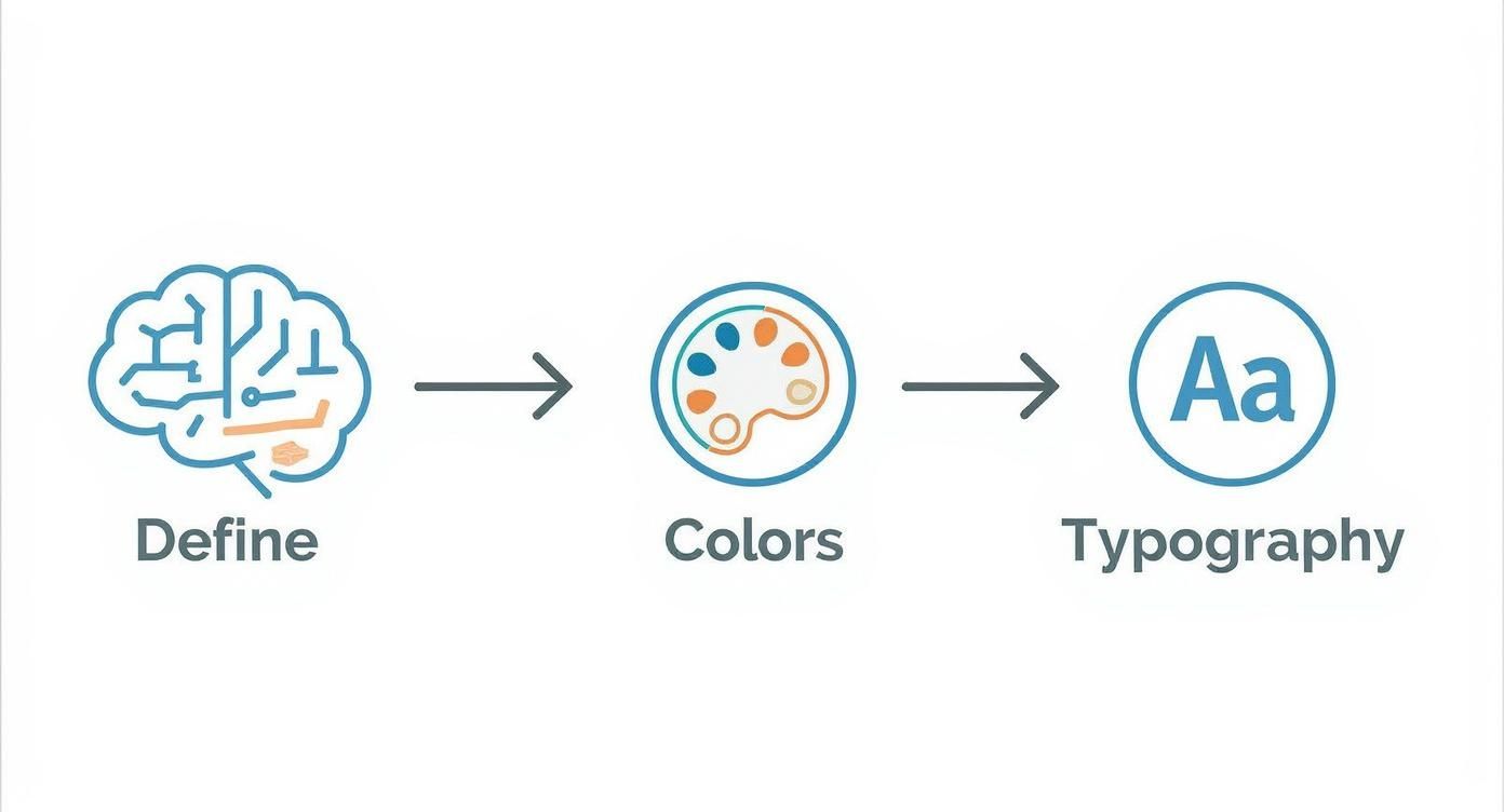
This little guide shows that a strong identity doesn’t just happen by accident. It's built from deliberate creative choices that all work together.
Crafting the Perfect AI Prompt
The quality of your final logo is a direct reflection of the quality of your prompt. I’ve found that a winning formula always includes four key ingredients: the style, the subject, the mood, and the color palette. Give the AI those, and it has everything it needs to create something special.
Here are a few prompt formulas I've used that you can tweak for your own channel:
- For a Cooking Channel: "Vector logo for a cooking channel, friendly chef mascot holding a whisk, warm and inviting color palette, flat design style."
- For a Tech Review Channel: "Minimalist logo for a tech channel, abstract circuit board icon, cool blue and silver colors, clean lines, futuristic feel."
- For a Fitness Channel: "Dynamic logo for a fitness channel, silhouette of a person lifting a kettlebell, energetic orange and black colors, bold typography."
See how detailed those are? They give the AI clear guardrails, leading to concepts that are much more on-point and unique. If you're looking for more ideas, checking out different AI tools for content creators can be a great source of inspiration for both ideation and design.
Pro Tip: Don't forget about "negative prompts." If the AI keeps throwing in stuff you don't want, like text or overly busy shapes, you can tell it what to avoid. Adding commands like
--no textor--no intricate detailsis a game-changer for cleaning up the results.
Iterating and Refining Your Concepts
Your first batch of images is never the final product. Think of it as the first draft. The real creative work begins when you start iterating on those initial ideas. Most AI tools let you generate variations of a design you like, which is perfect for exploring small tweaks without starting from scratch.
A solid workflow is to pick the strongest concept from your first run and use it as the seed for your next generation. This back-and-forth process is how you fine-tune the design, adjust the colors, and get the composition just right. Our guide on using a dedicated AI logo generator dives deeper into these practical steps.
Ultimately, the goal is to collaborate with the AI. Treat it less like a machine that spits out random images and more like a creative partner helping you bring your vision to life.
Choosing and Refining Your Best Logo
So, you’ve just generated hundreds of potential logos. It's exciting, but staring at that sea of options can also feel a bit paralyzing. How do you actually sift through them all to find the one? The trick is to switch gears from a creative mindset to a strategic one. A logo that just "looks cool" isn't enough; it has to work for you across every single part of the YouTube platform.
I have a simple, go-to technique for the first round of cuts: the squint test. No, seriously. Step back from your screen, or just zoom out, and squint until the designs get blurry. Can you still make out the basic shape and color? If a logo dissolves into a generic blob, imagine how it’ll disappear in a crowded subscription feed or next to a comment. The ones that remain distinct are your first round of contenders.
The Three Pillars of a Great YouTube Logo
Once you have a handful of favorites, it's time to get a bit more critical. I run every potential logo through these three essential checks. A logo that fails even one of these probably won't hold up in the long run.
-
Scalability: This is huge. Your logo is going to spend most of its life as a tiny circle next to your channel name. Does the design still work when it's shrunk down to the size of a thumbnail? Intricate details are the enemy here. Bold, simple shapes always win on scalability.
-
Relevance: Does the logo’s vibe actually match what your channel is about? If you run a calm, guided meditation channel, a gritty, grunge-style logo sends a confusing message. That disconnect can turn potential subscribers away before they even watch a video. The visuals have to align with your content.
-
Memorability: Your logo is your calling card in an ocean of content. Avoid anything that looks like a generic template you’ve seen a dozen times in your niche. You're looking for that one design with a unique silhouette or a color combo that sticks in someone's mind.
A truly great YouTube logo has to do one thing perfectly: communicate your channel's entire vibe in an instant, no matter how tiny it is. Clarity and recognition are everything.
Making Minor Tweaks for a Professional Finish
AI is an incredible starting point, but it's not always perfect. You'll often find a design you absolutely love, but it has a weird little artifact or a slightly jagged edge. Don't toss it out! A few minutes of manual cleanup can make all the difference.
You don’t need expensive software for this. Free tools like Canva or the web-based Photopea are more than enough to make some simple, high-impact edits.
- Clean Up AI Glitches: It's usually a quick fix to erase stray pixels or smooth out a wonky line.
- Add Your Channel Name: If the AI gave you a great icon, try adding your channel name underneath it in a clean, easy-to-read font. This can instantly make it look more complete and professional.
- Tweak the Colors: Is the contrast a bit low? You can bump up the saturation or adjust the colors slightly to make sure your logo pops against both YouTube's light and dark modes.
Think about YouTube's own logo. The addition of that simple red play button was a brilliant move, creating a symbol that's understood globally. It’s that focus on a single, clear icon that makes it so effective. If you're interested, you can find more insights into YouTube's iconic branding journey to see these principles in action.
Taking that little bit of extra time for these final polishes can elevate a good AI concept into a perfect, channel-ready logo.
Putting Your New Logo to Work
Alright, you've got a killer logo. Now what? A great design is useless until you put it everywhere your viewers can see it. Getting your new visual identity live across your entire channel is what separates the pros from the amateurs, building that instant trust with anyone who lands on your page.
First, let's nail the technical stuff. YouTube wants an 800x800 pixel file for your profile picture. Don't skimp on this. That high resolution keeps your logo looking sharp and clean, whether it's a tiny icon next to a comment or the main feature on your channel.
Your Logo Implementation Checklist
With your master file good to go, it's time to roll it out. The goal is consistency. You don't want your old branding popping up and confusing people. Run through this quick checklist to cover all your bases:
- Profile Picture: This is the big one. It's your face on the platform, so upload your new 800x800px logo here first.
- Video Watermark: Hop into YouTube Studio and add your logo to the corner of all your videos. A simple PNG with a transparent background is your best bet here.
- Channel Banner: Your main logo needs to be front and center on your banner, working alongside your channel name and tagline. Sizing a banner can be tricky, so using a solid YouTube aspect ratio calculator will save you a ton of headaches.
- Thumbnails: Create a basic thumbnail template that weaves in your logo or brand colors. This creates a cohesive, professional look when your videos appear in feeds and search results.
Having the same visual identity across all these spots does more than just look good. It signals professionalism and helps viewers recognize your content at a glance. It's a small detail that's absolutely vital for turning casual viewers into loyal subscribers.
Once the basics are covered, why not take it a step further? A slick intro can really make your videos pop. Learning how to animate your logo is a fantastic way to hook your audience from the very first second and leave a lasting impression.
Got Questions About Your YouTube Logo?
When you're designing a logo for your YouTube channel, a few common questions always pop up. Getting the answers right from the start saves you a ton of headaches later and keeps your channel looking sharp.
Let's clear up some of the most frequent concerns.
Can I Use an AI-Generated Logo on a Monetized Channel?
This is probably the biggest question people have, and the answer is a resounding yes. Most AI image generators give you full commercial rights to whatever you create. That means you're free to use your new logo for business, including on a monetized YouTube channel, without any legal fuss.
Of course, it's always a good idea to give the Terms of Service of your chosen AI tool a quick scan, but you're almost always in the clear.
What’s the Best File Format? And What About Updates?
For the technical side of things, PNG is your best friend. YouTube will accept other formats like JPG, but a PNG file is the only one that supports a transparent background. This is a game-changer when you want to use your logo as a video watermark—no more ugly white box floating in the corner of your content. Make sure to upload a high-resolution file, ideally 800x800 pixels, to keep it looking crisp everywhere.
So, how often should you change your logo? The short answer: almost never.
On YouTube, consistency is king. Your logo is how viewers spot your videos in a sea of thumbnails. Changing it too often is like hitting the reset button on all the brand recognition you've worked so hard to build.
Only consider a logo change if you're doing a complete channel rebrand or if your content has pivoted in a major way. A small touch-up every few years is fine, but remember that consistency is your most valuable branding asset.
Ready to create a professional, high-resolution logo in seconds? With Bulk Image Generation, you can generate hundreds of unique logo concepts and refine them with powerful editing tools. Start designing today at https://bulkimagegeneration.com.
