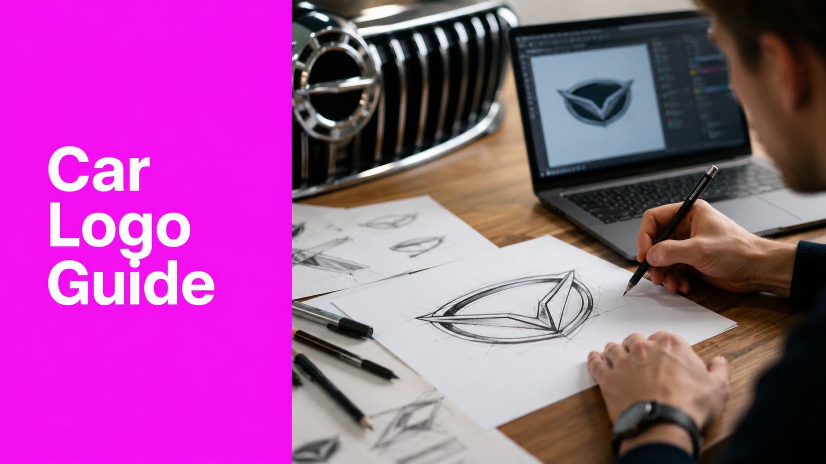
Logo Design Car Guide: From AI Concept to Road-Ready

Ryan Bennett • June 23, 2026
Learn the complete logo design car workflow. Our guide covers research, AI concepts, vector refinement, and vehicle-specific challenges for stunning results.
You've probably got a promising concept on screen right now. It looks strong in a presentation frame, maybe even dramatic in a polished mockup, but you're not yet sure whether it can survive the practicalities of a car badge, a steering wheel medallion, a dealership sign, a social avatar, and a legal review.
That tension is what makes logo design car work different from ordinary brand identity work. An automotive mark has to carry emotion and engineering at the same time. It needs presence in metal, discipline in vector form, and restraint in digital use. AI can speed up the front end of that process, but it can also flood you with flashy, unusable ideas if you don't impose professional standards early.
The designers who get good results aren't the ones generating the most images. They're the ones who know what to reject fast, what to refine manually, and what must never leave concept stage.
The Modern Automotive Logo Challenge
A car logo isn't just a symbol. It's a manufactured object, a brand memory device, and a trust signal that appears on one of the most expensive products someone will ever buy.

That's why generic logo advice often breaks down here. A cafe logo can get away with texture, illustration, or a quirky type treatment that only lives on packaging and social posts. A car mark has to read in motion, hold shape when embossed, and still feel credible years later when design fashion shifts.
Why the category carries so much weight
Automotive branding has had that burden for a long time. By the 1920s, over 90% of new passenger vehicles in the United States were sold under branded emblems rather than generic manufacturer names, and the Ford “blue oval,” registered in 1927, became an early example of a standardized logo used consistently across touchpoints such as grilles and advertising, as noted in this history of car branding.
That historical shift still shapes current expectations. Buyers don't read a car logo as decoration. They read it as shorthand for reliability, aspiration, status, and origin. Even when the mark is abstract, the audience expects it to feel engineered rather than merely styled.
A useful way to pressure-test your concept is to compare it against broader memorability principles, not just automotive references. The framework in 5 keys to a sticky brand is a good reminder that recognition comes from disciplined decisions, not decorative complexity.
Practical rule: If your concept needs a paragraph of explanation before it feels premium, it isn't ready for automotive use.
Physical, digital, and strategic pressure all hit at once
The hard part is that the same logo has to do conflicting jobs. On a grille, it needs depth and material authority. In an app icon, it needs immediate recognition. In a dealership environment, it has to scale without looking weak or noisy.
I've found that many teams still underestimate the cross-channel tension. They solve for the hero badge first, then try to flatten that idea for digital, and the result feels like two different brands. It's more effective to start with a mark that has a clean core shape, then build premium physical expressions around it.
That approach also lines up with the broader shift toward digital-first identity systems. If you're tracking where visual systems are heading, this overview of AI image generation trends in 2025 is useful for understanding why scalable, adaptable marks matter more now than ever.
What works and what fails
A strong automotive logo usually does three things well:
- Signals category fit: It feels appropriate for mobility, engineering, motion, or precision.
- Avoids imitation: It doesn't drift into familiar shields, wings, feline silhouettes, or luxury cues unless the brand has a legitimate claim to them.
- Survives simplification: It still works after the chrome, reflections, and presentation polish are stripped away.
Weak concepts usually fail for the opposite reasons. They chase drama, borrow too heavily from existing OEM language, or depend on effects that disappear the moment the logo becomes small, flat, or physical.
Research and Inspiration for Automotive Brands
Most bad automotive logos don't fail in Illustrator. They fail earlier, during research, when the designer mistakes mood for strategy.

Start with the competitive map
Before sketching, build a board of direct competitors, adjacent brands, and visual clichés in the segment. Include mass-market, performance, EV, luxury, motorsport, and regional players if the client could overlap with any of them.
This isn't just for inspiration. It's a rejection tool. In professional practice, agencies report that roughly 60 to 70% of first-round car-logo concepts are rejected because they fail distinctiveness tests against competitors or don't reduce legibly to small-screen sizes, and the recommended workflow starts with competitive mapping and abstract concept sketching, according to this guide on the professional logo design process.
A simple audit table helps:
| Focus area | What to check | Red flag |
|---|---|---|
| Shape family | Circles, shields, wings, lettermarks, animals | Your concept lands in the same silhouette cluster |
| Symbol logic | Motion, heritage, precision, power, sustainability | The symbol says one thing and the brand says another |
| Typography tone | Technical, elegant, rugged, futuristic | The type fights the emblem |
| Small-size behavior | App icon, avatar, dashboard UI | Fine detail collapses |
Translate brand values into form
Designers often stop at adjectives like “premium,” “electric,” or “urban.” That's too loose. Turn each value into visible form.
For example:
- Quiet confidence: smoother geometry, fewer interruptions, less aggressive angle language
- Raw performance: tension in the silhouette, compressed proportions, directional thrust
- Sustainable innovation: reduced visual weight, cleaner negative space, less ornamental symbolism
- Urban luxury: restraint, tighter spacing, less theatrical posture
Automotive work benefits from abstract thinking. A logo doesn't need to depict a car to belong to the category. In fact, literal car icons often make the brand feel generic and forgettable.
Good automotive research produces fewer ideas, but the remaining ideas are stronger.
Build a mood board that includes materials, not just graphics
A proper board for logo design car work should include more than logos. Add grille textures, steering wheel badges, light signatures, wheel spoke geometry, dashboard UI references, paint finishes, stitched interiors, and dealership environments.
That material context changes decisions. A shape that feels elegant on a white artboard may feel weak in chrome. A monogram that reads well in black may disappear when mounted on a dark grille. A clever internal cut may trap dirt or visually clog when embossed.
Use your board to test for three things:
-
Category alignment
Does the concept feel automotive without leaning on cliché? -
Brand attitude
Does it suggest luxury, utility, sport, or technology in the right proportion? -
Execution realism
Can you imagine it as a badge, an app icon, and a monochrome print mark without redesigning it from scratch?
When research is done well, the later AI stage becomes sharper. You're not asking a model for “cool car logo ideas.” You're directing it toward a controlled visual territory.
Generating Visual Concepts with AI
AI is useful in automotive identity work, but only if you treat it as a concept multiplier, not a logo author.

The biggest mistake I see is prompting for finished logos. That usually produces over-rendered symbols, fake typography, copied visual DNA, and forms that can't be engineered into a clean vector mark. The better use is to generate concept directions, then manually extract what's viable.
Prompt for territory, not final artwork
A productive prompt doesn't ask for “a premium automotive logo in chrome.” It defines the underlying logic. Think in terms of geometry, motion, stance, symmetry, and emotional tone.
A stronger prompt structure looks like this:
- Brand posture: restrained, aggressive, technical, elegant, progressive
- Formal cues: interlocking geometry, circular tension, directional cuts, balanced negative space
- Category cues: mobility, precision engineering, performance, electric simplicity
- Output constraint: flat symbol concept, no mockup, no text, no metallic rendering
Examples of useful prompt directions:
- Abstract emblem suggesting forward motion through intersecting geometric arcs, flat monochrome concept, no text
- Minimal symbol for an automotive brand, engineered symmetry, strong silhouette, negative-space driven, no chrome
- Performance-oriented badge concept using tension and angular compression, clean flat vector-style output, no literal car icon
That wording keeps the output in a usable zone.
Generate in batches and judge brutally
Batch generation is where AI earns its place. You can explore multiple symbol families quickly, then compare them side by side for distinctiveness. If you need a dedicated tool for early concept exploration, an AI logo generator can help speed up ideation.
The important part is the filter you apply afterward. I usually screen concepts against a short checklist:
- Can the core idea be redrawn cleanly?
- Does it resemble a known automotive mark too closely?
- Would it still work in one color?
- Does it depend on rendering tricks to feel premium?
- Is there a clear silhouette memory?
If the answer fails on any of those, the image stays in the discard pile.
AI gives you volume. Taste still has to do the sorting.
Treat legal risk as part of the ideation workflow
Many AI tutorials are irresponsible. They focus on speed and ignore infringement. Existing guidance on AI logo design often skips the legal side, even though the World Intellectual Property Organization tracks over 1.5 million active automotive trademarks globally. That scale makes casual visual borrowing especially risky in this category.
Automotive logos are a dangerous space for “inspired by” prompting because many marks already occupy recognizable territory: circles with internal divisions, winged motifs, big-cat postures, shield frameworks, stylized initials, and color identities with strong secondary meaning.
A few practical safeguards help:
- Avoid named-brand prompts: Don't ask for concepts “like” a specific car maker.
- Strip out signature cues: If the output echoes a known emblem shape, reject it immediately.
- Check recurring symbols: Horses, wings, shields, feline heads, and ovals need extra scrutiny.
- Don't trust AI typography: Redraw or replace every letterform manually.
Use AI where it's strongest
AI is best at widening the search field. It's not good at final decision-making, legal clearance, or production discipline.
Use it to explore:
- broad shape language
- symbolic metaphors
- stylistic territory
- variant compositions
Don't use it to finalize:
- typography
- production geometry
- trademark-sensitive features
- badge-ready files
For logo design car projects, that boundary matters. The value isn't that AI finishes the job. The value is that it shows you more possible starting points before you commit to craft.
Refining and Vectorizing Your Logo
At this stage, most AI-generated concepts either become real identity assets or get exposed as visual noise.
A production-ready automotive logo has to be rebuilt as a controlled vector mark. Not traced lazily. Rebuilt. That means deciding what the idea is, removing everything ornamental, and imposing geometric discipline on every curve, corner, and counterform.
Reduce the idea to its structural core
The fastest way to improve an AI concept is to stop treating the image as precious. Open Adobe Illustrator, place the concept as reference, and ask a harder question: what is the minimum amount of form needed to preserve the idea?
Top automotive brand studios commonly constrain final marks to 3 to 5 key vector paths and avoid more than two gradients to maintain manufacturing feasibility, with final files commonly delivered in pure vector, flattened CMYK, and monochrome line-art formats, according to this overview of the logo production process.
That benchmark is useful because it forces discipline. If your concept still needs layered effects, surface texture, internal highlights, and decorative fragments to feel complete, the concept isn't strong enough yet.
Apply the 16 px rule
The small-size test is essential. Professional automotive logo workflows often use a 16 px rule, meaning the mark must remain recognizable at that size before review. That standard changes how you draw.
Here's the practical sequence I use:
-
Redraw the main silhouette first
Ignore internal details. Get the outer read correct. -
Build symmetry intentionally
Don't assume reflected halves are visually balanced. Optical correction still matters. -
Standardize stroke logic
If one segment feels heavier, fix the structure, not just the appearance. -
Test in black only
Color can hide structural weakness. -
Reduce to favicon scale
If it becomes a blur, simplify again.
Studio habit: Zoom out early. A logo that only looks good at 800% is still unfinished.
Watch the negative space
In automotive marks, negative space often carries the feeling of precision. It can make a symbol look technical, fast, calm, or unstable depending on how it's handled.
Common failures include:
- trapped interior shapes that clog at small sizes
- lower cavities that make the logo feel visually heavy
- diagonal cuts that create accidental tilt
- counters that look elegant large but disappear when reduced
Many experienced designers tile multiple variants on one artboard to spot these distortions side by side. That's a useful move because tiny spacing changes can shift the entire stance of the mark.
Typography needs separate attention
If the logo includes a wordmark, don't let the AI output anywhere near final production. AI-generated text is rarely typographically trustworthy, and automotive use adds legal and scaling concerns.
Treat the lettering as a separate design problem:
- custom-modify the type
- convert approved final forms to outlines
- adjust spacing manually
- test the lockup independently from the emblem
The emblem and wordmark should feel related, but they don't need to share every formal gesture. In fact, forcing them into the same visual rhythm often weakens one of them.
A good vectorized automotive logo feels calm under scrutiny. No wobbly anchors. No accidental bumps. No mystery shapes that only exist because the AI invented them. Just a clear form that can survive real manufacturing.
Vehicle-Specific Design Considerations
A logo can pass every brand review and still fail on the vehicle itself.
That happens when the design process stays too screen-based. Cars introduce material, distance, lighting, curvature, dirt, reflection, and mounting constraints that don't show up in a neat presentation deck. Automotive identity work becomes better the moment you treat the emblem as an object, not just a graphic.
Scale changes the reading
A grille badge and a steering wheel badge don't behave the same way. The larger application can tolerate more openness and proportion nuance. The smaller one needs ruthless clarity.
I usually check the mark in at least these contexts:
| Application | What matters most | Typical failure |
|---|---|---|
| Grille emblem | Presence, depth, reflection control | Form gets busy when chrome catches light |
| Steering wheel badge | Clarity at close range | Fine interior detail muddies |
| Wheel center cap | Circular containment and balance | Mark feels cramped or off-center |
| App icon or key fob UI | Instant recognition | Brand loses identity after simplification |
A concept that only works in one of those settings isn't a complete automotive identity.
Material can improve or damage the logo
Chrome can make a simple mark feel premium, but it can also exaggerate weak geometry. Matte black can look elegant on screen, then disappear on darker paint colors. Illuminated treatments can feel modern, but they expose uneven spacing and poor silhouette decisions instantly.
When assessing production viability, I look for three material behaviors:
-
Edge integrity
Does the outer boundary remain strong when embossed or cast? -
Surface tolerance
Can the form survive reflective metal, molded plastic, and flat print without changing character? -
Contrast resilience
Does it stay readable across light, dark, glossy, and low-light situations?
This is also where overcomplicated concepts get punished. Tiny cuts, narrow channels, and fragile connectors may look sharp in a render, but they often lose authority when translated into real materials.
If the logo depends on a lighting setup to look premium, the vehicle will eventually expose that weakness.
Placement affects perception
A mark doesn't communicate in isolation. Vehicle placement changes how people read it. Front placement tends to carry brand recognition and confidence. Rear placement often works harder as a confirmation mark. Interior placement needs to feel tactile and refined because the viewer is closer and more attentive.
Designers should also think about body shape. A wide horizontal logo can feel planted on one vehicle and awkward on another. A vertically compressed badge may read well on digital surfaces but feel undersized on a tall grille.
Useful questions during review:
- Does the logo feel centered by geometry and by optics?
- Does the surrounding bodywork support or overpower it?
- Will panel lines, mesh, trim, or sensors interfere with the form?
- Does the mark still look intentional when viewed at an angle?
The best automotive logos are adaptable, not fragile
Strong marks accept translation. They can appear as a physical badge, a stitched seat emboss, a monochrome startup screen, or a dealer window decal without losing themselves.
Weak marks are fragile. They rely on finish, shadows, bevels, or a specific environment. That kind of logo causes endless downstream fixes because every team has to reinterpret it to make it work.
The cleanest automotive identities usually come from one disciplined decision: create a core symbol that's enduring enough to survive the car, then build the premium expression around it.
Finalizing for Production and Digital Use
Approval isn't the end of the work. It's the point where handoff quality starts to determine whether the identity stays coherent or slowly degrades.

Build a handoff package that prevents reinterpretation
Automotive brands now need more variants than many teams expect. Over 60% of car-brand logos use simplified, flat, and monochrome versions for digital platforms, yet only 28% of mid-tier agencies apply standardized localization checklists when adapting them for different markets and interfaces. That gap is where inconsistency creeps in.
A reliable final package should include:
-
Primary vectors
AI, EPS, and SVG versions of every approved lockup and symbol variant. -
Production rasters
PNG and JPEG exports for presentations, websites, and quick stakeholder use. -
Color specifications
CMYK, RGB, and Hex values, plus approved monochrome treatments. -
Minimum-size guidance
Define when the full lockup stops working and when the symbol-only version takes over. -
Clear-space rules
Keep the mark from being crowded by model names, partner badges, or UI containers. -
Physical application notes
Explain finish options, depth assumptions, and any forms that shouldn't be altered in fabrication.
For preparing multi-channel exports quickly, a tool like Bulk Image Resizer can help create consistent asset sets for social, UI, and presentation use without rebuilding every file manually.
Include localization and simplification standards
This part gets skipped too often. A global automotive logo system needs explicit guidance for regional and interface adaptation. That doesn't mean changing the identity every time. It means documenting what can flex and what can't.
A good usage manual should answer:
- when a monochrome version is required
- how the mark behaves in compact digital spaces
- whether region-specific color handling is allowed
- what cultural or symbolic readings need review before rollout
The strongest handoff isn't the prettiest PDF. It's the one that leaves the fewest judgment calls for the next team.
Mockups should prove function, not just impress stakeholders
Use mockups to test reality. Show the logo on a grille, wheel cap, steering wheel, social avatar, dealership sign, and dashboard-style interface. If the mark changes personality between those settings, you've found a system problem before launch.
That's the ultimate finish line in logo design car work. Not the first exciting concept. Not the polished render. The final test is whether the identity remains recognizable, manufacturable, and defensible everywhere it appears.
If you're building an automotive logo workflow that starts with broad AI ideation and ends with production-ready assets, Bulk Image Generation is worth a look. It's especially useful when you need to explore concept directions in volume, create multiple visual variants quickly, and prepare supporting assets for review before moving the best ideas into manual refinement and vector production.
