
Image color calibration: Achieve Consistent Brand Visuals and Accurate Monitors

Aarav Mehta • January 14, 2026
Master image color calibration to ensure brand consistency across devices. Learn calibration basics, color spaces, ICC profiles, and reliable monitoring tips.
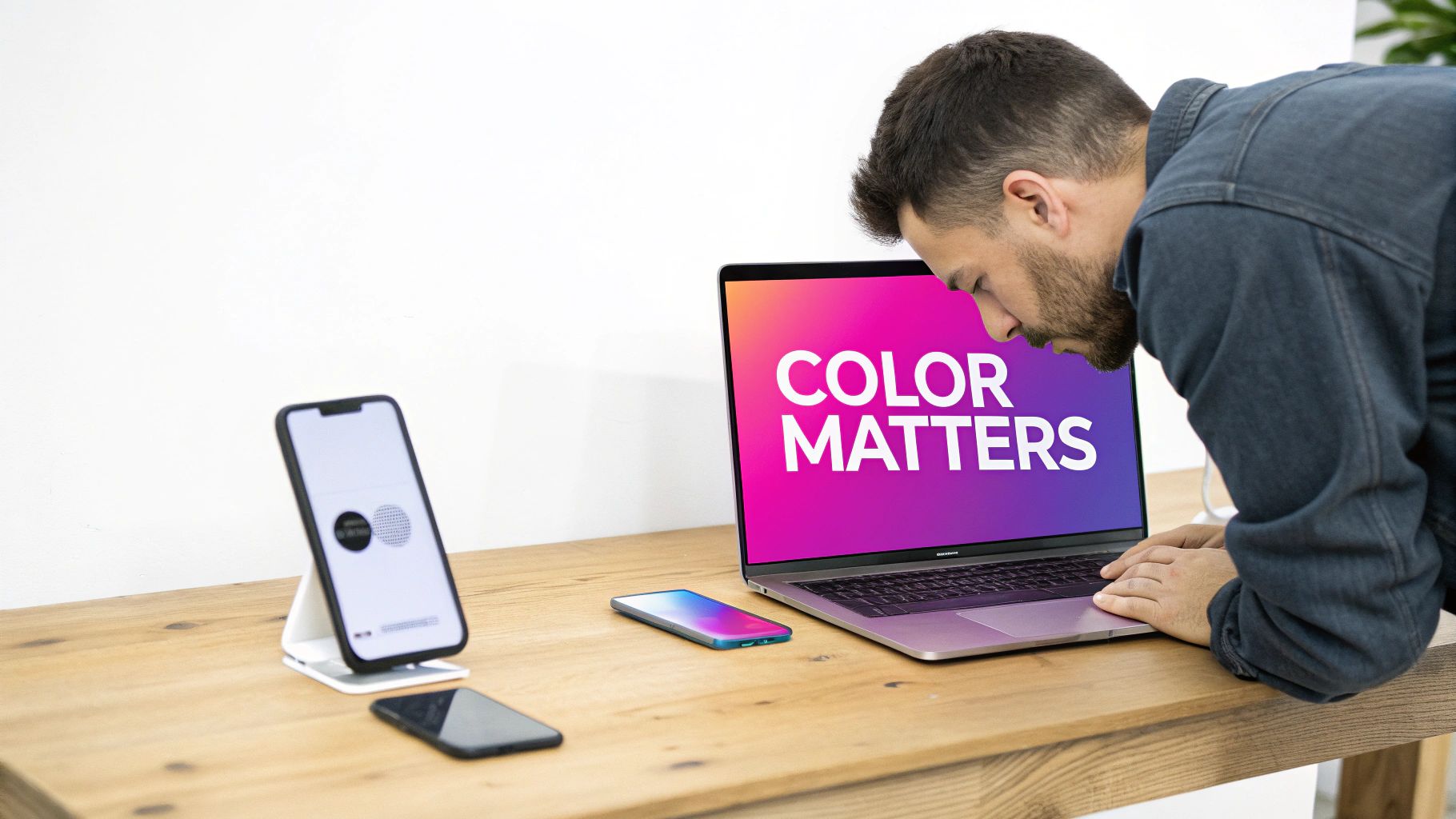
Image color calibration is all about making sure your monitor shows colors the way they’re supposed to look. It’s the essential step that guarantees the colors you see on your screen will actually match the final product, whether it’s a print run or a digital ad campaign.
Getting this right is how you prevent expensive printing mistakes and keep your brand visuals consistent everywhere. Think of it as bridging the gap between what you designed and what the world actually sees.
Why Color Accuracy Is Critical for Your Brand
In a world driven by visuals, color isn't just a pretty detail—it's a huge part of your brand's identity. Imagine the vibrant red in your logo showing up as a dull, sad orange on a customer’s laptop. Or that perfect shade of blue in your product photo looking completely different on their phone. It creates a subtle but damaging disconnect.
This is why professional color calibration isn't just some technical chore; it's a core business strategy. It’s the foundation that makes sure your visual assets look exactly the way you intended, no matter where they pop up.
The Tangible Costs of Inconsistent Color
Let’s talk real-world consequences. An e-commerce fashion brand lives and dies by accurate color. If someone orders a "forest green" dress that shows up looking more like "olive drab," you're looking at a product return, a bad review, and a lost customer. It’s no secret that color is often the main reason someone buys a product in the first place, so getting it right is everything.
These little problems quickly add up across all your marketing channels:
- Social Media: Your beautifully curated Instagram grid can look messy and unprofessional if the colors are all over the place because they were edited on different, uncalibrated monitors.
- Print Materials: A brochure or business card printed with the wrong color profile doesn't just look bad—it can make your entire brand feel amateur and lead to costly reprints.
- Digital Ads: The eye-catching visuals in your ad campaign lose all their punch if the colors look washed out or overly saturated on most people's screens.
Accurate color isn't about being a perfectionist; it's about protecting your investment. Every single piece of visual content you produce is a brand asset. Calibration ensures that asset holds its value and sends the right message.
Building Trust Through Visual Consistency
When it comes down to it, color consistency is about building and maintaining trust. When your visuals are reliable, customers learn to trust your brand. They feel more confident buying from you and engaging with your content because what they see is exactly what they get.
This reliability is absolutely crucial for any business scaling up its visual content.
For example, if you're generating a huge batch of images for a new product launch, you need every single one to be perfectly on-brand. A properly calibrated workflow and a defined color palette ensure that every image aligns with your brand's visual identity. You can learn more about setting this up in our guide on building a brand kit for AI image generation, which simplifies the whole process.
Proper image color calibration is the very first step in protecting your professional reputation, one pixel at a time.
The Essential Toolkit for Color Calibration
Getting professional, reliable color is about more than just eyeballing it. It takes a specific set of tools working in harmony. Think of it like a musician tuning their guitar—sure, you can get close by ear, but only a proper tuner guarantees you're perfectly in key. For us, that "tuner" is a mix of specialized hardware, smart software, and a controlled workspace.
Trying to calibrate without the right gear is a recipe for frustration. You end up with results that are no better than a wild guess. Investing in a simple toolkit is the single biggest step you can take toward mastering your color workflow. It’s the difference between hoping your colors are right and knowing they are.
Hardware: The Non-Negotiable Foundation
At the heart of any serious setup is a hardware measurement device. Our eyes are amazing at adapting to different lighting, which, ironically, makes them terrible judges of absolute color accuracy. A dedicated device cuts through all that subjectivity.
You’ll generally run into two types of hardware calibrators:
- Colorimeters: These are the go-to for most people and are pretty affordable. They use red, green, and blue filters to measure the light and color coming off your screen. If you're a photographer, designer, or digital marketer, a modern colorimeter is exactly what you need.
- Spectrophotometers: These are the heavy hitters—more advanced and way more expensive. Instead of just filters, they measure the entire spectrum of light, making them incredibly precise. They can calibrate monitors and reflective surfaces like paper, which is why you'll find them in high-end print shops and professional color labs.
For the vast majority of us, a quality colorimeter from a brand like Datacolor (Spyder series) or X-Rite (i1Display series) is the perfect place to start.
Software: The Brains of the Operation
If the hardware is the eye, the software is the brain. This program works with your colorimeter to walk you through the calibration process. It flashes a series of color patches on your monitor, and the hardware device measures each one.
The software then compares the color it measured to what the color should be. It spots all the little inaccuracies—maybe your screen is a bit too red, not quite blue enough, or just way too bright. Using that data, it builds a custom ICC (International Color Consortium) profile. This is just a small data file that tells your computer how to fix the monitor's output so colors display correctly.
An ICC profile is like a real-time translator for your monitor. It intercepts the color data your computer sends out and corrects it on the fly, making sure what you see on screen is a true representation of the actual file.
Your Environment: The Sneaky Variable
You could have the best gear in the world, but if your workspace is a color free-for-all, your calibration efforts will be compromised. The ambient light in your room has a huge impact on how you perceive the colors on your screen.
A bright, sun-drenched room with, say, blue walls will cast a cool tone on everything, tricking you into thinking your screen is warmer than it is. That's how you end up making bad color adjustments to your images without even realizing it.
To create a neutral viewing space, try these best practices:
- Control the Ambient Light: Work in a room where you can manage the lighting. Dim the overhead lights and pull the blinds. Direct sunlight is a killer because its color temperature shifts all day long.
- Go for Neutral Gray: If you can, make sure the wall behind your monitor is a neutral gray. Brightly colored walls will reflect onto your screen and mess with your color perception.
- Think About a Monitor Hood: A lot of pro-grade monitors come with a hood, or you can buy one separately. It’s a simple shade that blocks overhead and side light from hitting the screen, cutting down on glare and reflections.
Nailing these simple steps ensures that the light you're seeing is coming almost entirely from your monitor. That gives you the most accurate reference point possible for all your image color calibration work.
Calibrating Your Monitor for True-to-Life Color
Okay, you've got the right tools and a controlled environment. Now for the main event: actually calibrating your monitor. This is where we stop talking theory and start making a real, tangible difference, turning your screen from a source of color guesswork into a reliable reference for all your work. The process is a lot more straightforward than it sounds, and modern software basically holds your hand through the whole thing.
The goal here isn't just about making colors "look good"—it's about making them objectively accurate. By following a few simple steps, you’ll create a custom ICC profile that corrects your monitor's specific quirks. This is what ensures the deep navy blue in your client's logo is the exact shade they approved, not a slightly brighter or duller version that only exists on your screen.
Preparing for a Successful Calibration
Before you even plug in your calibration device, a few prep steps will make sure you get the most accurate reading possible. Honestly, skipping these can lead to a flawed profile, which kind of defeats the whole purpose.
First up, let your monitor warm up for at least 30 minutes. Just like an athlete needs to stretch, a monitor's color and brightness need time to stabilize. If you try to calibrate a "cold" screen, you'll get an inaccurate profile that becomes useless as the display reaches its normal operating temperature.
Next, dig into your monitor's settings and reset everything to the factory defaults. Most displays come with built-in modes like "Cinema," "Gaming," or "Vivid." These presets are just artificial adjustments to color and contrast that will mess with the calibration. You want to start from a completely neutral baseline, so find that reset option in the on-screen menu.
Finally, double-check that your viewing environment is consistent with the conditions you set up earlier.
- Dim the ambient lights in the room.
- Close any blinds or curtains to kill direct sunlight.
- Make sure no strong, colored lights are reflecting off the screen.
These steps create a mini "lab" where the only thing the calibrator is measuring is the light coming directly from your display.
Walking Through the Calibration Process
With your monitor prepped, it's time to fire up the software that came with your colorimeter. Just follow its on-screen instructions. You’ll hang the device over the top of your monitor so the sensor rests flat against the screen, usually inside a little target area the software shows you.
The software then runs a series of measurements, flashing dozens of different color and grayscale patches on the screen. The colorimeter measures each patch and feeds the data back to the software. This is where the magic happens: the software compares the color it measured to the color it expected to see, flagging every tiny deviation.
This workflow really breaks down the core steps, from getting your environment right to using the device and software to build out your profile.
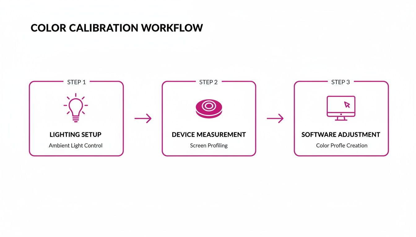
This simple, three-part process—environment, hardware, and software—is the universal foundation for getting accurate color on your screen.
Understanding the Key Calibration Targets
During setup, the software will ask you to define a few key targets. While the "auto" or "default" settings are usually pretty solid, knowing what these values mean gives you a lot more control over your color.
- White Point (or Color Temperature): This sets the "whiteness" of the whites on your screen. The industry standard for most photo and design work is D65 (or 6500K), which mimics natural daylight.
- Luminance: This is just a technical term for the brightness of your display, measured in candelas per square meter (cd/m²). A great target for photo editing in a dimly lit room is between 100-120 cd/m². Calibrating to this stops you from editing on a screen that's artificially bright, which often leads to prints or web images that look way too dark.
- Gamma: This controls the curve from pure black to pure white, which really affects the mid-tones in your image. A gamma of 2.2 is the standard for pretty much all modern displays and operating systems, including both Windows and macOS.
Think of these targets as a recipe. By setting the right White Point, Luminance, and Gamma, you're telling the software exactly what kind of neutral, accurate display you want. The software then does all the work to make your system match that recipe perfectly.
The demand for these tools is exploding because professionals simply can't afford to guess. The global market for display calibration, valued at USD 1.64 billion in 2025, is expected to climb to USD 2.41 billion by 2032. Driving this growth are advanced methods like 3D LUT (Look-Up Table) technology, which holds a dominant 48.6% market share and offers incredible precision in mapping colors for workflows like bulk image generation.
Once the measurements are done, the software will ask you to save your new ICC profile. Give it a name that makes sense, like "MyMonitor_Calibration_Date." Your operating system will automatically set it as the new default, and from that moment on, every color-managed application will use it to display colors correctly. The difference is often immediate and surprisingly dramatic. For anyone generating tons of visuals, like in AI product photography, getting this step right is non-negotiable for brand consistency.
Once your monitor is showing you true, accurate color, the next battleground is the digital file itself. This is where we get into color spaces and ICC profiles—the two things that make sure the colors you see on your screen survive the journey to a client's phone or a professional printing press.
Think of a color space as the language a file uses to describe color. It defines the specific range of colors—the gamut—that can be recorded or displayed. Getting this right isn't just a technicality; it's the key to making sure your work looks the same everywhere.
Making Sense of Common Color Spaces
In the world of digital imaging, you'll run into three main color spaces over and over again. Each one has a different-sized gamut, sort of like different-sized boxes of crayons, and they're each built for a specific job.
- sRGB: This is your standard box of crayons. It has the smallest range of colors, but it's the universal language of the internet. Every web browser, smartphone, and basic photo viewer on the planet assumes your image is sRGB. If your work is destined for a website, social media, or an email, sRGB is the only choice for your final file.
- Adobe RGB (1998): This is the bigger box with more crayons. It includes every color sRGB can show, plus a whole lot more vibrant cyans and greens. That extra range makes it a go-to for professional printing, since many commercial presses can actually reproduce those richer tones that sRGB just can't handle.
- ProPhoto RGB: This is the giant, Costco-sized box of crayons with colors you didn't even know existed. Its gamut is so massive it even includes colors the human eye can't see. For serious photo editing, this is the ideal working space because it gives you the maximum amount of color data to play with, preventing any loss of detail during heavy adjustments.
The rule of thumb I live by is simple: Edit wide, deliver narrow. Do your heavy lifting in a large space like ProPhoto RGB or Adobe RGB to keep all your color information intact. When it’s time to export for the web, always convert to sRGB to ensure it looks right for everyone.
To help you decide, here’s a quick breakdown of where each color space shines:
Choosing the Right Color Space for Your Project
| Color Space | Gamut Size | Best For | Key Consideration |
|---|---|---|---|
| sRGB | Smallest | Web, social media, email, general digital use | The universal standard. Final web exports must be converted to sRGB for consistent viewing. |
| Adobe RGB (1998) | Medium | Professional photo printing, high-quality print work | Captures richer greens and cyans than sRGB, which many printers can reproduce. Good working space. |
| ProPhoto RGB | Largest | High-end photo editing, archiving RAW files | Preserves the most color data during edits. Must be converted to a smaller space for delivery. |
Ultimately, choosing the right space depends entirely on your final output. Mismatching the space and the destination is one of the most common causes of color problems.
ICC Profiles: The Universal Translator for Color
So if color spaces are the languages, ICC profiles are the dictionaries. An ICC profile is just a small data file that describes exactly what a device's color space looks like. You just created one for your monitor, but your camera has one, and your printer has one, too.
When you embed an ICC profile into an image, you’re attaching a note that says, "The colors in this file follow the rules of Adobe RGB." This tells any color-aware program—like Adobe Photoshop, a web browser, or a printer driver—exactly how to interpret the numbers and show the colors correctly.
Forgetting to embed a profile is like sending a message in another language without a translation key. The receiving device just has to guess, and it almost always guesses wrong, leaving you with dull, flat, or weirdly shifted colors. If you’re sending files to a printer, understanding the role of profiles in preparing print-ready artwork is absolutely essential.
How This Works in the Real World
Let's put this into practice. You've just finished editing a gorgeous product shot for a client. You did all your work in Adobe RGB to preserve the rich detail from your camera. Now you need two versions: one for their website and one for a print catalog.
-
For the Web: In your editing software, you'll use an "Export" or "Save for Web" function. The critical step here is to "Convert to sRGB" and make sure the "Embed Color Profile" box is checked. This creates a brand new sRGB version of the file, guaranteeing it looks right on your customer's screen.
-
For Print: For the catalog, you'll save a separate copy. This time, you'll keep it in the Adobe RGB color space, and again, you’ll double-check that the profile is embedded. Your printer will use that profile to translate the file's colors to their specific press, ensuring those rich tones you perfected make it onto the page.
This isn't just busywork—it's professional discipline. The financial stakes are incredibly high, which is why the market for professional image quality analysis tools hit $500 million in 2025. In e-commerce alone, poor color calibration is blamed for 22% of content rejections, costing brands a fortune. The technology for this has come a long way since the 2015 ICC v4 profile update, with modern tools measuring color with microscopic precision to meet strict brand standards. You can read more about the growth of this market and its tools.
Keeping Your Colors Straight in High-Volume Workflows
A perfectly calibrated monitor is your foundation, but its real value shines when you need to scale up. Getting the color right on one image is a good start. Ensuring that same color accuracy across hundreds—or even thousands—of visuals is what separates the pros from the amateurs. This is where a color-managed bulk workflow isn't just a nice-to-have; it's an absolute necessity.
The goal is to stop tweaking images one by one. By setting up your editing software to automatically handle color profiles and creating batch-processing actions, you can apply consistent corrections across entire projects. This system makes sure every single image, from the first to the last, hits the exact same color standard with almost no manual effort.
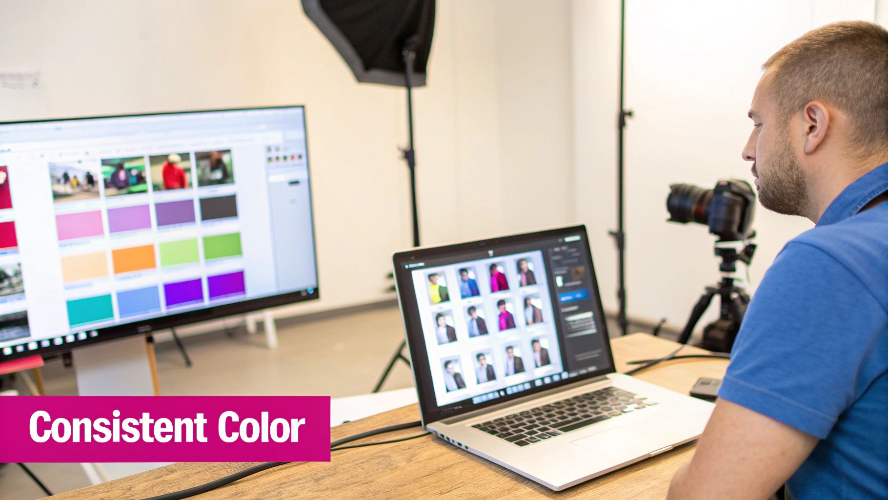
Building a Color-Managed Workflow From the Ground Up
Most professional editing software like Adobe Photoshop or Lightroom comes packed with robust color management settings. Before you even think about starting a big project, you have to get these settings configured to match your goals. In practical terms, this means telling the software exactly what to do when it opens an image with a missing or mismatched color profile.
You’re essentially creating a predictable, controlled environment. For instance, you can set your software to automatically convert any image you open into a standard working space, like Adobe RGB. This one simple step prevents the chaotic color shifts that pop up when you're juggling files from different cameras, designers, or stock photo sites.
Let Batch Processing Do the Heavy Lifting
Batch processing is the workhorse of any serious high-volume workflow. It lets you record a sequence of edits—everything from color correction and resizing to applying a watermark—and then run that exact same sequence on an entire folder of images. This doesn't just save a staggering amount of time; it guarantees uniformity.
Think about a small business owner with 100 new product photos. Here’s how a batch process saves their day:
- Perfect One "Master" Image: First, they meticulously edit a single photo, ensuring the product colors are spot-on and the lighting is perfect.
- Create an Action: They record all those edits as an "action" or "preset" in their software. This recipe includes color tweaks, sharpening, and, most importantly, the final conversion to the sRGB color space for the web.
- Run the Batch: Finally, they unleash this action on the other 99 photos. The software just churns through them, applying the identical changes to every file.
In a matter of minutes, they have a full set of web-ready product photos, all with consistent, accurate color. This systematic approach is even more critical in the age of AI content creation. If you're using a tool like a bulk social media image generator, a calibrated workflow ensures that every AI-generated visual aligns perfectly with your brand's color palette right out of the gate.
The real payoff of a bulk workflow is confidence. You stop spot-checking and just hoping for the best. Instead, you build a system that delivers reliable, professional results every single time, freeing you up to focus on the creative side of things.
Always Soft-Proof for the Final Destination
A solid workflow has to account for where your images will end up. The color profile you need for a website is totally different from what you'd need for print. Different printing methods, like understanding the nuances of sublimation printing for fabric, have their own unique color requirements.
This is where soft-proofing is your best friend. It lets you simulate how your images will look on different screens or in print, right on your calibrated monitor.
Before exporting that batch of 100 product photos, you could soft-proof them using a standard sRGB profile to see how they'll actually appear in a web browser. This preview might show you that some vibrant reds look a little dull, giving you a chance to make a quick adjustment before exporting the entire batch.
The demand for automated and accurate color handling is driving huge growth in the tech world. The AI image editor market is projected to explode from $6.285 billion in 2025 to a mind-boggling $48.74 billion by 2035. This boom is fueled by data showing that 87% of retailers see a direct revenue boost from AI-calibrated visuals, especially since uncalibrated images can lead to a 15-20% higher bounce rate on product pages. By implementing a strong bulk workflow, you put yourself in a position to harness this power efficiently.
Got Questions About Color Calibration? Let's Clear Things Up.
Even when you have a solid workflow, real-world questions pop up. It happens to everyone. Let's tackle some of the most common ones I hear, so you can handle these challenges without breaking your stride.
How Often Should I Actually Calibrate My Monitor?
This is a big one. For any professional work where color is critical, you need to calibrate your monitor once a month. Think of it as a non-negotiable part of your routine. Displays naturally drift over time as their components age, and a monthly calibration is the best way to keep that drift in check.
If you're more of a hobbyist or your work is less color-critical, you can probably stretch that to every two or three months. The most important thing is consistency. Pick a schedule and stick to it. Most calibration software has a reminder feature—use it! It’s a simple way to make sure your screen stays a reliable source of truth.
Can I Just Calibrate My Monitor Without Buying a Hardware Gadget?
Technically, yes, but you really, really shouldn't. Your operating system has built-in visual calibration tools, but they rely on your eyes to make adjustments. The problem? Human perception is subjective and notoriously unreliable for this kind of work. What looks right to you one day might look different the next, especially if you're tired.
A hardware device—like a colorimeter or spectrophotometer—takes all the guesswork out of it. It physically measures the light and color your screen is producing and builds a profile based on objective data. If color accuracy matters at all for your project, a hardware calibrator isn't just a nice-to-have; it's essential.
Trying to calibrate with software alone is like tuning a guitar by ear in a noisy room. You might get close, but it’ll never be perfectly in tune. A hardware device is your digital tuning fork, guaranteeing you hit the right note every single time.
What's the Real Difference Between Soft Proofing and Hard Proofing?
Both are vital quality-control steps, but they happen at different stages and serve different functions in a professional workflow.
-
Soft Proofing: This is your on-screen preview. Using the ICC profile of a target device (like a specific printer or another screen), your software simulates how the image will look in that context. It's a quick, free, and powerful way to spot potential color shifts before you export or send anything to print.
-
Hard Proofing: This is the final boss of color checking. It involves making an actual physical test print to see exactly how your colors will translate to paper. For high-stakes jobs like fine art prints, catalogs, or packaging, a hard proof is your ultimate confirmation that everything is perfect.
Think of it this way: soft proofing helps you catch 95% of the potential problems, saving a ton of time and materials. Hard proofing is that final, tangible check for when "close enough" isn't good enough.
Why Do My Images Look Washed Out on My Phone?
Ah, the classic question. If your images look great on your desktop but dull and desaturated on a phone or in a web browser, the culprit is almost always a color space mismatch.
This happens when you upload an image saved in a wide-gamut color space, like Adobe RGB or ProPhoto RGB, to a platform that only understands sRGB. The browser or device doesn't know how to interpret the richer color data, so it makes a bad guess, and the colors fall flat.
The fix is simple but crucial: Always convert your final web-bound images to the sRGB color space. Make sure you also embed the sRGB profile when you export. This one step ensures your images will look as consistent and predictable as possible across the vast, wild world of uncalibrated screens.
Ready to stop guessing and start creating consistently beautiful visuals at scale? With Bulk Image Generation, you can apply your perfectly calibrated color standards to hundreds of AI-generated images in seconds. Streamline your entire creative workflow, from initial concept to final export, and ensure every visual is perfectly on-brand. Try it today at https://bulkimagegeneration.com.