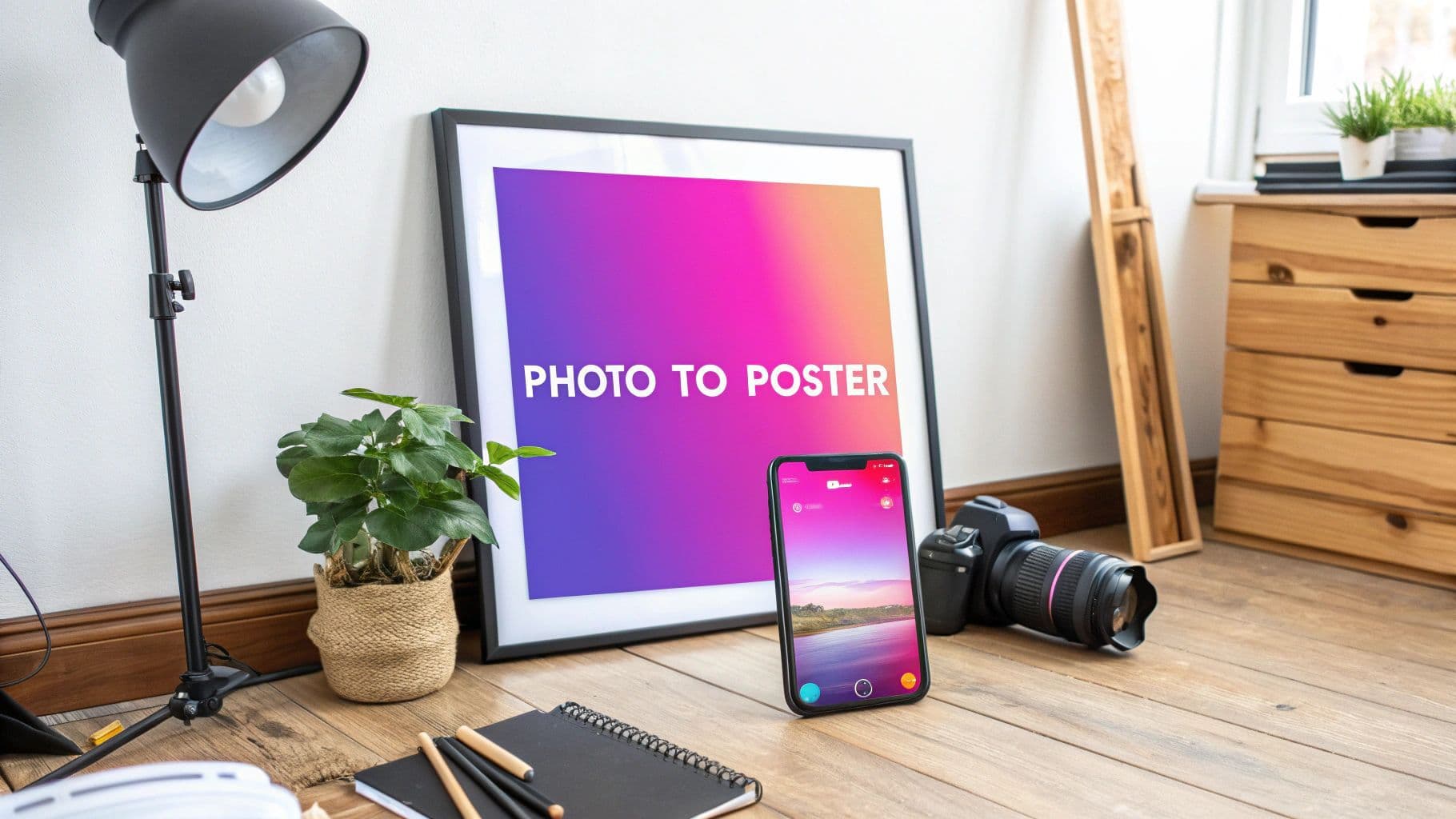
How to Turn Pictures Into Posters From Phone to Wall Art

Aarav Mehta • September 7, 2025
Learn how to turn pictures into posters with our complete guide. Discover tips on choosing photos, understanding resolution, editing, and professional printing.
The secret to turning a great picture into an incredible poster isn't complicated. It really comes down to three things: starting with a high-resolution photo, making a few basic tweaks to the color and layout, and then picking a solid printing service that offers the right kind of paper. If you nail these three steps, you'll turn those digital memories into something stunning you’ll actually want to hang on your wall.
Why Bother Turning Photos Into Wall Art?
Let's be honest, transforming a digital photo into a physical poster does more than just cover a blank space. It breathes life into your memories, giving them a real, tangible presence. A photo stuck on your phone is just one of thousands, but a poster becomes part of your home's personality. It starts conversations and brings back a good feeling every time you walk past it. You're not just decorating; you're personalizing your space with your own stories and relationships.
And this isn't just about getting sentimental. The whole process has gotten so much better than the old upload-and-print sites. Modern tools give you a ton of creative control, letting you create something that looks like it was professionally designed. You're not just printing a photo anymore—you're crafting a custom piece of art.
Before you jump in, it's a good idea to have a clear plan. A little prep work upfront saves a lot of headaches later. This quick checklist covers the essentials I always run through before starting a new poster project.
Poster Project Quick-Start Checklist
| Checklist Item | Key Consideration | Why It Matters |
|---|---|---|
| Source Image Quality | Is it high-resolution (at least 300 DPI)? | A low-res image will look blurry and pixelated when printed large. |
| Project Goal | Is this a gift, home decor, or for an event? | Your goal influences the style, size, and even the paper choice. |
| Editing Needs | Does it need color correction, cropping, or text? | Basic edits ensure the final print looks polished and professional. |
| Poster Size | What are the final print dimensions (e.g., 18x24")? | Size determines the required image resolution and printing costs. |
| Printing Service | Have you chosen a reputable printer? | A good printer ensures accurate colors and high-quality materials. |
| Paper Finish | Do you want matte, glossy, or semi-gloss? | The finish affects the final look, from vibrant and shiny to muted and artistic. |
Thinking through these points ensures you're set up for success from the get-go.
The Growing Appeal of Printed Photos
People are falling back in love with physical photos. The global photo printing market was worth around $19.23 billion in 2023 and is expected to almost double by 2031. This isn't just a random trend. It shows that we're all looking for ways to make our digital lives more real, especially now that printing tech has gotten so good. For a deeper dive, you can discover more insights about the future of photo printing.
A great poster does two things really well: it grabs your attention and it starts a conversation. It’s supposed to connect you to a memory, inspire an idea, or just make you happy when you see it.
When you learn how to turn your pictures into posters, you can:
- Create Unique Gifts: Nothing beats a custom poster made from a shared memory. It's personal, thoughtful, and always a hit.
- Decorate on a Budget: It’s a seriously affordable way to get large-scale art that’s perfectly matched to your style.
- Preserve Key Moments: Printing your most important photos is the best way to make sure they don't get lost in the digital abyss of your camera roll.
Selecting the Perfect Photo for Your Poster
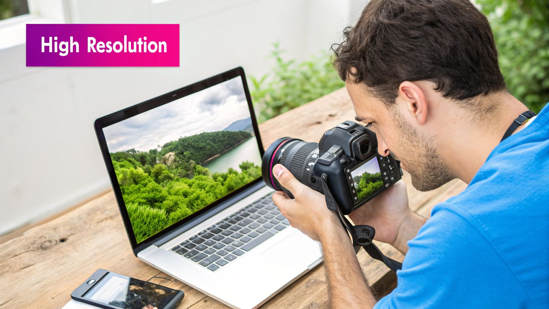
The journey to an amazing poster starts with one critical decision: your choice of photo. I can't stress this enough—not every picture is destined for large-format printing. The image you select is the foundation for everything that follows, so picking the right one is arguably the most important step.
A photo that looks fantastic on your phone screen might become a blurry, pixelated mess when blown up to 24x36 inches. This all comes down to resolution, which is just a fancy way of saying how much detail is packed into your image. More detail means a sharper, clearer print. It's as simple as that.
What Makes a Photo Poster-Worthy
Before you get too attached to a specific image, you need to do a quick technical checkup. Think of it as a pre-flight inspection for your poster project. I always look for strong fundamentals in three key areas.
- High Resolution: This is completely non-negotiable. An image from a modern DSLR or even a high-end smartphone in good lighting will generally have enough detail. Photos you've saved from social media? Almost always a no-go. They're too compressed and low-quality.
- Good Lighting: Look for photos with balanced light. Images that are too dark (underexposed) or blown out (overexposed) lose a ton of detail in the shadows and highlights. This becomes painfully obvious when you print them large.
- Clear Subject: The best posters have a strong focal point. Whether it's a portrait, a landscape, or an abstract shot, your main subject must be in sharp focus. Any slight blurriness will be magnified significantly in the final print.
A common mistake I see is choosing a photo based only on emotion. While sentimental value is important, a technically poor image will always lead to a disappointing poster. Start with a quality photo, and the emotional connection will shine through beautifully in the final print.
Checking Your Image's Technical Specs
You don't need fancy software to check if your picture is up to the task. Your computer's built-in tools are all you need to find its dimensions in pixels.
On a PC, just right-click the file, go to "Properties," and then the "Details" tab. If you're on a Mac, open the image in Preview and head to "Tools" > "Show Inspector."
You're looking for the pixel dimensions, which will look something like 4000 x 3000 pixels. For a high-quality poster, you'll generally want your image to be at least 2000 pixels on its shortest side. That's a good rule of thumb for prints up to around 18x24 inches. For anything larger, you'll need even more pixels to work with.
Making Preparatory Edits
Once you've got a high-quality candidate, a few simple adjustments can make a world of difference. The first thing to tackle is cropping. Most photos don't magically match standard poster sizes like 18x24 or 24x36.
Cropping your image to the correct aspect ratio is crucial; it ensures no important parts of your photo will be awkwardly cut off during printing. Use any basic photo editor to set the crop tool to the desired ratio (for example, a 2:3 ratio for a 24x36 poster). This simple action gives you full creative control over the final composition and is a foundational step for turning a picture into a poster that looks intentional and professional.
Getting Your Resolution Right for Flawless Printing
Before we get into the fun stuff, we need to have a serious chat about resolution. This might sound like a dry, technical detail, but it's the single most important thing that stands between a sharp, professional-looking poster and a blurry, pixelated mess.
Think of resolution as the DNA of your digital picture. It’s all about DPI, or Dots Per Inch. This is literally how many tiny dots of ink the printer will squeeze into every square inch of paper. The more dots, the sharper the image. Simple as that.
The Magic Number for Print Quality
For poster printing, the gold standard is somewhere between 150 and 300 DPI. If you can hit 300 DPI, you’re guaranteed a gallery-quality print. But honestly, 150 DPI is perfectly fine for most posters, especially larger ones that people will be looking at from a few feet away.
Dropping below 150 DPI is where you get into trouble. You risk pixelation—that blocky, jagged look that instantly cheapens your print.
Not sure if your image is big enough? Here’s some quick back-of-the-napkin math. Let's say you want to print a classic 18x24 inch poster. To hit that 150 DPI sweet spot, your image needs to be:
- Width: 18 inches x 150 DPI = 2700 pixels
- Height: 24 inches x 150 DPI = 3600 pixels
So, your image needs to be at least 2700x3600 pixels. Checking this before you start messing with styles and edits will save you a world of frustration later.
Dealing With Sizing and File Formats
So what happens if your photo is too small? The temptation is to just drag the corner and scale it up, but that’s a recipe for disaster. All you're doing is stretching the existing pixels, which is what causes that awful blurriness.
If you have a whole batch of photos that need resizing, your best bet is to use a tool built for the job. A good bulk image resizer to streamline the process can handle this without you having to open and save each file individually.
The file format you save your image as also makes a huge difference. Here's what you need to know:
- JPEG (or JPG): This is the format you’ll probably use most. It’s universal. Just make sure you save it at the highest possible quality setting to keep all that beautiful detail.
- TIFF: This is the professional’s choice. It’s a "lossless" format, which means it doesn't compress or discard any image data. The files are massive, but the quality is unbeatable.
- PNG: Great for web graphics, especially if you need a transparent background, but I’d steer clear of it for photo printing. It doesn’t handle photographic details as well as a high-quality JPEG or TIFF.
The most important takeaway? Always, always, always start with the highest-resolution photo you have. You can always shrink an image down, but you can’t magically add detail that was never there to begin with.
This infographic breaks down the key decisions you'll make when picking a template, from the size all the way to the layout.
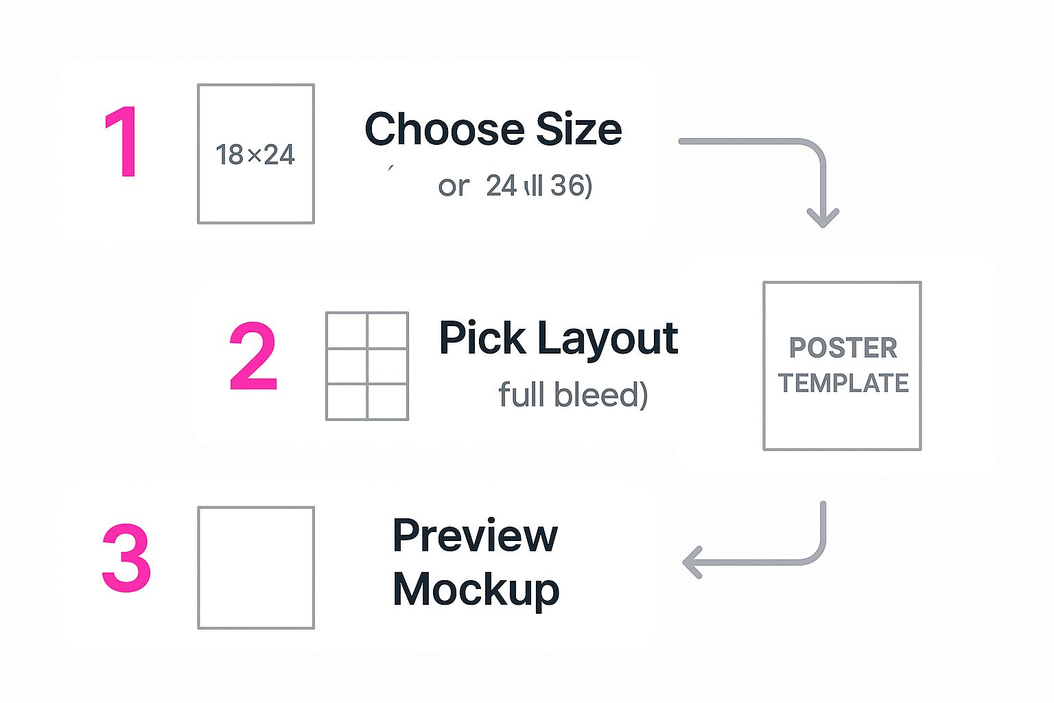
Thinking through these choices upfront is what ensures your final design actually works with your photo and brings your vision to life.
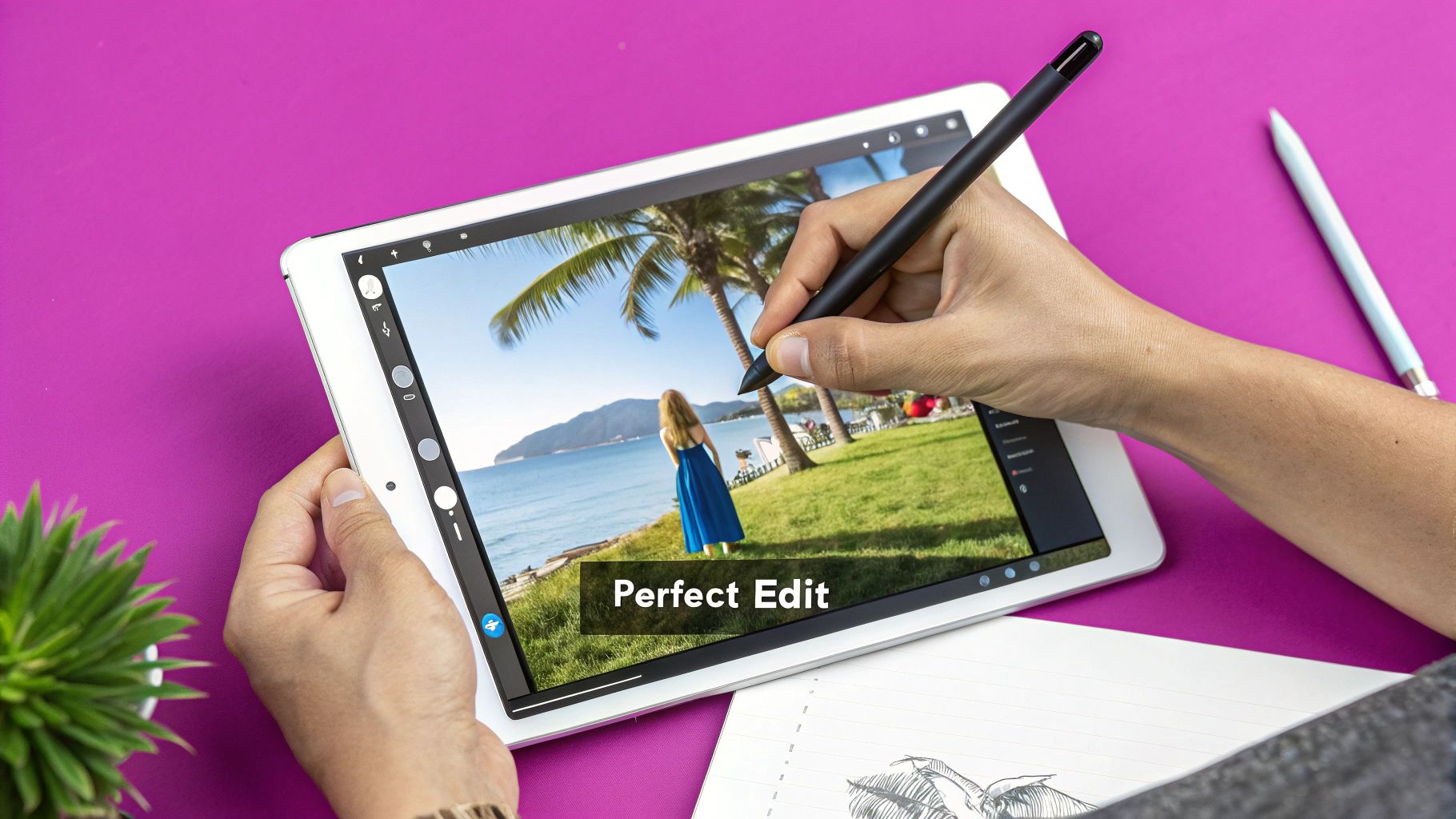
Editing Your Photo for Maximum Impact
Now that we’ve sorted out the technical stuff, it’s time for the fun part. This is where you take a perfectly good photo and turn it into a fantastic poster—a piece of art that really sings your style. The right edits are what elevate the mood, pull focus where it matters, and make the final print something you can’t take your eyes off.
Don't worry, you don't need a design degree or a wallet full of cash for expensive software. Free and surprisingly powerful tools like Canva, Adobe Express, or even the more advanced open-source option GIMP have all the firepower you need for what we're about to cover.
The trick is to edit with the end goal in mind. What vibe are you going for? A bright, airy family portrait calls for completely different tweaks than a moody, high-contrast landscape.
Mastering the Essential Adjustments
Before you jump into slick filters or text overlays, let's nail the fundamentals. These simple adjustments are the foundation of a polished, professional-looking poster. Honestly, most of the time, this is all a great photo really needs.
- Brightness and Contrast: Is your photo looking a bit gloomy or washed out? Gently nudge the brightness up to pull details out of the shadows. Follow that up with a little contrast to add depth and make the whole thing pop. Just be careful not to blast it—extreme changes can look harsh and unnatural.
- Color Saturation and Vibrance: If the colors feel a little flat, a small boost in saturation can make them more vivid. For a more refined touch, try playing with vibrance instead. It’s smarter, enhancing the muted colors while leaving skin tones alone so they don't end up looking orange.
- Sharpening: A final touch of sharpening can make the details appear crisper and more defined. This is a great little trick for posters, as it helps the image stay clear and impactful even when viewed from a few feet away. Again, a light hand is key; too much sharpening creates a gritty, over-processed look.
Exploring Creative Styles and Filters
Once the core elements of your photo are balanced, you can start getting artistic. This is how you take a picture and transform it into a poster that's truly you.
A dramatic black-and-white conversion, for instance, can be incredibly powerful for portraits or architectural shots. By stripping away color, you force the viewer to focus on light, shadow, form, and texture. Most editing tools have dedicated black-and-white presets you can start with, letting you fine-tune the conversion for maximum impact.
Another route is adding a vintage or film-like feel. You can get there by slightly desaturating the colors, adding a subtle grain effect, and applying a warm-toned filter. This works wonders for travel photos or candid moments, giving them a timeless, nostalgic quality.
Your poster is a visual abstract of your memory. The goal isn't just to print a photo; it's to connect someone to a moment or feeling. Your edits are the tools you use to amplify that connection.
Incorporating Text and Graphic Elements
Adding text is a fantastic way to turn a simple picture into a deeply personal piece of art. Think about adding a meaningful quote, a special date and location, or the names of the people in the photo.
When you do add text, keep a few key design principles in mind:
- Readability is Everything: Choose a font that’s clean and easy to read from a distance.
- Placement Matters: Position the text where it complements the photo, not competes with it. Look for areas of "negative space," like a clear sky or a plain wall—they're perfect spots.
- Contrast is Your Friend: Make sure your text color stands out against its background. White text on a dark area or black text on a light area is almost always a safe bet.
By layering these foundational edits with your own creative flair, you'll end up with a stunning, high-impact poster that you’ll be proud to hang on your wall.
Leaning on AI to Elevate Your Poster
Artificial intelligence has completely changed how creative projects get done, and making posters is no exception. These tools aren't just for tech wizards anymore; they're incredibly accessible and can give your final product a serious boost, often with just a few clicks. They're especially good at solving those annoying problems that used to require complicated software and a whole lot of patience.
Ever find that perfect photo, only to realize it's an old, low-resolution file? A few years ago, trying to enlarge it would have resulted in a blurry, pixelated mess. Now, AI-powered upscalers can analyze your image and intelligently add new pixels, sharpening the details and increasing its size without wrecking the quality. It's a total game-changer for breathing new life into photos from old digital cameras or phones.
More Than Just a Fix—It’s a Creative Partner
Beyond just upscaling, think of an AI editor as a smart assistant for your design process. It can cleanly remove distracting objects from a background, fix terrible lighting with surprising accuracy, or even suggest artistic styles that might work well with your photo. This lets you focus on your creative vision instead of getting stuck in the weeds of tedious manual edits.
This technology is also great for pushing your creative boundaries. Generative AI platforms let you build entirely new visual elements from the ground up.
- Custom Backgrounds: You can just describe a scene—say, "a serene, misty forest at dawn"—and the AI will generate a unique background to place your subject in.
- Artistic Blending: Want to get really creative? Merge your photo with a famous art style, like "Van Gogh's Starry Night" or a "Japanese Ukiyo-e woodblock print," to create a poster that is truly one-of-a-kind.
- Prompt-Based Ideas: If you hit a creative wall, you can describe your poster's theme and get instant visual ideas. A good free AI image prompt generator is a fantastic way to explore different creative avenues for your project.
Using AI isn’t about replacing your creativity; it's about augmenting it. These tools handle the technical heavy lifting, freeing you up to experiment and refine your artistic ideas more quickly than ever before.
Work Smarter, Not Harder
The power of AI is clear when you see how it's being integrated into the printing industry itself. The entire poster creation workflow is shifting, from simple text prompts generating high-quality designs to AI-driven automation that handles resizing and asset management. For some companies, this has cut production times by up to 80% without sacrificing print quality.
Ultimately, these tools help you get a professional-looking result far more efficiently. If you're looking to dive deeper into the tools that can really change your visual projects, it's worth checking out some of the innovative platforms revolutionizing image generation. By bringing AI into your process, you can fix technical flaws, explore new styles, and create a poster that really stands out.
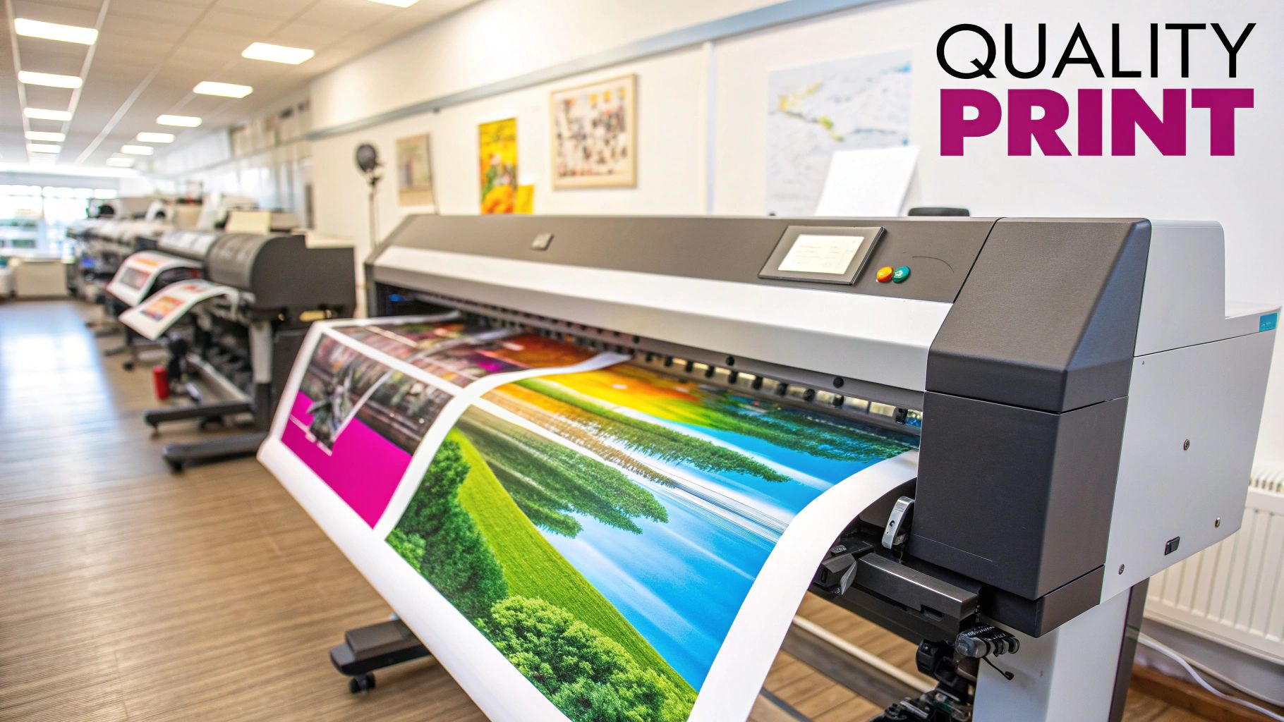
Choosing the Right Printing Service and Paper
You’ve done the hard work. Your file is edited, sharpened, and saved in glorious high-resolution. Now comes the best part: bringing that digital creation to life.
But this final step is just as critical as all the editing that came before it. Picking the right printing service and the perfect paper will make or break the final product. It’s what separates a decent print from a stunning piece of wall art.
Local Print Shop vs. Online Services
First, you need to decide where to print. Your two main options are a local print shop or one of the many online poster printing services.
A local shop has one massive advantage: you can talk to a real person. There's nothing like holding paper samples in your hand, seeing a physical proof, and getting a professional's opinion on your color balance. That hands-on guidance can be a lifesaver, especially for your first few prints.
On the flip side, online printers often offer a wider range of options and more competitive pricing. Services like Vistaprint or Printful are incredibly convenient, but you sacrifice that in-person expertise for a digital proofing process. It’s a trade-off between convenience and consultation.
Navigating Paper Finishes
The paper you choose does more than just hold the ink; it sets the entire mood of the poster. The finish interacts with light, and that can either elevate your image or create distracting glare.
There are three main finishes to know:
- Matte: This is a non-reflective, flat surface that gives off a sophisticated, almost artistic vibe. It’s my go-to for black and white photos or images with a subtle, moody color palette. Since it minimizes glare, it’s perfect for rooms that get a lot of natural light.
- Glossy: The complete opposite of matte. A glossy finish is shiny and reflective, making colors look incredibly rich and saturated. If you have a bold, colorful image that you really want to pop off the wall, this is your choice. The only downside is that it can create serious glare under direct light.
- Satin (or Luster): This is the sweet spot right in the middle. Satin has a gentle sheen but isn’t overly reflective. It offers a great balance, giving you nice, vibrant colors without the harsh glare of a full gloss finish. It’s a versatile and pretty safe bet for almost any photo.
Here’s my personal rule of thumb: I use matte for fine art, portraits, and vintage-style photos. I go with glossy for modern, high-impact commercial images. And when I'm not quite sure? Satin is almost always a fantastic choice that delivers professional-looking results.
The Final Pre-Flight Check
Before you hit that final "order" button, take a deep breath and triple-check the digital proof. This is your last chance to catch any weird cropping, text creeping too close to the edge, or any pixelation you might have missed.
Pay close attention to the "safe zone" or "bleed line" that most online printers show in their preview tool. Any critical part of your photo—like a face or an important detail—needs to be well inside this boundary. If it’s too close to the edge, it risks getting chopped off when the poster is trimmed.
Taking an extra minute on this step can save you from a costly and frustrating mistake. It’s a crucial part of turning a simple picture into a polished, professional-grade poster. For those managing multiple designs at once, streamlining this kind of creative workflow is key, and you might find our guide on using a bulk social media image generator useful for similar processes.
At Bulk Image Generation, our AI-powered tools help you create and edit stunning visuals with ease, preparing them perfectly for print. Discover how you can accelerate your creative process at https://bulkimagegeneration.com.