How to Create Brand Guidelines That Drive Consistency

Ryan Bennett • September 20, 2025
Learn how to create brand guidelines with actionable steps for defining your brand's core identity, visual system, and voice. Build a stronger brand today.
Creating brand guidelines is a pretty straightforward process once you get the hang of it. You’re essentially defining your brand's core mission, nailing down its visual identity, and setting its tone of voice. Then, you wrap all those rules up into a guide that everyone can access.
This isn't just busywork. This strategic rulebook ensures every single thing you put out—from a quick social media post to a major product launch—is consistent, recognizable, and authentic to who you are as a company.
Why Brand Guidelines Are Your Most Valuable Asset

Too many teams see brand guidelines as a creative straitjacket. I get it, but that’s the wrong way to look at it. In reality, they are a powerful asset that drives growth, eliminates confusion, and builds the kind of customer trust that lasts.
Think of them less as a rulebook and more as a compass. It keeps every department—marketing, sales, product, and customer support—all pointed in the same direction. Without that shared North Star, brand integrity starts to crumble. Fast.
The True Cost of Inconsistency
Picture this: a potential customer sees a witty, playful ad for your product on Instagram. They’re intrigued and click through to your website, but what they find is a wall of formal, corporate jargon and visuals that completely clash with the ad.
That jarring disconnect creates instant friction. A little voice in their head asks, "Is this the same company? What do they actually stand for?" This happens all the time when brand guidelines are either missing or ignored.
This isn't just a design problem; it's a real business problem. Inconsistency leads directly to:
- Customer Confusion: A fragmented brand experience makes it impossible for people to form a clear, memorable idea of who you are.
- Wasted Resources: Teams burn valuable time and money reinventing the wheel on every project, endlessly debating colors, fonts, and messaging.
- Diluted Brand Equity: Every off-brand piece of content chips away at the trust and recognition you've worked so hard to build.
Your brand guide is the single source of truth that empowers your team to create cohesive experiences. It transforms subjective opinions into objective standards, ensuring that whether a freelancer in another country or an in-house designer creates an asset, it feels undeniably like you.
You can dive deeper into creating on-brand visuals with our guide on using AI images for small business.
Empowering Teams Through Clarity
Here’s the thing: a well-defined guide doesn't limit creativity; it channels it effectively. When your team has clear parameters, they can innovate within that framework, confident their work aligns with the bigger picture.
Before we dive into how to build your own guide, let’s get a high-level view of the key components you'll need to include.
Core Components of Effective Brand Guidelines
Here is a quick overview of the essential elements every comprehensive brand guide should contain before we dive into the details of each.
| Component | What It Defines | Why It's Critical |
|---|---|---|
| Brand Heart | Mission, Vision, Values, Personality | The strategic foundation for all creative and messaging decisions. |
| Logo Usage | Primary/Secondary Logos, Spacing, Misuse | Protects the most recognizable asset of your brand identity. |
| Color Palette | Primary, Secondary, and Neutral Colors | Ensures visual consistency and evokes specific emotions. |
| Typography | Fonts for Headlines, Body Text, and UI | Creates a consistent reading experience and reinforces personality. |
| Imagery | Photography/Illustration Style, Iconography | Defines the visual mood and ensures all images feel cohesive. |
| Voice & Tone | Messaging Style, Vocabulary, Grammar | Shapes how your brand communicates and connects with its audience. |
A recent industry analysis really highlights the gap here. It found that while 95% of companies have brand guidelines, only about 25% actually enforce them consistently. That lack of follow-through is where massive opportunities are lost.
Defining Your Brand’s Core Foundation

Before you even think about picking a color palette or downloading a font, you have to look inward. Seriously. This is the soul-searching part of branding, where you define the core principles that will guide every single decision you make from here on out.
Skipping this step is like building a house without a blueprint. Sure, it might look okay for a little while, but it’s guaranteed to fall apart under the slightest pressure. This is where you get brutally honest about who you are as a brand.
You have to move from vague ideas to concrete actions. It’s easy to say you value "innovation," but what does that actually mean? Maybe it means your marketing team dedicates 10% of their time to experimental projects, or your support team is empowered to solve problems without a script. These are real-world behaviors that give your values teeth.
Articulating Your Brand's Purpose
First things first: you need to get crystal clear on your "why." What’s your reason for existing beyond just making money? The answer to that question is the bedrock of your entire brand.
A solid foundation starts with articulating your purpose, vision, and mission. This trio gives everyone—from your newest hire to your oldest customer—a clear sense of direction. For a deep dive into this, check out this excellent piece on defining your purpose, vision, and mission.
- Mission: What you do day in and day out. It’s the "how" and "what" behind your vision.
- Vision: The future you're trying to build. This is your North Star, your long-term aspiration.
- Values: The non-negotiable principles that dictate how you act, no matter what.
These aren't just fluffy words for a plaque in the lobby. They are active filters for making decisions. Does a potential partnership conflict with your core values? The answer is no. Does a new product idea get you closer to your vision? If not, it gets shelved.
A well-defined brand foundation turns subjective opinions into objective criteria. It’s the reason every piece of content, every product feature, and every customer interaction feels authentic and cohesive—it’s all rooted in who you are and where you're going.
From Principles to Personality
Once you’ve nailed down your core principles, you can start translating them into a personality. If your brand were a person, who would it be? The wise mentor? The witty best friend? The dependable expert?
Get specific with personality traits. Instead of just saying your brand is "friendly," you could define it as "approachable, warm, and encouraging, but never silly." This level of detail is gold when you start developing your brand voice later on.
To make this tangible, give this exercise a shot:
- List out three to five of your core values.
- Next to each one, write down a specific action that brings it to life.
- Describe your brand’s personality using three adjectives.
- For each adjective, list a word your brand would never use.
Going through these exercises provides the strategic clarity you need before touching the more visual parts of your brand guidelines. This foundation makes sure every choice you make from this point forward is intentional, consistent, and undeniably you.
Crafting Your Visual Identity System
Once you've nailed down your brand's core foundation, it's time to bring that strategy to life with a tangible visual language. This is where your brand’s personality really starts to show. A well-documented visual identity system is your single source of truth—it removes the guesswork, ensuring every design element feels cohesive and intentional.
Don’t underestimate this step. A staggering 55% of first impressions are purely visual. The rules you establish here for your logo, colors, and fonts are what create that uniform, professional look across every single touchpoint.
Defining Logo Usage and Misuse
Your logo is the face of your brand. It's the symbol people will come to recognize instantly, so protecting its integrity is non-negotiable. Your guidelines need to be crystal clear on how it should be used and—just as critically—how it should not be used. This isn’t about being a creative dictator; it’s about building immediate brand recognition.
Start with the essentials:
- Clear Space: Mandate a minimum amount of "breathing room" around the logo. This keeps it from getting lost or looking cluttered.
- Minimum Size: Define the smallest your logo can appear while still being legible, both on a tiny phone screen and on a printed brochure.
- Incorrect Applications: Show, don't just tell. Provide visual examples of what not to do—stretching it, changing the colors, slapping it on a busy background, or skewing its proportions.
Laying out these rules empowers your team and partners to use your logo correctly and confidently. If you're still in the early stages and hashing out ideas, an AI logo generator can be a fantastic way to explore concepts that vibe with your brand's personality.
Building Your Color Palette
Color is pure emotion. It’s one of the fastest ways to communicate a feeling. The palette you choose will set the entire mood for your brand, so choose wisely. A solid system should include primary, secondary, and a few neutral colors that all play well together.
For every single color, you need to provide the exact codes for different mediums. Consistency is key.
- HEX codes for anything on the web (like #1DB954 for Spotify's iconic green).
- RGB values for digital screens (e.g., R:29 G:185 B:84).
- CMYK values for anything printed (e.g., C:84 M:0 Y:55 K:28).
By documenting these codes, you guarantee that your brand's signature blue looks identical on a business card and your homepage. No excuses.
Establishing a Clear Typography Hierarchy
If color is emotion, typography is voice. A well-defined hierarchy guides the reader's eye and makes your content a breeze to read instead of a chore. Think of it as a roadmap for information. This quick infographic breaks down the process for choosing and implementing your brand's fonts.
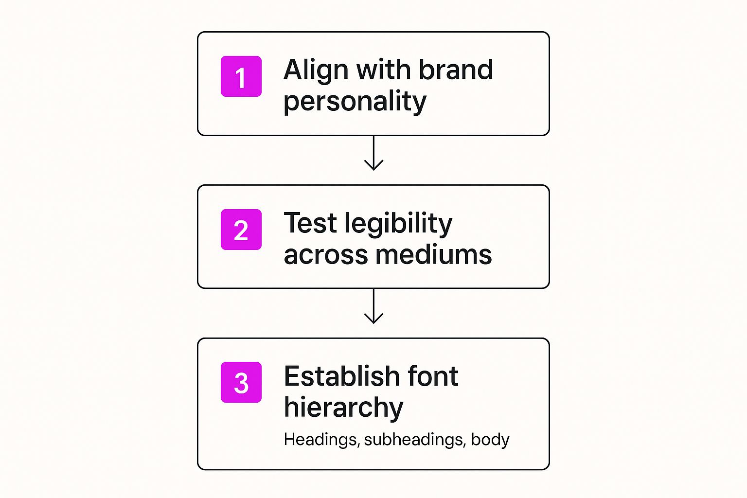
This process ensures your font choices are not just pretty, but also functional and perfectly aligned with your brand's personality.
Get specific about which fonts and styles go where:
- Headings (H1, H2, H3): This is your main, attention-grabbing typeface.
- Body Text: Choose something highly legible and easy on the eyes for longer paragraphs.
- Captions and Labels: A complementary font for the finer details.
Pro Tip: Always, always test your fonts on different devices and at various sizes. A font that looks incredible on a huge desktop monitor might become an unreadable smudge on a mobile screen. Legibility is everything.
Once your visual identity is defined, you have to see how it all comes together in the real world. A great next step is learning about creating website mockups to ensure your brand's look and feel translates perfectly across your digital platforms.
Developing Your Brand Voice and Tone

If your visual identity is how your brand looks, your voice and tone are how it sounds. This is the personality that shines through in every email, social media post, line of website copy, and even customer support chat. Nailing this is how you go from being just another company to a brand people genuinely connect with.
And it’s not just about feeling good. A strong, consistent voice has a real impact on your bottom line. In fact, 68% of companies report a revenue bump of 10-20% from consistent brand presentation alone. That consistency builds trust, which is everything. For a deeper dive into these numbers, check out this comprehensive report on branding statistics.
The Difference Between Voice and Tone
Before you start writing anything down, it's critical to get the distinction between voice and tone. I see people mix these up all the time. Here’s the simplest way to think about it:
- Brand Voice is your core personality. It’s fixed. Are you witty? Authoritative? Empathetic? Playful? That doesn’t change, no matter what you’re writing.
- Brand Tone is the emotional inflection you apply to that voice. It’s flexible and adapts to the situation.
Think of it this way: your voice is consistently helpful and expert. But your tone when writing a fun tutorial blog post will be encouraging and light. When responding to a customer complaint? It’ll shift to be serious and empathetic. The core voice is the same, but the emotional filter changes.
Your brand voice is what you say, and your tone is how you say it. Defining both ensures you communicate appropriately and effectively in every scenario, from a celebratory tweet to a serious service update.
Defining Your Core Voice Characteristics
To actually nail down your voice, circle back to your brand's foundation—its mission, values, and personality traits. Your job is to translate those abstract ideas into concrete communication rules. The best place to start is by picking three to five core adjectives that really capture your brand's personality.
Let’s run through a quick example. Imagine a tech startup whose big mission is "making complex technology simple." Their voice characteristics might be:
- Clear: We use simple language and kill the jargon.
- Empowering: We focus on what our users can achieve with our tool.
- Insightful: We offer genuine expertise, not just surface-level fluff.
From there, the next step is to make it practical for your team. A simple "do" and "don't" chart is my go-to tool for this. It gives everyone tangible examples of how to bring the voice to life in their day-to-day writing.
| Characteristic | Description | Do | Don't |
|---|---|---|---|
| Clear | Simple, direct language. | "Get started in three easy steps." | "Begin the onboarding process." |
| Empowering | Focus on user benefits. | "You can build a website in minutes." | "Our tool builds websites fast." |
Building a Tone Matrix
Okay, so your team knows your voice. But how do they adapt it for different situations without just guessing? That's where a tone matrix comes in. It’s an incredibly practical guide that shows your team how to flex your core voice for different channels and scenarios.
You simply list common communication types along one axis (like blog posts, social media, error messages) and your voice characteristics along the other. Then, you fill in the blanks, describing how the tone should adjust.
For example, how does that "Clear" and "Empowering" voice sound on a 404 error page versus a big marketing email? The marketing email will probably have an enthusiastic and benefit-driven tone. The 404 page? It needs to be helpful and reassuring. This matrix removes all the guesswork and ensures consistency, no matter who's doing the writing.
Choosing the Right Format for Your Guidelines
So, you’ve meticulously defined your brand's core elements. The final—and arguably most important—step is packaging them in a way that’s accessible, practical, and actually gets used.
A brand guide gathering digital dust in a forgotten folder is completely useless. The format you choose can be the difference between a 'living document' that empowers your team and a static PDF that gets ignored.
Your decision should really come down to your team's size, workflow, and how often your brand might evolve. There are two main paths you can take: the traditional, static document or a modern, dynamic brand hub.
Static Documents: PDFs and Presentations
The classic PDF or slide deck is a common starting point for a lot of businesses. It’s straightforward to create and dead simple to share via email or a shared drive. For small teams or brands with rock-solid, stable identities, this format can be perfectly fine.
But its static nature is also its biggest weakness.
Every time you update a logo, tweak a color, or refine your messaging, you have to manually hunt down the master file, edit it, and then redistribute it to everyone. This quickly spirals into version control chaos, with team members accidentally using outdated assets and rules. It happens all the time.
Dynamic Digital Brand Hubs
This is where your guidelines truly come to life. While brand manuals used to be printed booklets or fixed PDFs, companies are now shifting to centralized, cloud-based platforms. These hubs allow for real-time updates, foolproof version control, and easy access for everyone, from internal teams to external agencies. You can see just how much these modern brand identity guides are evolving.
Platforms like Frontify or Zeroheight transform your guidelines from a flat document into an interactive, searchable resource.
This example from Frontify shows how a digital hub can centralize everything—from logos and color palettes to UI components and brand voice principles—in one accessible online space. The real magic here is that any update made to the hub is instantly reflected for every single user. It completely eliminates the chance of outdated information being used.
These platforms also come loaded with features that are just impossible with a PDF:
- Integrated Asset Libraries: Designers can download the correct logo file directly from the hub, so you know they always have the latest version.
- Live UI Components: Developers can grab actual code snippets for buttons, headers, and other elements that are perfectly on-brand.
- Search Functionality: Team members can quickly find the exact rule they need without scrolling through a hundred-page document.
Choosing a dynamic hub means investing in a single source of truth. It ensures that every stakeholder—from an internal marketer to a freelance designer across the globe—is working from the exact same playbook, in real time.
For those looking to build out their visual assets, our guide on creating a brand kit for AI image generation can help you organize the elements you'll need, no matter which format you choose.
Got Questions About Brand Guidelines?
Even the best-laid plans can hit a few snags. When it comes to creating and rolling out brand guidelines, a few tricky questions always seem to pop up. Let's walk through the most common ones I hear so you can sidestep the pitfalls and make sure all your hard work actually sticks.
The biggest hurdle isn’t usually making the guide. It’s getting people to use it. A brand guide that collects digital dust is completely useless, so how do you get the whole company on board?
How Do I Get My Team to Actually Follow the Guidelines?
This is the million-dollar question. The secret is to stop treating the guidelines like a rulebook and start presenting them as a tool that makes everyone's job easier. You're not adding restrictions; you're removing guesswork and ending those endless debates over which shade of blue to use.
- Launch it with a bang. Don't just send out a PDF in a company-wide email and hope for the best. Host a real kickoff meeting or a hands-on workshop to walk everyone through the why behind the decisions.
- Make them impossible to ignore. Accessibility is everything. A digital brand hub is the gold standard, but even a meticulously organized folder on a shared drive works. If people have to hunt for it, they won't use it.
- Find your champions. You can't be everywhere at once. Pinpoint a few people in different departments who really get it. They can become the go-to experts and advocates for brand consistency on their teams.
Ultimately, getting people to adopt the guidelines is a mix of smart education, dead-simple access, and a little positive reinforcement. When your team starts seeing the payoff—like projects getting approved faster and everything looking more cohesive—they’ll get on board.
What’s the Difference Between a Brand Guide and a Style Guide?
I see this one all the time, and the fact that people often use the terms interchangeably doesn't help clear things up. They're definitely related, but there's a key distinction.
Here’s the simplest way to think about it:
- A Brand Guide is the big picture. It’s the high-level, strategic playbook that covers your mission, vision, values, personality, and the core of your visual and verbal identity. It’s the entire universe of your brand.
- A Style Guide is a focused, tactical manual for a specific use case. It’s a subset of the main brand guidelines. You might have a content style guide for writers (covering grammar and tone) or a design style guide for developers (detailing UI components for the website).
Your brand guide is the "what" and "why" of your brand. A style guide is the tactical "how" for a specific team or project. Ideally, your style guides should live inside or be born directly from your main brand guidelines.
How Often Should We Update Our Brand Guidelines?
Your brand guidelines should be a living document, not a stone tablet you create once and forget about. There isn't a magic number for updates, but a good rule of thumb is to schedule a formal review at least once a year.
That said, you should be ready to make changes whenever certain business triggers pop up:
- A major product launch that brings in new messaging or visuals.
- Expanding into new markets where you might need to adapt to different cultural norms.
- A company rebrand or merger that requires blending or creating new identities.
- Getting feedback from your team that a rule is unclear, impractical, or just not working.
Keeping your guidelines fresh and relevant is what makes them a powerful tool. And that dedication pays off. In fact, 68% of companies report that brand consistency contributes to revenue growth of 10-20%. You can dig into more numbers in this breakdown of branding statistics.
Ready to create stunning, on-brand visuals without the hassle? With Bulk Image Generation, you can produce hundreds of unique, professional-quality images in seconds. Let our advanced AI handle the creative heavy lifting so you can focus on building a consistent and memorable brand. Start generating your brand assets today at bulkimagegeneration.com.
