
How to Blend 2 Images for a Seamless, Professional Look

Aarav Mehta • December 21, 2025
Learn how to blend 2 images with professional techniques. This guide covers manual and AI methods for creating seamless composites that stand out.
Blending two images is all about making them one. You're using software to combine them into a single, cohesive picture, usually playing around with layer masks and blend modes to control how they interact. But the real secret? The sauce that makes it look professional? Making sure things like light, color, and perspective all match up perfectly between the photos.
Understanding What Makes a Great Image Blend
Before we dive into the specific tools and techniques, let’s talk about what actually separates a pro-level composite from a sloppy, amateur edit. Learning how to blend 2 images isn't really about the software—it’s about convincing the eye that this new reality you’ve created is real. A good blend really boils down to a few core principles.
Your main goal is to trick the viewer into seeing the final image as a single, authentic photograph. That means you have to sweat the small stuff. If one of your photos was shot in harsh midday sun and the other during the soft glow of dusk, just slapping them together is going to look jarring and fake. The shadows won't line up, and the color temperatures will clash immediately.
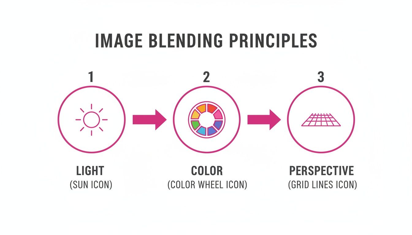
Key Principles for Realistic Blending
To pull off a convincing blend, you've got to nail these three things:
- Consistent Lighting: The direction of the light, its softness (or hardness), and its color temperature have to match across every single element. You can't have a person lit from the left dropped into a scene where the sun is clearly on the right. It just breaks the illusion.
- Harmonious Color and Tone: The whole image needs a unified color palette, saturation, and contrast. When the tones don't match, it's a dead giveaway that the picture has been manipulated.
- Unified Perspective: Everything in your scene has to follow the same rules of perspective. This means making sure the scale, angle, and vanishing points of your added elements align perfectly with the background. Our free aspect ratio calculator can be a lifesaver for keeping the proportions right when you're resizing.
The idea of blending images isn't new. Back in 1861, physicist James Clerk Maxwell created the very first color photograph by combining three separate black-and-white images. This foundational technique is the direct ancestor of the digital compositing we do today. In fact, those early principles underpin the layer blending modes used in 95% of digital composites created now.
At the end of the day, a great blend tells a seamless story. It doesn't matter if you're creating a surreal double exposure or a photorealistic landscape—these principles are the foundation for making something that's not just technically good, but truly believable.
Mastering Manual Blending in Photoshop and GIMP
While AI tools are fantastic for speed, there are times when you need absolute, pixel-perfect control. For that, nothing beats rolling up your sleeves and diving into desktop software like Adobe Photoshop or its powerful, free alternative, GIMP. This is where the real magic happens, giving you the same granular control the pros use to create flawless, believable composites.
Learning to blend images manually isn't about memorizing a rigid set of steps. It's about understanding how layers talk to each other. Once you get the hang of a few core techniques, you'll unlock a whole new world of creative possibilities. Let's break down the essential methods that will put you in the driver's seat.
The Power of Layer Masks
If there's one tool you absolutely need to master, it's the layer mask. Forget the eraser tool—masks are your best friend for non-destructive editing.
Think of a mask as a way to control what's visible on a layer without actually deleting anything. When you add a layer mask to your top image, you can paint on it with black, white, and shades of gray to fine-tune the blend.
- Painting with black hides parts of that layer, letting the image below show through.
- Painting with white does the opposite, bringing that layer back into view.
- Using shades of gray creates partial transparency, which is perfect for soft, feathered edges and seamless transitions.
This is the go-to technique for complex jobs, like cutting a person out of one background and placing them into another, especially when you have to deal with tricky edges like hair or fabric.
The idea of blending images this way really took off with Adobe Photoshop 1.0 in 1990, which introduced the layer-based tools we still rely on. By 1994, Photoshop 3.0 offered 15 blending modes, and by the year 2000, it commanded a staggering 90% market share among designers. It's estimated that blending techniques were used in around 70% of print ads at the time. You can learn more about this history from the Science and Media Museum.
Demystifying Blend Modes
Next up are blend modes. These are essentially mathematical formulas that dictate how the pixels on one layer interact with the pixels on the layers beneath it. Instead of just covering what's below, the layers merge in unique ways depending on the mode you choose.
While the dropdown list can look intimidating, most professionals stick to just a handful.
The best way to learn them is to just click through and see what happens. Modes like Multiply will darken the composite image, Screen will lighten it, and Overlay will boost the contrast, creating a much punchier look.
A classic example? Try placing a gritty texture image over a portrait and setting the blend mode to Overlay or Soft Light. You'll add instant depth and character without losing the details of the original photo.
Using Gradients for Smooth Transitions
Sometimes you don't need to paint in every little detail. For a clean, gradual fade between two images, the Gradient Tool is your secret weapon. This is the perfect method for jobs like swapping a boring, washed-out sky with a dramatic sunset.
It’s surprisingly simple. Just add a layer mask to your new sky layer, grab the Gradient Tool, and make sure it’s set to a black-to-white gradient. Then, just click and drag from where you want the blend to start to where you want it to end. The result is a beautiful, seamless transition that melts the new sky right into the original horizon line.
To help you decide which tool is right for the job, here's a quick comparison of these three foundational techniques.
Comparing Core Manual Blending Techniques
This table breaks down the three primary methods for manual blending in desktop software, helping you choose the best approach for any given task.
| Technique | Best For | Level of Control | Common Use Case |
|---|---|---|---|
| Layer Masks | Complex shapes and precise, detailed selections. | Maximum. Pixel-level control over visibility. | Compositing a person into a new background. |
| Blend Modes | Adding textures, lighting effects, and creative color grades. | Moderate. Affects the entire layer based on a formula. | Applying a vintage texture over a modern photo. |
| Gradients | Creating smooth, linear transitions between two images. | High, but limited to linear or radial fades. | Replacing a sky or blending two landscapes. |
Each technique has its place. Layer masks give you ultimate precision, blend modes create stylistic effects, and gradients deliver smooth, clean fades. The real power comes when you start combining them. A great composite might use a gradient on a layer mask, all while being set to a specific blend mode. Mastering these tools is the key to creating truly professional-looking blends.
Using AI for Instant and Creative Image Blends
While rolling up your sleeves with Photoshop gives you ultimate control, it’s not always the fastest route. When you need impressive results without the steep learning curve, AI-powered tools are a game-changer. This approach is completely shifting how we think about blending images by automating the most tedious parts of the job.
AI just eats up the tasks that used to take me hours. Think about making precise selections around complex subjects, refining tricky edges like hair or fur, or automatically matching the color palettes and lighting between two completely different photos. This kind of automation is a lifesaver for artists creating surreal composites or marketers who need to crank out product mockups at scale.
The AI-Assisted Blending Workflow
Instead of painstakingly painting on layer masks, the AI workflow is all about clear, descriptive language. The idea is to generate your separate elements with a consistent style and then simply tell the AI how to merge them. For instance, you could generate a fantasy character in one step, a mystical forest in another, and then use a final prompt to combine them into a single, seamless scene.
It usually breaks down like this:
- Generate Your Base Images: First, you create your subject and background images using text prompts. Being specific here is everything—it helps you nail the right lighting and mood from the very start. If you're struggling to come up with detailed instructions, a specialized tool like our free AI image prompt generator can really help get the best results.
- Let the AI Do the Compositing: Next, you upload both images into an AI editor. From there, you can use natural language to direct the tool. Tell it to place the character inside the forest, and watch it automatically adjust the scale, color, and lighting.
- Refine with Simple Prompts: The final blend isn't quite right? Just talk to it. Fine-tune the composite with more instructions like, "make the lighting on the character softer to match the forest" or "add a subtle glow where the character touches the ground."
"AI multi-image fusion can understand and merge multiple input images. You can put an object into a scene, restyle a room with a color scheme or texture, and fuse images with a single prompt."
This prompt-based editing makes the whole process incredibly accessible. The tech handles all the complex pixel-level adjustments, letting you focus purely on your creative vision. It’s an entirely new way to think about how to blend 2 images, putting your ideas ahead of technical execution.
When to Choose an AI Blending Tool
Let's be real: AI is the perfect choice for speed and experimentation. It lets you test out concepts rapidly without getting bogged down in manual selections or hours of color correction. If you need to produce a high volume of blended images for a social media campaign or a product catalog, AI tools will slash your production time.
This method is especially powerful for:
- Conceptual Art: Quickly visualize and create surreal or abstract imagery.
- Product Mockups: Instantly place your products into various lifestyle scenes.
- Rapid Prototyping: Test different compositions and ideas in minutes, not hours.
If you’re looking to explore dedicated AI platforms for innovative image blends, you might find some interesting ideas in Auralume AI's offerings. As this technology keeps getting better, the line between manual and AI-assisted blending is only going to get blurrier, opening up some seriously exciting creative doors for everyone.
Blending Images On The Go With Mobile Apps
Think you need a beast of a desktop machine to blend images? Think again. Some of the most compelling visual blends are now created right from a phone or a web browser, thanks to intuitive apps like Canva, Fotor, and Picsart. These tools pack some serious power, putting impressive editing capabilities right in your pocket.
This is a game-changer for creators who need fantastic results without getting bogged down in the complexities of traditional desktop software. Many of these apps have baked-in features like "double exposure" effects and dead-simple layering tools that make the whole process feel natural, not technical.
Let's say you're managing a brand's Instagram on the fly. You could snap a quick portrait, pull in a cool texture from your camera roll, and merge them into a moody, artistic graphic in just a couple of minutes. Or maybe you're an e-commerce seller who wants to show your product in context. A quick blend of your product shot with a lifestyle background can instantly make it more relatable and appealing.
Choosing The Right Mobile App
With so many options out there, the trick is to find the one that clicks with your creative style. Each app has its own personality—some are built for speed and templates, while others give you more granular control.
- Canva: Your go-to for anything template-driven. It's perfect for whipping up social media graphics or marketing materials with its massive element library and drag-and-drop simplicity.
- Picsart: If you lean more toward the artistic and experimental, Picsart is your playground. It’s loaded with filters, creative effects, and drawing tools that are perfect for surreal, eye-catching blends.
- Fotor: A great all-rounder. Fotor strikes a nice balance between easy-to-use features and more powerful tools like AI-driven background removal, giving you a bit more creative freedom.
Here’s a look at the Canva interface. Everything is laid out for speed, letting you upload photos and start blending without having to dig through confusing menus.
It’s funny to think about, but this idea of blending tiny elements to create a bigger picture has been around forever. Way back in 1907, the Autochrome plate hit the market, merging microscopic grains of color to produce the first full-color photos. What those pioneers did with chemistry, we now do with pixels on our phones. It's this accessibility that has fueled a massive 150% increase in user-generated content over the last decade. The evolution from glass plates to pocket-sized apps is a fascinating story you can explore in the history of photography technology.
Key Takeaway: Mobile apps have completely democratized image blending. They've torn down the technical walls, letting you focus on what really matters: telling a compelling story by merging two different visuals into a single, powerful message.
At the end of the day, it's all about speed and convenience. These tools empower you to act on a creative spark the moment it hits, turning your phone into a portable design studio. Whether it’s for a client or just for fun, blending images on the go has never been easier—or looked so good.
Pro Tips for Making Your Blends Look Realistic
Getting two images to occupy the same space is the easy part. Making them look like they belong together? That's where the real magic happens.
The difference between an amateur composite and a professional one is all in the details. Once you’ve combined your layers, you need to become a bit of a detective, focusing on the three pillars of realism: light, color, and edges. This is how you sell the illusion and convince the viewer they're looking at a single, authentic photograph.
To pull this off, you have to start looking at the real world differently. Pay attention to how light wraps around objects, how colors cool down in the shade, and how things rarely have perfectly sharp edges. Those little observations are what will guide your finishing touches and take your work to the next level.
Harmonize Your Lighting and Shadows
Mismatched lighting is the #1 giveaway of a fake composite. If your subject is lit from the left and you drop it into a scene where the sun is clearly on the right, the illusion instantly shatters. It just feels wrong.
Before you even start blending, take a hard look at both source images. Analyze the direction, quality, and even the color of the light.
- Direction of Light: Where's the main light coming from? Shadows on your added element absolutely must fall in the same direction as the existing shadows in the background. No exceptions.
- Quality of Light: Is the light hard and creating crisp shadows, like direct midday sun? Or is it soft and diffused, like on an overcast day? A subject with sharp, defined shadows will look completely out of place on a cloudy beach.
- Color of Light: Light isn't just white; it has a color temperature. Think about the warm, golden glow of a sunset versus the cool, blue light of dawn. They're worlds apart.
You can use dodging and burning—a classic technique of selectively lightening and darkening areas—to essentially "paint" in new highlights and shadows. This helps your added element feel like it's truly interacting with the light in its new environment.
Unify Your Color Palette
Just as critical as light is color harmony. Two photos taken with different cameras, at different times of day, or in different locations will almost certainly have clashing color profiles. Your goal is to make them feel like they were captured in the same moment with the same lens.
This is where adjustment layers in programs like Photoshop or GIMP are your best friend. Instead of making permanent, destructive changes, these layers sit on top of your image stack and affect everything below them.
Tools like Color Balance, Hue/Saturation, and Photo Filters are perfect for unifying a scene. For instance, adding a single, subtle warm photo filter over the entire composite can instantly tie a cool-toned subject into a warm, sunny background, making everything feel cohesive.
A huge part of making realistic blends is starting with a clean slate. That means separating your subject from its original background flawlessly. Checking out an AI background removal demo can show you how modern tools make this complex step incredibly simple.
Perfect Your Edges and Transitions
Nothing screams "cut and paste" louder than a harsh, digitally sharp edge. The transition point where your two images meet is probably the most critical area to get right. A believable blend needs edges that look natural and interact realistically with the new background.
Start by refining your layer mask. Grab a soft-edged brush with a low opacity and flow setting, then gently paint along the edges to soften that transition. You have to zoom in and pay close attention to tricky areas like hair, fur, or fabric.
Sometimes, feathering the mask selection by just a pixel or two can work wonders to eliminate any remaining hard lines. It's also vital to start with high-resolution source images; if you need to prep your files, a bulk image resizer can help you manage sizes without sacrificing quality.
Common Questions About Blending Images
Even after you’ve got the basics down, you’re bound to hit a few snags when blending images. It’s totally normal. Here are a few quick answers to the problems I see artists and editors run into all the time, designed to get you unstuck and back to creating.
How Can I Make Edges Look More Natural?
A harsh, cut-out edge is the fastest way to ruin an otherwise great composite. If your subject looks like a sticker slapped onto a background, the problem is almost always the transition between your layers. The fix? Refining your layer mask with a softer touch.
Forget the hard-edged brush. Instead, switch to a soft, round brush and crank its hardness setting all the way down to 0%. Then, lower the brush's opacity to around 20-30% and gently paint along the border of your mask. This method builds up the transition slowly, creating a much more realistic fade that helps your subject settle into its new home.
Why Do My Colors Look So Mismatched?
When you pull photos from different sources, their color profiles almost never line up. One might be warm and sunny, while the other is cool and overcast. Just smashing them together without any correction is a recipe for a jarring, unprofessional look. The real solution is to color grade the entire image as one cohesive unit.
This is where adjustment layers become your best friend:
- Photo Filter: This is great for a quick fix. Apply a subtle warming or cooling filter over the whole composite to unify the overall color temperature.
- Color Balance: This tool gives you surgical control over the shadows, midtones, and highlights, letting you nudge the colors until everything feels like it belongs together.
- Selective Color: Got a weird green in the trees or a mismatched blue in the sky? Use this to target specific colors across all layers at once and bring them into harmony.
The secret is to make global adjustments that affect both images simultaneously. This tricks the viewer’s eye into believing all the elements were captured in the same light and at the same time.
What Is The Best File Format for Saving Blended Images?
The right format really just depends on what you plan to do with the final image. There’s no single "best" option, but there are definitely right and wrong choices for different situations.
If your image is headed for the web—social media, a blog post, you name it—JPEG is almost always the answer. It gives you excellent compression to keep file sizes small for faster load times, though you do sacrifice a tiny bit of quality. If your composite has large areas of flat color or sharp text, PNG is a better bet because it keeps things crisp and supports transparency.
But for archiving your project or if you ever plan on printing it, always save a layered copy in your software’s native format, like a .PSD for Photoshop.
Ready to skip the manual work and create stunning visuals in seconds? Bulk Image Generation uses advanced AI to generate and edit hundreds of images at once. Describe your vision, and our platform handles the rest—from blending scenes to removing backgrounds. Scale your creative workflow with Bulk Image Generation today!