How Do You Superimpose Pictures A Pro Guide

Aarav Mehta • September 26, 2025
Learn how do you superimpose pictures with our pro guide. Discover actionable techniques, tools, and tips for creating seamless, realistic photo blends.
To superimpose a picture is really just a technical way of saying you’re placing one image on top of another to create a single, combined visual. It's the art of blending multiple photos, text, or graphics into a cohesive scene, letting you create everything from artistic double exposures to hyper-realistic composites.
What Does It Mean to Superimpose an Image?
At its heart, superimposing is about telling a new story by layering different visual elements together. It’s a technique that goes way beyond simple photo editing, allowing you to merge different realities into one frame. I like to think of it as digital collage-making, but the goal is always to make the final product look seamless and intentional.
This method is way more common than you might think and pops up everywhere. You’ve definitely seen it in:
- Marketing materials: A shiny new product is placed into a scenic background where it never actually was.
- Artistic photography: A portrait is blended with a sprawling cityscape to create a surreal, dreamlike effect.
- Film and media: Green screen technology is the classic example, where actors are superimposed into entirely digital worlds.
The Foundation of Digital Layering
Before you jump in, it helps to get a handle on a few key terms. The most important concept by far is layers. Imagine you have a stack of transparent glass sheets, and you've drawn a different image on each one. By arranging these sheets, you create a final, multi-faceted picture. In digital software, every image or element gets its own layer, which you can then move, resize, and tweak independently without messing up anything else.
From there, a couple of other ideas come into play:
- Opacity: This is just a slider that controls how transparent a layer is. A layer at 100% opacity is solid and fully visible, while at 0%, it's completely invisible. Playing with opacity is fundamental for blending images in a subtle, natural way.
- Blending Modes: These are powerful presets that change how the pixels on one layer interact with the pixels on the layers underneath it. Modes like 'Multiply' or 'Screen' can create some really dramatic lighting and color effects with just one click.
The real magic of superimposing isn't just cutting and pasting; it's the artful combination of layers, opacity, and blending to make the impossible look believable.
While today's digital tools make this all incredibly accessible, the concept itself isn't new. The history of photographic manipulation actually stretches back over 150 years. There's a famous 1860s portrait, for example, that combined President Abraham Lincoln’s head with someone else's body. It just goes to show that the desire to create composite images predates modern software by more than a century. You can even explore more about this early history of image manipulation.
Choosing Your Go-To Superimposing Tools
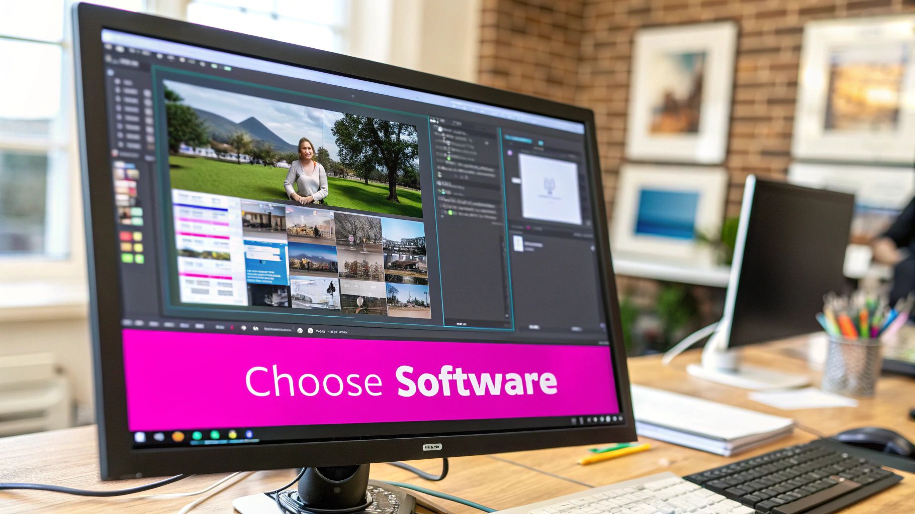
The software you choose is going to make or break your project. It directly shapes not just your final image, but how much of a headache it is to get there. Picking the right tool for superimposing pictures isn't about grabbing the one with the most bells and whistles; it’s about matching the software to what you actually need, your skill level, and the specific project you’re tackling.
For the heavy-duty, professional stuff, desktop software like Adobe Photoshop is still king. It gives you an insane amount of control over layers, complex selection tools, and a massive library of blending modes. But let's be real—the learning curve can feel like climbing a wall, and that subscription cost adds up.
Luckily, there are plenty of other options out there, especially for those of us who need great results without the professional-grade complexity.
Desktop Power vs. Mobile Convenience
The old debate between desktop and mobile apps usually boils down to one thing: control versus speed. A full desktop setup gives you surgical precision, but mobile apps put some serious creative power right in your pocket.
- Adobe Photoshop: This is the undisputed champ for pros who need pixel-perfect control. Its advanced masking and color grading tools are non-negotiable for creating composites that actually look believable.
- Affinity Photo: A seriously powerful alternative to Photoshop that you can buy with a one-time purchase. It packs a professional-grade feature set without the monthly fee, which is why it's a huge favorite among freelancers and hobbyists.
- GIMP (GNU Image Manipulation Program): This free, open-source beast offers a lot of Photoshop’s core features, including excellent layer management. If you're working on a budget, it's a fantastic place to start.
On the flip side, mobile apps are built for getting things done quickly and intuitively. Apps like Snapseed and Bazaart have surprisingly robust layering and masking features, letting you create impressive superimposed images right from your phone. They're perfect for knocking out social media content or getting creative on the fly.
The Rise of Specialized Online Tools
A new wave of browser-based tools is completely changing the game. These platforms often use AI to handle the tedious stuff, like removing a background or selecting a subject, which cuts down on manual effort in a big way.
For example, our own AI-powered image generator lets you dream up and tweak elements for your compositions without ever leaving your browser. Tools like these are brilliant for quickly generating assets or making edits without having to install bulky software. Many even come with templates that make the whole process a breeze for things like product mockups or marketing graphics.
The best tool is the one that gets out of your way and lets you create. Whether it’s the deep feature set of desktop software or the speed of an AI-powered online editor, pick what helps you bring your vision to life most effectively.
It's also interesting to see how the core principles of layering in photo editing show up in other creative fields. When you're exploring your options, it’s worth taking a look at tools like the best video editing software, since many of them offer powerful features for blending visual elements that could spark new ideas for your still images.
Ultimately, it’s all about finding a workflow that feels natural and lets your creativity flow.
Comparing Popular Image Superimposition Tools
To help you decide, I've put together a quick comparison of some of the most popular tools out there. This isn't an exhaustive list, but it covers the heavy hitters and should give you a good starting point for finding what fits your needs.
| Tool | Best For | Key Superimposing Features | Skill Level | Cost |
|---|---|---|---|---|
| Adobe Photoshop | Professional designers, photographers | Advanced layer masks, blending modes, content-aware fill, puppet warp | Advanced | Subscription (~$22.99/mo) |
| Affinity Photo | Professionals & hobbyists wanting a non-subscription option | Full layer support, live blend modes, high-end selection tools | Intermediate to Advanced | One-time purchase (~$70) |
| GIMP | Budget-conscious creators, open-source enthusiasts | Layers, masks, paths, extensive plugin support | Intermediate | Free |
| Bazaart | Quick mobile composites, social media content | Easy background removal, magic selection tool, layers, blending | Beginner | Freemium (Pro ~$11.99/mo) |
| Bulk Image Generation | Fast asset creation, AI-assisted editing | AI-powered element generation, automatic background removal | Beginner | Freemium (Paid plans vary) |
Choosing the right tool is a personal decision based on your budget, your projects, and how much time you're willing to invest in learning. Don't be afraid to try out the free versions or trials to see which one clicks with your creative style.
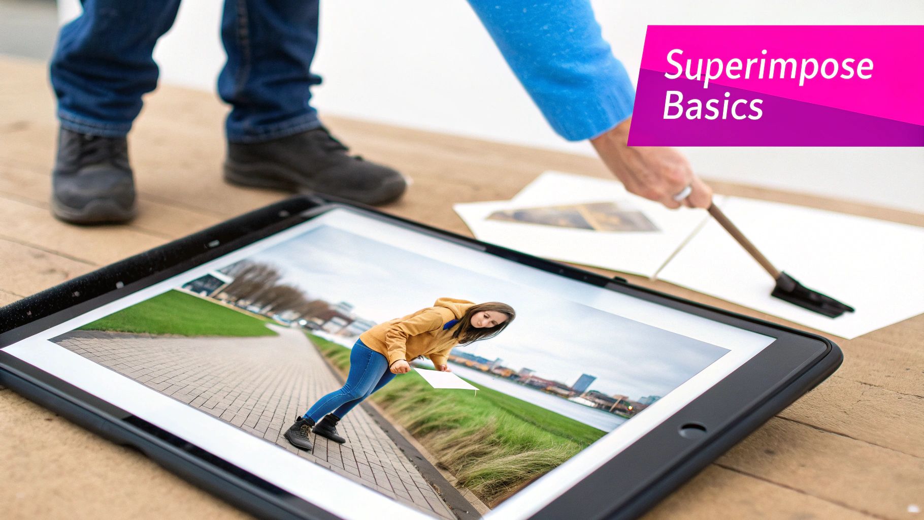
Your Practical Guide to Superimposing Images
Alright, let's get our hands dirty and actually blend some images. Theory is great, but the real learning happens when you start superimposing pictures yourself. The core steps I’m about to walk you through are the same whether you’re using professional desktop software or a quick-and-dirty mobile app.
The whole process kicks off with a crucial decision: picking your images. You’ll need a foreground image (this is your subject, the thing you want to cut out) and a background image (the new scene). The secret to a believable final image is choosing photos that have similar lighting and perspectives. If your subject is lit from the left but your background is lit from the right, it’s going to look fake in a heartbeat.
This infographic gives you a bird's-eye view of how a designer typically moves and layers images to create a final composite.
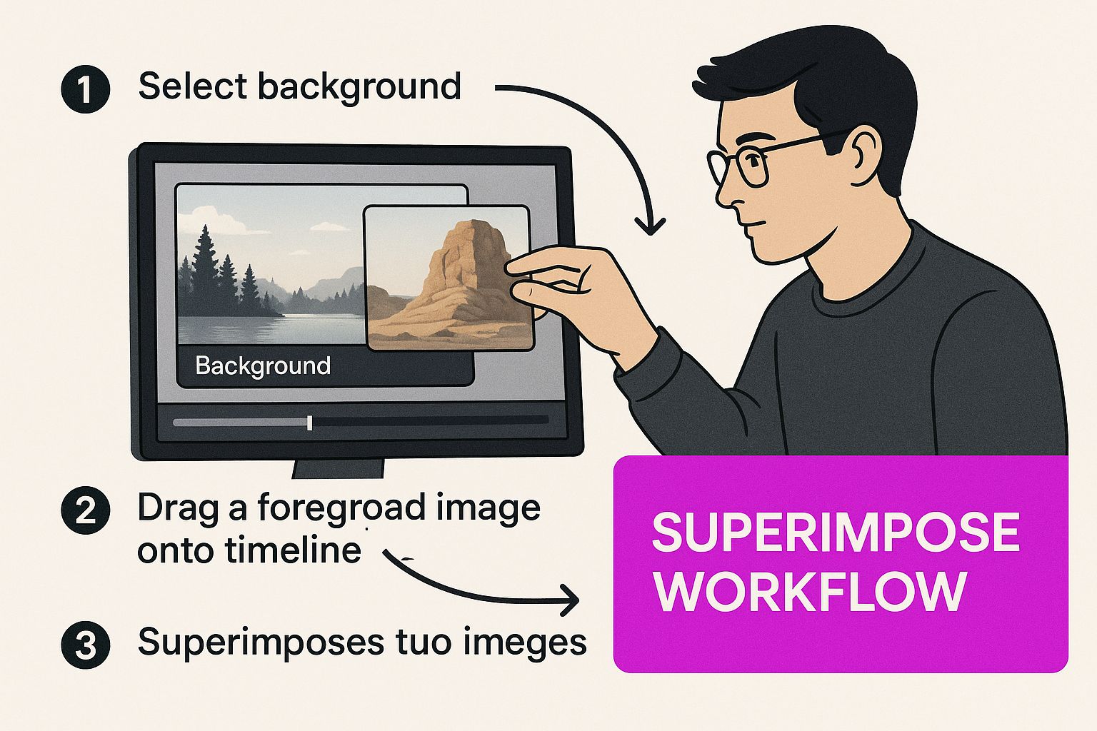
As you can see, it’s not a one-and-done process. It’s all about careful selection, precise cutouts, and making those small adjustments that sell the final illusion.
Preparing Your Layers
Once your photos are picked out, the first real task is to isolate your subject. This can often be the most time-consuming part, but getting it right is everything.
Modern tools give you a few ways to tackle this:
- Magic Wand/Quick Selection: These are fantastic when your subject is on a simple, high-contrast background. Just click on the area, and the tool intelligently finds the edges for you.
- Lasso Tool: This is your freehand option. It lets you draw a selection around your subject. It’s a bit rough around the edges, but it’s great for quick mockups.
- Pen Tool: For the cleanest, most precise results, nothing beats the Pen Tool. It lets you create a vector path around your subject, giving you total control over every curve and corner.
After you’ve selected your subject, you’ll copy it and paste it as a new layer right on top of your background image. This is the moment your new composition starts to come to life.
Don't get hung up on a perfect cutout right away. The goal is to get a clean initial selection. You can always fine-tune the edges later using layer masks—it's a much more flexible and non-destructive way to work.
Positioning and Sizing Your Subject
Now that your subject is sitting on its new background, it's time to get the placement just right. This stage is all about resizing and repositioning that foreground layer until it looks natural in the scene. Pay close attention to scale—if you have a person in the foreground, make sure they aren’t towering over a building in the background. Proportions matter.
Before you lock anything in, it's smart to make sure all your images are sized correctly. If you're working with a bunch of pictures that need to be a consistent dimension, a specialized tool can be a lifesaver. You can find out more about how a bulk image resizer works to make this part of the job a lot faster.
Final Blending and Color Adjustments
This is the final polish that makes the illusion believable. Even with a perfect cutout and placement, if the colors or lighting are off, the whole thing falls apart. You’ll need to use color correction tools—like Curves, Levels, or Hue/Saturation—to make your foreground layer feel like it belongs in the background.
Just ask yourself a few questions:
- Is the background warm-toned or cool-toned? Adjust your subject to match.
- Are the shadows in the scene hard and sharp, or soft and diffused?
- How saturated are the colors in the background image?
Making these small tweaks is what separates an obvious fake from a seamless composite. By the way, the skills you learn here are incredibly versatile and can be applied to all sorts of creative projects, like creating compelling YouTube thumbnails that grab attention.
Once you've nailed the basics of placing one image on top of another, the real fun begins. This is where you move from just cutting and pasting to creating composites that look like they were always meant to be a single, cohesive picture. It's all about mastering the subtle dance between your layers.
The magic often starts with blending modes. These are powerful tools that change how the pixels in one layer interact with the pixels underneath. Instead of just making a layer see-through, blending modes use clever math to alter color and light, opening up a world of artistic effects you just can't get any other way.
Exploring Creative Blending Modes
Think of blending modes like different photo filters that completely change the chemistry of your layers. Most photo editing software gives you dozens to play with, but a few are absolute workhorses you'll come back to again and again:
- Multiply: This mode darkens everything, kind of like printing one image onto a transparent sheet and laying it over another. It’s my go-to for adding realistic shadows or overlaying textures onto a brighter surface.
- Screen: This is the polar opposite of Multiply—it brightens the image. It's perfect for creating light leaks, glowing effects, or giving your composite an ethereal, dream-like quality.
- Overlay: A smart mix of Multiply and Screen, this mode punches up the contrast. It makes light areas lighter and dark areas darker, which is fantastic for making an image feel richer and more dynamic.
Honestly, the best way to get a feel for these is just to click through them and see what happens. You'll often stumble upon an unexpected effect that takes your work in a whole new direction.
The most convincing composites aren't just about a clean cutout; they’re about how seamlessly the light, color, and texture of the layers merge. Blending modes and sophisticated masking are the tools that make this happen.
Mastering Precision with Layer Masks
While a good selection is your starting point, layer masks are where you do the real fine-tuning. A layer mask gives you a non-destructive way to hide or reveal parts of a layer. It’s simple: you paint with black to hide parts of the layer and paint with white to bring them back. Using different shades of gray gives you partial transparency, which is key for creating soft, feathered edges that help your subject melt into the background.
For really complex scenes, you can step up your game with luminosity masks. These are advanced masks that are automatically generated based on the brightness values in your image. This trick lets you apply changes only to the highlights, midtones, or shadows, giving you an incredible amount of control. Say you want to add a gritty texture, but only to the darkest parts of your background—a luminosity mask is the perfect tool for the job. You can even use AI to create unique textures for your projects; our guide on using an AI texture generator can show you exactly how.
This whole idea of superimposition has even found its way into some highly specialized fields. For instance, craniofacial photographic superimposition in forensics has come a long way from a manual process to a high-tech discipline using 3D imaging to align skull images with photographs. While it’s not typically used for a final positive ID, it's still a valuable tool for ruling out possibilities. You can discover more insights about these forensic applications and see how the technique has been refined over the years.
Don’t Make These Superimposing Mistakes
Getting the steps right is just one piece of the puzzle. If you really want to create superimposed images that look real, you have to know what not to do. It’s the common pitfalls that separate a polished, believable composite from something that looks obviously fake.
A lot of beginners get tunnel-vision on making a perfect cutout, but they completely miss the subtle details that actually sell the illusion.
One of the biggest giveaways? Mismatched perspectives. If your subject was shot from a low angle but you drop them into a background that was photographed from above, it’s going to feel wrong. Your brain is hardwired to spot these inconsistencies, even if you can’t immediately put your finger on why the image looks off.
Another dead giveaway is inconsistent lighting. This is the fastest way to make your work look amateurish. The direction, softness, and even the color of the light have to tell the same story across every layer of your image. If they don't, the composite will never look convincing.
Mismatched Lighting and Color
Light has a personality. It can be warm and golden like a sunset or cool and blue like an overcast day. When you try to merge an image shot in warm, direct sunlight with a background from a cool, shady forest, the result is a jarring visual clash.
Pay close attention to these elements:
- Shadow Direction: All shadows need to move in the same direction. If the shadows in your background are pointing to the left, the shadows cast by your foreground subject better be pointing left, too.
- Light Quality: Match the type of light. Hard, crisp shadows belong with other hard shadows. Soft, diffused light needs to be paired with similarly soft lighting.
- Color Temperature: Use your color correction tools to balance the tones. Is the light warm (yellow/orange) or cool (blue/purple)? Make sure both your subject and background feel like they're in the same color environment.
A simple rule of thumb is to look at the highlights and shadows in both images. If they don't tell the same story about where the light is coming from, your composite is dead in the water.
Ignoring the Edges
Even with a flawless selection, the edges of your cutout can scream "Photoshop!" if you aren't careful. A razor-sharp, perfectly crisp edge just doesn't look natural. In the real world, light wraps around objects, creating subtle color bleeds and soft transitions that our eyes expect to see.
To fix this, always feather your selection by a few pixels. This simple step softens the edges just enough to make them look more natural. You can also try adding a very subtle blur or an inner glow effect that samples a color from the background. This helps your subject blend in and feel like it's truly part of the scene.
This kind of meticulous attention to detail isn't just for artists. In more technical fields, the standards are incredibly high. For instance, a study on the use of photographic superimposition in forensics from 1978 to 2009 found that out of 848 cases, the technique was only applicable in 14 of them—a tiny 1.7%. This highlights just how specialized and precise the work has to be. You can learn more about its historical use in forensic science to get a sense of the incredible level of detail involved.
Common Questions About Superimposing Pictures
Even after you get the hang of superimposing, a few questions always seem to pop up. I've been there. Getting clear on these points can save you a ton of frustration and really help you push your creative boundaries.
Let's dive into some of the questions I hear most often.
How Do You Make a Superimposed Picture Look Realistic?
This is the big one. Everyone wants to know how to make their composite images look like they were actually shot that way. It's less about fancy software and more about tricking the human eye.
It all comes down to matching three key things: light, perspective, and color.
First, light. The light source in your main image and your background image must come from the same direction. If your subject is lit from the right, but the shadows in the background scene clearly show the sun is on the left, the illusion is shattered instantly. It’s a dead giveaway.
Next up is perspective. The angle of your subject has to line up with the scene you're dropping it into. A photo of a person shot from a low angle will never look right in a background that was photographed from a drone high above. It just feels wrong.
Finally, you have to nail the color. Use your editing tools to match the warmth, saturation, and contrast across all the layers. If the background is cool and blue-toned but your subject is warm and yellow-toned, it's going to stick out like a sore thumb.
The secret to realism isn't just a perfect cutout. It's about convincing the viewer's eye that every single element in the frame belongs together by meticulously matching the light, color, and perspective.
Can You Superimpose Pictures on a Phone?
Absolutely. You definitely don't need an expensive desktop setup anymore to create high-quality composites. Modern mobile apps are incredibly powerful and more than capable of handling the job.
A few apps with great layering features come to mind:
- Snapseed: Its "Double Exposure" tool is fantastic for more artistic blending and creative effects.
- Bazaart: This one has excellent background removal and really solid layer management for more complex projects.
- Adobe Photoshop Mix: It's a simplified version of its big brother on the desktop, laser-focused on cutting out and combining images.
While they might not have every single advanced feature you'd find in a full desktop program, they give you all the essential tools you need to create professional-looking superimposed images right from your phone.
Is Superimposing the Same as a Collage?
Good question. Both techniques involve combining multiple images, but their artistic goals are worlds apart.
A collage is usually an arrangement of separate, distinct photos. You can often see the borders, and the whole point is to present a collection of moments or ideas. The individual images are meant to be seen as separate parts of a bigger picture.
Superimposing, on the other hand, tries to blend different visual elements into a single, cohesive image. The goal is often to make it look like everything was captured in a single photograph or to create a seamless, layered artistic effect where the lines between the images are intentionally blurred.
Ready to create stunning visuals without all the manual editing? Bulk Image Generation uses advanced AI to generate hundreds of unique images in seconds, handling everything from style to composition for you. It's the perfect way to streamline your creative workflow and start producing professional-quality images at scale.
Generate your images with AI today at bulkimagegeneration.com