
9 Inspiring Fall Color Palettes for Your 2025 Projects

Aarav Mehta • July 12, 2025
Discover 9 stunning fall color palettes for 2025. From classic autumn leaves to modern minimalist, find hex codes and pro tips for your next design.
When you think of autumn, a familiar tapestry of warm reds, oranges, and yellows likely comes to mind. While these classic hues embody the cozy spirit of the season, the world of fall color palettes is far richer and more diverse. This year, we're moving beyond the expected to explore palettes that capture every nuance of autumn, from the crisp, moody twilight of a November evening to the bright, energetic glow of a harvest sunset.
The right color combination is a powerful tool for communication. Whether you are a designer refreshing a brand, a marketer planning a seasonal campaign, or a content creator seeking visual inspiration, a well-chosen palette sets a distinct tone and evokes a specific emotion. These combinations are more than just colors; they are complete narratives waiting to be told.
This guide provides a curated collection of distinctive fall color palettes designed for immediate use. We will delve into 7 unique schemes, complete with hex codes, practical application tips, and real-world examples. You will learn how to leverage these combinations to create visuals that are not only seasonally appropriate but also fresh, sophisticated, and impactful. From classic leaves to modern minimalist aesthetics, these palettes offer a comprehensive toolkit for any creative project this season.
1. Classic Autumn Leaves
The quintessential fall experience is often defined by the warm, inviting colors of changing leaves. The Classic Autumn Leaves palette captures this exact feeling, drawing inspiration directly from the vibrant reds, rich oranges, and golden yellows of maple, oak, and birch trees at their seasonal peak. This combination is one of the most powerful fall color palettes because it instantly evokes nostalgia, comfort, and tradition.
This palette’s strength is its immediate emotional resonance. Brands like Pottery Barn and Starbucks leverage these colors in their fall marketing to create a cozy, welcoming atmosphere that feels both familiar and aspirational. It's an ideal choice for campaigns centered on home, family, and Thanksgiving celebrations.
How to Use This Palette
To prevent the powerful warm tones from becoming overwhelming, focus on balance and texture. A successful application often involves pairing these vibrant hues with neutral anchors.
- Implement the 60-30-10 Rule: Use a soft, creamy beige or a deep chocolate brown as your dominant (60%) color. Apply a warm orange or red as your secondary (30%) color, and use a bright golden yellow as an accent (10%).
- Incorporate Texture: Enhance the organic feel by pairing these colors with visuals of natural textures. Think woven fabrics, rough wood grain, or the soft glow of seasonal lighting in your photography and design assets.
This infographic summarizes the core components of this timeless fall color palette.
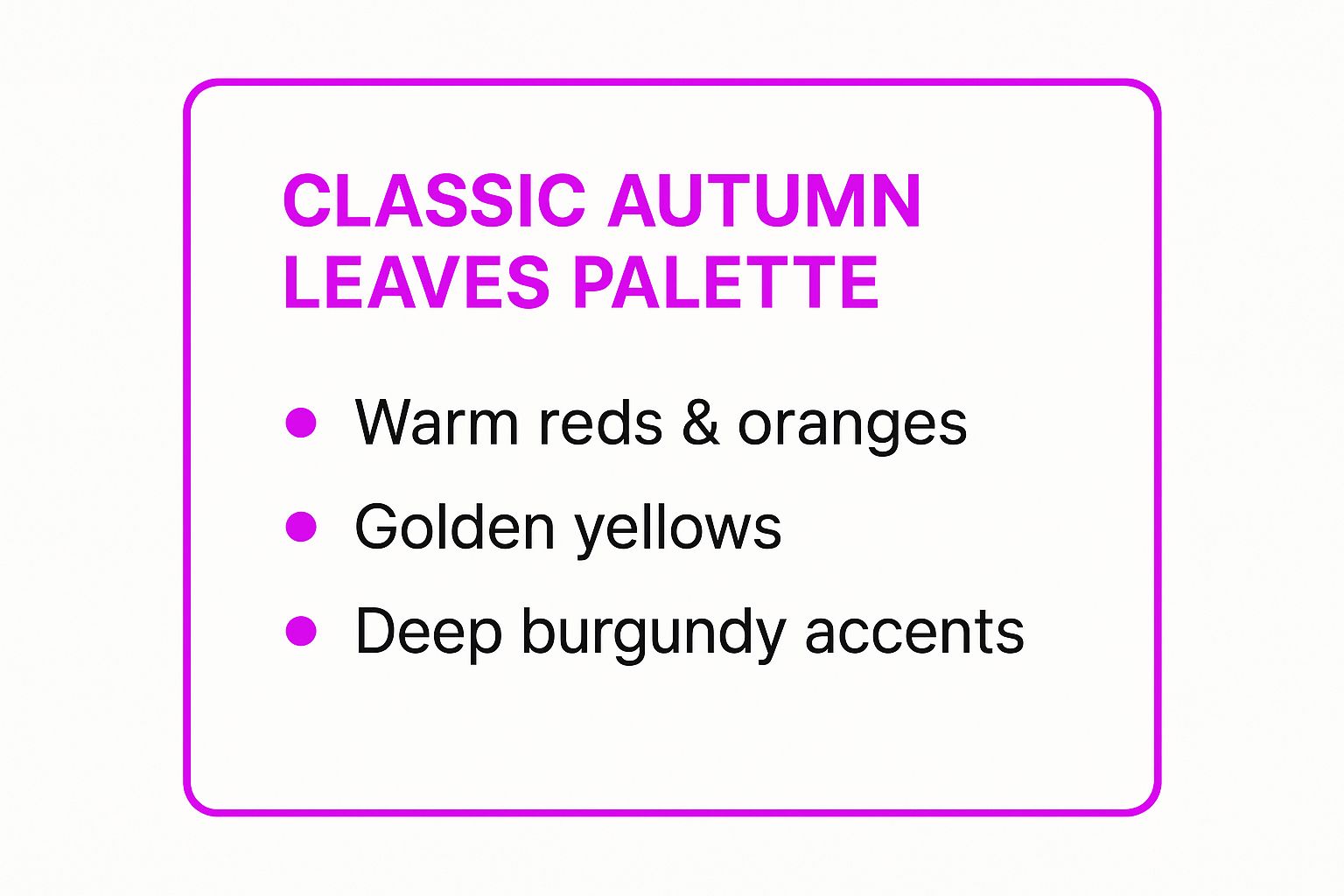
As the summary shows, balancing the primary warm tones with deeper, more subdued accents like burgundy creates a sophisticated and grounded visual hierarchy. For those creating seasonal activities or printables, you can explore detailed coloring page designs that make use of these classic autumn shades and find inspiration for your own projects by reviewing these coloring pages featuring Classic Autumn Leaves. This palette's universal appeal makes it a foolproof choice for engaging a broad audience.
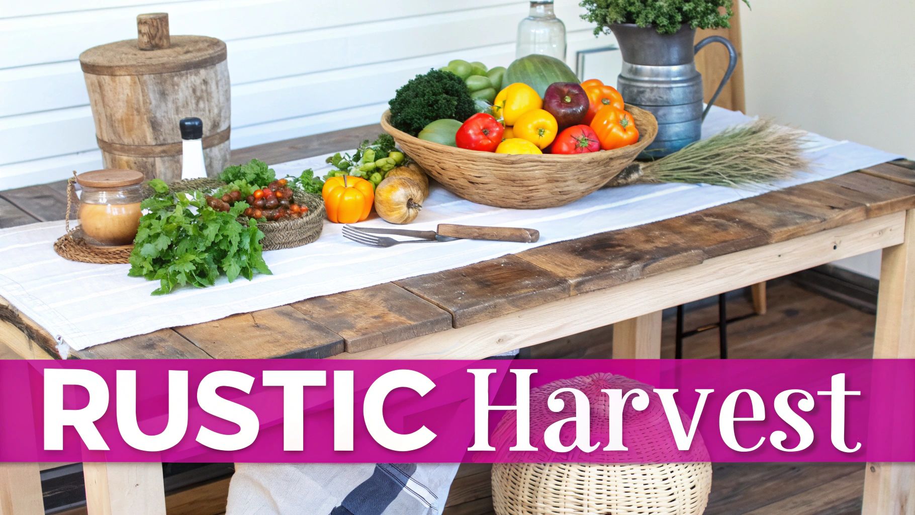
2. Rustic Harvest
Moving beyond bright foliage, the Rustic Harvest palette embraces the sophisticated, earthy side of autumn. It combines muted earth tones with rich, organic accent colors inspired by farmhouse aesthetics and the abundance of the harvest season. This sophisticated fall color palette emphasizes natural materials, weathered textures, and an authentic countryside atmosphere that feels both grounded and elegant.
The power of this palette lies in its ability to create a sense of calm, authenticity, and enduring style. Brands like Magnolia Home by Joanna Gaines have perfected this look, using it to evoke a modern yet timeless farmhouse feel. It is an excellent choice for interior design, lifestyle brands, and marketing campaigns focused on artisanal quality and natural living.
How to Use This Palette
Success with the Rustic Harvest palette depends on layering and thoughtful balance. The goal is to build depth without creating visual clutter, letting the natural-feeling tones create a serene backdrop.
- Layer Textures: Combine rough, natural elements with smoother surfaces to add visual interest. Pair visuals of weathered wood, stone, or woven linen with soft, matte colors in your designs to create a tactile experience.
- Use Metallic Accents Sparingly: Introduce muted metallics like antique brass or copper as small accents. These touches add a layer of sophistication and warmth without overpowering the palette’s earthy, natural feel.
- Balance Warm and Cool Tones: The Rustic Harvest palette often includes both warm terracotta and cool, slate-like grays or muted greens. Carefully balance these to create a dynamic yet harmonious composition that feels contemporary and inviting.
3. Modern Minimalist Fall
Moving away from traditional autumnal warmth, the Modern Minimalist Fall palette offers a contemporary and sophisticated interpretation of the season. This approach strips back the vibrant clutter of classic fall colors, focusing instead on clean lines, sophisticated neutrals, and subtle warm accents. It draws inspiration from Scandinavian design principles, emphasizing negative space and understated elegance to evoke a calm, crisp autumn day.
This palette's power lies in its quiet confidence and modern appeal. Brands like West Elm and tech giants such as Apple use these muted fall color palettes to create a feeling of sleek, uncluttered sophistication. It is an excellent choice for campaigns targeting a design-conscious audience, or for industries like tech, modern architecture, and contemporary art where a clean aesthetic is paramount.
How to Use This Palette
Success with this palette hinges on restraint and a focus on form over ornamentation. The goal is to create warmth and seasonal relevance without sacrificing a clean, modern feel.
- Prioritize Negative Space and Typography: Use a cool, light gray or an off-white as your dominant background. Let strong, clean typography do the heavy lifting. A single, muted accent color, like a desaturated terracotta or a deep olive green, can guide the eye without overwhelming the design.
- Introduce Warmth Through Texture: Since the colors are subdued, add warmth and depth through visual textures. Think soft cashmere, brushed metal, light-grained wood, or concrete surfaces in your design assets and photography. These elements add a tactile quality that prevents the palette from feeling sterile.
This palette proves that fall aesthetics can be both cozy and chic. For creators looking to design seasonal content with a contemporary edge, this modern approach provides a refreshing alternative to the more common fall color palettes.
4. Jewel Tone Autumn
Moving beyond traditional earth tones, the Jewel Tone Autumn palette offers a rich, luxurious alternative for the season. This palette draws its inspiration from precious gemstones, featuring deep, saturated colors like emerald green, sapphire blue, amethyst purple, and ruby red. This combination infuses the warmth of autumn with an air of elegance and drama, creating an opulent and sophisticated atmosphere.
This palette’s strength lies in its ability to feel both seasonal and exceptionally high-end. Luxury brands in fashion and hospitality often adopt these colors for their fall collections and decor to project quality and exclusivity. It is an ideal choice for campaigns targeting a discerning audience or for products associated with fine dining, premium goods, and formal events.
How to Use This Palette
The key to successfully using these powerful, dark colors is to balance them with light and texture to avoid a heavy or somber feeling. A little goes a long way with these saturated hues.
- Accent with Metallics: Use gold, silver, or brass accents to tie the deep jewel tones together. Metallics act as a neutral element that adds brightness and a touch of glamour, enhancing the palette’s luxurious feel.
- Leverage Rich Textures: Pair these colors with sumptuous materials. The visual depth of velvet, the sheen of silk, and the polish of dark wood can amplify the palette's inherent richness and create a multi-sensory experience.
- Use Sparingly for Impact: Instead of making a jewel tone the dominant color, use it as a powerful accent against a dark neutral like charcoal or black. A splash of emerald or ruby in a design will draw the eye and create a memorable focal point.
For those looking to create visuals with this palette, AI can be a powerful tool. You can find inspiration and craft detailed visual concepts by using a free AI image prompt generator to explore different combinations of these elegant shades. This approach makes Jewel Tone Autumn one of the most dynamic and impressive fall color palettes for creating a truly premium feel.
5. Warm Neutrals with Spice
Moving beyond the overtly vibrant, the Warm Neutrals with Spice palette offers a sophisticated and understated take on autumn. This approach builds a foundation of inviting neutral tones like creamy beige, soft taupe, and warm gray, then introduces carefully chosen pops of rich, spice-colored accents such as cinnamon, paprika, or turmeric. This combination is one of the most versatile fall color palettes, evoking a sense of calm elegance and warmth without sacrificing seasonal character.
Its strength lies in its ability to create a high-end, serene atmosphere. Upscale hospitality brands, professional service firms, and luxury residential developers often use these colors to cultivate a space that feels both modern and comforting. It’s an ideal choice for brands that want to project stability, quality, and timeless style while still acknowledging the season. This palette is refined, professional, and perfect for more mature or sophisticated audiences.
How to Use This Palette
Success with this palette hinges on creating depth through layering and maintaining a consistent undertone. The goal is to build a cohesive environment where the spice accents can truly shine without clashing.
- Layer Tones and Textures: Use your warm neutrals as the dominant base, layering different shades of beige, taupe, or greige to create visual interest. Introduce textures like boucle, linen, and brushed metals to add depth.
- Strategic Spice Accents: Use your spice colors purposefully. A single cinnamon-colored accent chair, a paprika-hued art piece, or turmeric-toned throw pillows can provide just enough seasonal warmth without overwhelming the neutral foundation.
- Consider Lighting: The right lighting is crucial. Use warm-toned lighting (2700K-3000K) to enhance the inherent warmth of the neutrals and make the spice accents feel richer and more inviting.
6. Moody Dark Autumn
Moving beyond the bright, cheerful hues of early fall, the Moody Dark Autumn palette embraces the dramatic and sophisticated atmosphere of the season's later days. This palette is defined by deep, rich colors that evoke mystery, warmth, and intimacy. It trades vibrant oranges for burnt siennas, sunny yellows for dark mustards, and introduces deep plums, forest greens, and charcoal grays. This combination is one of the more contemporary fall color palettes, perfect for creating an ambiance that feels both luxurious and comforting.
This palette’s power lies in its ability to create a sophisticated and immersive environment. It's heavily favored by boutique hotels, trendy cocktail lounges, and fashion-forward brands that want to project an air of exclusivity and modern elegance. The deep, saturated tones are ideal for campaigns targeting a discerning audience or for products associated with quiet luxury and cozy indulgence.
How to Use This Palette
Success with this palette requires a careful balance between its dark tones and elements that add life and dimension, preventing the aesthetic from feeling too heavy.
- Balance with Warm Lighting: The depth of these colors is best revealed with warm, layered lighting. Use visuals of soft lamplight, glowing fireplaces, or candlelight to make the dark hues feel inviting rather than somber.
- Incorporate Metallic Accents: Introduce touches of brushed brass, copper, or gold to cut through the darkness. These metallic elements act as highlights, adding a touch of glamour and reflecting light to create visual interest.
- Vary Textures: To prevent the dark colors from appearing flat, combine them with rich textures. Think velvet, dark wood grain, chunky knits, and leather. This textural play adds depth and a tactile quality to your designs.
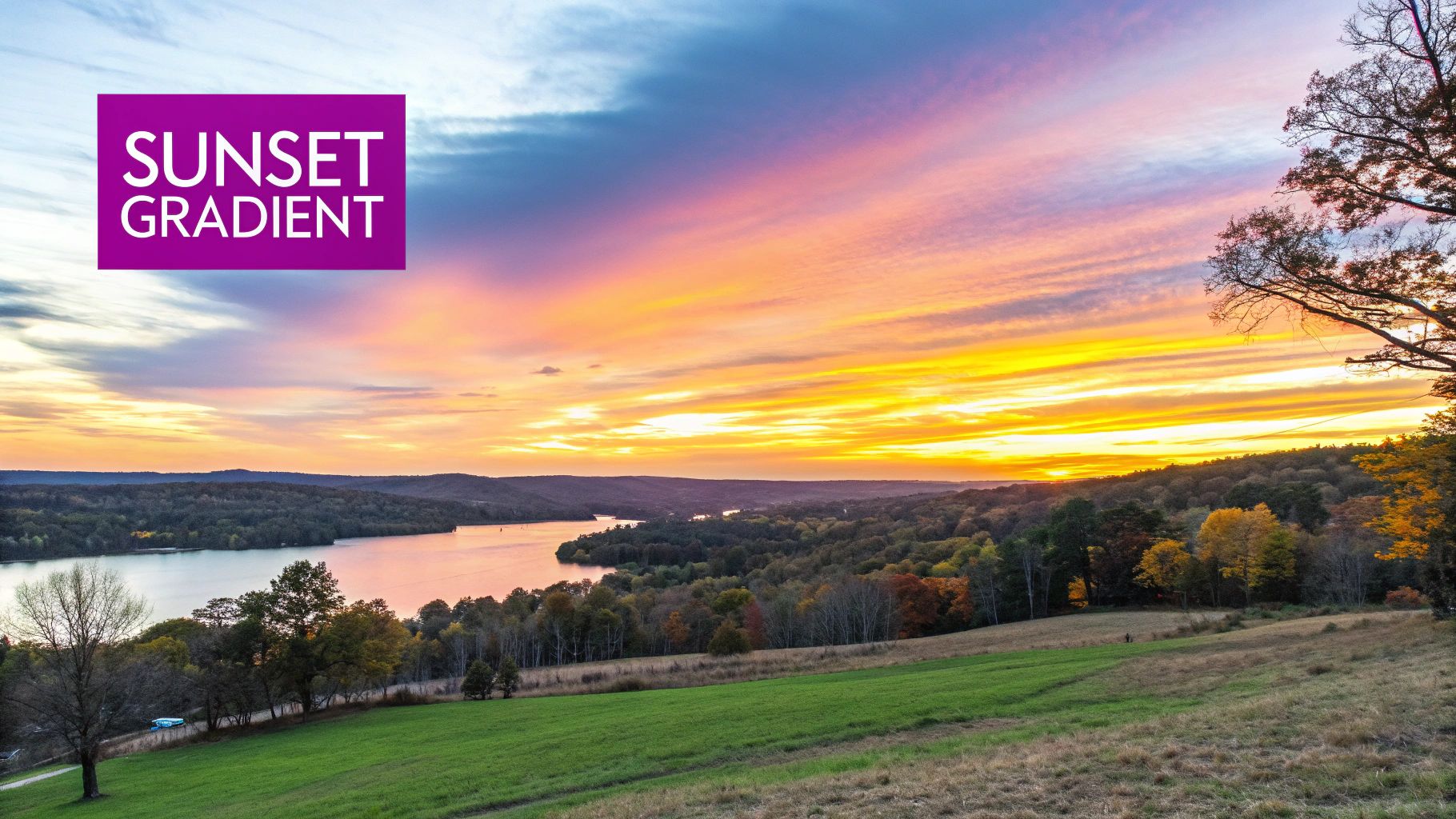
7. Sunset Gradient
Moving beyond the traditional earth tones, the Sunset Gradient palette captures the fleeting, magical moments of an autumn evening. It draws inspiration from the sky’s dramatic shift in color, blending fiery oranges with soft pinks and deep, dusky purples. This combination is one of the most modern fall color palettes, evoking a sense of energy, optimism, and contemporary style.
This palette's strength lies in its dynamic and emotional appeal, perfect for brands that want to feel fresh and vibrant. Social media influencers and digital design agencies often use these gradients to create visually arresting content that stands out in a crowded feed. It is an ideal choice for campaigns related to tech startups, modern lifestyle brands, and artistic events.
How to Use This Palette
The key to mastering this palette is managing its inherent vibrancy and ensuring smooth, believable transitions between colors. It works best when the gradient effect itself is a central design element.
- Embrace the Gradient: Use digital design tools to create smooth, seamless gradients for backgrounds, text overlays, or UI elements. The transition from a warm orange to a cool purple should feel natural and fluid, not abrupt.
- Balance with Neutrals: To prevent visual fatigue, frame these powerful gradients with clean, neutral backgrounds like charcoal gray or off-white. This allows the sunset colors to pop without overwhelming the entire design.
- Selective Application: If a full gradient feels too bold, use these colors selectively as accents. A pop of magenta or a soft pink highlight can add a modern twist to a more conventional fall design.
This dynamic palette is particularly effective in digital mediums where color transitions can be rendered flawlessly. For those looking to create similarly vibrant and unique visuals, you can explore powerful new tools and learn more about AI art generators. Leveraging a Sunset Gradient palette is a surefire way to give your fall-themed projects a contemporary and memorable edge.
9. Frosted Forest Dawn
Shifting away from the warmth of traditional autumn, the Frosted Forest Dawn palette captures the crisp, cool air of a late fall morning. This unique combination pairs the deep, muted teal of an evergreen forest with the soft, ethereal pinks and mauves of a sunrise filtering through morning mist. It is one of the more modern and sophisticated fall color palettes, offering a tranquil and refreshing alternative to the typical reds and oranges.
This palette’s appeal lies in its quiet elegance and unexpected pairing. It evokes a sense of calm, clarity, and renewal, making it a perfect choice for brands in the wellness, beauty, or high-end home goods sectors. Companies like Aveda or The White Company could leverage these colors to create a serene and luxurious atmosphere that feels both seasonal and timeless. It’s ideal for campaigns focused on self-care, mindfulness, and quiet moments of reflection.
How to Use This Palette
Success with this palette hinges on creating a sense of balance between the cool, dominant teal and the soft, warmer pinks. The contrast is what gives it a distinctive and memorable quality.
- Lead with Cool Tones: Use the deep, muted teal as your primary background (60%) to establish a calm and grounded foundation. This works exceptionally well for website heroes, social media templates, and packaging.
- Use Pinks as Highlights: Introduce dusty pink and soft mauve as secondary (30%) and accent (10%) colors. These warmer tones are perfect for call-to-action buttons, headline text, or delicate illustrative elements that pop against the cool backdrop.
- Lean into Minimalism: This palette shines in clean, minimalist designs. Pair these colors with ample white space, elegant serif fonts, and high-quality photography featuring soft lighting and natural elements like fog or dew-kissed foliage.
Comparison of 9 Fall Color Palettes
| Palette Name | Implementation Complexity | Resource Requirements | Expected Outcomes | Ideal Use Cases | Key Advantages |
|---|---|---|---|---|---|
| Classic Autumn Leaves | Moderate - traditional palette, easy to apply but requires color balance | Standard design tools and warm color selections | Warm, cozy, nostalgic atmosphere | Seasonal marketing, home decor, weddings, restaurant ambiance | Universally appealing, evokes warmth and comfort |
| Rustic Harvest | Moderate - requires layering textures and balancing muted tones | Natural materials, subtle color accents | Authentic, timeless, sophisticated feel | Interior design, artisanal branding, weddings, restaurants | Sophisticated, gender-neutral, works well with natural materials |
| Modern Minimalist Fall | High - demands skilled use of negative space and minimal color | Minimal palettes, high design precision | Clean, contemporary, adaptable designs | Corporate branding, digital interfaces, modern architecture | Clean, sophisticated, contemporary appeal |
| Jewel Tone Autumn | High - complex color balancing and premium material use | High-quality materials, metallic accents | Luxurious, dramatic, elegant ambiance | Luxury branding, evening events, high-end retail | Luxurious, dramatic impact, upscale applications |
| Warm Neutrals with Spice | Low to Moderate - easy palette, requires accent planning | Basic materials, warm neutrals with spice accents | Versatile, timeless, elegant | Professional environments, hospitality, residential interiors | Extremely versatile, safe for conservative settings |
| Moody Dark Autumn | Moderate to High - requires lighting balance and texture use | Deep color materials, layered textures | Intimate, cozy, sophisticated spaces | Entertainment venues, luxury retreats, fashion retail | Creates cozy atmosphere, sophisticated, hides wear well |
| Sunset Gradient | High - requires skill in gradients and color transitions | Digital tools preferred for gradients | Energetic, uplifting, modern vibe | Digital marketing, social media, modern hospitality, creative industries | Energetic, unique, great for digital applications |
From Palette to Project: Bringing Your Autumn Vision to Life
Choosing the perfect fall color palette is the foundational first step in crafting a memorable and effective seasonal narrative. As we have journeyed through this collection, it has become clear that autumn’s visual language is incredibly diverse. The spectrum extends far beyond the expected reds and oranges, offering a rich tapestry that includes the dramatic depth of jewel tones, the calming warmth of spiced neutrals, and the clean sophistication of minimalist hues.
Each palette presented in this guide is more than just a collection of colors; it is a powerful communication tool. It tells a distinct story, sets a specific mood, and can powerfully influence perception and guide user action. Whether you are a small business owner aiming to evoke a sense of cozy nostalgia or a social media manager for a luxury brand wanting to project elegance and exclusivity, the right colors are essential.
Key Takeaways for Effective Implementation
The central lesson is to move beyond simply what looks "autumnal" and instead select a palette that serves a strategic purpose. Your choice should be a deliberate intersection of three critical elements:
- Seasonal Appropriateness: The palette must clearly signal the fall season to resonate with your audience's expectations and create an immediate connection.
- Brand Alignment: The colors must feel authentic to your brand's identity. A playful, bright brand might struggle with a moody, dark palette, while a sophisticated brand could thrive with it.
- Project Goals: The palette should directly support the objective of your project, whether that's driving sales for a fall promotion, increasing engagement on social media, or creating educational materials that feel warm and inviting.
From Color Theory to Creative Execution
Once you have selected your ideal combination from the fall color palettes we have explored, the next crucial phase is implementation. This is where creative vision meets practical execution. The challenge often lies in translating your chosen hex codes into compelling, on-brand visual assets consistently and efficiently. Manually searching for stock photos or painstakingly creating graphics that perfectly match your Sunset Gradient or Rustic Harvest theme can consume valuable time and resources.
This is where modern creative technologies can revolutionize your workflow. Instead of the traditional, time-intensive process, AI-driven platforms can bridge the gap between concept and creation almost instantly. By providing your chosen palette and a simple descriptive prompt, you can generate hundreds of bespoke, high-quality images that are perfectly aligned with your vision. Imagine describing your goal as 'create a series of Instagram stories for a coffee shop using the Warm Neutrals with Spice palette' and receiving a batch of ready-to-use visuals in minutes. This integration of strategic color theory and powerful AI tools empowers you to execute your creative campaigns with unparalleled speed and brand consistency, ensuring every project beautifully captures the perfect essence of fall.
Ready to turn your chosen fall color palettes into a stunning visual campaign? Stop searching and start creating. With Bulk Image Generation, you can use your new palette and a simple prompt to generate hundreds of unique, on-brand images in seconds. Visit Bulk Image Generation to see how AI can bring your autumn vision to life with unprecedented speed and creativity.