
8 Inspiring Christmas Color Palette Ideas for 2025

Aarav Mehta • July 10, 2025
Discover 8 inspiring Christmas color palette ideas for 2025. From classic red and green to modern rose gold, find the perfect festive mood for your designs.
Christmas is a season of vibrant sensory experiences, and color is at the heart of its magic. While classic red and green evoke instant nostalgia, the modern holiday season embraces a much wider spectrum of hues. This guide is designed to move beyond the traditional and explore a curated collection of fresh, inspiring Christmas color palette options. Each one is crafted to create a specific mood and aesthetic, from cozy and rustic to elegant and modern.
This listicle provides more than just pretty colors. For each of the eight distinct palettes, we will break down the specific hex codes you can use immediately in your digital designs. We'll also provide actionable insights and practical application tips tailored for different uses.
Whether you're a digital marketer planning a holiday campaign, a small business owner styling product photos, or a creator developing festive content, you'll find a palette that speaks to your goals. You will learn how to effectively balance tones, use contrasting shades for impact, and incorporate textures to bring your festive vision to life. Let's explore the palettes that will define your holiday style this year.
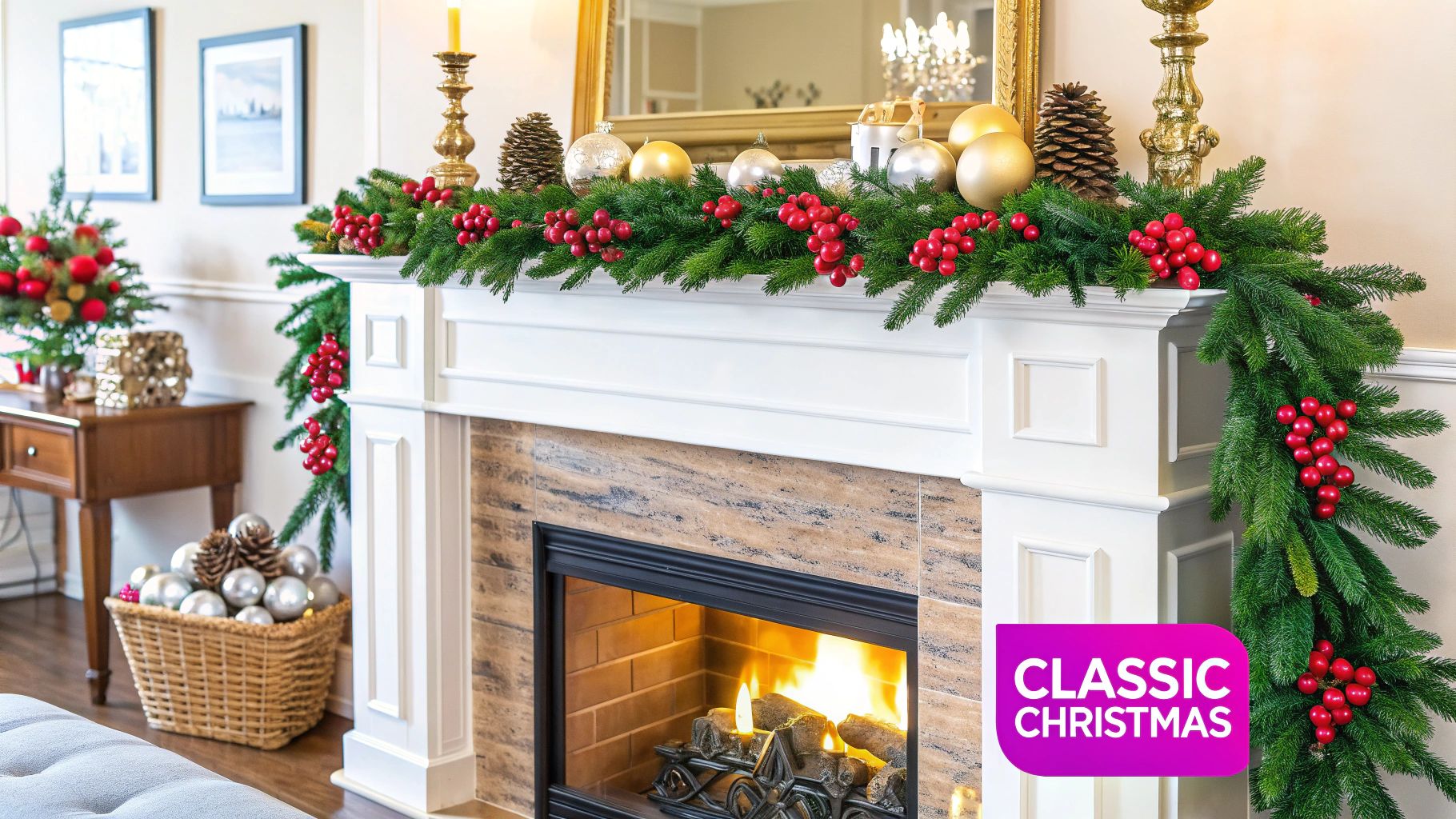
1. Traditional Christmas Red and Green
When you think of a classic Christmas, the first colors that likely come to mind are a rich, vibrant red and a deep, comforting green. This duo is the quintessential Christmas color palette, steeped in centuries of history and cultural significance. Its roots trace back to ancient traditions where evergreen plants like holly, ivy, and mistletoe were used to celebrate winter solstice festivals, symbolizing life and rebirth during the coldest, darkest days of the year.
The Victorians later popularized this combination, solidifying its place in holiday traditions. The deep green represents the eternal life of evergreen trees like fir and pine, while the bold red symbolizes the blood of Christ in Christian tradition, as well as the vibrant berries of the holly bush. This timeless pairing evokes feelings of warmth, nostalgia, and festive cheer, making it an enduring favorite for holiday branding and decor.
Color Palette Hex Codes
- Rudolph Red:
#C02324 - Forest Green:
#284924 - Winter White:
#F5F5F5 - Gold Accent:
#D4AF37 - Charcoal:
#36454F
How to Use This Palette Effectively
To prevent this classic Christmas color palette from feeling dated, focus on balance and texture. The high contrast between red and green can be overwhelming if not managed correctly.
- Introduce a Neutral Buffer: Use Winter White or a soft cream as your dominant background color. This allows the red and green to pop without clashing, creating a clean and sophisticated look.
- Add Metallic Elegance: Incorporate the Gold Accent in small doses for a touch of luxury. Think foil details on printed materials, metallic ornaments on a tree, or elegant ribbons on gift wrapping.
- Vary the Shades: Don’t stick to just one red and one green. Layering different tones, like a bright cherry red with a muted sage green, adds visual depth and a more modern feel.
- Incorporate Natural Textures: Ground the palette by pairing it with natural materials. Wooden elements, burlap ribbons, and pinecones can soften the bold colors and enhance the rustic, cozy atmosphere.
This palette is ideal for brands wanting to tap into feelings of tradition and nostalgia, such as retail stores creating holiday displays or social media managers crafting campaigns that evoke classic Christmas memories.
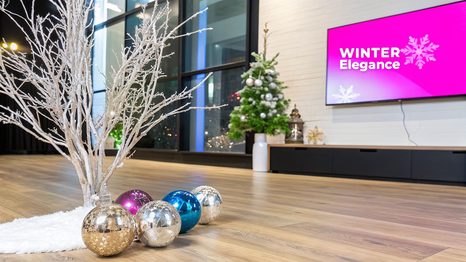
2. Winter Wonderland White and Silver
For an elegant and sophisticated take on holiday décor, the Winter Wonderland White and Silver palette captures the serene beauty of a frosty, snow-covered landscape. This largely monochromatic scheme moves away from bright, bold colors to create a clean, modern Christmas aesthetic. It emphasizes the peaceful and pristine aspects of winter, evoking feelings of calm, luxury, and chic festivity.
This palette is heavily influenced by Scandinavian design traditions and is often seen in high-end retail displays and contemporary homes. It swaps traditional warmth for a cool, crisp ambiance, perfect for creating a magical, light-filled space. The combination of glistening silver, soft whites, and cool grays mimics the way light reflects off fresh snow and ice, turning any environment into a serene seasonal escape. You can explore creating your own unique imagery with an AI stock image generator.
Color Palette Hex Codes
- Snowfall White:
#F9F9F9 - Shimmering Silver:
#C0C0C0 - Icy Blue:
#D6EAF8 - Pearl:
#EAE0D7 - Shadow Gray:
#8A9A9A
How to Use This Palette Effectively
The key to a successful white and silver christmas color palette is layering textures to prevent the look from feeling stark or cold.
- Vary Your Whites: Use multiple shades of white, from pure Snowfall White to creamier tones like Pearl. This adds depth and prevents the monochromatic scheme from looking flat.
- Play with Textures: Combine different materials to create visual interest. Mix soft elements like faux fur throws and wool knits with hard, reflective surfaces like mercury glass ornaments, silver glitter, and metallic accents.
- Incorporate Natural Elements: Bring in natural components like white-painted birch branches, frosted pinecones, and white winter berries. These add an organic touch that softens the palette’s cool tones.
- Use Warm Lighting: Counterbalance the cool colors with warm white string lights. The soft, golden glow will create a cozy and inviting atmosphere, making the silver and white elements sparkle beautifully.
This palette is ideal for luxury brands, modern interior designers, or anyone aiming for a refined and tranquil holiday theme. It excels in minimalist settings and provides a sophisticated backdrop for social media content and product photography.
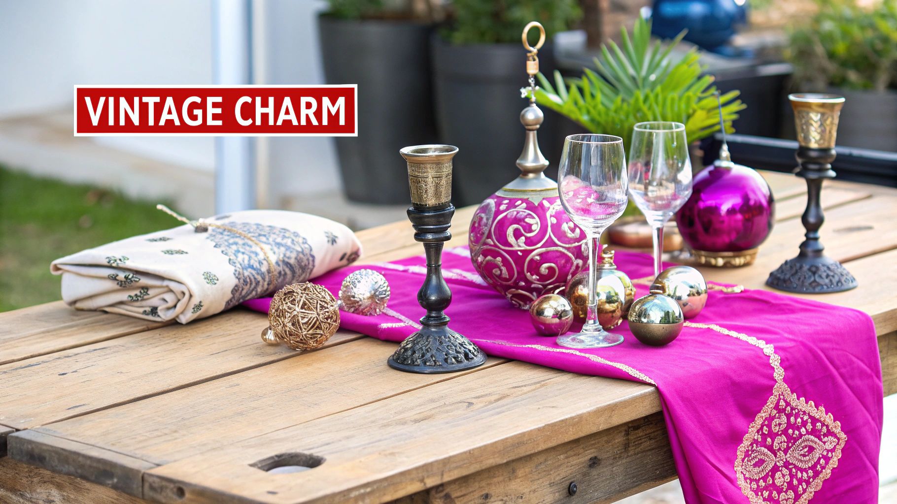
3. Rustic Christmas Burgundy and Gold
For a Christmas color palette that exudes warmth, luxury, and vintage charm, look no further than the sophisticated pairing of deep burgundy and lustrous gold. This rich combination moves away from the brighter reds of traditional decor, opting for a deeper, wine-toned hue that feels both opulent and cozy. It evokes the feeling of a grand, yet intimate, holiday gathering, reminiscent of Victorian-era celebrations or a festive dinner in an English country estate.
This palette’s strength lies in its ability to feel both traditional and luxurious. The deep burgundy offers a sense of comfort and history, while the shimmering gold adds a layer of celebratory elegance. It’s a combination that speaks of refined taste and timeless style, making it perfect for creating an upscale yet inviting atmosphere for the holiday season.
Color Palette Hex Codes
- Deep Burgundy:
#800020 - Antique Gold:
#C5B358 - Creamy Ivory:
#FFFDD0 - Evergreen Accent:
#054C46 - Warm Wood:
#7B3F00
How to Use This Palette Effectively
The key to mastering this palette is balancing its rich, dark tones to maintain a warm and welcoming feel rather than a heavy one.
- Let Burgundy Dominate: Use Deep Burgundy as your primary color in textiles like velvet ribbons, tablecloths, or plush ornaments. This creates a luxurious and cohesive foundation.
- Use Gold as an Accent: Apply Antique Gold sparingly to avoid overpowering the look. Use it for highlights like candle holders, cutlery, delicate patterns on stationery, or the star on the Christmas tree.
- Lighten with Neutrals: Introduce Creamy Ivory as a significant secondary color. Use it for backgrounds, dinnerware, or even floral arrangements to break up the darker tones and add brightness to the overall design.
- Incorporate Natural Elements: Ground the opulent colors by including Warm Wood tones and hints of Evergreen Accent. Wooden decorations, a rustic fireplace mantel, and fresh greenery will enhance the rustic, cozy feel and add textural depth.
This elegant christmas color palette is ideal for luxury brands, upscale restaurants creating their holiday menus, or anyone aiming for a sophisticated, heritage-inspired holiday theme that feels both grand and deeply personal.
4. Nordic Blue and White
For a Christmas color palette that feels serene, modern, and effortlessly chic, look no further than Nordic Blue and White. Inspired by the minimalist principles of Scandinavian design, this palette evokes the tranquil beauty of a frosty winter landscape under a clear sky. It moves away from traditional reds and greens, instead embracing a cool, calming aesthetic that embodies the Danish concept of hygge – a feeling of cozy contentment and well-being.
This combination draws from the natural elements of Nordic winters: the deep blues of frozen lakes and long nights, the crisp white of freshly fallen snow, and the soft greys of winter skies. Popularized by Scandinavian design movements and brands like IKEA, this palette offers a sophisticated and contemporary take on holiday decor, perfect for creating a peaceful and inviting atmosphere.
Color Palette Hex Codes
- Frosty White:
#F0F8FF - Ice Blue:
#A3D5E4 - Midnight Blue:
#003366 - Natural Wood:
#CDBA96 - Charcoal Gray:
#464646
How to Use This Palette Effectively
The key to mastering this cool-toned palette is to introduce warmth and texture, preventing it from feeling cold or sterile.
- Embrace Natural Elements: Ground the cool blues and white with the Natural Wood tone. Incorporate light-colored wood in furniture, decor accents like bead garlands, or even simple wooden star ornaments to add an organic, earthy feel.
- Layer Textures: Create a sense of hygge by layering soft and cozy textures. Think chunky wool knit blankets, faux fur pillows, felt ornaments, and linen tablecloths. These materials add physical and visual warmth that balances the cool color scheme.
- Vary the Blues: Use a spectrum of blues to create depth and interest. A dominant Ice Blue can be accented with the deep Midnight Blue for contrast, while a soft, dusky blue can serve as a gentle mid-tone.
- Incorporate Soft Lighting: Warm, soft lighting is essential. Use fairy lights with a warm yellow glow, candles, and dimmed lamps to create an inviting ambiance that counteracts the coolness of the blue and white.
This christmas color palette is ideal for brands aiming for a modern, minimalist, and sophisticated holiday presence. It works exceptionally well for home decor brands, lifestyle bloggers, and anyone wanting to project a sense of calm and contemporary elegance.
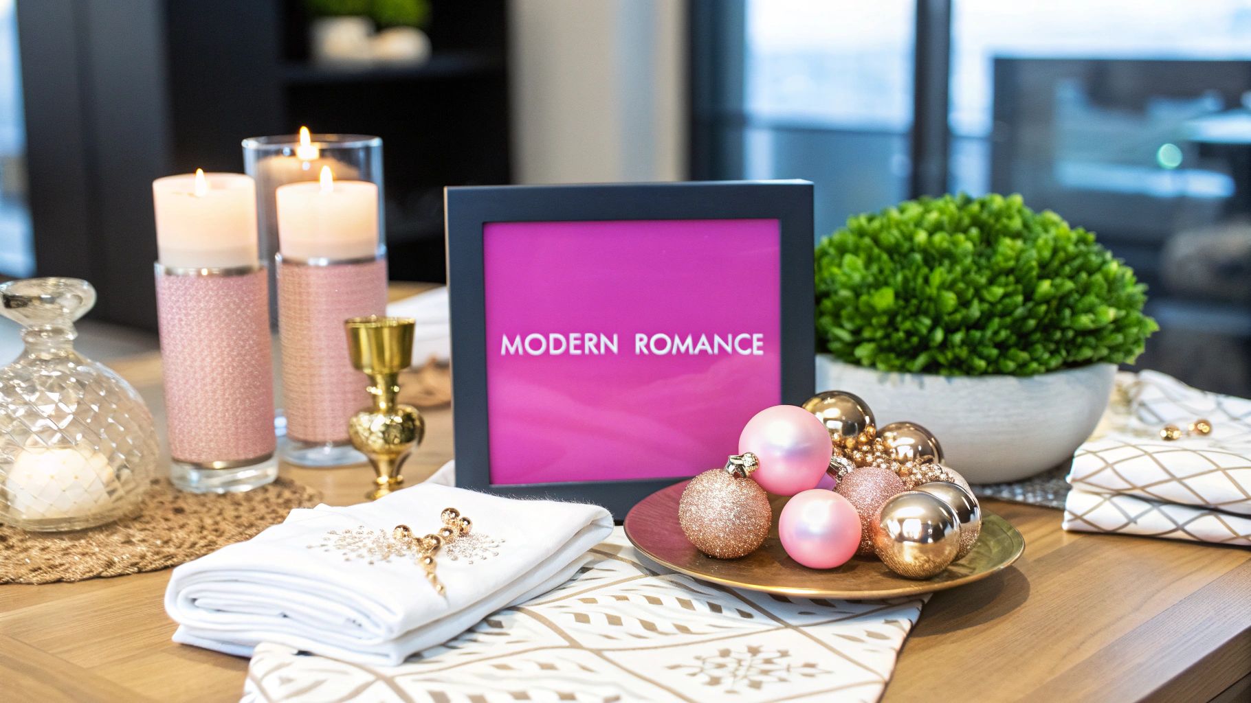
5. Rose Gold and Blush Pink
Moving away from tradition, this contemporary Christmas color palette offers a chic and romantic alternative. Rose gold and blush pink create a sophisticated and modern aesthetic that feels both festive and elegant. Popularized by social media influencers and contemporary home decor brands, this combination swaps out bold reds for soft, warm pinks and replaces traditional gold with the trendy, coppery tones of rose gold.
This palette evokes feelings of warmth, modern romance, and gentle festivity. It’s perfect for those looking to create a stylish, updated holiday atmosphere that is light, airy, and distinctly feminine. The combination shines in minimalist settings, where its subtle warmth can take center stage without overwhelming the space, proving that holiday cheer can be both soft and striking.
Color Palette Hex Codes
- Rose Gold:
#B76E79 - Blush Pink:
#F1D4D4 - Soft White:
#F9F6F1 - Champagne:
#F7E7CE - Dusty Rose:
#DCAE96
How to Use This Palette Effectively
The key to mastering this modern palette is subtlety and balance. It's about creating a soft glow rather than a burst of color.
- Lean on Neutrals: Use Soft White and Champagne as your base colors for walls, linens, or digital backgrounds. This allows the blush tones and metallic accents to provide warmth without making the space feel overly pink.
- Use Rose Gold as an Accent: Treat Rose Gold as a precious metal. Use it for key decorative pieces like candle holders, cutlery, ornament hooks, or delicate foil lettering on invitations. A little goes a long way in adding that touch of glamour.
- Layer Pink Tones: Combine Blush Pink with the deeper Dusty Rose to create visual interest and prevent the palette from feeling flat. Think layered ribbons, assorted ornaments, or varied throw pillows.
- Incorporate Soft Textures: Enhance the palette’s inherent warmth with soft, luxurious textures. Think faux fur blankets, velvet cushions, and frosted glass. These materials complement the soft colors and enhance the cozy, elegant feel.
This palette is ideal for modern brands, lifestyle bloggers, and boutiques aiming for a chic, on-trend holiday look. It's particularly effective for social media campaigns targeting a millennial audience. If you need inspiration for your designs, consider using an AI image prompt generator for artistic ideas to visualize unique combinations.
6. Forest Green and Copper
For those seeking an earthy, organic alternative to traditional holiday glamour, the pairing of deep forest green and warm, metallic copper offers a sophisticated and grounded aesthetic. This christmas color palette draws direct inspiration from nature, evoking the serene atmosphere of a winter woodland. The rich green mirrors the depths of evergreen forests, while the shimmering copper adds a touch of warmth reminiscent of a crackling fire or the autumn leaves that linger into winter.
This combination has gained popularity alongside the farmhouse and rustic decor movements, resonating with a desire for authenticity and a connection to the natural world. It moves away from overtly bright and cheerful themes to create a mood that is calm, elegant, and inviting. The palette feels both modern and timeless, perfect for creating a cozy and refined holiday environment that is deeply rooted in the beauty of the outdoors.
Color Palette Hex Codes
- Deep Forest Green:
#1A472A - Warm Copper:
#B87333 - Birch White:
#F6F4F1 - Rich Soil Brown:
#5C4033 - Soft Sage:
#B2AC88
How to Use This Palette Effectively
The key to mastering this palette is embracing texture and natural elements to enhance its organic feel. The understated elegance relies on layering rather than high-contrast statements.
- Make Green the Foundation: Use Deep Forest Green as the dominant color in your design. This could be through textiles like velvet tablecloths, painted accent walls, or prominent foliage in floral arrangements.
- Use Copper as a Highlight: The Warm Copper should be used for accents that catch the light. Think copper wire fairy lights, mule mugs for festive drinks, or metallic foil on holiday invitations. This creates warmth without overwhelming the serene mood.
- Incorporate Natural Textures: This palette shines when paired with natural materials. Introduce Rich Soil Brown through wooden furniture, burlap ribbons, pinecones, and leather details to ground the design and add rustic charm.
- Soften with Neutrals: Use Birch White and Soft Sage to create breathing room. These neutrals prevent the darker green and brown from feeling too heavy, adding a layer of airy sophistication to the overall look.
This christmas color palette is ideal for brands with an artisanal, natural, or eco-conscious identity. It works exceptionally well for farmhouse-style product photography, rustic event invitations, or social media content aimed at a sophisticated, nature-loving audience.
7. Purple and Silver Royal
For a Christmas aesthetic that exudes opulence and modern sophistication, a Purple and Silver Royal palette offers a stunning alternative to more traditional schemes. This combination trades rustic charm for regal elegance, pairing deep, majestic purple with the crisp, cool shimmer of silver. This pairing evokes a sense of luxury and celebration, making it perfect for formal events or high-end branding.
The historical association of purple with royalty, stemming from the rarity and cost of Tyrian purple dye in ancient times, gives this palette an inherent sense of prestige. When combined with silver, which represents moonlight and winter’s frost, the result is a sophisticated and magical Christmas color palette. It’s a choice that feels both contemporary and timeless, ideal for creating an atmosphere of festive grandeur and memorable elegance.
Color Palette Hex Codes
- Royal Purple:
#4B0082 - Shimmering Silver:
#C0C0C0 - Deep Amethyst:
#9966CC - Winter White:
#F5F5F5 - Charcoal Gray:
#36454F
How to Use This Palette Effectively
To master this luxurious palette, the key is to create balance between the rich, cool tones and ensure the overall feeling remains festive and inviting, not cold.
- Layer Shades of Purple: Use Royal Purple as your strong anchor, but incorporate lighter tones like Deep Amethyst to add dimension. This layering prevents the color from feeling flat and creates a richer visual experience.
- Use Silver as an Accent: Let Shimmering Silver catch the light. Use it for metallic ornaments, cutlery, embroidered details on linens, or foil accents on invitations. This adds sparkle without overwhelming the scene.
- Incorporate Rich Textures: Enhance the palette’s opulence with tactile materials. Think velvet ribbons, silk tablecloths, and frosted glass. Texture adds warmth and depth, preventing the cool tones from feeling stark.
- Brighten with White: Use Winter White generously as a neutral base for tablecloths, dishware, or digital backgrounds. This makes the purple and silver stand out and keeps the atmosphere bright and airy. When creating graphics, ensure your image assets are properly sized for each platform. For social media campaigns featuring this palette, you can explore the benefits of a bulk image resizer to maintain quality across different posts.
This palette is perfectly suited for luxury brands, formal holiday galas, or anyone wanting to create a chic, memorable Christmas setting that stands apart from the conventional.
8. Coastal Christmas Teal and Coral
Breaking away from winter frost and snow, the Coastal Christmas palette brings a wave of fresh, sea-inspired air to the holidays. This unconventional combination pairs the deep, tranquil tones of oceanic teal with the soft, warm glow of coral. It’s a modern and breezy take on festive decor, perfect for those celebrating in warmer climates or anyone looking to infuse their holiday with a unique, beachy vibe.
This aesthetic swaps pine trees for palm trees and snowflakes for seashells, creating a serene and relaxed atmosphere. Popularized by coastal lifestyle brands and resorts in tropical destinations, this Christmas color palette evokes the feeling of a holiday spent by the sea. The teal represents the calm, deep ocean, while the coral adds a touch of cheerful warmth, reminiscent of a winter sunset over the water.
Color Palette Hex Codes
- Ocean Teal:
#008080 - Warm Coral:
#FF7F50 - Sandy Beige:
#F4A460 - Seafoam Green:
#98FF98 - Driftwood Gray:
#A49A87
How to Use This Palette Effectively
To master this coastal Christmas color palette, the key is to create a light, airy feel while maintaining a sense of holiday coziness.
- Embrace Natural Textures: Ground the palette by incorporating elements from the shore. Use Driftwood Gray tones in ornaments, garlands made of seashells, and accents of rope or jute to enhance the nautical theme.
- Use White as a Canvas: A crisp white or off-white background is essential. It mimics the white sands of a beach and allows the Ocean Teal and Warm Coral to stand out without overwhelming the space.
- Layer with Lighter Tones: Introduce Sandy Beige and Seafoam Green to add depth and complexity. These softer shades act as complementary accents that round out the coastal look and prevent it from feeling too stark.
- Add Warm Lighting: Since this palette lacks traditional warm colors, use soft, warm-toned string lights. This simple addition creates a cozy and inviting ambiance, ensuring the space still feels festive and celebratory despite its non-traditional colors.
This palette is ideal for home decor retailers targeting coastal communities, travel agencies promoting holiday getaways, or any brand wanting to project a relaxed, modern, and unique holiday identity.
Christmas Color Palette Comparison of 8 Styles
| Palette Title | Implementation Complexity | Resource Requirements | Expected Outcomes | Ideal Use Cases | Key Advantages |
|---|---|---|---|---|---|
| Traditional Christmas Red and Green | Low to moderate | Easy to source common decorations | Warm, cozy, festive atmosphere | Classic homes, retail, traditional settings | Instantly recognizable, timeless, versatile |
| Winter Wonderland White and Silver | Moderate to high | Requires reflective/metallic items | Elegant, bright, spacious feel | Luxury hotels, modern minimalist décor | Sophisticated, photogenic, works with any décor |
| Rustic Christmas Burgundy and Gold | Moderate | Deep colors and gold accents needed | Rich, upscale, vintage charm | Victorian, upscale restaurants, traditional English | Luxurious look, complements wood/natural materials |
| Nordic Blue and White | Moderate | Various blue shades and natural elements | Calm, serene, minimalist atmosphere | Scandinavian markets, modern homes | Timeless, peaceful, non-traditional |
| Rose Gold and Blush Pink | Moderate | Warm metallics and blush tones required | Romantic, trendy, modern vibe | Boutique displays, influencer décor | Trendy, photogenic, complements modern décor |
| Forest Green and Copper | Moderate | Natural materials and copper accents | Warm, rustic, organic appeal | Farmhouse, rustic cabins, artisan fairs | Timeless, complements natural materials |
| Purple and Silver Royal | Moderate to high | Luxurious metallics and rich purples | Regal, elegant, unique display | Luxury hotels, formal events, art galleries | Distinctive, elegant, formal ambiance |
| Coastal Christmas Teal and Coral | Moderate | Coastal-themed items, teal & coral tones | Fresh, beachy, contemporary feel | Warm climates, coastal homes, tropical events | Unique, balanced warm/cool tones |
Bring Your Festive Vision to Life with Color
As we've journeyed through a spectrum of festive possibilities, it's clear that a Christmas color palette is far more than just a set of hues; it's the foundational language of your holiday story. Each combination we've explored, from the nostalgic comfort of Traditional Red and Green to the unexpected warmth of a Coastal Christmas, offers a distinct emotional and aesthetic impact. The power of color lies in its ability to instantly evoke feelings of joy, serenity, elegance, or rustic charm, setting the entire tone for your designs, decorations, or brand campaigns.
The key takeaway is that strategic color selection moves your projects from generic to memorable. It transforms a simple social media post into a thumb-stopping piece of art, a product package into a coveted gift, and a living room into a curated winter escape. Your choice of a palette is the first and most critical decision in crafting a cohesive and compelling holiday narrative that connects with your audience or family.
From Inspiration to Implementation
Translating these ideas into tangible results is the next exciting step. To truly master the art of combining colors effectively, it helps to go beyond simple pairing. To truly bring your festive vision to life with color and select palettes that resonate, delving into the foundational aspects of design, such as understanding color harmony and split complementary colors, can be incredibly beneficial. This knowledge empowers you to adapt, customize, and even create your own signature holiday palettes with confidence.
Here are some actionable steps to get started:
- Define Your Goal: Before choosing colors, clarify the mood you want to create. Are you aiming for sophisticated and modern (like Purple and Silver) or cozy and traditional (like Burgundy and Gold)?
- Create a Mood Board: Collect images, textures, and typography that align with your chosen palette. This visual reference will keep your project consistent and focused.
- Test on a Small Scale: Before committing to a full rebrand or large-scale project, apply your chosen Christmas color palette to a smaller asset. Create a test Instagram graphic, a sample product label, or a small decorative arrangement to see how the colors interact in a real-world context.
The Power of a Cohesive Visual Strategy
For small business owners, marketers, and branding agencies, consistency is paramount during the bustling holiday season. A well-defined Christmas color palette ensures that every touchpoint, from your website banner and email newsletters to your social media ads and in-store displays, reinforces the same festive message. This visual harmony builds brand recognition and creates a seamless, professional experience for your customers. It shows intentionality and a deep understanding of how design influences perception.
Ultimately, the palettes in this guide are not rigid rules but springboards for your own creativity. Feel free to mix elements, adjust shades, or introduce an unexpected accent color. The most impactful designs are often those that carry a personal touch. By thoughtfully selecting and applying a color scheme, you are not just decorating; you are designing an experience. You are crafting the visual backdrop for cherished memories, successful campaigns, and a truly beautiful holiday season.
Ready to create stunning, on-brand holiday visuals at scale? Bulk Image Generation can help you instantly produce hundreds of unique images based on your chosen Christmas color palette. Describe your concept, and let our AI bring your festive campaign to life in seconds. Try Bulk Image Generation today and make your holiday content creation effortless.