
8 Inspiring Holiday Color Palette Ideas for 2025

Aarav Mehta • July 11, 2025
Discover 8 inspiring holiday color palette ideas for your 2025 campaigns. Get hex codes, design tips, and inspiration for every festive occasion.
Colors do more than just decorate; they tell a story, evoke emotion, and create an atmosphere. Choosing the right holiday color palette is crucial for designers, marketers, and creators looking to capture the spirit of the season in their campaigns, printables, and products. A well-selected palette is a powerful tool, capable of instantly communicating a specific mood, from the cozy nostalgia of Christmas to the cool elegance of a winter wonderland.
This guide moves beyond the obvious, presenting a curated collection of 8 distinct and actionable color schemes. Each entry includes specific hex codes, practical application tips, and design inspiration tailored for maximum impact. To truly master festive color combinations, it helps to grasp the fundamental concepts of color theory. Understanding these principles will empower you to adapt, customize, and create your own unique palettes.
Whether you're crafting social media graphics, designing event decor, or developing product branding, the right colors provide a strategic foundation. We will explore combinations that range from timeless traditions like Kwanzaa and Hanukkah to modern minimalist aesthetics. This resource is designed to be your go-to reference for creating visually stunning and emotionally resonant holiday visuals that connect with your audience. Let's dive into the palettes that will define your festive projects.
1. Classic Christmas: Red, Green, and Gold
This quintessential holiday color palette is the bedrock of festive design, instantly signaling warmth, tradition, and celebration. Drawing from deep-rooted Victorian traditions and religious symbolism, the trio of rich red, deep green, and shimmering gold creates a sense of nostalgic comfort and luxury. Red evokes the holly berry and symbolizes love, green represents the eternal life of evergreen trees, and gold signifies divinity, light, and precious gifts. It’s a combination that feels both sacred and joyful, making it a powerful tool for any holiday campaign.

This palette’s effectiveness is proven by its long history of commercial success, from Coca-Cola's iconic holiday campaigns to the opulent window displays of luxury retailers like Harrods.
Palette Hex Codes
- Crimson Red:
#9B2226 - Forest Green:
#004B23 - Antique Gold:
#BB9457 - Creamy White:
#F8F7F4
Actionable Tips for Implementation
To prevent this classic holiday color palette from feeling dated, focus on modern application techniques. Balance is key; use one color as your dominant shade and the other two as accents.
- Modernize with Texture: Introduce depth by pairing a matte red with a high-gloss green or using a brushed gold effect instead of a pure metallic sheen. This contrast adds a contemporary, tactile quality.
- Incorporate Neutrals: Soften the palette’s intensity by integrating generous amounts of creamy white or light beige. This negative space allows the core colors to stand out without overwhelming the viewer.
- Use Gold Strategically: Reserve gold for key elements you want to highlight, such as call-to-action buttons, headline text, or elegant borders on a printable. Overusing it can cheapen the effect.
Key Insight: The power of this palette lies in its universal recognition. Use it when you need to create an immediate and unambiguous connection to the Christmas season, especially for campaigns targeting a broad, traditional audience.
2. Winter Wonderland: Ice Blue, Silver, and White
This sophisticated holiday color palette moves away from traditional warmth, capturing the serene and elegant beauty of a frost-covered landscape. It combines crisp whites, shimmering silvers, and a spectrum of cool blues to evoke the quiet magic of a fresh snowfall, glistening icicles, and clear winter skies. The result is a clean, modern, and peaceful aesthetic that feels both luxurious and tranquil, making it an excellent choice for New Year's events, high-end seasonal promotions, and winter-themed branding.

Its effectiveness is showcased by luxury brands like Tiffany & Co., whose iconic blue box becomes even more fitting during the holidays, and the global phenomenon of Disney's Frozen, which built an entire visual world on these cool tones.
Palette Hex Codes
- Ice Blue:
#A2D2FF - Glacial Silver:
#C9C9C9 - Midnight Blue:
#003049 - Crisp White:
#FDFDFF
Actionable Tips for Implementation
To prevent this palette from feeling overly cold or sterile, focus on creating depth and adding subtle touches of warmth through texture and light. This combination thrives on nuance and sophisticated execution.
- Introduce Natural Textures: Counterbalance the coolness by incorporating textures like soft faux fur, unbleached linen, or light-grained wood. These organic elements add a layer of cozy comfort that makes the palette more inviting.
- Play with Light and Sparkle: Use reflective surfaces to mimic the glimmer of ice. Incorporate glass, crystal accents, or holographic foil in your designs to catch the light and add a dynamic, magical quality to the otherwise calm palette.
- Layer Shades of Blue: Create visual interest and depth by using a range of blues, from a pale, almost-white powder blue to a deep, dramatic midnight blue. This tonal variation prevents the design from appearing flat. The distinct shades in this color scheme are also perfect for creating engaging winter-themed coloring pages.
Key Insight: This holiday color palette excels at creating an atmosphere of modern elegance and serene sophistication. Use it for campaigns targeting a discerning audience or for brands that want to project a calm, premium, and contemporary holiday image.
3. Hanukkah: Royal Blue, Silver, and White
This sophisticated holiday color palette moves away from traditional reds and greens to embrace the elegant and meaningful tones of Hanukkah. The combination of royal blue, shimmering silver, and crisp white is deeply rooted in Jewish tradition and symbolism. Royal blue and white are the central colors of the Israeli flag, representing divinity and purity, while silver evokes the precious metals of the menorah and other sacred temple objects. This trio creates an atmosphere of reverence, hope, and dignified celebration for the Festival of Lights.
This palette’s cultural significance is evident in Judaica store branding, synagogue decorations, and the packaging for specialty Hanukkah gifts. Its cool, refined aesthetic offers a distinguished alternative for seasonal campaigns.
Palette Hex Codes
- Royal Blue:
#0038A8 - Shimmering Silver:
#C0C0C0 - Pure White:
#FFFFFF - Deep Navy:
#00205B
Actionable Tips for Implementation
To honor this palette’s cultural weight, focus on elegance and symbolic representation. The key is to create a design that feels both modern and respectful of its deep heritage.
- Balance Blue with Light: Use royal blue as the strong, grounding base, but ensure generous use of white and silver to maintain a sense of light and space. This contrast is essential to prevent the design from feeling too heavy.
- Incorporate Symbolic Motifs: Integrate culturally significant elements like the Star of David, dreidels, or stylized flame motifs representing the menorah's candles. For those looking to create a more narrative design, you can explore the use of an AI Bible art generator to produce unique, thematic illustrations.
- Use Silver for Emphasis: Reserve silver for accents that you want to feel special and luminous. Use it for typography, elegant borders, or to highlight key imagery, mimicking the glint of light from a candle flame.
Key Insight: This holiday color palette is perfect for campaigns targeting Jewish communities or for brands wanting to present a more inclusive, diverse holiday message. Its power lies in its ability to communicate respect, tradition, and celebration with grace and sophistication.
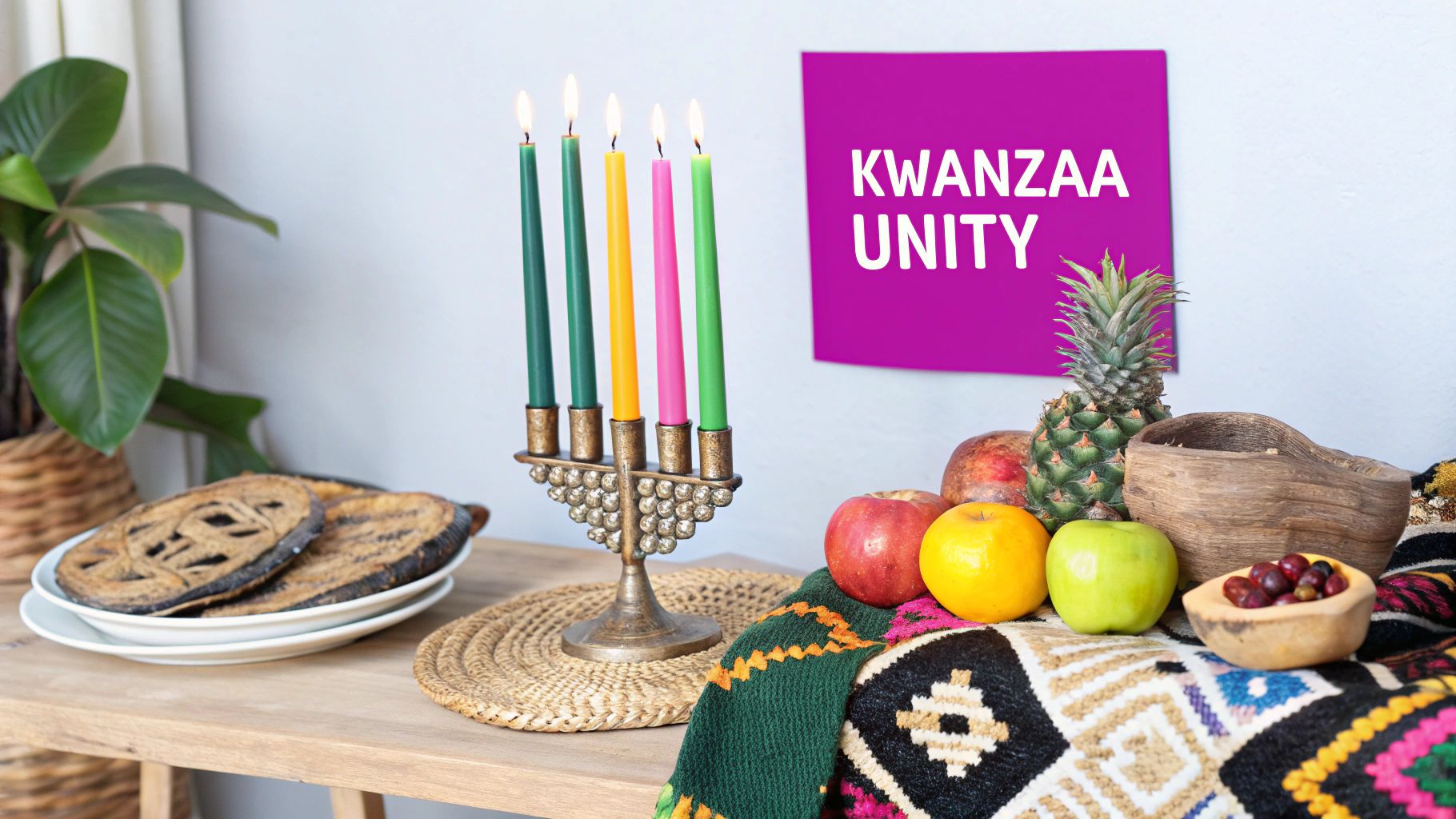
4. Kwanzaa: Red, Black, and Green
This powerful holiday color palette is rooted in the Pan-African movement and represents the cultural holiday of Kwanzaa. Established by Dr. Maulana Karenga in 1966, this combination is rich with symbolism and history. The bold red, black, and green are not just decorative; they are deeply meaningful. Red signifies the struggle and the blood shed by ancestors, black represents the people and their unity, and green symbolizes the land of Africa, hope, and the future. This trio is a celebration of African heritage, family, and community.

Its impact is seen in decorations for community celebrations, educational materials, and designs centered on the Kwanzaa kinara (candleholder). The palette immediately communicates cultural pride and the holiday's core principles.
Palette Hex Codes
- Symbolic Red:
#D70000 - Unity Black:
#000000 - Vibrant Green:
#00843D - Natural Wood Brown:
#8B5E34
Actionable Tips for Implementation
To honor the significance of this palette, focus on authentic and respectful application. The colors are strong, so thoughtful design is crucial for creating a balanced composition.
- Incorporate Natural Textures: Ground the bold colors by pairing them with natural materials. Think of warm wood tones, woven textiles like kente cloth, or rustic burlap textures. This adds warmth and authenticity.
- Use Symbolic Patterns: Integrate traditional African patterns and motifs into your design. These can be used as subtle backgrounds, borders, or accents to reinforce the cultural message without overwhelming the core colors.
- Balance with Neutrals: Use a neutral background, such as a soft cream or earthy tan, to make the red, black, and green pop. This negative space ensures the design feels intentional and not overly dense. Include symbols like corn (mazao) and the unity cup (kikombe cha umoja) to tell a richer story.
Key Insight: This holiday color palette is ideal for campaigns and designs that aim to connect authentically with the African diaspora and celebrate Kwanzaa. Its strength lies in its deep cultural meaning, making it perfect for educational content, community event promotions, and brands honoring cultural heritage.
5. Modern Minimalist: Sage Green, Cream, and Natural Wood
Moving away from bold, traditional hues, this holiday color palette offers a contemporary and calming alternative. It champions an ethos of quiet sophistication, drawing inspiration from Scandinavian design and the natural world. The combination of muted sage green, warm cream, and organic wood tones creates a serene and mindful holiday atmosphere. This palette reflects a modern desire for sustainability, wellness, and understated elegance, making it feel both fresh and timeless.
Its popularity is evident in the curated holiday collections of brands like West Elm and CB2, as well as the influential aesthetic of Magnolia by Joanna Gaines, all of whom leverage these tones to create a peaceful and sophisticated festive feel.
Palette Hex Codes
- Sage Green:
#B2BBA3 - Warm Cream:
#F5F1E7 - Wood Brown:
#8A6744 - Charcoal Gray:
#4A4A4A
Actionable Tips for Implementation
To successfully execute this minimalist holiday color palette, the focus should be on texture and subtle layering. The goal is to build a cozy, inviting environment without visual clutter.
- Embrace Natural Textures: Incorporate materials like unfinished wood, raw linen, chunky wool knits, and ceramic with a matte finish. These tactile elements prevent the muted palette from feeling flat and add organic warmth.
- Leverage Greenery: Use real or high-quality faux greenery, such as eucalyptus, olive branches, and simple pine sprigs, as central design elements. This reinforces the connection to nature and provides a gentle, living splash of color.
- Introduce Warm Lighting: Enhance the cozy, hygge-inspired feeling with soft, warm lighting. Think candlelight, fairy lights with a warm-white glow, and lamps with fabric shades to create an intimate and welcoming ambiance.
Key Insight: This palette is ideal for brands and campaigns targeting a design-conscious audience that values mindfulness, sustainability, and modern aesthetics. Use it to convey a sense of calm, authenticity, and sophisticated restraint in your holiday messaging.
6. Thanksgiving Harvest: Burnt Orange, Deep Red, and Golden Yellow
This warm, earthy palette captures the essence of autumn celebrations, evoking feelings of gratitude, abundance, and cozy gatherings. The combination of burnt orange, deep red, and golden yellow mirrors the natural beauty of the harvest season, from the changing leaves to the bountiful produce like pumpkins, apples, and corn. This holiday color palette is less about overt festivity and more about creating an atmosphere of rustic comfort and heartfelt connection.
Its effectiveness is showcased in the seasonal styling of brands like Pottery Barn and the warm, inviting food photography seen on the Food Network. The palette creates a strong sense of place and time, immediately grounding any design in the heart of autumn.
Palette Hex Codes
- Burnt Orange:
#CC5803 - Deep Red:
#800F2F - Golden Yellow:
#FFB600 - Warm Brown:
#5F4842
Actionable Tips for Implementation
To make this palette feel rich and inviting rather than flat, focus on layering and texture. The goal is to build a design that feels as warm and welcoming as a Thanksgiving feast.
- Layer with Textures: Combine these colors with natural textures to enhance their earthy feel. Think of incorporating digital patterns that mimic burlap, raw wood grain, or soft-woven fabrics. This tactile approach adds depth and authenticity.
- Introduce Natural Elements: Integrate imagery of gourds, wheat sheaves, dried leaves, or acorns into your designs. These elements reinforce the harvest theme and add organic shapes that break up more structured layouts.
- Add Metallic Accents: Introduce a pop of metallic copper or brushed bronze for a touch of elegance. Use it for typography, icons, or subtle borders to elevate the palette without losing its rustic charm.
- Enhance with Warm Lighting: In digital designs, use soft gradients and warm-toned overlays to simulate the glow of candlelight. This technique enhances the palette’s inherent warmth and creates a cozy, intimate mood.
Key Insight: This palette excels at creating an emotional connection based on comfort and gratitude. Use it for campaigns focused on family, community, and seasonal promotions in the fall, particularly for industries like home goods, food and beverage, and event planning.
7. Valentine's Romance: Blush Pink, Rose Gold, and Cream
This sophisticated holiday color palette reimagines Valentine's Day, shifting away from the traditional bold red and hot pink to embrace a more mature and elegant aesthetic. The combination of soft blush, warm cream, and shimmering rose gold creates a sense of modern romance and understated luxury. It speaks to contemporary sensibilities, evoking feelings of gentle affection, tenderness, and high-end charm, making it perfect for brands targeting a discerning adult audience.
This palette’s success is visible in the marketing of luxury goods, from high-end chocolate and jewelry packaging to the decor of upscale restaurants offering Valentine's packages. It has been widely popularized by wedding industry trends and high-end hospitality brands that aim for an atmosphere of refined romance.
Palette Hex Codes
- Blush Pink:
#F1C2C2 - Rose Gold:
#D9A59A - Warm Cream:
#F5EFE6 - Charcoal Gray:
#4E4E4E
Actionable Tips for Implementation
To maximize this palette’s sophisticated feel, focus on texture and balance. The goal is to create an environment that feels inviting and special, not juvenile.
- Introduce Tactile Textures: Combine different finishes to add depth and interest. Pair a matte blush with a metallic rose gold foil or use a soft, velvety texture for cream-colored backgrounds. This sensory contrast elevates the overall design.
- Incorporate a Dark Neutral: Ground the soft, light colors with a touch of charcoal gray or deep brown. Use this anchoring color for text, fine lines, or subtle structural elements to provide contrast and improve readability without overpowering the delicate tones.
- Balance with Structured Elements: Prevent the palette from feeling overly soft by incorporating clean lines and strong geometric shapes. This structure provides a modern edge that complements the romantic colors, as seen in minimalist packaging or sleek web design layouts. You can discover AI-generated images for Valentine's Day to see this principle in action.
Key Insight: This modern Valentine's holiday color palette is ideal for appealing to an audience that values subtlety and elegance over loud declarations. Use it for premium products, exclusive events, or any campaign where the desired tone is sophisticated romance rather than playful flirtation.
8. Halloween Gothic: Deep Purple, Black, and Metallic Silver
This sophisticated holiday color palette moves beyond the typical orange and black to create an atmosphere of dark elegance and mystique. It elevates traditional Halloween themes by blending deep, velvety purple with absolute black and the sharp glint of metallic silver. Drawing inspiration from gothic architecture, Victorian mourning attire, and the dramatic flair of cinematic horror, this trio crafts a mood that is both spooky and incredibly chic. It appeals to an adult audience looking for a more refined and dramatic take on Halloween festivities.
This aesthetic has been popularized by the Tim Burton-esque style and is frequently seen in upscale Halloween parties, luxury retail displays, and adult-oriented haunted attractions that prioritize atmosphere over jump scares.
Palette Hex Codes
- Deep Amethyst:
#311432 - Onyx Black:
#0B0B0B - Polished Silver:
#C0C0C0 - Ghostly White:
#EAEAEA
Actionable Tips for Implementation
To harness the power of this gothic palette, focus on creating dramatic contrast and employing rich textures. The goal is to build an immersive, moody environment.
- Embrace Textural Contrast: Combine materials to add depth and tactile interest. Pair the matte finish of black with the sheen of deep purple velvet or satin. Introduce lace overlays or damask patterns to enhance the gothic, historical feel.
- Use Silver as a Highlight: Let black and purple establish the dominant dark mood, and use metallic silver strategically to catch the light. Apply it to delicate filigree, elegant typography, or as accents on packaging to create points of focus.
- Incorporate Dramatic Lighting: This palette thrives in low-light conditions. Use candlelight, purple uplighting, or focused spotlights to make the silver elements sparkle and to cast intriguing shadows, enhancing the overall sense of mystery.
Key Insight: This holiday color palette is perfect for targeting an adult demographic that appreciates sophistication and drama. Use it for high-end events, exclusive product launches, or any campaign aiming for an elegant, moody, and unforgettable Halloween experience.
Holiday Color Palette Comparison of 8 Themes
| Palette Name | Implementation Complexity | Resource Requirements | Expected Outcomes | Ideal Use Cases | Key Advantages |
|---|---|---|---|---|---|
| Classic Christmas: Red, Green, and Gold | Moderate | Common materials; metallics needed | Warm, nostalgic, timeless holiday look | Traditional decorations, retail, family events | Instantly recognizable; versatile use |
| Winter Wonderland: Ice Blue, Silver, and White | Moderate | Metallic accents, cool lighting | Sophisticated, peaceful, modern winter vibe | Winter holidays, New Year events | Elegant; culturally neutral; modern look |
| Hanukkah: Royal Blue, Silver, and White | Moderate | Specific cultural elements | Dignified, spiritual, culturally meaningful | Hanukkah celebrations, Judaica design | Deep cultural significance; elegant |
| Kwanzaa: Red, Black, and Green | Moderate | Bold colors, natural materials | Bold, striking, culturally rich atmosphere | Kwanzaa events, cultural centers | Strong cultural symbolism; educational |
| Modern Minimalist: Sage Green, Cream, and Natural Wood | Low | Natural materials, simple decor | Calm, eco-friendly, contemporary feeling | Sustainable living, modern homes | Trendy; sustainable; versatile |
| Thanksgiving Harvest: Burnt Orange, Deep Red, and Golden Yellow | Low to Moderate | Earthy materials, layered textures | Warm, cozy, autumnal | Thanksgiving, fall events | Warmth; strong seasonal connection |
| Valentine's Romance: Blush Pink, Rose Gold, and Cream | Moderate | Metallics, floral accents | Soft, romantic, sophisticated ambiance | Valentine’s Day, weddings, luxury | Sophisticated; modern adult appeal |
| Halloween Gothic: Deep Purple, Black, and Metallic Silver | Moderate | Dark fabrics, metallic accents | Dramatic, mysterious, gothic elegance | Adult Halloween, luxury events | Sophisticated; dramatic; distinctive |
Bringing Your Vision to Life with the Right Palette
The journey through the world of holiday color palettes reveals a fundamental truth: color is the emotional and narrative cornerstone of seasonal design. We've explored a wide spectrum, from the traditional warmth of Classic Christmas reds and greens to the cool, crisp elegance of a Winter Wonderland. We delved into the deep cultural significance of the Kwanzaa and Hanukkah palettes and ventured into modern aesthetics with the earthy, calming tones of a Minimalist holiday. Each combination offers a unique language to communicate a specific feeling, tradition, or brand identity.
Your choice of a holiday color palette is more than just a decorative decision; it's a strategic tool. It sets the tone for your marketing campaigns, informs the atmosphere of your retail space, and guides the creation of everything from social media graphics to printable gift tags. The right palette ensures consistency, strengthens brand recall, and creates an immersive experience that resonates deeply with your audience.
From Palette Selection to Practical Application
Transforming a set of hex codes into compelling visuals is where your creative strategy truly comes to life. The key takeaway is that a palette is a flexible framework, not a rigid rule. The most successful designs often come from thoughtful application and a willingness to experiment within your chosen color scheme.
Here are some actionable next steps to put these concepts into practice:
- Audit Your Existing Assets: Before launching a new campaign, review your brand's current visual identity. How can you integrate a seasonal palette without losing your core brand recognition? Sometimes, a subtle nod with one or two new accent colors is more effective than a complete overhaul.
- Develop a Style Guide: For each holiday campaign, create a mini style guide. Define the primary, secondary, and accent colors from your chosen holiday color palette. Specify rules for their usage, such as which color to use for headlines, backgrounds, or call-to-action buttons. This ensures consistency across all your marketing channels.
- Experiment with Ratios: Don't feel obligated to use every color in a palette in equal measure. A design using 70% Winter Wonderland white, 20% ice blue, and 10% silver will feel vastly different from one that reverses those ratios. Play with dominance and accents to achieve the perfect mood.
- Leverage Technology: To effectively apply your chosen holiday colors, consider leveraging specialized graphic design tools that can help bring your visual concepts to life. These platforms provide the features needed to manipulate colors, create layouts, and produce high-quality assets efficiently.
Ultimately, mastering the art of the holiday color palette gives you the power to craft a memorable and emotionally resonant experience. It allows you to connect with your audience on a deeper level, moving beyond simple transactions to create lasting seasonal impressions. Embrace these palettes as your starting point, and don't be afraid to infuse them with your unique creative spark.
Ready to turn your chosen holiday color palette into a stunning collection of visuals? Bulk Image Generation makes it easy. Simply describe your desired scene and color scheme, and our AI will generate hundreds of unique, on-brand images in minutes, helping you scale your content creation for a beautiful and efficient holiday season. Start creating with Bulk Image Generation today!