
Mastering Display Resolution Change on Any Device

Aarav Mehta • January 12, 2026
Tackle any display resolution change with confidence. Our guide covers Windows, macOS, and mobile, plus how to troubleshoot common issues and optimize images.
Ever stared at a blurry logo or had to scroll sideways to read text on a website? That’s a display resolution mismatch in the wild. Getting your visuals right isn't a one-size-fits-all game anymore—it’s about making sure your content looks sharp and professional on every single screen your audience uses.
Why Screen Resolution Still Matters
In a world overflowing with screen sizes—from massive 4K monitors to tiny smartphone displays—understanding resolution is non-negotiable for anyone creating digital content. This goes way beyond a technical chat about pixels. It directly impacts user experience, how people perceive your brand, and ultimately, your bottom line. When your visuals look stretched, pixelated, or just plain wrong, it can make an otherwise polished brand feel amateurish.
The biggest headache is the sheer diversity of devices. A single image you create might get viewed on a high-density laptop, a vertical mobile screen, and a sprawling desktop monitor all in the same day. Each one has a different pixel count crammed into its display, demanding visuals that can adapt on the fly without tanking in quality.
The Fragmented Device Landscape
If you look at the data, it’s crystal clear: there is no single "standard" screen size. The chart below gives you a snapshot of just how varied the resolution landscape is, with everything from modern high-res displays to older monitors still in the mix.
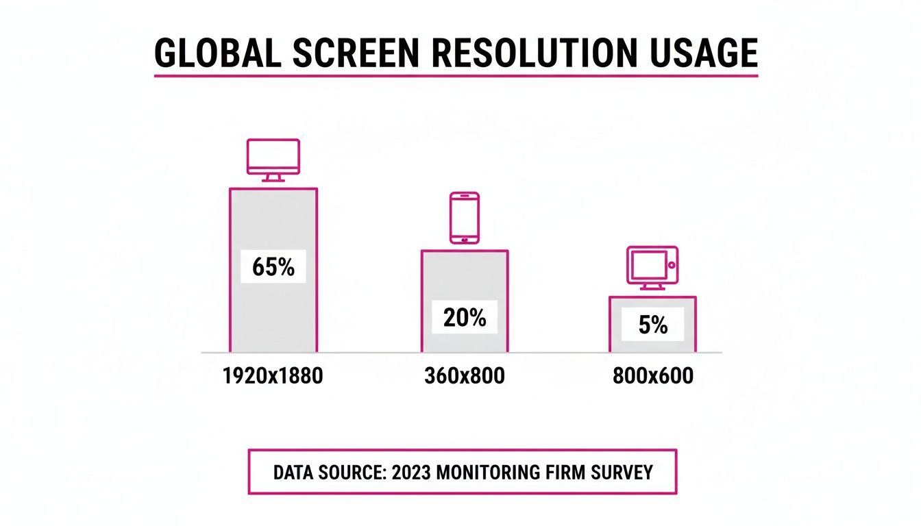
This fragmentation isn't going away. By late 2025, global display resolution stats show a wildly mixed bag. You've got 1920×1080 holding 8.43% of the market, the common mobile resolution of 360×800 at 6.6%, and even ancient resolutions like 800×600 clinging to a 3.25% share.
These numbers scream one thing: adaptive imaging is a must-have, especially for anyone creating content in bulk. You can’t just design for your own screen and call it a day. For a deeper dive, you can check out more on global display resolution statistics and what they mean for creators.
To make sense of it all, here’s a quick rundown of common resolutions and where you'll typically find them. This can help you prioritize which screen sizes to focus on when you’re preparing your assets.
Common Display Resolutions and Their Primary Use Cases
| Resolution (Pixels) | Common Name | Typical Devices | Market Share Snapshot |
|---|---|---|---|
| 1920×1080 | Full HD (1080p) | Desktops, Laptops, TVs | The most common desktop resolution, but its dominance is waning. |
| 1366×768 | HD | Older Laptops, Budget Monitors | Still surprisingly prevalent, a key target for compatibility. |
| 2560×1440 | QHD / 2K | Gaming Monitors, High-End Laptops | A growing standard for premium desktop experiences. |
| 3840×2160 | 4K / UHD | High-End Monitors, Modern TVs | The benchmark for ultra-high-definition content. |
| 360×800 | Mobile Portrait | Many Android Smartphones | A major slice of the mobile web traffic pie. |
| 414×896 | Mobile Portrait | Larger iPhones | Represents a significant portion of the iOS user base. |
As you can see, the range is huge. From legacy hardware to the latest 4K screens, your content needs to perform everywhere.
The goal isn't just to make an image fit. It’s to ensure the message stays clear, the quality holds up, and the user has a great experience, no matter what device they’re on.
For marketers, designers, and content creators, getting a handle on display resolution is no longer just a technical skill—it’s a core competency. It's fundamental to maintaining brand consistency and delivering a professional impression at every digital touchpoint. The only way to win is with a proactive approach: start with high-quality source files and use smart tools for resizing and batch processing. That's the key to success.
How to Tinker With Your Display Resolution
Messing with your screen resolution is one of the oldest tricks in the book for changing how much stuff you can see on your display. Whether you're a multi-tasker trying to squeeze more windows onto the screen or just want to make text a bit bigger and easier on the eyes, a quick resolution change is usually the ticket. The exact steps differ a bit depending on your operating system, but the general idea is always the same.
Before you start clicking around, there's one key concept you absolutely need to know: native resolution. This is the one, true resolution of your screen—the exact number of physical pixels it has. For the crispest, sharpest image possible, you almost always want to stick with this setting. When you pick something else, your computer has to do some guesswork to map the pixels, and that usually leads to a bit of blurriness.
Making the Change on Windows
For anyone running Windows 11, adjusting the display resolution is a piece of cake. The OS is pretty smart and usually points you right to the best setting for your monitor.
- Find an empty spot on your desktop, right-click, and choose Display settings.
- If you prefer the long way, you can go through the Start Menu to Settings > System > Display.
- Look for the "Scale & layout" section, where you'll find the Display resolution dropdown.
- Your monitor's native resolution will be conveniently labeled as (Recommended). Feel free to click the dropdown and pick another option to see what happens.
Don't panic if your screen goes black or looks funky. Windows gives you a 15-second preview before it automatically switches back. If you don't like the change, just wait it out.
Here's a pro tip: think about resolution and scaling together. If everything looks too small at the native resolution, try bumping up the Scale percentage first. This keeps your image perfectly sharp while making text and icons bigger.
Adjusting Resolution on macOS
Apple takes a slightly different path with macOS, hiding the raw pixel counts behind more user-friendly language. On their Retina displays, the whole game is about clarity and readability.
To get to the settings on a Mac:
- Click the Apple menu in the top-left corner.
- Head into System Settings (or System Preferences if you're on an older version).
- Find and click on Displays.
Instead of a long menu of resolutions like 1920x1080, you'll see options like "Larger Text" or "More Space." Choosing "More Space" is basically the same as increasing the resolution—it lets you see more on the screen at once. If you really want to see the specific pixel counts, you might have to right-click an option and select "Show list" or dig around for an advanced display mode.
Navigating Linux Distributions
Linux is all about choice, which is great, but it also means the steps to change your display resolution can be different depending on your setup. Luckily, most modern desktop environments like GNOME (which Ubuntu uses) or KDE have simple, graphical tools that feel familiar.
If you're an Ubuntu user, the process will feel a lot like Windows:
- Open up Settings.
- Go to the Displays panel.
- You'll see a Resolution dropdown menu where you can pick your new setting.
This kind of cross-platform consistency is great, but it's worth remembering why these settings are so crucial in the first place. Back in the early 2010s, the rise of the 1366×768 resolution on budget laptops was a huge deal. It quickly pushed out the old 1024×768 standard and, at its peak, captured over 27% of the market share. For web designers and content creators, this was a nightmare. Visuals designed for one standard suddenly looked stretched or fuzzy on nearly a third of new devices, driving home just how jarring a resolution mismatch can be. You can learn more about the wild evolution of screen resolutions and its impact.
What About Mobile Devices?
When it comes to your smartphone or tablet, whether it's iOS or Android, you generally can't just change the display resolution. These devices are meticulously calibrated to their native resolutions to give you the best performance and battery life. For designers and developers, this means you can't rely on users changing their settings. You have to create visuals that are responsive and look sharp on a massive range of fixed mobile resolutions, from the smallest phones to the biggest tablets.
Fixing Common Display Resolution Problems
Changing your display resolution only to get a black screen or blurry text feels like you’ve taken a step backward. It’s a classic frustration, but the good news is you don’t need to be a tech wizard to fix it. Most of these problems are pretty straightforward.
Think of it as a simple miscommunication between your computer and your monitor. Your goal is to get them speaking the same language again. Whether it's distorted images or fuzzy fonts, there's almost always a solution built right into your operating system.
The Dreaded Black Screen Scenario
One of the most jarring things that can happen after changing your resolution is the "no signal" message or a totally black screen. This usually means you’ve picked a resolution or refresh rate your monitor just can't handle. Your PC is sending out a signal, but your display has no idea what to do with it.
To fix this, you just need to revert to a setting that works. The most reliable way is to boot into Safe Mode.
- For Windows: Restart your computer and start tapping the F8 or Shift key during startup. This gets you to the Advanced Startup Options menu, where you can select "Enable low-resolution video" or just enter Safe Mode, which forces a basic, universally-accepted resolution.
- For macOS: Restart your Mac and hold down the Shift key as it boots. This will kick it into Safe Mode, which also defaults to a standard resolution. From there, you can get back into your Display settings and fix the problem.
Once you’re in, you can choose your monitor's recommended native resolution and get back to normal.
The key is not to panic. Safe Mode is your safety net, designed specifically for situations like this. It bypasses the problematic settings and gives you a clear path to fix the display resolution change.
Tackling Blurry Text and Stretched Images
Sometimes, your new resolution technically works, but everything just looks awful. Text might seem fuzzy and hard to read, or images and icons get stretched out of shape, as if someone pulled them sideways.
This blurriness is almost always a side effect of not using your monitor’s native resolution. When the resolution you set doesn't perfectly match the physical pixels on the screen, your system has to guess how to fill in the gaps, which kills the sharpness. If you absolutely have to use a non-native resolution, try enabling your OS's text-smoothing tools, like ClearType in Windows, to make things more readable.
Stretched images are a dead giveaway of an incorrect aspect ratio. This was a massive headache back in the day. In the early 2000s, the 800×600 resolution had a 56% market share, defining the old 4:3 "boxy" screen era. As the world moved to widescreen 16:9 displays, everyone had to adapt their visuals to avoid that distorted look—a problem that modern tools now solve automatically. You can learn more about how screen resolutions have evolved over time.
To fix this today, just make sure the resolution you choose matches your monitor's native aspect ratio. If you're creating visuals that end up looking stretched on different screens, your best bet is to use a bulk image resizer to prep your assets for different aspect ratios from the get-go.
Creating Visuals That Work on Any Screen
Instead of just fixing problems after a display resolution change, the real secret is to build visuals that are designed to adapt from the get-go. This forward-thinking approach saves you from endless troubleshooting down the line and makes sure your brand looks sharp and professional, no matter what device a customer is using.
The whole strategy is built on one simple rule: always start with the highest resolution source image you can get your hands on. It’s way easier to shrink a large, crisp image without losing quality than it is to try and blow up a small, pixelated one. Trying to enlarge a low-res image is like zooming in on an old printed photo—it just turns into a blurry, unusable mess.
A Real-World Marketing Scenario
Let's say you're a social media manager launching a new product campaign. You need a ton of amazing visuals for different platforms, and each one has its own quirky size requirements. Your design team just sent over a folder of beautiful, high-resolution product shots. Great.
Now, the grind begins. You need to prep assets for a few key spots:
- Instagram Post: A perfect square, usually 1080x1080 pixels.
- Facebook Ad: A landscape image, often around 1200x628 pixels.
- Website Banner: A wide, cinematic header at 1920x1080 pixels.
Doing this the old way—manually cropping, resizing, and exporting each image in a photo editor—is a massive time-drain. For a campaign with dozens of images, this tedious work could easily burn your entire afternoon, pulling you away from high-impact tasks like writing copy or analyzing performance.
From Manual Tedium to Automated Efficiency
This is exactly where modern tools change the game. Instead of treating every image as a separate, manual chore, you can use a single platform to knock out the entire workflow in minutes. Just upload your high-resolution source files, set a few rules, and you can automatically generate all the required sizes and aspect ratios at once.
This approach has some serious perks over the old way of doing things. You get perfect brand consistency because every visual comes from the same high-quality source. Plus, you kill the risk of human error that always creeps in during repetitive manual resizing, like accidentally stretching an image or exporting it at the wrong resolution.
The goal isn't just to make content faster; it's to make it better and more consistent across every touchpoint. When your visuals are sharp and correctly formatted everywhere, it signals professionalism and builds trust with your audience.
This same principle applies to specialized uses like digital menu displays, where getting the resolution and aspect ratio right is critical for the customer experience. A poorly formatted menu is just as off-putting as a stretched social media ad.
Leveraging AI for Smart Image Generation
Taking this a step further, AI-powered tools can do more than just resize what you already have. They can help you generate entirely new visual concepts tailored to your exact needs. This is a lifesaver when you need to spin up a variety of creative assets for A/B testing or for different audience segments.
For example, you might need a series of lifestyle images featuring your product. With a smart AI platform, you can describe your goal in plain English and let the system figure out the complex prompt engineering. You can see how an AI image generator like ours at https://bulkimagegeneration.com/tools/image-generator can produce a huge range of styles and compositions, giving you a wealth of creative options without needing a professional photoshoot.
Ultimately, mastering visuals in an era of countless screen resolutions is about working smarter, not harder. By starting with high-quality source files and using intelligent tools for batch processing, you can ensure every image looks its absolute best, no matter where it’s seen. This method doesn't just save a ton of time; it elevates your brand's presence across the entire digital ecosystem.
Scaling and Aspect Ratios: The Details That Matter
Changing your display resolution is just scratching the surface. To really get a handle on how modern screens work and make your visuals look incredible, you need to understand two other key ideas: scaling and aspect ratio. Getting these right is what separates the pros from the amateurs.
A lot of people mix up resolution and scaling, but they do completely different jobs. Resolution is the raw pixel count of your display—the total number of tiny dots that make up the image. Scaling, on the other hand, tells your operating system how big to draw everything on top of those pixels, making text and icons larger or smaller without touching the native resolution.
The Real Deal with Display Scaling
Think about a brand new 4K monitor. Its native resolution is a massive 3840x2160 pixels. If you actually tried to run it at 100% scaling, every piece of text and every icon would be so tiny you'd need a magnifying glass to read them. This is exactly why scaling exists.
Modern operating systems are smart about this. On high-DPI (dots per inch) screens, Windows and macOS will often default to scaling levels like 150% or 200%. This approach uses every single one of those sharp, native pixels to draw the image but blows up the user interface to a size that’s actually comfortable to use. It’s the perfect compromise: you get maximum clarity without any of the eye strain.
Key Takeaway: Before you ever think about lowering your screen resolution just to make things bigger, check your display scaling settings first. Increasing the scaling preserves the native sharpness of your monitor, which is critical for crisp text and detailed images.
Why Aspect Ratios Are Everything for Creators
While scaling makes things readable, the aspect ratio defines the actual shape of the screen. It’s simply the relationship between the display's width and its height. For anyone creating visual content, this isn't just a minor detail—it's absolutely essential.
You see these numbers everywhere:
- 16:9: This is the widescreen standard for just about every modern monitor, laptop, and TV out there.
- 21:9: The ultrawide format. It’s a favorite for gamers and productivity hounds who need that extra horizontal space to spread out.
- 9:16: The vertical king. This ratio dominates mobile-first platforms like TikTok, Instagram Reels, and YouTube Shorts.
If you design an image without thinking about the target aspect ratio, you’re setting yourself up for failure. That beautiful, cinematic 16:9 product shot is going to get awkwardly cropped or sandwiched between ugly black bars when it’s forced into a 9:16 mobile story. And if you're working with automated tools, knowing how an AI Shorts Generator will interpret these ratios is crucial for getting a polished result.
The best way to sidestep these problems is to plan ahead. Using a simple aspect ratio calculator can help you figure out the precise dimensions you need for different platforms before you even open your design software. It’s a small, proactive step that guarantees your visuals are perfectly framed, every single time.
Display Resolution Questions We Hear All The Time
Diving into display settings can feel a bit technical, and a few common questions always seem to pop up. Whether you're trying to pick the right setting or figuring out why things look a little funky after a change, here are some straightforward answers.
What Is the Best Resolution for My Monitor?
The best setting is almost always your monitor's native resolution. Think of this as its home base—the exact number of physical pixels built into the screen. Using it guarantees the sharpest, most detailed image possible.
When you choose a non-native resolution, you're asking your computer to play a guessing game, forcing it to stretch or squish the image to fit. This almost always leads to a blurry or distorted picture.
You'll usually find the native resolution marked as "(Recommended)" in your display settings. Stick with that, and you'll get the crisp, clear visuals the manufacturer intended.
Why Does My Screen Look Blurry After Changing the Resolution?
Blurriness is the classic side effect of picking a resolution that isn't native to your monitor. When the resolution from your software doesn't perfectly match the physical pixel grid on your screen, your graphics card has to improvise. The result? Softened lines and fuzzy text.
For instance, if you set a 1920x1080 monitor to display 1280x720, each pixel from the source image has to be stretched over more than one physical pixel. That's what creates the fuzz.
The first step to fix this is always to switch back to the recommended native setting. If text still seems a bit off, you can also fine-tune your operating system's text smoothing tools.
Your monitor was built for one perfect resolution. Deviating from it is always a trade-off, sacrificing clarity just to make things on-screen bigger or smaller. It's usually much better to use display scaling to adjust the size of elements while keeping everything sharp.
Can a Display Resolution Change Damage My Monitor?
It's extremely unlikely. Changing your resolution won't cause any permanent hardware damage. Modern monitors have built-in safeguards to handle a wide range of resolutions and refresh rates without breaking a sweat.
If you happen to select a setting your monitor can't handle, the worst that will happen is a temporary black screen or a "No Signal" message. Your OS is smart enough to notice this and will typically revert to the previous setting after about 15 seconds. If for some reason it doesn't, a simple restart into Safe Mode will reset your display to a basic, functional resolution.
Ready to create stunning, perfectly sized visuals for any screen without all the manual effort? The AI tools at Bulk Image Generation can help you generate and resize entire image campaigns in seconds. Start creating for free at bulkimagegeneration.com.