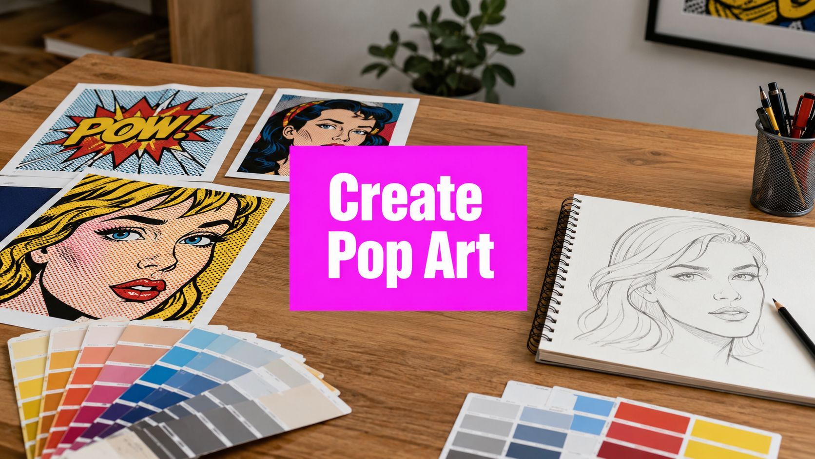
Create Pop Art from Photo: Guide to Digital Magic 2026

Ryan Bennett • June 29, 2026
Learn how to create pop art from photo with AI, Photoshop, or apps. Our 2026 guide features techniques, prompts, & expert tips.
You already have the photo. It's probably a selfie, a portrait of a friend, a product shot, or a pet image that feels fine but not memorable. You want something louder. Flatter. More graphic. Something that looks like it belongs on a poster, a canvas print, or a campaign visual instead of sitting forgotten in your camera roll.
That's why pop art still works. It takes an ordinary image and turns it into a visual statement.
If you want to create pop art from a photo, there isn't one best method for everyone. The right workflow depends on what you need most. Precision. Speed. Portability. Batch output. A print-ready file. A fun social post. This guide breaks the choice into three real paths: manual editing in Adobe tools, quick edits on your phone, and AI-driven generation when you want fast variations with less hands-on labor.
What Makes Pop Art an Iconic Style
Pop art is one of the few styles people recognize almost instantly. The reason isn't mystery. It's visual clarity. Strong outlines, loud color, commercial imagery, repetition, and a refusal to look subtle.

It also comes with a clear historical attitude. Pop art emerged in the mid-to-late 1950s, and artists including Andy Warhol and Roy Lichtenstein pushed ordinary consumer imagery like soup cans and comic strips into fine art. The movement pushed against traditional art values and embraced mass production, low cost, and youth orientation, which helped democratize visual culture, as outlined in the history of pop art.
Why the look still feels current
Pop art was built for images that travel well. That matters now as much as it did then. Flat color reads fast on a phone screen. Bold contrast survives compression. Repetition turns one subject into a brandable motif. Even when you aren't copying Warhol or Lichtenstein directly, you're borrowing the same logic: simplify the subject, exaggerate the shape language, and make the image impossible to ignore.
That's why a mundane portrait can suddenly feel editorial when it's posterized into blocks of color. It's also why product photos, creator headshots, and event artwork adapt so well to the style.
Pop art doesn't make a photo more realistic. It makes it more legible, more symbolic, and more memorable.
Three ways to get there
The workflow you choose changes both the process and the result.
- Manual editing gives you the most control. You decide where edges get cleaned, how dots appear, and which shapes stay flat or detailed.
- Phone apps are the fastest route when you need a shareable image now and don't care about deep customization.
- AI generation works best when you want lots of creative options, especially when you're testing directions instead of polishing one final frame by hand.
If your goal is a gallery-style print or client work, manual editing usually wins. If your goal is a profile image or social content, apps are often enough. If your goal is exploration at scale, AI changes the speed of the whole process.
The Manual Method in Photoshop and Illustrator
Manual editing is still the strongest option when you need deliberate control. If you care about edge quality, scalable output, and the difference between “nice filter” and “convincing pop art,” this is the method that pays off.

The core Photoshop workflow is specific. Apply Surface Blur with radius 10–15, then Oil Paint with Stylization 10 and Cleanliness 10, then layer Color Halftone with Max Radius 16 and use a Soft Light blend mode to simulate Ben-Day dots, as shown in this Photoshop pop art workflow reference.
Start with the right photo
Not every image deserves the same amount of editing time. Pick a source photo with strong subject separation and obvious light-dark structure. A face turned slightly to the side often works better than a flat front-facing shot because the shapes read more clearly once tones get simplified.
The manual route punishes weak source material. Busy backgrounds create cleanup work. Muddy lighting makes posterization look accidental. If the original image has no visual hierarchy, you'll spend most of your session fixing it before you even get to the fun part.
The Photoshop build
Use this as a practical base workflow, not a rigid formula.
- Duplicate the original layer so you can compare stages without losing the source.
- Isolate the subject with Select Subject, the Pen tool, or a manual mask. Clean edges matter because pop art thrives on shape.
- Reduce distracting detail with Surface Blur. The goal isn't softness. It's to merge small tonal noise into broader zones.
- Apply Oil Paint to push the image away from photography and toward stylized surface treatment.
- Add Color Halftone on a duplicate or merged layer, then change that layer to Soft Light so the dot pattern integrates instead of sitting on top.
- Posterize or remap colors manually with adjustment layers. You want a limited palette, not natural skin tones.
- Paint or draw black outlines where forms need more authority. Don't leave edge strength to chance.
Practical rule: If the subject doesn't read well in grayscale before color treatment, it won't suddenly become strong after halftone dots.
Where beginners usually go wrong
The biggest mistake is stacking filters and assuming the software will resolve the style for you. It won't. Filters create texture. You still have to decide what the image is saying.
A few trade-offs show up fast:
- Too much blur removes character from faces.
- Too little simplification leaves the image looking like a photo with an effect applied.
- Overly realistic color weakens the graphic impact.
- Uncontrolled halftone placement makes the image noisy rather than iconic.
A good manual edit usually involves selective correction after the filter stage. I often clean eyes, lips, jawlines, and clothing folds separately because those areas carry recognition.
When Illustrator helps
Photoshop handles texture and tonal reduction better. Illustrator helps when you need precision, repeatability, and scale.
Use Illustrator if you want:
- Vector edges for large-format printing
- Clean shape separation for posters or merchandise
- Editable color regions for easy palette swaps
- Typography integration with speech bubbles, banners, or caption blocks
A common workflow is to do tonal preparation in Photoshop, then move into Illustrator for Image Trace or manual Pen-tool redrawing. That hybrid method takes longer, but it produces sharper commercial output. It's especially useful when you're creating pop art from a photo for print, packaging, or wall decor that has to hold up at larger sizes.
Best fit for this method
Manual editing is the right choice when quality matters more than speed.
| Goal | Manual Adobe workflow fit |
|---|---|
| Fine art print | Excellent |
| Client branding asset | Excellent |
| Social avatar | Good, but slower than needed |
| Bulk campaign variations | Weak |
| Learning the style deeply | Excellent |
If you enjoy craft, this method teaches you the actual structure of the pop art look instead of hiding it behind presets.
Quick and Easy Pop Art Apps for Your Phone
Sometimes you don't want a layered PSD. You want a usable image before the coffee gets cold. That's where mobile apps make sense.
Phone apps are best when convenience outranks control. They're good for profile pictures, quick story graphics, casual posters, and experiments you might later rebuild properly on desktop.
Which apps are worth trying
A few app categories matter more than individual branding. Some apps lean hard into posterized Warhol-style color blocks. Others are better at comic-style outlines and halftone overlays. In practice, three kinds of apps stand out:
- Preset-heavy pop art apps work best for instant transformations. You upload, tap through styles, and export.
- General creative editors like PicsArt are more flexible if you want to combine stickers, text, cutouts, and filter effects in one place.
- AI-enhanced mobile editors like Prisma or ToonMe are useful when you want a stylized portrait quickly, even if the result isn't strictly classic pop art.
If you're comparing mobile output against browser-based generation tools, it's worth testing a dedicated AI image generator for creative concepts alongside your favorite phone app. The difference usually shows up in variation quality and how much the result feels reinterpreted instead of merely filtered.
What apps do well and what they don't
Apps win on speed. They also remove friction. That matters when you're building content for social channels and don't want to open Photoshop for every idea.
They struggle in three places:
- Edge cleanup is usually basic.
- Halftone controls can feel decorative instead of deliberate.
- Export flexibility is often limited compared with desktop workflows.
That means app results tend to look fun first, polished second. For casual use, that's fine. For print or brand work, it usually isn't.
If you're editing on your phone, choose a photo with a simple background and strong lighting. Mobile tools have less room to rescue a weak image.
A simple way to choose
Use a phone app when your answer is yes to most of these:
- You need speed: You're making a story post, reel cover, or quick profile image.
- You don't need layered files: Final export matters more than editability.
- You're okay with style presets: You want a look fast, not full authorship.
- You're testing ideas: The app output is a draft, not the final production file.
If that isn't your situation, skip the app phase and go manual or AI.
The AI Revolution to Generate Pop Art in Seconds
AI changed the workflow because it doesn't just tint a photo. It can rebuild the image according to stylistic rules. That's a major difference.

For pop art, that matters because the style depends on abstraction. Advanced AI models require high-contrast photos with a minimum resolution of 1000px on the shortest side. They simulate techniques like halftone patterns, rebuild images with bold outlines and limited palettes, and the AI pop art workflow guidance notes that the third or fourth variation often yields the strongest result.
Why AI is different from a filter
A filter applies a treatment. AI interprets. The stronger systems identify structural features first, then restyle them. That gives you room to direct the result with language rather than just sliders.
This makes AI especially strong when you want multiple distinct looks from one source image. A single portrait can become a comic-book panel, a Warhol-inspired poster, or a high-contrast editorial collage with only prompt changes.
If you work in print-on-demand, it also helps to understand where AI fits in a production pipeline. Skup's AI tools guide for POD is a useful overview because it places generators in the larger context of merch and design workflows instead of treating them like novelty tools.
Prompts that actually work
Generic prompts produce generic art. Pop art prompts work best when they specify visual behavior.
Try language like this:
- For a Warhol-inspired direction: “Transform this portrait into bold pop art with flat color blocks, repeated panel composition, high contrast, simplified facial shadows, graphic screen-print feel, vibrant commercial palette.”
- For a Lichtenstein-inspired direction: “Turn this portrait into comic-style pop art with bold black outlines, Ben-Day dot shading, flat primary colors, dramatic expression, speech-bubble energy, retro print texture.”
- For modern branded pop art: “Create a clean pop art poster from this product photo with limited saturated palette, sharp contour lines, simplified background, ad-style composition, bold graphic finish.”
The trick is to ask for shape simplification, limited palette, bold outlines, and print texture. If you only ask for “pop art style,” many systems drift into generic cartooning.
What improves results fast
AI rewards a few habits consistently:
- Use a source image with obvious contrast: Flat lighting leads to flat stylization.
- Crop aggressively: Don't make the model solve a weak composition.
- Generate several versions: Early outputs often miss the best edge treatment or color balance.
- Prompt for restraint: Too many descriptors can muddy the style.
A good AI workflow also includes some editorial judgment. The fastest result isn't always the best one. The strongest image is usually the one where the subject still feels recognizable after simplification.
Strong AI pop art starts with a strong photo. The model can stylize structure, but it can't invent good lighting choices you never captured.
Where AI fits best
AI is the strongest choice when you need variation at speed. That includes campaign ideation, social content sets, poster concepts, classroom examples, and series-based creative work.
It's also useful when you want to explore what's changing in image generation more broadly. This guide to AI image generation trends is worth reading if you're deciding how much of your visual workflow should move from manual editing toward prompt-driven production.
Manual editing still wins for surgical control. Apps still win for immediacy. AI wins when exploration, scale, and stylistic range matter most.
Mastering the Core Principles of the Pop Art Look
No tool can save a weak understanding of the style. Whether you use Photoshop, an app, or AI, the same design principles decide whether the final image reads as pop art or just “bright digital art.”

Authentic pop art depends on primary color palettes with high contrast. Technical guidance also recommends a halftone maximum radius of 16 pixels for sharp dots, and bold black outlines at a minimum 3px width are especially important because 78% of viewers identified pop art correctly only when those outlines were present, according to this pop art style benchmark guide.
Color that behaves like pop art
Naturalistic color is usually the enemy here. Pop art color works by declaring, not describing.
Use palettes that feel intentional and compressed:
- Primary-led schemes for classic comic energy
- Complementary clashes when you want more visual aggression
- Limited palette sets so the subject stays graphic instead of painterly
If skin tones stay realistic while everything else gets flattened, the image often looks undecided. Commit to stylization.
Dots and texture with discipline
Halftone and Ben-Day dots matter because they signal print culture, not because dots are decorative. Size and placement should support form.
Keep these principles in mind:
- Dots should follow areas of tone, not randomly cover the whole image.
- Too small a pattern can disappear or clutter.
- Too large a pattern can overpower facial features and make surfaces smear visually.
The best pop art texture feels integrated into the image structure. It shouldn't look like a wallpaper laid over a photo.
Outlines, flatness, repetition
Outlines do more than define shape. They separate the subject from photographic realism. That's why line weight matters.
Three finishing moves make a big difference:
- Strengthen the silhouette so the subject reads at thumbnail size.
- Flatten depth selectively by reducing subtle gradients into broad tone blocks.
- Repeat or reframe the image if you want a stronger Warhol-style composition.
Some of the best pop art doesn't rely on complexity at all. It relies on confidence. A bold outline, a restricted palette, and a flat background can do more work than a dozen layered effects.
Putting Your New Pop Art to Use
The first useful thing many create isn't a gallery print. It's something personal. A birthday poster. A profile image. A framed pet portrait. A shirt graphic for a school event. Pop art works because it travels well between private keepsake and public-facing design.
A small business owner might turn a founder headshot into a hero image for social graphics. A teacher might convert a student photo into a classroom art-history project. A musician might use a pop art portrait as cover art for a promo post. A maker selling prints might develop one strong image into a whole series by changing palette, crop, and background treatment.
Export for the actual destination
The export settings should match the use case. Don't finish a strong image and then flatten it into the wrong file setup.
- For web use: Export in RGB as JPG or PNG. Keep the file lightweight enough for fast loading.
- For print use: Export in CMYK as TIFF or PDF if your print provider asks for it, and keep resolution high enough for the final print size.
- For merchandise mockups: Save a transparent PNG if the artwork needs to sit on different colored products.
- For social campaigns: Prepare multiple aspect ratios instead of forcing one crop to fit every platform.
If you're producing a lot of variations for posts, ads, or seasonal promotions, a dedicated bulk social media image generator can help you turn one visual idea into a broader content set without rebuilding each asset manually.
Inspiration after the file is done
Wall art is one of the best reality checks for your design. A piece that looks energetic on screen can feel weak when printed larger. Browsing finished products helps you judge whether your own image has enough contrast and presence. If you want a reference point for how bold color and graphic simplification translate into home display, you can explore POPvault wall decor.
One last rule matters more than any export preset. Use photos you own, photos you've licensed, or photos you have permission to transform. Pop art has always borrowed from mass culture, but your workflow still needs to respect copyright, likeness rights, and client usage boundaries.
If you want the fastest way to turn one idea into many polished visuals, Bulk Image Generation is built for that workflow. You can generate multiple pop art directions in bulk, explore variations quickly, and move from concept to usable campaign assets without wrestling with complex software.
