
Mastering the Principles of Graphic Design

Aarav Mehta • July 29, 2025
Unlock the core principles of graphic design to create powerful visuals. This guide breaks down balance, contrast, hierarchy, and more with practical examples.
The world of graphic design is built on a set of core principles. Think of them not as rigid, unbreakable rules, but as a reliable toolkit. They're the foundational guides every seasoned designer uses to build compositions that are both effective and visually compelling.
At their heart, these principles are about organizing visual elements to tell a clear story, guide the viewer's eye exactly where you want it to go, and create a cohesive experience.
The Grammar of Visual Communication
I like to think of these principles as the grammar of a visual language. Just as proper grammar gives structure and clarity to a sentence, these principles bring order and purpose to a visual layout. Without them, a design can feel chaotic, confusing, and ultimately, unprofessional. By mastering them, you can arrange text, images, and colors into a narrative that truly connects.
This skill has never been more vital. The global graphic design industry is on track to hit a market value of $57.8 billion by 2026. This isn't just a random number; it's fueled by the fact that over 90% of companies now see quality design as absolutely essential to their brand.
A Roadmap for Effective Design
When you get a handle on these principles, you gain control over how your audience perceives and interacts with your work. It's the key difference between a random assortment of elements on a page and a deliberate, impactful composition.
For a quick overview, here are the 7 core principles we'll be diving into:
- Balance: Distributing visual weight to create a sense of stability.
- Contrast: Using distinct differences to make key elements pop.
- Hierarchy: Arranging elements to clearly show their order of importance.
- Repetition: Unifying a design by repeating key elements and styles.
- Proximity: Grouping related items together to build structure and relationships.
- White Space: Using negative or empty space to improve clarity and focus.
- Unity: Ensuring all the individual parts of a design work together in harmony.
To help you get a better sense of these concepts, here is a quick-reference table summarizing the core principles, their functions, and their impact.
The 7 Core Principles at a Glance
| Principle | Core Function | Visual Impact |
|---|---|---|
| Balance | Distributing visual weight evenly | Creates stability, calm, or dynamic tension |
| Contrast | Highlighting differences between elements | Draws attention, creates focus, improves readability |
| Hierarchy | Organizing elements by importance | Guides the user's eye, clarifies the message |
| Repetition | Reusing styles, colors, or elements | Builds consistency, strengthens brand identity |
| Proximity | Grouping related items together | Reduces clutter, creates clear relationships |
| White Space | Using empty areas intentionally | Improves readability, reduces overwhelm, adds elegance |
| Unity | Making all parts feel like they belong | Creates a cohesive, harmonious, and complete design |
This table is just a starting point, but it shows how each principle plays a unique role in shaping the final design.
Take this photo of balanced stones, for instance. It’s a perfect real-world example of how visual weight can create a feeling of stability and calm—which is the entire point of the principle of balance.
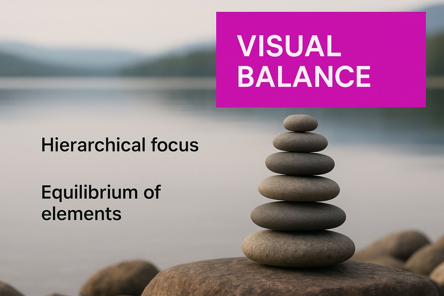
Even though the stones are all different sizes and shapes, the composition feels stable and intentional. It naturally guides your eye. This same fundamental idea applies to any design project, whether it's a simple social media graphic or a complex brand identity.
The goal isn't just to make things look pretty; it's to communicate with purpose. Each principle is a tool to help you achieve that purpose, whether you're trying to drive a sale, explain an idea, or build brand trust.
Getting comfortable with this toolkit is non-negotiable for creating professional-grade work. Whether you're designing a website, building a presentation, or even using an AI logo generator for a new side project, these fundamentals will steer your decisions and elevate every single thing you create. They are what transform your ideas into a visual language everyone can understand.
2. Achieving Visual Stability with Balance
Think about a well-built house. It feels solid, stable, and permanent. Great design aims for that same feeling of stability, and it gets there using balance, one of the most fundamental principles in design.
It all boils down to distributing visual weight. Every element you place—an image, a block of text, or a colored shape—has a certain "weight" based on its size, color, and texture. Balance is the art of arranging these elements so no single part of the design feels like it's about to topple over.
The Foundation of Symmetrical Balance
The most direct path to balance is through symmetrical balance. Imagine drawing a line straight down the middle of your design. If the elements on one side are a perfect mirror image of the other, you've got symmetry. This approach creates a composition that feels formal, orderly, and incredibly stable.
You'll see symmetrical balance everywhere in traditional design, from wedding invitations to architectural blueprints. It communicates trustworthiness and a sense of calm perfection. While powerful, it can sometimes feel a bit static or predictable if you’re not careful. Use it when your message needs to convey reliability and tradition.
Creating Interest with Asymmetrical Balance
While symmetry gives us order, asymmetrical balance delivers something far more dynamic and engaging. Instead of mirroring elements, this approach uses visual weight to create a feeling of equilibrium. For example, a single large, dark element on one side can be balanced by several smaller, lighter elements on the other.
It's like a seesaw. To balance a heavy person with a lighter one, the heavier person needs to sit closer to the middle. In design, you achieve this by playing with contrast, color, and scale to create a layout that feels balanced but isn’t identical on both sides. It’s a modern, energetic technique that’s a favorite for websites and marketing materials.
Key Takeaway: Asymmetrical balance isn't unbalanced. It’s about achieving equilibrium by carefully arranging different elements to create a more visually complex and often more interesting layout.
Exploring the Focus of Radial Balance
A third, less common type is radial balance, where every element radiates outward from a single, central point. Think of a sunburst, the spokes of a wheel, or the ripples spreading from a drop in a pond. This type of balance instantly pulls the eye toward the center of the design.
Because of this, it's a powerful tool for creating a strong focal point. You'll often find radial balance in logos, circular charts, and any design where a central element is the star of the show. It naturally creates a sense of motion and energy bursting from the core.
Whether you go for symmetrical, asymmetrical, or radial balance, the end goal is always the same: to create a design that feels intentionally structured and guides the viewer's eye. Getting a handle on this principle is a huge step in moving from cluttered layouts to professional, polished work.
Guiding the Eye with Hierarchy and Contrast
If every element in your design is screaming for attention, nothing gets heard. It’s just noise. This is where hierarchy and contrast come in, working together as your most powerful tools for directing a viewer’s gaze. They’re the core principles that create a clear visual journey, making sure your most important message lands first.
Think of hierarchy as the art of creating a visual roadmap. It tells the viewer, "Start here, look at this next, then maybe check this out." Without it, a design is just a jumble of information that the brain has to work way too hard to sort through.
You see this principle at work in any good blog post. The main headline is huge, grabbing you immediately. Subheadings are a bit smaller, breaking up the text into manageable chunks. The body copy is the smallest, designed for focused reading once you’re already invested.
Building a Strong Visual Hierarchy
Creating an effective hierarchy isn't as complicated as it sounds. It really just boils down to using a few visual cues that our brains are already wired to notice. By playing with these cues, you can effortlessly guide the eye and build a clear path through your work.
Here’s how you can establish a solid hierarchy:
- Size and Scale: This is the most straightforward method. Bigger things feel more important. Your main message or hero image should always command the most real estate.
- Color and Brightness: Bright, bold colors naturally pop, while muted or darker tones tend to recede into the background. That vibrant call-to-action button is a classic example of using color to create an unmissable focal point.
- Placement and Position: We’re trained to read from top-to-bottom and left-to-right. Anything you place at the top or in the center of a layout will naturally be seen first. That upper-left corner is prime visual real estate.
When you start combining these techniques, you can build a multi-layered design that guides a user from the most critical headline all the way down to the finest detail.
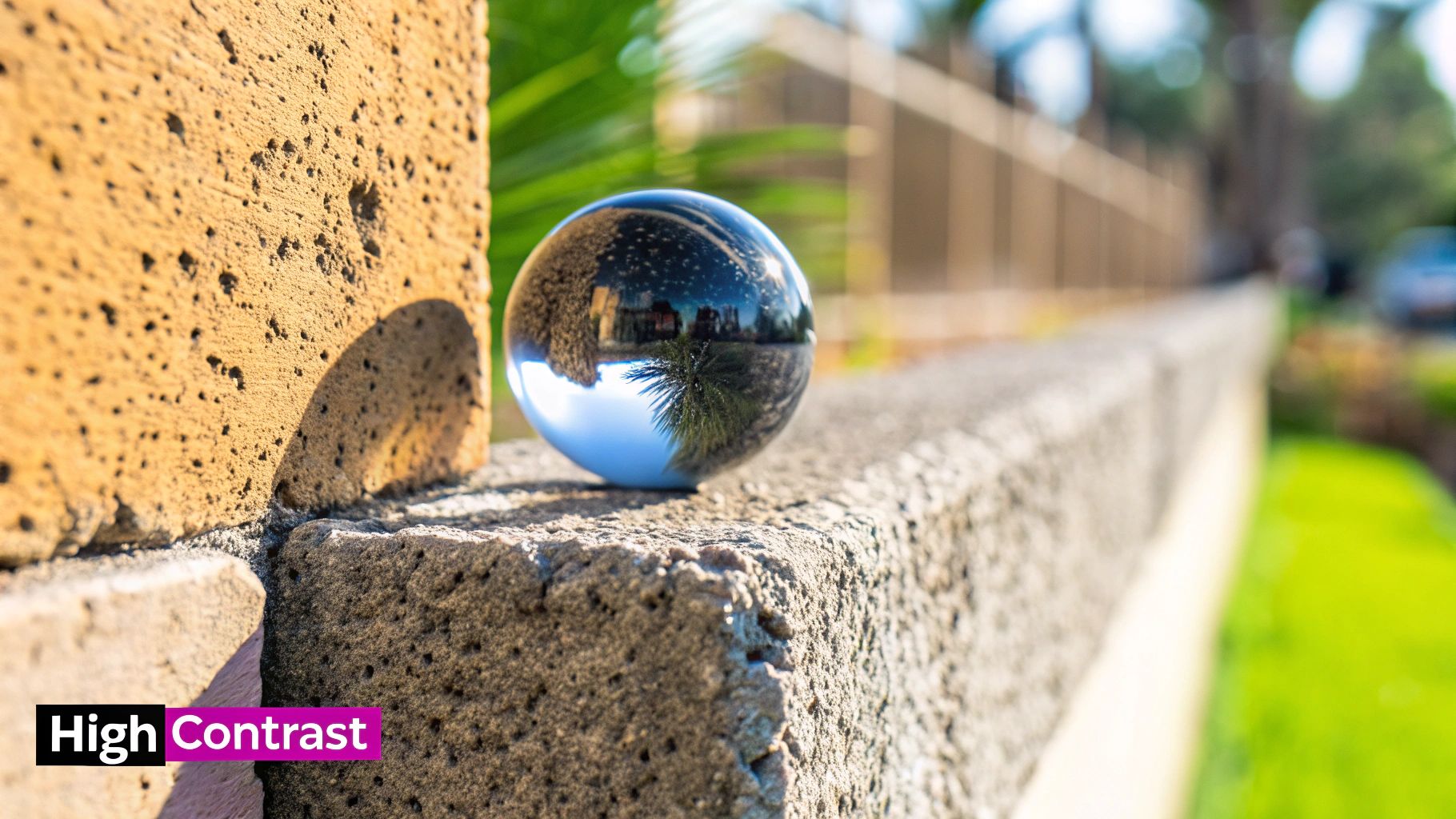
Making Key Elements Pop with Contrast
While hierarchy gives your design a structure, contrast is what makes it interesting. It’s the secret ingredient that keeps a design from feeling flat, boring, or just plain uninspired. Contrast happens any time you place two strikingly different elements next to each other.
Contrast is so much more than just light versus dark. It’s about creating a powerful distinction that draws the eye, creates visual energy, and makes your design both memorable and easy to navigate.
The most obvious example is color contrast—light text on a dark background is a no-brainer for readability. A solid grasp of contrast is absolutely essential for guiding the eye, which is why it helps to understand the foundational concepts of color theory.
Creative Ways to Use Contrast in Design
But effective contrast goes way beyond simple color choices. It's an incredibly versatile tool that can add real depth and excitement to any layout. Think about using contrast in some of these other ways:
- Typographic Contrast: Try pairing a big, bold headline font with a light, simple body font. The difference in visual weight creates an instant sense of order and makes the whole thing more appealing to look at.
- Shape Contrast: Combine sharp, geometric shapes like squares and circles with more organic, free-flowing forms. That juxtaposition can make a design feel much more dynamic and less rigid.
- Texture Contrast: Place a smooth, clean element right next to something with a rough, detailed texture. The difference adds a tactile quality that users can almost feel, giving your design another layer of depth.
Ultimately, hierarchy and contrast are a team. Hierarchy provides the blueprint, and contrast provides the spark. Together, they transform a static page into a dynamic and genuinely effective piece of communication.
Building a Unified Design with Repetition and Proximity
Ever look at a design and feel like everything just clicks? That's not an accident. Great designs feel like a cohesive family, not a room full of strangers. This sense of belonging comes from two of the most fundamental principles in any designer's toolkit: repetition and proximity.
When you get these two right, you transform a jumble of separate elements into a unified, intuitive experience. It’s what separates amateur work from something that feels professional and intentional.
Creating Rhythm with Repetition
Think of repetition as the underlying beat or melody of your design. It’s the simple act of reusing specific elements—like a font, a color, a shape, or even a particular graphic style—throughout a composition. This isn't about being boring; it's about building a visual rhythm that guides the eye and creates a powerful sense of unity.
A great example is a brand that consistently uses its signature blue for all headlines and buttons. Whether you see it on their website, a social media post, or a slide deck, you instantly connect that color with them. That consistency builds familiarity, making the design instantly recognizable and reinforcing the brand's identity.
It’s what makes a well-designed magazine feel like a single, cohesive product, even with different articles and authors. The same font for all titles, the same style for all photo captions—this repetition creates a predictable pattern that makes the information incredibly easy to digest.
Here are a few key places to apply repetition:
- Typography: Sticking to a consistent set of fonts for headings, subheadings, and body text.
- Color Palette: Using a defined color scheme for backgrounds, text, and accent elements.
- Shapes and Lines: Reusing specific icons, shapes, or line styles to create a recurring motif.
- Layout Structure: Applying a similar grid or layout across multiple pages or screens.
By repeating key elements, you're not being lazy—you're being consistent. Consistency builds trust and makes your design feel more professional and organized. It tells the viewer that every choice was deliberate.
Reducing Clutter with Proximity
While repetition ties a design together, proximity is what keeps it organized. The principle is deceptively simple: items that are related to each other should be placed close together. When you group elements, our brains instinctively see them as a single, related unit.
This one simple move dramatically reduces visual clutter and makes information so much easier to understand.
A business card is a perfect real-world example. The person’s name, title, and company are all clustered together. A little further away, the contact details—phone, email, website—form another distinct group. You don't need lines or boxes to understand the relationship; the space does all the work.
You see proximity in action everywhere online, especially on e-commerce sites. The product image, description, price, and "Add to Cart" button are always huddled together. This grouping makes it crystal clear that all these pieces of information belong to that one specific item. This clarity is crucial when you're creating clean visuals, like those for AI-powered product photography, where sharp organization helps the product shine.
Mastering repetition and proximity is about turning chaos into clarity. Repetition unifies the entire design with a consistent visual language, while proximity organizes related information into logical, easy-to-digest chunks. Together, they are absolute essentials for creating work that isn't just beautiful, but incredibly clear and effective.
Bring It All Together with White Space and Unity
Sometimes, the most important part of your design is what you choose to leave out. This is the whole idea behind white space, or as it's often called, negative space. It’s not just “empty” space; it's an active, powerful tool that adds clarity, focus, and a feeling of calm sophistication to your work.
Think of it like the pauses you take when you speak. Those brief moments of silence give your words impact and help your listener process what you're saying. White space does the exact same thing for a visual layout. It gives every element room to breathe, preventing the design from feeling cluttered, chaotic, and overwhelming.
The Power of Negative Space
Giving your design elements some breathing room is one of the fastest ways to make them more effective. When you intentionally leave areas of the canvas blank, you’re creating a natural guide for the viewer's eye. This negative space helps define the edges of your content and pulls attention toward the most important parts—no flashy graphics or loud colors needed.
A design with plenty of white space just feels more approachable and elegant. It lowers the viewer's cognitive load, which is a fancy way of saying they don't have to work as hard to understand the information you're presenting. This is a core concept for creating user-friendly websites, apps, and clean print layouts.
Here's how white space actively improves your work:
- Boosts Readability: Good spacing between lines of text and around paragraphs can improve a reader's comprehension by up to 20%. It makes dense information feel less intimidating and much easier to scan.
- Creates Powerful Focus: When you surround a key element—like your logo or a call-to-action button—with white space, it immediately becomes the star of the show. The lack of distractions around it gives it instant visual priority.
- Establishes a Sophisticated Vibe: Minimalist designs lean heavily on white space to create a sense of luxury, calm, and confidence. It suggests the content is so strong, it doesn't need to scream for attention.
Achieving Harmony with Unity
Once you’ve nailed balance, hierarchy, and repetition, your final task is to achieve unity. This is the principle where every part of your design comes together to form a single, harmonious whole. When a design has unity, it feels complete and cohesive, as if every element truly belongs.
Unity is the quiet success of a well-executed design. It’s that feeling when you know nothing could be added or taken away without making the final piece worse. It’s what separates a random collection of parts from a unified masterpiece.
This sense of cohesion is becoming more critical than ever. For example, complex fields like environmental, social, and governance (ESG) reporting rely on unified, data-rich visuals to be understood quickly. Likewise, in fast-growing design areas like augmented and virtual reality (which are expanding at a 15% CAGR), a unified visual experience is non-negotiable for user immersion. You can see how these principles are being applied in new ways by exploring the growing graphic design market.
To get there, you need to step back and look at your design as a whole. Do the colors, fonts, images, and spacing all work together to support the same message and mood? If even one element feels out of place, it can throw off the entire composition. Unity is that final, critical check, ensuring all the principles of graphic design are working in concert to create something truly seamless and impactful.
How These Principles Work in the Real World
It’s one thing to learn the principles of graphic design from a book, but watching them come to life is where the real magic happens. These concepts aren't just abstract rules for artists. They are the practical, everyday tools designers lean on to build things that are clear, compelling, and just plain work.
Let's stop talking theory and start looking at how these ideas get put into practice. We'll break down a few real-world examples—from websites to mobile apps—to see exactly how these principles team up to solve problems. This is the moment where knowing the rules turns into using them.
Deconstructing a Sleek Website Homepage
A great website homepage is a masterclass in applying the principles of graphic design. Take a look at any modern tech company's site. The first thing you'll see is a big, bold headline right at the top—that’s hierarchy at its best. It's the largest piece of text, and it immediately screams, "This is the most important thing here!"
Your eyes will probably land on a call-to-action button next, usually in a bright, attention-grabbing color. That pop is a deliberate use of contrast, making sure you can’t miss the one action they want you to take. The page might also use an asymmetrical layout, with a big "hero" image on one side and blocks of text on the other. This creates a visually interesting but stable feeling—a perfect example of asymmetrical balance. If you're interested in building layouts like this, understanding how to start mocking up a website is a great next step.
Analyzing an Intuitive Mobile App UI
Mobile apps live and die by how easy they are to use, which makes design principles absolutely essential. Just think about your favorite food delivery app. All the key info—the restaurant's name, its rating, and the delivery time—are huddled together. That’s proximity in action, grouping related information to make it easier to digest.
The menu items are laid out in a consistent, repeating pattern, which creates a natural rhythm and makes the list a breeze to scan. That's a clever use of repetition. The most critical buttons like "Order Now" or "Checkout" use strong contrast to jump off the screen, making them easy to find and tap. And all that white space? It’s there to prevent the small screen from feeling cluttered and overwhelming. Every single choice is made to guide you from browsing to buying without a second thought.
Key Insight: In UI design, these principles aren't just about making things look pretty. They're the very foundation of a good user experience. When a principle is applied well, the app just feels better to use.
Breaking Down an Effective Social Media Campaign
On social media, you have about two seconds to grab someone's attention, so graphics have to be bold and direct. Think about a successful Instagram post for a new product. It probably has one powerful image that acts as the focal point. The brand’s logo is likely tucked into the same corner on every single post, using repetition to build instant recognition.
The text is usually short, sweet, and high-contrast, so you can read it in a flash while scrolling. The best campaigns use a consistent color palette and typography across all their visuals, creating a strong sense of unity. This cohesive look makes the brand immediately recognizable in a crowded feed. Creating this kind of consistency is a huge deal for businesses, and our guide on how to create stunning digital product images using AI generators offers some great tips for getting it right every time.
Got Questions? Let's Talk Design Principles
As you start playing with these principles, you're bound to have some questions pop up. It happens to everyone. Let's tackle a few of the most common ones I hear from designers who are just starting to find their footing.
Think of this as your go-to reference when you hit a creative roadblock.
Where Should I Even Start?
It's a classic question: "With all these principles, which one do I learn first?" They all work together, of course, but if I had to pick one, it would be hierarchy.
Getting a solid grip on hierarchy forces you to think about your message before you think about anything else. What's the single most important thing you want people to see? Once you nail that, you’ll find yourself naturally using contrast, scale, and white space more effectively. It’s the perfect gateway principle.
Is It Okay to Break the Rules?
Absolutely. But—and this is a big but—you have to know the rules first. The best designers on the planet break the rules all the time, but they do it with purpose.
Think about it. You could throw a design completely off-balance to create a sense of tension or unease. That might be perfect for a horror movie poster or a provocative ad campaign. The trick is to have a solid "why" behind your choice.
Breaking a design principle on purpose is a creative choice. Breaking it out of ignorance just leads to a design that feels chaotic and fails to communicate its message effectively. Always have a "why" behind your decision.
How Do These Principles Apply to UI and UX?
These principles aren't just for posters and logos; they are the absolute bedrock of modern user interface (UI) and user experience (UX) design. How you apply them directly shapes how easy and enjoyable a website or app is to use.
- Proximity is why the username field, password field, and "Login" button are always huddled together. They’re related, so they live together.
- Hierarchy is what walks you through a checkout process one step at a time, so you don't get overwhelmed.
- White space is what keeps an app from feeling like a cluttered mess, reducing stress and helping you focus.
- Contrast is the reason you can actually read the text and spot the bright, shiny "Buy Now" button.
In UI/UX, these aren't just aesthetic preferences. They're fundamental to usability, accessibility, and whether a user has a good time or just gives up.
Ready to put these principles into action without the steep learning curve? With Bulk Image Generation, you can create hundreds of professional, high-quality visuals in seconds. Describe your goal, and our AI will handle the rest, from composition to style. Start creating for free today at bulkimagegeneration.com.