Mastering Photo Colour Grading

Aarav Mehta • September 25, 2025
Unlock the secrets of professional photo colour grading. This guide explains key concepts, tools, and workflows to transform your images with stunning style.
Photo colour grading is where the magic really happens. It’s the artistic process of shifting and enhancing the colours in an image to create a specific mood, atmosphere, or signature style. While colour correction is all about fixing technical issues like white balance, colour grading is where you inject your creative vision, turning a standard photo into an emotionally compelling story.
What Is Photo Colour Grading and Why It Matters
Think about a film director picking the perfect soundtrack for a movie scene. The music doesn't just fill the silence; it guides the audience's feelings, builds tension, or creates a sense of pure joy. Photo colour grading does the exact same thing for a single, still image.
It’s that final, artistic touch that transforms a technically "correct" photograph into something that truly connects with the viewer on an emotional level.
A properly exposed and balanced photo is like an actor delivering their lines perfectly. The colour grade, however, is the performance—the emotional subtext that tells the real story hiding beneath the surface.
The Art vs The Science of Colour
One of the biggest hurdles for anyone new to photo editing is getting tripped up by the difference between colour correction and colour grading. They aren't the same thing, but they are two distinct, sequential steps in any professional post-production workflow.
For a deeper dive, it's worth exploring the distinctions between color correction and color grading in more detail. But in short, one is a technical must-do, while the other is a creative choice.
-
Colour Correction (The Science): This is your foundation. The main goal here is to make the image look natural and accurate—just as the human eye would see it in real life. This step involves adjusting exposure, setting the correct white balance, and making sure you have detail in your shadows and highlights. It's all about creating a clean, neutral starting point.
-
Colour Grading (The Art): This is what comes next. Using that corrected image as your blank canvas, you start to apply a specific look or style. This could mean pushing in warm, golden tones for a nostalgic, hazy summer feel, or introducing cool, blue hues for a sense of isolation or modern calm.
Simply put: colour correction fixes problems, while colour grading adds personality. This artistic layer is what makes your images stand out, convey a consistent brand aesthetic, or tell a powerful visual narrative.
To really nail this down, here’s a quick comparison to help clarify the distinct goals and processes of each stage.
Colour Correction vs Colour Grading At a Glance
| Attribute | Colour Correction | Colour Grading |
|---|---|---|
| Goal | Accuracy & Neutrality | Style & Emotion |
| Process | Technical Adjustments | Creative Application |
| Analogy | Proofreading a Document | Choosing a Font & Layout |
| Result | A clean, true-to-life image | A stylized, atmospheric image |
Ultimately, you can think of it like a painter. You first have to prime the canvas to create a perfect, neutral base (correction) before you can start applying your unique palette of colours to create a masterpiece (grading). You need both, and in that specific order, to get professional results.
The Building Blocks of Colour Theory
Before you can start crafting a stunning colour grade, you have to speak the language of colour itself. Just moving sliders around randomly is like trying to cook without knowing what any of the ingredients taste like. Intentional, professional-level grading begins with three core concepts that every single editing program is built on.
These concepts are Hue, Saturation, and Luminance—often bundled together as HSL. Think of them as the three main dials you can turn to control every colour in your image.
Hue, Saturation, and Luminance Explained
Hue is the easy one. It’s what most people think of when they hear the word "colour." Is it red, green, blue, or yellow? Hue defines the pure shade itself, like the difference between a fire-engine red and a maroon red.
Saturation is all about the intensity or purity of that colour. Imagine a clear glass of water. If you add a single drop of red food colouring, you get a faint, low-saturation pink. But if you dump in ten drops, you get a rich, vibrant, high-saturation red. In your photos, cranking up the saturation makes colours pop off the screen, while dialing it back makes them feel muted and grayish.
Luminance, sometimes called brightness or value, controls how light or dark a specific colour appears. It’s the difference between a dark, moody forest green and a bright, electric lime green. By adjusting luminance, you can brighten or darken just the greens in your photo without touching the overall exposure of the image.
Key Takeaway: Every single colour adjustment you'll ever make is just a combination of tweaking these three properties. Getting a grip on HSL is what moves you from guessing to making precise, deliberate choices.
Understanding Colour Harmonies
Once you've got HSL down, the colour wheel becomes your roadmap for creating combinations that just feel right. It’s a simple visual tool that shows how colours relate to one another, and it’s what the pros use to build specific moods.
Here’s a look at a standard colour wheel, showing the primary, secondary, and tertiary colours.
This wheel unlocks some powerful relationships that form the backbone of the most popular grading styles.
Here are a few of the big ones you need to know:
- Complementary Colours: These are total opposites on the wheel, like the famous teal and orange or a classic blue and yellow. Pitting them against each other creates killer contrast and visual tension, which is exactly why the "blockbuster" teal and orange look is so dominant in movies.
- Analogous Colours: These colours are neighbours on the wheel, like blue, teal, and green. Sticking to an analogous palette creates a really smooth, harmonious feeling. It’s perfect for serene landscapes or gentle, pleasing portraits.
- Triadic Colours: This scheme grabs three colours that are evenly spaced around the wheel, forming a triangle. It gives you a palette that’s vibrant and balanced—dynamic, but not quite as in-your-face as a complementary scheme.
By understanding these relationships, you can start building a colour grading strategy that’s about more than just making things "look better." You can start telling a specific emotional story with your images, all through intentional, harmonious colour choices.
Your Essential Colour Grading Toolkit
Okay, you’ve got a handle on the theory. Now it’s time to step into the digital darkroom and get your hands dirty. Software like Adobe Lightroom and Photoshop are jammed with features, but honestly, just a few key tools do most of the heavy lifting in professional photo colour grading.
Master these, and you’ll be miles ahead.
Think of these tools less like intimidating controls and more like an artist’s brushes. Each one has a specific job, and learning how they dance together is what unlocks your real creative power. Let's break down the big three you'll find yourself reaching for in almost every single edit.
The Mighty Tone Curve
If you learn only one tool, make it this one. The Tone Curve is the undisputed champion of shaping an image's mood. It's your master control for every bit of light and shadow in the frame.
Just by nudging this simple line around, you can inject dramatic contrast, create a soft and faded vintage vibe, or even subtly shift colours in your highlights and shadows.
A classic move is the "S-curve." You gently lift the curve in the highlights and pull it down in the shadows. This one small adjustment instantly boosts contrast, giving your photo a dynamic pop that makes it feel way more alive and three-dimensional.
Precision Control with the HSL Panel
If the Tone Curve is your broad brush for mood, the HSL (Hue, Saturation, Luminance) panel is your set of fine-tipped pens. This is where you get surgical.
The HSL panel lets you target one specific colour and tweak it without messing up anything else in the picture. Want that blue sky to look richer and deeper, but you’re terrified of turning your model’s skin orange? This is the tool for the job.
You can dive in, isolate just the blues, crank up their saturation, and maybe drop their luminance (brightness) for a more dramatic feel. Everything else stays exactly as it was. This is the secret to getting that clean, polished look where every colour feels intentional.
When you're starting out, it's so easy to push things too far. A great rule of thumb is to get your adjustments looking good, then dial back the overall strength by about 20-30%. More often than not, this lands you right in that sweet spot between boring and overcooked.
Colour Balance and Split Toning
This is where you graduate from correcting an image to truly stylizing it. Tools like Colour Balance and Split Toning are all about infusing different colours into the shadows, midtones, and highlights of your photo.
Ever wonder how photographers get that famous "teal and orange" cinematic look? This is it.
By adding a hint of teal into the shadows and warming up the highlights (especially skin tones) with a bit of orange, you create that classic, high-contrast palette you see in so many movies. These tools are your gateway to developing a signature style that makes your work instantly recognizable.
The demand for these kinds of pro-level features is a big reason why the photo editing software market is booming, with a forecast value of USD 3.29 billion by 2032. Photographers are hungry for more creative control. You can find more stats on the growth of photo editing software on llcbuddy.com.
As you start weaving these tools into your workflow, don't forget about efficiency—especially when you’re dealing with a ton of photos. Making sure your images are the right size from the get-go saves a massive amount of time later. That’s why a good bulk image resizer is an unsung hero in any serious photographer's toolkit.
A Proven Step-By-Step Grading Workflow
Jumping straight into creative color adjustments is like trying to paint a masterpiece on a dirty canvas. To get those consistent, professional-looking results every single time, you need a plan. A structured workflow is your best friend here.
This repeatable process ensures your creative decisions are built on a solid technical foundation, saving you a ton of time and helping you sidestep common mistakes.
The best way to tackle the complex task of photo colour grading is to break it down into four logical stages. Each step builds on the last, guiding you from basic, must-do corrections all the way to the final artistic polish. Think of it like building a house: you pour the foundation before you put up the walls and add the decorative finishes.
Stage 1: Primary Correction
This is your non-negotiable first step. The goal here is simple: create a clean, neutral, and technically correct image. Before you even think about adding your signature style, you have to fix any underlying problems.
This stage involves a few key adjustments:
- Correcting Exposure: Is your image too bright or too dark? Get it just right. You're aiming for a balanced histogram where you can see details in both the shadows and the highlights.
- Setting White Balance: Get rid of any weird color casts. The whites in your image should look white. This gives you an accurate and true-to-life color base to build upon.
- Adjusting Contrast: Establish a good, solid range of tones from the darkest blacks to the brightest whites. This initial pop of contrast gives the image depth before you even get to the fun stuff.
A quick word of advice: Skipping primary correction is the single biggest mistake I see beginners make. If you apply a creative grade to an image with bad white balance or exposure, you’re just going to make those flaws worse, ending up with muddy, unnatural colors.
Stage 2: Secondary Adjustments
Okay, with a clean base locked in, you can now move on to more targeted refinements. Secondary adjustments are all about tweaking specific parts of your image without messing up the whole photo.
This is where you'd jump into something like the HSL panel to fine-tune individual colors. Maybe you want to deepen the blue of a sky or make the green in the foliage really pop. You can also use masking tools to selectively brighten a subject's face or darken distracting elements in the background, subtly guiding the viewer's eye exactly where you want it.
Stage 3: Creative Grading
Now for the fun part. With a perfectly corrected and refined canvas, you're finally ready to apply your signature style. This is the step most people think of when they hear photo colour grading—it’s where you inject the image with a specific mood and emotion.
This is where you make your creative mark.
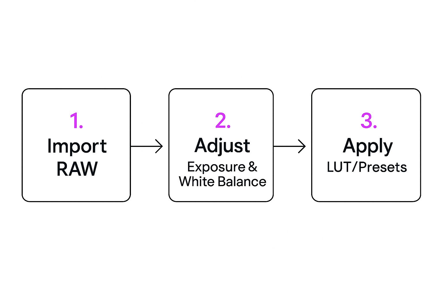
As the infographic shows, creative choices like applying LUTs or presets are way more effective after you’ve nailed the foundational adjustments.
In this stage, you’ll play with tools like Color Balance or Split Toning. You can introduce specific hues into the shadows and highlights to create popular looks, like the cinematic "teal and orange" effect or a warm, hazy vintage aesthetic.
Stage 4: Final Polish
The last stage is all about adding those little finishing touches that tie everything together. These subtle details can take a great image and make it truly exceptional.
Common final adjustments include:
- Sharpening: Applying just a touch of sharpening to bring out fine details and make the image feel crisp.
- Film Grain: Adding a bit of grain can give your photo a textured, analog feel that's really popular right now.
- Vignetting: Slightly darkening the edges of the frame is a classic trick to draw more attention to your main subject.
This kind of structured workflow is becoming the industry standard as the demand for high-quality visuals explodes. The market for color grading tools is growing fast, with AI-powered solutions making it easier than ever to get professional results.
This same structured thinking is vital when you need to create a large volume of consistent visuals, like those we cover in our guide to AI product photography.
Nail the Most Popular Colour Grading Styles

Alright, you've got the theory down and a workflow in mind. Now it's time for the fun part: moving from practice to actually creating some iconic looks. Certain photo colour grading styles have become famous for their power to instantly set a mood. Getting a handle on how to build these popular grades is the best way to master your tools and eventually develop a signature style of your own.
Let’s pull back the curtain on three of the most requested aesthetics in photography today. Once we deconstruct them, you’ll see how straightforward the core ideas really are.
The Cinematic Teal and Orange
This one is the undisputed king of cinematic colour. You’ve seen it everywhere, from Hollywood blockbusters to high-end commercials. The secret sauce behind this look isn't magic; it's just simple colour theory. Teal and orange are complementary colours, sitting opposite each other on the colour wheel, which means they create the strongest possible contrast and make your image pop.
The whole game is about splitting your image into warm and cool tones and then assigning them to specific parts of the picture.
- The Technique: You're aiming to push teal or blue tones into the shadows while simultaneously adding orange or warm yellows into the highlights, especially skin tones.
- Key Tools: Your best friends here are the Colour Balance or Split Toning panels. It’s that easy. In the shadows, just drag the slider toward cyan/blue. Then, in the highlights, nudge the slider over to yellow/orange.
This powerful contrast makes subjects—especially people—jump right out from the background, giving you that polished, professional look that just grabs attention.
The Moody and Dark Aesthetic
A moody grade is all about atmosphere. It’s pure emotion. By using desaturated colours, deep shadows, and softened highlights, you can create a feeling of drama, intimacy, or even a bit of nostalgia. This style isn't just about making things dark for the heck of it; it's about carefully sculpting light to tell the viewer exactly where to look.
The real trick is to slightly "crush" your blacks. This just means you're turning the absolute darkest parts of your photo into a very dark grey instead of pure, inky black.
Pro Tip: The Tone Curve is your go-to for this. Find the bottom-left point of the curve (that's your absolute black point) and lift it straight up, just a tiny bit. You'll instantly get that faded, matte finish in your shadows that defines the moody style.
To really sell the look, jump over to the HSL panel and start selectively desaturating certain colours. Often, pulling back the vibrancy of greens and blues is all it takes to create a subdued, cohesive palette that feels both timeless and deeply personal.
The Light and Airy Feel
On the complete opposite end of the spectrum, the light and airy style is all about brightness, cleanliness, and soft light. It’s a massive hit in wedding, portrait, and lifestyle photography because of its fresh, optimistic vibe. The whole aesthetic is built on bright exposures, low contrast, and a colour palette that leans toward pastels.
Getting this right actually starts in-camera by slightly overexposing your shot from the get-go.
- Editing Approach: Once you're in your editing software, lift the shadows a good amount to get rid of any heavy, dark areas.
- Colour Palette: Use the HSL panel to gently desaturate your colours and shift the hues toward softer tones. A great example is pushing your greens toward a more minty or sage colour while also pulling back their saturation.
Of course, nailing any of these styles depends on having the right tools and, crucially, a way to see your colours accurately. As everyone's visual standards get higher, the tech that supports creators is getting better, too. The global market for professional colour grading monitors—which are essential for this kind of precise work—was valued at $1.2 billion in 2024 and is on track to more than double. This explosion shows just how vital accurate colour has become. You can learn more about the growth of the color grading monitor market on marketintelo.com.
Once you've mastered these foundational styles, you have a fantastic launchpad. As you get comfortable, you can even apply these same colour concepts to generate entirely unique visuals from scratch, a topic we explore in our guide on using an AI Texture Generator.
Got Questions About Colour Grading? Here Are Some Answers
Diving into the world of photo colour grading always brings up a few practical questions, especially when you're just starting out. Getting a handle on these common hurdles can seriously speed up your learning curve and help you nail down your technique. Let's tackle some of the things photographers ask most often.
Can I Actually Do Professional Colour Grading on My Phone?
Yes, absolutely. Long gone are the days when mobile apps were just for slapping on a basic filter. Modern apps like Lightroom Mobile, Snapseed, and VSCO have become incredibly powerful editing suites. You'll find professional-level tools like curves, HSL sliders, and selective adjustments right at your fingertips.
Sure, for high-stakes commercial work, nothing beats a big, calibrated monitor. Accuracy is king in that world. But for just about everything else, especially content destined for social media, today’s mobile apps are more than capable of producing stunning, professional-grade results. The core principles of colour theory and having a solid workflow don't change, no matter what device you're using.
The real magic of mobile grading is its accessibility. You can practice and sharpen your eye for colour literally anywhere, turning five minutes of downtime into a productive editing session.
What Is a LUT, and How Does It Work for Photos?
A LUT, which stands for Look-Up Table, is basically a file that tells your software how to remap the colours in your image. Think of it as a super-charged, highly precise preset. It can apply a complex cinematic or vintage colour grade in a single click, something that would take ages to do manually.
Photographers love LUTs for a few key reasons:
- Speed: They’re a massive shortcut to achieving a sophisticated look without fiddling with dozens of sliders.
- Consistency: Using the same LUT across a series of photos guarantees they all have the exact same colour treatment. This is how you get that cohesive, professional look.
- Creativity: They make fantastic starting points. Apply a LUT, then tweak it to perfectly match the mood of your specific image.
More and more editing programs, including Photoshop and recent versions of Lightroom, now have great support for LUTs, making them an essential tool for any creative photographer.
What Are the Biggest Colour Grading Mistakes to Avoid?
Most of the common slip-ups come from a lack of subtlety. It’s just so easy to get carried away when you have all these powerful tools.
The biggest errors to watch out for are over-saturating colours—it just looks unnatural and amateurish. Another is "crushing" your blacks or "blowing out" your highlights, which completely destroys important detail in the image. But maybe the most critical mistake is getting skin tones wrong. Our eyes are incredibly sensitive to skin tones, and if they look off, the whole photo feels weird, no matter how good it is otherwise.
Here's a great habit to get into: after you've made your adjustments, step away for five minutes. Seriously, go get a coffee. When you come back, compare your edit to the original. This little break resets your eyes and helps you see if your changes were actually an improvement.
Ready to create stunning visual content without all the manual work? Bulk Image Generation uses powerful AI to generate hundreds of unique, high-quality images from a single description, completely changing your creative workflow. See how you can produce more, faster, at https://bulkimagegeneration.com.