
Your Guide to Facebook Ad Image Specs

Aarav Mehta • August 21, 2025
Master Facebook ad image specs for every placement. Our guide covers dimensions, ratios, and best practices to maximize your ad performance and ROI.
Nailing your Facebook ad image specs is the first step to making sure your visuals look sharp and professional everywhere they show up. There's nothing worse than a stretched, blurry, or awkwardly cropped ad.
As a rule of thumb, a 1080x1080 pixel image (a perfect 1:1 square) is your safest bet for most feed-based placements. For anything full-screen, like Stories or Reels, you'll need to go vertical with a 1080x1920 pixel image (a 9:16 ratio).
Quick Lookup Table for Ad Image Specifications
If you're a busy marketer, you don't have time to second-guess dimensions. Getting your images sized incorrectly from the start leads to frustrating edits, weird cropping by the platform, and can ultimately tank your ad performance. Nobody clicks on a blurry ad.
I've put together this quick lookup table to take the guesswork out of the process. Use it as your go-to reference for the most common and critical ad placements before you even think about opening your design software.
| Placement | Recommended Dimensions (Pixels) | Aspect Ratio | File Types |
|---|---|---|---|
| Feed | 1080 x 1080 | 1:1 | JPG, PNG |
| Stories & Reels | 1080 x 1920 | 9:16 | JPG, PNG |
| Right Column | 1080 x 1080 | 1:1 | JPG, PNG |
| In-Stream | 1080 x 1080 | 1:1 | JPG, PNG |
| Marketplace | 1080 x 1080 | 1:1 | JPG, PNG |
Having this handy ensures your creative assets are built correctly from the ground up, saving you a ton of headaches down the line.
This infographic does a great job of showing you exactly why these different sizes matter.
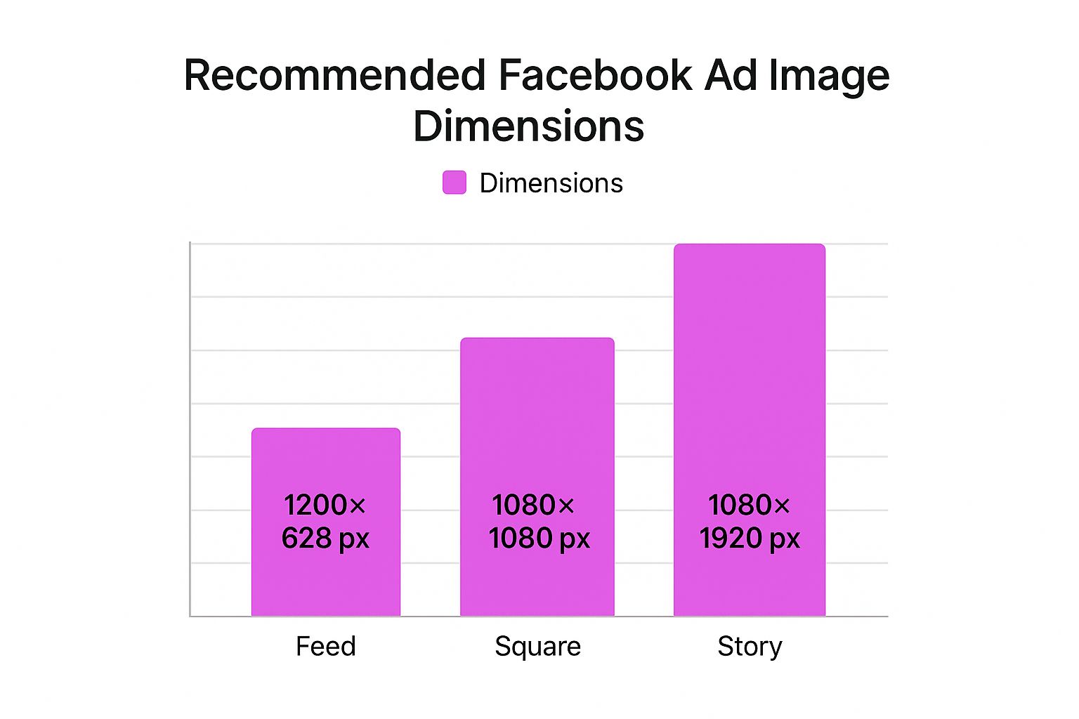
You can immediately see the stark difference between the square Feed format and the tall, vertical Story format. It's a perfect visual reminder that a one-size-fits-all approach just doesn't work on Facebook.
Why Image Specs Are Critical for Campaign Success
Let's be blunt: getting the Facebook ad image specs right is way more than a technical checkbox. It's a strategic move that can make or break your campaign performance.
When your images don’t fit the required dimensions, Facebook's algorithm doesn't just reject them—it tries to "fix" them by automatically cropping or stretching your creative. This almost always ends up looking awkward and unprofessional, instantly killing user trust and engagement. An incorrectly sized image screams "low quality," causing people to scroll right past without a second thought. This torpedoes your click-through rates, drives up your costs, and basically wastes your ad spend on creative that never had a chance.
Maximizing Visibility and Engagement
Optimizing your ad images to the exact specs is one of the most fundamental things you can do to get solid results. When your visuals are formatted correctly, you guarantee your key message and call-to-action are fully visible—not awkwardly cut off at the edges. Getting this right is foundational if you want to master lead generation on social media.
Just look at this example from Facebook’s own platform. It shows a perfectly optimized ad that fits seamlessly into the mobile feed.
See how the image uses a 1:1 aspect ratio? No part of the visual is lost, which is exactly what you want for communicating your message clearly.
When you respect the platform's rules, you don't just improve ad delivery. You also create a better user experience, which Facebook's algorithm rewards with better placement and lower costs.
Of course, creating compelling visuals is the other half of the battle. If you're using AI to generate your ad creative, knowing how to produce perfect product shots is essential. For some practical tips, check out our guide on how to https://bulkimagegeneration.com/blog/en/tutorials/how-to-create-stunning-digital-product-images-using-ai-generators-5-digital-product-image-prompt-examples.
Getting Your Images Right for Feed and In-Stream Ads
The Facebook Feed is prime real estate. Think about it—it’s where everyone spends most of their time, scrolling endlessly. This makes it an incredibly crowded and valuable spot for your ads. To even stand a chance, your creative has to be perfectly dialed in, and that starts with the right image specs.
For most ads you’ll run in the Feed or as In-Stream video placements, a square 1:1 aspect ratio is the undisputed king. It just works. It gives your ad a solid, balanced presence on both desktop and mobile without ever feeling like it’s taking over the screen.
Technical Specs for 1:1 Square Images
When you’re creating that perfect square image, aim for a resolution of 1080 x 1080 pixels. Sure, Facebook might accept something smaller, but this size guarantees your image looks sharp and professional. The last thing you want is pixelation or blurriness, which instantly makes your brand look cheap and tanks your campaign performance.
You've got two main file formats to choose from: JPG and PNG.
- JPG: This is your go-to for photographs and other complex images. You get great quality without a massive file size.
- PNG: Perfect for graphics that need sharp lines, text, or a transparent background, like slapping your logo on something.
No matter which format you pick, keep the file size under 30 MB. This helps avoid upload errors and ensures your ad loads quickly, even for people on a spotty connection.
Going Vertical with 4:5 Images
While 1:1 is a safe bet, you can actually claim more vertical screen space on mobile by using a 4:5 aspect ratio. This taller format can feel much more immersive because it literally pushes other content off the screen. For this one, the recommended resolution is 1080 x 1350 pixels.
That little bit of extra height can make a huge difference in how much attention your ad grabs. It fills more of the user’s view, making your message much harder to scroll past.
So, should you use 1:1 or 4:5? It really depends on your creative. If your image is naturally taller or you just want to own as much of the mobile screen as possible, 4:5 is a seriously powerful choice. If you want to double-check your dimensions before exporting, a simple tool can save you a headache. You can find what works for your design with our handy aspect ratio calculator.
Best Practices for Designing Feed Ads
Getting the numbers right is only half the battle; how you compose the image is what really matters. Don't forget that Facebook’s own interface—the user's name, your primary text, the CTA button—will frame your ad.
Keep these principles in mind to get the most impact:
- Keep Text Off the Image: Facebook's ad system really prefers images with little to no text overlay. Put your message in the headline and primary text areas, not plastered all over the visual. Ads with too much text risk getting lower reach or even being rejected.
- Design for Mobile First: Always, always design for the smallest screen. Make sure your main subject is crystal clear and any important details are big enough to be understood at a glance. Cluttered designs with tiny elements just get lost on a phone.
- Have a Clear Focal Point: You need to guide the viewer's eye. A strong visual hierarchy is non-negotiable. Whether it's your product, a person's face, or a key graphic, make it obvious what they should look at. A single, compelling focal point will always beat a busy, confusing scene.
Mastering Specs for Stories and Reels
Stories and Reels are where you capture undivided attention. These are full-screen, vertical formats built for a mobile world, so they feel far more native and less like a disruptive ad. To win here, you have to ditch the square or landscape mindset and go all-in on the vertical canvas.
The absolute, non-negotiable rule for these placements is the 9:16 aspect ratio. This is what makes your ad fill the entire screen, pulling the viewer into an immersive experience without any distractions. If you use anything else, you'll get those ugly black bars at the top and bottom, which is a dead giveaway of a lazy ad.

Vertical Ad Dimensions and File Size
To keep your images looking sharp on high-resolution smartphone screens, you need to aim for 1080 x 1920 pixels. Facebook might technically accept lower-resolution images, but this size is the gold standard for making sure your visuals are crisp and professional.
And just like with Feed ads, you have to keep the file size under the 30 MB limit. This is a big deal. A smaller file ensures your ad loads instantly, even for people on a weaker connection. A slow-loading ad is an ad that gets skipped—it's as simple as that.
Navigating the Critical Safe Zones
Now, designing for a full-screen ad isn't just about filling a 1080x1920 rectangle with your creative. Facebook slaps its own interface elements right on top of your ad—things like the profile icon, account name, and the call-to-action button. If your logo or main message sits in those spots, it’s going to be completely covered up. This is why understanding "safe zones" is so important.
Here’s the breakdown:
- Facebook Stories: Keep your critical content away from the top 14% and bottom 20% of the screen.
- Reels Ads: The safe margins here are even tighter. You need to leave 14% at the top, a whopping 35% at the bottom, and 6% on each side clear to avoid any cropping issues on different phones.
Think of the safe zone as your ad's "no-fly zone." All your important stuff—logos, text, key visuals—needs to live in that central area to guarantee it gets seen. Ignore this, and you might as well not run the ad at all.
Nailing these placements allows your brand to connect with people in a much more personal and engaging way. Since you're already creating vertical content, it's a good idea to know the optimal Instagram Reel size and dimensions too, as the specs often overlap across Meta's platforms. In the end, respecting the unique layout of Stories and Reels is how you make ads that feel like they actually belong there.
Getting the Technicals Right: Universal Rules for Facebook Ads
Before you even think about specific ad placements, there are a few ground rules that apply to every single image you upload to Facebook Ads Manager. Nailing these fundamentals is the first step to making sure your ads look sharp and actually get delivered properly. These are the non-negotiables, covering everything from file formats to how much text you can (and can't) get away with.
JPG vs. PNG: Picking the Right File Type
First up, let's talk file formats. Facebook plays nice with a few, but the two you'll use 99% of the time are JPG and PNG. Knowing when to use each one is key.
- JPG (or JPEG): This is your go-to for photographs. If your ad creative is a photo of a person, a product in a real-world setting, or anything with complex colors and gradients, JPG is your best friend. It compresses the image to keep the file size down, which means your ad loads faster for users—a small but important detail.
- PNG: Use this format for graphics, logos, or any image with sharp lines and solid blocks of color. The real superpower of a PNG file is its ability to handle transparent backgrounds. This is a game-changer when you want to overlay a logo or a specific design element without that ugly white box around it.
The Truth About Text on Ad Images
If you've been in the game for a while, you probably remember Facebook's dreaded "20% text rule." Ads with too much text overlay were flat-out rejected. While they've officially done away with that rigid rule, the spirit of it lives on.
Facebook's algorithm still penalizes images that are crowded with text. Think of it this way: the platform favors clean, eye-catching visuals that feel native to the user's feed, not disruptive, text-heavy banners.
Ads with a lot of text overlay might see their reach choked, or in some cases, they might not run at all.
Your best bet is to keep the text on your image minimal. Save the compelling copy, your killer offer, and the call to action for the actual ad fields—the primary text, headline, and description. Let your image do the heavy lifting visually.
For a deeper dive, it's also smart to be familiar with the general guidelines for posting photos on Facebook size, as many of those principles carry over into creating effective ad creative.
Common Image Mistakes and How to Avoid Them
Even with the right Facebook ad image specs in your back pocket, it’s surprisingly easy to make simple, costly mistakes that drag down your entire campaign. Getting a handle on these common pitfalls is the first step to creating professional, high-performing ads every single time. It'll save you a ton of time and money in the long run.
One of the most frequent slip-ups? Using low-resolution images. A grainy or pixelated ad just screams low quality, which instantly damages how people see your brand and makes them scroll right on by. Always export your final creative at the highest resolution possible, like 1080 x 1080 pixels, to keep it looking sharp on every screen.
Another big one is forgetting about the safe zones for specific placements. This is an absolute deal-breaker for Stories and Reels, where Facebook slaps interface elements like your profile name and CTA buttons right on top of your ad. If your logo or key message gets covered up, you've wasted your impression.
Creating a One-Size-Fits-All Image
The single most damaging mistake I see is creating one image and expecting it to work everywhere. A square image designed for the Feed looks amateurish and jarring in a vertical Story placement, usually ending up with ugly black bars or weird crops. It tells users you couldn't be bothered to create a native experience for them.
The fix is simple: tailor your creative for each main placement group.
- Feed & Marketplace: Stick to a 1:1 or 4:5 aspect ratio.
- Stories & Reels: Go with a vertical 9:16 aspect ratio.
Making this small adjustment helps your ads feel like they actually belong there, which can give your engagement a serious boost. If you're looking to speed things up, automating parts of the creative process is a lifesaver. There are various types of AI marketing software out there that can help streamline these kinds of tasks.
"A one-size-fits-all ad creative is a one-size-fails-all strategy. Customizing visuals for each placement isn't just a best practice; it's a fundamental requirement for maximizing your return on ad spend."
By sidestepping these common blunders—low resolution, ignored safe zones, and generic creative—you can be sure your visuals are perfectly set up to grab attention and drive results, no matter where they show up.
Frequently Asked Questions
Even with a detailed guide like this one, a few specific questions about Facebook ad image specs always seem to pop up. I get it. Here are the direct answers to the most common queries I hear, designed to clear up any lingering confusion so you can launch your campaigns with confidence.
What Happens If I Use the Wrong Dimensions?
If you upload an image with the wrong dimensions, Facebook’s system will try its best to make it work. Usually, that means it will either awkwardly crop your image or stretch it to fill the placement.
The result is almost always a disaster: a distorted, blurry, or just plain unprofessional-looking ad. Key parts of your visual, like a logo or a call-to-action, could get completely chopped off. This immediately tanks your ad’s performance by hurting engagement and driving up your costs. My advice? Always tailor your images to the recommended dimensions for each specific placement.
Does the 20 Percent Text Rule Still Exist?
Good question. The old, hard-and-fast rule where Facebook automatically rejected ads with more than 20% text is gone. However, that doesn't mean you should cram your images with text. The ad delivery system still penalizes images that are too crowded.
Ads with a high amount of text may experience significantly reduced reach or, in some cases, may not run at all.
The best practice is simple: keep the text on the image itself to a bare minimum. Let your visuals do the talking and save your compelling copy for the ad’s primary text and headline fields.
Which Is Better for Ads: JPG or PNG?
The right file format really depends on your creative. Think of them as different tools for different jobs:
- Use JPG for photographs and complex images with lots of colors and gradients. JPG files strike a great balance between quality and a smaller file size, which is crucial for helping your ads load faster for users.
- Use PNG when your graphics need a transparent background, like for logos or icons. PNG is also the better choice for images with sharp lines and flat colors, such as illustrations, because it preserves crisp details without any compression fuzziness.
Can I Use the Same Image for Facebook and Instagram Ads?
Technically, you can, but you really shouldn't. It's a recipe for poor performance. The ideal Facebook ad image specs are often quite different from what works best on Instagram, especially when you compare placements.
A square (1:1) image that looks perfect in the Facebook Feed will look amateurish in a vertical (9:16) Instagram Story, showing up with those ugly, distracting black bars. To get the best engagement and maintain a polished brand image, you absolutely should create separate, tailored creative for the unique specs of each placement. It's a small extra step that makes your ads feel native to the platform and way more effective.
Ready to create stunning, perfectly sized ad images in seconds? Bulk Image Generation uses powerful AI to generate hundreds of professional visuals from a single prompt, complete with tools to resize and edit for any ad placement. Stop wasting time on manual design and start scaling your creative workflow today. Check it out at https://bulkimagegeneration.com.