
How to edit colors on a picture: quick, vibrant edits

Aarav Mehta • November 25, 2025
Discover how to edit colors on a picture with simple steps, color grading tips, and AI tools to make your photos pop.
Learning to edit colors on a picture is about taking control of its core components: hue, saturation, and luminance. It’s the leap from applying simple filters to having precise command over your image's tone, mood, and impact, making your photos truly stand out.
Why Mastering Color Editing Is a Game-Changer for Your Photos
Color is the heart of a photo. It’s what sets the mood, directs attention, and tells a story before a single word is read. That's why learning how to properly edit colors on a picture elevates your work from a simple snapshot into a powerful visual statement. This isn't just about slapping on a trendy filter; it's about understanding the "why" behind your color choices.
Whether you’re a marketer trying to build a consistent brand identity or just a hobbyist wanting your vacation photos to feel the way the moment felt, color control is everything. Once you get a handle on it, you can:
- Evoke Specific Emotions: Warm tones can pull out a sense of nostalgia and happiness, while cooler tones might convey a feeling of calm or even melancholy. You're in the driver's seat of the story.
- Build Unshakeable Brand Consistency: Making sure your product photos and marketing materials all share a cohesive color palette is fundamental to building brand recognition.
- Guide the Viewer's Eye: You can make key elements pop just by nudging their saturation or selectively shifting their hue. This pulls the viewer's focus exactly where you want it to go.
A Skill in High Demand
Being able to skillfully manipulate color is more valuable today than ever before. The global photo editing software market was valued at around $449.2 million in 2023 and is on track to hit $886.2 million by 2032. This explosive growth isn't just a number—it shows a massive and growing need for high-quality visual content across every industry imaginable.
The biggest leap in your photography skills comes not from a new camera, but from mastering color. It's the difference between documenting a scene and interpreting it.
This guide will demystify the core tools you need for this interpretation. To get started with the fundamentals like HSL adjustments and color balance, a capable tool like Screenshotwhale's online image editor gives you the precision you need. We'll explore these techniques and more advanced color grading to give you the confidence to make any image unforgettable.
Your Core Color Editing Toolkit
Before we dive in, let's get familiar with the basic tools of the trade. Think of these as your primary colors on a painter's palette—they're the foundation of everything we're about to do.
| Tool Name | Primary Function | Best Used For |
|---|---|---|
| Hue/Saturation/Luminance (HSL) | Adjusts the shade, intensity, and brightness of individual colors. | Changing the color of a specific object or enhancing skies and foliage. |
| Color Balance | Fine-tunes the mix of Red, Green, and Blue in shadows, midtones, and highlights. | Correcting color casts from tricky lighting or adding a creative color tint. |
| White Balance | Corrects unrealistic color casts so that objects which appear white in person are rendered white in your photo. | Fixing photos that look too yellow (warm) or too blue (cool). |
| Curves & Levels | Provides advanced control over the tonal range, brightness, and contrast. | Making precise adjustments to overall exposure and color channels. |
| Vibrance | A smarter version of saturation that boosts muted colors more than already saturated ones. | Enhancing colors without making skin tones look unnatural or orange. |
Understanding what each of these does is the first step. Now, let's learn how to use them to tell a better story.
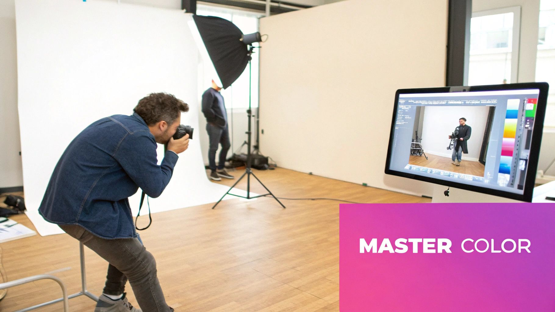
Building Your Foundation with Color Correction
Before you even think about applying those cool, stylistic filters, we need to talk about the bedrock of any professional edit: color correction. This isn't the flashy part, but it's arguably the most important. The goal here isn’t about making a creative statement; it’s about making the image accurate. You’re aiming to make the colors look just as they would in real life, creating a clean, neutral canvas for any grading you do later.
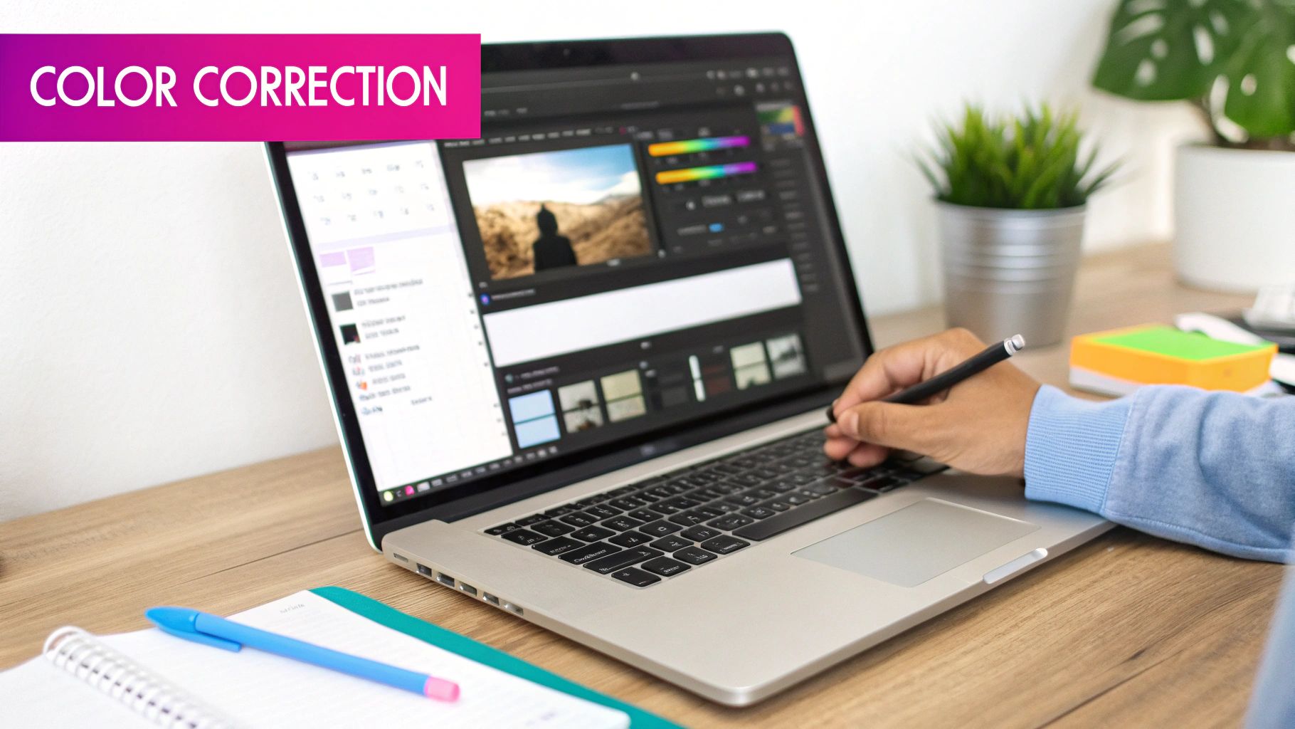
Think of it like tuning a guitar before a concert. If the foundational notes are off, the whole song is going to sound wrong, no matter how well you play. Color correction fixes those "off-key" colors, ensuring your image is balanced and true to life.
Mastering the HSL Sliders
One of the most powerful tools in your arsenal for this is the Hue, Saturation, and Luminance (HSL) panel. Instead of making clumsy, image-wide adjustments, HSL lets you target specific color ranges with surgical precision. This is where the real control happens.
- Hue: This slider shifts the actual shade of a chosen color. You could take a dull, yellowish-green lawn and push it toward a richer, more emerald tone.
- Saturation: This controls a color's intensity. It’s perfect for boosting a muted blue sky to make it pop or, just as importantly, toning down a distracting red sign in the background that pulls focus.
- Luminance: This adjusts the brightness of a specific color. A classic move is to brighten the blues in the sky to make it feel more airy, or darken them to create a more dramatic, moody scene.
Let's say you have a photo from an overcast day where everything has a subtle, gloomy blue cast. Using the color balance or temperature sliders, you can gently introduce warmth (yellow) to neutralize that blue, instantly making the scene feel more natural and inviting.
Or consider indoor lighting, which often leaves a heavy yellow or orange tint on everything. By pushing the temperature slider toward the cooler (blue) end of the spectrum, you counteract that cast and bring your whites back to pure white. Once you get the hang of fixing these common issues, you can delve into dedicated color correction tools that offer even more advanced options.
Real-World Color Correction Scenarios
Alright, enough theory. Let's talk about how this works in practice.
Picture a product photo taken under less-than-ideal lighting. The color of the shirt looks washed out and doesn't quite match the real-life product—a massive problem for any e-commerce store.
The primary goal of color correction isn't to make an image look "better" in a subjective sense, but to make it look correct. Accuracy is the foundation of every great edit.
Using the HSL panel, you can isolate the specific color of that shirt, then carefully boost its saturation and adjust the luminance until it's a perfect match. This simple fix ensures that what your customers see online is exactly what they’ll get in the mail. We actually explore how to apply these principles at scale for consistent results in our guide to AI product photography over at https://bulkimagegeneration.com/blog/en/tutorials/ai-product-photography.
Here's another classic example: a landscape shot where the foliage just looks a bit flat. A beginner's mistake is to crank up the global saturation slider, which usually makes everything, including skin tones and the sky, look fake and oversaturated. Instead, a pro would go into the HSL panel, select only the greens and yellows, and give them a targeted saturation boost. This brings the landscape to life without ruining the rest of the image.
Mastering these foundational fixes is what separates a good edit from a great one. Get this right, and you've built the perfect launchpad for all your creative ideas.
Telling a Story with Creative Color Grading
Once your image is properly corrected, you can get to the fun part: color grading. This is where you stop being a photo technician and become a visual storyteller. Color grading isn't about accuracy; it's about deliberately styling the colors in your image to create a specific mood, feeling, or aesthetic.
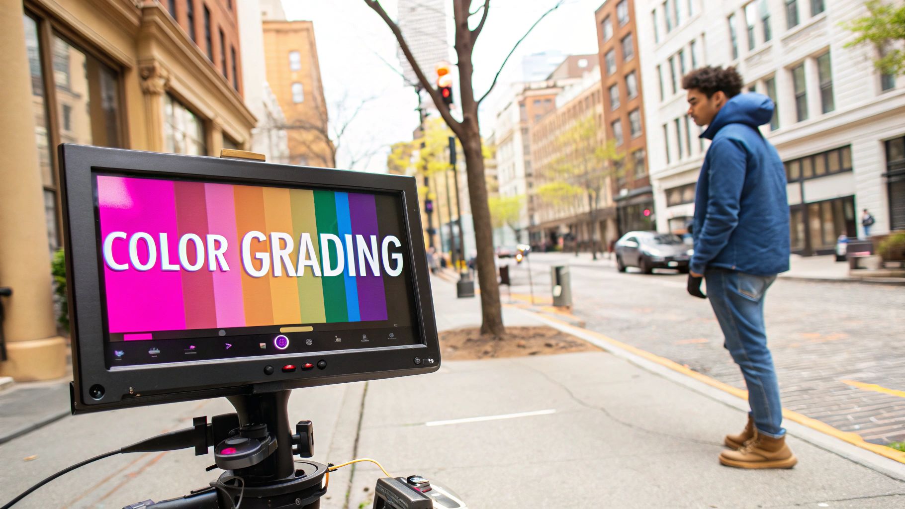
Think about how filmmakers make a desert scene feel scorching hot with heavy oranges and yellows, or how a sci-fi cityscape feels cold and sterile with desaturated blues and cyans. That’s color grading in action. You're no longer just editing colors; you're using them to spark a powerful emotional response.
Creating Iconic Looks with Curves and Wheels
For professional-level color grading, two of your most powerful tools are Curves and Color Wheels. They might look a little intimidating at first glance, but they offer incredible control once you get the hang of them.
Color Wheels, for example, let you "push" specific colors into the shadows, midtones, and highlights of your shot.
Ever heard of the cinematic "teal and orange" look? It's everywhere in blockbuster films for a reason. To get that style, you’d typically:
- Push teal or blue tones into the shadows.
- Nudge subtle orange or yellow tones into the highlights, which beautifully complements skin tones.
This creates a really pleasing color contrast that just works. In the same way, you can create a warm, dreamy "golden hour" vibe by pushing yellows and reds into the midtones and highlights, mimicking that soft light from a setting sun. This entire process of visual storytelling can even be automated from the very beginning; our AI art generator explores how text prompts can define these color moods from the get-go.
The Challenge of Natural Skin Tones
Here’s a common pitfall: you apply a really cool, blueish grade across an image, only to realize the people in the photo now look sickly or totally unnatural. It's a dead giveaway of an amateur edit.
The secret is to apply your grade selectively. Most advanced editing software lets you create a mask that isolates skin tones based on their color range. This lets you apply that dramatic teal grade to the entire image except for the skin you've masked off. The result is a shot that has the mood you want, but with people who still look healthy and natural.
A successful color grade should feel intentional but not distracting. The goal is to enhance the story of the image, not to have the viewer think, "Wow, look at that filter."
Making a Single Color Pop
Sometimes, your story isn't about the overall mood but about one specific, important detail. Picture a person in a bright red coat walking through a dreary, gray cityscape. You want that coat to be the only thing anyone sees.
This is where selective color adjustments are your best friend. Using a tool like the HSL panel, you can isolate the red channel and crank up its saturation and luminance. At the same time, you can dial back the saturation on the other colors, like the blues and grays of the city. You're left with a striking image where that red coat commands all the attention, telling a story of vibrancy in an otherwise monochrome world.
Using AI to Edit Colors at Scale
Editing a few photos by hand? No problem. But what about an entire e-commerce catalog? Or a gallery of 500 event shots? Suddenly, that manageable task explodes into a logistical nightmare. You're looking at days of tedious work, fighting to keep every image consistent—a battle you'll likely lose.
This is exactly where AI-powered batch processing comes in. Forget one-by-one adjustments. Modern tools can look at a single, perfected image, learn its color profile, and then apply those exact corrections across hundreds of other photos in minutes. It's not just about saving time; it's about achieving perfect visual harmony, no matter the scale.
The Power of Batch Editing for Consistency
Imagine you've just nailed the look for a new product line. The lighting is perfect, the whites are crisp, and the product's color is spot-on. In a traditional workflow, you'd have to meticulously copy and paste settings for every single photo, hoping you don't miss a beat. It’s a process just begging for human error.
AI-driven batch editors flip that script. They create a color "template" from your hero image. You perfect one, and the system intelligently applies those same hue, saturation, and luminance adjustments to the rest of the batch.
This is an absolute game-changer for:
- E-commerce Stores: Ensuring every product on a category page looks like it belongs there, creating a clean, professional storefront.
- Event Photographers: Delivering a full gallery with a signature color grade that’s consistent from the first photo to the last.
- Marketers: Maintaining strict brand guidelines across dozens of social media visuals and ad campaigns without breaking a sweat.
There's a reason the photo editing software market is projected to grow by $606.1 million between 2025 and 2029. This boom is largely fueled by AI tools that make complex tasks like batch color editing accessible to everyone. You can dig into the specifics by exploring the full Technavio report.
A Practical Walkthrough with a Batch Editor
Let's see how this works in the real world with a tool like Bulk Image Generation's batch editor. The whole process is built for speed—you can upload an entire folder of images at once.
In this setup, you see your main image on the left and the rest of your batch on the right. Once you apply your color edits to that main photo, a single click ripples those exact changes across every other image.
The real magic is the instant visual feedback. You immediately see how your color grade translates across different products or scenes. This lets you make quick tweaks on the fly before exporting, turning what used to be a multi-day editing marathon into a task you can knock out in under an hour.
To really understand the difference, let's break down the old way versus the new way.
Manual Editing vs AI Batch Editing
| Feature | Manual Editing | AI Batch Editing |
|---|---|---|
| Speed | Slow; hours or days for large sets | Fast; minutes for hundreds of images |
| Consistency | Prone to human error and variations | Perfect, pixel-for-pixel consistency |
| Workflow | Repetitive, one-by-one adjustments | "Edit once, apply to all" workflow |
| Scalability | Poor; becomes impractical with volume | Excellent; handles thousands of images easily |
| Time Cost | Extremely high, especially for pros | Minimal, freeing up creative time |
The table makes it pretty clear. The manual approach just doesn't scale in a world that demands high-volume, high-quality content.
By automating repetitive color adjustments, you free up valuable time to focus on the more creative aspects of your work. AI handles the consistency, so you can handle the artistry.
This automated approach is at the heart of modern image tools. For marketers juggling tons of content, our guide on using a bulk social media image generator dives deeper into creating consistent visuals quickly. In the end, using AI to edit colors at scale isn’t just about the technology—it’s about reclaiming your time while pushing your brand's quality to a new level.
Common Color Editing Mistakes to Avoid
Knowing which sliders to move is only half the battle. Just as important—maybe even more so—is knowing what not to do. I’ve seen so many aspiring editors fall into the same traps over the years, but with a bit of foresight, you can sidestep them for much cleaner, more professional results.
These common errors usually come from a desire for instant, dramatic impact, but they almost always do more harm than good. A subtle, thoughtful touch will beat a heavy-handed adjustment every time.
Modern AI-powered tools have simplified the editing journey, turning a complex task into a few straightforward steps.
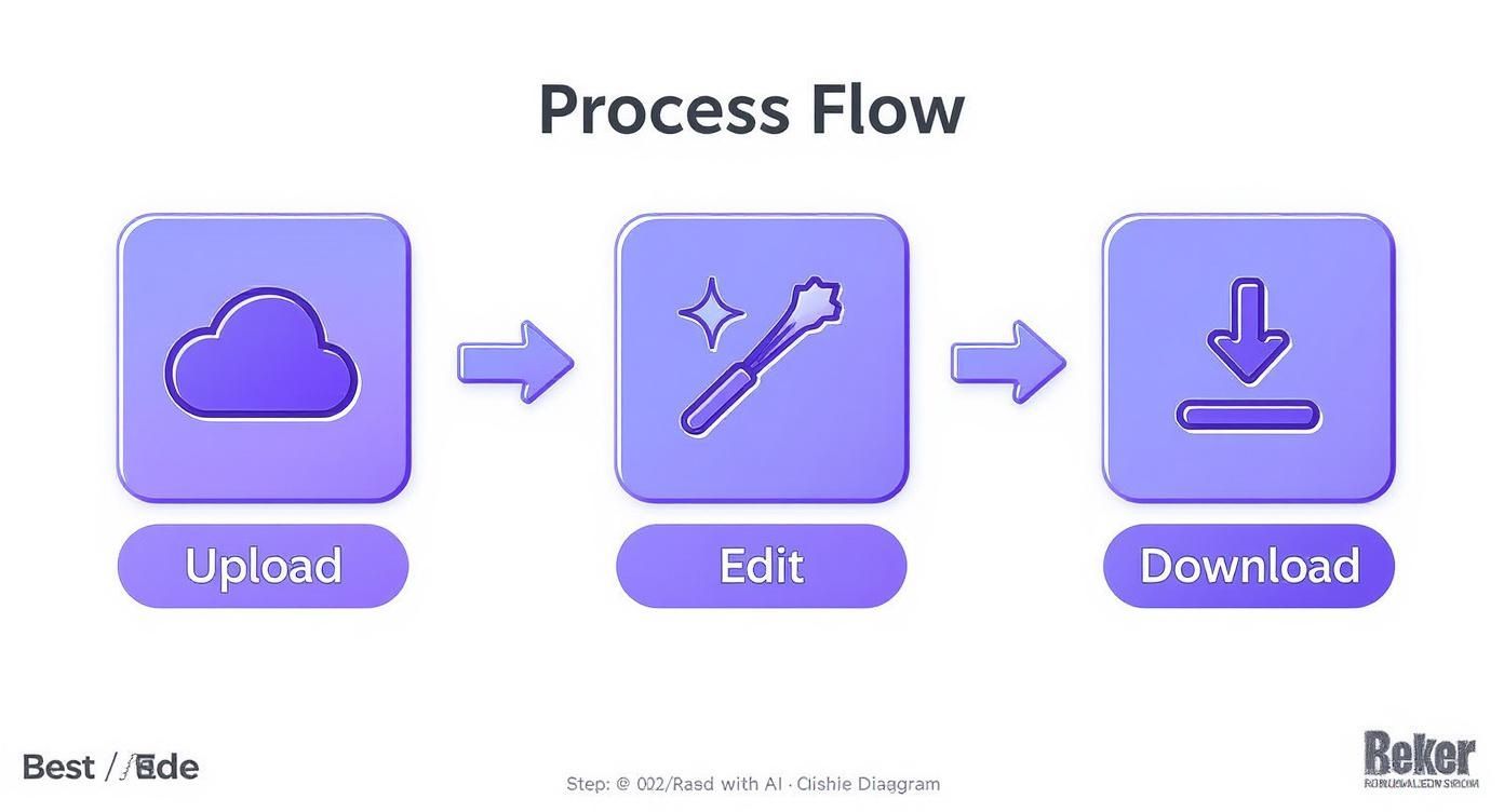
This workflow shows just how streamlined the process has become.
Overcooking the Saturation
This is the big one. It's the most common mistake I see, and it instantly screams "amateur." Cranking the saturation slider to the max might seem like an easy way to make colors pop, but it results in a garish, unnatural mess. Skin tones turn an alarming shade of orange, delicate color transitions get crushed, and the whole image just looks cheap.
Instead of hammering the global saturation, reach for the Vibrance slider. It's much smarter, boosting the less-saturated colors while protecting the ones that are already vibrant, especially skin tones. For even more precise control, jump into the HSL panel. There, you can saturate just the blues in the sky or the greens in the grass without making your friend look like a traffic cone.
The goal of a great edit is to enhance reality, not create a cartoon. If the colors look like they’re screaming for attention, you’ve probably pushed them too far.
Misusing Presets
Presets are fantastic starting points, but they are rarely a one-click fix. A preset designed for a bright, sunny beach photo is going to look completely out of place on a portrait taken on a cloudy day. Blindly slapping on presets without any adjustments is a recipe for inconsistent and often bizarre-looking images.
Think of a preset as a base recipe, not the final dish. You should always expect to tweak the ingredients. After applying a preset, go back and adjust the exposure, white balance, and contrast to make it truly fit your photo's specific lighting and subject.
Ignoring Monitor Calibration
This one is a bit technical, but it's absolutely critical. If your monitor isn't calibrated, what you see isn't what everyone else gets. You could spend an hour perfecting the colors, only to find the image looks too dark, too warm, or sickly green on your client's computer or a customer's phone.
Using a hardware calibration tool ensures you're working with accurate, true-to-life colors. For any professional work, especially in e-commerce where product color accuracy is everything, this is non-negotiable. Editing on an uncalibrated screen is like trying to mix paint in the dark. You're just guessing.
Photo Color Editing: Your Questions Answered
When you're first diving into editing colors, a few common questions always seem to pop up. Getting these sorted out early will save you a ton of frustration and get you to the look you're after much, much faster. Let's tackle some of the big ones.
How Can I Change the Color of Just One Thing in a Photo?
This is a classic editing challenge. The secret is using selective adjustments, which almost always means working with masks.
Think of it this way: you want to change a blue shirt to green without turning everything else in the photo green, too. In a program like Photoshop or Lightroom, your first move is to isolate that shirt. You can use an object selection tool to trace the item, essentially putting a digital fence around it.
Once the shirt is selected, you apply a Hue/Saturation adjustment just to that area. Now you can slide the hue slider and watch the shirt change colors while the rest of the image stays exactly the same. It's the go-to technique for making targeted, believable color changes.
What Is the Difference Between Color Correction and Color Grading?
This one trips up a lot of people, but the distinction is crucial. I always tell people to think of it like this: color correction is science, and color grading is art.
Color correction is the technical first step. It’s all about fixing problems to make the image look true-to-life. This means adjusting the white balance so a white wall actually looks white (not yellow), fixing the exposure, and balancing the contrast. You're establishing a neutral, accurate baseline.
Color grading is what you do after correction. This is where your creativity comes in. It’s the process of adding a specific style, mood, or emotional tone to the image. For example, adding warm orange and yellow tones for a nostalgic, golden-hour vibe? That’s color grading. Pushing cool blues and teals into the shadows for a dramatic, cinematic feel? Also color grading.
You always correct first, then grade.
The easiest way to remember it: correction fixes reality, while grading creates a mood. One is about accuracy; the other is about emotion.
How Do I Make My Colors Look Good on Instagram and Online?
Ah, the age-old battle of color consistency across a million different screens. You can't control what phone or monitor other people use, but you can take two key steps to give your images the best possible chance of looking right.
First, if you're serious about your colors, work on a calibrated monitor. This is a game-changer. It ensures that the colors you see while editing are accurate, so you're not making adjustments based on a screen that's too blue or too bright.
Second, when you're ready to share your photo online, always export it in the sRGB color profile. This is the universal standard for pretty much every web browser and mobile device out there, including Instagram. Exporting in sRGB ensures that most screens will interpret your colors as closely as possible to how you intended them.
Ready to stop editing one image at a time and start scaling your creativity? Bulk Image Generation uses powerful AI to apply your unique color styles across hundreds of photos in seconds, ensuring perfect brand consistency with minimal effort. Try it for free and transform your workflow today.