
How to create fb cover photo collage that gets noticed

Aarav Mehta • November 30, 2025
Learn how to create fb cover photo collage that tells your story with easy layout ideas and tool picks.
A Facebook cover photo collage is your chance to combine several standout images into one powerful banner, perfectly sized for your profile. This isn't just about slapping pictures together; it’s about choosing a theme, picking photos that complement each other, and arranging them in a layout that tells a story—all within the specific dimensions Facebook requires. Get it right, and you turn that prime digital real estate from a static picture into a dynamic canvas.
Why a Great Cover Collage Still Matters
Think of your Facebook cover as the digital welcome mat for your brand or personal page. It’s the very first thing people see, making it your best shot at a killer first impression. While a single, strong photo can work, a collage gives you so much more room to play with. You can tell a richer story, showcase an entire product line, or reveal different facets of your personality all at once.
It’s basically your own mini-billboard. A local bakery could feature shots of their best-selling pastries, their friendly staff, and a packed weekend cafe. A travel blogger might stitch together photos from their latest adventures in Bali, Tokyo, and Rome, instantly screaming "expert traveler." It's just a more engaging way to introduce yourself.
Boost Engagement Through Visuals
It’s no secret that visual content crushes it on social media. In fact, photos on Facebook are known to pull in 35% more engagement than posts that are just text. That’s a huge number you can’t ignore.
A thoughtfully designed cover collage taps directly into this, using the power of images to grab attention the second someone lands on your page.

This visual-first strategy is what stops the scroll and encourages visitors to stick around and see what you're all about.
A well-crafted cover collage does more than just decorate your profile—it communicates value, sets expectations, and encourages visitors to explore further. It’s your first and best chance to show people what you're all about without saying a word.
Putting in the effort to create a FB cover photo collage is a smart move that pays off in brand recognition and audience connection. When you pair this creative approach with modern tools, like those found in guides on AI marketing software, you turn a simple profile element into a hardworking marketing asset.
Selecting and Preparing Your Images
A great collage doesn’t start in a design tool. It starts with the images you choose. While high-resolution photos are a must, the real secret is picking pictures that tell a cohesive story together. You need to think like a curator, not just a collector. Your job is to find images that share a visual language.
For instance, if you're a fitness coach, don't just throw a bunch of random gym photos together. Look for shots with similar lighting—maybe everything is bright and energetic, not dark and moody. What about the colors? Do the blues in one photo clash with the reds in another? Sticking to a consistent color palette or a clear theme is what makes a collage look polished and professional, not like a chaotic mess.
Streamline Your Workflow with AI
Let's be honest, prepping each photo by hand is a drag, especially when you're sorting through dozens of them. This is where modern tools can completely change the game. Instead of resizing images one by one or painstakingly cutting out backgrounds, you can put those repetitive tasks on autopilot.
AI-powered features make prepping your assets incredibly fast. Imagine grabbing a batch of photos and having their backgrounds removed in seconds, leaving you with clean cutouts ready to go. It's a massive time-saver that frees you up to focus on the creative side of things. Getting every image to the right dimensions is also key for quality. To see this in action, check out our guide on using a bulk image resizer to prep your photos in no time.
Pro Tip: Before you even think about design, create a dedicated folder with 10-15 of your absolute best, fully prepped images. Having this "shortlist" ready makes the final selection process so much smoother and keeps you from getting buried in options.
By focusing on visual harmony upfront and letting smart tools handle the grunt work, you’re setting yourself up for a much better final design. This prep work ensures that when you do create your collage, it looks intentional and professionally crafted. The right foundation makes all the difference.
Designing Your Cover Collage Layout
Alright, this is where the fun really begins. You’ve gathered your images, and now it’s time to bring that vision to life by actually building your Facebook cover photo collage. Forget about following a rigid, step-by-step formula; think of this as a creative sandbox.
If you're just starting out, using versatile design platforms like Canva is a solid move. They come loaded with pre-sized templates and drag-and-drop tools that make the whole process much smoother.
The first, and most critical, decision is getting your canvas set up correctly. The ideal size for a Facebook cover photo is still 851 x 315 pixels. This gives you that clean 16:9 aspect ratio that looks good across most devices. But here's the kicker: you absolutely have to design within the mobile-safe zone, which is a centered area of roughly 820 x 312 pixels. This stops Facebook from awkwardly cropping your key visuals on phones.
Finding the Perfect Grid
With your canvas ready, the next move is to pick a layout grid. This is the skeleton that will hold your photos together. Don't just grab the first one you see—think about the story you're trying to tell.
- Launching a new product? Try a layout with one large central spot and smaller cells around it. Put your hero product right in the middle and use the surrounding spaces for lifestyle shots or close-up details.
- Building a personal brand? A more balanced grid with three or four equally sized cells is perfect for showing different sides of your work—maybe a shot of you public speaking, a behind-the-scenes moment, and a client success story.
This flowchart breaks down the prep work that gets your images ready for any layout you choose.
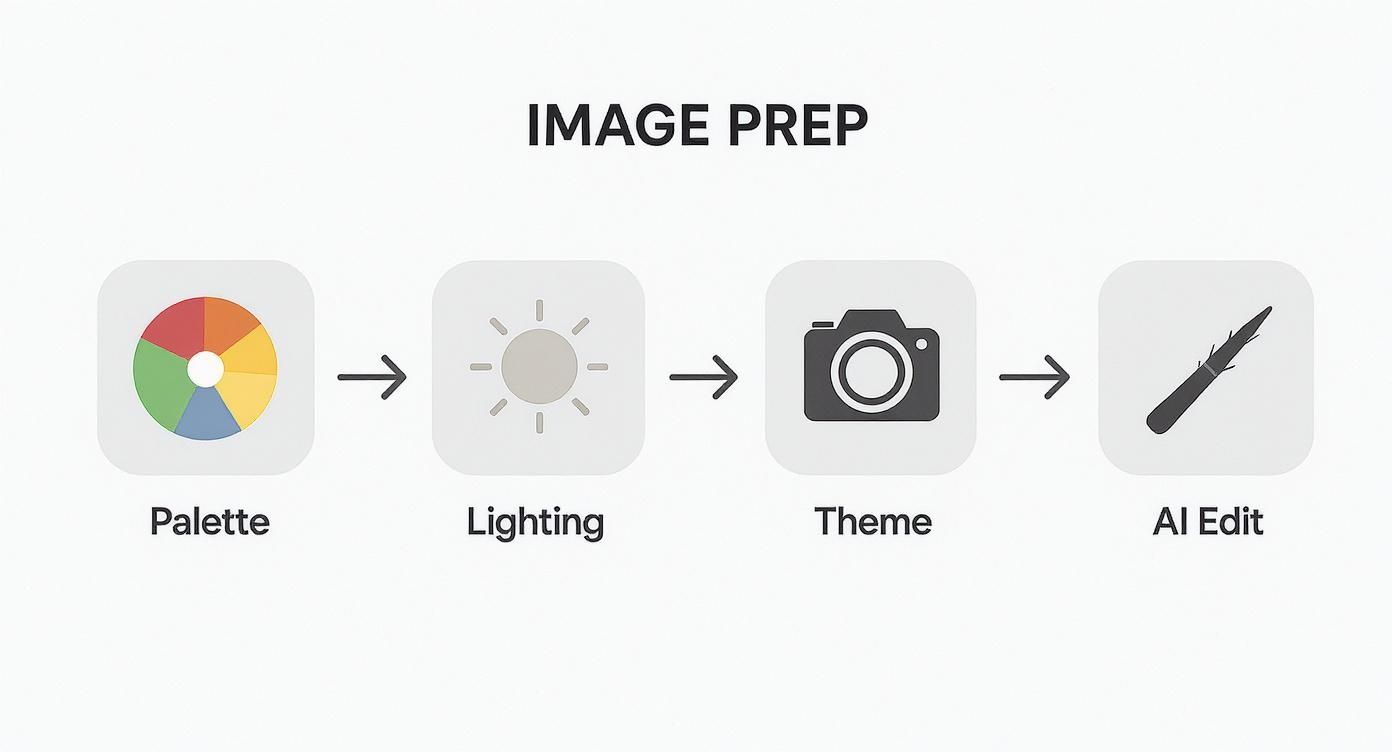
Following these steps ensures that every single photo contributes to a cohesive final design, from color harmony all the way to thematic consistency.
Once you’ve settled on a grid, start dragging and dropping your prepped images into the cells. Play around with the arrangement. Does the visual flow feel natural? Do the colors in adjacent photos clash or complement each other? It's a bit of trial and error until the whole composition feels balanced and makes an impact. You can also add a tasteful text overlay with your business name or a short tagline, but keep it minimal to avoid cluttering the design.
The goal isn't to cram as many photos in as possible. It's to create a visual hierarchy that guides the viewer's eye to the most important elements of your story. Less is often more.
Nailing the dimensions from the get-go is non-negotiable if you want a professional look. If you need a hand calculating different image sizes while keeping the right proportions for your collage cells, our free aspect ratio calculator can be a huge help. By focusing on a strong layout and always keeping the mobile view in mind, you’ll end up with a cover collage that looks fantastic everywhere.
Pro Tips to Make Your Collage Pop
Okay, you’ve got your layout. Now for the fun part—turning a simple arrangement of photos into something that actually stops the scroll. This is where a little bit of design thinking goes a long way.
First things first, you need a clear visual hierarchy. Think of it this way: not every photo in your collage can be the star of the show. You have to pick one. Is it your main product? A powerful portrait? The one image that captures the entire vibe? Whatever it is, give it the spotlight. Make it bigger, stick it in the center, or use color to make it jump off the screen. This guides the viewer’s eye, telling a story instead of just throwing a jumble of images at them.
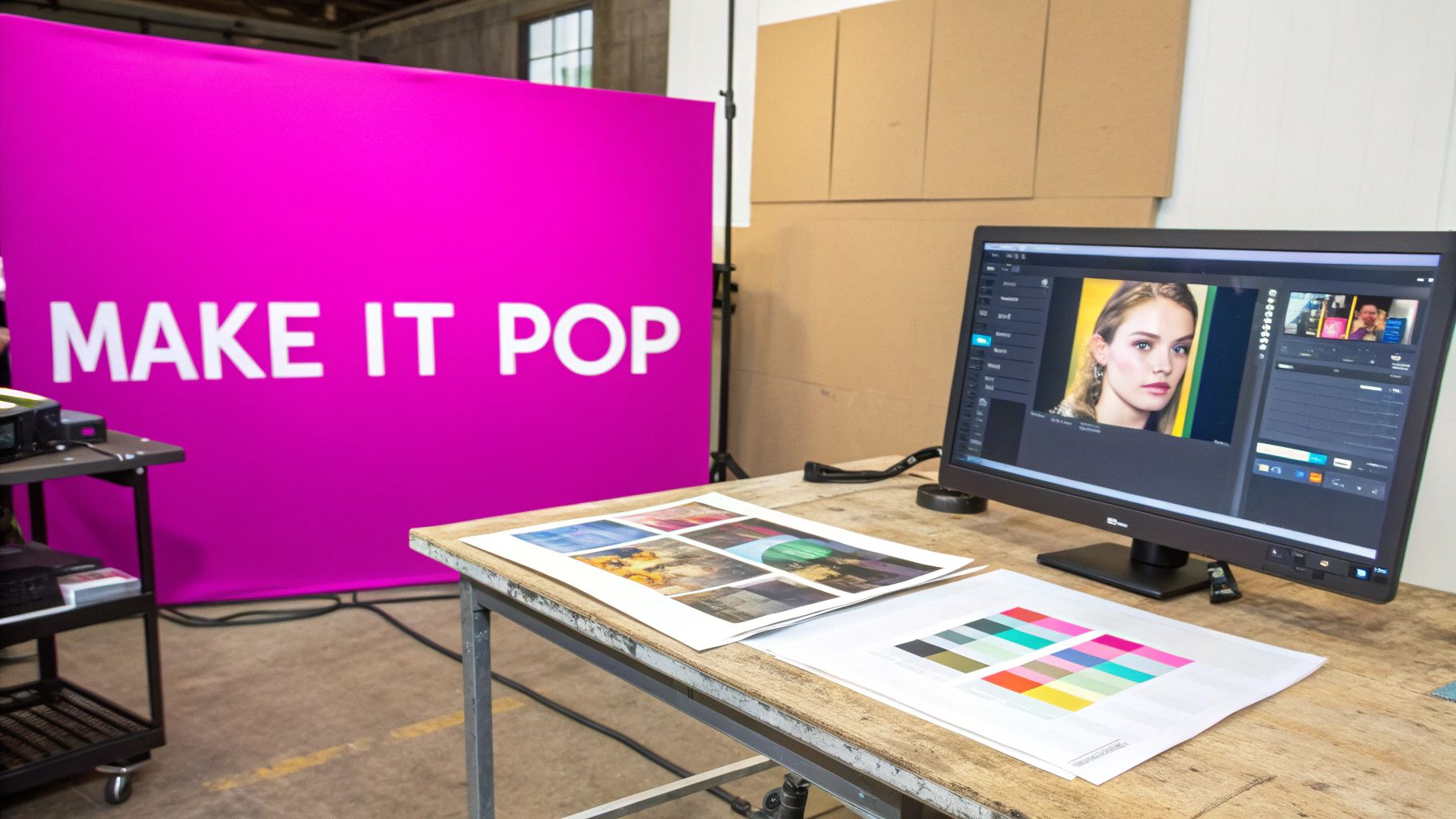
Unify Your Aesthetic with Color and Filters
When you create a FB cover photo collage, the goal is to make it feel cohesive, not chaotic. An easy win here is to apply a consistent filter or color grade across all your photos. It’s a simple trick, but it instantly makes a bunch of separate images feel like they belong together.
For example, a warm, slightly faded filter can create a nostalgic vibe, which is perfect for a family photographer's page. On the other hand, a clean, high-contrast black-and-white treatment might be just the thing for a sleek tech brand. The idea is to make the individual photos feel like they’re all part of one harmonious picture.
The best collages connect on an emotional level, and nothing does that better than authentic human faces. When people see relatable expressions, they instantly feel a stronger connection to your story or brand.
This isn’t just a gut feeling; there’s data to back it up. Event banners featuring real human faces have been shown to get 3.2 times higher click-through rates than those with generic stock photos. You can dig into these engagement insights on Content Studio to see just how much of a difference a friendly face makes. Balancing this human touch with a clean design is the secret to a collage that doesn’t just get seen—it gets felt.
Time to Export and Go Live
Alright, you've done the hard work of designing your collage. Now for the final, crucial step: getting it out of your design tool and onto Facebook without losing all that beautiful quality.
Don't just hit the download button and call it a day. Facebook can be pretty aggressive with how it compresses images, which can turn your sharp, vibrant collage into a blurry mess. The secret is giving the platform a file that it likes from the very beginning.
Before you export, dig into the settings. Your goal is to save the collage as a JPG. While you might see PNG as an option, JPGs give you the best mix of quality and file size for photos, which is exactly what a collage is.
Your Pre-Flight Export Checklist
I can't stress this enough: getting these settings right makes all the difference. To avoid those classic upload fails, just run through this quick list:
- File Format: Always, always choose JPG.
- Color Profile: Make sure it’s set to sRGB. This is the standard for the web and ensures your colors don't look weird or washed out after you upload.
- File Size: Try to keep the final file under 100 KB. This is the magic number that helps you avoid Facebook's harshest compression while keeping things looking crisp.
If you want to go a little deeper, understanding the basics of image optimization for web is a game-changer. The same principles apply here and will help you get better results on any platform, not just Facebook.
Once your collage is uploaded, you're not quite done. Facebook gives you the option to reposition the image. Take a second to drag it up or down until the framing is perfect.
Final Check: This is non-negotiable. Pull up your Facebook page on a desktop computer and on your phone. See how the cover photo looks on both. This one last check guarantees your design looks fantastic no matter how people find you.
Common Questions About Cover Collages
Even with a perfect plan, you're bound to hit a snag or two when putting together a Facebook cover collage. Getting a quick answer to those common hurdles can save you a ton of time and frustration, helping you get a design you’re actually proud of. Let's tackle some of the questions I hear most often.
One of the first things people want to know is what free tools are best for the job. For most people, Canva is the top choice. It’s loaded with perfectly sized templates and a huge library of drag-and-drop grids, and its interface is simple enough for anyone to just jump in and start creating. If Canva isn't your thing, Adobe Express and Fotor also have powerful free versions that get the job done.
Why Does My Collage Look Blurry?
Ah, the classic problem. The fix is usually pretty straightforward, though. Blurriness on Facebook almost always comes down to two culprits: low-resolution source images or Facebook’s own aggressive compression. So, rule one is to always start with the sharpest, highest-quality photos you can find.
When you export your final design, the trick is to save it as an sRGB JPG file under 100 KB. Hitting that file size is the sweet spot. It helps you dodge the worst of Facebook's compression, meaning your image will look much clearer and crisper once it's uploaded.
Your cover collage is a living part of your profile, not a static fixture. Keeping it updated signals to visitors that your page is active, relevant, and worth following.
Another common question is how often the collage should be updated. Honestly, it really depends on your goals. A business might switch up its cover quarterly or to push a specific campaign, a new service, or a seasonal sale. For a personal profile, you could refresh it after a big life event—a wedding, a trip, a new pet—or just whenever you feel like changing up your online look. There’s no hard-and-fast rule, but keeping it current is always a smart move.
Ready to create stunning visuals for your next project without the hassle? With Bulk Image Generation, you can produce hundreds of unique, high-quality images in seconds. Let our advanced AI handle the creative heavy lifting for you. Start creating for free today at bulkimagegeneration.com.