
8.5 x11 aspect ratio: Master the Perfect Page Layout

Aarav Mehta • December 3, 2025
Discover the 8.5 x11 aspect ratio and learn ideal pixel dimensions, DPI guidance, and printing tips to ensure sharp, accurate results.
The 8.5 x 11 aspect ratio is probably the most familiar shape you can think of. It’s US Letter—the standard for everything from school reports to office memos across North America. But behind those simple dimensions is a specific proportional relationship: 17:22.
Understanding the 8.5 x 11 Aspect Ratio
When we talk about the 8.5 x 11 aspect ratio, we’re not just talking about physical inches. We’re talking about a rule of proportion. It’s like a recipe for a shape: for every 8.5 units of width, you need exactly 11 units of height. This rule keeps the shape consistent, whether it's a small handout or a giant poster.
This particular shape is the backbone of design in the United States, Canada, and parts of Mexico. While most of the world runs on the A4 standard, US Letter has its own unique story. It dates back to old-school manufacturing practices where paper molds were sized based on the arm span of the papermaker. Cutting down those massive sheets just happened to result in the familiar 8.5 by 11-inch page we use today.
Why This Shape Is More Than Just Paper
Getting this ratio right is everything. It dictates how your visuals—your text, your images, your graphics—all fit within the frame. If you design something for a square (1:1) or a widescreen video (16:9), it’s simply not going to fit on a US Letter page without getting mangled.
An aspect ratio is a rule of proportion, not a set of fixed dimensions. It guarantees that an image or design maintains its intended shape, preventing unwanted stretching, cropping, or empty space when scaled or printed.
For anyone creating content that will end up on a piece of paper in North America, mastering this ratio is a must. It’s the bridge that ensures your digital designs look just as good in the real world.
Ignoring it? That leads to some frustrating—and expensive—problems:
- Unintended Cropping: The edges of your beautiful design or key bits of information get sliced off during printing.
- Awkward White Space: To avoid cutting off content, the printer might add ugly white bars (called letterboxing) to the sides or top and bottom.
- Distorted Visuals: Images get stretched or squashed to force a fit, making everything look unprofessional and amateurish.
When you work within that 17:22 proportion from the very beginning, you’re in control. You dictate exactly how the final product will look.
Translating 8.5 x 11 Inches to Pixels and Ratios
The physical measurement of 8.5 by 11 inches is straightforward, but in the digital world, those numbers need a translation. Design software, AI image generators, and even web browsers think in pixels and ratios, not inches. Getting this conversion right is the key to making sure your digital creations look perfect when they finally hit the paper.
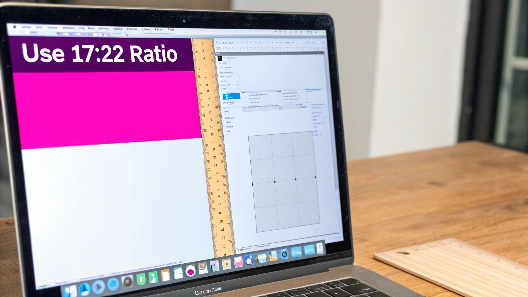
The 8.5 x 11 aspect ratio can be a bit awkward to work with because of that decimal. To clean it up for digital use, you can simply multiply both numbers by two. This little trick removes the fraction and gives you a much cleaner, whole-number ratio of 17:22.
That 17:22 ratio is your golden ticket. It's the exact proportion you should use in AI tools like Midjourney or DALL-E to generate perfectly shaped images for US Letter projects right from the start.
From Inches to Ratios
Another way to think about this relationship is in its decimal form. If you divide the height (11) by the width (8.5), you get approximately 1.294. This just means that for every 1 unit of width, the height needs to be 1.294 units to maintain that perfect US Letter shape. It’s a handy number to remember when you need to scale your work without causing weird stretching or distortion.
You might wonder where this oddly specific size even came from. It's actually a practical holdover from the days of handmade paper. Early paper molds were about 44 inches wide—a dimension based on the arm span of a papermaker. When those massive sheets were cut in half twice, they produced four sheets that were roughly 8.5 x 11 inches. It became a standard almost by accident!
Converting Inches to Pixels
For any designer, the most critical translation is from inches to pixels, and this all hinges on one thing: DPI (Dots Per Inch). DPI is the resolution, or simply the number of tiny pixel dots packed into every inch of your image. Higher DPI means a sharper, more detailed print.
Think of DPI like the thread count in bedsheets. A low thread count sheet (low DPI) feels rough, and you can almost see the individual threads. A high thread count sheet (high DPI) feels smooth and luxurious because the threads are packed so tightly together. It's the same idea with pixels.
A standard web image at 72 DPI will look blurry and pixelated if you try to print it, while a professional print file at 300 DPI will be crisp and clear. Knowing how your design will be used is everything—it determines the DPI you need from the very beginning.
If you're ever unsure about the math, our simple aspect ratio calculator can find the right pixel dimensions for you in seconds.
8.5 x 11 Inch Dimensions in Pixels at Common DPI
Here’s a quick reference table to help you convert the 8.5 x 11 aspect ratio into the correct pixel dimensions for your next project. Just find your use case and grab the numbers you need.
| DPI (Dots Per Inch) | Pixel Dimensions (Width x Height) | Common Use Case |
|---|---|---|
| 72 DPI | 612 x 792 pixels | Digital mockups, web graphics, and on-screen previews where print quality isn't needed. |
| 150 DPI | 1275 x 1650 pixels | Standard home or office printing, draft documents, and good-quality presentations. |
| 300 DPI | 2550 x 3300 pixels | Professional printing for flyers, brochures, high-quality photos, and art prints. |
| 600 DPI | 5100 x 6600 pixels | High-end archival printing, fine art reproduction, and detailed line art. |
Choosing the right DPI from this table ensures your final output, whether it's on a screen or on paper, looks exactly as you intended. 300 DPI is the industry standard for high-quality print work, so when in doubt, it's a safe and reliable choice.
Why This Ratio Matters for Printing and Cropping
This is where the rubber meets the road—connecting your digital canvas to a physical page. The 8.5 x 11 aspect ratio is the bridge, and if you ignore it, you’re setting yourself up for some frustrating (and expensive) printing mistakes.
Ever print a photo only to find weird white bars along the edges? Or worse, realize the top of someone’s head has been chopped clean off? That’s a classic aspect ratio mismatch in action.
It happens when you try to force an image with one shape onto a page with another. Most phone cameras shoot in wider formats like 4:3 or 16:9. When you try to print that on a taller, narrower 17:22 sheet of US Letter paper, the printer has to guess what you want. It either adds filler space or starts cropping things out.
The Consequences of Mismatched Ratios
When your image's proportions don't line up with the 17:22 ratio, one of two things will happen, and neither is good:
- Your content gets cropped: To fill the entire 8.5 x 11 page, the printer will just slice off parts of your image. This is a nightmare if important details are near the edges of your frame.
- You get letterboxed: To save the whole image, the printer adds white bars (what we call "letterboxing") to the top and bottom or the sides. The result looks amateurish and wastes a ton of space.
Getting this right is a bigger deal than you might think, especially since we still print so much. The average U.S. office worker goes through around 10,000 sheets of copy paper every year.
This image shows you exactly how your digital file's resolution (DPI) translates to the pixel dimensions you need for a sharp print.
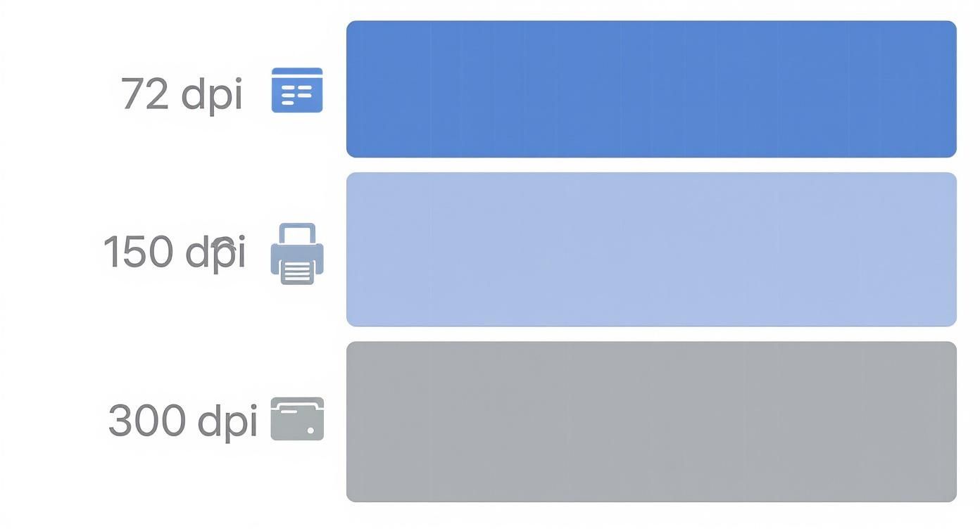
As you can see, a high-quality print at 300 DPI requires a file with way more pixels than a simple screen graphic.
How to Prepare Images for Perfect Printing
The only way to avoid these problems is to prep your images before you hit "print." This is where cropping becomes your best friend. Think of it not as cutting things out, but as reframing your shot to perfectly fit the page.
Cropping is the essential step that aligns your image's aspect ratio with your print dimensions. By setting a 17:22 crop from the start, you take full control over the final composition and ensure there are no surprises.
Every decent photo editor lets you lock the aspect ratio in the crop tool. Just plug in 17:22 (or the exact pixel dimensions for your target DPI) and you'll see precisely what will end up on the page.
And if you’re prepping a whole batch of images? A bulk image resizer can automate this whole process, saving you a massive amount of time while making sure every single image is formatted for a flawless print run.
Putting the 8.5 x 11 Ratio to Work in Your Tools
Okay, so you've got the theory down. The 8.5 x 11 aspect ratio isn't just a random number; it's a specific shape. Now for the fun part: making it work for you. Getting that 17:22 proportion set up in your favorite design and AI tools is surprisingly easy once you know where to click.
Nailing this at the start saves you from the headache of awkward cropping and resizing later. Whether you’re thinking in inches for a flyer or pixels for a digital mockup, the core idea is the same: tell your software the exact shape you need before you even start designing.
This simple step ensures every project kicks off on a perfectly sized canvas, ready for your ideas.
Setting Up in Standard Design Software
Most pro-level design software gives you total control over your canvas from the get-go. And when you're looking at different book cover design tools, knowing how to input these specific print dimensions is a must. Here’s a quick rundown for the most common platforms:
- Adobe Photoshop & Illustrator: When you create a new document (File > New), a dialog box pops up. Just switch the units to "Inches," then type in 8.5 for the width and 11 for the height. Pro tip: if it’s for print, make sure you set the resolution to 300 DPI right here for a crisp, high-quality result.
- Canva: On the Canva home screen, hit the "Custom size" button. In the little window that appears, change the unit dropdown from "px" (pixels) to "in" (inches). Then just enter 8.5 and 11 into the width and height boxes. Done.
That’s it. Your digital canvas is now a perfect twin of a US Letter page.
Generating AI Images with the Correct Ratio
The 8.5 x 11 aspect ratio is just as critical when you’re working with AI image generators. If you're creating artwork for a coloring book, a poster, or a report cover, getting the shape right from the start is a massive time-saver. Luckily, most AI tools use a simple command to lock in the aspect ratio.
The trick is to use the simplified whole-number ratio: 17:22. That’s the language AI tools understand. In Midjourney, for example, you’d just add the parameter
--ar 17:22to the end of your prompt.
This command tells the AI to generate an image that perfectly fits the US Letter shape. The result? An image you can drop straight into your 8.5 x 11 layout without any weird stretching, cropping, or gaps.
This becomes a real superpower when you're creating visuals at scale. For instance, our AI image generator can churn out hundreds of images at once, all pre-formatted to the 17:22 ratio. It completely streamlines the creative workflow for bigger projects.
Comparing US Letter with International A4
If you've ever worked on a project with an international team, you’ve probably run into a frustratingly common problem: the 8.5 x 11 aspect ratio used in North America versus the A4 standard used almost everywhere else. They look nearly identical at first glance, but that tiny difference can cause some major headaches.
The two sizes are fundamentally different. US Letter measures exactly 8.5 x 11 inches. In contrast, A4 is 210 x 297 millimeters, which works out to about 8.27 x 11.69 inches. This means A4 paper is a little narrower and a touch taller than its American cousin.
Key Differences at a Glance
This subtle size shift can wreak havoc on your document formatting. It's the reason page breaks suddenly appear in the wrong places, footers get cut off, and margins look awkward when a file is shared internationally. For a deeper dive into global standards, check out this comprehensive guide on printer paper sizes.
Let’s put these two titans of the paper world head-to-head.
US Letter vs. A4 A Quick Comparison
Here's a quick breakdown of how US Letter and A4 stack up against each other.
| Feature | US Letter (8.5 x 11 in) | A4 (210 x 297 mm) |
|---|---|---|
| Dimensions (Inches) | 8.5 x 11 in | ~8.27 x 11.69 in |
| Dimensions (mm) | 215.9 x 279.4 mm | 210 x 297 mm |
| Aspect Ratio (Simplified) | 17:22 | 1:1.414 (√2) |
| Primary Region | North America | Most of the world |
This split wasn't an accident. The A4 standard, part of the ISO 216 system, was logically defined in Germany back in 1922 based on a clever mathematical principle. U.S. sizing, on the other hand, evolved more from historical papermaking traditions than a neat formula. It’s a classic example of how old industrial habits can still shape global design and communication today.
Designing for a Global Audience
When you're creating something for an international audience, ignoring this difference is a recipe for looking unprofessional. That resume you formatted perfectly for US Letter might look like a jumbled mess when someone in Europe opens it on their A4 system.
To play it safe, always ask about the intended print region. If you’re not sure, design with a "safe zone" by keeping critical text and graphics away from the extreme edges of the page. This gives your layout enough breathing room to work on both formats.
A great habit to get into is creating two versions of a document if you know it'll be used in both North America and elsewhere. It’s a small extra step, but it guarantees your design looks exactly as you intended, preventing printer jams, formatting errors, and a poor experience for the end user—no matter where they are.
Common Questions, Answered
Even when you've got the basics down, you'll still run into little questions that pop up mid-project. Here are some quick, straightforward answers to the most common snags people hit with the 8.5 x 11 aspect ratio.
How Do I Convert 8.5 x 11 to Landscape?
Easy. Just flip the numbers. Instead of 8.5 inches wide by 11 inches tall, you’ll make your canvas 11 inches wide by 8.5 inches tall.
Keep in mind, this also changes the simplified ratio. The landscape version of 8.5 x 11 becomes 22:17. If you’re using an AI tool like Midjourney, you’d pop in the command --ar 22:17 to get that perfect horizontal frame.
Is US Letter the Same as 8.5 x 11?
Yep, they’re the exact same thing. "US Letter" is just the official name for paper that measures 8.5 by 11 inches. You'll hear the terms used interchangeably, but they both point to the standard paper size used all over North America.
Can I Use 8.5 x 11 for Digital Designs?
You absolutely can, but there's a catch. The 8.5 x 11 aspect ratio is tall and skinny compared to most digital screens, which are built for wider formats like 16:9. It’s perfect for digital documents meant to be printed—think flyers, PDFs, and ebooks—but it’s not a great fit for things like website banners or social media posts.
For content that will only live online, you’re better off designing in a widescreen ratio from the start. But if there’s any chance your design will be printed or downloaded, starting with an 8.5 x 11 canvas is the way to go.
Where Can I Find 8.5 x 11 Templates?
You don't need to look far; most design tools have them built right in. Here are a few spots to find pre-sized templates:
- Canva: Just search for "US Letter Document" or "Flyer." You'll find thousands of templates ready to go, all set to the right 8.5 x 11 dimensions.
- Adobe Express: Much like Canva, Adobe’s tool has a huge library of templates for flyers, reports, and resumes that are already in the US Letter format.
- Microsoft Word & Google Docs: Every new document you open in these apps defaults to 8.5 x 11, making them the simplest starting point of all.
Using a template saves you the headache of setting up your canvas manually, so you can jump straight into the fun part—designing.
Ready to create stunning, perfectly sized visuals without the guesswork? Bulk Image Generation lets you generate hundreds of AI images in the exact 17:22 aspect ratio you need, all in just a few seconds. Ditch the tedious resizing and start creating faster at https://bulkimagegeneration.com.