
How to Superimpose Images A Professional Guide

Aarav Mehta • September 17, 2025
Learn how to superimpose images with our complete guide. Discover expert techniques for layering, blending, and creating realistic compositions.
Ever heard the term "superimposing" an image? It's the art of layering one photo on top of another to create a single, composite picture. But it's so much more than just stacking visuals; it's about blending them together seamlessly. To get a believable result, you need to get comfortable with layers, transparency, and blending modes.
Understanding Image Superimposition
At its heart, image superimposition is a creative process that combines multiple visual elements into a single, unified composition. Think of it as making two or more images coexist in the same space. The goal is often to tell a story, create a surreal scene, or add context that a single photo just can't convey on its own. This isn't your simple copy-and-paste job; it takes a bit of finesse to look professional.
While modern software makes this whole process pretty accessible, the idea itself is anything but new. The technique actually dates back to the 19th century. Early photographers were already innovating with things like "multiplying cameras" back in 1854, which let them expose different parts of a single photographic plate one after the other. They were effectively combining images right inside the camera, long before digital editing was even a dream.
Core Concepts You Need To Know
To really nail superimposing an image, you'll need to get familiar with a few key terms. These are the building blocks that give you control over how your images interact and blend.
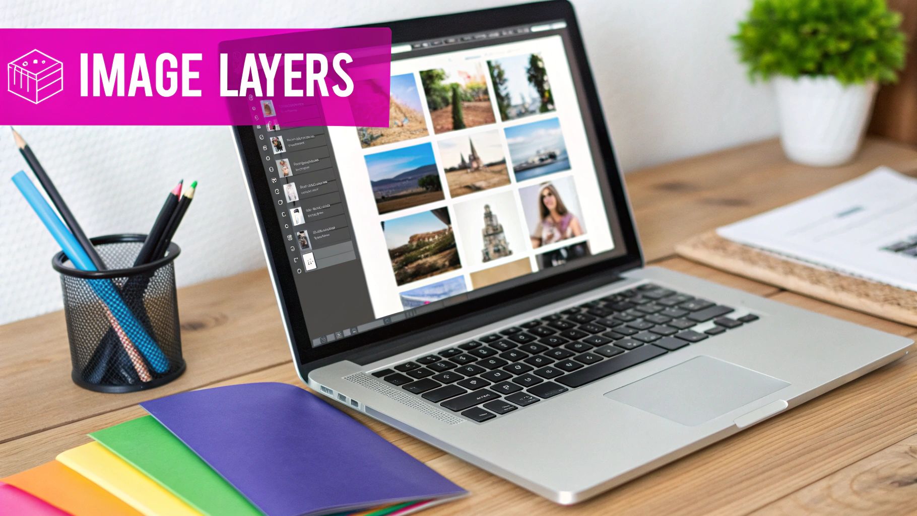
- Layers: Picture layers as transparent sheets stacked on top of one another. Your main background image is the bottom sheet. Every new element you add—whether it’s a person, an object, or a texture—sits on its own sheet above it. This lets you move, edit, and adjust each piece independently.
- Opacity: This setting is your transparency dial. At 100% opacity, a layer is completely solid and visible. At 0%, it's totally invisible. Playing with the opacity is the simplest and most effective way to start blending an image into its background.
- Blend Modes: These are the real secret sauce. Blend modes are powerful presets that change how the pixels on one layer interact with the pixels on the layer directly beneath it. Modes like Screen, Multiply, and Overlay can create all sorts of effects, from realistic lighting to cool artistic textures.
Before we move on, let's quickly break down these core ideas in a table to make sure they stick.
Key Concepts in Image Superimposition
Here’s a quick summary of the essential terms you'll encounter when superimposing images.
| Concept | What It Does | Why It Matters |
|---|---|---|
| Layers | Organizes image elements onto separate, stackable transparent sheets. | Allows you to edit, move, or delete individual parts without affecting the rest. |
| Opacity | Controls the transparency of a layer, from fully visible (100%) to completely invisible (0%). | It's the fundamental tool for blending and fading elements together seamlessly. |
| Blend Modes | Determines how the pixels of a top layer interact with the pixels of the layer below it. | Creates advanced effects like realistic lighting, shadows, and artistic textures. |
Getting a handle on these concepts is your first step toward creating truly compelling composite images.
The goal of superimposition isn't just to combine images, but to create a new reality where all elements belong together. Mastering these fundamentals is the first step toward achieving that illusion.
If you're interested in exploring how AI is pushing the boundaries of image manipulation even further, the field of AI image-to-image processing is a fascinating area to dive into.
Prepping Your Images for a Seamless Blend
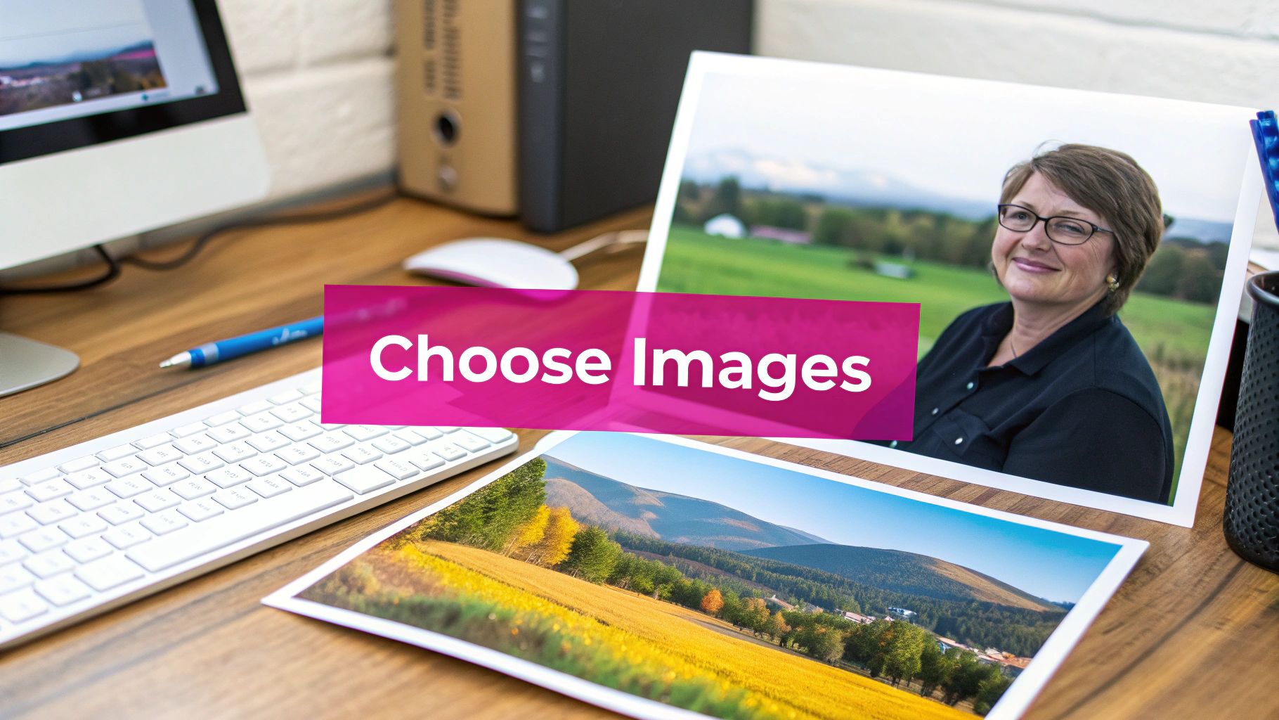
The secret to a believable superimposition has less to do with fancy software tricks and more to do with the images you start with. Think of it like cooking—even the best recipe can't salvage bad ingredients. If you want a result that looks natural, your foreground and background images need to feel like they belong in the same world.
First up, look at the lighting. If your background is a shot from an overcast day with soft, diffused light, dropping in a subject blasted with harsh, direct sunlight will immediately look fake. The same goes for perspective. A subject shot from a low angle will look bizarre and out of place against a background photographed from above.
Nailing the Technicals: Resolution and Color
High-resolution images are non-negotiable. You need plenty of pixel data to play with, especially if you plan on resizing elements or getting really precise with the edges. Trying to work with low-res photos is a fast track to a blurry, pixelated mess. If you find your images are different sizes, you can run them through our https://bulkimagegeneration.com/tools/bulk-image-resizer to get them matched up before you start.
Color is the other big piece of this puzzle. Subtle differences in color temperature or saturation are often what make a composite feel "off." Having a basic grasp of color theory for designers can be a huge help here, giving you the know-how to tweak your images until they look like they were made for each other.
The real goal is to make the editing work easier on yourself before you even begin. Choosing images with consistent lighting, perspective, and resolution from the get-go will save you hours of frustrating cleanup work later.
It's pretty amazing that we can even do this. All this layering of high-quality digital photos is possible thanks to decades of innovation. The whole thing kicked off back in 1957 when Russell Kirsch created one of the very first digital image scanners, capturing light as a grid of pixels. That early breakthrough paved the way for the incredible composites we can create today with cameras capturing 20 megapixels or more.
With your images selected and prepped, you're ready to move on to the fun part: isolating your subject for a clean overlay.
Putting It All Together: Layers and Blending Modes
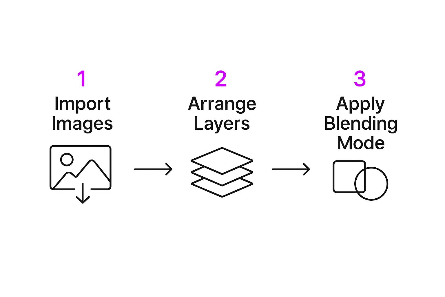
Okay, you’ve got your images prepped and ready to go. Now for the fun part—bringing them together. This is where we move from basic prep work to actually building a new, cohesive scene.
Let’s stick with a classic e-commerce scenario: you need to place a new product, say a designer watch, onto a lifestyle photo of a modern desk.
First things first, you'll bring both the desk photo (your background) and the isolated watch image (your foreground) into your workspace. Each one will sit on its own layer, which is crucial. This setup gives you total freedom to resize, rotate, and nudge the watch around until it looks like it belongs there. Ask yourself: what’s the right scale? Where would a watch naturally sit on this desk?
The basic process of superimposing images is pretty simple once you get the hang of it: import, arrange, and blend.
As you can see, the real creative magic kicks in right after you’ve got the technical layer setup handled.
Choosing the Right Blend Mode
This is where your composite image goes from looking "Photoshopped" to looking real. Blend modes are powerful tools that dictate how the pixels on your top layer interact with the pixels on the layer below. Forget just slapping one image on top of another; we're going to make them work together.
Let’s look at a few practical examples using our watch-on-a-desk scene.
- Multiply: This is my go-to for creating realistic shadows. Create a new layer, paint a soft black shape where a shadow would naturally fall, and set the layer mode to Multiply. It instantly darkens the pixels of the desk beneath it, making it look like the watch is casting a shadow.
- Screen: Think of this as the polar opposite of Multiply. It’s perfect for adding light effects. Want a subtle lens flare or a glint of light on the watch face? A little white brushwork on a new layer set to Screen will do the trick. The white becomes transparent, and darker pixels vanish.
- Overlay: This one is a fantastic hybrid of Multiply and Screen. It maintains the highlights and shadows of the background while blending the colors from your top layer. It’s great for adding subtle textures or color tints to make the scene feel more unified.
Blend modes are your secret weapon for making an object feel like it truly belongs in a scene. Don't just stick to the default 'Normal' mode; experiment to see how each one affects your image.
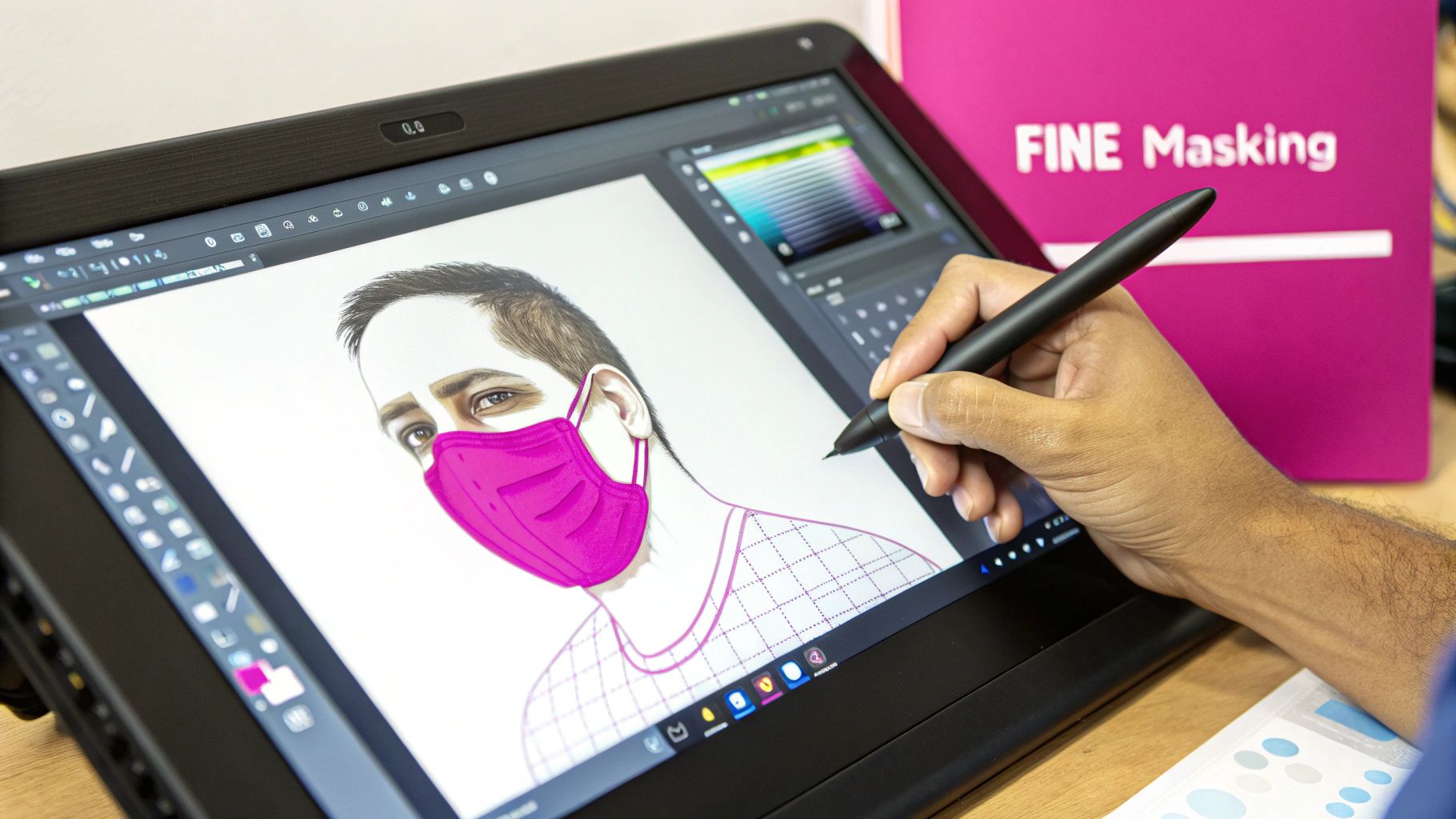
A key technique for a seamless blend is the layer mask. A mask lets you hide parts of your layer without permanently deleting anything. For our watch, you could grab a soft brush and paint on the mask to gently fade the edges. This little trick makes it appear settled into the desk's surface rather than just sitting awkwardly on top.
And if you find yourself needing an extra prop or background element to complete your vision, our AI-powered image generator can create custom assets on the fly.
Advanced Techniques for Realistic Results
Alright, you’ve got your layers in place. That’s a solid start, but the real magic happens in the fine-tuning. This is where you go from a simple cut-and-paste job to a composite image that actually fools the eye. Your goal is to make someone believe what they're seeing is real.
One of the biggest red flags in a superimposed image is when the lighting and color just feel... off. Your subject and background need to look like they were shot in the same environment, at the same time. That means getting granular with the light's direction, temperature, and softness.
Harmonizing Light and Color
The best way I’ve found to blend everything together is by using adjustment layers. They're a lifesaver because they let you play around with colors and tones without messing up your original images.
First, take a hard look at the light source in your background. Is it the warm glow of a sunset or the cool, diffused light of an overcast day? Use a Color Balance adjustment layer and clip it directly to your subject. From there, you can gently push the tones to match the scene. Honestly, a few small tweaks in the midtones are often all it takes.
Next up is contrast. A Curves adjustment layer is your best friend here. If the background has rich, deep shadows and bright highlights, your subject needs to match that intensity. A gentle S-curve can add that little bit of pop that makes your subject feel like it truly belongs in the scene.
Pro Tip: I see this mistake all the time: people make their foreground object way too bright or saturated. In the real world, things that are further away from the lens tend to look a little less vibrant. Try slightly desaturating your subject—you'll be surprised how much more integrated it looks instantly.
Grounding Your Subject with Shadows and Texture
An object without a shadow looks like it’s floating in space. It's a dead giveaway. Fixing this is probably one of the most important steps for creating a believable image.
Just create a new layer right underneath your subject, grab a soft black brush set to a low opacity, and start painting where the shadow would naturally land. Set that layer's blend mode to Multiply, and you'll see the shadow interact realistically with whatever texture is beneath it.
Texture is another one of those subtle details that makes a huge difference. If your background has a bit of film grain or digital noise, your perfectly clean subject is going to stick out like a sore thumb. Matching texture is a core skill for the over 90% of professional designers who rely on compositing in their daily work.
An easy fix is to add a consistent texture overlay across the entire final image. A little bit of grain can work wonders. If you want to get more creative, our guide on using an AI texture generator has some great ideas for creating custom patterns that can really tie your whole piece together. These final touches are what sell the illusion.
Alright, let's get into some of the classic slip-ups I see all the time when people start superimposing images. It's easy to get excited and rush into things, but a few small mistakes can make your final creation look obviously fake.
Knowing these pitfalls ahead of time is the best way to build good habits and get believable results every single time.
Mismatched Lighting and Scale
The most glaring error is mismatched lighting. Every photo has a light source, and that light has a specific direction, color, and intensity. If your background is lit from the left with soft, warm afternoon sun, your subject has to match.
Placing a subject with harsh, cool shadows into that scene completely shatters the illusion. Always, always analyze the light in your background image first.
Unrealistic scale is another dead giveaway. We all know roughly how big a person should be next to a car, or how a coffee mug looks on a desk. It's incredibly easy to make a superimposed object just a little too large or too small for its new home, and it immediately screams "amateur edit."
My Pro Tip: Use objects you recognize in the background as your guide. If there’s a chair in the scene, you have a solid reference for how large your superimposed person should be.
Fuzzy Edges and Clashing Colors
Next up, let's talk details. Blurry or jagged edges around your subject are a sure sign it was dropped in from another photo. You really have to take your time to refine the selection and get a crisp, clean edge.
Equally important is making the colors work together. If your background is full of muted, earthy tones, dropping in a brightly saturated subject will make it stick out like a sore thumb.
The fix is usually pretty simple. Use adjustment layers to gently tweak the saturation and color balance of your foreground element. The goal is to make it blend in so seamlessly that it feels like it was there all along. Avoiding these common mistakes is what separates a decent composite from a great one.
Got Questions? Let's Get Them Answered
Even with the best guides, you're bound to run into a few questions when you're getting the hang of superimposing images. I get it. Here are some of the most common things people ask, cleared up so you can get back to creating.
What's the Best Software for This?
Honestly, the "best" software is the one that fits your workflow and budget.
For pros who need all the bells and whistles, Adobe Photoshop is still king. Its layering, masking, and blending tools are second to none. But you don't have to pay a subscription to get great results. Free options like GIMP and the browser-based Photopea are incredibly powerful and more than capable for most projects.
And if you’re working from your phone?
- Bazaart is fantastic for more complex edits with its surprisingly robust selection and layering tools.
- Snapseed is my go-to for quick, artistic overlays. Its "Double Exposure" tool is a fun and easy way to blend images.
How Do I Make a Superimposed Image Actually Look Real?
Making a composite image look believable comes down to nailing three things: lighting, perspective, and color. If any one of these is off, the whole illusion falls apart.
First, check your lighting. The light source on your foreground subject must match the light in your background scene. If the sun is on the right in the background, your subject can't be lit from the left. It's a dead giveaway.
Next, perspective has to be perfect. You can’t just drop a subject shot from a high angle into a background photographed from ground level. It will always look wrong. Make sure the camera angles feel consistent.
Finally, you have to unify the colors. This is where adjustment layers are your best friend. Tweak the color temperature, saturation, and contrast until both elements feel like they belong in the same world.
Here's a little trick I've learned over the years: add a very faint, consistent grain over the entire final image. It’s a subtle detail, but it helps trick the eye into believing all the separate elements were captured by the same camera at the same time.
Can I Superimpose Images Without All the Tedious Cutting?
Absolutely! This is where you can get really creative, especially with textures and light effects. You don't always need a perfect cutout.
This technique relies on blend modes. Let's say you want to add a gritty texture, a cool pattern, or a lens flare to your photo. Just place that new element on a layer above your main image.
Then, in your layers panel, change its blend mode from "Normal" to something like Screen, Overlay, or Soft Light. Instead of just sitting on top, the new layer will interact with the pixels below it based on brightness and color, creating a rich, layered look in seconds. It's a super fast way to add mood and depth without touching the pen tool.
Tired of the manual grind? If you want to skip straight to the good part and superimpose images at scale, the AI-powered batch editor at Bulk Image Generation can do the heavy lifting for you—from background removal to enhancements. Start creating faster at bulkimagegeneration.com.