How to Change the Color of an Image The Right Way

Aarav Mehta • October 12, 2025
Learn how to change the color of an image with AI and traditional tools. This guide covers pro techniques for realistic, high-quality photo editing.
Changing the color of an image is a powerful skill, whether you're using a classic editor like Photoshop or a modern AI platform. At its core, the process is about isolating a specific color or object and then tweaking its hue, saturation, and lightness to get the exact look you're after.
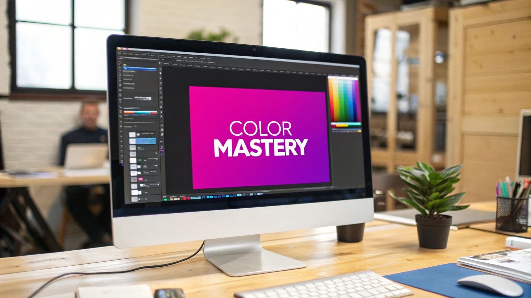
Why Mastering Image Color Changes Everything
Knowing how to change an image’s color isn't just a neat party trick—it's a foundational skill that opens up huge creative and business opportunities.
Imagine you're a product photographer. You have one photo of a sweater. Instead of setting up an expensive and time-consuming photoshoot for every single color variation, you can do it digitally. In minutes, you can create an entire product line from that one shot, showing off ten different colors. The time and money saved are massive.
For marketers, it's all about brand consistency. If a campaign visual doesn't quite match the official brand palette, a quick color correction fixes it, ensuring every asset is perfectly on-brand. To really get a feel for how color can shift an image's entire mood, this guide on photo colour grading is a great resource for learning specific artistic styles.
The Evolution of Color Editing
The ability to manipulate image color has come a long way. Early photography innovations really set the stage for the digital tools we have today. A key breakthrough happened back in 1861 when James Clerk Maxwell created the first color photograph using a three-color method. He took separate shots through red, green, and blue filters and combined them. It was revolutionary for its time.
Today, we've moved light-years beyond those early experiments. The journey from complex, manual techniques to accessible digital tools means anyone can now learn how to change an image's color.
The real power isn't just in changing a color from red to blue. It's in the ability to test new product ideas, align marketing campaigns, and tell more compelling visual stories without friction.
This guide will walk you through the two main methods available now, so you can pick the best approach for any project that comes your way.
Using Traditional Editors for Precise Color Control
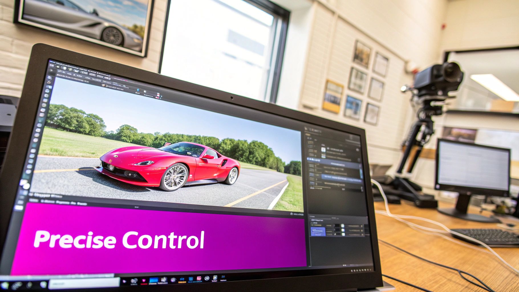
When a project demands absolute, pixel-perfect accuracy, nothing beats the old guard. Traditional photo editors like Adobe Photoshop or GIMP are still the go-to tools for anyone who needs granular control over every aspect of an image. They're the digital darkrooms where you can fine-tune color with a level of precision that AI tools just can't match yet.
The magic of these platforms lies in their non-destructive workflow. Instead of permanently changing your original image, you work with layers, masks, and adjustment tools. This approach gives you the freedom to experiment endlessly, walk back any changes you don't like, and stack effects without ever degrading the quality of your source file.
It's a huge leap from where digital editing started. When Photoshop first hit the scene in the late '80s and early '90s, it completely changed the game by giving us tools to adjust hue, saturation, and lightness. The introduction of layers and masks was the real breakthrough, allowing designers to isolate and alter specific colors without messing up the rest of the image.
A Practical Example: Transforming a Red Car
Let's walk through a common scenario. Imagine you have a great shot of a red car, but your client's branding is blue. You need to change the car's color to a deep, metallic blue while making it look completely natural—reflections, shadows, and all.
First things first, you'd need to create a painstaking selection of the car's body. This is the most critical step. You have to carefully trace around the paint, making sure to exclude the windows, tires, chrome trim, and everything else. A sloppy selection here will ruin the final result, guaranteed.
Once the car's body is perfectly isolated, you'd apply a Hue/Saturation adjustment layer. This is where the color transformation happens. By moving the Hue slider, you can cycle through the entire color spectrum until you land on the exact shade of blue you're looking for. From there, you can use the saturation and lightness sliders to dial in the intensity and brightness to nail that metallic sheen.
The secret to a realistic color change is all in the details. You're not just swapping colors; you're thinking about how light interacts with the new surface. This means preserving the bright highlights and deepening the shadows to match the properties of the new color.
Refining the Color with Layer Masks
With the initial color change in place, the real work begins. This is where layer masks come in. A layer mask lets you paint directly onto your adjustment layer to selectively hide or reveal its effect. It's the key to finessing the final look.
You'll use masks for a few crucial tasks:
- Cleaning Up Edges: Inevitably, your initial selection won't be perfect. A mask lets you paint back in tiny areas you missed or erase spots where the color "bled" onto the background.
- Managing Reflections: To keep the car looking glossy and realistic, you might need to dial back the color-changing effect on the brightest reflections where the paint would reflect the sky or other light sources.
- Preserving Shadows: Making sure the shadows under the car and in its crevices stay dark and natural is what sells the illusion. A layer mask lets you paint out the color adjustment in these areas.
This manual process gives you complete, unapologetic control over the final image. Yes, it takes more time and a bit more skill than AI alternatives, but for high-stakes professional work, that level of precision is often non-negotiable. Just remember that all these layers and masks can make for some chunky file sizes. If you need to prep your final images for the web, a tool like a bulk image resizer can be a lifesaver for getting those file sizes under control.
The AI-Powered Approach for Speed and Scale
While traditional editors give you granular control, let's be real—they can be painfully slow. The modern creative world runs on speed and volume, and this is where AI tools aren't just an alternative; they're a total game-changer. Forget meticulous selections and layers. Now, you can change an image's color with a few simple words.
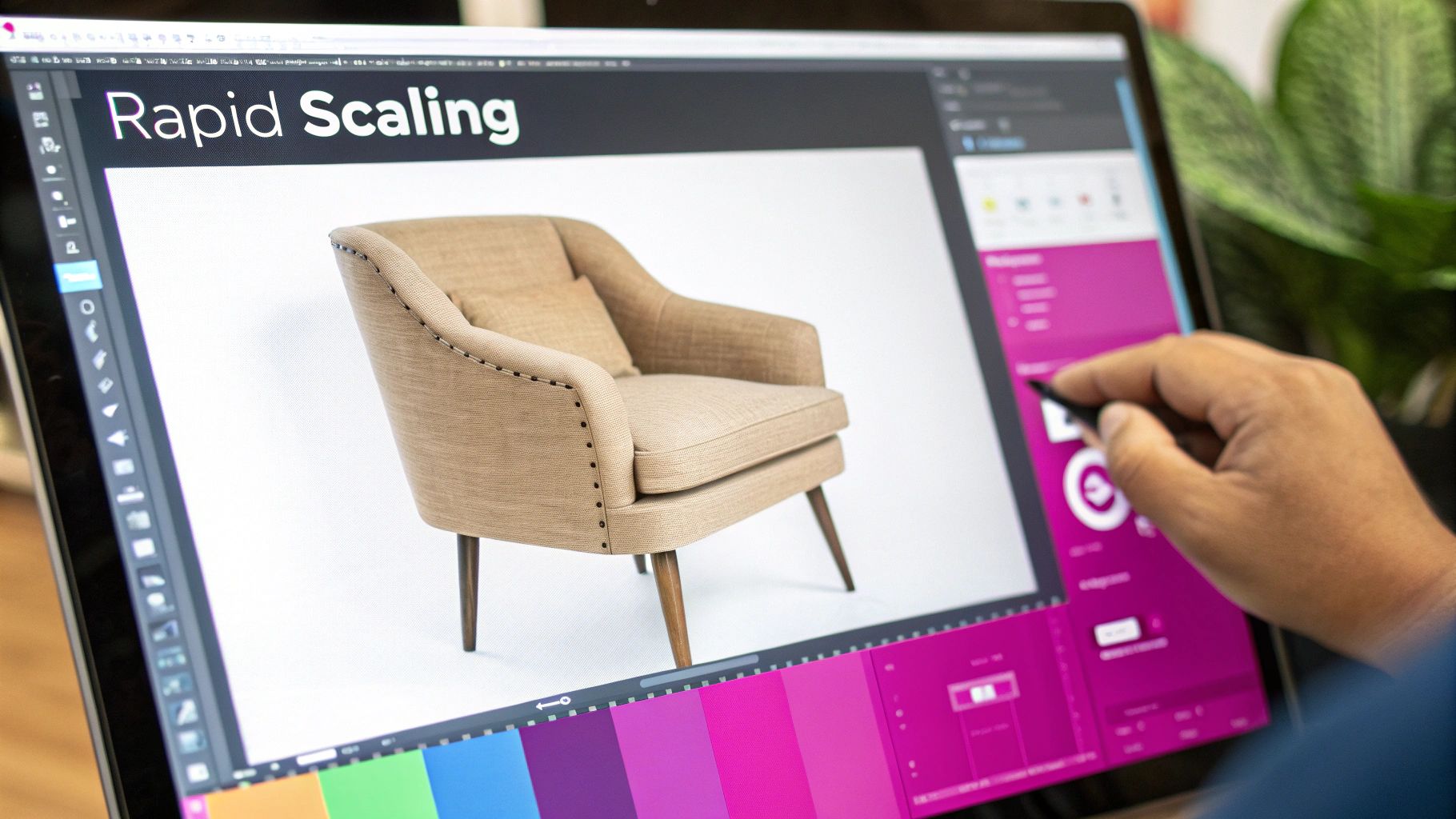
Imagine you're running an e-commerce store. You've got one perfect shot of your best-selling armchair in a safe, neutral beige. But you offer it in 15 different fabrics. Manually editing that one photo 15 times? You’re looking at hours, maybe even days, of tedious work.
With an AI platform, that entire workflow gets flipped on its head. You just upload your high-quality armchair photo and start telling the AI what you want to see. The whole process hinges on clear, descriptive language.
Generating Variations with Text Prompts
And you don't need to be a Photoshop wizard to get incredible results. The key is being specific. For that armchair, your prompts could be as simple as:
- "Change armchair to sage green velvet"
- "Change armchair to charcoal gray linen"
- "Change armchair to deep navy blue corduroy"
The AI doesn't just splash on a new color. It intelligently figures out what the "armchair" is and applies both the new color and the requested texture. In minutes, you can have a full gallery of product shots ready to go. The AI even handles the tricky parts, like adjusting lighting and shadows to make the new material look completely natural.
This method is a massive leap forward for anyone who needs to scale their visual content. What once required a dedicated graphic designer can now be handled by a marketer or store owner in a single afternoon.
This kind of efficiency is a lifesaver for small businesses and solo entrepreneurs who need a high volume of assets without a big budget. It truly levels the playing field. You can see how this works for yourself with a powerful AI image generator that makes the process incredibly straightforward.
These tools are versatile, too. They’re not just for subtle color swaps. They can handle dramatic transformations, like creating stunning black and white headshots with AI, which shows just how powerful this technology is for all sorts of creative needs. For anyone looking to change image colors at scale, the AI-powered approach is easily the most direct and effective path forward.
Choosing Your Tool: AI vs. Traditional Editors
So, how should you actually go about changing an image’s color? The answer really boils down to one simple question: what’s more important to you, precision or speed?
There’s no single "best" tool out there—only the right one for the job at hand. Your choice here will completely shape your workflow and, ultimately, the final results you get.
The Case for Traditional Editors
Traditional editors are the undisputed champions of detail. I’m talking about the workhorses like Adobe Photoshop or the open-source hero, GIMP. If you're a graphic designer neck-deep in a high-end commercial composite, you absolutely need the pixel-perfect control that only these tools can provide.
This hands-on approach is essential when you're managing intricate details. Think about preserving the subtle reflections on a car's metallic paint job or flawlessly blending a new color into complex shadows. For that level of finesse, you have to go manual.
When AI Makes More Sense
On the flip side, AI-powered platforms are built for one thing above all else: getting a lot done, fast. An e-commerce manager who needs to generate one hundred product mockups before their lunch break doesn't have time to mess around with layer masks and selection tools. For them, efficiency is everything.
This is exactly where AI shines. It can turn a process that used to take days of painstaking work into a task you can knock out in just a few minutes.
How to Make the Call
So, which path is right for you? It all comes back to their core strengths. Traditional editors give you deep, granular control, letting you fine-tune every single aspect of the color change. This is non-negotiable for professional work where flawless execution is the only option.
AI tools, on the other hand, are all about accessibility and scale. They empower people who aren't designers to produce a high volume of quality images quickly, often with simple text prompts instead of complex software. This has been a game-changer for marketers, founders, and small business owners.
Still not sure? This decision tree can help you figure out the best fit for your project in seconds.
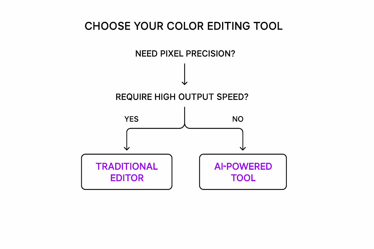
As you can see, your primary goal—either pinpoint accuracy or high-speed output—is the single most important factor in this decision.
To break it down even further, let’s look at a side-by-side comparison of what each approach brings to the table.
AI Tools vs. Traditional Editors: Which is Right for You?
| Criteria | AI-Powered Tools | Traditional Editors |
|---|---|---|
| Speed | Extremely fast; generates dozens or hundreds of variations in minutes. | Slow and methodical; requires manual adjustments for each image. |
| Control | Limited; relies on the AI's interpretation of your text prompt. | Absolute pixel-level control over selections, masks, and blending. |
| Learning Curve | Very low; typically just requires writing a clear text prompt. | Steep; requires significant time to master tools and techniques. |
| Use Case | Bulk content creation, product mockups, rapid prototyping, social media assets. | Professional photo retouching, branding, high-end commercial work. |
| Consistency | Excellent for creating a large volume of images in a consistent style. | Can be challenging to maintain exact consistency across many images. |
| Cost | Often subscription-based, can be very cost-effective for high volume. | Can be a significant one-time purchase or ongoing subscription fee. |
Ultimately, both toolsets are powerful, but they solve very different problems. Your choice should align with your project's specific demands and your personal workflow.
Your goal defines your tool. A meticulous artist and a fast-moving entrepreneur have different needs, and thankfully, there are powerful options for both. Choosing correctly from the start saves immense time and frustration down the line.
Getting Results That Actually Look Real
Knowing the buttons to click to change a color is one thing. Making it look like it was always that color? That’s a whole different ball game. The little details are what separate an amateur edit from something that looks truly professional.
The biggest giveaway of a clumsy color swap is lost texture. When you change the color of a piece of clothing, it still has to look like fabric, not a flat, plastic-y blob. You have to keep the original highlights, shadows, and all those tiny threads intact. The second that texture disappears, the illusion is shattered. Our guide on using an AI Texture Generator actually dives deeper into keeping surfaces looking authentic.
Mind Your Light and Shadows
Here's something a lot of people miss: light hits every color differently. A bright yellow car is going to cast softer, lighter reflections than a deep navy blue one would in the same spot. Your color changes have to respect the basic physics of light.
Key Takeaway: Don't just change the object's color. You have to think about how that new color would realistically affect its surroundings—the intensity of its shadow, the color it reflects onto nearby surfaces. That's the secret sauce for making it believable.
This isn't a new concept, by the way. Back in 1935, Kodachrome film became the gold standard for rich, natural-looking color by cleverly layering emulsions to capture light authentically. It's a great reminder that the interplay between light and color is a fundamental principle that’s just as crucial in Photoshop today as it was in a darkroom almost a century ago. You can learn more about how these fundamentals evolved by reading up on the history of color photography.
To really elevate your work, steer clear of these common mistakes:
- Over-saturation: Pushing the colors way too far is a surefire way to make things look fake and cartoonish. Dial it back.
- Ignoring Color Harmony: Don’t just pick a random color. Use a little color theory to choose something that actually complements the rest of the image.
- Leaving Halos: This is a classic rookie error. You have to clean up the edges of your selection meticulously to avoid that ugly color bleed or "halo" effect.
Common Questions about Image Color Editing
So you’ve got the basics down, but what about those tricky situations that always seem to pop up? It’s one thing to shift a blue to a green, but it’s another thing entirely to deal with pure black, white, or figuring out the right file format.
Let's walk through some of the most common questions I get.
What’s the Deal with Black and White Objects?
Changing the color of something that’s pure black or pure white isn't as straightforward as adjusting a hue. The reason is simple: there’s no color data there to begin with.
With white objects, you can't just slide a hue adjuster and expect magic. Since white has no color information, you have to add it. The easiest way is to apply a color overlay, which essentially paints a new color on top while using a blending mode to respect the object's original shape and texture.
Black objects are even tougher. Pure black has zero brightness or color. Before you can add any color, you have to create some light. This means jumping into your editor's levels or curves to manually create some highlights and mid-tones. Only then can you apply color to those newly brightened areas.
Think of it this way: color-changing tools need something to work with. For pure black or white, you first have to create the light and shadow information yourself. This is the secret to getting a result that has depth and doesn't just look like a flat, colored sticker.
What's the Best File Format to Use?
This question comes up all the time, and the answer always depends on where the image is going. There’s no single "best" format.
- For the web? Stick with a high-quality JPEG or WebP. Both give you a great balance between visual quality and small file size, which is crucial for fast-loading websites.
- Need a transparent background? You have one choice: PNG. It's the only common format that supports transparency, which is essential for logos, icons, or product images on colored backgrounds.
- Still working on it? If you think you might need to come back and make more edits, always save a version in the editor’s native format. For Photoshop, that means saving a .PSD file to keep all your layers and adjustments intact.
We've covered some common hurdles here, but what if you could sidestep the manual work entirely?
With Bulk Image Generation, you can create countless color variations for your products, marketing assets, or creative projects in just seconds. Our platform is built to handle these complexities for you.
Ready to see how fast it can be? Start generating at Bulk Image Generation and see how AI can completely change your creative workflow.