How to Blend Photos Together in Photoshop Like a Pro

Aarav Mehta • December 1, 2025
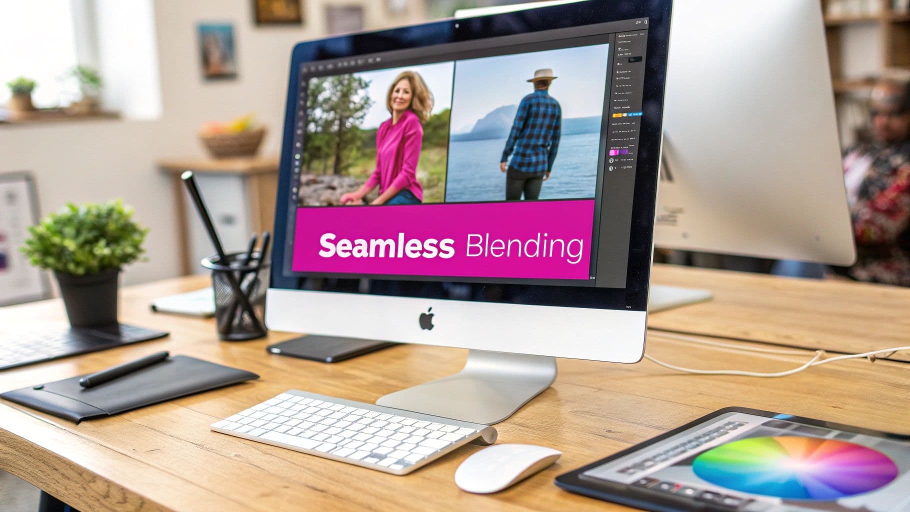
Learn how to blend photos together in Photoshop with this guide. Master layer masks, blend modes, and color matching for seamless, professional composites.
If you want to blend photos together in Photoshop, the first thing you need to get your head around is its layer-based system. It’s all about stacking your images on separate layers and then using tools like layer masks to control which parts of each image show through. Once you nail this core concept, you're well on your way to creating professional, totally believable composites.
The Building Blocks of Seamless Blending
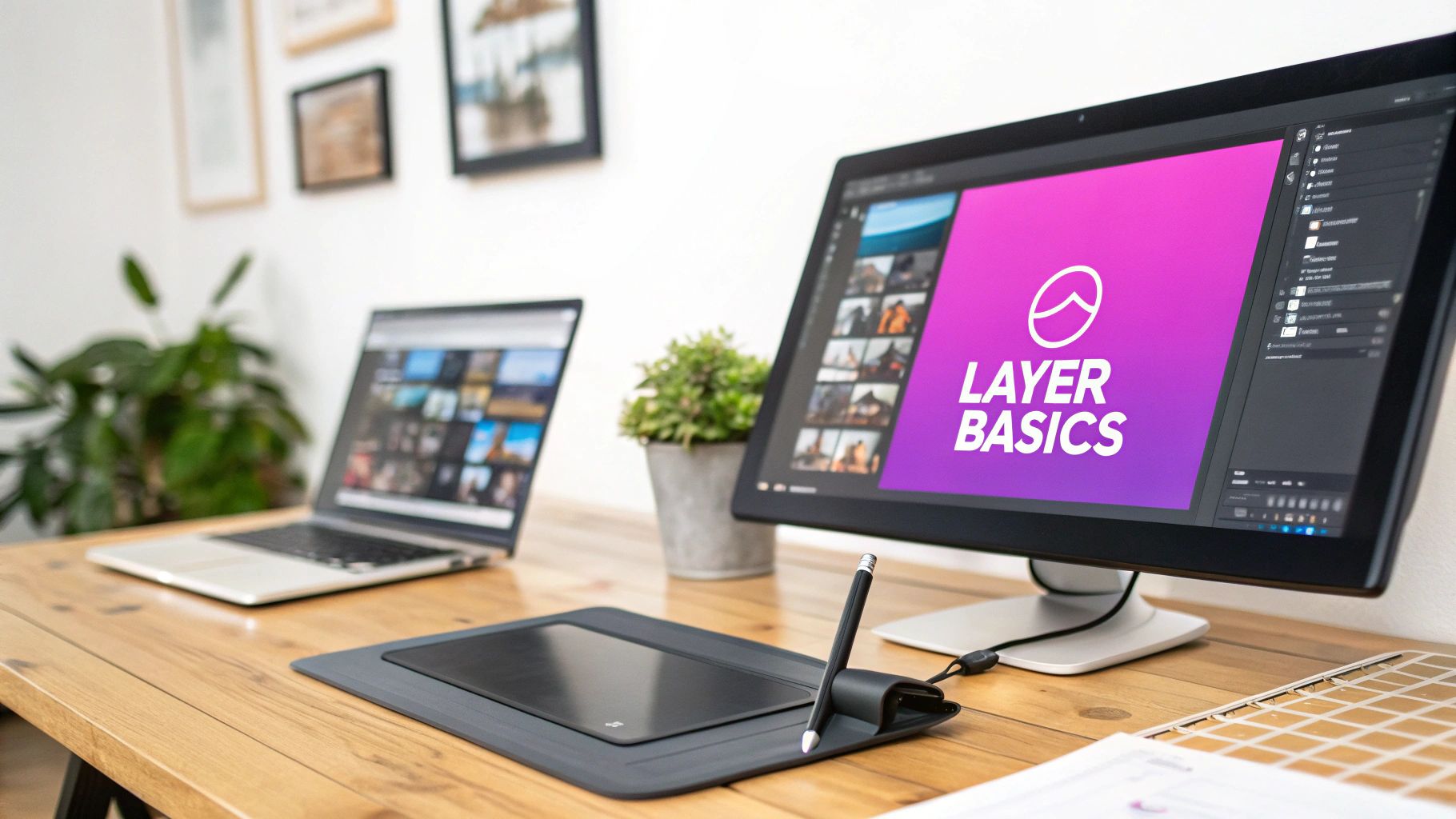
Before we jump into the fancy stuff, let's get comfortable with the basic tools that make all the magic happen. Think of Photoshop as a stack of clear plastic sheets. Every image or adjustment you add gets its own sheet, or "layer," so you can mess with one part of your project without messing up everything else.
This non-destructive workflow is what separates the pros from the amateurs. It gives you the freedom to experiment, tweak things, and backtrack without ever permanently changing your original photos. The two tools you'll be using constantly are layers and layer masks.
Understanding Layers and Masks
A layer mask is like a magic stencil you attach to a layer. It lets you control exactly what parts of that layer are visible or hidden. The idea is simple but insanely powerful:
- Paint with black on the mask, and you hide that part of the layer.
- Paint with white, and you bring it back.
- Use shades of gray for everything in between, which is perfect for creating soft, gradual fades.
This feature, introduced way back in Photoshop 5.0 in 1996, changed the game for editors. It lets you blend images together without ever touching the Eraser tool.
Pro Tip: Always, always duplicate your background layer before you start. Just drag it to the 'New Layer' icon. This keeps your original image safe and sound, giving you a safety net if you ever need to start over from scratch.
The Role of Blend Modes
Now, beyond just making parts of a layer visible or invisible, blend modes change how the pixels on one layer actually interact with the pixels on the layers below it. You'll find this dropdown menu at the top of your Layers panel, and it's basically a bunch of math formulas that mess with color and light in cool ways.
There are a ton of them, but you’ll probably find yourself coming back to these three for most of your blending work:
- Multiply: This darkens everything by combining the colors of your top and bottom layers. It’s my go-to for adding realistic shadows or applying textures to bright surfaces.
- Screen: The exact opposite of Multiply. This one lightens things up and is perfect for blending in things like lens flares, stars, or sparks.
- Overlay: This is a mix of both Multiply and Screen, which boosts the contrast. It makes darks darker and lights lighter, giving your blend a really rich, punchy look.
To give you a quick cheat sheet, here are the core tools we're talking about and what they're best for:
Essential Photoshop Blending Tools
| Tool/Feature | Primary Function | Best Use Case |
|---|---|---|
| Layers | Organizes elements into a stack | The fundamental structure for all composite work. |
| Layer Masks | Controls the visibility of a layer | Creating precise, non-destructive blends and cutouts. |
| Blend Modes | Determines how layers interact | Adding light effects, shadows, or creating artistic styles. |
| Opacity/Fill | Adjusts layer transparency | Fading an effect or making subtle adjustments. |
| Gradient Tool | Creates smooth color transitions | Making soft, gradual blends over a large area on a layer mask. |
Getting a solid handle on these tools is absolutely essential. They form the foundation for every other technique we'll cover.
To really dig into these foundational principles, I'd also recommend checking out a detailed guide on how to blend two images for another perspective.
Getting Your Images Ready for a Perfect Blend
A great blend starts long before you ever touch a layer mask. I've learned this the hard way. The real secret to a composite that actually looks believable is in the prep work—picking photos that were meant to be together from the start.
Skip this, and you'll spend hours fighting with your tools, trying to force a fit that just isn't there. The final image will almost always feel… off.
So, what should you look for? Consistency is everything. Pay close attention to the light source. Is it coming from the same direction in all your photos? Is the perspective similar? Mismatched lighting is the number one giveaway of a fake composite. An object lit from the left will stick out like a sore thumb in a scene where the sun is clearly on the right.
Setting Up Your Photoshop Workspace
Once you've got your images picked out, it's time to get them all into one place. The easiest way is to open each photo and simply drag it into a single, main project file. Photoshop will automatically put each image on its own layer, which is exactly what we want for a flexible workflow.
Here's a quick trick I use all the time for initial alignment. Select your top layer and knock the Opacity down to about 50%. This makes the layer semi-transparent, so you can see the image below it. Now, you can grab the Move Tool (V) and line up key features perfectly. For tiny adjustments, just tap your arrow keys to nudge the layer pixel by pixel.
My Personal Workflow: The very first thing I do is convert my image layers into Smart Objects. Just right-click the layer and choose "Convert to Smart Object." This is a non-destructive workflow, meaning you can resize, rotate, and warp the image as much as you need without ever losing quality. It's a lifesaver.
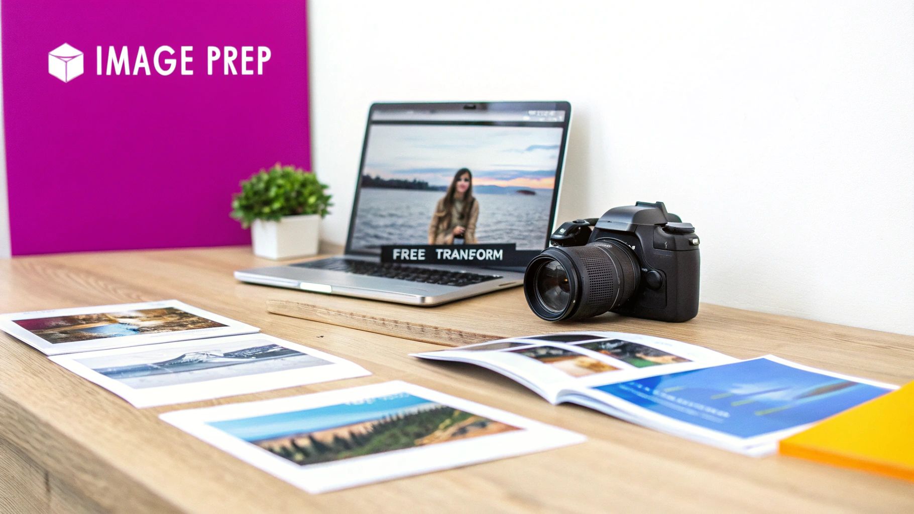
Aligning and Transforming for a Natural Fit
Sometimes, just moving an image around isn't enough. You need to bend it to your will. This is where the Free Transform tool comes in—it's an absolute game-changer. Hit Ctrl+T (or Cmd+T on a Mac) to bring up the transform box.
You can resize and rotate, but the real magic is hiding in the right-click menu. Inside, you'll find tools like:
- Skew: This lets you tilt an image vertically or horizontally. It's fantastic for matching angled surfaces, like placing a poster on a slanted wall.
- Perspective: This alters one side of the image to create a sense of distance. It's absolutely essential for matching vanishing points in a scene.
- Warp: This gives you a flexible grid to bend and distort your image with incredible precision. Think wrapping a logo around a coffee cup—Warp is the tool for that.
Getting comfortable with these transformation tools is what separates an amateur composite from a professional one. Your elements won't just sit on top of each other; they'll look like they truly belong in the scene. For anyone working on product shots, these skills are non-negotiable. In fact, you can see how AI is taking this to the next level in our guide on AI product photography.
Creating Smooth Transitions with Layer Masks
Okay, with your images stacked and aligned, we get to move from the technical setup to the fun, artistic part: the blend itself. This is where the magic happens, and your single most important tool is the layer mask.
Honestly, the layer mask is what separates a seamless, professional composite from a harsh, amateur-looking cutout. It’s the key to making the transition between your two photos look completely natural.
Let’s start by adding a layer mask to your top image. Just select that top layer in your Layers panel and click the little icon at the bottom that looks like a rectangle with a circle inside. A white thumbnail will pop up right next to your layer’s preview. This white box is your mask, and because it's white, everything on that layer is currently 100% visible.
Now for the core concept, and it's beautifully simple: painting with black on the mask hides that part of the layer. Painting with white reveals it again. That’s it. Black conceals, white reveals.
Mastering the Brush for a Flawless Blend
Your go-to for working on a layer mask is almost always going to be the Brush Tool (B). But you can't just grab any old brush and start painting. The secret to a buttery-smooth, gradual transition is using a soft-edged brush.
Once you’ve selected the Brush Tool, glance up at the options bar at the top of your screen. Find the Hardness setting and crank it all the way down to 0%. This gives you a soft, feathered edge that's absolutely essential for a clean fade.
Think of it like this: a hard-edged brush is like using a marker—it creates a sharp, defined line. That's the last thing we want. A soft brush is more like an airbrush, diffusing the effect and making the transition between the two photos practically invisible.
From here, you can start painting on your layer mask with black as your foreground color. As you brush over the edge of your top photo, you'll see it start to melt away, revealing the layer underneath.
Pro Tip: The relationship between your brush's hardness and its opacity is everything. For maximum control, I almost always lower the brush Opacity to around 20-30%. This lets you build up the blending effect gradually with each pass, giving you the precision you need for a truly professional result.
The Gradient Tool for Perfect Fades
While the brush is fantastic for complex shapes or uneven edges, sometimes you just need a perfectly straight, even transition. This is super common in landscape photography, like when you're blending a new sky into a scene with a flat horizon. For these jobs, the Gradient Tool (G) is your absolute best friend.
Here’s how to use it to get a perfect fade in seconds:
- Select the Layer Mask: First, make sure you click on the white mask thumbnail in the Layers panel, not the image preview itself. You want to be sure you're applying the gradient to the mask.
- Grab the Gradient Tool: Just press 'G' on your keyboard.
- Set Your Gradient: Up in the options bar, make sure you have the classic "Black to White" gradient preset selected.
- Draw the Gradient: Now, just click and drag across your image in the direction you want the blend to happen. For a sky replacement, you'd typically start at the top of the sky and drag down towards the horizon line.
The tool instantly creates a perfectly smooth transition from black to white on your mask. The result is an impeccably even blend that would be a nightmare to try and paint by hand. It's a massive time-saver for blending large, uniform areas.
Advanced Blending for Photorealistic Results
Moving beyond simple fades and soft brushes is where your composites really start to sing. This is where the magic happens. We're not just hiding seams anymore; we're intelligently weaving together the best parts of multiple images to create a single, flawless final piece.
One of the most powerful tricks in any editor's toolkit is exposure blending. It's the secret behind those breathtaking landscape and real estate photos where both the bright sky and the dark foreground look perfectly exposed. Instead of letting automated HDR software call the shots (which can sometimes look a bit fake), this manual approach gives you total control over the final look.
Mastering Exposure Blending
The core idea behind exposure blending is simple. You take several photos of the same scene at different exposure levels—some dark to capture all the detail in the highlights, some bright to get everything out of the shadows. Then, you stack them up in Photoshop and use layer masks to literally paint in the best-lit parts from each shot.
This technique is a total game-changer for real estate photography, where you absolutely have to capture both the bright, beautiful view outside a window and the details of the room inside. I've seen photographers take up to seven shots under different lighting conditions for a single room. By applying inverted masks and carefully brushing details back in at a low opacity, they can pull back every last detail from blown-out highlights and deep shadows. The results speak for themselves: this method can lead to a 118% increase in online listing views and can raise pricing popularity by up to 47% per square foot.
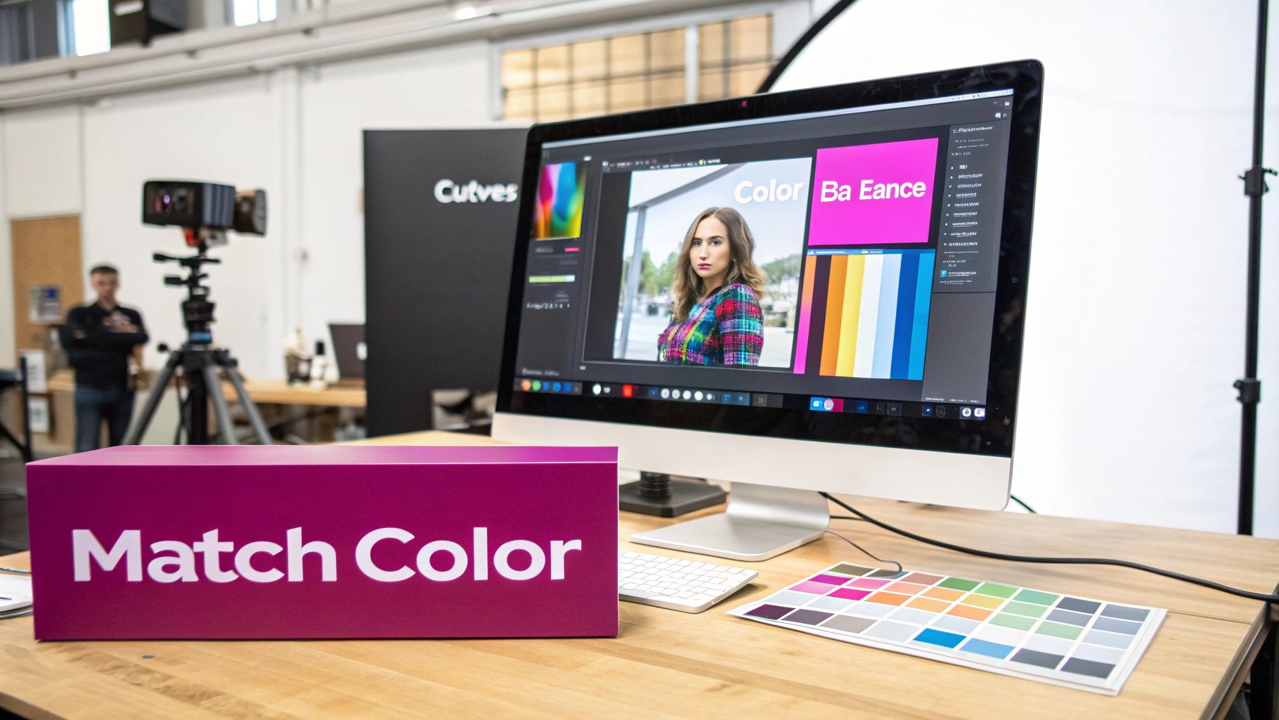
This diagram breaks down the basic workflow for using layer masks, which is the heart and soul of exposure blending.
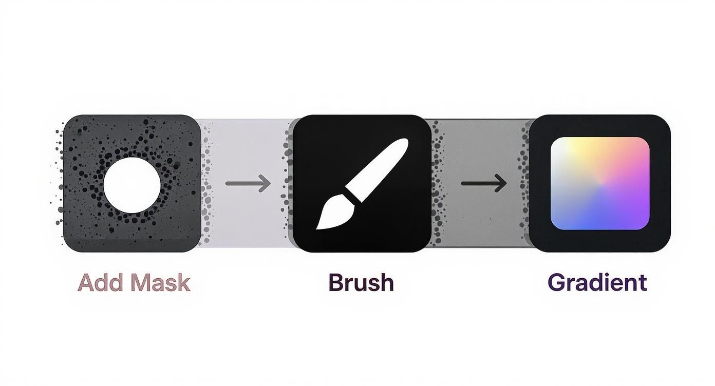
It really just boils down to those three core actions—adding a mask, painting with a brush, and using a gradient—to give you pinpoint control over your blend.
Using Precision Selections for Complex Subjects
But what about when you need to blend something with tricky edges, like wispy hair or the leaves on a tree, into a completely new background? A soft brush just isn't going to cut it. This is when precision selection tools become your best friend.
Instead of just painting wildly, you start by creating a hyper-accurate selection of your subject. For clean, smooth curves, nothing beats the meticulous control of the Pen Tool. But for more complex shapes, the AI-powered Object Selection Tool can often nail it with just a single click.
Once your selection is active, just click the "Add Layer Mask" button. Photoshop instantly creates a perfect mask based on that selection, giving you a clean, professional edge without any of the tedious manual painting.
This combo of a precise selection and a layer mask is how you convincingly lift a subject from one photo and drop it into another. When you get it right, it looks like it was always there. You can even get creative and use these selections to generate custom backgrounds. For more ideas on that, check out our guide on using an AI Texture Generator.
As you dig deeper into advanced blending, it’s also worth keeping an eye on the latest AI content creation tools for images. They can generate incredible custom elements or backgrounds to drop into your composites, opening up a whole new world of creative possibilities.
Harmonizing Color and Light to Finalize Your Blend
So, you've perfectly aligned your layers and painted a seamless mask, but something still feels… off. It’s a common roadblock. A technically perfect blend can completely fall flat if the color and lighting don't match between the different photos.
This final stage is where the magic really happens. It's all about making the composite believable, tricking the viewer's eye into seeing one cohesive photograph instead of two separate images just stuck together.
The key to getting this right is using Adjustment Layers. Unlike making changes directly on a layer, these are non-destructive. That means you can tweak them, hide them, or delete them at any time without permanently damaging your original images. They give you the ultimate flexibility for color grading and light correction.
Clipping Masks for Targeted Adjustments
When you first add an adjustment layer, it affects everything below it by default. To make it only impact a single layer—like the person you just added to a new background—you need a clipping mask.
Just right-click the adjustment layer in the Layers panel and choose "Create Clipping Mask." You’ll see a little arrow appear, pointing down to the layer it's now attached to. Now, any changes you make will only affect that one layer.
This is the professional workflow for matching tones. You can add a Curves layer clipped to your subject to match its brightness and contrast to the new background. Then, you might add a clipped Color Balance layer to fine-tune the color casts in the shadows, midtones, and highlights.
My Personal Tip: Don't just eyeball the colors. Use the Eyedropper tool to sample a shadow color from your background, then open a Solid Color fill layer with that color. Do the same for a highlight. Now you have visual targets to aim for while you adjust your subject's tones.
Unifying Your Composite with a Final Polish
Once the individual pieces of your composite look like they belong together, you can add a final, global adjustment layer over the top of everything. This is like the final coat of varnish—it "glues" all the different elements together with a consistent, overall color grade.
Here are a few of my go-to adjustment layers for this final polish:
- Curves: This gives you incredibly precise control over the overall brightness and contrast of the entire scene.
- Color Balance: This one is excellent for adding a universal color cast, like a warm golden-hour glow or a cool blue tone for a nighttime shot.
- Selective Color: This adjustment layer gives you surgical control, allowing you to tweak specific colors (like making the greens in the trees more vibrant or the reds in a shirt less saturated) without messing up the rest of the image.
The AI-Powered Shortcut to Blending Photos
If you're looking for a faster workflow, Photoshop's Neural Filters offer a ridiculously powerful solution.
The Harmonize filter uses AI to automatically analyze the color and tone of a background layer and apply it to your subject. It's not always perfect, but it can get you 90% of the way there in a single click. This tool is part of a growing suite of AI features designed to simplify what used to be complex, time-consuming editing tasks.
Adobe's recent updates, including Generative Fill and improved removal tools, are estimated to speed up creative workflows by up to 60%. This is making high-end compositing more accessible than ever before. You can see how Adobe is integrating these AI advancements on their official YouTube channel. For many jobs, Harmonize is the secret weapon for creating a cohesive scene in seconds, leaving you more time for the creative finishing touches.
Stuck on Your Blend? Here Are Some Common Fixes
Even after you've learned the ropes, it's totally normal to hit a few snags when you're blending photos in Photoshop. These little issues can feel frustrating, but trust me, the solutions are usually way simpler than you think. Let's walk through some of the most common questions I hear to get you moving again.
Why Do My Edges Look So Harsh and Fake?
This is probably the number one complaint I see from people just starting out. You mask something out, and you're left with this hard, ugly line that screams "this is a fake picture!" This almost always boils down to your brush settings.
It’s an easy fix. Just grab your Brush Tool (B) and glance up at the options bar. You’ll see a Hardness slider—crank that baby all the way down to 0%. A soft-edged brush is your best friend for creating a natural, feathered transition between images.
For even more control, I like to drop the brush’s Opacity down to around 20-30%. This lets you build up the blending effect gradually instead of blasting it all at once.
Which Blend Mode Should I Actually Use?
Another big question is which blend mode to pick from that giant dropdown list. While there’s no single "magic" blend mode, a few are my absolute go-tos for specific jobs.
- Screen: Perfect for adding things like sparks, lens flares, or stars to a darker photo. It basically makes anything black in the layer invisible.
- Multiply: This is the exact opposite of Screen. It's fantastic for adding textures or painting in realistic shadows because it darkens everything.
- Overlay & Soft Light: I use these all the time to punch up the contrast and add a bit of richness to a composite without destroying the original pixels.
Honestly, the best way to figure it out is just to play around. Click on the blend mode dropdown menu in the Layers panel and then use the arrow keys on your keyboard. You can cycle through every single one and see a live preview of what it does.
How Do I Get the Colors to Match?
Mismatched colors are another dead giveaway of a composite. The best tool for this job, hands down, is Adjustment Layers. I usually start with a Color Balance adjustment layer.
Make sure you clip the adjustment layer directly to the layer you want to change (the one you're blending in). This ensures your edits only affect that specific layer, not the whole image. From there, just tweak the sliders for the shadows, midtones, and highlights until the color cast feels right.
You'll probably also need a Curves adjustment layer to get the brightness and contrast just right. Getting the lighting to match is critical for making a scene feel believable, especially when you're pulling images from different sources, like stock photo sites. If you want to dive deeper, check out our guide on how to handle AI-generated images from Adobe Stocks, which has some great tips for working with diverse assets.
At Bulk Image Generation, we build powerful tools that let you create incredible visuals in just moments. If you need to scale up your creative projects, head over to https://bulkimagegeneration.com and see how our AI can supercharge your design workflow.